By Sophie Anderson
Walking into “Bearing Witness: Installations by Margi Weir” tension is already present before even processing the work. The floor is barren, except for a few low benches for viewing. The bright lights amplify the empty distance between the walls. Confrontational, bright, reflective artworks on plexiglass, bleed out onto the walls with vinyl cutouts that mimic the patterns present in the works. The complicated patterns are reminiscent of a shiny, busy wrapping paper design. It takes a moment to take in the artworks individually to break them down.
The artist explains that her works are personal. They are a way for her to process what angers and frightens her. They are political in many cases, but she is fighting the polarized nature of political discussion not trying to add to it. So much of political discourse is done in bad faith. It is not designed to bring people together; instead, it serves a way to create two increasingly severe parties. Weir is disturbed by this. She is not creating a call to action, but a path for viewers to question parts of our shared reality. She calls the main body of work exhibited, The Politics of Hue. Each painting uses a specific color, weaving its negative and positive associations together in a textile-like pattern.
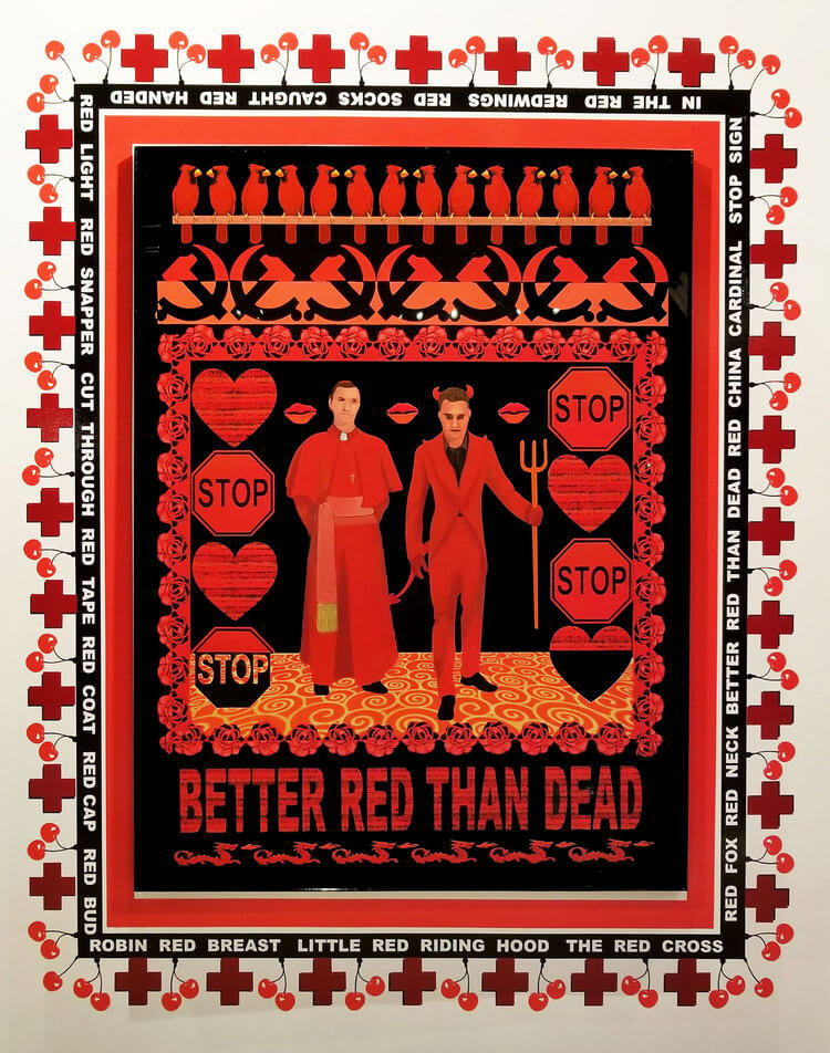
In the center on the left wall Better Red draws my eye. It is big and red with bold black outlines. In the center, a priest and the devil stand side by side. They are surrounded by a pattern made from robins, stop signs, sickles, hearts, and roses. On the bottom, in all caps, the words BETTER RED THAN DEAD are underlined with dragons. Like the other works, a vinyl sticker, on the wall, borders the painting with word associations to the color represented, in this case red. A pattern of red crosses and cherries surrounds this, further blurring the line between the wall and the ride. The sheer number of objects presented opens the work up to interpretation. For me, the work brings to mind the Catholic Church’s numerous scandals involving the sexual assault of children and the subsequent protection of the abusive priests. The priest and the devil stand side by side with cartoon kissy lips at the eye level, bringing focus to what might be, truly, on their minds. The hearts, juxtaposed with the stop signs, represent the love bombing process and the sexual abuse that go hand in hand with each other. It is easy to also make the association with the “red scare”. The sickles and tag line, BETTER RED THAN DEAD, could convey a fear of communism for the American public. For me, the latter is more interesting and topical, given how highly publicized cases of abuse in churches are.

A predominant theme of racial inequality runs throughout the surrounding works. Blue is Not a Neutral addresses the pro-police, Blue Lives Matter, movement, created in protest of Black Lives Matter. The four predominate figures in this piece are silhouetted police officers in riot gear on a background of a blue brick wall, referencing the blue wall of silence. The upper half of the image has some birds, a 1st place ribbon, and a blue commuter error screen; but none of the other imagery is as strong or as political as the police figures. White Privilege and its counterpart, Black Lives Matter, reflect their names in a predictable, but well-executed, manner. White Privilege does not have a central image that grabs the viewers’ attention. From the top down, there’s the white house with the words white wash written underneath, a clothesline, a white picket fence, chess pieces, and white bread. The white bread stands out as a humorous element, due to the modern association that something very vanilla, suburban, and middle class might be “white bread”. Smaller works to the side address ‘hands up don’t shoot’ and issues of gun violence directly. The entire show is tied together by the installation on the right wall. This section is Weir’s most recent body of work and it focuses on the issue of border control and the separation of refugee families. Watchtowers and a large wire fence with crows sitting on top spread over the wall like a mural combining the three works. These are not as heavily patterned as the earlier pieces in the show, and this sprawling line work design pulls them together. The fluttering weaponized hands surround the sky, further reinforcing the combined theme of the show. Throughout Weir’s work, she addresses racism, gun violence, police brutality and privilege. This final, sprawling, work layers these themes purposely to bring attention to how often these issues, that might seem separate, are actually intersectional.
With both highs and lows, this exhibition succeeds where the artist has left some vagueness for the viewer to be drawn into, and it fails when there is no discovery to be unearthed with only one note ideas to be picked up on. Some require patient viewing for the onlooker to decipher all the objects in the patterns and the near pun tag lines that play on color. While staring at these slow burning pieces, the viewer can begin to see their own reflection in the Plexiglas and begin some introspection. The lows, for me, are where the artworks seem more like undeviating messages. Better Red is strong because it uses so many politically and emotionally charged symbols that can lead to several interpretations, depending on the focus of the viewer. Other pieces lack this level of depth and are much more designated for single interpretations. Black Lives Matter is an undoubtedly important movement that, in this series, has been reduced to its title. The artist’s goal of creating some sort of question is lost in the directness. A person aware of the political climate around these issues, of race and the police force, will either agree with the work or disagree. There is no content in these lows that could take hold of someone and really challenge them.
Sophie Anderson is a Bachelor of Fine Arts at Valdosta State University focusing in the area of ceramics. She is originally from Thomasville Georgia and plans to return there after graduation and pursue a masters in ceramics at Florida State University.