Walking into the Dedo
Maranville Fine Arts Gallery located on the Valdosta State University Campus,
audiences will be greeted with a splash of different colors from the
“Bearing Witness” gallery installations by Margi Weir. These
installations take color and combine everything that is symbolized in modern
culture by that color and collage them into one beautifully designed acrylic
painted piece. Weir also uses the acrylic paintings to create awareness as well
beyond just the colors creating one large piece that is equivalent to 3 of her
normal-sized large canvases. Vinyl images merged to create this one stunning
piece that is so large it fills up one whole wall of the gallery. This
exhibition combines many ideals, so if viewers do not agree with one color and
its symbols, there are up to eight colors, including Red, Blue, Green, Yellow,
Black, White, Purple, and Orange, so that everyone can relate to something in
this exhibition. The stories and awareness that Weir provides are modern
culture. The execution of each piece is very detailed in each work presented.
This year, Valdosta State University had the honor of hosting the 32nd annual “Valdosta National” in the Dedo Maranville Fine Arts Gallery, consisting of fifty artists and fifty-two works from twenty-five states across the U.S. The exhibition showcases the “best” contemporary art from all media. As the viewer enters the installation, art is displayed to the left and right with a choice of where to start. Furthermore, each piece was given a text panel consisting of the title of the artwork, type of medium, the artist’s name, and the location where the artist works. The floating question of the exhibition was “is this actually the best art?” Art is a relative term. Many artists, art historians, and others have defined characteristics or guidelines for something to be art, yet those guidelines have constantly been broken by a new movement of art. Using the artwork’s originality, craftsmanship, the content, and composition, I will evaluate what the artist is intending their art to convey.
The “Valdosta National” exhibition at the
Valdosta State University Dedo Maranville Fine Arts Gallery displayed artists
from all over the country. The selection process for this exhibit was rigorous,
with 406 works of art from 146 different artists from 35 states in the United
States all submitting their art to be selected. 52 works of art by 50 different
artists were invited to have their art put on display at this exhibition. The
atmosphere of this exhibit was calm and relaxing. Many viewers knew one another
already so it was a very friendly environment; people were laughing and viewing
the art in a calm way. These works were all spaced out well and were not cluttered
in the placing of each work. When I walked into this exhibit, I was handed a
list of each artwork and the selling price for that piece. This brought an
additional perspective into this process; being able to judge the work for
myself and being able to see what these artists thought their art was worth was
a new viewpoint.
Margi Weir, Justice in America, 2016, acrylic on canvas, surrounded by vinyl
Valdosta State University’s Dedo Maranville Fine Arts Gallery has opened up a new exhibition, called “Bearing Witness”, showcasing Margi Weir’s social political artworks. The show officially opened on the 17th of February and will end on March 6th. The artworks collectively shed light on subjects from social injustice to eco-sustainability. Weir’s works show the violence of these problems in the form of beautiful visuals, and it is evident that she has a passion to voice her concerns for these subject matters.
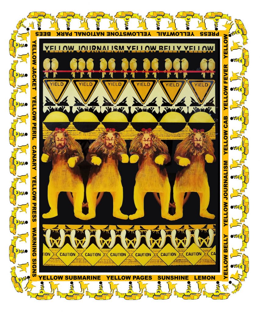
Yellow journalism, 2018, 60″ x 46,” painting of acrylic on Plexiglas surrounded by multicolored vinyl
If one is into or just a bit curious about visually appealing tapestry-like designs, Margi Weirs work offers that and a deeper look into the world we live in. Walking into her Bearing Witness: Installations exhibit, the placement of the artwork in the open room pulls the viewer in with the bright exciting colors and structure of her designs. Her art has a twist that gets more interesting the longer the viewer examines the almost monochromatic design. The longer I stare at the designs, things start to connect, her work becomes more than just shapes, words, and colors dancing around one another. Rather, it contains characters from movies, figures from everyday life, and deep conversations that people tend to avoid. The execution of her pieces is very unique and like nothing I have seen before. There are some pieces that are displayed directly on the walls like stickers either around projected prints or by themselves helping to complete the story or making one of its own. I find the artist attempting to sway an idea in front of the viewer’s faces and let them preserve what they may.
When discussing her work Weirs states that it is, “something beautiful on the surface has an underlying violence, dark side, if you will, I find this present in many of the works displayed. One piece in particular comes to mind, titled, Yellow Journalism, its bright yellow colors that are normally associated with ideas of happiness. Bringing the viewer in with a familiar face, the lion from Wizard of Oz. There are more yellow objects such as caution signs, bananas, submarines, silhouettes of a dog and yellow birds; such things bring a sense of lighthearted playfulness to the piece. Also present in this piece is the title which she puts in the yellow banner that surrounds the work, resembling caution tape. Without knowing which movie the lion comes from, I fear the whole concept she’s trying to make the viewer see would be lost, but Weir must have had that exact thought while creating not only this design but all of them. To think that far ahead, to consider the reactions and thoughts of her audience. Choosing a character that is so well known for being a coward helps explain her concept on how she portrays journalists. An unspoken message, calling the cowards hiding behind their yellow tape as they gossip like chirping birds. It is the concept I thought she was hinting at, but it may be different for others, again the viewer is in charge of what he or she perceives.
White Privilege, 2017, 73.7″ x 51.25,” painting of acrylic on Plexiglas surrounded by multicolored vinyl
Her work is not something a person can understand with a glance. At first I feared people would get lost in the design and the beautiful judgments of symmetry in some pieces, but Weir’s placement of features makes people question why it is there, what it could mean. She states that her work is meant to spark conversation on “ecology and/or social political realities of the contemporary world around us”. I find this statement to come into play with her work titled White Privilege, with a solid black background and white objects. The biggest is the White House followed by king chess pieces, white bread, a white picket fence, and white clothes hanging on a clothesline. Featuring the White House and white picket fence undeniably corresponds with America and the common “American Dream”. In the middle of the artwork the words, “whitewashed”are displayed.
There are very different emotions, arguments, and discussions that this piece has started on what this artwork actually stands for. Whether people agree with her view or not, she is hinting at the way America is whitewashed, imposing that white is superior in our society. Although like the previous work, the title is present in the work, White Privilege is huge among the bottom of the piece of art. Along with other text, which I feel is crucial in her work to not only engage the audience but help them see her point further. I find this to help with understanding the clothes line in the design. Without the text I would not be sure that her work, personal opinion on the subject, or the questions and conversations she is hoping for would be understood by the audience. I find the commentary on the works brilliant, because she has found a way to have a debate about her work with the audience. While being able to move the viewer without being there physically to push or explain the reason to have the conversation.
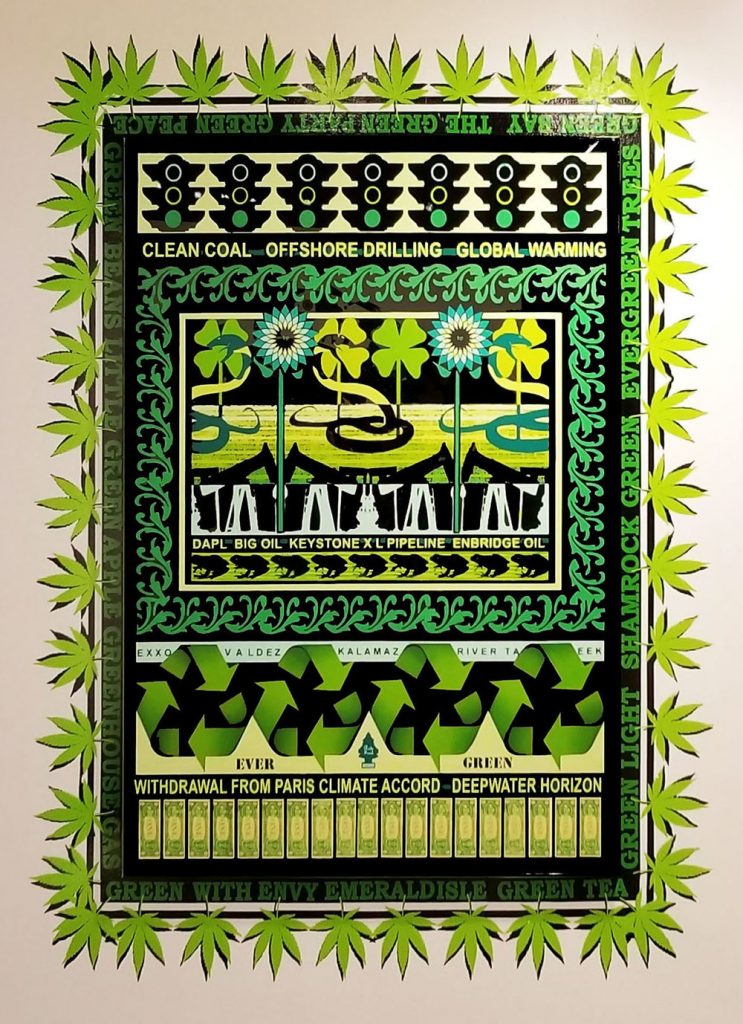
Ever Green, 2017, 73.7″ x 51.25,” painting of acrylic on Plexiglas surrounded by multicolored vinyl
Similarly, in her piece titled Evergreen, she uses the same style with the words, yet the design does not give me anger or shock or even a complete understanding until the design is fully studied. This topic is not being discussed with such a serious outlook like sexism or oppression that is a prominent conversation nowadays. The topic of the piece is climate change and our effect on the world. Unlike others, it is overlooked because of the time that passes before anyone sees what impact a person’s actions have on the environment is not a concept that’s always in one’s face. Again, Weir uses a color that is excellent, a vibrant green to demonstrate the figures in the piece. At first glance the green overwhelms the vision with the recycling symbol, flowers, vines, and what appears to be a weed plant surrounding the piece.
Although the longer one stares at it the oil drills under the flowers it becomes the main focus. Realizing this the eyes move around the print trying to pick up what else they could have overlooked. The more one looks the less joyful the art feels and a more serious feeling overwhelms the mind. With the money being a green that seems like it belongs, the viewer is blind to what is happening. Until they were not, once I realized the money was right there, hidden in plain sight. Once the money is spotted at the bottom it draws many questions as to why it is there. This fuels a deeper conversation on how money fits into an art piece about the environment. Could it have been hinting at the fact that money is a huge part of covering up the effects we have on the environment? Unlike the oil drills that are an ice blue making a point these things are disrupting nature, in the piece and the world we live in. With them being present it shows Weir was hinting at the possibility we only blame big companies for the environment. Instead money is influencing the whole piece. She uses the word “Deepwater Horizon” which was a disaster involving a huge oil spill in the Gulf of Mexico. Which could have been avoided if it was not for the greed for fossil fuels. By using those words in this piece, her art does exactly what she said it would, showing a dark side, and connecting it to a real event that has happened. This piece is very focused on raising all the right questions needed to make a change and shine light on things we overlook everyday. Weir has created an amazing concept that is best described as a venus fly trap. What I mean by this is that Weirs work lure people in and holds their attention.
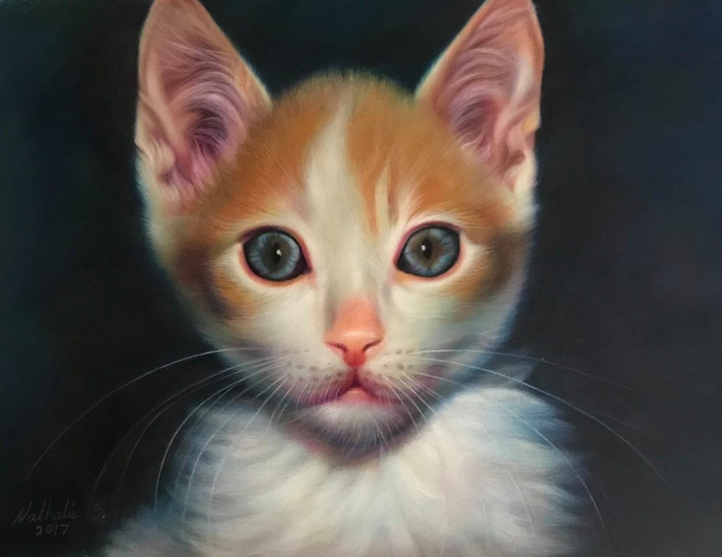
Visitors who attended the “Valdosta National” saw a bicycle that resembled an antelope, a hyper-realistic colored pencil drawing of a kitten, patterned paper silhouettes, three-dimensional layers of colored cardstock artworks, and an abstract artwork which consisted of cut fabric and string. These were only a few works among the many which were displayed in the “Valdosta National” exhibition which opened on January 21, 2020. The exhibition was located at the Dedo Maranville Fine Arts Gallery at Valdosta State University. This was Valdosta State University’s 32nd year hosting the “Valdosta National”. There were 406 individual artists who competed for $1,500 in awards which were announced at the opening reception. The entire list of these awards as well as photographs of the show are located on the VSU Dedo Maranville Fine Arts Gallery Facebook page. A total of 52 works were selected from 50 individual artists from 25 states. This year Didi Dunphy had the honor of judging each artwork. She graduated with an MFA from San Francisco Art Institute. Dunphy is a professor at the Lamar Dodd School of Art at UGA where she teaches contemporary and digital media art classes. Furthermore, Dunphy spends her time as an independent curator in partnership with regional art museums.
The “Valdosta National” exhibition is displayed in the Valdosta State University Dedo Maranville Fine Arts Gallery in Valdosta, GA. This exhibition is the gallery’s annual display of contemporary art that showcases multiple medias. The exhibition runs from January 21-February 7, 2020. After stepping into the gallery, one is embraced with a calming and quiet atmosphere. The viewer can browse the exhibition however they want without a specific order. I believe that the installation was great for the exhibition. Each work in the exhibition is labeled with the artist’s name, the title of the work, and the medium of the work. Every work in the show is well lit by the use of studio lighting and they are spaced to where each work can be seen without being crowded by other works. Out of the 48 works, 46 of them were for sale and ranged from $100-$8500. They were judged and awards were given for first through fourth place, as well as honorable mentions.
It was a colder night than most in Valdosta, Georgia, but my heart was warm with excitement and anticipation at the opening gallery that Tuesday evening. I finally arrived at the location, the Valdosta State University Fine Arts Building for the 2020 “Valdosta National All-Media Juried Competition”. I was worried about the lack of vehicles surrounding the area but was pleasantly surprised at the mass of people entering the gallery space. As the description on the wall panel stated there were paintings, sculptures, illustrations, and hanging reliefs. Thus, I began my journey through the maze of art.
Valerie Aranda Caminos/Paths (Peublito Mosconi)
This piece despite being place in the very back of the gallery won the heart of the judge. At first place was Caminos/Paths (Peublito Mosconi) by Valerie Aranda. The piece is acrylic on canvas, depicting people going in different directions. Some were walking, running, in groups, on bikes, riding scooters, and motorcycles, as well as dogs, chickens, and a peacock scattered throughout sitting, walking, and grooming themselves. Underneath the very paint itself was a string, paper origami cranes, and even torn lingerie. Lastly placed in the middle were three handcrafted flowers in the shade of lime green, turquoise, and dark grey, all of this being placed on top of a flat bright Forrest green background. Night Lights (Mind), by Timothy Short, is an oil on canvas painting. It appears as a collage of moments, poses, and facial expressions all surrounding the same protagonist, a young adult African American woman. The mind begins to visually divide the image into three sections in the colors of red, yellow, and blue spread on the canvas. These choices in color as well the size help aid in the amount of interest and inclination a person might feel towards it.
Timothy Shorts, Night Lights (Mind)
After viewing the large green painting, I felt more inclined to look at other works of color. Temple by Sarah DePetris was one of the examples of color, is a silkscreen on paper consisting of hyper realistic rocks in cold shades of pink, white, black, pale orange, purple, blue, and lavender. H. V. II a mixed Media artwork by Pearl Bryant was an abstract explosion of pigments from intense red to muted creams even a few chromatic gold and silvers imagine can most likely be found on this canvas. Kevin Sloan used the work The Mesa. The small piece was an acrylic painting of a landscape from what looks like Colorado. There are mountains faded in the background with yellow flowers in the foreground, and amid it all is a large black tire. The last painting is one that I personally found Rough Draft by Robert Schoolfield to be a captivating piece. It consisted of multiple mediums with abstract and well as recognizable illustrative elements. The canvas felt almost chaotic yet controlled due to the unification of specific colors spreading across the canvas. Bright translucent yellow, magenta, muted turquoise, intense orange, and black seemed to dance on top of the white paper. Underneath the color was writing used with different colors and utensils. I was privileged enough to see the back of the canvas which was a continuation of the work. It had a long paragraph written by the artist asking many questions that artist think throughout their career. What makes a work of art good? Why must I make art be beautiful for someone else? Who is anyone to say what art can be limited to? In his struggle of find answers, I felt an even greater admiration for this piece. The size though not as large as Valerie Aranda or Timothy Short still left a lasting impression on me.
Robert Schoolfield, Rough Draft
Upon first entry I felt a little overwhelmed at the diversity in media as well as subject matter. Yet as I began viewing pieces, I found friends and others as well as myself going back to certain pieces. Works of scale and color felt to be the attention grabbers in this exhibition. Though as an overall, each and every piece went through a process of being chosen out of many other hundreds of artworks. Many of the artworks in this exhibition deserved their place among the exhibitions title “The Valdosta National”
Finding a Sense of Home Within the Valdosta National 2020 Exhibition
By: Harlee E. Webb
Valerie Aranda, Caminos/Paths (Mosconi town), Acrylic on canvas
This year the 32nd annual “Valdosta National” All-Media Juried Exhibition was held at Valdosta State University in the Dedo Maranville Fine Arts Gallery. This specific exhibition contained a variety of artwork from all over the country showcasing contemporary visual art from 50 artists representing 25 states. From the ceramics studio down the hall, one could hear the chatter of numerous guests, waiting to enter the gallery. Students covered in paint came fleeing towards the gallery in swaths– so too did men and women in business attire– all of them piling in through the glass door. Having maneuvered my way through the throng, I found myself amongst the menagerie of artwork– some extremely pleasing, and others shocking to behold. This exhibition was diverse in media, style, and subject matter, so much so that it felt overwhelming. The richness of this exhibition served not only to showcase the talents of the artists from 25 states, but also to provoke discourse between those attending.
This year the 32nd annual “Valdosta National” All-Media Juried Exhibition was held at Valdosta State University in the Dedo Maranville Fine Arts Gallery. This specific exhibition contained a variety of artwork from all over the country showcasing contemporary visual art from 50 artists representing 25 states. From the ceramics studio down the hall, one could hear the chatter of numerous guests, waiting to enter the gallery. Students covered in paint came fleeing towards the gallery in swaths– so too did men and women in business attire– all of them piling in through the glass door. Having maneuvered my way through the throng, I found myself amongst the menagerie of artwork– some extremely pleasing, and others shocking to behold. This exhibition was diverse in media, style, and subject matter, so much so that it felt overwhelming. The richness of this exhibition served not only to showcase the talents of the artists from 25 states, but also to provoke discourse between those attending.
The current exhibition located in the Dedo Maranville Fine Arts Gallery was created and installed by artist Margi Weir. The exhibition, “Bearing Witness: Installations by Margi Weir,” consists of installations or artworks that revolve around Weir’s personal experiences and opinions which are often political in nature. The exhibition did not have an opening due to Weir’s professional duties as an Associate Professor of Painting and Drawing at Wayne State University in Detroit, Michigan. Although there was no opening there will be a closing ceremony for the exhibition, March 6th, 2020 where Weir will be present to discuss her work.