Maria Carbonell
The Department of Art and Design of Valdosta State University is presenting the Spring 2021 Senior Exhibition at the Dedo Maranville Fine Arts Gallery, “as the semester comes to a close, 20 art students graduating from VSU have worked together to create the digital gallery show ‘Living inColor’” (VSU Gallery).
Since the exhibition cannot be experienced in person due to the circumstances, one shall adapt and experience the works through other means. Experiencing the works through a digital exhibition has its pros and cons. I would argue that this new media helps to have an overall view of the exhibition’s intent by having a summary before presenting the pieces. Most of the time when one is presented with an in-person gallery, one is greeted with small brochures that contain a little summary, but it does not go too into detail due to the limited space. I personally like the malleability and freedom that one has when presenting information online since the space is “infinite.” By clicking on “2021 Senior Exhibition” or on the banner “Living in Color,” one is taken directly to the exhibition’s main page where one is received by an overview of “Living in Color.” The layout used to adapt the exhibition to a digital one can be classified as effective due to its user-friendly style. By scrolling down, one encounters a picture of the twenty senior students with their names at the bottom. By clicking on each picture individually, one is taken to their own page, which could also be seen as their designated space if the gallery was in person. This makes it easy and straight to the point. By taking into account the interaction design and layout, experiencing the exhibition through a computer is no problem to internet-savvy users and more traditional users. Following up the designated student’s page, each artist has an introduction, their personal statement, and about five of their pieces. I felt that I could have a personal connection and understand better the point of the artist by having their designated tab with a summary and personal statement. They did not have to cut their intent short to make it fit in a small brochure, but instead had the freedom to layout the meaning behind their work, which helps the viewer immensely. I believe that what a gallery can sometimes lack during an in-person experience, a digital gallery can exceed in interpersonal experience by giving out more information about the artist and art. I must admit that, still, an online experience will never quite match the experience of having a work in front of you and having the opportunity of going closer or further as one may desire. Physical works are hard to capture digitally, especially when their media is three-dimensional. Pieces such as metalworking and jewelry are not the same in person than through a picture, so in that aspect one may be let down. Due to the wide variety of media, which include paintings, drawings, sculptures, photography, graphic design, printmaking, book art, ceramics, jewelry, and metalworking, the experience can differ depending on the work presented. The vast array of media not only offer diversity at the moment of experiencing the exhibition, but it also connects with the overall message of the exhibition, which is to celebrate differences and how these connect us. What unifies the exhibition is that all of them are seniors presenting their final pieces, and the meaning behind such pieces go hand-in-hand with diversity and union. According to the Dedo Maranville Fine Arts Gallery, “this vast array of artistic mediums and subject matter highlights the unique differences in each student and their art” (VSU Gallery). Instead of the gallery being presented as a room with white walls, dim lights, and the art pieces hanging on a wall or standing on a pedestal, the background of the main page is black, highlighting the colorful background of each picture. Since the name of the exhibition is “Living in Color,” I find it successful that at first, the background is a dark color, but when one clicks at the colorful senior picture, one is taken to their page which is bright and even more colorful. This is also a positive side of the digital exhibition since they can change the “plain, white walls” to fit the aesthetic and theme of the exhibition.
“Living in Color” is an exhibition inspired by the uniqueness of each of the artists, and how, through the use of varied color palette and differences, one can still find the allure in them (VSU Gallery). The meaning behind each work is to communicate the artist’s intent, whether this communication lies “within the self as a deeper personal exploration or shines through with the ability to share their unique experiences in life” (VSU Gallery). Since everybody experiences the world through different eyes and creates their memories out of their own perspectives, the versatility of media in this exhibition is a tangible representation of all the diverse perspectives. All of this “is featured in works that express the versatility of the body, the struggles of living as a person of color in America, and the duality of nature” (VSU Gallery). The overall goal is to, through the development as art students and progression in the arts, share what inspires them and their journey growing up as someone interested in multiple media. Through their works and personal statement, senior artists let the viewer know how their personal journey shaped them and their medium of choice. They are ready to open their wings and throw themselves into the professional world, where they will use their art skills and subject matter as a way to identify themselves to others.
Each artist has their one medium which they find it easiest to communicate their message to the world. Some of the artists present in the exhibition were Jadah Alford, Isabelle Redenius, and Christian Perry.
Alford focused on the relief print technique to express how growing in the deep South prohibited her from being her true self and embracing her sexuality. According to Alford, “I use the closet in my work to address both the figurative and mental space people confine their identity in, in order to feel safe or to fit in” (VSU Gallery). In her relief print Freedom Reach and The Closet, Alford uses the imagery of a closet to explain the constraints multiple members of the LGBT+ community have gone through, and the difficulties and challenges they have to face before deciding to leave the closet and embrace themselves fully. Alford used the closet as a “safe space” in the piece The Closet by engraving “your secret’s safe with me,” but uses a different connotation in Freedom Reach where she interprets the closet as shackles that prevents the person from reaching the doorknob and being free. I consider her relief print series successful in addressing her intentions, and I find such pieces powerful by embracing her personal experiences and using it as the fire to ignite the match. Also the relief and details in both pieces draw your eyes into it, to absorb every single bit of, and submerge yourself in what she is trying to say.
Another artist featured in “Living in Color” is Isabelle Redenius who focuses on collages and mixed media. Refenius’ works are filled with colors and a variety of shapes, forms, and sizes, which make the eye wander from one corner of the piece to the other. Redenius’ interest in multiple things combined is due to her desire to collect as many experiences as possible. “My artwork is an extension of my desire to collect experiences and information through the eyes of a twenty-one-year-old woman in contemporary society,” stated Redenius (VSU Gallery). In her work Open Book Detail, she joined and assembled in a sort of collage, multiple sketches, drawings, and doodles, and used silkscreen and photo-silkscreen as well to create more figures. Redenius often uses her “sketchbook to collect doodles as well as thoughts in a diaristic manner” (VSU Gallery). In another work of hers called Untitled 1, Redenius used the same silkscreen process to develop a piece full of colors and used fruits, vegetables, bottles, and even human anatomy to come up with a unique piece. Overall, Redenius’ works are fun to look at and leave one searching for more figures, kind of like a letter soup, where the more you focus your sight, the more things you find. Her intention of recollecting memories in a series of collages and using mixed media is a great way to portray how memories often pop up in your head without a timeframe. Experiences and memories come up at random, and the use of collages make her works successful by achieving that same ephemeral and random burst of ideas that pops up in one’s head.
Christian Perry, born in Okayama, Japan, grew fond of denim production and apparel. Perry has used various “mediums that convey his interest in the fast fashion industry” (VSU Gallery). Perry’s interest in the production of fibers and textiles inspired him to do pieces such as I Don’t Want To Die For Fashion, made out of deconstructed jeans and stamped using plate lithography, and Repurposeful, made out of recycled denim and scrap fabrics. After learning the harsh truth about fast fashion, Perry decided to do something about it. Hence he started making apparel out of old shirts, denim, and textile he had, giving his old closet a new life by recycling old attire. “Many industries are offenders of inhumane and eco-unfriendly business models, but I am most concerned and make art surrounding fashion,” stated Perry in his artist statement (VSU Gallery). I find Perry’s purpose and art coherent, which makes his pieces more meaningful since he is determined to shed a light and bring awareness to the awful conditions experienced in sweatshops. Through his art Perry wants to bring attention to clothes that have multiple uses and should not just be discarded after a minor inconvenience. Afterall, he creates his work by using materials from scrapped or donated garments (VSU Gallery).
The Senior Show of 2021 has multiple works by outstanding art students that aligned their purpose and mission to their crafts and creativity. By using personal experiences, hardships, business ideas, and creativity, they came out with multiple works involving various media such as printmaking, paintings, drawings, sculptures, photography, graphic design, printmaking, book art, ceramics, jewelry, and metalworking.
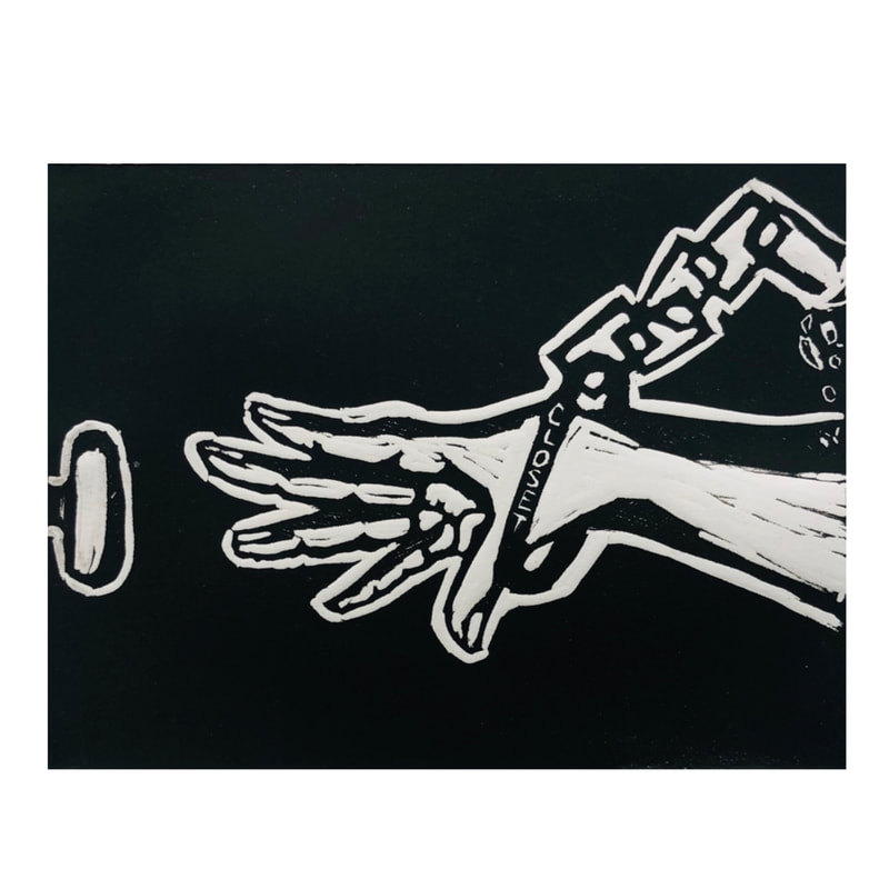
Black background with engraved white hand in the center of the piece. Black is also used as shadows and to outline the hand’s details such as nails, crevices, and skin. The hand is reaching for a doorknob at the far left. The hand is being held on the wrist by a chain that spells “closet.” At the fart right where the beginning of the chain is shattered into pieces.
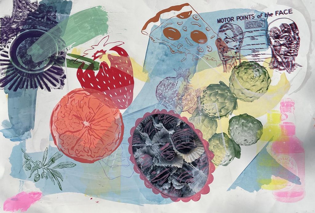
White background with numerous colorful pieces. At the top left corner there is what appears to be part of the architecture of a building in a navy blue colors. At the center leaning more towards the left is a red strawberry and an orange. There us a tan pizza at in the upper part of the piece. At the top right corner there is a figure of an anatomical human head, and beneath it are some green sprouts. At the bottom right is a pink bottle of liquor. There are yellow, blue, and pink brushstrokes all over the piece, and imprinted really lightly are what appears as vegetables and plants.
Work Cited
Valdosta State University Dedo Maranville Fine Arts Gallery Virtual Exhibition. Accessed April23, 2021. https://www.vsugallery.org/