A Look At The Man Behind The Canvas: Mitch Ogletree

By Sara Williams

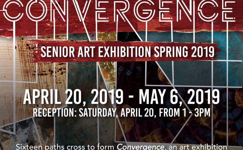
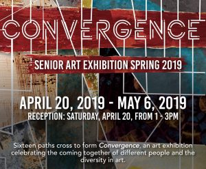
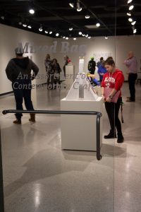
The Dedo Maranville Fine Arts Gallery is once again decorated to the max with tangible expressions, emotions, thoughts, and statements.  Sixteen artists, all seniors who are about to graduate from Valdosta State University, are showing off their best artwork at “Convergence Senior Art Exhibition Spring 2019”; and, I get to discuss the brilliant, thought-provoking artwork of Mitch Ogletree. “How old are you, Mitch?”, I blatantly ask.  Mitch sweetly smiles in my direction and says, “I’m thirty-three years old”.  Mitch Ogletree, born and raised in Tifton, Georgia, is about to graduate from Valdosta State University as part of the class of 2019 with his Bachelor of Fine Arts degree.  With a practical expression and experienced tone, he states, “It’s something I started a while ago, when I was younger.”  Acknowledging the fact that he is a non-traditional student is no big deal.  Life experiences and cultural observations have helped shape who he is as an artist, and a gentleman.

In our discussion of his use of skulls, hearts, and faces, I mention the idea of those things being thought of clichés in the minds of many critics.  He tells me that he prefers to utilize those symbols in a unique way to connect to people on a very basic level.  Indeed, the basic ideas of “death, love, and desire” drew me into the abstract symbols to contemplate the meaning behind the artworks.  When I stood before Ogletree’s Self Portrait, I had that unique experience that fine art should have on a body.  The faces in the oil painting directed me to look and feel and see as if they were taking over my own innate reaction to the painting.  Brilliant, cool colors shift to warm colors and dark values provide dramatic contrast which further convinces me that this is a deeply emotional piece for Ogletree.

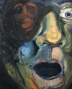
Self Portrait By Mitch Ogletree

Ogletree confesses that his life experiences and influence from the Surrealist movement have certainly been driving forces in his development as an artist.  In his artist statement he uses the term, “non sequitur”, which alludes to some of the emotive juxtapositions of his work.  The uncanny parallel of emotional growth and art are evident in Ogletree’s work that show the personal journey from personal lows to highs.  Ogletree’s artwork indicates that he has a unique voice which may otherwise never be heard if one does not simply listen.  The artwork of Mitch Ogletree is certainly an outlet for his creative overflow, but that is not the only way he chooses to release the beast.  A musically inclined individual, Ogletree strums his guitar with coherent tunes to further drive home his artistic happenings.  Quite a fitting addendum to this artist’s resume, Ogletree mingles one art style into another.  According to Ogletree, “Music is intensely emotional, and every chord has a color and conveys a specific feeling.  I enjoy the spontaneity of playing music and a feeling of progression.  I would like to incorporate this into my art, by making moving images, artwork paired with music, or sequential storytelling.”

What is next for Mitch Ogletree?  As with most people, the goal after graduation is to utilize that coveted degree.  While a steady income is important to Ogletree, he plans to obtain employment that will fit around his artistic endeavors.  Currently in the process of designing a children’s book, Ogletree’s dream of becoming a professional illustrator is becoming a reality.  In addition, Ogletree is currently marketing himself and his artistry through professional websites and marketplaces which certainly add to his pursuit for success.  I expect to see and hear a lot more from this artist as he is certainly a valuable asset to the collection of Valdosta State University Alumni.


Sara Williams is a Bachelor of Fine Arts student at Valdosta State University majoring in Art Education.  While focusing on art education, Williams discovered valuable research in the field of art therapy.  Graduate school and a career in art education or art therapy is on the horizon.

Armani Bibbs the Artist

Armani Bibbs considers himself a self-taught artist. Not taking art classes until his tenth grade year in high school, he found a love and passion for art at an early age. Born in Riverdale, Georgia, Armani spent most of his time growing up in Warner Robins, Georgia. At a young age he found a liking for art. “I remember I was in the first grade we were drawing stick figures, and I just remember mines being different from everybody else’s. Like everybody had the stick with the arms and head, but I stepped outside the box. I was the kid trying draw shirts and shoes on the stick figure, and I guess in that moment I knew I was good.” (Armani Bibbs).

Art is something that came natural to Armani. Coming to college really opened up Armani’s perspective about art. Growing up he thought of art as just being graphic design and painting and drawing. Coming to college and taking all the different classes, learning different skills boosted him as an artist.

When it comes to a specific style in art, he feels as though his art cannot be placed in a certain category because he is so diverse. The themes of most of his work deals with the African American community. He likes to create art that his culture can understand and relate to. “Say for instance like if I were to paint a painting of kids playing in the street, in a neighborhood. I would put a big street light in the center with the light out. Growing up if you were black, you knew to be at home before the street lights go off.” (Armani Bibbs).

“Implied” 18 x 24″ watercolor paint on canvas.

His most recent works has a similar theme, he focuses on the identity of a black man. In his the senior show his piece entitled “Implied”, is an 18×24 inch water color painting featuring a famous artist/actor Childish Gambino. This peace to Armani signified being black at all the wrong times. In the background of the painting he painted certain phrases like “when I walk, when I talk, when I sleep, when I breath” referencing that even doing those simple things as a black man sometimes is wrong in the view of the oppressors eyes. The main subject in the foreground has his arms stretched out with his hands making a gun symbol. Knowing your history on current issues with police and African American culture, you would know that a simple playful gesture as such could cause a black man to lose his life. Continue reading Armani Bibbs the Artist

Anything but Death

by Joseph Mays

Ashley Smith is a senior Art major at Valdosta State University, and plans to graduate in May of this year with a BFA. She is originally from Atlanta, but lived in Saint Simes Island for the majority of her life. When it comes to her creative process, Smith says that she usually starts off with a base concept. Next, she chooses her media based off what would work best with the specific idea. From there, she makes sketches that will guide her in the actual creation of her piece. Sometimes, however, for certain works, it may be in her favor to choose her media beforehand. Smith also notes that if the work is graphic design related, there may be times where the sketching process is digital rather that the old-fashioned pencil and paper. There also may be instances where the work is for a client, meaning it will be less personal to you, causing you to have to remove yourself from the work itself to an extent. In situations like this, Smith says that she still tries to incorporate themes that are a part of her style. Ashley Smith is greatly influenced by Hosanna Rubio, a metalsmith, whom Smith says incorporates moths and bone structures into much of her work, something that she often does herself. Along with concept, Smith is also fond of the way Rubio approaches her work in general.

Smith sees death as a “timely conclusion rather than an abrupt end.” She feels that death is seen as a taboo topic nowadays so she uses symbols of death, mostly from nature, to ease into the conversation. “If you’re going to talk about death, it is essential to talk about life first,” Smith says when explaining her reasoning behind much of her work. “To speak about the end (death) before we actually get there would be incomplete” she says, which is why life itself is also a focal point in some of her work. Often times, Smith uses her work to either describe and/or accentuate her own personal experiences.

              The Days That Followed is a silkscreen piece that shows an older male sitting alone at a table, specifically in a dining room. The man shown is actually Smith’s grandfather and if you look closely you can see a faint outline of a person sitting across from the table. This faintness is Smith’s nana. The concept around this piece is the grief that is carried by her grandfather after the passing of his wife, Smith’s nana. Memento Mori is a digital animation that also focuses on the concept of death. In the short clip we see a moth sitting on an insect zapper, and as it flies off another insect comes and lands on the object. Upon making contact with it, the insect is zapped and falls to the ground. The moth shown is the death’s-head hawkmoth which is known for having a skull-like image on its back. This specific insect is used a lot in pop culture to represent death and Smith says that in order to live, we must remember that life will end. The fly getting zapped at the end adds comic relief and represents a way for people to ease into the topic of death.

              Come Undone is a woodcut piece that is personal to Smith because it conceptually portrays a medical condition known as cleft lip, a condition in which an opening or split in the upper lip occurs during the facial development of an unborn baby. Smith was born with cleft lip and has had multiple surgeries to correct it. She once had a dream that those surgeries were undone, which inspired this elevated piece that is supposed to show the many transformations that take part within our lives. About 1-in-700 people are born with cleft lip, making it rather common, yet not many people talk about it. Smith hopes this piece can spark conversation surrounding the condition.

Lastly, Protect Me From The Past is a mixed media piece done with copper, enamel, and textiles. It is said that birthmarks represent how you died in the past life. This piece is done in the shape of a shoulder pad that can sit on one’s shoulder, the place of Smith’s birthmark. This formed metal has the life cycle of a beetle across it, an insect that represents rebirth, which should in turn help one to live. On the inside there are embroideries that make the metal comfortable to sit upon one’s shoulder. Psychopomps, creatures that can move between life and death, are another important part of this piece.

In today’s society, discussions revolving around death are often frowned upon. Ashley Smith understands this and, through her work, creates pieces that can be used as activators to open up the discussion about an such an inevitable topic.


Joseph Mays is a Bachelor of Art Student at Valdosta State University. With a focus in graphic design, Joseph’s passion for art and design has grown over the years and plans to graduate and pursue a career in the art field.

Senior Show Spotlight: Jasmine Allen

Photo of Jasmine Allen taken by Jasmine Frazier ©

Jasmine Allen lives a double life. By day she’s an art student. To class she sported a simple Black turtleneck and a pair of blue jeans- a look reminiscent of Steve Jobs. Except this Steve Jobs donned a pair of Nike Air Max 95s. It’s been a full week since the Seniors had their Opening Exhibition Convergence. Even though the seniors have had their show, the school work continues to flow for Allen. We talk about all the projects she still has due while she grabs a snack from the vending machine. Like all seniors, she’s so ready to be done with school, one facet of her double life. By night, Allen is the CEO and Creative Director for Ugly Urban, a Georgia-based street-wear brand. Ugly Urban or UURBN prides itself on transmitting a message of love, power, and overcoming barriers through different media such as printmaking, fashion, and even furniture. When you ask Allen why the brand is called that, she’d quickly respond, “It’s the ugly struggle to defy urban stereotypes.” Personally, I connect with that meaning. In a world where urban can be easily pinned as another word for black, there are plenty of stereotypes in need of defying. Urban culture is often alienated in higher-class circles, but Ugly Urban is meant to serve as the warm embrace for the alienated. Through street-wear silhouettes and witty Instagram captions, Allen has captured an audience of fellow culture enthusiasts, and outcasts.

“It was a feeling of accomplishment,” She stated when asked how she felt about being a graduating senior showing art in the senior show. “Because, nobody really thought I was going to finish my work, so me finishing it, and feeling as if I did a good job, it makes me feel accomplished. I still get compliments about some of the pieces. Somebody told me this morning that they were dope.”

Image of Jasmine Allen's artwork
D.U.S Series (Red)

VSU’s Dedo Maranville Gallery houses 16 seniors’ pieces, and Allen has 3 pieces in the show. The three pieces include: D.U.S. (Series), UURBN Throne, and UURBN Wardrobe. “Which is your favorite?” I asked. She took a long pause and said the UURBN Wardrobe. The piece she’s referring to is a slim yet tall wardrobe. Standing at 6ft, the Wardrobe towers over Allen’s small person. The wardrobe is made of wood that has been stained black, and is fashioned with glass on the doors and lights included inside to illuminate the clothes, all easily identified as UURBN by their similar logo bearing the Defy Urban Stereotypes motif. I immediately asked, “Why is this one your favorite?” It didn’t take long for her to reply, “Because it was the piece I did outside of school. I literally had to watch a You-tube video and prove to myself I could do it. I had to figure out how to figure it out.” I can’t help but be impressed about how this small woman managed to build such a tall structure. The clothes inside are just as important as the wardrobe encapsulating them. Hanging within the wardrobe are hoodies, tee-shirts, and jerseys, all coveted street-wear essentials. The fashion of UURBN takes inspiration from a hip-hop influenced 90s era. Hip-Hop enthusiasts can clearly recall a time when sporting your favorite brand’s jersey was a huge trend in parties and music videos. Wearing the jersey of a champion made you feel like you were one too, like you’re part of the team. Taking a look at the clothes, it’s clear to see that Allen seeks to bring that same feeling of camaraderie back with her ‘UURBN’ jerseys.

Image of Jasmine Allen's artwork
D.U.S Series (Yellow)

I found it appropriate to inform Allen that the UURBN Throne is my personal favorite piece of hers. The Throne is a chair built of the letters U-U-R-B-N. One could clearly tell that repetition is clearly important to Allen. Allen uses these letters to create a visual language based off of urbanism and self-pride. The Chair, similar to the wardrobe, is made of black stained wood. This piece of furniture is also ornamented with a series of small interlocking ‘UU’ logos. Thematically it pairs well with the Wardrobe because they are so similar in aesthetic. Although the pieces aren’t directly next to each other, they still converse as harmonious pieces of artistic furniture crafted in the same family. “I painted it black because black is my favorite color. Black can be a symbol of power and royalty, which is why it’s a throne, but really black is my favorite color.” Allen shared with me that the throne is meant to empower whoever is sitting on it. Since the piece acts as an accessory of luxury, the user of the piece assumes the role of royalty. “What would sitting in this chair make me the king of?” “The chair is a symbol of royalty within the community. It’s a symbol of Kingship and Queenship. I didn’t want to limit it to just one gender. Whoever chooses to sit in it is considered royalty regardless of gender and skin color. I speak on urban from the perspective of a Black Woman because that’s all I know, but UURBN doesn’t exclude anyone.”

Image of Jasmine Allen's artwork
D.U.S Series (Blue)

Lastly, the piece that Allen and I could both agree to have a special connection with is D.U.S. Series. The piece is a portrait of a man, whose face is covered by a butterfly. The figure of man and butterfly sits carefully placed on top of a colorful circle and the phrase “Defy Urban Stereotypes” is repeated behind. The series is able to be differentiated piece by piece with the circle that sits behind the man’s head. The circle varies in color; blue, red, yellow. The meaning to this piece was shared as a caption posted to Ugly Urban’s Instagram page just days before the show. The special meaning read, “Celebration of the black man. Often times black men don’t get the necessary praise they deserve, so with this piece I took a friend of mine and covered his face to take away the identity because sometimes we only treat people a certain way due to their affiliation with us when in actuality everyone deserve the same respect you give to the people you love. I used Red to represent power, love, and determination. Yellow to represent joy, happiness, and intellect. Blues represents trust, loyalty, and confidence. These words are used to combat the negativity that is formed against the black male. Love your brother and mate and uplift him so that he can be the leader he’s destined to be. Defy urban stereotypes.”


Rasheem Callender is a Fine Arts student from Atlanta, GA. While in undergrad, Callender is focusing on graphic design and printmaking. After graduating, Callender will attend grad school with the expectation of becoming an art director or a curator.

2019 Convergence Senior Exhibition: Zaadia Flores

VSU Dedo Maranville Fine Arts Gallery, Convergence: Senior Art Exhibition Spring 2019, 2 May 2019, flyer

Zaadia Flores is a Senior Bachelor of Fine Arts major at Valdosta State University in Valdosta, Georgia. She was born in Belize City, Belize. But, she transferred to Valdosta State University in 2017 to complete her last two years of college. During her art career, Flores has created and conveyed visual and tactile finishes in media such as ceramics, printmaking, photography, and metalsmithing. Flores presented a total of four artworks for the “Valdosta State University Dedo Maranville 2019 Senior Exhibition.” The three abstract color photography artworks and one fabric and metal artwork consisted of visual and tactile textures. Oneirodynia was made from fibers and metal. The other three artworks were digital photography: Granmamare, Volneniye, and Creation of Adam.

Continue reading 2019 Convergence Senior Exhibition: Zaadia Flores

Senior show: Allyson Doyal

By Daniel Carter

Allyson Doyal is an artist whose main inspiration for her work lies in her love for nature and mythology. Doyal’s artwork consists of instillation pieces, all combining her love for nature and mythology within each piece. From her wine bottles instillation’s Dionysus, to her Aristaeus glass bottles, Doyal’s fascination with the ancient mythology and nature is a truly marvelous sight to see.

When speaking with Doyal, one of her main reasons for her wine bottle instillation, Dionysus, was because of her grandparents and home. The piece is a representation of the Greek god of the same name. Dionysus is the Greek god of wine and one that interested her for to create a design that could wrap around the wine bottles. Her preference for choosing the simplistic design for the bottles and all of her works is based on her idea of sleek, minimalistic designs. Doyal said that her “product design incorporates aspects of Greek mythology and nature in different ways.” She mixed in her ideas of making Greek mythology modern.

Allyson Doyal, Dionysus, glass, paper, wax

One of her other works is her honey bee jars titled Aristaeus, named after the Greek god of beekeeping. Once again, this instillation shows her preference for minimalism as the design is simplistic in the design itself. When asked about why she chose this particular, Doyal spoke of having strong points in her design, but needing things to work on. She incorporates the use of nature along with Greek mythology to merge two of her interest into one single work. The bottles are simply hexagon shaped while the design used to make the logo and label uses hexagonal shapes to give a true sense of a bee hive. The colors themselves are associated with honey in order for her idea of the Greek god along with the nature that is honey for this particular work.

Allyson Doyal, Aristaeus, glass, paper

Doyal’s love of nature also drives her works. She spoke of nature being a calming space for her, and a place she can go to when in the need of time alone. While she expresses her love for nature with her art, Doyal has spoken of being someone with good ideas, but has trouble flushing them out. Doyal may say that, but her final work in the exhibition says otherwise. Her last work is the Dryad Confections, a package piece, is named after the tree spirit or tree nymph’s in Greek mythology. This is another example of Doyal’s use of graphics design, as she uses it to her advantage in order to give the work a stronger presence in its place.

Allyson Doyal, Dryad Confections, paper

Allyson Doyal uses her love for nature and Greek mythology in order to express her own style of art. She uses her skills as an artist and her knowledge of mythology to create pieces that shows her personality and work ethic. Doyal shows that her passion for nature and mythology help her show a new range of artistic diversity within the exhibition.

Valdosta State Exhibition

The Valdosta State National Exhibition is an exhibition that allowed different  artists to display a variety of works that they’ve created. It is an assortment of various media, and an open space to allow people from all over to experience a great show. Walking into the gallery itself, my mission was to find an art piece that stood out to me. Being that there were many beautiful artworks that were on display, it was hard for me to choose one.


Jason Guynes Company With Myself, 2016 Oil on Canvas 58in x 36in x 4in

As I am walking through the gallery, I notice a painting that stuck out among the rest. It was the painting titled Company With Myself by Jason Guynes. It is an oil on canvas painting. Looking at the painting, its displays a young gentleman sitting at a table with 5 other men who look exactly like him. On the table, you see various drinks, glasses, and papers. Fluttering around the gentlemen are 1 dollar bills in the shape of butterflies. All of this seems to be taking place in a  house of some sort.

“This is a very interesting piece.”, I utter under my breath as I look further for a better description in detail. It was hard to notice the details from a distance with all of the lighting that was set by the curator. The brush strokes really showed the time that was spent to create such a piece. The meaning of the young man being accompanied by himself was a major point as well. We find ourselves comfortable with other people, but we have to experience a true enjoyment by ourselves.

A pattern was orchestrated with the gallery itself as a whole. The curator wanted there to be a balance with all of the artworks. They did not want other art pieces to overshadow one another. Not only were there artworks on display, but the entire gallery stood out as an art piece within itself. The entire gallery was a gallery for inspiration, and a platform for different people to experience, and express emotion and ideas.

Exploring Your Own Mixed Bag.

By A’Niecia DeFour

The recent exhibit at the Dedo Maranville Art Gallery at Valdosta State University was intriguing and full of life. The exhibition is titled “Mixed Bag: An Assortment of Contemporary Craft” which is a perfect description for the show itself. The show consisted of mixed media contemporary crafts by five different artists from across the US: Max Adrian, Emily Culver, Elyse-Krista Mische, M. Paige Ward, and Xia Zhang. Each piece in the exhibit dealt with different aspects of personal identity such as sexuality, religion, and culture.

The set-up of the exhibit appeared to be fairly spaced out, as if they did not have enough pieces featured or large enough pieces to fill the space allotted. This could also be partly to blame on the arrangement as well. Each piece demanded to be observed by the viewer so much that each created a space of their own. Each piece takes the viewer into an individual space because of the amount of energy that radiates from the works.

Max Adrian, The Buddy Community, Faux Fur, pleather, leather, spandex, misc. materials, chains, hardware

The work of Max Adrian was a crowd favorite in the exhibit. His work features pleather, fur, chains, and spandex, which gives his work a sexual energy. Adrian’s sculptural piece entitled, “The Buddy Community,” can be interpreted as a representation of the sexual community behind BDSM. This soft sculptural collection features 12 plush, animal-like figurines. Each figure is clothed in furs and leathers and black and pink are continuously used to add unity among each form. Flashes of electric blue, red, and neon yellow on other forms add life to this piece. Some forms have animal ears and tails while others are missing these features. Each form does have two small holes in its head, where a nose would usually be placed. Coming out of some of these nostril-like holes are chains hooked to a ring which resembles a septum piercing. Adrian created these forms without faces, giving the viewer the opportunity to project themselves onto these forms and explore their own sexual identity.

Max Adrian, Scrap Alphabet, Vinyl, pleather, leather, thread, faux fur, athletic mesh, chains, hardware

Another piece that stood out was Adrian’s, “Scrap Alphabet,” wall piece. This piece has scraps of pleather, thread, faux fur, and athletic mesh pressed between clear, square vinyl. There are twelve sets of ten vinyl squares linked together by a single ring on each end in vertical and even rows. Adrian created 120 individual compositions out of these scraps of fabric and unified them using a limited color palette of red, pink, black, white and yellow. Adrian placed the yellow scraps of fabric through the piece, allowing the viewer’s eyes to move throughout the artwork. Each individual composition has a different personality and mood. One of the compositions features yellow scraps radiating out of a black square center, resembling a cheery sunflower or sun. Another square has black and pink string tangled inside of it, evoking chaos. Overall, this piece forces the viewer to form their own meanings and emotions based on the scrap compositions floating within each square.

Xia Zhang, Thoroughness of your Seediness, Video

Xia Zhang was another artist featured in this exhibit. Her video installation, titled “Thoroughness of your Seediness,” features a visually satisfying bird’s eye view of the artist cutting up a pomegranate and stitching it back together with black thread. There are red juices bleeding from this fruit and seeds pop out of it as she slices it into thin layers. This video seems to be a symbol of heartbreak and healing. Zhang is shown threading the needle and tying the knot in preparation to put her heart, the pomegranate, back together. This video is long enough for some viewers to grow bored or impatient. This can be also seen as a symbol of an individual taking their time to heal their heart regardless of feeling rushed by others. Healing has no time limit.

The feature that made this exhibit the most enjoyable was the playful exploration of mediums. Throughout each piece, there were various mediums seen in crafts such as fabrics and stitching and each artist used them to create piece that explore emotions and self-identity. This exhibit relates both to the artist and the viewer giving the opportunity to explore their own sense of identity and truly gives definition to the exhibit title “Mixed Bag: An Assortment of Contemporary Craft.”

A’Niecia De Four is an Art Education major at Valdosta State University. She is originally from Dallas, Texas but has spent most of her life living in Georgia. She enjoys creates work based around womanism and the objectification of the female form.

“Mixed Bag: An Assortment of Contemporary Art” Exhibition Review

https://www.facebook.com/pg/VSUGALLERY/photos/?tab=album&album_id=10157051056197766
VSU Dedo Maranville Fine Arts Gallery, Exhibition “Mixed Bag: An Assortment of Contemporary Craft”, 25 February 2019, opening night

Mixed Bag: An Assortment of Contemporary Art is an exhibition consisting of 5 major artists that aim to display various perspectives within contemporary craft communities. The artists are Max Adrian (Columbus, Ohio), Emily Culver (Richmond Virginia), Elyse-Krista Mische (Appleton, Wisconsin), M. Paige Ward (Gatlinburg, Tennessee), and Xia Zhang (Tulsa, Oklahoma). The Valdosta State University Dedo Maranville Fine Arts gallery shows a text panel at the entrance of the gallery. It highlights the artists aim to examine and challenge the social issues that are difficult to discuss. For example, sexuality, queerness, faith, race, and death are some of the themes they explore. Though different in many ways, they unite through these heartfelt themes.[1] Each artist shared experience as the Artists-in-Residence at Arrowmont School of Arts and Crafts in Gatlinburg, Tennessee from June 2017 to May 2018. Since their separation, Mixed Bag now serves as the first reunion of their works in almost a year.

Continue reading “Mixed Bag: An Assortment of Contemporary Art” Exhibition Review

More Than Meets the Eye

By Arin Guyette


Valdosta State University’s Dedo Maranville Fine Arts Gallery has recently brought in a new show: Mixed Bag: An Assortment of Contemporary Craft. This exhibition is composed of five artists (Max Adrian, Emily Culver, Elyse-Krista Mische, M. Paide Ward, and Xia Zhang) who bring together different perspectives of contemporary art from across the country. Artists today often explore the concepts of sexuality, gender, religion, race, and death and this exhibition brings those challenges to the public of Valdosta, Georgia.

After walking in through the front, you’ll find the gallery to your left behind two glass doors. The overall space is small, and if you’re not paying attention, you may just bump into Mische’s piece The Great Divide. A white, pyramid-like shape with human silhouettes across from one another. One laying down and the other rising upwards, likely calling back to religion- specifically Christianity (as there is a cross at the top of the piece).

Zhang’s work Thoroughness in Your Seediness is in a dark corner with the identification card moved to a completely different spot. It’s a bit disorienting. Thoroughness in Your Seediness is a video of someone cutting up a pomegranate and sewing the pieces back together. The crunch of the knife against the fruit is a little unsettling and the lack of any outside noise makes it border on ASMR (or Autonomous Sensory Meridian Response). Though most ASMR videos are meant to relax the viewer, certain sounds may trigger an unpleasant chill or irritation of the ears. I’m not sure what to make of this work, however, I feel a deeper meaning present by the choice of medium. I found myself asking a friend what they made of it and they said, “Maybe it’s about control and reconstruction”. The fact this person chooses to cut up the fruit but sews it back together in their own way can symbolize the willful destruction of something to bring it back more personalized than before. In relation to Zhang’s statements about race and genders in their art, I can’t say that this piece’s message is clear.

One of the 8 frames from Zhang's Madame X. The focus is on a Chinese woman who says "I feel something in heart."
Xia Zhang, “Madame X”, February 25, 2019, Porcelain, cotton, gold thread, wood, wire, glaze

Contrasting with Thoroughness in Your Seediness, along the first wall to the left is Zhang’s Madame X. The set of 8 frames is evenly spaced and well lit. The small subtitles for each image insist that you get up close and move with the piece. Zhang’s focus here is on race and gender, which becomes evident through the text. The fourth image (from left to right) shows a man grabbing a woman by her arm and saying, “You come to my room, then there won’t be any trouble.” In five, six, and seven we notice the Chinese women using bad English, which contrasts with all the men’s lines and enforces the foreign dialect. Created with porcelain, cotton, gold thread, wood, wire, and glaze, each image appears as a sleek, yellow box that juts out from the wall. Each box is somewhat crooked with dents and bends as if it was crafted quickly or half-hearted. However, the glaze on each frame shows Zhang’s solidified dedication to their shape. The subtitles are emphasized with the gold thread while the images appear printed on standard copy paper.

Ward's "How Firm a Foundation IV". It is a curved wood casing sitting on top of a concrete pillow.
M. Paige Ward, “How Firm a Foundation IV”, Cast concrete, cedar, found wood, copper plated nails

Most of the work off the wall belongs to Ward and their How Firm a Foundation series. Created from cast concrete, cedar, found wood, and copper nails, Ward plays with the word “firm” by casting the pillows with concrete. Nestled above each of the concrete casts are curved wood panels, lined with thin strips of wood and held together by the copper nails. Ward creates the illusion of the wood’s weight through the realistic curvature and bends in her cast pillows. With each piece, the size of the pillow, height, and type of the wood change, but everything else remains the same. The concrete pillows represent Ward’s longing for stability and the curved wood may very well represent the artist or the audience of the world she wishes to stabilize.

Within the space, there are several pedestals positioned around the room and a large tiled artwork on the floor in the far back (Culver’s What She Saw When She Walked In). This setup is a common approach to so the overall feel is lacking and a little creepy. Overall, this show is meant to evoke thought and spur conversation. It is some of the newest works out there so that speaks to the appeal. However, the current setup of the pieces with the odd placement and lackluster lighting choices somewhat detracts from that power.


BioArin is a junior Bachelor of Arts major who is studying animation and graphics design at Valdosta State University. They are scheduled to graduate in 2020 and wish to work with television, movies, and gaming.