February 24, 2017
These Maps Put A Spotlight On The Cultural Divide In The U.S.
It has been several months since the election and thanks to a series of post-election maps, we can clearly see which area of the United States voted for Donald Trump or Hillary Clinton. But let’s say you didn’t have those maps. Let’s say you had to determine which areas of the U.S. supported either candidate more. Would you be surprised to find out that the popularity of a TV show like ‘Duck Dynasty’ correlates to how strongly Trump did during the election?
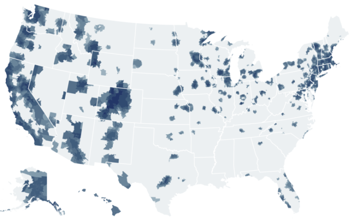
Based on these maps released by The Upshot of The New York Times, there is a very close relation between politics and culture.
Using Facebook data to determine which TV shows were “liked” by users in various ZIP codes, they found that 50 of the most-liked shows were separated into three distinct groups based on geographic distributions. The data reveals a cultural divide among three regions in the U.S.: cities and suburbs, rural areas, and the extended Black Belt, an area extending from the Mississippi River along the Eastern Seaboard and up to Washington as well as locations with large nonwhite populations.
Urban Areas

Most common shows: Adventure Time, American Horror Story, Family Guy, Game of Thrones, It’s Always Sunny in Philadelphia, Modern Family, Mythbusters, Once Upon a Time, Orange is the New Black, Saturday Night Live, So You Think You Can Dance, South Park, The Big Bang Theory, The Daily Show, The Simpsons, The Tonight Show, Tosh.O
Rural Areas

Most common shows: 16 and Pregnant, American Dad!, America’s Funniest Home Videos, Bones, Cake Boss, Criminal Minds, Dancing With the Stars, Deadliest Catch, Duck Dynasty, Fast n’ Loud, Grey’s Anatomy, NCIS, Pawn Stars, Pretty Little Liars, Ridiculousness, Rob Dyrdek’s Fantasy Factory, Supernatural, Teen Mom, The Vampire Diaries, The Voice, The Walking Dead, Wipeout
Extended Black Belt

Most common shows: 106 & Park, Bad Girls Club, Empire, Keeping Up With the Kardashians, Law & Order: SVU, Love & Hip Hop, Real Housewives of Atlanta, Scandal, Spongebob SquarePants, The First 48, The Tom and Jerry Show
The 50 maps were ranked in order of the disparity between their highest and lowest fan percentages, and as you can see, there is a strong cultural divide throughout the U.S. Gone are the days when networks focused solely on audience numbers. Now it’s all about demographics which helps to fracture national culture.
Take a look at some of the maps below to see just how large the cultural divide is and make sure you check out the rest of the maps here.
1. Duck Dynasty
5. The Daily Show
7. Modern Family
9. Empire
11. The Big Bang Theory
15. Game of Thrones
16. The Walking Dead
17. Bad Girls Club
19. The Tonight Show
21. Fast n’ Loud
25. Teen Mom
40. 16 and Pregnant
43. Cake Boss
45. Supernatural
50. The Vampire Diaries
[Via: The New York Times]
Source: Visual News


0 Comments
Leave A Comment