-
News & Updates
June 16, 2017
Watching this mind-bending projection mapping demo will melt your brain
What do you get when you cross some cutting-edge tech with the world’s worst acid trip? Probably something like the setup created by French creative studio Theoriz. No virtual reality headset necessary.
The post Watching this mind-bending projection mapping demo will melt your brain appeared first on Digital Trends.
Source: Digital Trends VR
June 16, 2017
The Daily Chord Weekly Recap – Friday, June 16

The Daily Chord shares links to the top music news stories Monday through Friday. This week included news of Bonnaroo’s bounce back, Spotify’s financial report, XXL’s freshman class, and the Grammys’ move to online voting. Subscribe to The Daily Chord’s email updates and cut through the clutter of online music news.
Monday, June 12
-
Do androids dream of electric guitars? Exploring the future of musical A.I.
Feature from Pitchfork -
Eventbrite to buy Ticketfly
Post from Pollstar -
After 50 years, an encore of the Monterey Pop festival
Story from LA Times -
The official Hip-Hop Museum will be coming to Harlem in 2018
Post from Okayplayer -
Alt.Latino’s favorite music of 2017 (so far)
Post from KUNC -
Aretha Franklin performs career-spanning set, attends street naming at Detroit Music Weekend
Post from Billboard
Tuesday, June 13
-
Bonnaroo’s attendance bounces back with 65k turning out for U2, Weeknd
Post from Billboard -
The core flaw of blockchain
Post from Music Tech Solutions -
Inside the LCD Soundsystem/Rhino Records vinyl reissue kerfuffle
Post from Variety -
Do you need to be Korean to be K-Pop?
Story from CNN -
Halsey’s ‘hopeless fountain kingdom’ gives her a no. 1 album
Post from NY Times -
Brothers and sisters! Wayne Kramer uploads rare/remastered MC5 footage
Post from Metro Times
Wednesday, June 14
-
Grammy Awards move to online voting in hopes of increasing participation
Post from LA Times -
YouTube, ASCAP strike data-sharing deal
Post from Variety -
Pirate Bay might infringe copyright after all, European court rules
Post from CNET -
Did Bob Dylan take portions of his Nobel lecture from SparkNotes?
Post from Slate -
After fallout, PWR BTTM seeks control of its music
Post from NPR -
Rosalie Sorrels, a folk singer who transported her audience, dies at 83
Obituary from NY Times
Thursday, June 15
-
Yoko Ono added to Imagine writing credits
Post from BBC News -
2017 Freshman Class
Feature from XXL -
Classical music streaming no longer plays second fiddle
Post from CNET -
Shawn Mendes fights alleged ticket scalper
Post from Teen Vogue -
Believe Digital actively seeks sale, major players show interest
Post from Hypebot -
It’s official: No Bridge School benefit concert in 2017
Post from Thrasher’s Wheat
Friday, June 16
-
Spotify is growing, but so are its losses
Story from NY Times -
Obama praises Jay Z in new video for Songwriters Hall Of Fame
Post from Pitchfork -
Leaked data reveals just how freaking expensive it is to put Spice Girls and Coldplay songs in crappy movies
Post from Gizmodo -
Bob Seger hits streaming for the first time
Post from Billboard -
Why Anita Pallenberg, Rolling Stones muse, was queen of the underground
Tribute from Rolling Stone -
Kraftwerk’s Ralf Hütter: ‘Music is about intensity….the rest is just noise’
Interview from The Guardian
The post The Daily Chord Weekly Recap – Friday, June 16 appeared first on SXSW.
Source: SxSW Music
June 16, 2017
EVERYTHING WE’VE LEARNED FROM MAKING 4,000 INFOGRAPHICS
This article originally appeared on Column Five.
With over 4,000 under our belt, we’ve learned a lot about how to make infographics in our time. (We even wrote a book about it.) It’s been almost a decade since we started, and although the publishing landscape has changed since our early days of million-view infographics on Digg, they’re still a great way for brands to build brand awareness and communicate with the world. The format has even evolved since we’ve been in the game, allowing us to create more exciting, dynamic infographics than ever.
But there are still a lot of awful infographics in the world. Some are made with good intentions, some could just use a little tweaking, and some are a straight-up nightmare. But most of those ineffective infographics could be great with the right direction.
HOW TO MAKE INFOGRAPHICS
We’ve made infographics for everyone from small startups to Fortune 100 companies. We’ve learned what works and what really throws a wrench in the infographic process, from that first brainstorm to the moment the project goes live.
We don’t want you to waste your time creating less-than-awesome content, so we’re sharing our best tips to create solid infographics, based on everything we’ve learned. Here’s our step-by-step breakdown of the process and what will help or hurt you at each stage.
THE PROCESS
In general, the infographic creation process looks like this:
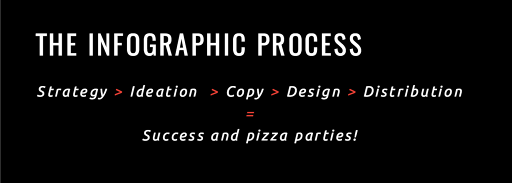
The most important thing to remember is that each stage builds on the other, so you need clear communication and sign-off at each stage to move things forward and create a piece of content that works for everyone. (Basically, by the time you see your first infographic design, you aren’t looking at an entire “first draft.” The idea and copy should have been locked and edited several times by the time you get to that stage.) There should be no surprises on the back end.
START WITH STRATEGY
The process to make a successful infographic starts way before you ever come up with an idea.
People often get excited at the idea of an infographic and want to head into design immediately, but this is the number one thing that sabotages an infographic. Whenever we kick off a fresh project with a partner, we start with a meeting to confirm what the project’s goal is.
At this stage, you’re setting the groundwork for the project. Your job is to ask the right questions to identify exactly what you want to achieve.
1) WHO ARE YOU TRYING TO REACH?
If you want your infographic to succeed, knowing who you want to reach is paramount. You should be able to identify who your audience is or who your audience segments are, as well as their pain points and desires. This will help you create an infographic they actually care about.
If you haven’t already, create audience personas that include demographic and psychographic information to guide these discussions. (Try our quick exercise to build your personas in less than an hour.)
2) WHAT IS YOUR GOAL?
What are you trying to achieve with this piece of content? How does it fit into your short- and long-term marketing goals? Wanting to create an infographic because they’re “cool” is not a reason. It can actually be a huge waste of time if it’s not tied to your larger strategy.
3) IS AN INFOGRAPHIC WHAT YOU NEED TO ACHIEVE THAT GOAL?
This is a big one. Way too often we see people get excited about a certain format or trend and go all in. Sometimes they want to create something because a competitor did. Other times they just want to appease a higher-up who wants what they want because they want it. Over and over, we remind people that format should be determined by the story you’re telling. An infographic may absolutely be the right format, but a GIF series, interactive infographic, motion graphic, or video might be the better solution.
4) HOW ARE YOU GOING TO DETERMINE SUCCESS?
Your KPIs will tell you whether or not your infographic worked; they should not be an afterthought. If you need tracking links or analytics set up, these are all things that should be locked down before you go into production.
Other things to consider:
- Who needs to weigh in on the content created? Too many cooks in the kitchen or a major edit right before publication is a pain in the ass.
- Who will own the project? Decide who will consolidate edits from stakeholders, who will coordinate with design and PR, who will make sure that what’s created aligns with the project goal, and who will problem-solve along the way.
- Where is this going to live? In our early years, we were always shocked to deliver a slick infographic, then find out our partner doesn’t even have a blog to post it on. Knowing where this is going to be displayed will also influence design. Don’t surprise anyone down the line.
Once your team understands the project goals, only then can you move into the fun part: coming up with awesome ideas.
FIND THE RIGHT IDEA
Too many brands try to make infographics for themselves—not for the people they’re trying to reach. Great ideas are only great if they work for the core audience. It’s easy to get hyped up on a fun or interesting idea, but it will ultimately fail if you forget who you’re creating it for.
STEP 1: BRAINSTORM
Bring the right stakeholders together at this stage, including your copywriter, art director or designer, and PR. PR is particularly important, as they know what publishers and influencers are interested in. They can also help facilitate co-partnerships, which is a strategy that we love to use. (Read more about how to approach publications for this type of content.)
Brainstorms can be tricky when you have a lot of stakeholders (or egos) in the room. Remind your team what the ultimate goal is to keep discussions on track. Something that helped us tremendously was learning about the 4 different types of creative brains. (Understanding what type of thinker you are and how to better communicate with others will save your sanity.) You can also try these 16 methods for coming up with great infographic ideas.
STEP 2: VET YOUR IDEAS
A freestyle brainstorm sounds fun, but you’re here to achieve a goal. Vet every idea to make sure it really will capture people’s interest.
- Does this solve a problem, expand their knowledge, or have a practical application?
- Is it relevant to them?
- Would they want to share it?
- Has this been done already? Can you do it better or give it your own spin?
STEP 3: WRITE A CREATIVE BRIEF
This document keeps everyone on the same page and outlines everything anyone working on the project needs to know. If you don’t have that information available, you might end up with an infographic optimized for web publication that was supposed to be an enormous visual for a tradeshow presentation (not that that’s ever happened to us—multiple times).
If you need a little help there, follow our guide to writing creative briefs your team can actually use.
Also, we find that there can be some confusion when talking about infographic creation. Before you head into production, make sure your team is all on the same page with the same language. A few terms to know:
- Data visualization: Strict visualizations of data, which include charts and graphs.
- Infographic: A graphic combining copy and data visualization.
- Information design: A graphic that visually displays information but not necessarily data (e.g., a flow chart).
- Interactive infographic: Web-based content that users can interact with and/or manipulate.
- Animated infographic: An infographic that features animation (aka movement). It’s sometimes called a GIFographic.
TELL YOUR STORY
A lot of people think infographics are eye-catching and therefore effective, but that’s way off. A well-crafted infographic is effective because it tells a story. Combined, the text and visuals make that story easier to understand. Your words are the backbone; design enhances your words. The stronger your story, the better your infographic.
Dig into your data: Data storytelling is a powerful way to communicate, but only if you have a strong data set that actually has a story. A few things to keep in mind:
- Proprietary data is gold: Your own data is one of the best sources for unique, original stories. Look at internal data, including research, studies, surveys, reports, etc. Here are 9 places to look for great data.
- A statistic is not data storytelling: Just adding a single stat to your infographic doesn’t mean you’re doing data right. A great data story extracts meaning and insight from a data set. Try these 5 tips to find stories in your data if you’re stuck.
- Data can be manipulated, misinterpreted, or misrepresented: You should always use a credible, non-biased source for data. Follow these 5 tips for sourcing infographics to stay legit.
- Provide context and insight: When you do have a strong story (ideally from a single, solid data set), provide context and insight to guide your reader through the content. BTW, please don’t stuff your infographic with every single data point just because you can.
Tell a single story: We’ve all encountered monster infographics that never seem to end. It’s tempting to cram as much as you can into your story, but an infographic is effective when it tells a strong and straightforward story that brings more clarity to a topic. If you have multiple angles or aspects of a story, it may be better told through a series of infographics.
Here’s a good litmus test: Is it easy to write the headline for this story? Can you summarize your message in a few sentences (or a PR pitch)? If you have trouble writing your story succinctly, people will have trouble understanding it.
For more help, find out how to craft a strong infographic narrative.
Structure content in a logical hierarchy: Good design starts with copy. The better you structure your content, the easier it is for users follow the story and the easier it is for designers to lay it out intuitively.
Write to your reader: You should be telling a story they want to hear—and telling it in their language. Write to their level of understanding, explain terms that may be unfamiliar, and, dear god, avoid buzzwords.
Channel your brand voice: Your brand is made up of humans. Your brand voice should be human, too. No one likes corporate speak or dry language. Always give your content a second edit for tone and word choice. Here are a few more ways to take the BS out of your content.
Don’t get too clever: Sometimes marketers get excited about a certain story concept or metaphor, but if it doesn’t fit the story, it will do more damage than good. (Would a beauty brand campaign be about “scoring a homerun”? Probably not.) The same goes for headers. Be careful with puns. People want to know what the infographic is about—not decipher some obscure reference.
Kill redundancies: Be as succinct as possible. Context is important, but there’s no need to over explain. Design is there to do the heavy lifting and bring elements to life, so let it do its job. If a graph shows a 50% increase, the body copy, subhead, and callout do not need to reiterate the 50% increase.
Watch your wordcount: Infographics are not term papers or opportunities to prove to the world that you went to grad school. In fact, they require much less text than you’d expect. Condense and cut as much as you can. This allows more breathing room for design and helps you keep your story tight.
Edit and approve: Save yourself headaches and make sure everyone signs off on copy before you go into design.
DESIGN A GREAT INFOGRAPHIC
Great infographic design is meant to enhance the copy, increase comprehension, and make the content as visually appealing as possible.
The number one question to ask when designing: Does this serve the story?
Know your specs: Are you designing for print? Social? Web? Mobile? Responsive? What’s your resolution? This is relevant not just for practical reasons but to help achieve your goal. If the goal is to increase FB followers, the infographic better be optimized for social.
Read the content before you design: It’s an obvious one, but it’s important. You need to know what you’re really trying to express and you need to double-check that all copy is there.
Design data according to best practices: Good data design doesn’t just depict data; it uses design to enhance comprehension and bring clarity to complicated subjects or concepts. The design elements and copy should work symbiotically to tell a cohesive story—rather than design just reiterating what the copy already communicates. To make sure your data visualization is on point, read up on best practices and find out how to design the most common charts and graphs.
Follow your visual language: Every brand needs a visual language. Imagery, photography, and iconography are all tools to communicate your brand story. That said, follow your brand guidelines! If your brand is all about minimal line drawings, a brightly colored photo-based infographic is a fail. For more on that, find out what 4 things your brand style guide needs.
Be consistent: Six different typefaces and sizes or 2D and 3D illustration combined in one infographic—these are the eyesores to avoid. Again, your brand’s visual language will likely have guidelines for these things, but keep an eye out for consistency. You should also avoid these 8 design mistakes in your visual content.
Experiment when you can: Not all infographics have to be static illustrations. If your visual language allows, you can try working with papercraft, photography, or motion. For example, we turned our infographic about the trends for the future of infographics into an animated infographic for INC, which helped us tell the story in an even more exciting way.

Solicit useful design feedback: Ask the team to tell you what they think is working and what is not working instead of what they like and don’t like.
Proof the infographic: Before you send your infographic into the world, triple check that the copy is clean and the design is on point.
- Is all copy there?
- Are there typos?
- Does it have a logical flow?
- Is everything aligned?
- Are data visualizations accurate and best represented?
- Is the resolution correct?
Nothing’s more embarrassing than a major error. (Let’s not forget the Fox News pie chart that totaled 193%.)
DISTRIBUTE YOUR INFOGRAPHIC
Writing a great story and designing a stellar infographic are only half the battle. Getting eyeballs on your work is what will help you ultimately succeed. To help your team distribute the infographic effectively, there are a few extra steps.
Optimize your infographic for SEO: Make sure you have the right file names and keywords to get the most SEO traffic. For a full rundown of everything you need to do, follow our guides to optimize your infographic for SEO and optimize your blog for infographic publishing.
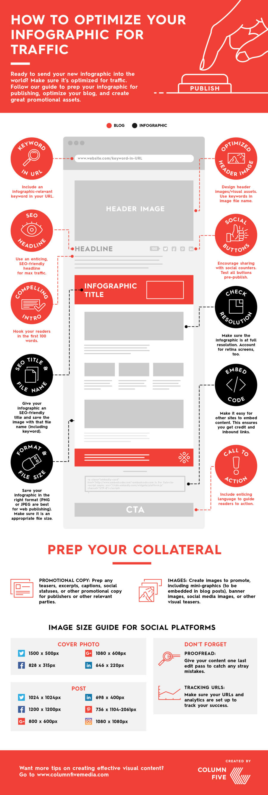
Create shareable assets: Coordinate with your design team to get assets for your channels. Make sure you have the right resolution, file formats, and sizes, whether it’s going out via email, blog, or social. Breaking up an infographic into different assets is a great way to get more mileage from the content. You can read more about how to do that with a divisible content strategy.
Craft a compelling pitch: If you’re trying to get coverage (and you should be), you need a pitch that explains why your infographic is interesting and relevant to their readers.
- Use an attention-grabbing subject line: Journalists and influencers get a ton of email. Give them a reason to read yours.
- Keep your pitch personal and brief: Put the story front and center.
- Highlight key takeaways: Include a brief overview, as well as a few bullet-points or “tweetable” stats so the journalist doesn’t have to dig for them.
- Include multiple story angles: Pitch stories that will best align with their readers. If appropriate, offer to write a sample post for your infographic if the journalist is strapped for time.
We hope these tips help you create better infographics and think more critically about your current process. Things are always changing in the marketing world, and even some of these tips may be outdated in a few years, but we’ll do our best to share everything we learn. If you have some of your own tips, send them our way.
Need some more infographic inspiration?
- See 9 infographic design examples that will leave you inspired.
- Learn more about the power of data visualization.
- Find out the 5 great ways you can use infographics in your organization.
- Try Visage, our data design platform.
Source: Visual News
June 16, 2017
Photography: Exploring the The MAAT in Lisbon, Portugal
Photography: Exploring the The MAAT in Lisbon, Portugal
We are exploring today the The MAAT – Museum of Art, Architecture and Technology located in Lisbon, Portugal through photography by Joel Filipe. If you are like me who does appreciate the architecture om full view and perspective, well you will love this project. You just gotta love his colour palette against the beautiful sky to create a stunning photographic atmosphere. This is definitely a location to mark on your map/list on your next or first adventure to Lisbon, Portugal.
Joel Filipe who is a creative director based in Madrid, Spain. I personally dig his perspective game within his photography, you should definitely follow his work on Behance.
The MAAT – Museum of Art, Architecture and Technology is a new cultural proposal for the city of Lisbon. A museum that combines these three fields in a space for debate, discovery, critical thinking and international dialogue. An innovative project that brings together a new building, designed by the architect Amanda Levete, and the Tejo Power Station, an example of Portuguese industrial architecture from the first half of the 20th century, and one of the most visited museums in the country.
Project Gallery


More Links
- Check out Joel Filipe’s site: joelfilipe.com
- Make sure to follow Joel on Behance
AoiroStudio
Jun 16, 2017
Source: Abduzeedo Photography
June 15, 2017
6 Premiere Pro Timeline Tips to Speed Up Your Workflow and Stay Organized
Become a Premiere Pro by mastering the timeline panel with these 6 tips.<p>After working in Adobe Premiere Pro for more than 10 years now, I’ve found a …
Source: CW’s Flipboard Feed
June 15, 2017
Virtual reality can make a trip to the dentist visit less painful, study says
Visiting the dentist doesn’t have to be so detestable. Researchers used virtual reality to calm patients in a new study from the universities of Plymouth, Exeter, and Birmingham, with promising results.
The post Virtual reality can make a trip to the dentist visit less painful, study says appeared first on Digital Trends.
Source: Digital Trends VR
June 15, 2017
These Maps Do More Than Just Give Directions
Generally, city maps are used for navigating streets and subways but do little to inform about the experiences of a city. That’s where Tags and the City comes in. Created by Tin Fischer, David Goldwich, Jug Cerović, and Andrea Rohner, a journalist, software engineer, architect and map maker, and graphic designer respectively, the transit maps are labeled based on popular Instagram hashtags used near each station.

The hashtags analyzed by Fischer were chosen based on their proximity to a station and did not include tags that referenced temporary events or installations, neighborhood names, or station names. The purpose of the analysis was to determine what people were frequently photographing and sharing.
Looking at each map gives users a pretty decent idea of trending events and experiences around each city. For New York, there are plenty of food trends marked throughout the city like the #Cronut in SoHo and #RedRooster in Harlem, while Paris was considerably more defined by cultural landmarks rather than food.

For Fischer, the hashtags that he found most interesting weren’t ones labeling food or cultural landmarks but something completely different altogether. “What always surprises me is how popular it is to go and see filming locations from movies, like the fire station from #Ghostbusters in New York or the high rail from #Inception in Paris,” he says.
Unfortunately, since Instagram changed its open data policy, the data only covers images from 2014 and can no longer be updated but they do intend to make. For now, you can check out the maps they’ve already created for Berlin, London, New York, Paris, and San Francisco Bar Area.
Have a look around each of the cities here.

[Via: Co.Design]
Source: Visual News
June 15, 2017
Which Countries Destroy The Environment The Most (And Least)?
This article originally appeared on Priceonomics.
In 1970, people first used more environmental resources than the world could produce.
The gap between demand and nature’s ability to meet that demand has grown steadily since then. Each year we live in ecological deficit–taking more than can be replenished–we draw down the world’s reserves of natural resources. Ensuring we don’t use up the world’s resources is a global effort, though some countries use up more resources than others.
We wanted to know what countries were the heaviest users
of environmental resources, and which ones have the lightest footprint.
We used data from Priceonomics customer data.world, a platform that ties many different data sets together so it’s easy to analyze them. In particular we analyzed a data set from Global Footprint Network–a research group dedicated to helping leaders in government and finance quantify how much people take from nature and how much nature has to give. The 2017 edition of the National Footprint Accounts contains data from 1961 through 2013, and is available on data.world, where you can query, download, and comment on the data.
Not surprisingly, we found that on average people across the world use vastly more resources than nature can replace.
Countries in Western Europe, East Asia and oil-producing countries typically run the largest per person deficits. Luxembourg has a per person deficit 10 times larger than the world average. Sparsely populated and densely forested South American countries like Guyana, Suriname and French Guiana have the largest per person surpluses.
We saw that a country’s affluence is a strong predictor of its natural resource consumption. Looking just at the 50 largest economies, Canada is the most environmentally responsible and South Korea the least. Of these large economies, the United States has the second worst environmental track record.
***
Ecological footprint measures how much biologically productive area a country needs to fuel its resource consumption and absorb its waste.
The more fruits, vegetables and grains a country consumes the more farmland it needs to supply that demand. The more animal product it consumes, the more fishing and grazing area it needs. The more carbon emissions it puts out, the more land it needs to pull that carbon back out of the atmosphere and trap it. If you’re concerned with the environment, having a large ecological footprint is a big negative.
On the other hand, “biocapacity” is a positive for the environment. Biocapacity measures how much a country’s land and water can produce.
Densely forested land can be logged for lumber, or left to convert carbon in the air into leaves and stems on the ground. Farmers need land to grow crops or raise livestock. How much the land can provide depends on both how rich it is, and what people use it for.
Both ecological footprint and biocapacity are measured in a common unit, global hectares. A global hectare is the average amount of resources a hectare (roughly two and a half acres) of productive land produces.
We began by looking at total resource consumption to see which countries have the largest (and smallest) ecological footprints. The biggest consumers are among the most populous, most expansive, and most developed countries in the world. Small island countries make up the other extreme.

Data source: data.world and GFN
The absolute amount of demand falls rapidly the further down the list. The United States ranks second largest, with just over half the demand of number one China. India, the next largest, consumes about half what the United States does. Two more spots down the list, Japan comes in at fifth largest with half the demand of India. Rounding out the top 10, the United Kingdom has a footprint half the size of Japan’s footprint–and roughly one-sixteenth the size of China’s footprint.
It’s not very surprising, however, that countries with the most people also have the largest footprints. But if you control for population, which countries use the most per person?

Data source: data.world and GFN
Luxembourg, a country with a little over half a million people and just under a thousand square miles, sits atop the list. Each Luxembourger uses the equivalent of 13.092 hectares of productive land. The bottom 10 countries, on the other hand, need less than one global hectare per person. It takes approximately 26 Eritreans to match one Luxembourger’s ecological footprint. Island countries, such as Timor-Leste in the south Pacific or Trinidad and Tobago in the Caribbean, show up at both extremes.
Countries use natural resources in different ways. Different spending habits means a country has to sacrifice different things to start living within its means again. We found the 10 countries that put the largest burden on the earth, and show how they spend their resources.

Data source: data.world and GFN
Carbon emissions are the largest demand most countries place on natural resources. Typically discussions about carbon emissions revolve around tons of carbon. The ecological footprint measures carbon in the amount of productive land and sea needed to pull the carbon out of the air. Indonesia and Brazil place a heavier burden on their resources for food production than removing carbon. For the 10 countries with the largest footprint, growing food makes up the second largest part of demand.
***
Consumption is only half of the equation. A country that consumes less than it produces will have resources to export. So, which countries are rich in environmental resources and don’t have large ecological footprints?
To begin with, we investigated who had the most in terms of sheer natural resources. The table below shows the countries with the most and least biocapacity:

Data source: data.world and GFN
As could be expected, many of the countries that have the most productive land are also some of the largest countries by area. Eight out of 10 are also in the 10 largest countries by area. Indonesia and the Democratic Republic of Congo are the two that fall below top 10 by area. Like we’ve seen above, the chart of the least biocapacity is a list of the smallest island countries.
Sorting countries by the amount of resources their populations use on average drastically changes who comes out on top. Many of the largest, most resource rich countries also happen to have large populations.

Data source: data.world and GFN
Citizens of large, sparsely populated countries, such as those of French Guiana, have their footprints made up for several times over by the lush vegetation in their countries. A couple of the countries that top the list of ecological consumers–Australia and Canada–appear in the top 10 for most biocapacity as well. Densely populated and sparsely-vegetated countries like Singapore and Jordan have few resources to spread across their populations.
Several different resources contribute to a country’s overall biocapacity. Managing these resources helps countries remain as overall producers of biocapacity. We looked at the 10 countries that replenish the most resources to see how they break down.

Data source: data.world and GFN
Forest land is capable of absorbing large amounts of carbon. The forests in the Congo and Brazil, two of the most resource rich countries, generate over three quarters of their available natural resources. Land used for food production–growing crops, raising livestock, or fishing–provides over half of the resources available from six of the ten most resource rich countries. Built-up land contributes a nearly negligible portion.
After ranking countries by the size of their demand for natural resources and the size of the country’s ability to produce and replenish those resources, we wanted to know which countries live within their ecological means, and which countries rack up ecological debt.
To do this, we subtracted a country’s ecological footprint (how much it takes from the environment) from its biocapacity (how much it puts back into the environment) to find its net biocapacity in global hectares per person. Below are the top ecological creditors and debtors ranked by net per capita footprint.

Data source: data.world and GFN
South American countries like French Guiana and Suriname contribute the most net biocapacity per person. Forests are highly productive in terms of natural resources. More than just the goods that come from forests, they consume and trap carbon. However, those countries are fairly small and consume a fraction of what the most resource-hungry countries consume.
Our next list features the other end of the spectrum, the biggest ecological debtors.

Data source: data.world and GFN
Luxembourg, a micronation neighboring Germany, ranks number one with an 11.51 global hectare per person deficit. Singapore, Belgium, South Korea, the Netherlands, Japan, Switzerland, Malta and the United Kingdom all place in the top 25 biggest ecological debtors. Oil producing countries such as Qatar, Kuwait, Bahrain, Saudi Arabia, Oman and Libya also rank highly.
***
We wondered if a country’s affluence was related to the amount of natural resources it could consume. Are the countries that don’t destroy the environment simply the ones who haven’t yet built up their economies?
We plotted the size of the ecological footprint against Gross Domestic Product (GDP) for each country. There’s a large amount of inequality in how GDP and ecological footprint are distributed, with the top few accounting for as much as all the rest combined. To keep those outliers at the top from distorting the picture, we performed a log transformation on both sets of numbers.

Data source: data.world and GFN
Countries that use the most resources typically have the highest GDP, while countries with low GDPs generally use the least resources. The correlation between the two is strong and positive — footprint increases as GDP increases. We fit a linear regression from GDP to footprint. It has an r-squared value of .843–GDP explains the vast majority of the variation in ecological footprint.
With GDP explaining so much of how much a country consumes, we wanted to see how the 50 largest economies performed. Positive numbers indicate an ecological surplus. People in those countries consume less than nature replenishes. Negative numbers show a deficit, where people consume more than their land can support.

Data source: data.world and GFN
Canada is the most environmentally friendly major economy and tops the list with 7.42 global hectares per person of surplus. There are 13 countries from the 50 largest that produce surplus; the remainder take more than they put back. South Korea rounds out the bottom of the list with a 5.19 global hectares per person deficit. The United States has the second worst environmental track record by this measure.
Ecological footprint provides an accounting system for comparing the effect on our ecological account balance of many different types of human activity, such as weighing deforestation in the Amazon against the adoption of renewable energy sources in the United States. Bringing our global demand for biological resources back in line with what the earth can support has different implications for different countries.
As it turns out, having a large economy is a very good predictor you’ll be consuming more of the environment than you replace. As countries look to grow, the trend of environmental destruction will likely continue unless these countries take action to change course.
Source: Visual News
June 15, 2017
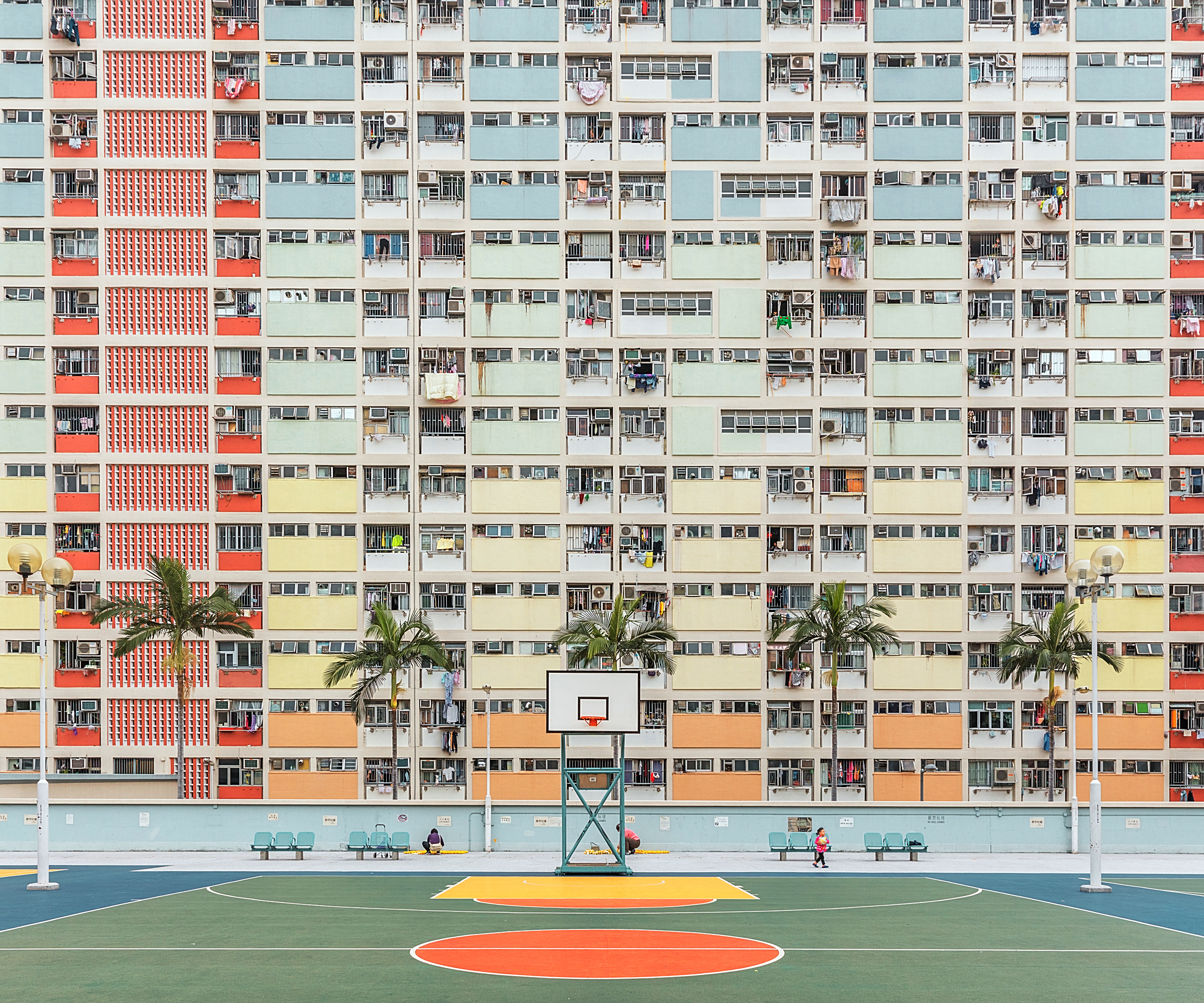
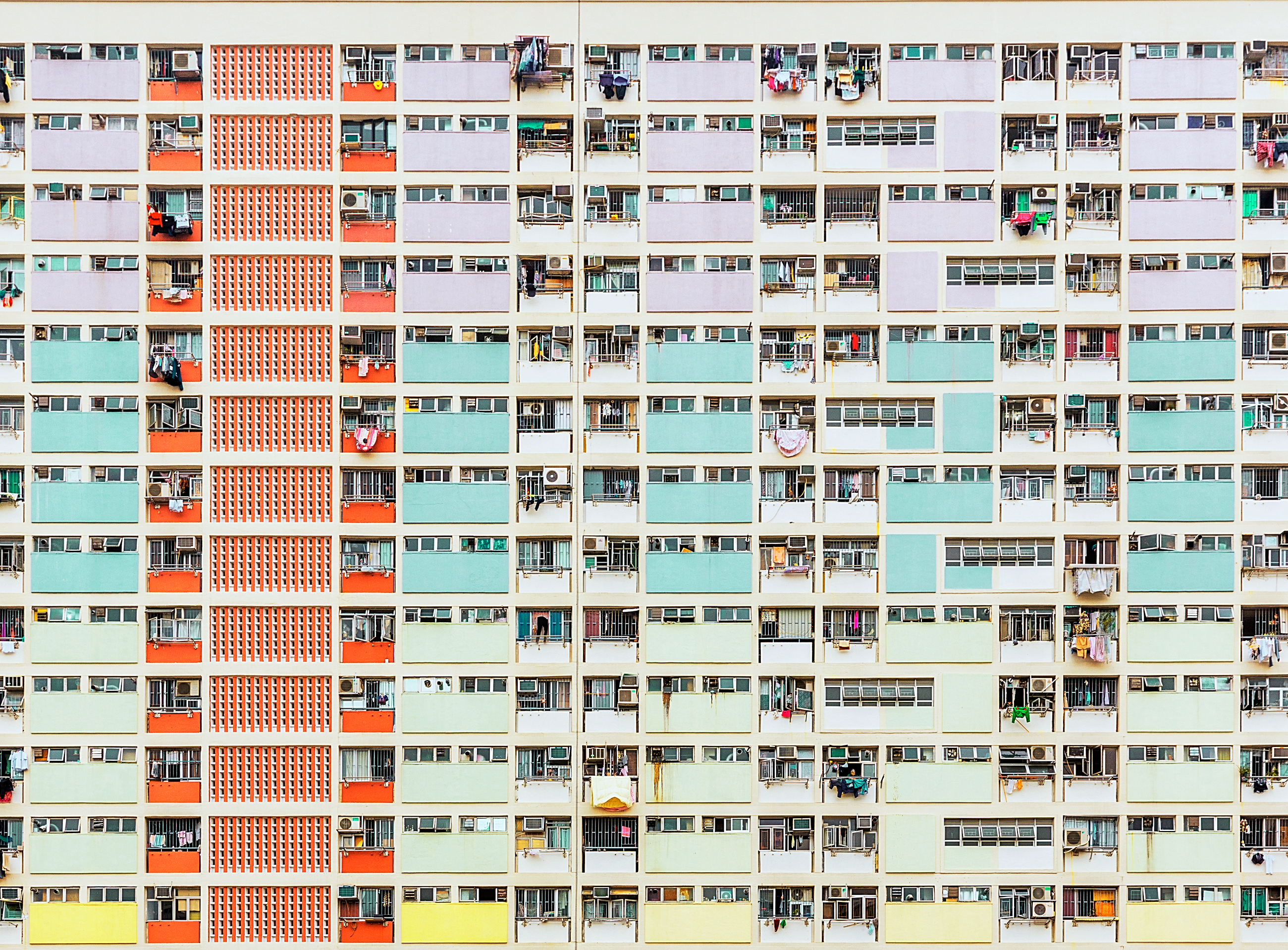
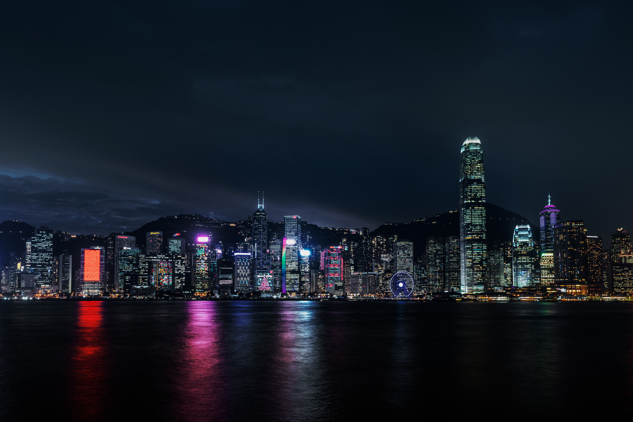
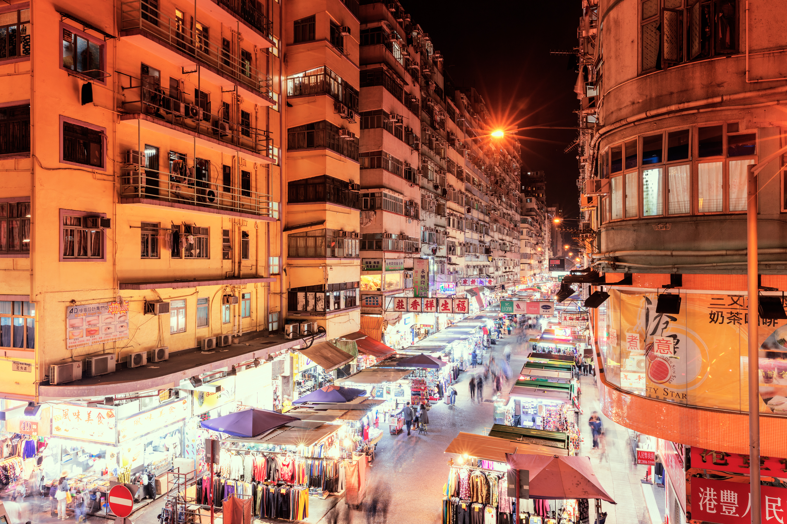
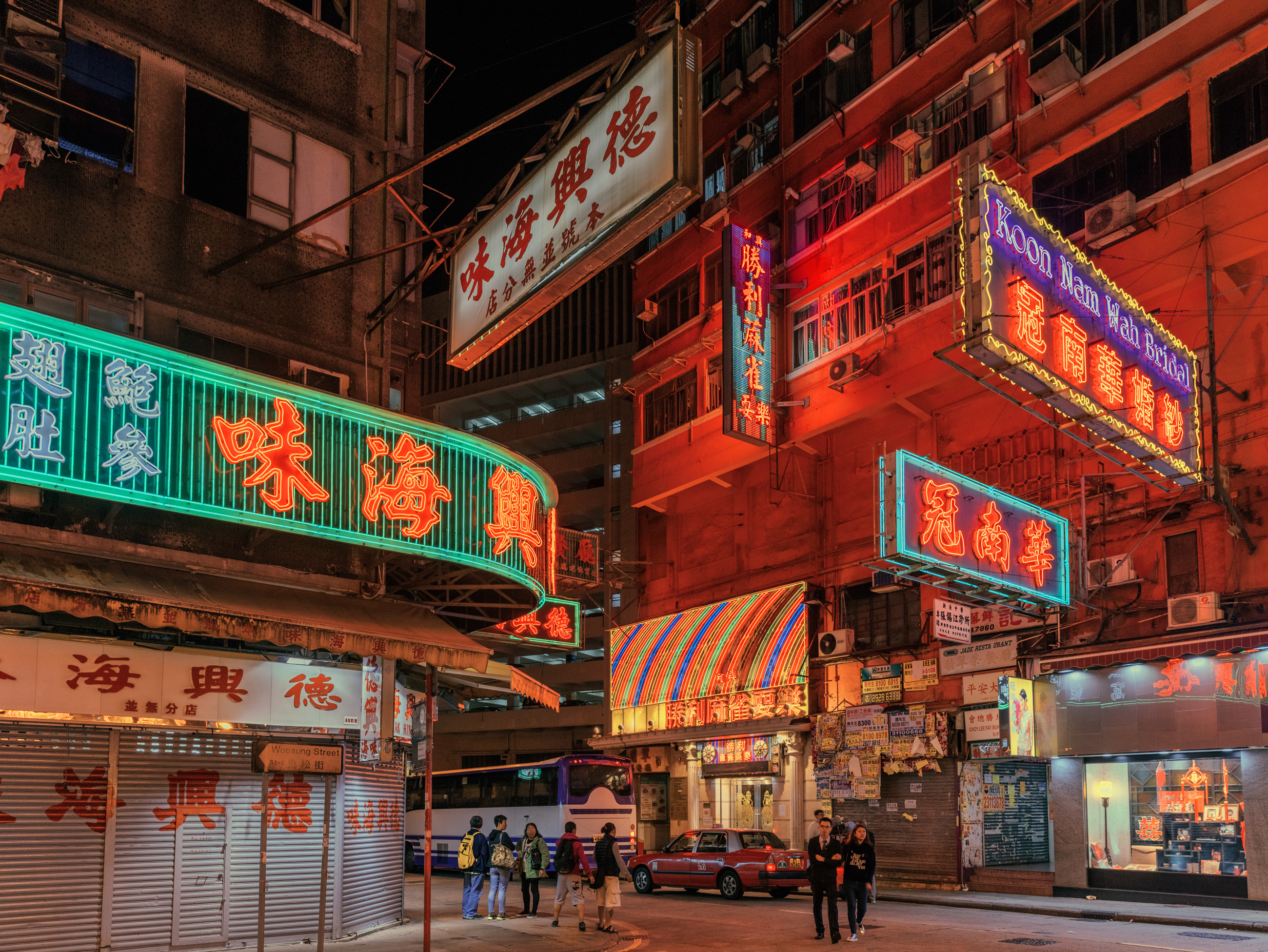
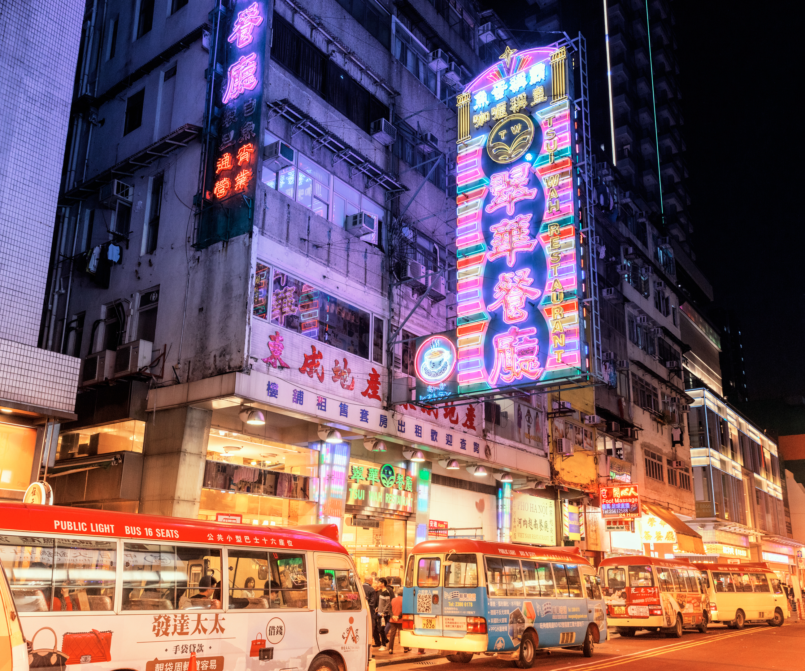
Digital Photography of Hong Kong by Ludwig Favre
Digital Photography of Hong Kong by Ludwig Favre
Let’s explore this digital photography series on one’s journey in Hong Kong by Ludwig Favre. From daytime till nighttime, he’s taking us through different locations where you can admire the colours of Hong Kong from its endless symmetry to its famous neon street lights. This series is inspiring enough to give that desire to pack your bags, your camera and book your next photo adventure. Don’t you think?
Behind this photo series, we have the work from Ludwig Favre who is a photographer based in Paris, France. Definitely follow his Behance, he has a variety of different projects to get inspired from photography to architecture.
Project Gallery


More Links
- Check out Ludwig Favre’s site: ludwigfavre.com
- Check out Ludwig on Behance
AoiroStudio
Jun 15, 2017
Source: Abduzeedo Photography
June 15, 2017
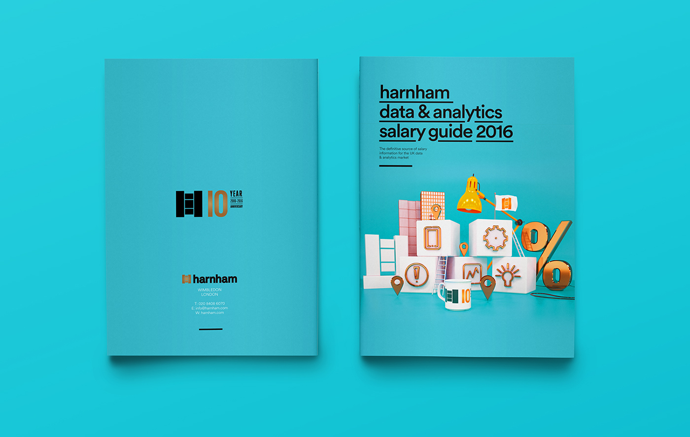
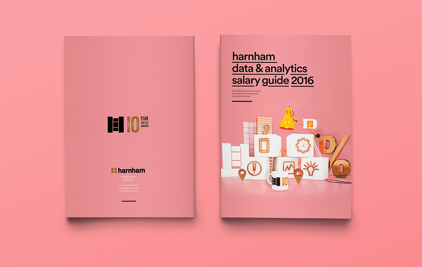
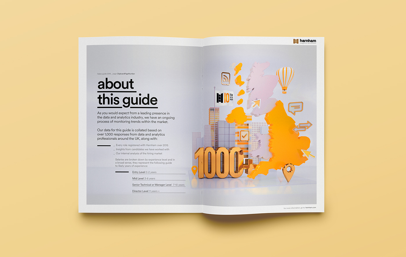
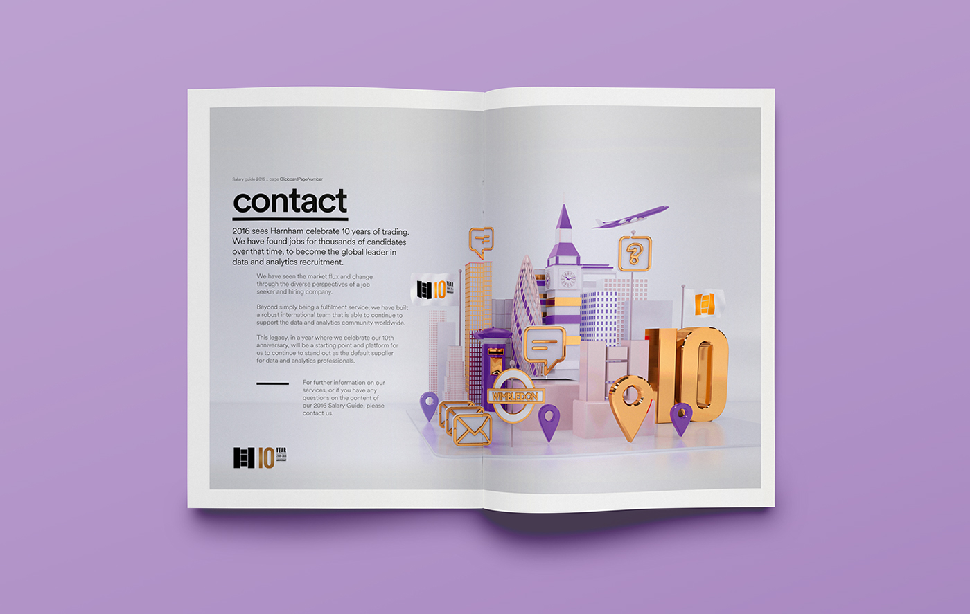
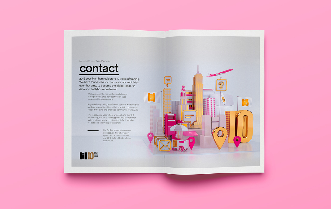
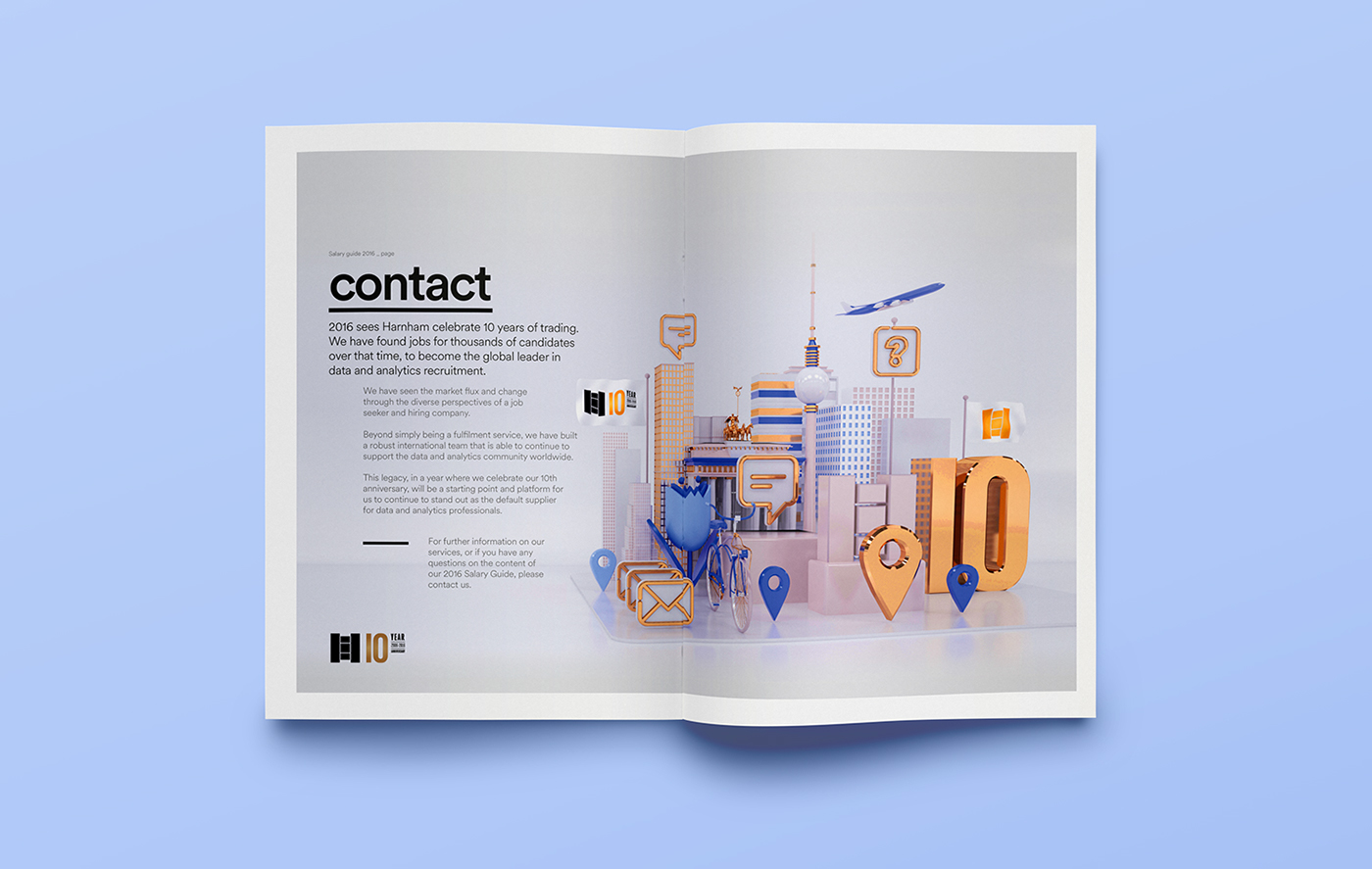
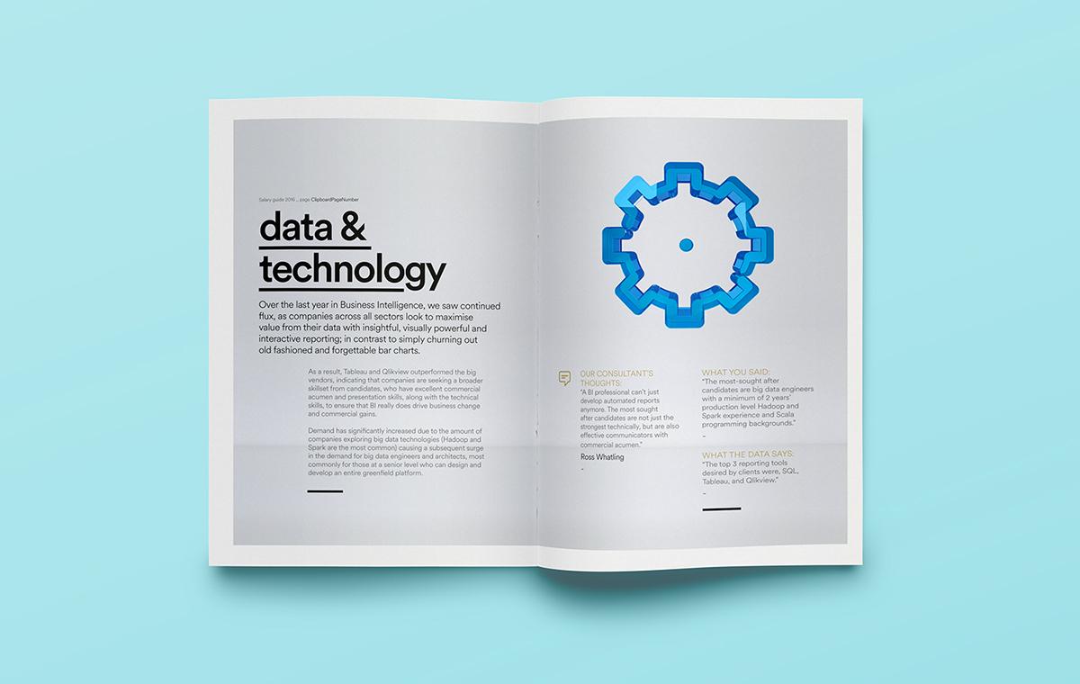
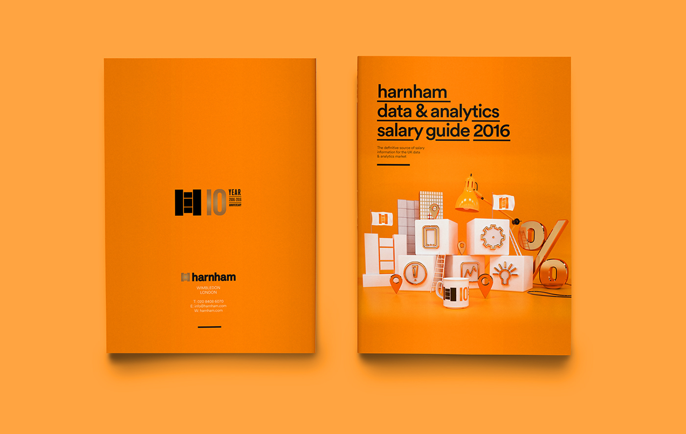
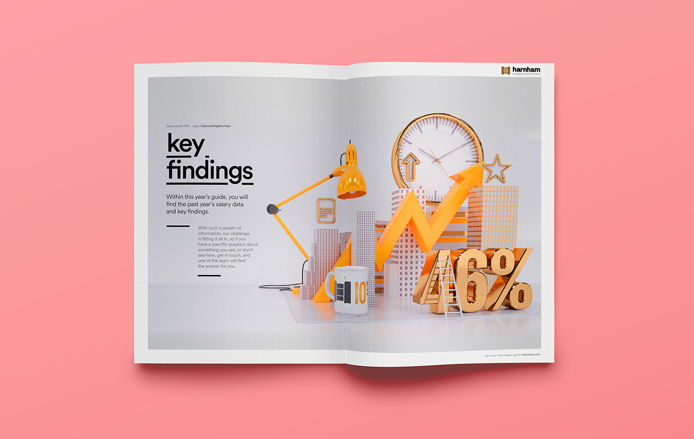
Illustration & Typography: Harnham Salary Guide (2016)
Illustration & Typography: Harnham Salary Guide (2016)
Mixing both 3D Illustration, Typography, and design, let’s take a look at the 2016 Salary Guide of Harnham. A guide that revealed the positive trends in the UK for Analytics and Data professionals and a distinctly candidate driven market. Designed by Craig Minchington and Radim Malinic, they both combined their skills into a composition of 3D, CGI, typography and a vibrant colour palette. Personally knowing both of their styles, the final result is a delightful mixture of a well-defined conceptual layout, props for their work.
This is a collaboration between Craig Minchington on the 3D Illustrations and Radim Malinic on the creative direction and design. See the full project on Behance.
Harnham’s Annual Salary Guide for 2016 reveals more positive trends in the UK for Analytics and Data professionals and a distinctly candidate driven market. This is a collaborative guide that is made possible by the participation of data and analytics professionals completing our survey. With their help, Harnham are not only able to put together our ever popular salary tables but a comprehensive view of the data and analytics market trends that will impact business hiring decisions in the coming year and beyond.
Project Gallery


Credits
- Creative direction and design: Radim Malinic / Brand Nu
- 3d Illustration: Craig Minchington / Adora Attack
More Links
- Check out Craig’s site: adoraattack.com
- Check out Radim’s site: brandnu.co.uk
AoiroStudio
Jun 15, 2017
Source: Abduzeedo Illustration