August 7, 2017
Minimalist Design for Nike Desktop and Mobile Concept
Minimalist Design for Nike Desktop and Mobile Concept
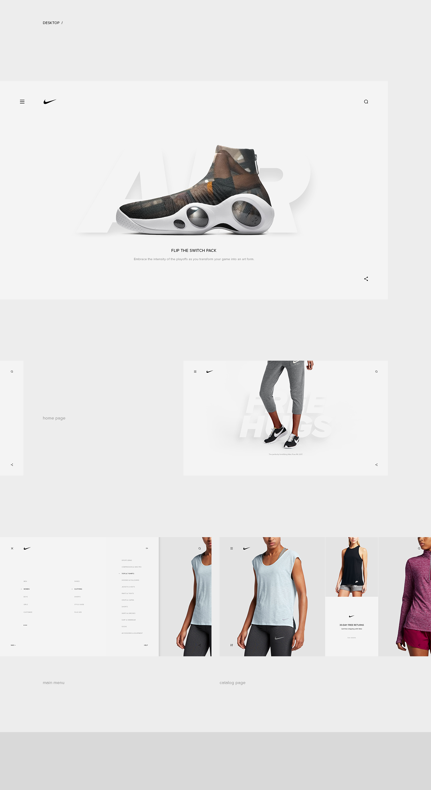
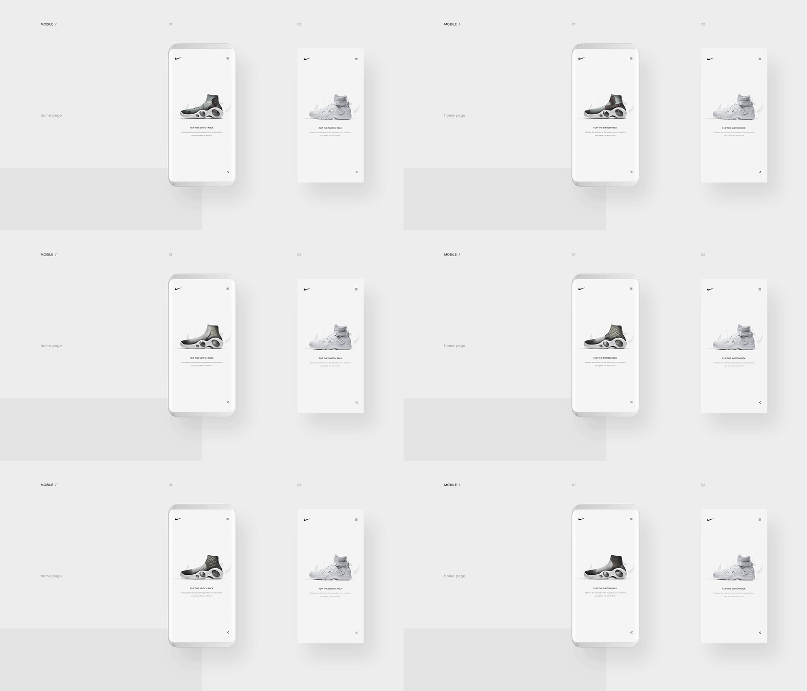
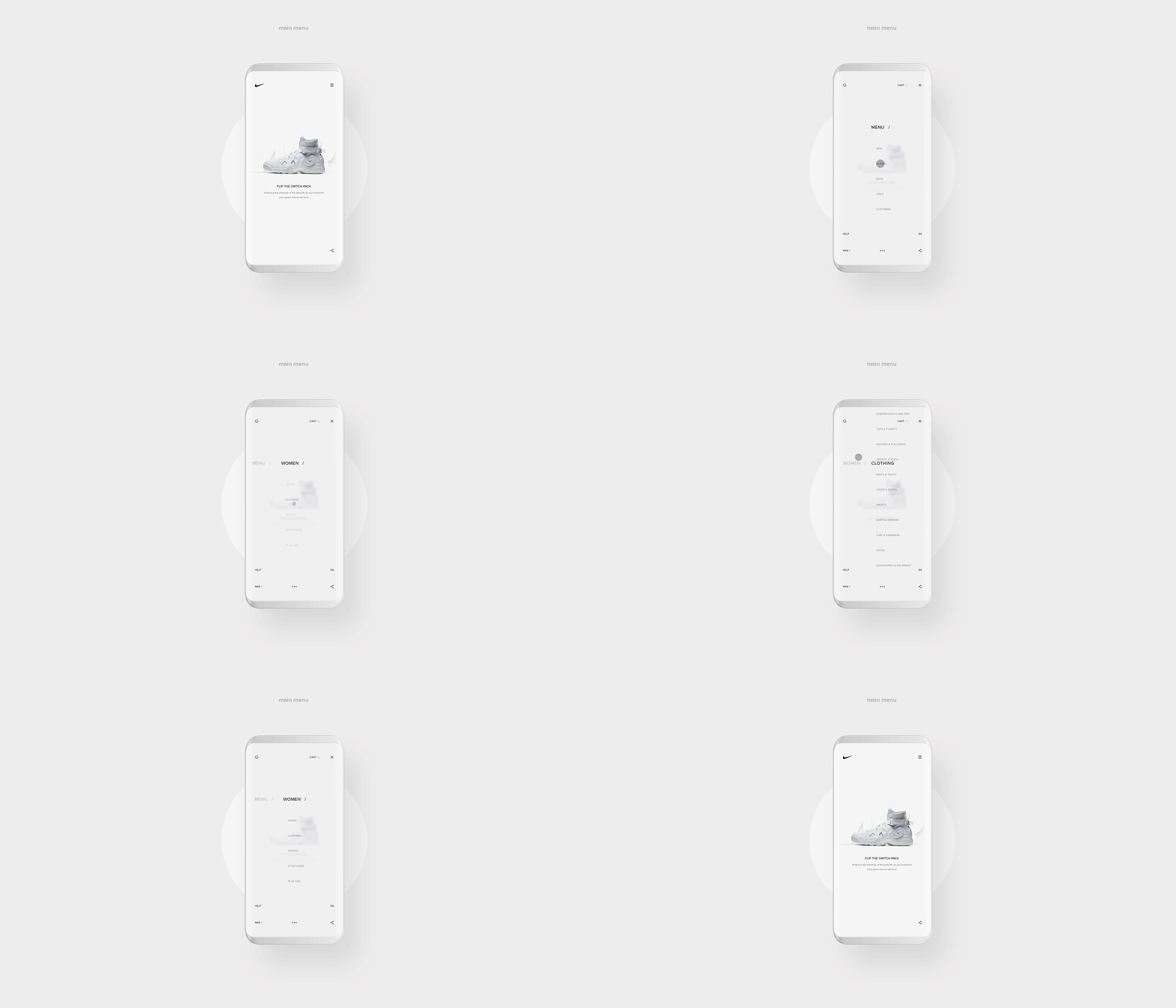
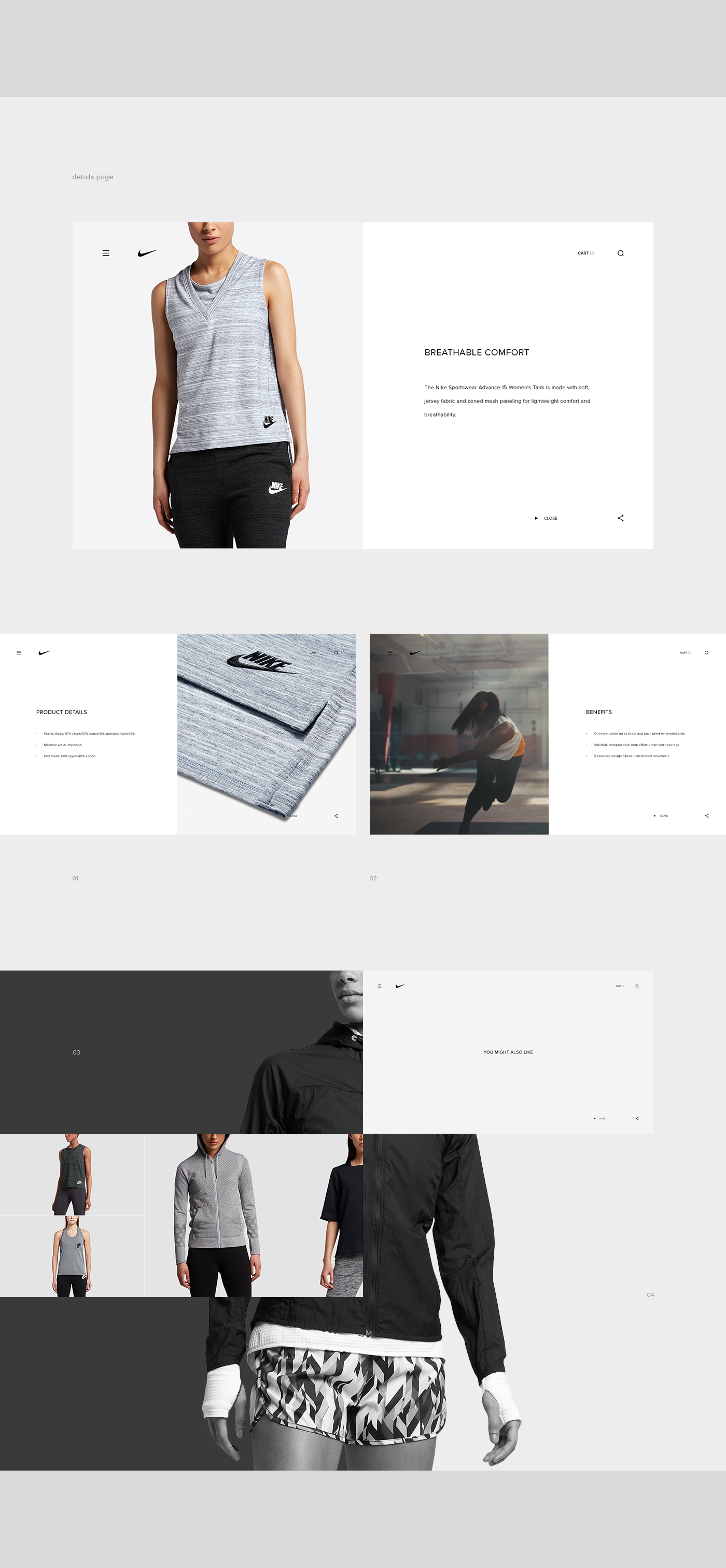
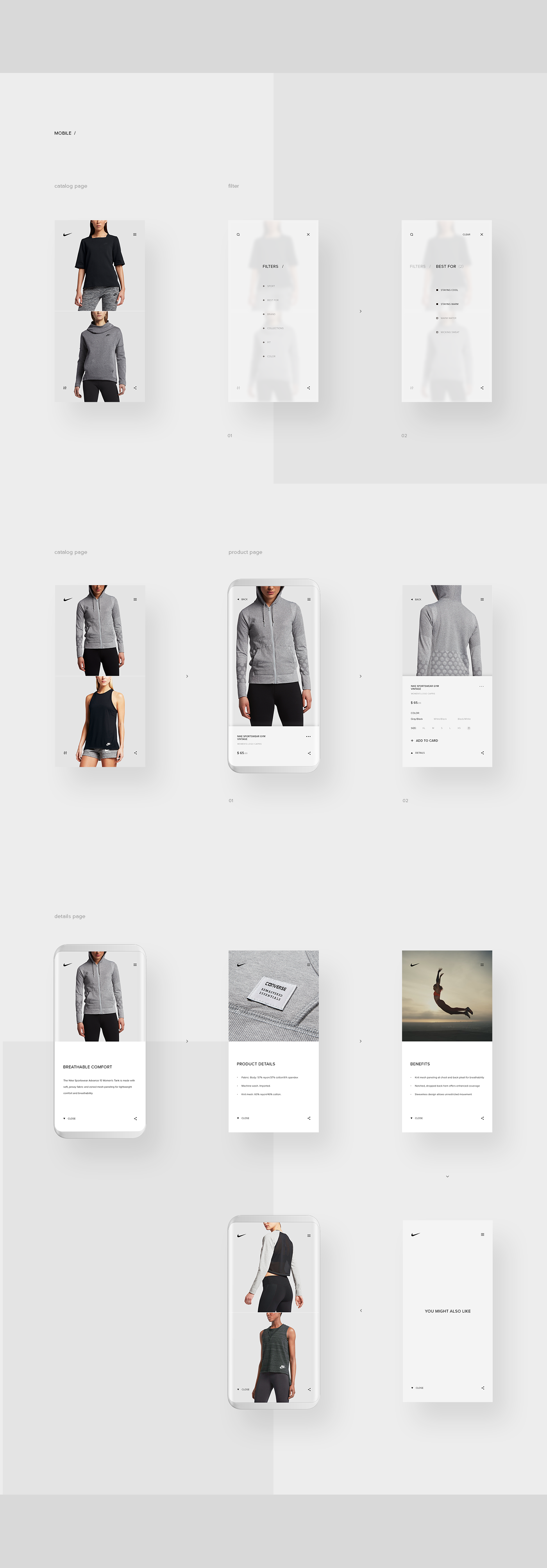
I am a fan of minimalist design and the work that Anton Skvortsov shared on his Behance profile for a concept idea for what the Nike store could look like on desktop and mobile is an amazing example of minimal and elegant. It’s hard to evaluate minimalist design when it comes to user testing. Some users might always prefer density rather than focus on less. It’s okay, but some companies can definitely afford that and Nike is a great example of one that I think it could work. Below you can see some images and a bit of the process.
There’s a lot to love about this project, especially the web version. The grid the nice navigation, I also have to point that the designer didn’t take in consideration different display sizes and resolutions. In my opinion the text size is extremely small as well, almost to the point that I don’t know if it could be readable, especially on mobile. That said, I think there’s a lot of good ideas here and they definitely inspired be for some changes on the Abduzeedo redesign I am working on.
In visual arts, music, and other mediums, minimalism is a style that uses pared-down design elements. Minimalism began in post–World War II Western art, most strongly with American visual arts in the 1960s and early 1970s. Wikipedia
Minimalist design






Anton is a UI/UX and web designer from Russia He has other really cool projects like this on his portfolio and I highly recommend that you check it out. For more information make sure to visit:
abduzeedo
Aug 07, 2017
Source: Abduzeedo UI/UX
0 Comments
Leave A Comment