-
News & Updates
Uncategorized
July 7, 2017
New Music! SXSW Artist Releases – Friday, July 7

We’re back from July 4th holiday and are busy prepping for SXSW 2018. If you’re interested in being a part of the event, apply to be a Showcasing Artist or enter a PanelPicker session idea.
This week, similar to last week, sees a slightly lower than average amount of new releases because of July 4th, but there are still some awesome releases from past artists at SXSW. Indie-electronic pop artist Toro Y Moi is back with a new album full of the summery jams that he’s made his name on, East-coast hip-hop duo The Doppelgangaz return with a new album, and indie-rock mega-group Broken Social Scene return with their first full-length since 2010. Check below for the full list of SXSW artist releases.
Each week we will pick one of the album releases and make a playlist for those that are enjoying the album but want to discover more similar artists. This week, we’re selecting a female vocal driven playlist inspired by Grulke Prize winners HAIM, their new album Something to Tell You releases today. Go ahead and give it a listen because these playlists will only be active for one week before we pick a new artist to focus on. Follow us on Spotify to keep up with our playlists each week.
Past Showcasing Artist July 7th Releases
This Is The Kit – Moonshine Freeze
Broken Social Scene – Hug of Thunder
HAIM – Something to Tell You
The Doppelgangaz – Dopp Hopp
Toro Y Moi – Boo Boo
Public Service Broadcasting – Progress
Haim at SXSW 2013 – Photo by Yoomi Park
The post New Music! SXSW Artist Releases – Friday, July 7 appeared first on SXSW.
Source: SxSW Music
July 7, 2017
Tech and Film: 7 Innovations Changing the Industry
These 7 technologies are poised to shape the film industry.
Source: CW’s Flipboard Feed
July 7, 2017
The Daily Chord Weekly Recap – Friday, July 7

The Daily Chord shared the last of the mid-year think pieces this short work week, and linked to stories reporting on positive and negative aspects of streaming businesses. The profiles of Ted Leo, Charley Pride and Dr. Octagon should lead you to seek out their music. After checking out this weekly wrap-up, please subscribe to the Daily Chord email blast and make your inbox interesting.
Wednesday, July 5
-
Music industry at mid-year mark
Post from Variety -
DJ Khaled narrowly beats Imagine Dragons to no. 1
Post from NY Times -
Ticketmaster to kill long lines by checking event attendees with smartphone audio data
Post from The Verge -
Jay Z’s new album pirated almost 1 million times in first 3 days
Post from Hypebot -
Machines of loving grace: How ‘Artificial Intelligence’ helped techno grow up
Post from The Guardian -
John Blackwell Jr., Prince’s former drummer, dies at 43
Obituary from Billboard
Thursday, July 6
-
Streaming soars, Kendrick Lamar has 2017’s top album (so far) in Nielsen Music’s mid-year report
Post from Variety -
The music industry’s still off-key
Post from Bloomberg -
This is how Fender will get you to dust off your old guitar
Post from CNET -
How musician Shawn Wasabi helped develop the arcade-inspired Midi Fighter 64
Post from The Verge -
Let Kool Keith’s Dr. Octagon cure what ails you
Interview from Noisey -
Charley Pride talks new album, Merle Haggard, and disappointment over stalled biopic
Interview from Billboard
Friday, July 7
-
The streaming problem: How spammers, superstars and tech giants gamed the music industry
Post from Vulture -
SoundCloud cuts 40% of staff in push for profitability
Post from Bloomberg -
Lamb Of God’s Randy Blythe gives a tour of his bookshelf
Post from Noisey -
Ted Leo is like you
Profile from Stereogum -
A little help from my friends: The guest stars transforming pop albums
Post from The Guardian -
Spotify’s new project sees artists blocked by Trump’s travel ban come together
Post from Mashable
The post The Daily Chord Weekly Recap – Friday, July 7 appeared first on SXSW.
Source: SxSW Music
July 7, 2017
‘The Reagan Show’ Editors Reveal America’s First Reality TV President

Three editors sifted through thousands of hours of footage to bring Reaganism alive—to unsettling effect.
There is not a single talking head in Sierra Pettengill and Pacho Velez’s documentary The Reagan Show. No one sits around glibly pontificating on Reagan’s legacy. Instead, history speaks for itself, and it’s the audience’s job to listen.
This left the film’s three editors with a daunting task: to build an evocative narrative solely from archival footage. Daniel Garber, David Barker, and Francisco Bello sifted through thousands of hours of news reports and White House TV footage, shot by the Reagan administration in an unprecedented effort to document his presidency. The result is an eerily prescient window into America’s first performance artist president.
Source: NoFilmSchool
July 7, 2017
SXSW 2017 Closing Night Film LIFE Now Available [Video]
“We brought [LIFE] to SXSW because Austin is where it’s at these days and we were very honored to be a part of your closing night,” said Producer Bonnie Curtis.
LIFE, a frightening sci-fi thriller about a team of scientists aboard the International Space Station, follows a mission of discovery that turns to one of primal fear. The film features an ensemble cast of Jake Gyllenhaal, Rebecca Ferguson, Ryan Reynolds, Hiroyuki Sanada, Ariyon Bakare, and Olga Dihovichnaya and is available to watch now digitally and on DVD/Blu-Ray.
Read below for our interview with director Daniel Espinosa and check out our Q&A from the world premiere, moderated by Director of SXSW Film, Janet Pierson.
Q: Tell us a little about your film?
DE: It’s about a strange friendship that goes wrong… And it gets very scary very fast.
Q: What motivated you to tell this story?
DE: My fear of germs. Or, rather, the possibility of germs. They could take over, you know.
Q: What do you want the audience to take away from this film?
DE: To have a blast … and maybe think a little afterwards.
Learn More About SXSW 2018
Learn how to successfully submit your film to the 2018 SXSW Film Festival with our How to Submit Your Film video and find out more information about deadlines and fees on our submissions page. Stay tuned for more information about our programming for the season, and mark your calendars for Tuesday, August 1 when registration and housing opens.
Follow us on Facebook, Twitter, Instagram, and SXSW News for the latest SXSW coverage, recaps, late-breaking announcements, and updates.
The post SXSW 2017 Closing Night Film LIFE Now Available [Video] appeared first on SXSW.
Source: SxSW Film
July 7, 2017
HOW TO MAKE BETTER INFOGRAPHICS: TELL A SINGLE STORY
This article originally appeared on Column Five.
A lot of people want to know how to make infographics. We’ve made over 4,000 infographics for tons of companies over the last decade, so we know a thing or two about it. Most importantly, we know it’s not enough to make an infographic; you need to make a great infographic. But too often we see people sabotage their work. How? They try to do way too much, cramming as much as possible in.
- More stats!
- Another CTA!
- Product mentions!
- Another 10 sources!
The instinct is understandable. You want to get the most bang for your buck. You want to give your reader as much info as possible. But this overlooks the actual purpose of an infographic: to tell a succinct story and deliver it in a package that makes it as easy to understand as possible.
WHY LESS IS MORE IN INFOGRAPHICS
Although infographics always been around, it was only in this decade that marketers fell in love with them. This has prompted the revival of a wonderful and effective communication form, but many people are enamored with their flashy visuals and snazzy copy, overlooking their intended use. (In fact, we often have partners come to us asking for an infographic, when what they’re really looking for is information design. Learn more about the difference between them.)
An infographic combines copy, data, and visuals—all three of which work symbiotically—to help people comprehend and retain information more effectively. That’s why they’re so unique. But many people don’t understand what really makes a good infographic. Too many people think the infographic process is something like this:
- Slap together some copy.
- Sprinkle in some charts and graphs.
- Add a few illustrations, logo, and CTA.
- Sit back and relax.
We’re here to set the record straight. Just because you have copy, data, and visuals doesn’t mean you have a good infographic. The best, most effective infographics don’t just “deliver information” with these elements. They tell an interesting, enticing story.
Why story? When you are trying to deliver specific information or get a certain message across, wrapping it in story makes it more accessible to the people you’re trying to reach. It’s an intuitive formula, and they know what to expect: introduction, setup, payoff.
“Cool! I can make a story,” we hear people say. And that’s when things can go even more off the rails. They drown their infographic in data. They stuff it with a novel’s worth of copy. They pack it with picture-book visuals. The result? A Franken-graphic that is an unreadable eyesore. Here’s the thing about story: It’s a balance. Sometimes you have too much, too little, none at all, or something way off track.
To make sure you’re telling a solid story, you need the right ingredients.
HOW TO MAKE INFOGRAPHICS THAT TELL A STRONG STORY
A strong infographic contains many elements, from the narrative to the design. To help illustrate the example, let’s walk through an infographic we created with Upwork, a global freelancing platform.
This infographic is a great example of a well-crafted, well-designed piece that is perfect for its intended audience and, therefore, helps the brand connect with them. Here’s how to emulate it.
1) CHOOSE A SINGLE TOPIC (THAT PEOPLE ARE INTERESTED IN)
This may be broad or specific, depending on your goals, but it should have a specific angle. You might craft an infographic about overall industry trends or tell a story about a specific sector of the industry, but don’t try to cover every single aspect of your industry in one infographic. Either way, it should be relevant to people’s interests.
Tip: If you are interested in exploring a topic from many angles, craft an infographic series. These can be published all together or used to enhance other larger pieces of content, such as an e-book. To make sure your story ideas are actionable and interesting to people, create marketing personas of your target audience. Try our exercise to help you do it in an hour.

The Upwork infographic is effective because it addresses a very specific subject that isn’t too broad or too granular: finding and attracting remote development talent. For a freelancing platform, this is a highly relevant topic.
2) EXTRACT RELEVANT DATA INSIGHTS
Sometimes you will already have these insights, which will inspire the topic. Sometimes you’ll have to go looking for them. The key here is to include only the most relevant data.That doesn’t mean you cut out data that doesn’t “support” your story, but you should include only that which helps you communicate it effectively.
Tip: If you don’t know how to extract those insights, try our 5 tips for finding stories in your data. Not sure where to find data at all? Start with these 104 great sources of data.
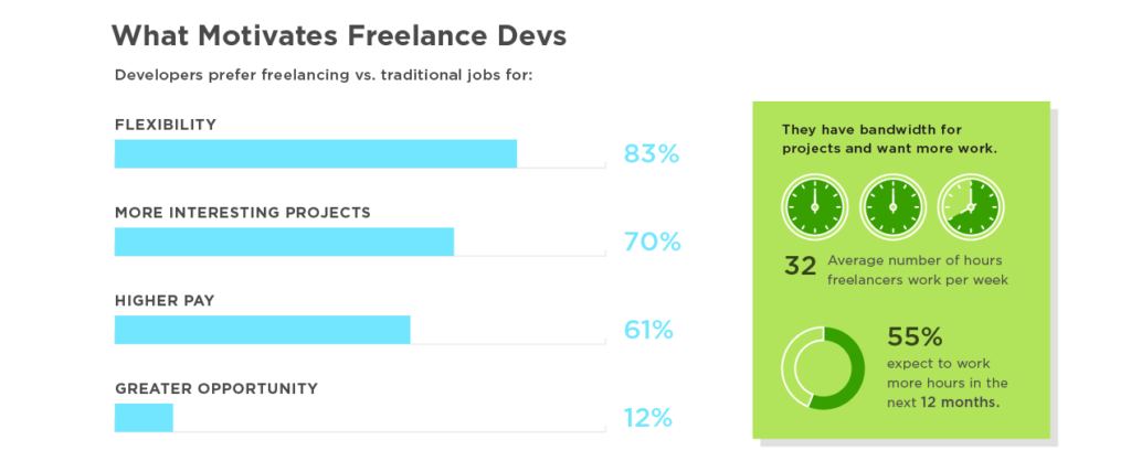
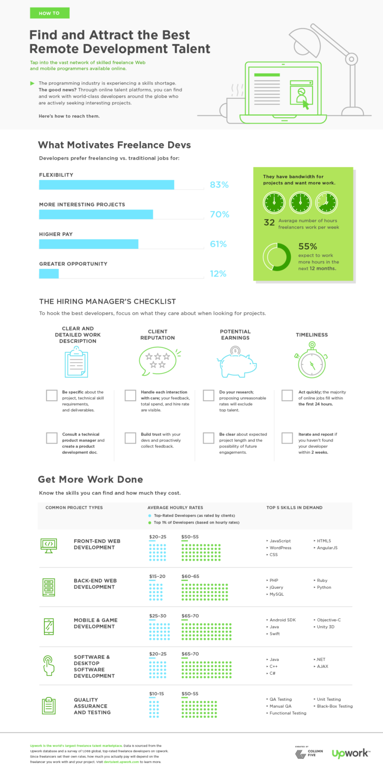
This graphic was created using Upwork company data and survey data from 1,068 top-rated freelance developers on Upwork. It provides fantastic insight into what motivates and concerns this segment of the workforce.
3) STRUCTURE A CLEAR NARRATIVE
The same grade-school writing rules apply:
- Introduce the topic.
- Guide readers through in an intuitive manner, with supporting data.
- Call out or provide context for any particularly relevant (or possibly unclear) data.
- Wrap it up with a simple, intuitive CTA.
When it comes to actually writing:
- Limit copy: Large blocks of text are an immediate turnoff. Data and design are meant to enhance and do some of the heavy lifting. Keep copy short, quick, and to the point.
- Kill redundancy: Again, let design to its job. Don’t over label charts. Don’t call out the same stat in the body copy, header, callout, and chart. Keep it clean and simple.
Tip: Here’s a good litmus test: Is it easy to write the headline for this story? Can you summarize your points in a few sentences? If not, you may need to simplify. Get more tips on crafting an infographic narrative, and check out these 101 resources for copywriters.
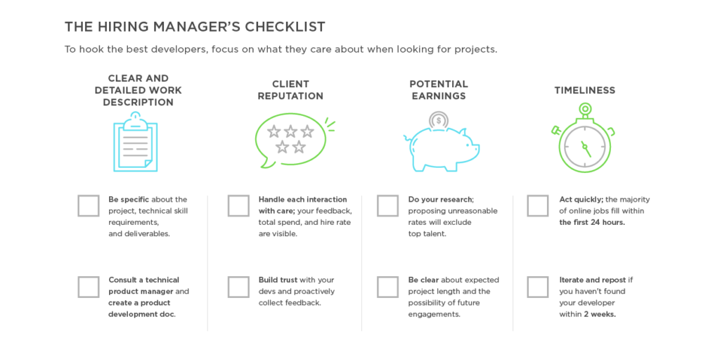
The Upwork graphic doesn’t just throw in a few random stats. It presents data and translates that data into useful and actionable tips for the target audience. This helps them not only understand those workers (through data) but understand how they can attract those workers.
4) DESIGN FOR STORY
Another common issue on the design side is over-designing: adding a ton of illustrations, getting too crazy with a visual metaphor, or including chart junk that distracts from data visualizations. Everything from the layout to the font choice affects how the reader absorbs the story. Design should never distract, only enhance. Never forget that white space is your friend!
Tip: Follow best practices for data visualization. Check out this e-book to learn how to design the most common types of charts and graphs, and make sure you avoid these 8 common design mistakes.
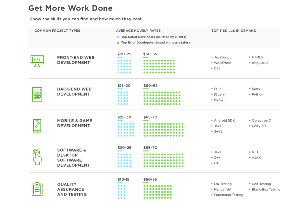
The infographic’s clean data visualization and modular design makes it easy to navigate. Each panel presents a certain aspect of the story, and it flows in a logical order.
Creating great infographics isn’t difficult, but it does take knowledge, practice, and skill. To make sure you’re on top of your game, stay educated and informed. Want to start now?
- Check out even more tips to make effective infographics, from brainstorm to distribution.
- Look at these 9 infographic design examples for inspiration.
- Learn more about the power of data visualization.
- Try Visage, our data design platform.
Source: Visual News
July 7, 2017
Tamron Lenses 101: A Cheaper Alternative Without the Sacrifice

Tamron lenses are a great alternative to expensive glass. Here’s why.
We previously highlighted the cine and photography Sigma lens lines, which got us thinking about other budget-friendly glass. Tamron immediately came to mind as its SP series aim to compete optically with Canon L and Nikon NIKKOR ED lenses with significant savings.
Tamron’s lens story dates back to the 1950s, when the company developed a 135mm f/4.5 for the 35mm single-lens reflex cameras. Then, in 1961, Tamron introduced a 95-205mm f/6.3, an affordable telephoto zoom lens, to make a splash in the market next to Zeiss, Cooke, Canon, and others. (The first zoom lens was patented in 1902 by Clile C. Allen; the first non-telescopic complex zoom lens for cinematography was the Bell & Howell Cooke Varo 40-120mm.)
Recently, Tamron announced two new lenses: the SP 24-70mm f/2.8 Di VC USD G2 and the 18-400mm f/3.5-6.3 Di II VC HLD. Below, we break down the current offerings and tell you what all the “Di,” “VC,” and “USD” is all about.
Source: NoFilmSchool
July 7, 2017
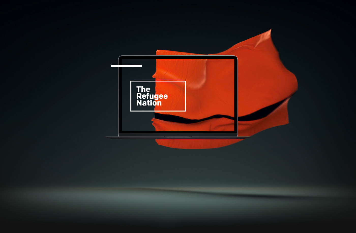
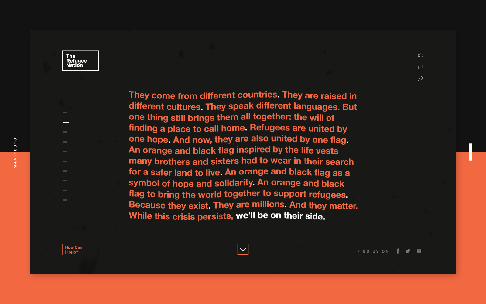
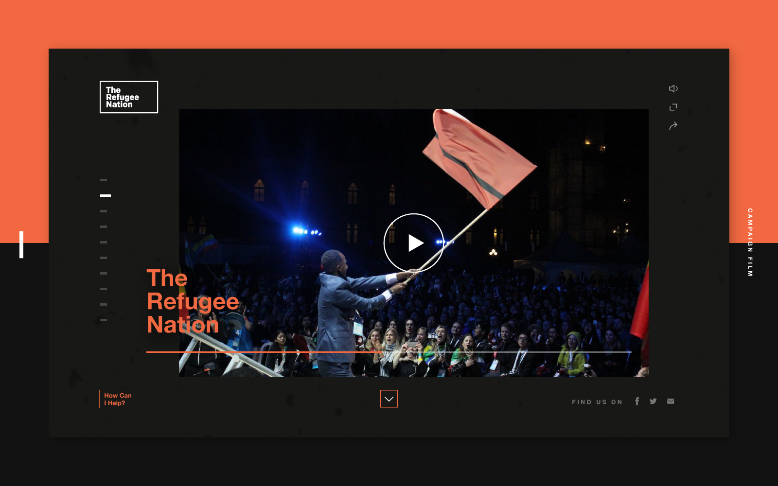
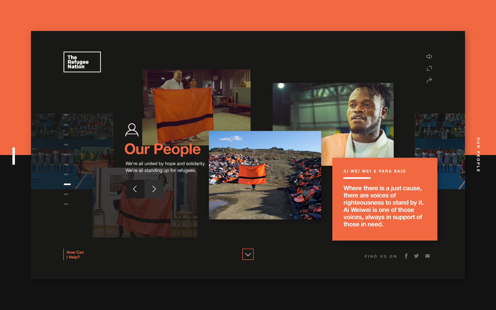
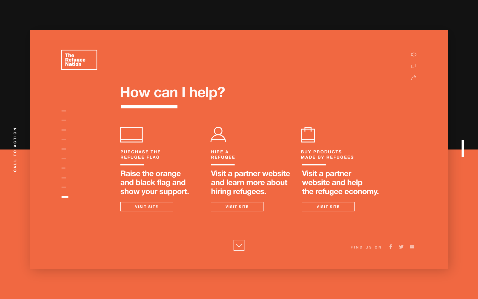
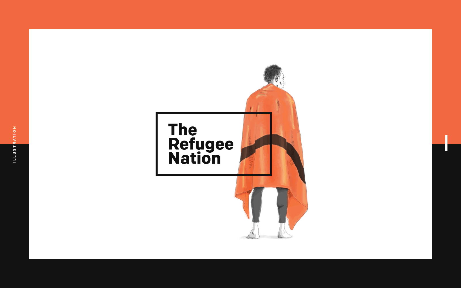
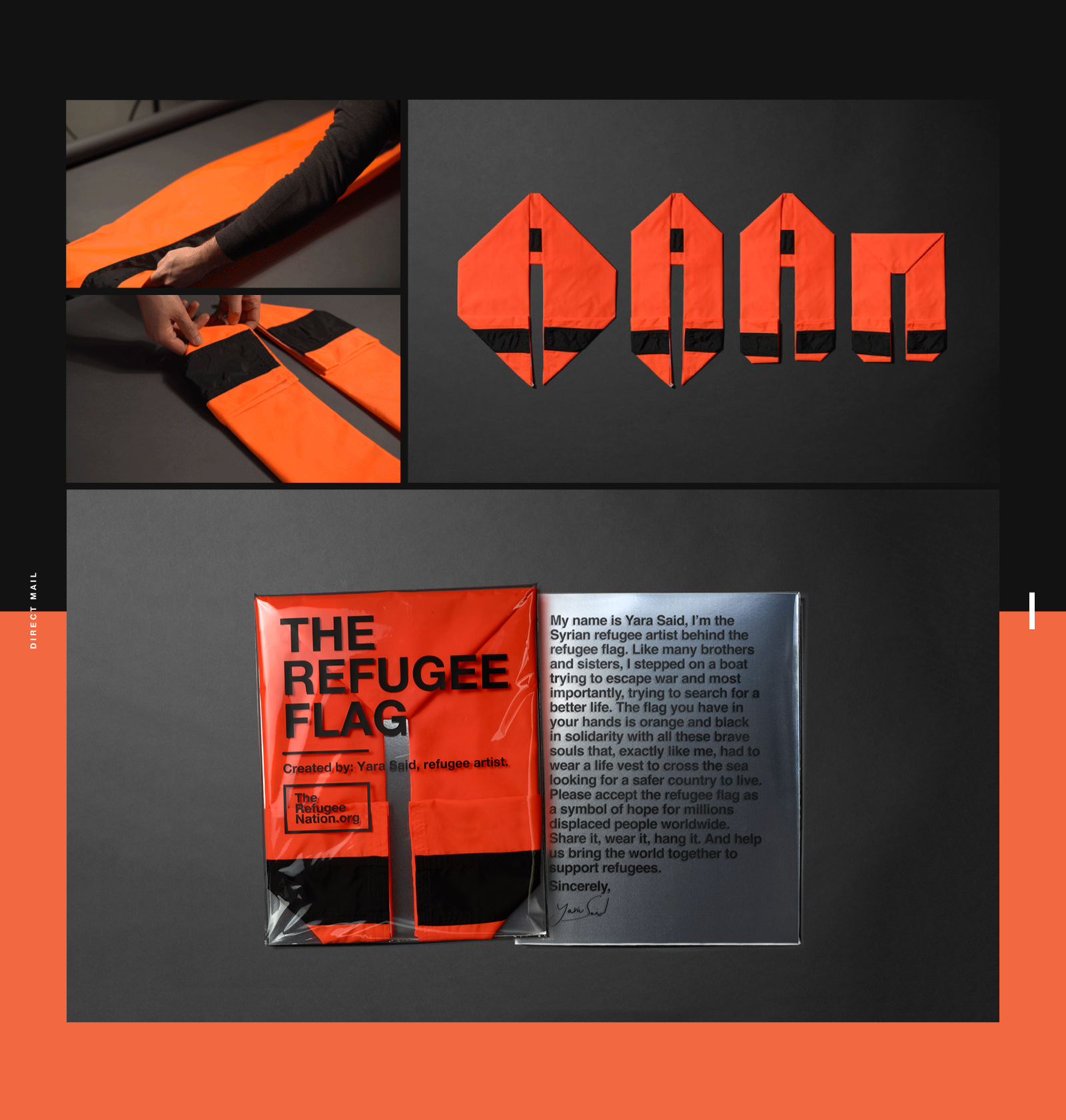
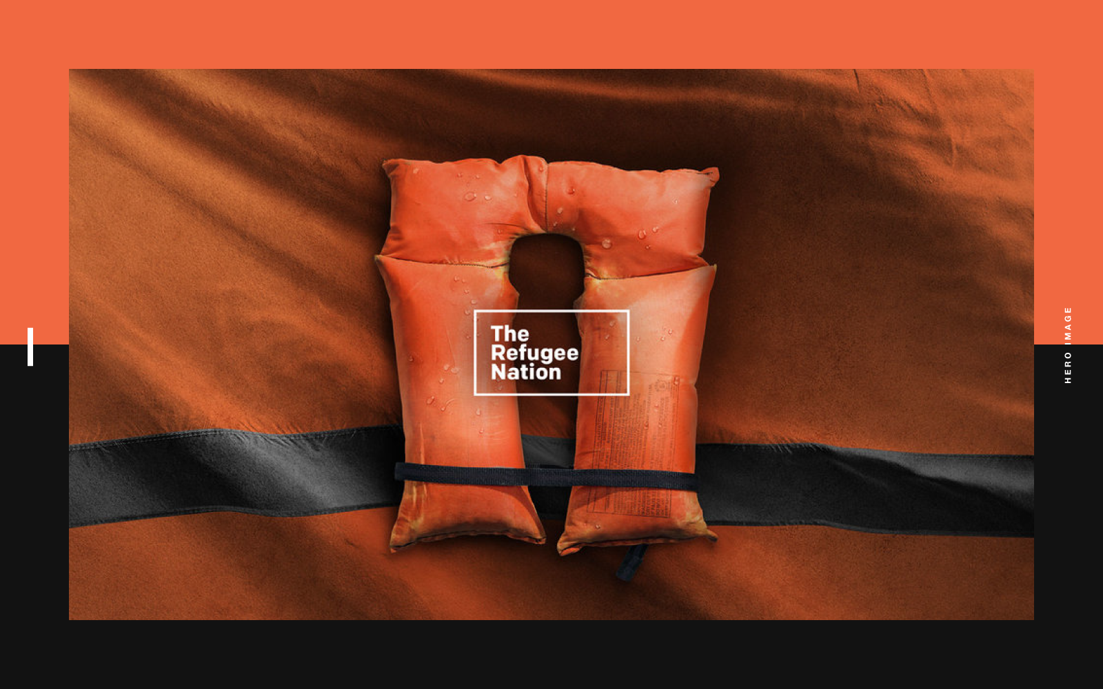
Interaction Design & Art Direction: The Refugee Nation
Interaction Design & Art Direction: The Refugee Nation
An Interaction Design and Art Direction for Refugee Nation by Justin Au. I don’t know if you guys remember at the last Olympics, we’ve witnessed a team of refugee athletes compete in the games. A first in the history and since they had no official “home” to call their own, no anthem and no flag. A flag of the “Refugee Nation,” created by Syrian refugee was orange and black, to represent the life vests the athletes wore as they set off in boats for a better life. It’s quite a beautiful story, I would definitely the full project via his Behance.
Justin Au a designer and an art director working at Ogilvy & Mather New York. Currently based in Brooklyn, you should definitely follow his Behance where you’ll find work for IBM, 36 days of type and more.
Video
Bringing the world together to support Refugees. For the first time in Olympics history, the games saw a team of refugee athletes compete in the games. But unlike other competitors supported by their nation countries, these champions had no official “home” to call their own, and thus, no anthem and no flag. The flag of the “Refugee Nation,” created by Syrian refugee Yara Said, was orange and black, to represent the life vests the athletes wore as they set off in boats for a better life. Another Syrian refugee, composer Moutaz Arian, created a wordless anthem to convey a universal message of love and hope. The Refugee Flag has since become an international symbol of welcome and inclusion. It is hoisted all over the world by different people, organizations, and even countries as a sign of solidarity in support of refugees. I was tasked with designing a web experience that captured and explained the idea behind the flag and all that it stands, to visitors from all over the world who may have stumbled upon its colors.


Links
- Follow Justin Au on Behance
AoiroStudio
Jul 07, 2017
Source: Abduzeedo UI/UX
July 7, 2017
Oscar-Winning DP of ‘Life of Pi’ Claudio Miranda on Drones and Experimenting with New Technology
Oscar-winning DP Claudio Miranda, ASC discusses experimenting with drones and other technology.<p>As new technology influences the entertainment …
Source: CW’s Flipboard Feed
July 6, 2017
Google Blocks makes it easy for anybody to create VR objects in 3D
Google has focused on making it easier to create artwork and 3D objects for use in AR/VR environments and then sharing them with the world. Its newest offering is Blocks, which is aimed at creating 3D assets in VR headsets.
The post Google Blocks makes it easy for anybody to create VR objects in 3D appeared first on Digital Trends.
Source: Digital Trends VR