-
News & Updates
Uncategorized
June 15, 2017
Virtual reality can make a trip to the dentist visit less painful, study says
Visiting the dentist doesn’t have to be so detestable. Researchers used virtual reality to calm patients in a new study from the universities of Plymouth, Exeter, and Birmingham, with promising results.
The post Virtual reality can make a trip to the dentist visit less painful, study says appeared first on Digital Trends.
Source: Digital Trends VR
June 15, 2017
These Maps Do More Than Just Give Directions
Generally, city maps are used for navigating streets and subways but do little to inform about the experiences of a city. That’s where Tags and the City comes in. Created by Tin Fischer, David Goldwich, Jug Cerović, and Andrea Rohner, a journalist, software engineer, architect and map maker, and graphic designer respectively, the transit maps are labeled based on popular Instagram hashtags used near each station.

The hashtags analyzed by Fischer were chosen based on their proximity to a station and did not include tags that referenced temporary events or installations, neighborhood names, or station names. The purpose of the analysis was to determine what people were frequently photographing and sharing.
Looking at each map gives users a pretty decent idea of trending events and experiences around each city. For New York, there are plenty of food trends marked throughout the city like the #Cronut in SoHo and #RedRooster in Harlem, while Paris was considerably more defined by cultural landmarks rather than food.

For Fischer, the hashtags that he found most interesting weren’t ones labeling food or cultural landmarks but something completely different altogether. “What always surprises me is how popular it is to go and see filming locations from movies, like the fire station from #Ghostbusters in New York or the high rail from #Inception in Paris,” he says.
Unfortunately, since Instagram changed its open data policy, the data only covers images from 2014 and can no longer be updated but they do intend to make. For now, you can check out the maps they’ve already created for Berlin, London, New York, Paris, and San Francisco Bar Area.
Have a look around each of the cities here.

[Via: Co.Design]
Source: Visual News
June 15, 2017
Which Countries Destroy The Environment The Most (And Least)?
This article originally appeared on Priceonomics.
In 1970, people first used more environmental resources than the world could produce.
The gap between demand and nature’s ability to meet that demand has grown steadily since then. Each year we live in ecological deficit–taking more than can be replenished–we draw down the world’s reserves of natural resources. Ensuring we don’t use up the world’s resources is a global effort, though some countries use up more resources than others.
We wanted to know what countries were the heaviest users
of environmental resources, and which ones have the lightest footprint.
We used data from Priceonomics customer data.world, a platform that ties many different data sets together so it’s easy to analyze them. In particular we analyzed a data set from Global Footprint Network–a research group dedicated to helping leaders in government and finance quantify how much people take from nature and how much nature has to give. The 2017 edition of the National Footprint Accounts contains data from 1961 through 2013, and is available on data.world, where you can query, download, and comment on the data.
Not surprisingly, we found that on average people across the world use vastly more resources than nature can replace.
Countries in Western Europe, East Asia and oil-producing countries typically run the largest per person deficits. Luxembourg has a per person deficit 10 times larger than the world average. Sparsely populated and densely forested South American countries like Guyana, Suriname and French Guiana have the largest per person surpluses.
We saw that a country’s affluence is a strong predictor of its natural resource consumption. Looking just at the 50 largest economies, Canada is the most environmentally responsible and South Korea the least. Of these large economies, the United States has the second worst environmental track record.
***
Ecological footprint measures how much biologically productive area a country needs to fuel its resource consumption and absorb its waste.
The more fruits, vegetables and grains a country consumes the more farmland it needs to supply that demand. The more animal product it consumes, the more fishing and grazing area it needs. The more carbon emissions it puts out, the more land it needs to pull that carbon back out of the atmosphere and trap it. If you’re concerned with the environment, having a large ecological footprint is a big negative.
On the other hand, “biocapacity” is a positive for the environment. Biocapacity measures how much a country’s land and water can produce.
Densely forested land can be logged for lumber, or left to convert carbon in the air into leaves and stems on the ground. Farmers need land to grow crops or raise livestock. How much the land can provide depends on both how rich it is, and what people use it for.
Both ecological footprint and biocapacity are measured in a common unit, global hectares. A global hectare is the average amount of resources a hectare (roughly two and a half acres) of productive land produces.
We began by looking at total resource consumption to see which countries have the largest (and smallest) ecological footprints. The biggest consumers are among the most populous, most expansive, and most developed countries in the world. Small island countries make up the other extreme.

Data source: data.world and GFN
The absolute amount of demand falls rapidly the further down the list. The United States ranks second largest, with just over half the demand of number one China. India, the next largest, consumes about half what the United States does. Two more spots down the list, Japan comes in at fifth largest with half the demand of India. Rounding out the top 10, the United Kingdom has a footprint half the size of Japan’s footprint–and roughly one-sixteenth the size of China’s footprint.
It’s not very surprising, however, that countries with the most people also have the largest footprints. But if you control for population, which countries use the most per person?

Data source: data.world and GFN
Luxembourg, a country with a little over half a million people and just under a thousand square miles, sits atop the list. Each Luxembourger uses the equivalent of 13.092 hectares of productive land. The bottom 10 countries, on the other hand, need less than one global hectare per person. It takes approximately 26 Eritreans to match one Luxembourger’s ecological footprint. Island countries, such as Timor-Leste in the south Pacific or Trinidad and Tobago in the Caribbean, show up at both extremes.
Countries use natural resources in different ways. Different spending habits means a country has to sacrifice different things to start living within its means again. We found the 10 countries that put the largest burden on the earth, and show how they spend their resources.

Data source: data.world and GFN
Carbon emissions are the largest demand most countries place on natural resources. Typically discussions about carbon emissions revolve around tons of carbon. The ecological footprint measures carbon in the amount of productive land and sea needed to pull the carbon out of the air. Indonesia and Brazil place a heavier burden on their resources for food production than removing carbon. For the 10 countries with the largest footprint, growing food makes up the second largest part of demand.
***
Consumption is only half of the equation. A country that consumes less than it produces will have resources to export. So, which countries are rich in environmental resources and don’t have large ecological footprints?
To begin with, we investigated who had the most in terms of sheer natural resources. The table below shows the countries with the most and least biocapacity:

Data source: data.world and GFN
As could be expected, many of the countries that have the most productive land are also some of the largest countries by area. Eight out of 10 are also in the 10 largest countries by area. Indonesia and the Democratic Republic of Congo are the two that fall below top 10 by area. Like we’ve seen above, the chart of the least biocapacity is a list of the smallest island countries.
Sorting countries by the amount of resources their populations use on average drastically changes who comes out on top. Many of the largest, most resource rich countries also happen to have large populations.

Data source: data.world and GFN
Citizens of large, sparsely populated countries, such as those of French Guiana, have their footprints made up for several times over by the lush vegetation in their countries. A couple of the countries that top the list of ecological consumers–Australia and Canada–appear in the top 10 for most biocapacity as well. Densely populated and sparsely-vegetated countries like Singapore and Jordan have few resources to spread across their populations.
Several different resources contribute to a country’s overall biocapacity. Managing these resources helps countries remain as overall producers of biocapacity. We looked at the 10 countries that replenish the most resources to see how they break down.

Data source: data.world and GFN
Forest land is capable of absorbing large amounts of carbon. The forests in the Congo and Brazil, two of the most resource rich countries, generate over three quarters of their available natural resources. Land used for food production–growing crops, raising livestock, or fishing–provides over half of the resources available from six of the ten most resource rich countries. Built-up land contributes a nearly negligible portion.
After ranking countries by the size of their demand for natural resources and the size of the country’s ability to produce and replenish those resources, we wanted to know which countries live within their ecological means, and which countries rack up ecological debt.
To do this, we subtracted a country’s ecological footprint (how much it takes from the environment) from its biocapacity (how much it puts back into the environment) to find its net biocapacity in global hectares per person. Below are the top ecological creditors and debtors ranked by net per capita footprint.

Data source: data.world and GFN
South American countries like French Guiana and Suriname contribute the most net biocapacity per person. Forests are highly productive in terms of natural resources. More than just the goods that come from forests, they consume and trap carbon. However, those countries are fairly small and consume a fraction of what the most resource-hungry countries consume.
Our next list features the other end of the spectrum, the biggest ecological debtors.

Data source: data.world and GFN
Luxembourg, a micronation neighboring Germany, ranks number one with an 11.51 global hectare per person deficit. Singapore, Belgium, South Korea, the Netherlands, Japan, Switzerland, Malta and the United Kingdom all place in the top 25 biggest ecological debtors. Oil producing countries such as Qatar, Kuwait, Bahrain, Saudi Arabia, Oman and Libya also rank highly.
***
We wondered if a country’s affluence was related to the amount of natural resources it could consume. Are the countries that don’t destroy the environment simply the ones who haven’t yet built up their economies?
We plotted the size of the ecological footprint against Gross Domestic Product (GDP) for each country. There’s a large amount of inequality in how GDP and ecological footprint are distributed, with the top few accounting for as much as all the rest combined. To keep those outliers at the top from distorting the picture, we performed a log transformation on both sets of numbers.

Data source: data.world and GFN
Countries that use the most resources typically have the highest GDP, while countries with low GDPs generally use the least resources. The correlation between the two is strong and positive — footprint increases as GDP increases. We fit a linear regression from GDP to footprint. It has an r-squared value of .843–GDP explains the vast majority of the variation in ecological footprint.
With GDP explaining so much of how much a country consumes, we wanted to see how the 50 largest economies performed. Positive numbers indicate an ecological surplus. People in those countries consume less than nature replenishes. Negative numbers show a deficit, where people consume more than their land can support.

Data source: data.world and GFN
Canada is the most environmentally friendly major economy and tops the list with 7.42 global hectares per person of surplus. There are 13 countries from the 50 largest that produce surplus; the remainder take more than they put back. South Korea rounds out the bottom of the list with a 5.19 global hectares per person deficit. The United States has the second worst environmental track record by this measure.
Ecological footprint provides an accounting system for comparing the effect on our ecological account balance of many different types of human activity, such as weighing deforestation in the Amazon against the adoption of renewable energy sources in the United States. Bringing our global demand for biological resources back in line with what the earth can support has different implications for different countries.
As it turns out, having a large economy is a very good predictor you’ll be consuming more of the environment than you replace. As countries look to grow, the trend of environmental destruction will likely continue unless these countries take action to change course.
Source: Visual News
June 15, 2017
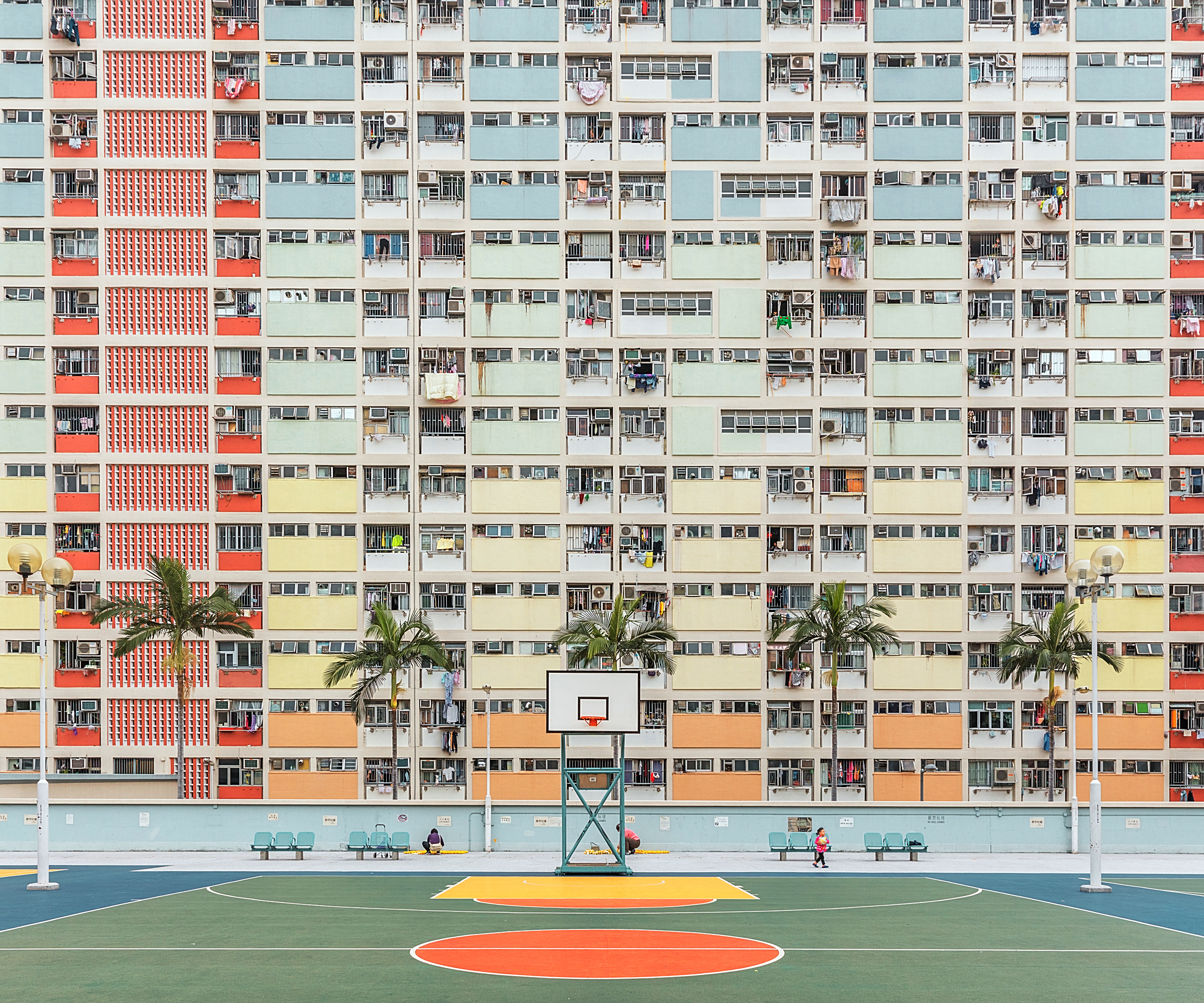
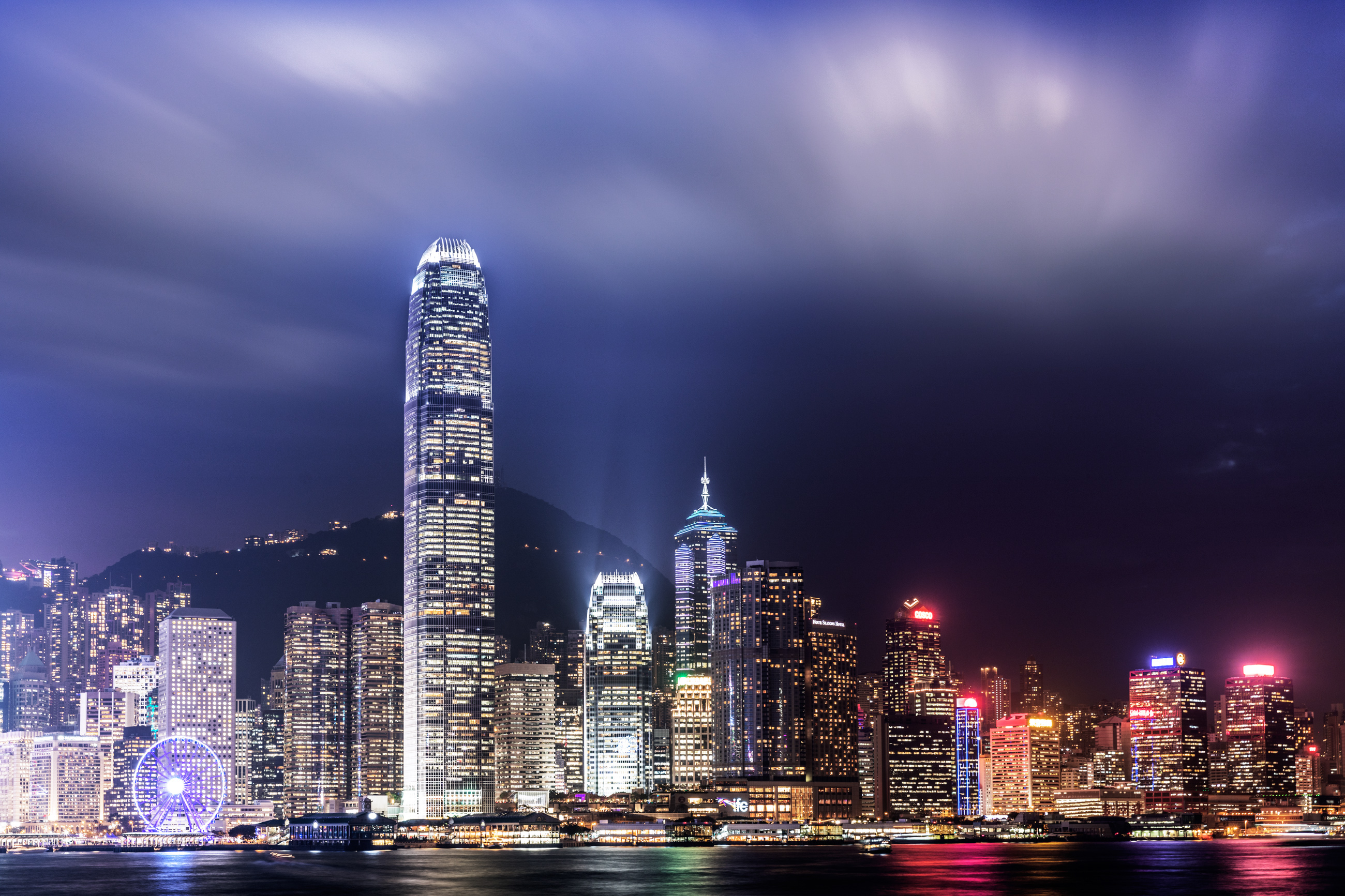
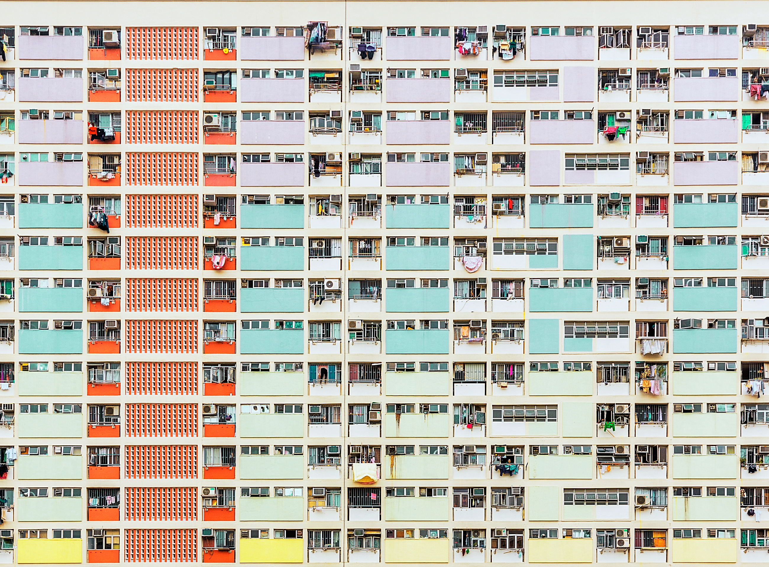
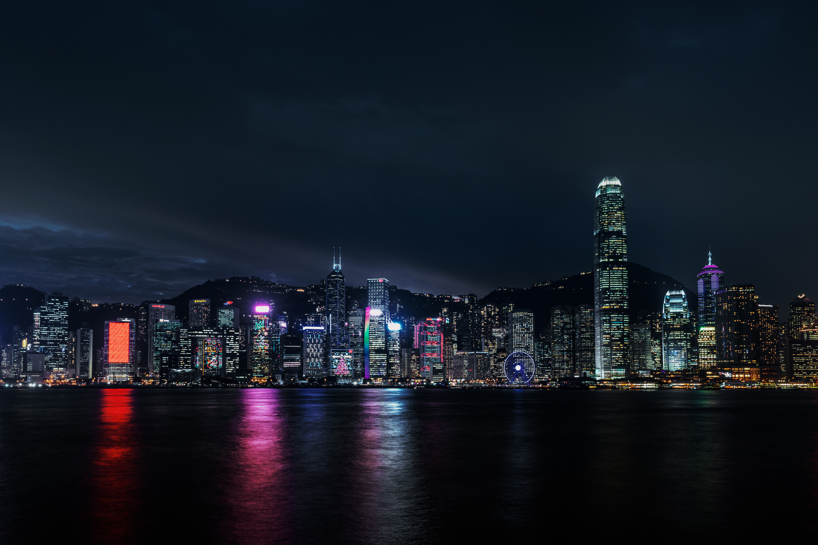
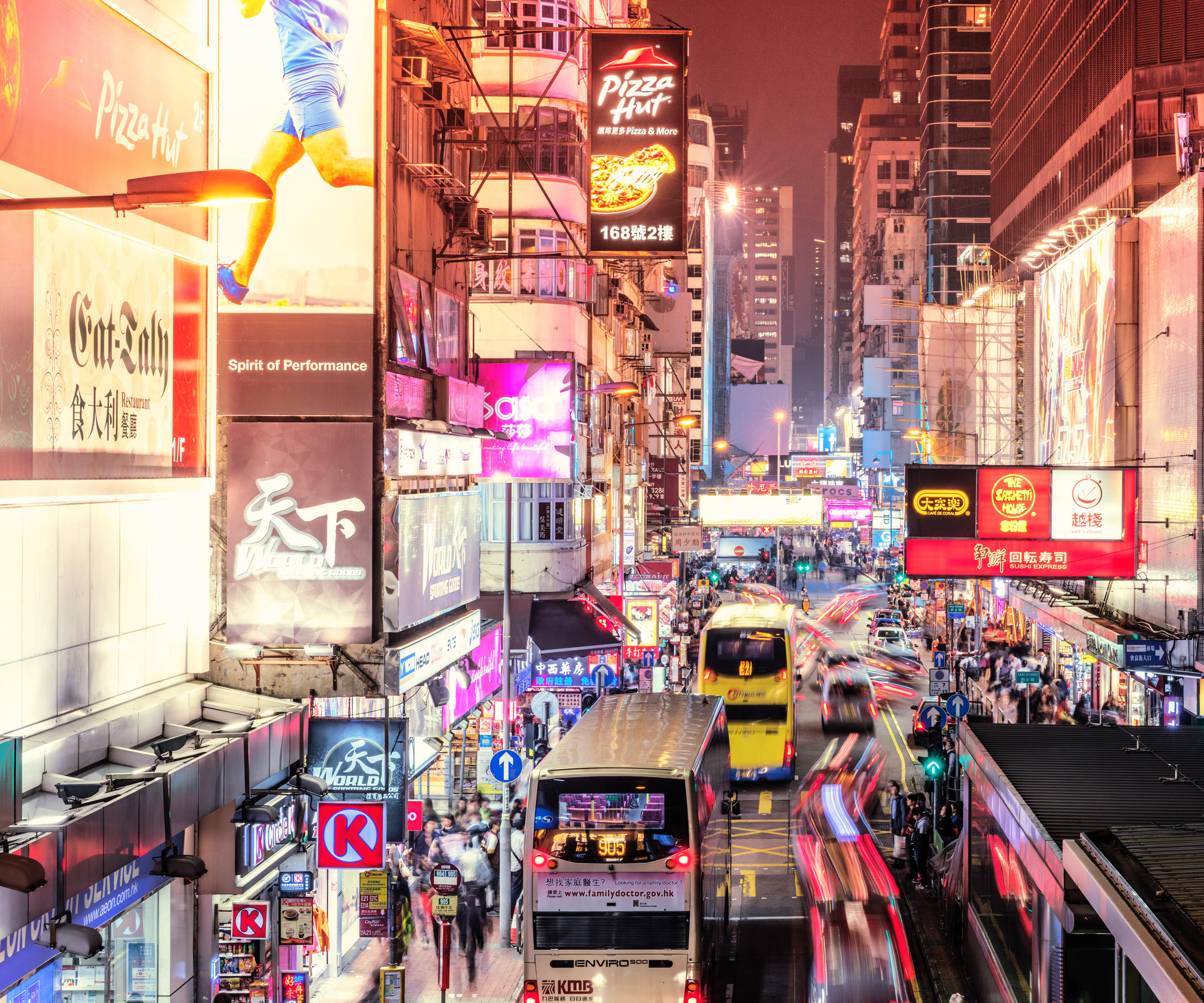
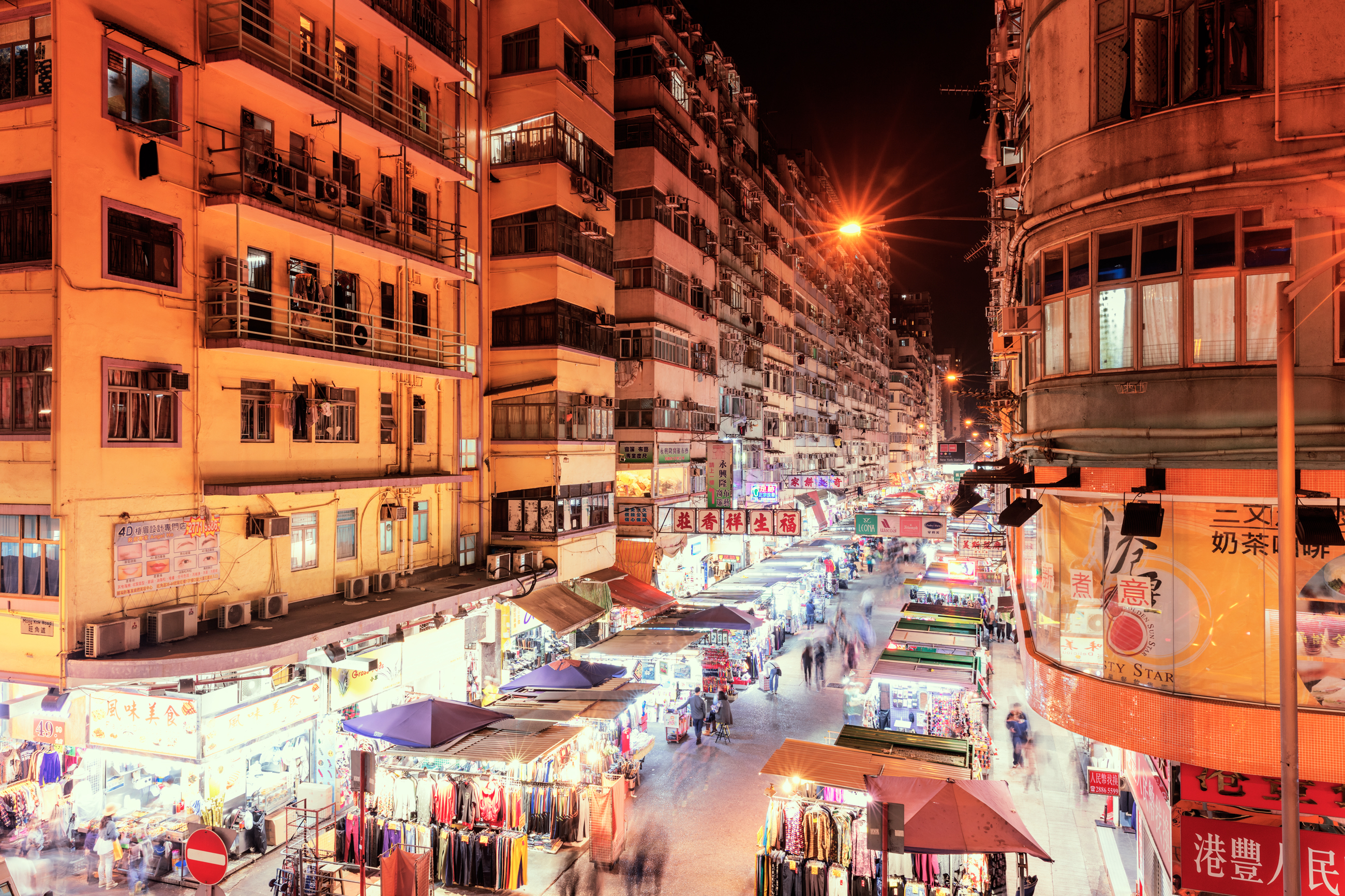
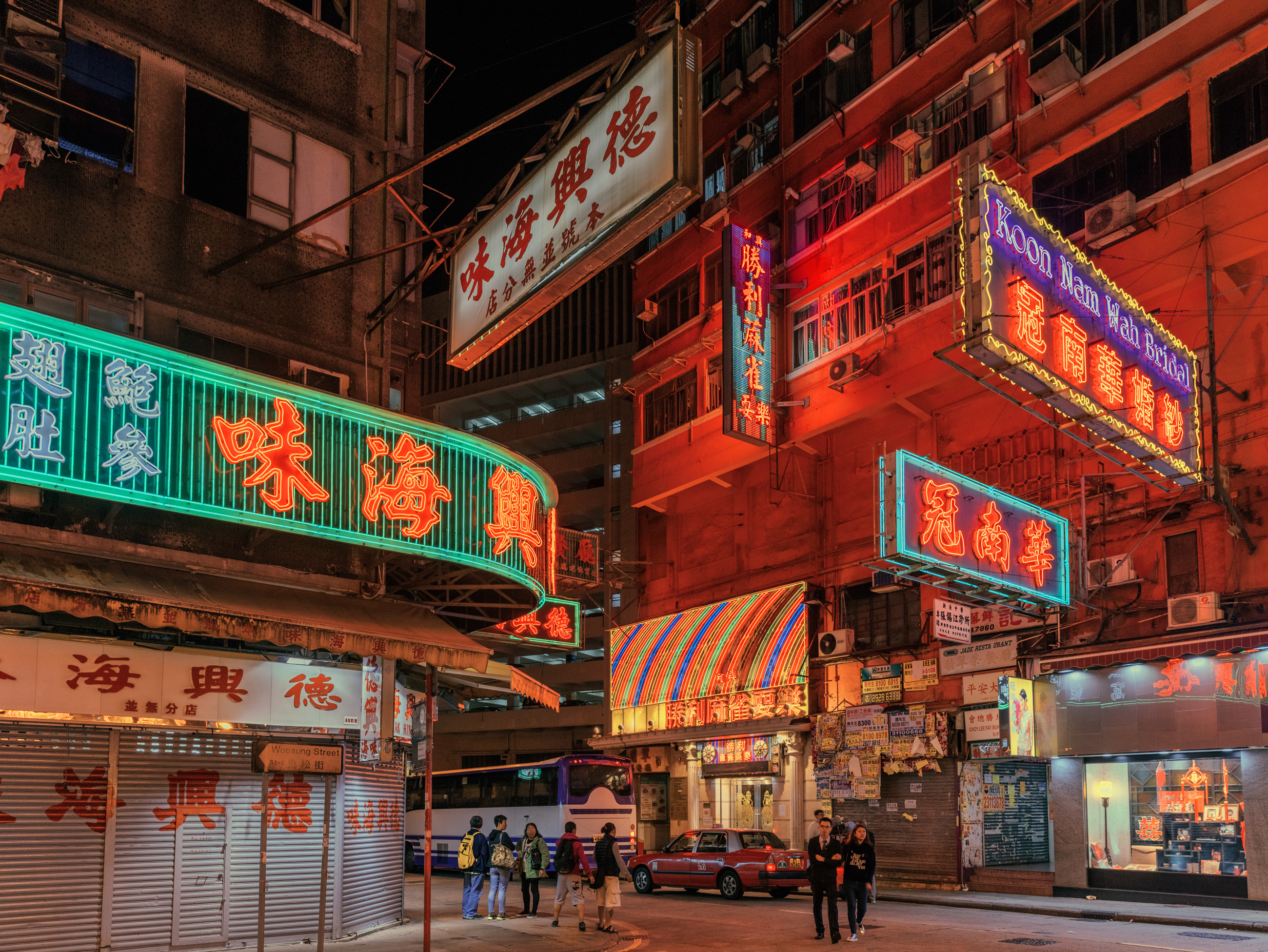
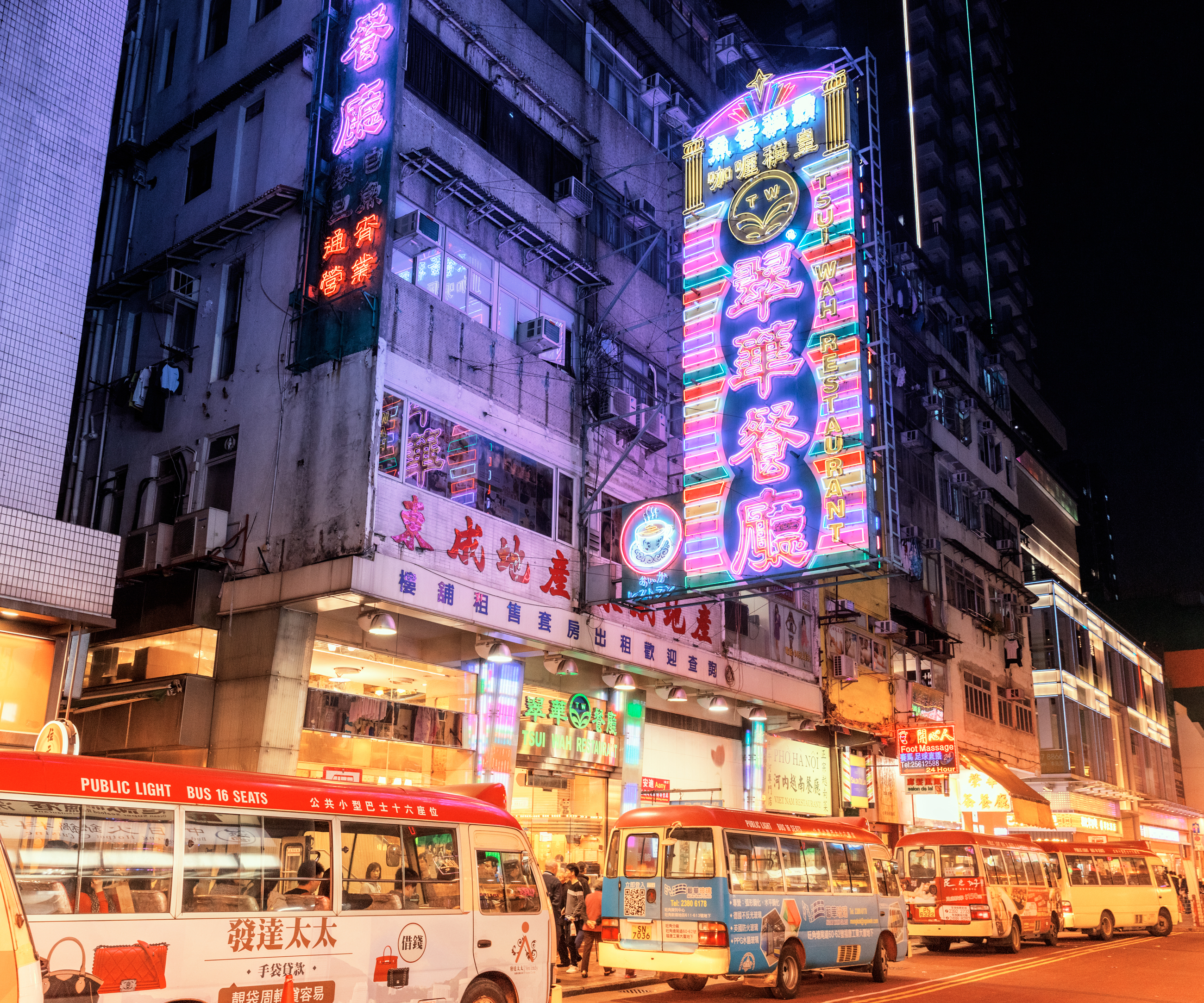
Digital Photography of Hong Kong by Ludwig Favre
Digital Photography of Hong Kong by Ludwig Favre
Let’s explore this digital photography series on one’s journey in Hong Kong by Ludwig Favre. From daytime till nighttime, he’s taking us through different locations where you can admire the colours of Hong Kong from its endless symmetry to its famous neon street lights. This series is inspiring enough to give that desire to pack your bags, your camera and book your next photo adventure. Don’t you think?
Behind this photo series, we have the work from Ludwig Favre who is a photographer based in Paris, France. Definitely follow his Behance, he has a variety of different projects to get inspired from photography to architecture.
Project Gallery


More Links
- Check out Ludwig Favre’s site: ludwigfavre.com
- Check out Ludwig on Behance
AoiroStudio
Jun 15, 2017
Source: Abduzeedo Photography
June 15, 2017
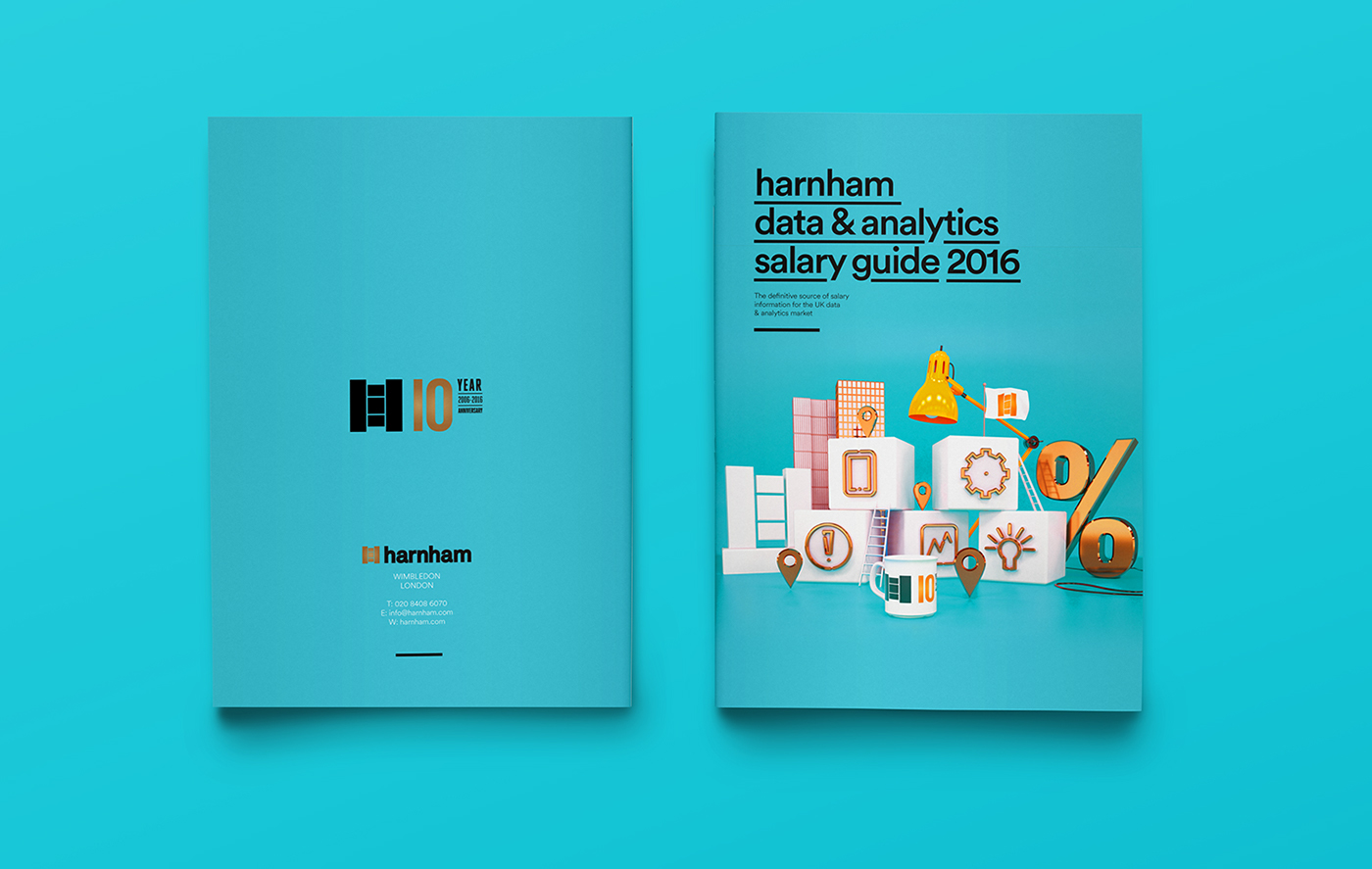
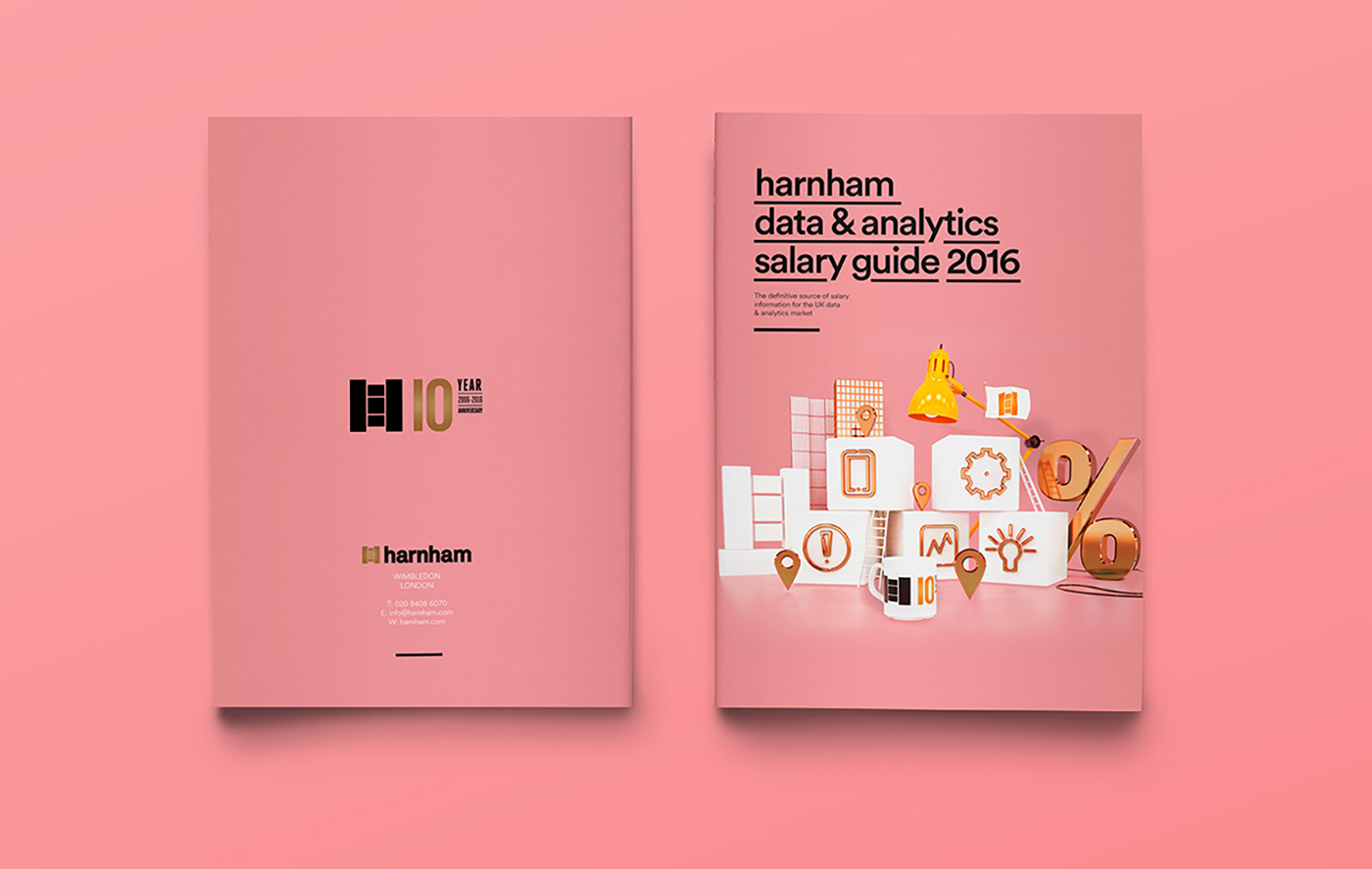
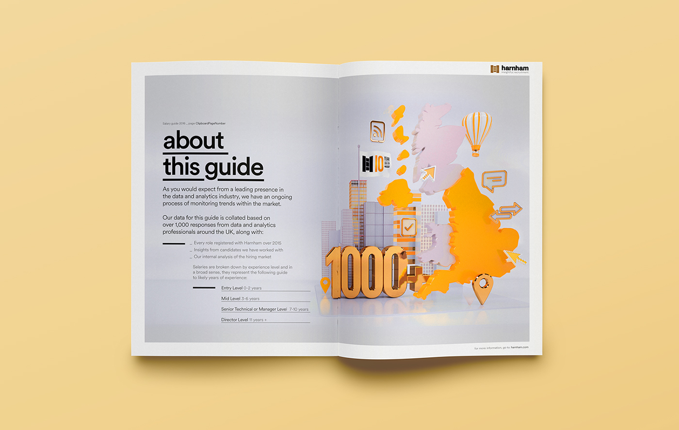
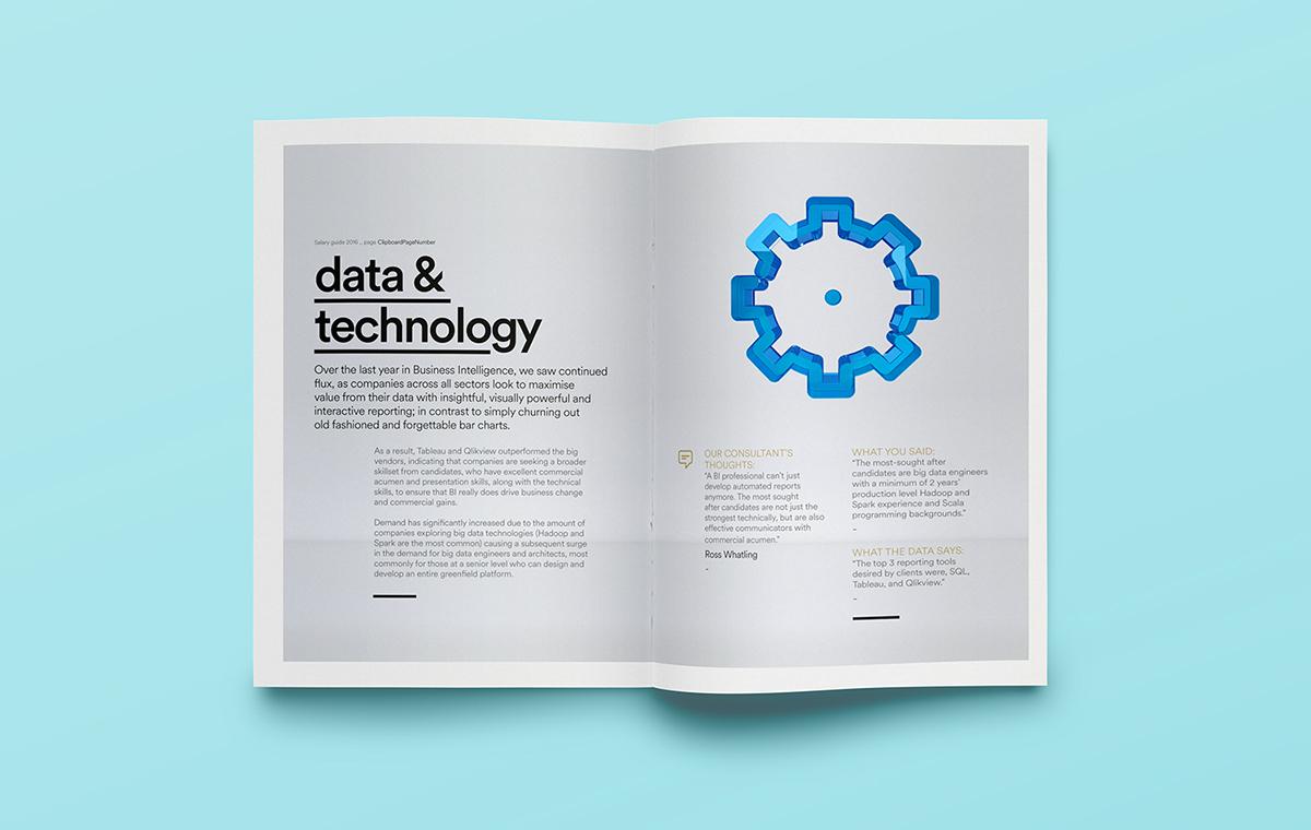
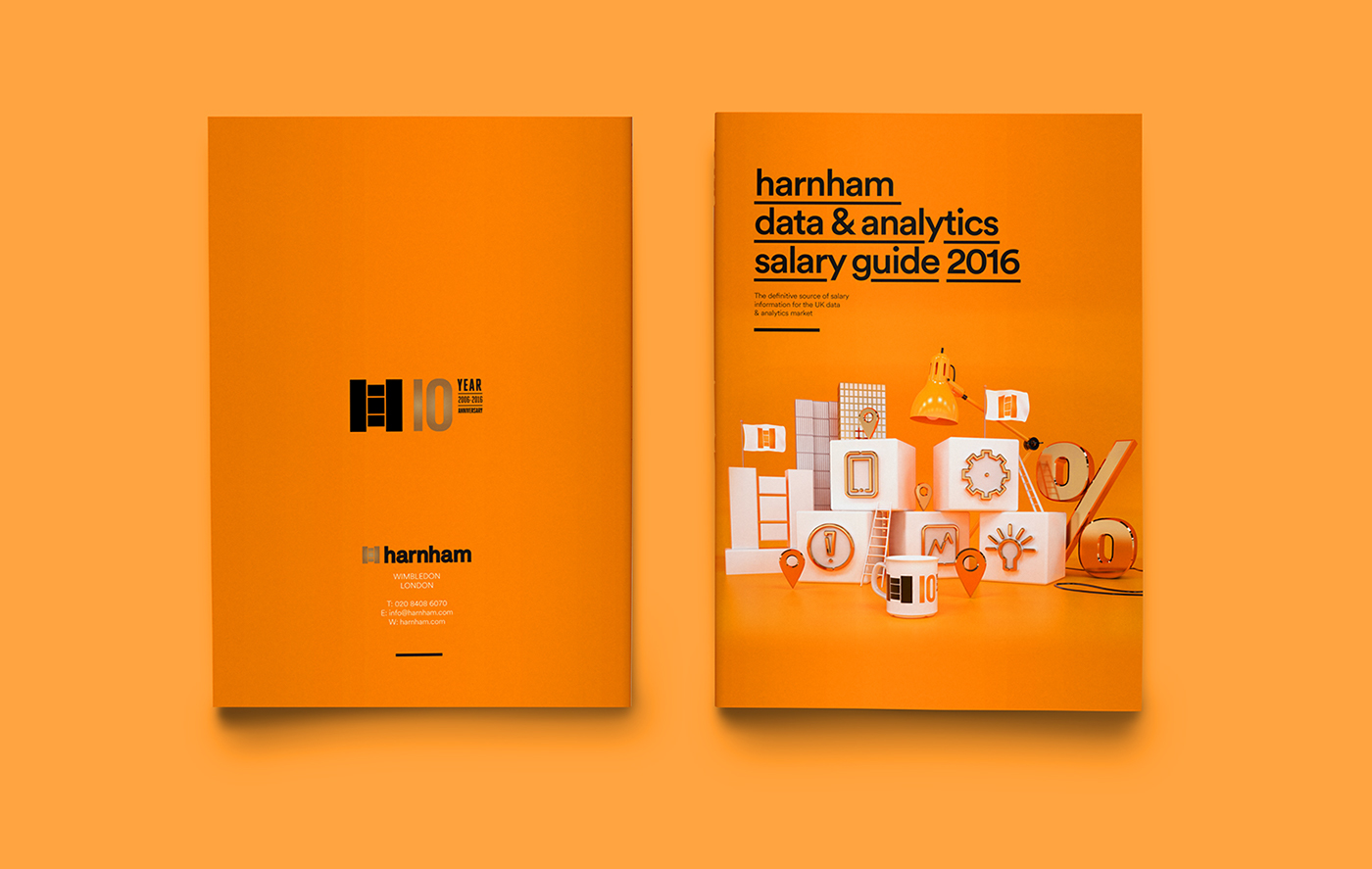
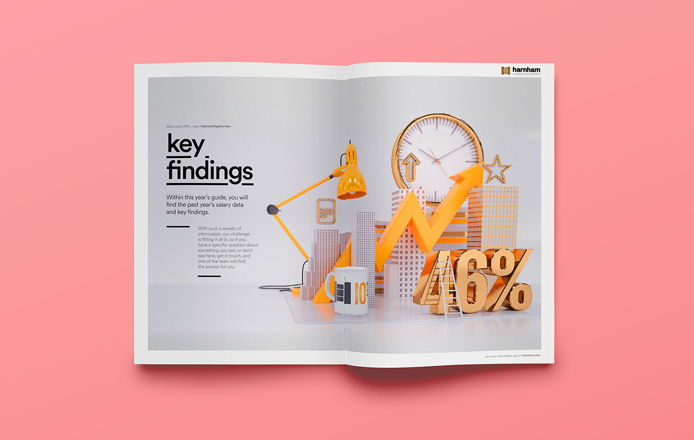
Illustration & Typography: Harnham Salary Guide (2016)
Illustration & Typography: Harnham Salary Guide (2016)
Mixing both 3D Illustration, Typography, and design, let’s take a look at the 2016 Salary Guide of Harnham. A guide that revealed the positive trends in the UK for Analytics and Data professionals and a distinctly candidate driven market. Designed by Craig Minchington and Radim Malinic, they both combined their skills into a composition of 3D, CGI, typography and a vibrant colour palette. Personally knowing both of their styles, the final result is a delightful mixture of a well-defined conceptual layout, props for their work.
This is a collaboration between Craig Minchington on the 3D Illustrations and Radim Malinic on the creative direction and design. See the full project on Behance.
Harnham’s Annual Salary Guide for 2016 reveals more positive trends in the UK for Analytics and Data professionals and a distinctly candidate driven market. This is a collaborative guide that is made possible by the participation of data and analytics professionals completing our survey. With their help, Harnham are not only able to put together our ever popular salary tables but a comprehensive view of the data and analytics market trends that will impact business hiring decisions in the coming year and beyond.
Project Gallery


Credits
- Creative direction and design: Radim Malinic / Brand Nu
- 3d Illustration: Craig Minchington / Adora Attack
More Links
- Check out Craig’s site: adoraattack.com
- Check out Radim’s site: brandnu.co.uk
AoiroStudio
Jun 15, 2017
Source: Abduzeedo Illustration
June 14, 2017
California startup mixes 7K photos, 3K live-streams in a $99 360 camera
Stream to Facebook Live or YouTube without sacrificing resolution with this camera from a California start-up. The company says the VRDL360 is the first that mixes 7K photos, 3K photos and live-streaming from one device.
The post California startup mixes 7K photos, 3K live-streams in a $99 360 camera appeared first on Digital Trends.
Source: Digital Trends VR
June 14, 2017
2018 SXSW Showcasing Artist Applications Open on June 26

Now is the time for artists to begin making plans for showcasing at the 2018 SXSW Music Festival. 2018 Music Festival Showcase Applications will open on Monday, June 26. Fill out the application on SXSW’s website to be considered by our Music Festival programming team for an official performance at the leading music industry event of the year.
The initial application fee for Showcasing Artist applications will be $35. The early deadline to apply is Friday, September 8. After this deadline, the application fee will be $55. The final application deadline is Friday, October 20.
Considering applying? The SXSW Music Festival presents a great opportunity to network with industry pros and perform with thousands of artists from all over the world. More than 2,000 Showcasing Artists performed at SXSW this past March, with 544 of those acts representing 63 countries outside of the U.S. As a leading industry event, there will be reps from record labels, booking agencies, management and PR firms, publishers, and media outlets in attendance, as well as up-and-coming musicians and potential future fans. Showcasing Artists can also attend SXSW Conference sessions to learn from music icons and industry veterans about their craft.
Please visit the Showcase FAQ page for more information about performing at the 2018 SXSW Music Festival, and visit the showcase applications page beginning Monday, June 26 to apply.
Sundara Karma photo by Amy E. Price / Getty Images
The post 2018 SXSW Showcasing Artist Applications Open on June 26 appeared first on SXSW.
Source: SxSW Music
June 14, 2017
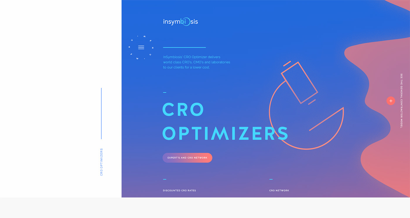
Interaction Design & UI/UX: InSymbiosis Website
Interaction Design & UI/UX: InSymbiosis Website
And yet another Interaction Design & UI/UX for you guys today. This time is the work from Phoenix the Creative Studio based in Montreal, QC for InSymbiosis. They are a pharmaceutical company and boy we know how most of them are looking pretty boring and unfriendly. Well, it’s not the case with this one. In a universe of what is sexy, original and scientific; what I love the most about this design is the hamburger button. I know what we all think about this button but this treatment is quite genuine and playful. Worth a look!
Phoenix the Creative Studio is a studio based in Montreal, QC, Canada (Yay!). They are focusing their work into emotions, interactions; create brand experiences that engagge people. Breaking standards in the goal to connect people together.
InSymbiosis is a pharmaceutical company that assists in the development of new medicinal drugs. The company acts as a mediator between the client and the research and marketing team. Far from the austere and dull look of the medical world, we created a universe both sexy, original and scientific. We wanted a fresh and innovative website that offered a friendly vision of the pharmaceutical world. Our team, which was keen to leave behind the typical illustrations of pills, microscopes and white blouses, turned to the theme of the aquatic and microscopic universe. Numerous animations populate the website; in particular molecules and anemones created in WebGL which interact with the user in a floating movement.
Project Gallery


More Links
- Check out Phoenix the Creative Studio Site: phoenix.cool
- Follow Phoenix Studio on Behance
AoiroStudio
Jun 14, 2017
Source: Abduzeedo UI/UX
June 14, 2017
Your Microwave Isn’t Listening, But These Devices Are
- 88% of Americans say it is important that they not have someone watch or listen to them without their permission.
- However, the demand for voice-first devices (like Alexa or Echo) is expected to grow from 6.5 million in 2016 to nearly 25 million this year.
- Hackers, government agencies, and online companies might have access to your data/info if you’re not taking the proper steps to protect yourself.

Source: Visual News
June 14, 2017
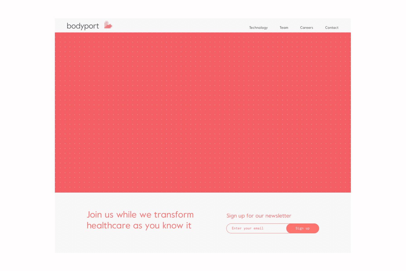
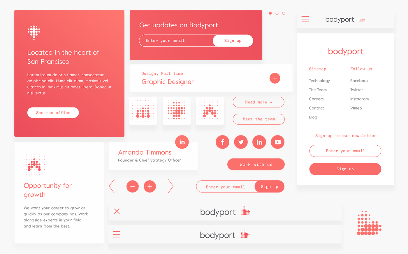
Web Design & UI/UX: Bodyport Start-up
Web Design & UI/UX: Bodyport Start-up
Let’s take a look at this superb web design and UI/UX project from the mighty folks from Anagrama and their work for Bodyport. They are a San Francisco based start-up dedicated to the development of at-home cardiovascular monitoring technologies at the reach of everyone. The whole UI across the identity and web design has been made to be easy and friendly to follow. I loved the micro-interactions from the header to icons, it’s pretty neat. I personally wish there was an additional colour to balance the contrast but that might be just me. Hope you like it!
Anagrama is a studio based in Mexico City. They focus their work into branding, graphic design and packaging. We have featured their work before on ABDZ, give it a look!
The website’s objective aims to educate the user about Bodyport’s technological attributes through simple and friendly graphical representations on an informative tour. The identity system manifests around the navigation while the visual breaks and interaction strengthens the content and communication with the user.
Project Gallery


More Links
- Check out Anagrama Site: anagrama.com
- Follow Anagrama on Behance
AoiroStudio
Jun 14, 2017
Source: Abduzeedo UI/UX