-
News & Updates
Uncategorized
June 2, 2017
The Daily Chord Weekly Recap – Friday, June 2

In this week in music news, failed festivals drew legal action and warnings from industry leaders, with Canada’s Pemberton event receiving scrutiny. Spotify’s settlement of class action suits from songwriters brought a long-simmering dispute to an end. These and other milestones, business maneuvers, scene reports and lists of upcoming music are compiled, posted and emailed in The Daily Chord. Shoot us your email and we’ll show up in your inbox each weekday.
Tuesday, May 30
-
Gregg Allman, southern rock pioneer, dead at 69
Obituary from Rolling Stone -
Spotify settles class action lawsuits filed by David Lowery and Melissa Ferrick with $43.4 million fund
Post from Billboard -
Linkin Park beats expectations with 6th chart topping album
Post from NY Times -
Geiger, Riley talk Pemberton
Post from Pollstar -
The Pitchfork guide to upcoming releases: Summer 2017
Post from Pitchfork -
The 12 best summer music releases you may have missed
Post from Salon
Wednesday, May 31
-
How is a major concert organised at short notice?
Post from BBC News -
Pitchfork president Chris Kaskie is stepping down
Post from Billboard -
YouTube must not be allowed to benefit from ‘legalised piracy on an unimaginable scale’
Commentary from Music Business Worldwide -
Taylor Swift’s record label releases vodka
Post from The Spirits Business -
City of dreams: Music and politics meet in the border community of McAllen, Texas
Feature from Pitchfork -
Radiohead’s rhapsody in gloom
Story from Rolling Stone
Thursday, June 1
-
Booming Blackpool: The musical rebirth sweeping Britain’s coastal towns
Story from The Guardian -
MQA, Nugs.net offer hi-res live recordings of Metallica, Bruce Springsteen, others
Post from CE Pro -
Music festival’s mystery disturbs council members
Post from Lansing State Journal -
This song uses star sounds to blow your mind
Post from Gizmodo -
Everfest raises $3.6 million from Live Nation, ATX Seed Ventures
Post from Variety -
How outlaw country keeps the renegade independent spirit alive
Video from Noisey
Friday, June 2
-
Why Universal is like cheese puffs, and could be headed for an IPO
Post from Music Business Worldwide -
Fyre was bad. For the concert industry, this one could be worse.
Story from NY Times -
Arcade Fire announce ‘Infinite Content’ tour
Item from NME -
Five music executives primed for TV – and the label president who got bumped from ‘Boy Band’
Post from Variety -
Eminem’s ‘Stan’ is now officially in the dictionary
Post from MTV News -
Look at me! The noisy, blown-out SoundCloud revolution redefining rap
Post from Rolling Stone
The post The Daily Chord Weekly Recap – Friday, June 2 appeared first on SXSW.
Source: SxSW Music
June 2, 2017
SXSW Alumni Film Releases – June 2017
Discover some of the SXSW alumni films on release this month, such as BABY DRIVER, THE BIG SICK, and THE HERO. Continue on for a complete list with trailers and more info.

BABY DRIVER
Narrative Feature, World Premiere, 2017
Website | Trailer
The latest film from cult favorite Edgar Wright stars John Hamm, Kevin Spacey and rising star Ansel Elgort in a relentlessly gripping thriller with a killer soundtrack.
In theaters June 28

THE BIG SICK
Narrative Feature, 2017
Website | Trailer
Kumail Nanjiani draws on his own life story for this hilarious, painfully real look at the complexities of 21st century relationships.
In theaters June 23

THE HERO
Narrative Feature, 2017
Website | Trailer
A typically charismatic, nuanced performance from the legendary Sam Elliott grounds this perfectly pitched, idiosyncratic drama that also stars Nick Offerman and Laura Prepon.
In theaters June 9

THE INCOMPARABLE ROSE HARTMAN
Documentary Feature, World Premiere, 2016
Website | Trailer
One of the great unsung heroes of celebrity photography, Rose Hartman finally gets her due in this playful portrait of the iconic artist.
In theaters June 2

LIFE
Narrative Feature, World Premiere, 2017
Website | Trailer
Jake Gyllenhaal stars in this claustrophobic, inventive sci-fi horror film that closed out this year’s SXSW Film Festival with a bang. Also stars Ryan Reynolds and Rebecca Ferguson
Digital HD from Amazon Video and iTunes on June 2

LONG STRANGE TRIP
Documentary Feature, 2017
Website | Trailer
The inspiring, complicated, downright messy tale of the Grateful Dead, a tribe of contrarians who made art out of open-ended chaos, and inadvertently achieved success on their own terms.
In Theaters May 27

MISSION CONTROL: THE UNSUNG HEROES OF APOLLO
Documentary Feature, World Premiere, 2017
Website | Trailer
This gripping documentary shines a much-needed spotlight on the plucky Houstonians behind one of the most important exploratory missions in history, space-bound or otherwise.
On Blu-ray and DVD June 27

SUNTAN
Narrative Feature, North American Premiere, 2016
Website | Trailer
Sun, sea, sand and sexual frustration set the tone for this dark drama, part of an exciting wave of new films from Greece, and now available on DVD.
On DVD June 13

T2: TRAINSPOTTING
Narrative Feature, US Premiere, 2017
Website | Trailer
Danny Boyle returns with the long-awaited sequel to his seminal sophomore feature, and its as inventive as ever. A secret screening at SXSW 2017, the film is finally available for home viewing.
On Blu-ray/DVD June 27
The post SXSW Alumni Film Releases – June 2017 appeared first on SXSW.
Source: SxSW Film
June 2, 2017
SXSW 2017 World Premiere of I’m Dying Up Here Debuts on Showtime [Video]
“I’m really proud to be premiering here. It’s comedy and there is this sort of rock and roll element to it. It feels like this is the perfect festival for us,” said Executive Producer Michael Aguilar.
The World Premiere of the new Showtime series I’m Dying Up Here , took place at the 2017 SXSW Film Festival, but will make its debut this Sunday, June 4th at 10pm ET/9 CT.
The series follows the trials and tribulations of the LA comedy scene in the 1970s, with much of it based on executive producer Jim Carrey‘s personal experiences.
Jonathan Levine acts as director while David Flebotte performs the duty of showrunner for the TV series. The show features an ensemble cast including: Melissa Leo, Ari Graynor, Clark Duke, Michael Angarano, Andrew Santino, Stephen Guarino, Erik Griffin, RJ Cyler, and Al Madrigal. Levine is best known for directing the Golden Globe®-nominated film 50/50. His additional feature credits include The Night Before, Warm Bodies, All the Boys Love Mandy Lane, and The Wackness. He directed the recent film Snatched starring Goldie Hawn (SXSWedu alumna) and Amy Schumer (SXSW Film alumna). Read our interview with David Flebotte below.
Q: Tell us a little about your series?
A: Set in L.A.’s infamous stand-up comedy scene of the 1970s, I’m Dying Up Here delves into the inspired and damaged psyches that inhabit the hilarious but complex business of making an audience laugh.
Q: What motivated you to tell this story?
A: I’ve been a fan of comedy since I was kid, starting with listening to Bill Cosby records and following such shows as All In The Family and M*A*S*H. I did some open mic and sketch comedy in the late ‘80s, early ‘90s and hung around with a lot of funny people. Add to that I’ve been working comedy writing rooms for the past 20 years so it felt like a great opportunity to work in a world that I truly love.
Q: What do you want the audience to take away from this TV series?
A: I hope they find it entertaining, honest and funny. It’s a fictional account of the time but we try to be as accurate as possible in our depiction of the time and energy that was the comedy circuit out here in LA after Carson moved here from NY. I hope that the audience finds it relatable. Granted the world of stand-up comedy is a bit rarefied, but there’s something universal in pursuing a dream and all the trials and tribulations that come with that pursuit. That there’s as much nobility and courage (as well as necessity) in failure as there is in success, and that one doesn’t happen without the other.
After you watch the pilot, be sure to check out our extended Q&A with the cast and crew, moderated by Doug Benson.
Explore More Content From SXSW 2017
Get inspired by a multitude of diverse visionaries at SXSW – browse more 2017 Keynotes, Featured Sessions, Red Carpets, and Q&A’s on our YouTube Channel.
Follow us on Facebook, Twitter, Instagram, and SXSW News for the latest SXSW coverage, recaps, late-breaking announcements, and updates.
The post SXSW 2017 World Premiere of I’m Dying Up Here Debuts on Showtime [Video] appeared first on SXSW.
Source: SxSW Film
June 2, 2017
This Month’s 15 Best Data Visual Inspirations
1. Film Money by DataMake

A minimalist interactive data visual that looks at what it actually takes to finance movies. As you scroll through the visual, you get an idea of how the film industry fluctuates as the visual transforms to highlight various budgetary differences.
2. What Makes a Good Visualization? by David McCandless

David McCandless, founder of Information is Beautiful, created this graphic as a visual guide of the four elements he believes are necessary for a well-crafted data visualization. This is a great tool for anyone looking to design their own data visual but is unsure of where to start.
3. On The Trump Emoto-Coaster by Periscopic

This data visual mixes interactive elements as well as video elements to create a completely immersive experience. The interactive charts reveal information as well as match video segments for each dominant emotion.
4. Literary Constellations by C82

These beautiful visualizations offer a unique take on classic literary works of art, such as Dracula and Robinson Crusoe, by analyzing each book’s parts of speech and first sentence from every chapter. The visuals create sections of the night sky by generating constellations out of words found in each chapter.
5. World Bank Group Education by Column Five

The two interactives look at different aspects of educational programs the World Bank finances. This allows users to get a broad look at the various organizations but also gives them the ability to take an in-depth look as well. This creates an uncluttered experience while still providing all the necessary information.
6. All Fights in Dragon Ball Z by Nadieh Bremer

If you’re a fan of Dragon Ball Z, this comprehensive look at all of the fights that occurred throughout the 291 episodes is the perfect way to get a mental refresh of the anime. The interactive multi-colored chart is playful and perfectly presents the information in a way that isn’t too overwhelming, considering how much is being delivered.
7. The Tallest Statues In The World by Marco Hernandez

This visual is not only artistically stunning, it is also highly informative and offers up some interesting facts about important statues across the globe. Available to be viewed in print version, on a desktop, or on a mobile device, the visual is well-designed and well thought out for cross-platform applications.
8. 30 Years of Oil and Gas Pipeline Accidents by CityLab

This startling visual is straightforward and uses little flare to portray the severe impact of oil and gas pipeline accidents. The simplicity of the dots amassing on the map as accidents across the country accumulate is enough to highlight the gravity of the situation.
9. One Angry Bird by Periscopic

This beautiful visual beautifully interprets the emotional arcs of the past ten U.S. presidential inaugural address as multicolored feathers. Users can scroll through and quickly determine the dominant emotion president’s portrayed during their speech and click on sections of the feather to view the speech in a popup video screen.
10. Baby Connect by andrew_elliot

Voted as the most beautiful data visualization of all time in Reddit’s r/dataisbeautiful forum, this simple image actually represents six months of Reddit user’s andrew_elliot’s daughter’s life in one continuous thread. The journey begins at the center of the circle (birth) then wraps outward as she ages with dark blue representing the time when she was asleep and yellow for when she was awake. A full revolution is equal to one 24-hour day making midnight the top of the clock.
11. Sierra Nevada Global-Change Observatory by Carmen Torrecillas

This visual has a lot of information on it, but the organization and neatness make it easy to navigate and understand. The thin multi-colored lines make for a beautiful system to interpret the abundant and varied bits of data.
12. What Drives A Designer? by Maga Design

A simple and to the point set of visuals, this particular example makes use of contrasting colors to compare different details of the design industry. Users can quickly determine the two distinct aspects of the study and hone in on the relevant information.
13. Data Visualization of Trump Trends on Social Media by Affinio and TechRepublic

This set of graphics looks at the rising influence of social media in politics, paying particular attention to Donald Trump’s campaign prior to his election. The color-coded categories and adjoining threads show how the different demographics and social groups connected in conversation over Trump’s inauguration.
14. Paid Parental Leave Benefits by Column Five

This data visual perfectly separates relevant information into different blocks, creating distinct sections of related sets of data, while color continuity unifies all of the information together.
15. Death in Syria by The New York Times

As users scroll through this visual, the thousands of dots that cover the screen paint a startling picture of the situation in Syria. It’s simplicity yet effectiveness to illustrate the gravity of the situation is perfectly executed and designed, down to the color choice and large numerical font.
Source: Visual News
June 2, 2017
Microsoft Research Reveals New, Slimmed Down AR Glasses
The Microsoft Research Team revealed a new pair of augmented reality glasses today that offer an exciting form factor, even if their performance …
Source: CW’s Flipboard Feed
June 2, 2017
Conceptual Art & Illustration by Sylvain Sarrailh
Conceptual Art & Illustration by Sylvain Sarrailh
We are looking at the conceptual art & illustration work of Sylvain Sarrailh who is currently based in France. His stylish art always has been a mixture of illustration and also painting. What I like about his art is the non-presence of the main character which is presented as a shadowed silhouette, kind of giving this “Seul Au Monde” atmosphere across. We would definitely suggest you guys check out his ArtStation where you’ll see more of his latest work, hope you will enjoy!
Behind this art, we are featuring the stunning work from Sylvain Sarrailh who is a freelance concept artist based in Toulouse, France. We have featured his work before on ABDZ. It’s nice to see his progression at crafting his art throughout the years, it has definitely been rewarding for him.
Photo Gallery


More Links
- Follow Sylvain’s Work on ArtStation
- Follow also Sylvain on Behance
AoiroStudio
Jun 02, 2017
Source: Abduzeedo Illustration
June 1, 2017
Every NBA Finals game will offer highlights in virtual reality
For the historic third straight NBA Finals meeting between the Cleveland Cavaliers and Golden State Warriors, the NBA is giving game-by-game highlights and a full series documentary in virtual reality.
The post Every NBA Finals game will offer highlights in virtual reality appeared first on Digital Trends.
Source: Digital Trends VR
June 1, 2017
A Conversation with Nirvana’s Krist Novoselic at the 2017 SXSW Conference [Video]
“Seattle music was selling music world-wide to international acclaim and then we were getting basically shut down by the state and city . . . we started to advocate a message with legislators that our music community is an asset and not a liability and we bring cultural and economic vitality to the region and we started to change perspectives . . . and that’s how I got my civic education.” – Krist Novoselic
Krist Novoselic, bassist of legendary rock band Nirvana and Board Chair for FairVote, joins us for this Featured Session at the 2017 SXSW Conference for a conversation with John Avlon, Editor-in-Chief and Managing Director of The Daily Beast, and a CNN political analyst.
This conversation provides an entry point for anyone interested in learning more about proposed election and voting reforms in the United States election process. FairVote, a non-profit that seeks to make democracy fair by reforming voting processes, seeks to re-incentivize the democratic process to combat the political apathy that develops in groups that feel under-represented in democracy. Novoselic, an influential part of the Northwest political scene, and Avlon cover the key components of reform such as preferential balloting and independent redistricting commissions, while keeping the conversation accessible to those who are new to the concepts.
Watch the full SXSW 2017 Featured Session in the video above featuring a conversation between Krist Novoselic (Nirvana, FairVote) and John Avlon (The Daily Beast), and an extended Q&A session with the audience. In the Q&A, Novoselic opens the conversation up to cover anything that audience is curious about including his music career.

Explore More Content From SXSW 2017
Get inspired by a multitude of diverse visionaries at SXSW – browse more 2017 Keynotes, Featured Sessions, Red Carpets, and Q&A’s on our YouTube Channel.
Follow us on Facebook, Twitter, Instagram, and SXSW News for the latest SXSW coverage, recaps, late-breaking announcements, and updates.
Photo by Nicole Burton
The post A Conversation with Nirvana’s Krist Novoselic at the 2017 SXSW Conference [Video] appeared first on SXSW.
Source: SxSW Music
June 1, 2017
HOW WE MADE 101 LINKEDIN GRAPHICS IN 24 HOURS
This article originally appeared on Column Five.
There’s nothing we love more than solid data storytelling, especially when we get to help a brand bring their own data to life. LinkedIn’s 2017 Workforce Report is our latest collaboration with the brand—and a stellar example of how to turn internal data into headline-worthy content. If you’ve been hesitant to use your own data in your marketing, their example will convince you to do it ASAP.
LINKEDIN’S DATA GOLDMINE
We’ve collaborated with LinkedIn on many projects over the last few years, helping the company communicate through e-books and infographics. (We also trade content marketing tips from time to time.)
Since we believe strongly in LinkedIn’s mission to connect people to opportunity, we’re always happy to help them reach their audience through compelling visual content. Luckily, they have plenty of great ideas for all sorts of content, thanks to their goldmine of data.
With access to 133 million U.S. worker profiles, 3 million monthly job postings, 20,000 companies, and the 50,000 potential job skills workers can add to their profiles, LinkedIn has especially unique insight into the state of the U.S. workforce.
Instead of letting that data rest in their servers, the brand wisely sought to turn it into a useful resource for their audience. Thus they created the LinkedIn 2017 Workforce Report, a monthly report to shine a light on the U.S. job economy.

Each month, they analyze the data for country-wide trends, as well as trends in 10 of the largest U.S. cities. The report details the most interesting and influential metrics about the American workforce, including hiring trends, migration between cities, and relative scarcity and abundance of skills.
The report is meant to help workers better navigate their careers and to give companies a better understanding of the state of their industries, making it a fantastic piece of content to support LinkedIn’s mission.
The report also happened to be an enormous undertaking, requiring some of the biggest design problem-solving we’ve ever had to do.
A DATA VISUALIZATION CHALLENGE
LinkedIn came to us with a formidable request to contribute data visualizations to the report; they needed us create 101 beautifully designed graphics and data visualizations every month—and deliver them within 24 hours of receiving the data. While this seemed impossible initially, even with our entire design team working on it, we knew we could do it if we figured out a way to automate the graphic creation process dynamically from the data.
Fortunately, our software company Visage, a web-based design platform that allows users to create visual content and reports, had been building a new feature to address this very significant yet common challenge. (Many clients and companies we talk to are struggling to find a solution for regularly creating well-designed graphics with minimal time and effort.)
To complete LinkedIn’s ask—and ensure accuracy and quality of the graphics—Visage and Column Five collaborated to create an automated system.
First, our team designed on-brand templates for the graphics and data visualizations that would accompany each report. Then we implemented these custom templates into Visage, where they could be easily edited by the LinkedIn team.

Our new Google Sheets integration enabled us to connect LinkedIn’s data directly to the report, so we could refresh the graphics with a single click when new data was received.

Through this process, the LinkedIn team was reassured that all charts were accurate, on-brand, and ready for publish as soon as they were created. Even better, we could create a high volume of visualizations in very little time.

It was exciting to test these new features with such an amazing client and come up with a helpful solution that both teams felt confident in. So far, the LinkedIn 2017 Workforce Report has been well-received, so we’re glad it paid off.
(Although only in its second month, the report has garnered 8,600+ mentions and significant buzz. In February, it was tweeted by Microsoft CEO Satya Nadella. March’s report was also tweeted by President Donald Trump and featured in a live segment on CNBC.)

We hope it will continue to make an impact each month, and we’re proud to be a part of the project.
We’d also encourage you to consider what data you might turn into a great piece of original content or regular series. If you need a little help, we’d absolutely love to help you out.
Want more on creating great data-driven content?
- Find out the 3 reasons you should pursue data storytelling.
- Check out the animated infographic we made to showcase NewsCred’s survey results.
- See how we turned 10 million data cells into a sleek interactive for Northwestern University in Qatar.
Source: Visual News
June 1, 2017
Filmmaker In Focus Series: Crime
Our next three films in our Filmmaker In Focus Series tell tales of danger, consequence, and risk. If you missed these standout movies at our film festival, all are available to watch now!
In Ben Young‘s debut feature Hounds of Love (SXSW 2017 North American Premiere, Narrative Spotlight), Vicki Maloney is randomly abducted from a suburban street by a disturbed couple and quickly realizes she must drive a wedge between them if she is to survive. Young is an award winning writer and director who began his career as a screen actor at the age of 12. He has since gone on to working in commercials, music videos, fashion, series television and short film. Hounds of Love is currently playing in theaters.
In the documentary Mommy Dead and Dearest (SXSW 2017 World Premiere, Documentary Feature Competition) Erin Lee Carr enlightens us about Dee Dee Blanchard and her ailing, wheelchair-bound daughter, Gypsy Rose and the mystery that surrounds their relationship. Carr is currently directing a third true crime story for HBO with producer Andrew Rossi as well as writing a book commissioned by Random House. Mommy Dead and Dearest is currently streaming on HBO.
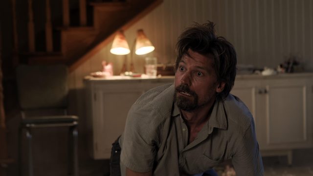
Small Crimes (SXSW 2017 World Premiere, Narrative Spotlight) follows a disgraced former cop, fresh off a six-year prison sentence for attempted murder, who returns home looking for redemption but winds up trapped in the mess he left behind. Evan Katz‘s directorial debut Cheap Thrills premiered at SXSW in 2013 where it won the Midnighter Audience award. Small Crimes is currently streaming on Netflix.
Hounds of Love

Q: Tell us a little about your film?
A: Hounds of Love is a psychological thriller exploring themes of control and codependence between a teenaged girl and a couple in their thirties who abduct her. It was shot in 20 days entirely on location in Western Australia over a period where the daily temperature was up to 107F.
Q: What motivated you to tell this story?
A: My mother is a crime fiction writer and often gave me books on true crime she’d read for her own research. One of these was about women who commit murder and I found it fascinating how their motivations were very different from why men tend to kill. This was something I hadn’t seen explored on screen much, certainly never in Australia, so it got me thinking about how I could do it. In further research I discovered the very real and unfortunate phenomenon of couples who kill together. This to me was a concept I felt provide the footings for an interesting and disturbing character driven, psychological thriller that could be executed for a low budget. As a director who’s interest is primarily in character and performance this seemed like the perfect idea for me to develop.
Q: Tell us a random fact?
A: I’m an Australian who grew up on a sheep farm about an hour away from where our film is set. I began my career as an actor at 12 then moved onto direct commercials, kids television, short film and music videos. While at film school I worked as a clown at kids birthday parties.
Mommy Dead and Dearest

Q: Tell us a little about your film?
A: Things are not always as they appear, especially in the case of Dee Dee and Gypsy Rose Blanchard. Child abuse, mental illness, and forbidden love converge in this mystery involving a mother and daughter who were thought to be living a fairy tale life that turned out to be a living nightmare.
Q: What motivated you to tell this story?
A: I could not believe that this actually happened.
Q: Tell us a random fact?
A: Well, I won the award for “Little Miss Irish Princess” in Hopkins, Minnesota in 1994 for doing a jig in front of city hall. Don’t worry, it was more of a Fargo thing than a Toddlers and Tiara moment. Now, I am obsessed with crime and the internet and I lucky enough for that to be my job.
Small Crimes
Q: Tell us a little about your film?
A: It’s a gonzo riff on the classic “Man Out of Prison” and “Search for Redemption” subgenres.
Q: What motivated you to tell this story?
A: To some degree my interest in seeing how far I could get an audience to follow somebody who is so obviously the wrong character to root for – also a chance to comment a bit on the political and social climate in our country these days. For some reason, the truth seems to hold less and less value to us as a culture, and I’m fascinated/horrified by what that says about us. I think the “hero” of Small Crimes (played beautifully by Nikolaj Coster-Waldau) is sort of a weird amalgamation of current politicians, and people that I know personally. There’s probably even a little bit of me in there.
Q: Tell us a random fact?
A: I have the attention span of a flea, but can tell you the name of the most obscure death rock album I listened only once way back in High School, if asked. I literally can’t remember a five numeral code two seconds after I’ve been told, even with a gun to my head. Please don’t test this. Also, I’m obsessed with food, hip hop, and anything pulpy, dark, and funny.
Explore More Content From SXSW 2017
Get inspired by a multitude of diverse visionaries at SXSW – browse more 2017 Keynotes, Featured Sessions, Red Carpets, and Q&A’s on our YouTube Channel.
Follow us on Facebook, Twitter, Instagram, and SXSW News for the latest SXSW coverage, recaps, late-breaking announcements, and updates.
The post Filmmaker In Focus Series: Crime appeared first on SXSW.
Source: SxSW Film