-
News & Updates
Uncategorized
March 2, 2017
Cinematography Tip: Control Window Light With ND Gels
Take control of window lighting on your next shoot with ND filters.<p><i>Top image via Shutterstock.</i><p>Windows are light sources that can work wonders — if …
Source: CW’s Flipboard Feed
March 1, 2017
The Best External Hard Drives for Video Editors
The professional video editor or filmmaker depends on a reputation for organization and reliability. Nothing can ruin a client relationship or career …
Source: CW’s Flipboard Feed
March 1, 2017
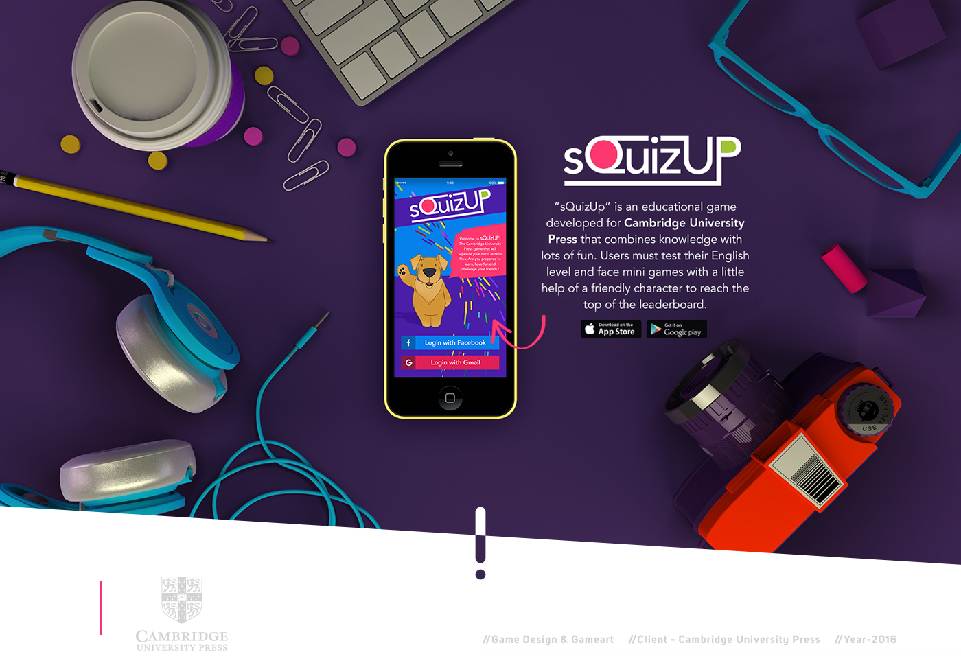
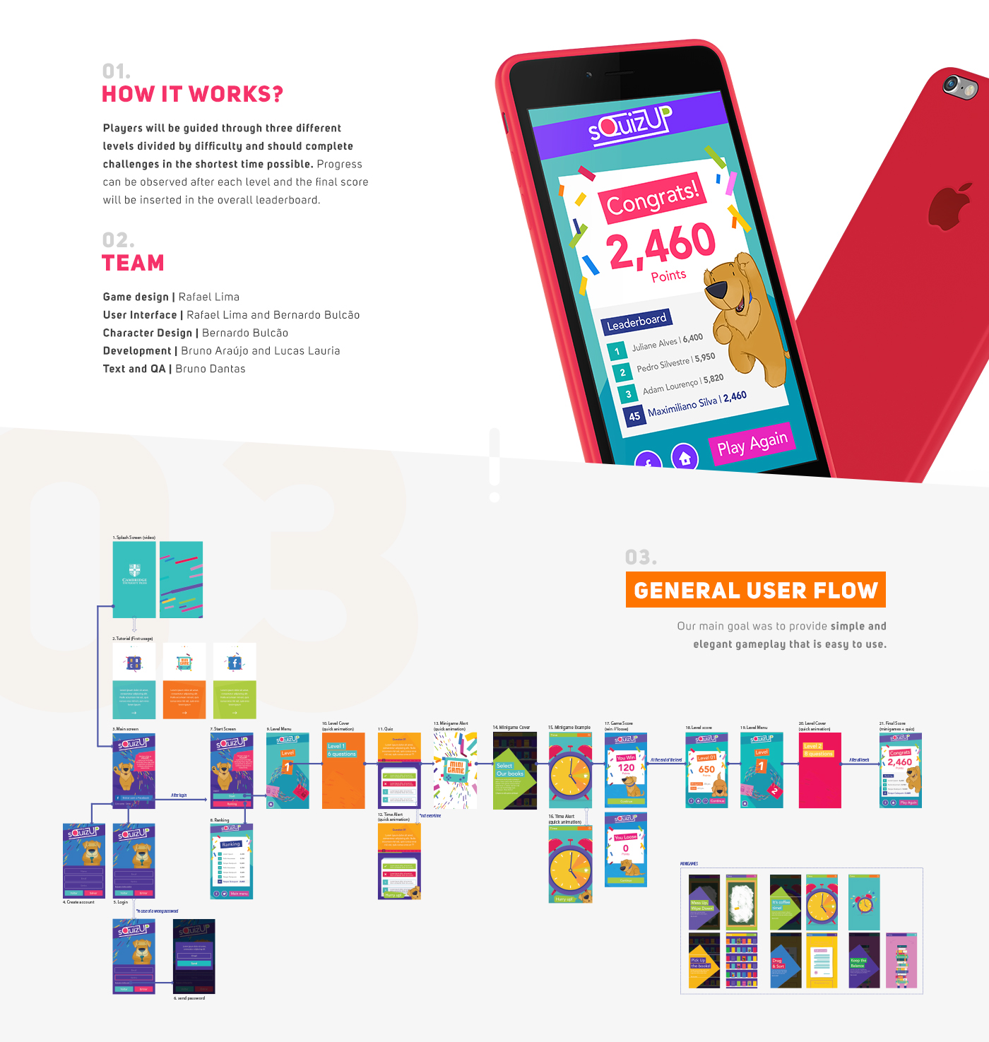
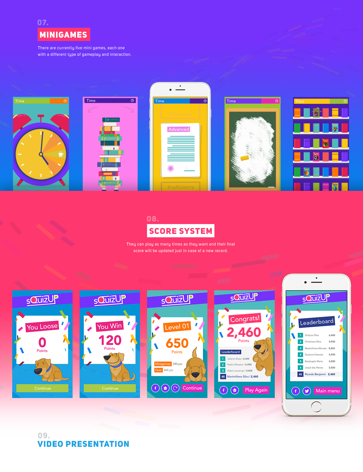
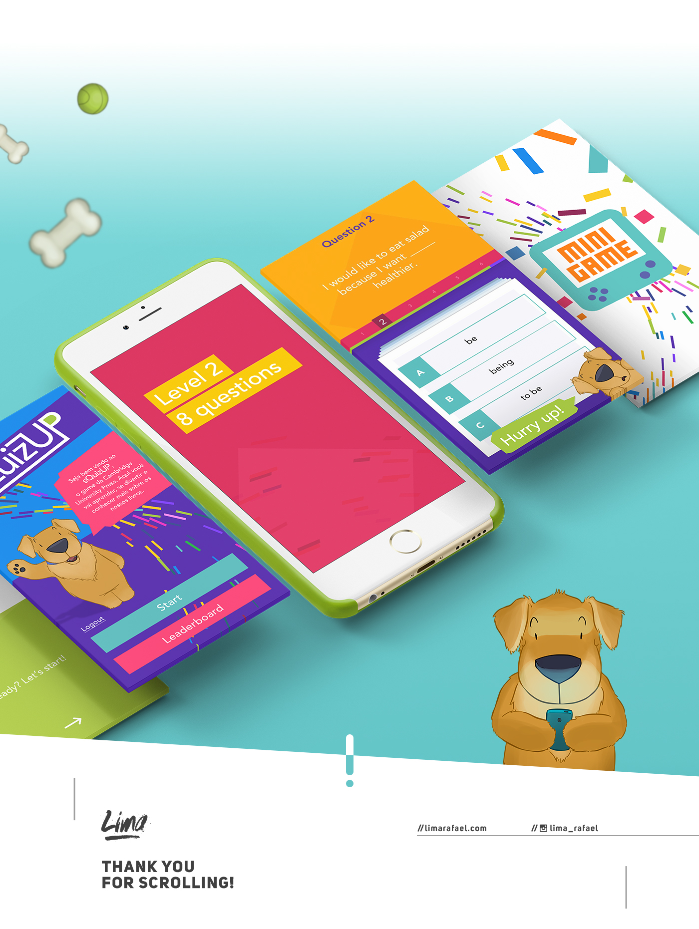
Game Design and Interaction Design: Cambridge sQuizUp
Game Design and Interaction Design: Cambridge sQuizUp
Cambridge sQuizUp is an interaction design, UI/UX and game design project shared by Rafael Lima and Bernardo Bulcão on their Behance profiles. Basically it’s an educational game developed for the Cambridge University Press that combines knowledge and fun by testing the gamers english level through mini games. They also created a character to help them through the game. The game design is super friendly and colorful, in addition to that, the project share more details about the basic IA of the game, which is always cool for us to see.
Rafael Lima is a designer with more than 6 years of professional experience in different fields of innovation with an emphasis on digital interface and user experience. In recent years he had the privilege of work in projects for important companies like Coca Cola, Faber Castell, Cambridge University Press, FAAP and CVC. I’m currently working at Samsung Ocean Center, focusing on research and development of apps and games for different kinds of android devices like smartwatches, mobile phones and Gear VR.
Bernardo Bulcão is an illustrator and character designer from Manaus, Brazil.
Game design and interaction design


abduzeedo
Mar 01, 2017
Source: Abduzeedo UI/UX
March 1, 2017
35 Super Creative Explainer Video Examples
Explainer videos are a great communication tool for brands. Whether you’re explaining a product or service, demonstrating how to do something, or introducing your company to a visitor, they’re a quick and easy way to deliver that info. They’re also an opportunity to showcase your brand in everything from the visuals to the voiceover. Apply a little creativity and even the most boring product can become an entertaining explainer video. If you need proof, we’ve rounded up 35 awesome explainer video examples.
Our Favorite Explainer Video Examples
From motion graphics to live-action, these show you how to engage viewers in very little time. Take a look below, and if you need more inspiration, find out why explainer videos work, learn how to craft an awesome explainer video script, and see the 10 keys to a great explainer video.
1. “Tonx Truly Great Coffee In Your Kitchen, Without Much Fuss” by Sandwich Video
2. “Wizzki Making Hiring Simple” by MyPromoVideos
3. “NextGlass” by breadnbeyond
4. “Super Sync Sports” by No Mint
5. “Instagram Direct” by Delve
6. “Unwanted Tracking Is Not Cool” by BLACKMATH
7. “British Gas” by CHI & Partners
8. “BYOB Lumberjack Party” by Motion Authors
9. “Stampsy Launch Video” by Twistedpoly // Nejc Polovsak
10. “Don’t Be A Pitch” by Vireo Films
11. “Dumb Ways To Die” by Passion Paris
12. “Shark Wrap” by Video Brewery
13. “Sevenly” by Sevenly
14. “Lettuce App” by Brandon Wall
15. “Introducing Whistle” by Manifold
16. “Poo-Pourri Second Hand Stink” by A76 Production
17. “LivePlan Explainer” by Palo Alto Software, Inc.
18. “One Is One…Or Is It?” by TED-Ed
19. “Industrial Internet of Things” by Honeywell
20. “Skype for Business: Simplifying Communication in the Cloud” by Office Videos
21. “Explainer Video on Explainer Videos” by Column Five
22. “Web Standards for the Future” by W3C
23.” Text Me Up App” by Thinkmojo
24. “Digit” by Giant Ant
25. “The Happy Home Company” by Doug Ludlow
26. “Get Rewarded for Not Texting While Driving” by XL Team
27. “Just The Cream” by BriefMe
28. “Think With Your Hands” by FiftyThree
29. “Create Your Own Business” by Squarespace
30. “Zopim Overview” by Zendesk
31. “Clear for iPhone” by Realmac Software
32. “The Value of Data Visualization” by Column Five
33. “Helping Blind See” by Be My Eyes
34. “Smart Mailbox” by Epipheo
35. “Salesforce Desk.com” by Oddfellows
If you could use a little outside help with your next explainer video, read our parent company Column Five‘s tips on how to choose a video agency. They’re always happy to chat about any ideas you might have, too.
Source: Visual News
February 28, 2017
Up Side Down: A Map Game That Will Have You Questioning Geography
The concept of north is “up” and south is “down” is a manmade idea. The only reason we perceive places to be geographically “up” or “down” is due to the composition of the conventional map. Some prime examples of how a map can change your perception of direction would be the early Egyptian maps that established the east as being on top and the early Muslim maps that positioned the south on top.

A beautifully designed version of a south-up, or upside down, map was made by Angus Hyland, a partner at the London office of Pentagram. Hyland had designed the map for the firm’s annual Christmas card but has since turned it into an interactive site with an online quiz.
The interactive map completely warps the idea of directionality. To play the game, you are tasked with naming cities and countries based on an out of context, zoomed in image of a random landmass or body of water that has been flipped in one way or another. Even if you’re a geography whiz you’ll still have a pretty difficult time.

As stated in a Pentagram blog post, the point of the game is to show just how arbitrary map orientations are:
The booklet and quiz mischievously play with the rigidity of the commonly accepted world map, which is increasingly at odds with modern GPS software that allows us to manipulate the space around us with a pinch of our fingers.
Change your perspective and test your geography smarts here.
[Via: Co.Design]
Source: Visual News
February 28, 2017
Web design: The Journal Concept UI/UX
Web design: The Journal Concept UI/UX
The Journal concept is a web design, UI/UX and graphic design project shared by Bohdan Kononets and Slava Kornilov on their Behance profile. As the name suggests, it’s a concept project for a journal or a blog if you prefer. There are so many good things about this project, in particular the detail pages. The little colored frame for content gives it a nice editorial style, of course there might be some issues like the images overlaying the borders. Anyways, it’s a great project and definitely inspired me for the next batch of changes on the Abduzeedo design.
Bohdan Kononets and Slava Kornilov are the designers and founders of Flat Studio, a team with full range of services. They have worked on projects for Google, Microsoft, Tesla, Rambler, Novo Banco, Continente, Uplabs and Cleverdo.
Our principal rule is to keep things simple, intuitive and adaptive for every person in the world.
For more information check out their website at http://flatstudio.co/
Web design


abduzeedo
Feb 28, 2017
Source: Abduzeedo UI/UX
February 27, 2017
Photography Challenge of the Week: #abdz_shadowplay
Photography Challenge of the Week: #abdz_shadowplay
And the photography challenge goes on! Yes! Mainly, It’s an open concept that is made purely for fun and also to improve your photos or mobile photography skills. The idea is simple! At the beginning of the week, we’ll share a theme through a hashtag for your pictures. During that given week, you will use that hashtag whenever you seem is appropriate or not. On Friday we’ll select and publish our favourite photos on the blog and also on Instagram account (@Abduzeedos). We look forward to see what you will come up with.
This for this week, we are going for the hashtag: –> #abdz_shadowplay. What does it mean? As the title suggests it is all about playing with shadows and of course light. From abstract to simple people’s shadows, there are many ways to capture the subject. In addition to that, it will be a great exercise for us, enthusiasts of the art of capturing the moment.
Photography


abduzeedo
Feb 27, 2017
Source: Abduzeedo Photography
February 27, 2017
Here Is How The New WWF Logo Might Look Like
The World Wildlife Fund’s (WWF) iconic panda logo is easily recognizable by anyone around the world. It has been used since 1961 for the organization dedicated to wildlife conservation. But since the panda is no longer considered endangered, the question is should the logo be updated to feature other wildlife in danger as a result of global warming?
Just recently, the International Union for Conservation of Nature reported that the giant panda was no longer an endangered species but “vulnerable,” though the same could not be said for polar bears. When ad agency Grey London saw the report about the declining polar bear numbers, a major cause being human activity, the creatives designed a new WWF logo featuring the polar bear.
“What we are absolutely not doing is saying that the other problems WWF campaigns against are not important,” says the agency in a post on Medium. “But human impact through climate change is killing off animals of all species on scale. That’s why we think the polar bear, an animal synonymous with climate change, and the inclusion (or lack) of its habitat reflects this very modern and very pressing threat better.”

The logo features the distinct face of the polar bear above the WWF name. A GIF was also created to illustrate the transformation from the panda to the polar bear.
Grey London is offering the logo, as well as their services, to WWF completely free of charge, stating that “[WWF] have better things to be spending money on than branding.”
The agency is hoping that the new logo will spark more conversation about the pressing issue of climate change.
“We felt that the most famous wildlife charity in the world could be doing more, through what is the most famous logo in conservation, to highlight what is the largest and most pressing issue today,” says Grey. “It’s the biggest threat the world, and its wildlife, has ever face.”
[Via: AdWeek]
Source: Visual News
February 26, 2017
Will Smith Raps the Oscars (Kind of) — Listen
Demi Adejuyigbe, a mashup artist from Los Angeles, has recorded a timely project for the Academy Awards. “Will Smith Raps the Oscars” finds the young singer doing his best impression of the actor/musician, with three raps set to the music that plays over the credits of “Arrival,” “Hacksaw Ridge” and “Moonlight.” Listen below.
READ MORE: 2017 Oscar Predictions: Best Original Score
In “Hacksaw Rap,” for example, Adejuyigbe uses the melody from Rupert Gregson-Williams’ “Praying” and the score from Mel Gibson’s World War II drama as the base of a Smith-inflected rap. “This is the story/Of a man from Virginia/He fought for his country/And for the lives of his fellow soldiers/Up on the Hacksaw Ridge,” goes the song.
“Whoo!-light,” meanwhile, remixes “Little’s Theme” from Barry Jenkins’ critical darling: “Saturday night, with Jazzy and Jaden/We were gettin pretty bored, it was gettin pretty late and I said/’Let’s go out and catch us a flick’/’Collateral Beauty’ wasn’t playin, so I let Jaden pick.”
Stay on top of the latest breaking film and TV news! Sign up for our Email Newsletters here.
Source: IndieWire film
February 26, 2017
Terrence Malick Directed a Perfume Ad Starring Angelina Jolie, Because of Course He Did — Watch
If you’ve ever found yourself thinking that Terrence Malick’s lyrical approach to filmmaking would be conducive to, say, a perfume commercial, your time has come. The director has helmed a commercial for Guerlain’s fragrance Mon Guerlain, with Angelina Jolie in the lead. Watch below, with thanks to the Film Stage.
Set to Andy Quin’s “Awakening,” which was also featured in the trailer for “To the Wonder,” the one-minute spot is exactly what you’d expect of a perfume commercial directed by the man responsible for “Days of Heaven,” “The Thin Red Line” and “The Tree of Life.” Balletic movements and cutaways to nature abound; if you include the female voice speaking “Mon Guerlain” at the end, there’s even narration.
Malick’s next film, “Song to Song,” will serve as opening-night at film South by Southwest next month, with the World War II drama “Radegund” expected to premiere on the festival circuit later this year.
Stay on top of the latest breaking film and TV news! Sign up for our Email Newsletters here.
Source: IndieWire film