-
News & Updates
camera
July 12, 2017
Interaction Design & Motion: Defind, the Word Finder App
Interaction Design & Motion: Defind, the Word Finder App
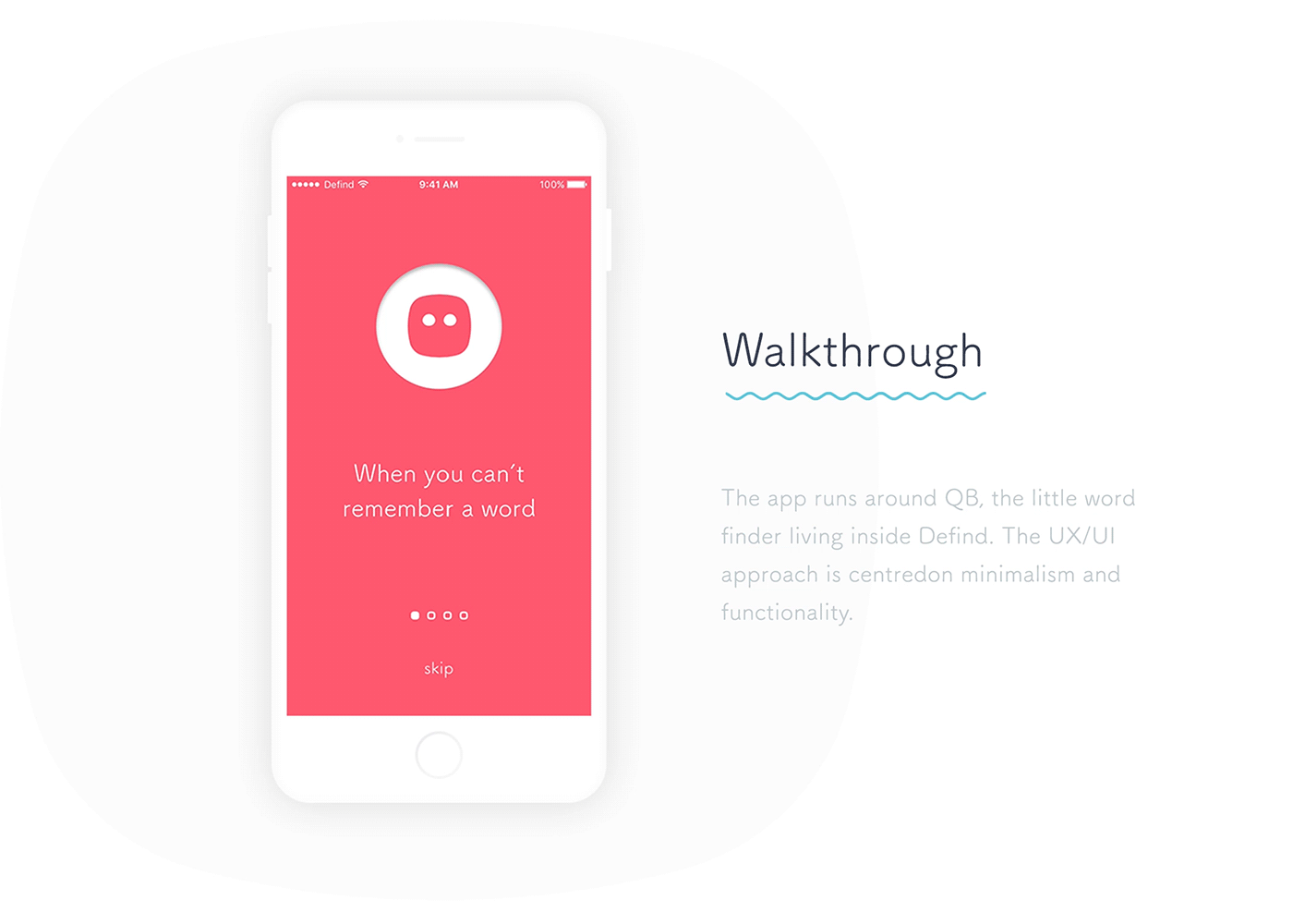
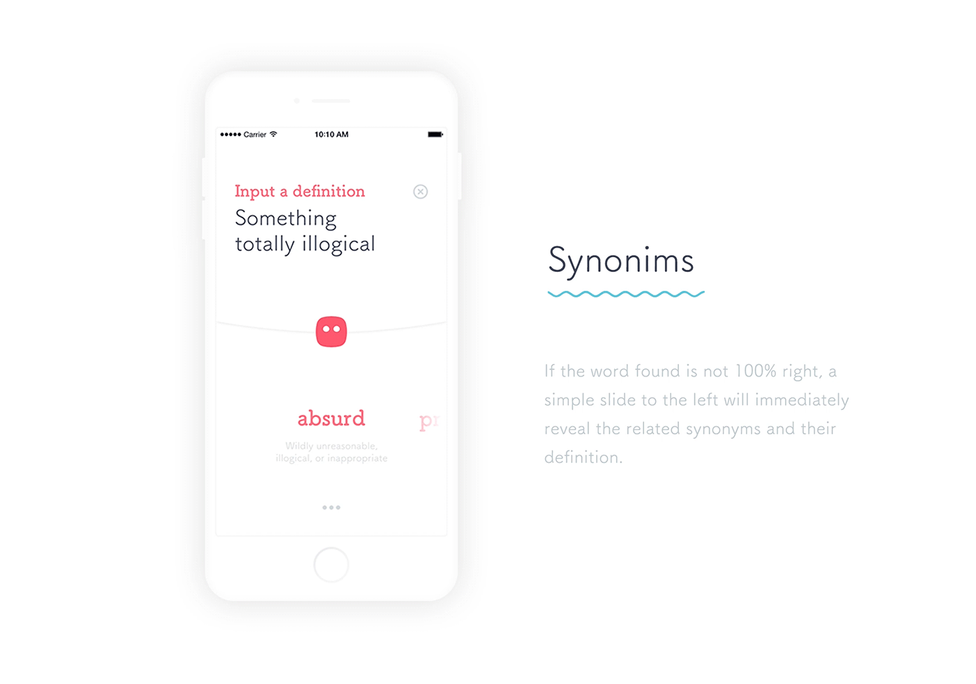
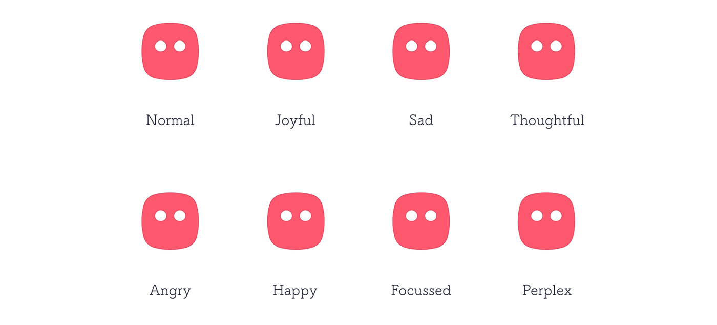
We are taking a look at this interaction design & motion project of the iOS app called: Defind. What is it? It’s an app that will search of word for you by you defining its definition. The concept might be useless to some but I liked about this project is about its execution, flow, motion and overall UI design. Designed by Alex Pluda, the app is taking through different sections to find that particular word from research, synonyms, translation and more.
Alex Pluda is working as general manager at A Maza Inc where he focus his work into interaction design, UI/UX and graphic design. You might have recognized his Barry the Touch Bar project, check it out via his Behance.
How many times it happens we can’t remember that word we need. This time has come ti an end (almost). Defind helps you to remember any word just by typing a definition.


Links
- Make sure to follow the latest from Alex Pluda on Behance
AoiroStudio
Jul 12, 2017
Source: Abduzeedo UI/UX
July 11, 2017
World’s First Photo Exhibition using a Car as a Camera
World’s First Photo Exhibition using a Car as a Camera
In Photography, you are welcomed to a wide range of a variety of tools to somehow increase your workflow or simply change the game. We’ve seen things from aerial to drones but how about street photography using a car? Volvo Cars has teamed up with Pulitzer Prize-winning photographer and artist Barbara Davidson for a World’s First Photo Exhibition using the on-board safety cameras of the new Volvo XC60 to create a special collection of photographs. Connecting art and safety for people to see the benefits of technology such as cameras and on-board sensors in cars. The photographs were first exhibited at Canvas Studios gallery in London’s Shoreditch this week and the exhibition will travel to other countries during 2017.
Barbara Davidson is a Pulitzer Prize & Emmy Award winning photographer located in Los Angeles, CA and former staff photographer for The Los Angeles Times. You can follow her tweets @photospice and her Instagram.
Video
Copenhagen, Denmark. I had an amazing experience collaborating with Volvo Cars to create the worlds first ever photo exhibition using the #XC60’s car safety camera. The project played out like a film production and all scenes were created for this commercial endeavor. Was really nice to work on a conceptual body of work which is vastly different from my life as a photojournalist thanks to all the crew for this amazing experience!


Over 1.2 million people die each year in road accidents around the globe. Volvo’s approach to road safety is focused on real-life traffic situations which the company has studied in detail since 1970 through its Traffic Accident Research Team. With this matchless set of real-world data Volvo’s safety engineers have set about systematically working to mitigate or eliminate potential life-threatening accidents.
“We take a realistic and practical approach to safety at Volvo Cars. Our vision is to reach a point in time where no one should be killed or seriously injured in a new Volvo car. We call it Vision 2020,” said Malin Ekholm, Vice President of Volvo Cars Safety Centre.
Links
- Learn more about Volvo Cars at volvocars.com
- Learn more about Barbara Davidson via Instagram
- Follow along with #XC60Moments
AoiroStudio
Jul 11, 2017
Source: Abduzeedo Photography
July 11, 2017
Beautiful Graphic Design Erkenntnisweg und Heiliger Geist
Beautiful Graphic Design Erkenntnisweg und Heiliger Geist
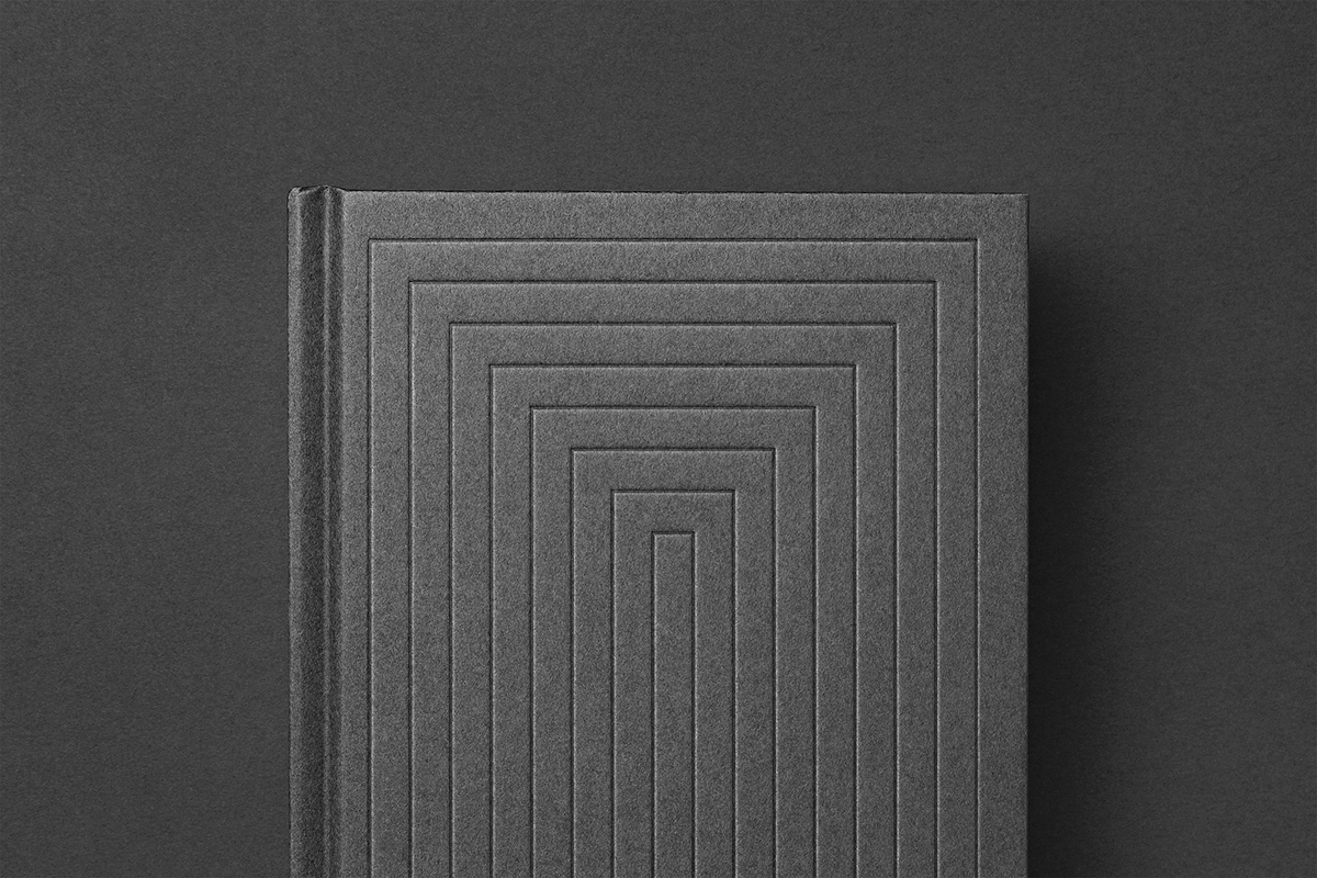
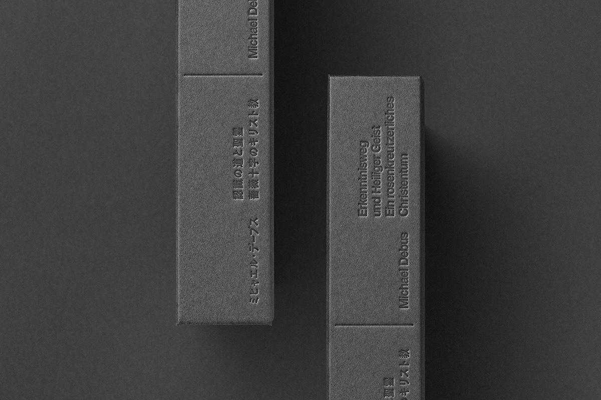
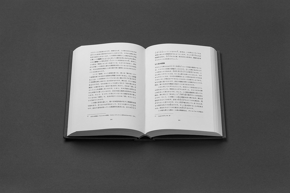
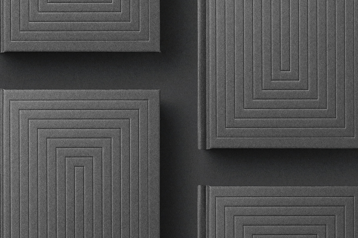
Yuta Takahashi shared an incredible graphic design and editorial design project on his Behance profile titled Erkenntnisweg und Heiliger Geist. As he mentions in the description, this book, which combines modernity and minimalism, ancient knowledge and philosophical thought, has a completely new, unique design. You can definitely see that right away with the cover that is simple but very elegant because of the paper texture. Below I also added more info I got from the project, but just spend some time checking the images, they are truly inspiring.
We designed Michael Debus’s book “Erkenntnisweg und Heiliger Geist”. The book attempts to use philosophy to unravel the wisdom handed down in the form of myths and legends.
Project description
Through the unique cover art, we represented the idea of multiple layers of doors of knowledge appearing and being opened by thought. On the other side of the door, the letter “I” appears. We represented the reader’s awareness transitioning from darkness to daylight through the use of neutral colors between light and shadow. As a result the book’s appearance is reminiscent of the cloister in church architecture.
Graphic design


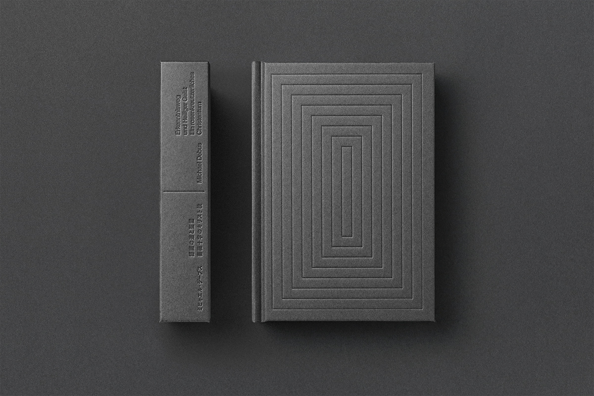


Yuta Takahashi is an Art Director, Designer, working on branding graphic design, editorial design and packaging design. His work feature minimal designs which grasp the essence of materials and remove unnecessary elements. For more information make sure to check out and follow Yuta on.
abduzeedo
Jul 11, 2017
Source: Abduzeedo Editorial Design
July 10, 2017
Digital Art Series: Pop Culture Dystopia
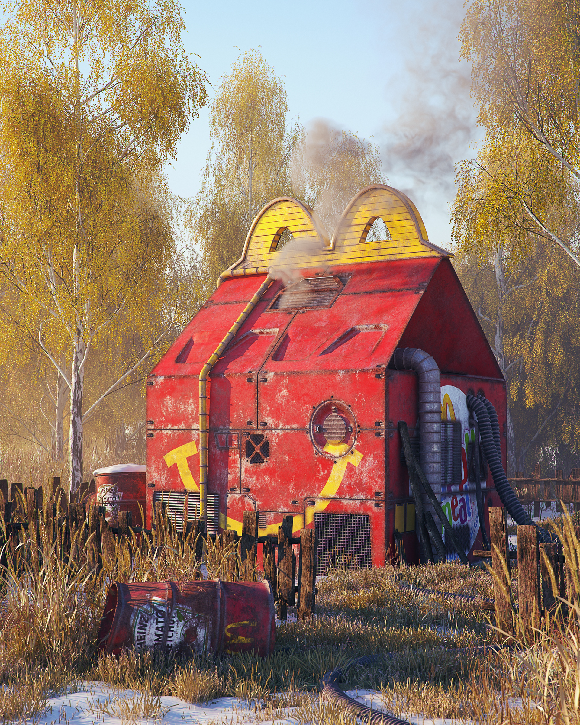
Digital Art Series: Pop Culture Dystopia
One of the many great advantages of doing the Daily Inspirations is to discover talented artists all over. This digital art series by Filip Hodas are part of my findings; his series is entitled: Pop Culture Dystopia. It’s a beautiful series where dystopia goes where the imagined where everything is different and unpleasant. A right insightful perspective to the future if things would go bad, looking forward of seeing more.
Filip Hodas is a freelance 3D artist located in Prague, Czech Republic. Focusing his work in sculting, illustration and digital art; follow the latest of this work on his Behance.
A series showing popular culture icons in realistic dystopian environments.


Links
- Check out the latest from Filip on Behance
AoiroStudio
Jul 10, 2017
Source: Abduzeedo Illustration
July 10, 2017
Illustration & CGI: Kiplinger Magazine Spread
Illustration & CGI: Kiplinger Magazine Spread
Starting off the week with this stunning magazine that is a spread for the Kiplinger Magazine located in Washington, DC. Designed by Pakistan-based Omar Aqil, he used a combination of Phoshop, Illustration and Cinema 4D. The result as you can imagine is right down colourful and you can’t help to appreciate all the details. Make sure to give him some love on Instagram.
Omar Aqil is a designer, art director and illustrator currently based in Lahore, Pakistan. You can follow his work and features from like Behance, Wacom, Adobe and more. I am quite supprised that we haven’t his work ever before.
Kiplinger’s Magazine Spread Illustrations | 2017 August Issue


Links
AoiroStudio
Jul 10, 2017
Source: Abduzeedo Illustration
July 10, 2017
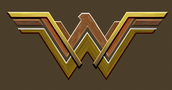
Create the Wonder Woman Logo in Photoshop – Photoshop Tutorials
Create the Wonder Woman Logo in Photoshop – Photoshop Tutorials
It’s been a long time since the last time I wrote Photoshop tutorials. A lot of things have happened as I probably mentioned in the past. Right now there are tons of sites with Photoshop tutorials and they all share tons of content so I started to feel it wasn’t necessary for me to keep doing. However, I have been trying to get back to a routine of trying new things back in Photoshop moving away a bit from product design, UI and flat design. Essentially, taking a step back to the good old days of having fun with light effects, textures and that 80s look I miss so much.
So for this tutorial I will show you how to create the Wonder Woman logo with that crazy metal effect using Photoshop. There are several ways to do it, a 3D tool might be the best way, but I decided to try it in Photoshop. I hope you have as much fun doing it as I did 🙂
Photoshop Tutorials
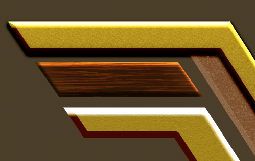
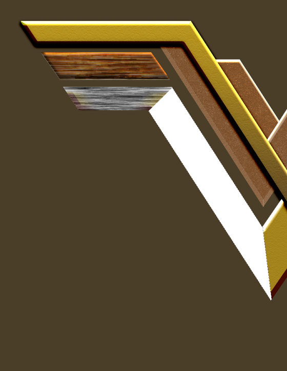
Step 1
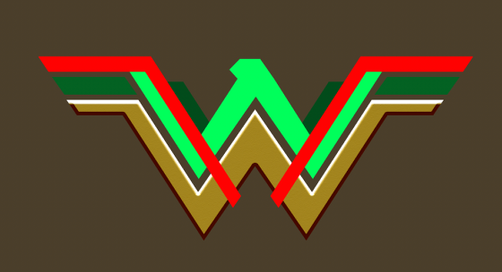
The first thing to do is get the basic shape of the Wonder Woman symbol. I recreated this one in Illustrator. You can do everything in Photoshop if you want, I just feel more comfortable using Illustrator as it’s faster for me.

Step 2
Now in Photoshop the secret here is to have all shapes in different layers. You can achieve that by copying and pasting or importing, or even selecting and creating layers from the selection. It doesn’t really matter how you do it as long as you have one layer for each part. We will apply some Layer Styles on the following steps.

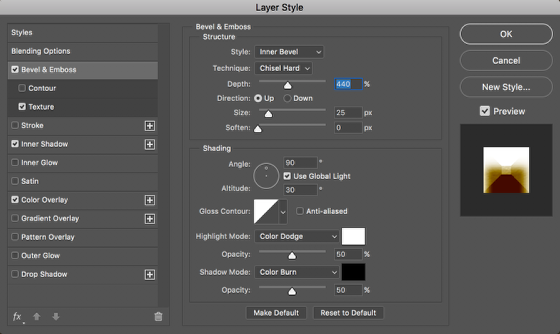
Step 3
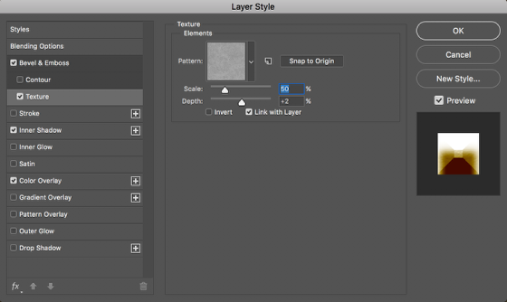
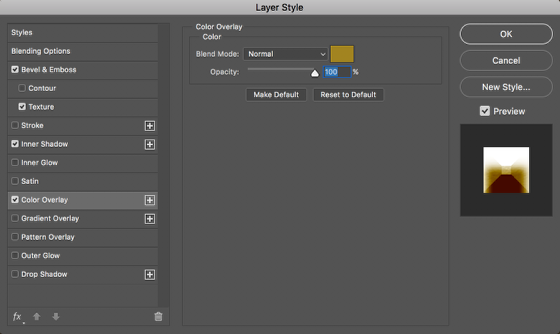
Select the bottom and biggest shape of the logo, the blue in my image. Then go to Layer>Layer Styles>Bevel & Emboss. Use the values below. We will also add a Texture, Inner Shadow and Color Overlay. You can tweak things here as much as you want. For the Texture, use a metal texture. An easy way to do it is to do a Google search for metal texture images, get the one you like. Open it in Photoshop and select it all, then go to Edit>Define Pattern. You will be able to use that in the Layer Styles then.

Step 4
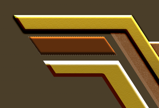
Here you can see the first layer with the bevel look. It’s important for it to have strong highlights and shadows. Repeat the same process for the other parts and use different colors.
Step 5
Now that you have all layers with effect, make sure to tweak them a little. Notice that I have not only different colors but also different strengths for the parts. The 2 parts that go on top of everything else I added a drop shadow as well to create more depth. Experiment with it.

Step 6
Now the tricky part, add the metal texture. I believe there might be a multitude of ways of doing this, I went with my way, or the way I thought it was the easiest one. So select one of the shapes.
Step 7
Add a new layer and fill it with white.
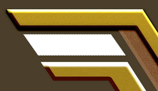
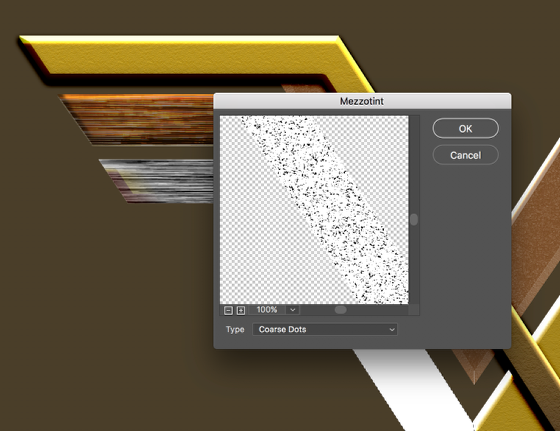
Step 8
Then go to Filter>Pixelate>Mezzotint. Use Coarse Dots. Make sure that you have white and black for the background color.
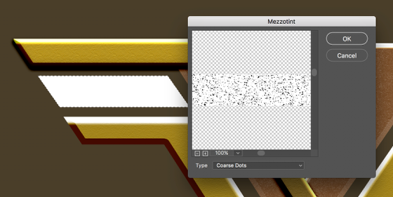
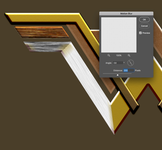
Step 9
After that still with the marquee selection active go to Filter>Blur>Motion Blur. Use a high value for the Distance. My image is huge so I used 200 pixels.
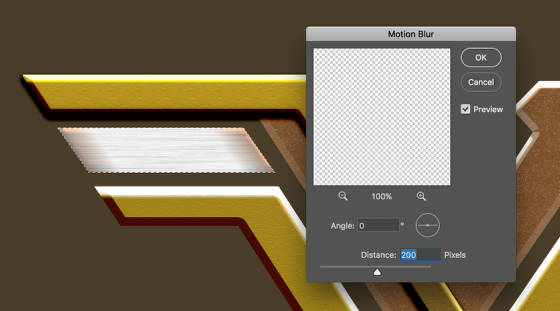
Step 10
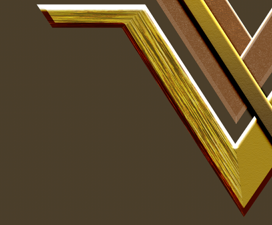
Because the original logo looks like a very rough metal, we need to make the texture a bit stronger. So go to Image>Adjustments>Levels. Move the black level all the way to the right and the white level a bit to the left. The idea is to increase the contrast. Use the image below for reference.
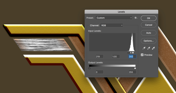
Step 11
Change the Blend Mode to Linear Burn and play with the opacity. I used around 10-30%.
Step 12
Duplicate the layer and move it down a couple of pixels then change the Blend Mode to Color Dodge at around 80-100% depending on the color of your shape.
Step 13
For the shapes that have different angles I just did the same thing but with one difference. I did different angles of motion blur depending on the angle of the shape. The tip here is to use the Polygonal Lasso Tool to select the right angle for the junctions. Below you can see how I did the first 2 parts of the bottom shape.
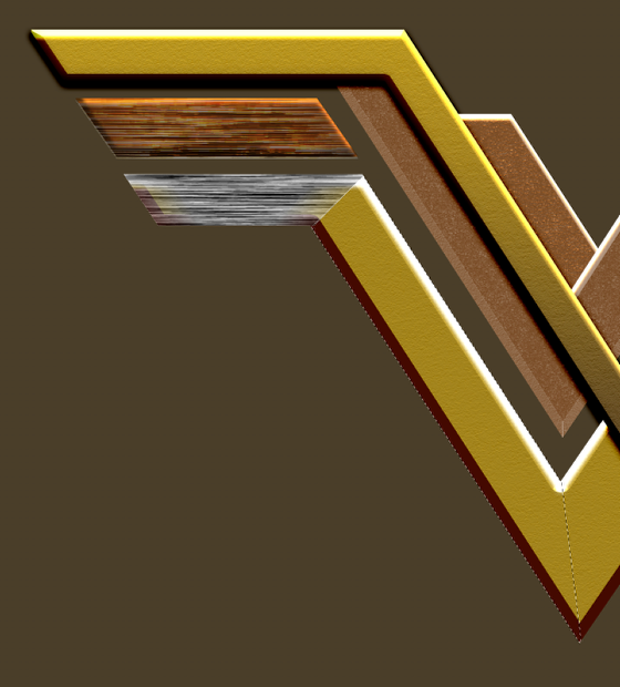
Step 14
Repeat that pretty much for every other shape. For the head, this is where you will have to do that 3 more times because of the different angles you get there. It’s the same process, it will require a bit more attention though.
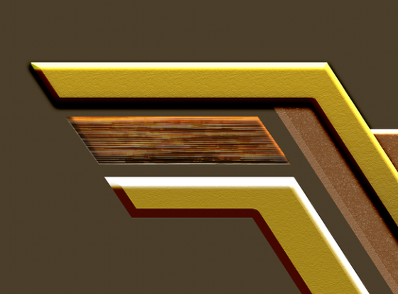
Step 15
Group all shapes into a folder then apply a shadow to that folder. You can also merge the folder if you want. I always forget that I can add layer styles to folders now.

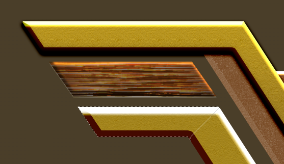
Step 16
Add a new layer and mask it with the shape of the symbol. Then with the Brush Tool paint the sides and bottom with a very soft brush and black for the color. I painted with my brush at 50% so I could have more control. The goal is to create a sort of vignette effect.

Step 17
Add another layer and fill with black. Change the Blend Mode to Color Dodge, then with the brush tool, paint some white spots on your design. Because of the Blend Mode the brush strokes will create a really nice light effect. That’s my favorite trick in Photoshop for light effects. It works all the time.

Conclusion
Add another layer and fill with with black, use it as background. Then, select all layers and duplicate them. After that, merge them onto one layer and go to Filter>Blur>Gaussian Blur. I used 20 for the radius but you can try different values depending on the size of your image. Right after, change the Blend Mode to Overlay at 50%. Duplicate this layer and change the Blend Mode to Screen at 40%. Those 2 layers will give the image more depth, contrast and an interesting glow effect. And that’s it. That’s how to create a design with the effect similar to the Wonder Woman logo you see in the posters out there. As usual, try your way, have fun and check out more of our Photoshop tutorials.

Download Photoshop file
abduzeedo
Jul 10, 2017
Source: Abduzeedo Tutorials
July 8, 2017
Writing 101: A Simple Breakdown of How to Structure Your Screenplay

Navigating the monomyth is a tedious, arduous, and confusing endeavor for any hero on their journey, but it’s even more so for screenwriters.
One seemingly straightforward but surprisingly complicated things about writing a screenplay is story structure. Plenty of screenwriting gurus have offered their two cents on what a well-structured script should look like, but Joseph Campbell’s Hero’s Journey, or monomyth, is perhaps the most widely known and template for crafting stories, and is arguably one of the most accessible for new writers. If you want to get a real handle on story structure, Film Riot has shared an excerpt from Seth Worley’s Writing 101 online screenwriting course that will really help you out.
Even though the excerpt is just an introduction to screenwriting basics, it breaks down the most important and fundamental elements of the craft. Not nailing down your story’s structure is like dropping your audience in the middle of nowhere without a map and expecting them to make it all the way home. It can be done, but 1.) it probably won’t, and 2.) if it is, your audience will be super pissed when they get there.
Source: NoFilmSchool
July 8, 2017
Watch: Learn How to Fly a Drone in 7 Minutes

If you’re ready to take to the skies with your first drone, you’ll want to learn the basics first.
Drone technology is getting better and better every year, making it easier for beginners to take it out of the box and take to the skies. However, even the most basic drone has a bit of a learning curve. So, if you’re ready to shoot some sweet aerial shots but don’t really know how to get off the ground, this video from Darious Britt of D4Darious shows you the basics of drone operation, from rules and regulations you need to follow before you take off to flight exercises you can practice once you’re in the air. Check it out below:
There’s more to flying a drone than being able to pull off sweet moves. Great drone pilots aren’t just those capable of doing advanced aerial maneuvers, they’re those who are capable of doing them safely. Know the rules and regulations in your area. If you’re in the U.S., the FAA may require you to register your drone, but it has actually relaxed its rules to allow hobbyists to fly without having to register.
Source: NoFilmSchool
July 7, 2017
Beyond the Basics: Keyframing in Adobe After Effects

Up your After Effects game with these advanced keyframing tips and tricks.
Keyframing is one of the most important and powerful features of Adobe After Effects. Knowing how to apply and manipulate them will help you to become a more seasoned motion graphics artist. Let’s take a look at a few advanced tips and tricks when it comes to working with keyframes in After Effects. We’ll focus on five methods in particular, including precisely editing values, reversing time, changing interpolation, adding roving keyframes, and working with expressions. We’ll use these advanced methods to bring an airplane graphic to life.
Precisely Edit Values
In After Effects, you use keyframes when you want a value of a layer to change over time. Adding two keyframes to a layer at different times with differing values will bring that property to life.
Source: NoFilmSchool
July 7, 2017
New Music! SXSW Artist Releases – Friday, July 7

We’re back from July 4th holiday and are busy prepping for SXSW 2018. If you’re interested in being a part of the event, apply to be a Showcasing Artist or enter a PanelPicker session idea.
This week, similar to last week, sees a slightly lower than average amount of new releases because of July 4th, but there are still some awesome releases from past artists at SXSW. Indie-electronic pop artist Toro Y Moi is back with a new album full of the summery jams that he’s made his name on, East-coast hip-hop duo The Doppelgangaz return with a new album, and indie-rock mega-group Broken Social Scene return with their first full-length since 2010. Check below for the full list of SXSW artist releases.
Each week we will pick one of the album releases and make a playlist for those that are enjoying the album but want to discover more similar artists. This week, we’re selecting a female vocal driven playlist inspired by Grulke Prize winners HAIM, their new album Something to Tell You releases today. Go ahead and give it a listen because these playlists will only be active for one week before we pick a new artist to focus on. Follow us on Spotify to keep up with our playlists each week.
Past Showcasing Artist July 7th Releases
This Is The Kit – Moonshine Freeze
Broken Social Scene – Hug of Thunder
HAIM – Something to Tell You
The Doppelgangaz – Dopp Hopp
Toro Y Moi – Boo Boo
Public Service Broadcasting – Progress
Haim at SXSW 2013 – Photo by Yoomi Park
The post New Music! SXSW Artist Releases – Friday, July 7 appeared first on SXSW.
Source: SxSW Music