-
News & Updates
camera
May 6, 2017
Watch: 10 Ways to Create Different Moods with Lighting

With the right approach, you can immediately alter the mood of a scene from happy to horrifying simply by changing the lighting.
Lighting is a powerful tool. It not only makes images look more cinematic and beautiful, but it also elicits emotions in audiences depending on its design. In this intriguing video from The Lighting Channel, we get to see how drastically a mood can change simply by changing the placement of a light or adding a colored gel. Check it out below:
These lighting setups, though they’re extremely popular, can be a little difficult to get right. It’s important to know what kind of lights and modifiers to use to, say, soften the look of a subject to get that angelic look, or create dramatic shadows to turn that same subject into a machete-wielding maniac for your horror film.
Luckily, The Lighting Channel has provided an explanation on how they achieved each look in the video’s description:
Source: NoFilmSchool
May 6, 2017
Waterbird’s Adjustable MultiSlider Is Both a Linear and Curved Camera Track

Waterbird’s MultiSlider let’s you switch from a linear slider to a curved one by simply bending the adjustable track.
Camera sliders are great for helping to make your shots look more dynamic and professional, but until now, your options were to either purchase linear or curved tracks. Waterbird has unveiled their brand new MultiSlider, which gives users the ability to bend the track to create straight and curved camera movements.
Other than being fully adjustable, the MultiSlider has other desirable features, including a high-precision stepper motor and drive belt, a 10″ minimum radius, and a powerful motion controller with Bluetooth connectivity and mobile app. The track can be locked in place to keep your desired configuration, whether you want it completely linear, curved, or a little bit of both. If you’re mounting the MultiSlider to a tripod, each axis segment has its own individual thread, allowing you to choose the best place to attach it so the entire unit is balanced.
Source: NoFilmSchool
May 6, 2017
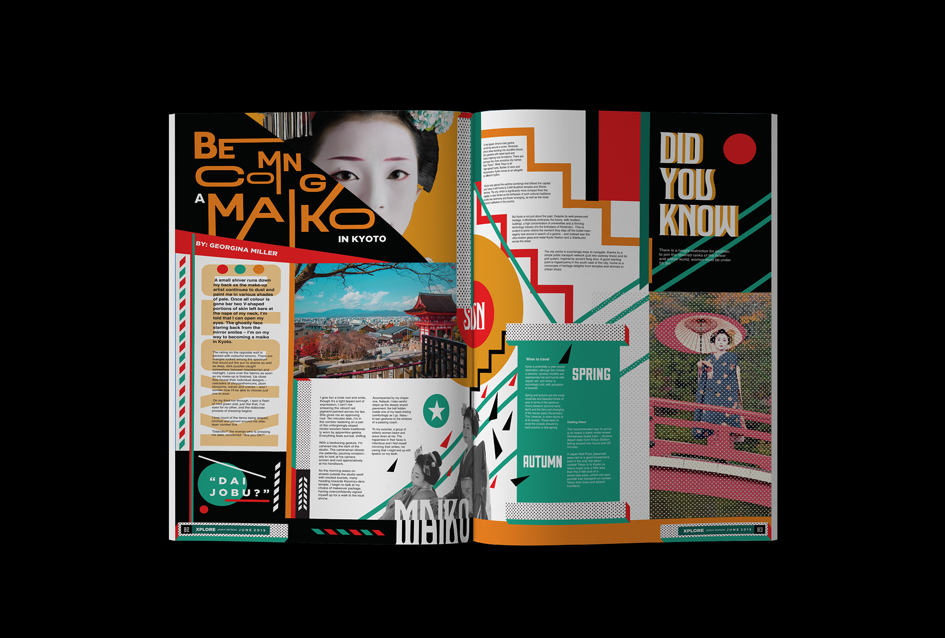
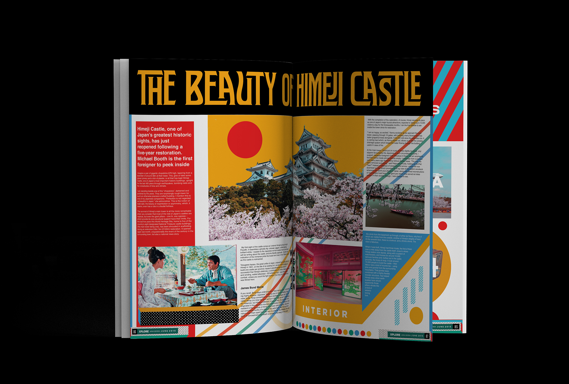
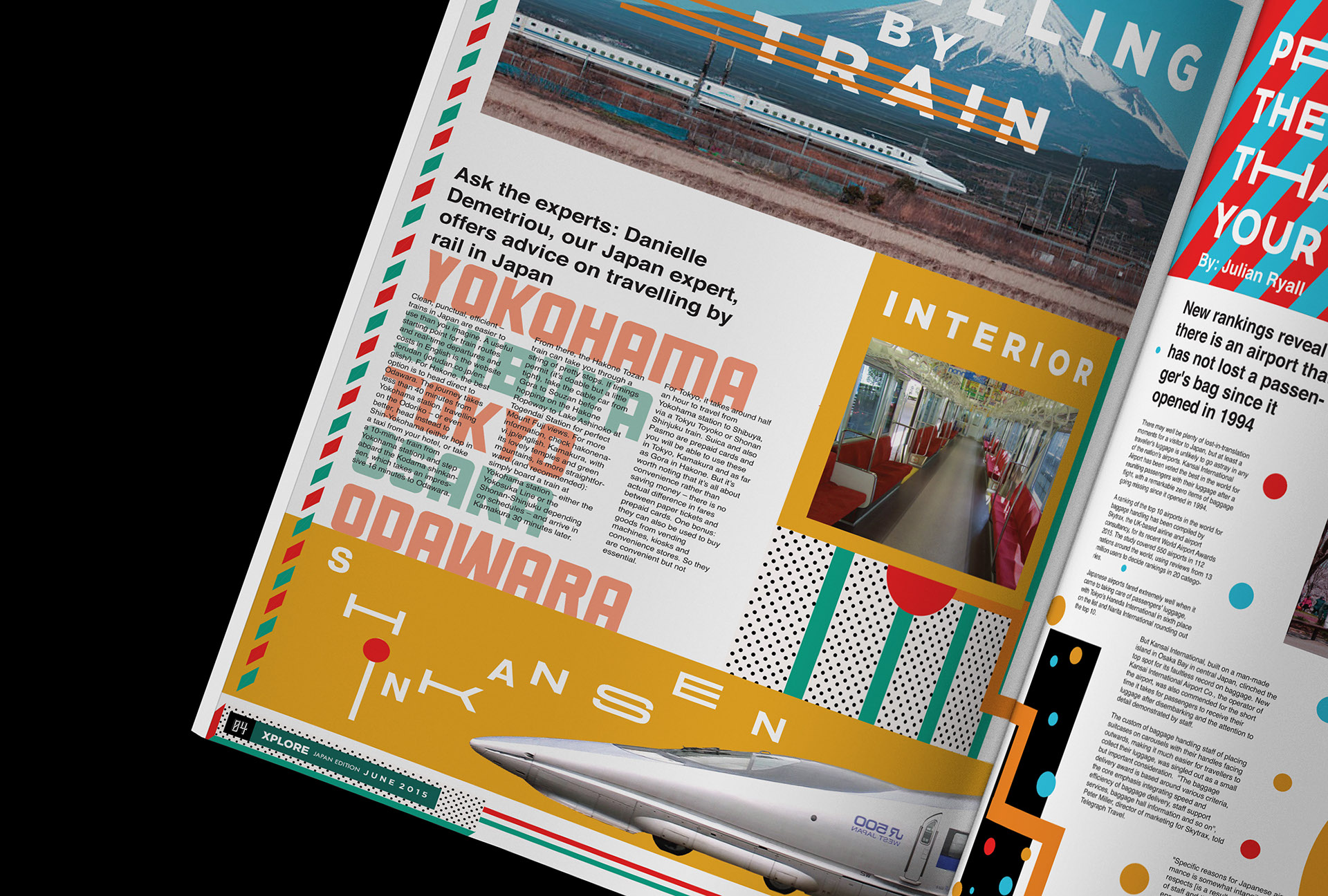
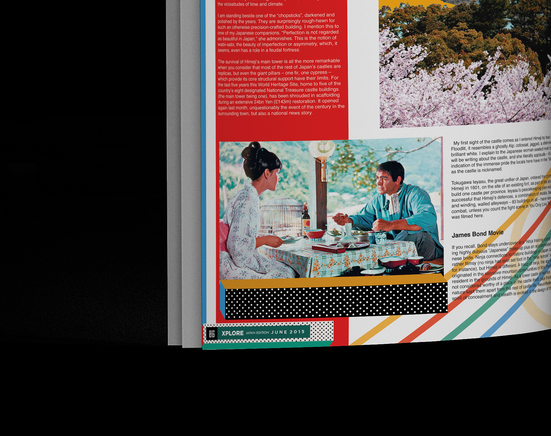
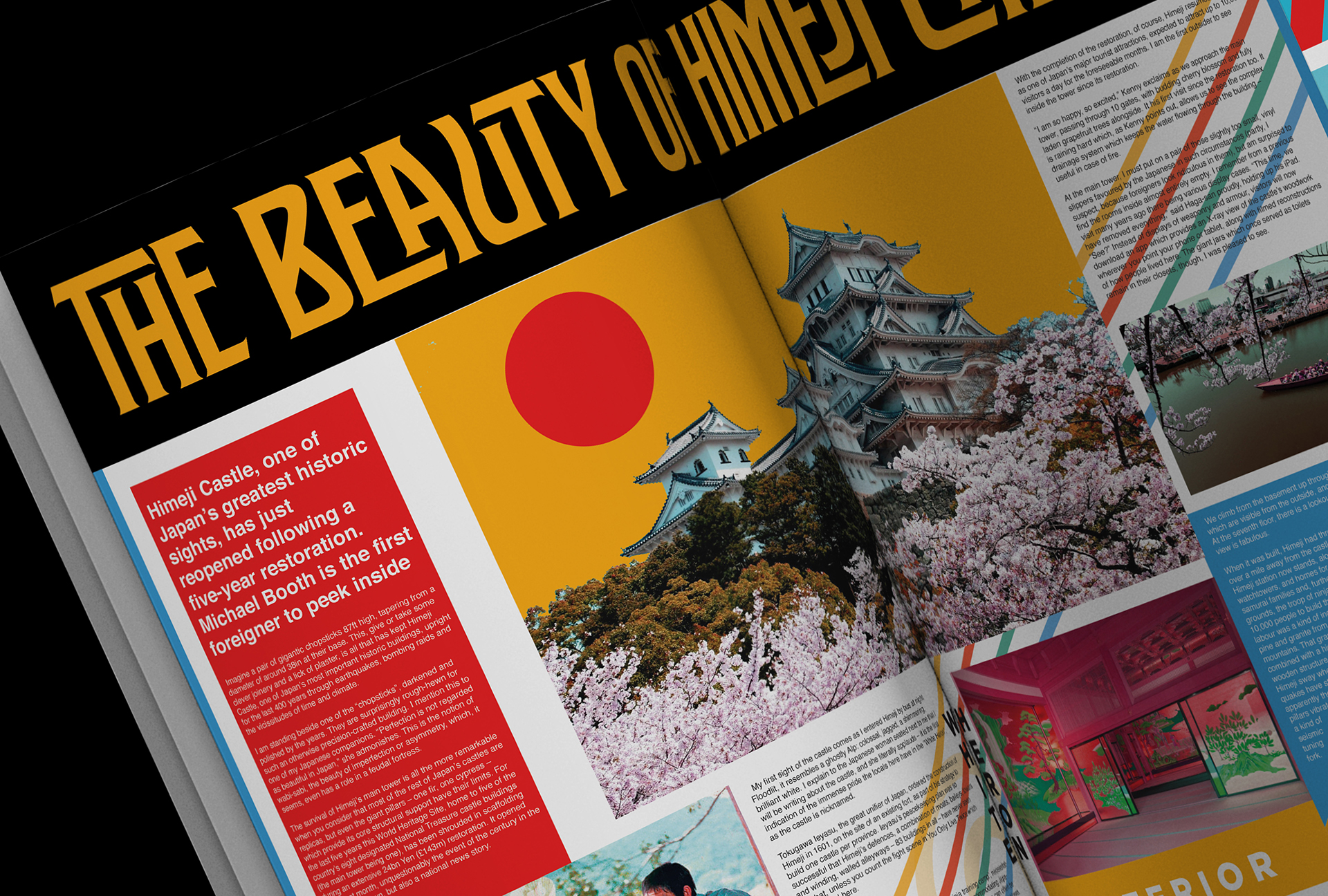
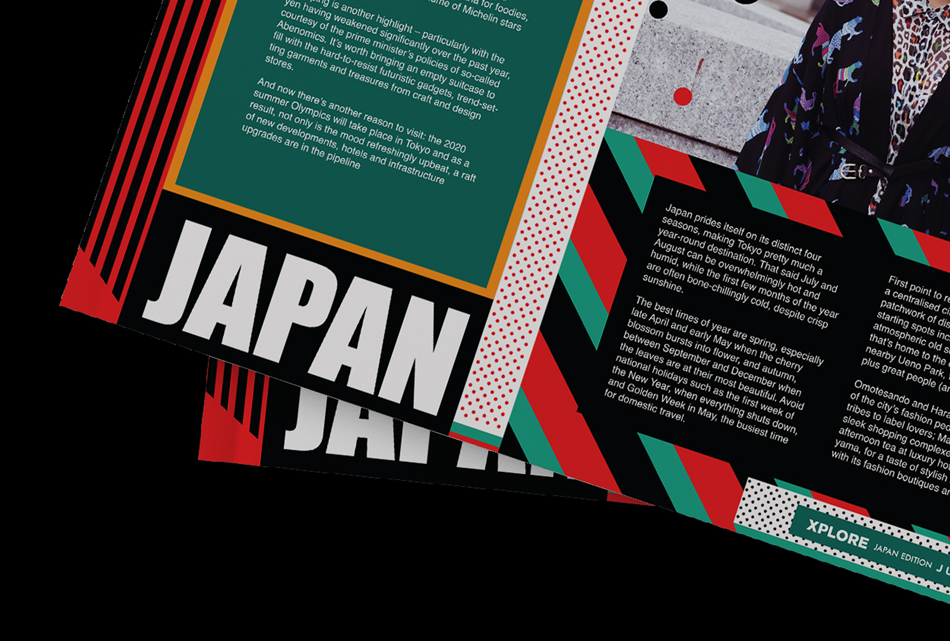
An Editorial School Project: Xplore Newsletter
An Editorial School Project: Xplore Newsletter
Nothing to start off your Weekend with an editorial project made by a graphic design student. The project is called: Xplore Newsletter and it has been designed by Parmuditho Wahyudhana. Remove the fact that I loved his choice of subject which was the city of Tokyo but I enjoyed his treatment on the layout with different shapes into the grid to make everything messy and unique at the same time. I also enjoyed his direction on the pictures with a psychedelic approach that gives you an impression of Japan from the 60s, beautiful work Parmuditho! Looking forward to see more of you in the future.
Behind this school project is the work from Parmuditho Wahyudhana who is a graphic design student from Jakarta, Indonesia. You should definitely follow his work on Behance.
Newsletter about tourism and travel, assignment from typography class. The brief is to designing a Newsletter about one of the asian country, the contents it can be about traveling, politics, culture and etc.


AoiroStudio
May 06, 2017
Source: Abduzeedo Editorial Design
May 6, 2017
Recreating the Bold Look of Classic Film Noir

This video shows you several cinematic techniques that will help create the iconic look of film noir.
How slick is film noir? Not only did it dominate the big screen from the early 40s to the late 50s, but the look was so stylish it made fedoras cool and slatted blinds ominous. The look is so iconic, with the chiaroscuro lighting, cigarette smoke, and urban settings, that it has become a favorite among filmmakers to replicate. If you’re interested in making your own work more gritty and stylized like that of a film noir, check out this video from Film Riot, which not only explains many of its stylistic elements, but gives you some history behind the film movement, as well as some simple techniques you can use to get that classic look.
There are many elements that made film noir what it was, from snappy dialog to femme fatale characters, but host Ryan Connolly highlights and breaks down a few basic visual elements that are definitely quintessential film noir.
Source: NoFilmSchool
May 5, 2017
Watch: Learn How to Create a Peephole POV in After Effects

This simple tutorial shows you how to create a realistic peephole POV effect in post.
Almost every movie has a scene in which there’s a knock at the door—if you’re working on a project right now you most likely have one, too. There’s a pretty straightforward way of dealing with this kind of situation, which is simply having your subject open the door, but another way that filmmakers have done it is through the peephole POV. This technique not only adds a little more style to your scene, but it also serves as an interesting introduction to characters that are about to walk through the door and into the scene. Check out this PremiumBeat tutorial to find out how to pull it off in Adobe After Effects.
Source: NoFilmSchool
May 5, 2017
The wind sensors on the Curiosity Rover broke — it’s using pictures instead
Curiosity isn’t just analyzing Martian sand — it’s offering a 360-degree glimpse at what Mars’ sand dunes look like. With the wind sensors on Curiosity now inoperable, the rover is measuring the effects of the wind in photos.
The post The wind sensors on the Curiosity Rover broke — it's using pictures instead appeared first on Digital Trends.
Source: Digital Trends VR
May 5, 2017
The Daily Chord Weekly Recap – Friday, May 5

How do analog and digital music co-exist for musicians and music fans? A pair of articles linked by the Daily Chord this week explored the question. In addition, the Fyre Festival fallout continued, the delayed impact of streaming music on mainstream country drew attention, and Adidas introduced something we didn’t know we needed, a sneaker/drum machine hybrid. Keep current on important and interesting music news by surfing the links provided each weekday by the Daily Chord. Here’s a pro tip – subscribe to our email updates and get the headlines in your inbox.
Monday, May 1
-
Mark Geragos files $100 million lawsuit against Fyre festival
Post from Variety -
Stagecoach festival proves it rides in the shadow of Coachella no more
Review from LA Times -
Easy as hey, B, C: how this euphoric yell took over pop music
Post from The Guardian -
Sony recorded music sales fall 6%, hampered by strength of yen
Post from Music Business Worldwide -
Eminem’s ‘Lose Yourself’ lawsuit with New Zealand political party begins
Post from Rolling Stone -
Dick Contino, accordion heartthrob, dies at 87
Obituary from NY Times
Tuesday, May 2
-
Twitter partners with Live Nation to livestream videos of concerts
Post from TechCrunch -
Music industry is singing loud and proud in clash with YouTube
Post from Irish Times -
How the rise of streaming has radically changed Nashville’s music industry
Story from The Tennessean -
In New Orleans, a festival defies trends and welcomes Cuba
Review from NY Times -
Sugarhill Gang: How we made ‘Rapper’s Delight’
Interview from The Guardian -
Col. Bruce Hampton dies hours after 70th birthday celebration at Fox Theater
Post from Atlanta Journal-Constitution
Wednesday, May 3
-
We’re living in a digital world, but analog is making a comeback
Post from Recode -
Justin Kalifowitz, founder/CEO Downtown Music Publishing, interviewed
Post from Hypebot -
For frazzled travelers, airports offer live music respite
Story from SFGate -
Thurston Moore: The first time I saw bands at CBGB (in 1976)
Post from NY Times -
A musical about The Pogues is coming via The Wire creator David Simon
Post from Belfast Telegraph -
Grandaddy bassist Kevin Garcia dies after suffering stroke
Post from NPR
Thursday, May 4
-
‘Rap on trial’: Why lyrics should be off-limits
Post from Rolling Stone -
What does it take for a K-Pop band to blow up in South America?
Story from NY Times -
Alanis Morissette’s ex-manager jailed for six years for stealing $7M
Post from BBC News -
New Adidas trainer design features built-in drum machine
Item from NME -
Is this the most chill music festival ever?
Review from NY Post -
Gotcha covered: ‘Thirteen’
Post from Stereogum
Friday, May 5
-
Beatie Wolf brings her new album Raw Space to life with augmented reality
Post from TechCrunch -
Copyright bill momentum has music industry tuning up for a big legislative year
Story from Variety -
Why I want my own music in the age of streaming
Commentary from Mashable -
Music festival websites to go dark to campaign against sexual assault
Item from BBC News -
Dance of death: Are the days of the moshpit numbered?
Post from The Guardian -
The emerging indie music industry in Saudi Arabia
Post from World Policy
The post The Daily Chord Weekly Recap – Friday, May 5 appeared first on SXSW.
Source: SxSW Music
May 5, 2017
Oculus is ‘winding down’ Story Studio, its film development division
Henry, Lost, and Dear Angelica are some of the most well received virtual reality short-film experiences, but they will be the last that Oculus’ Story Studio ever makes, as the VR developer is shuttering its studio.
The post Oculus is ‘winding down’ Story Studio, its film development division appeared first on Digital Trends.
Source: Digital Trends VR
May 5, 2017
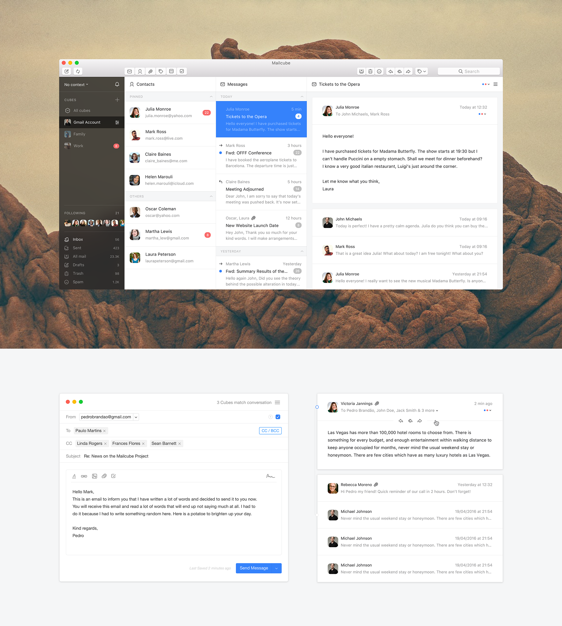
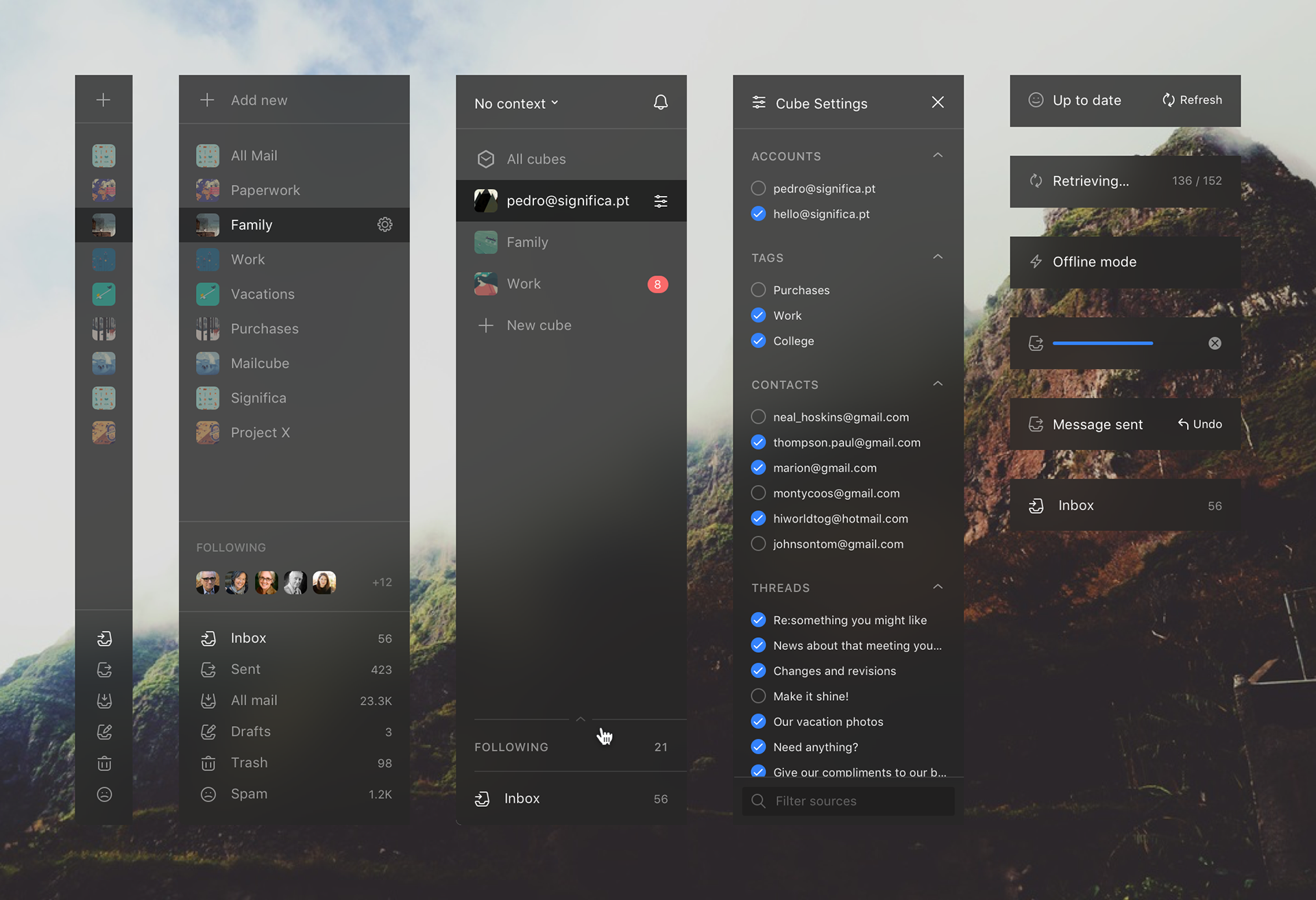
Interaction Design & UI/UX of Mailcube MacOS App
Interaction Design & UI/UX of Mailcube MacOS App
Let’s take a look at this interaction design & UI/UX for a MacOs app named Mailcube, behind the app we have the team over Significa that believed that the email is not dead and it’s all about how you treat this relationship. Right off the bat, you are introduce to what they called: faces where you can customize as you pleased through faces (categories) like messages, contacts, attachments and more. What I liked the most is the fact that your notifications are filtered and you can organize your emails by dragging a cube (kind of like creating a channel on Slack). You can join their private beta here.
Behind this design, we have the work from Significa, a creative studio based in Porto, Portugal. Currently focusing their work into interaction design and brand development. You should definitely see their motto through their work and it’s about good design thinking that can answer almost any question and solve most problems.
Even though many of us have declared email dead, it’s up to all of us to breathe new life into it. Let’s face it: you’re not going to stop using email, so, instead, why not work on the relationship?


AoiroStudio
May 05, 2017
Source: Abduzeedo UI/UX
May 5, 2017
Thanks Obama! For recording this awesome VR tour of the White House
Barack Obama is back in the White House, but this time as a guide offering a look around the famous building in 360-degree video. The immersive content is the work of Emmy Award-winning Felix & Paul Studios.
The post Thanks Obama! For recording this awesome VR tour of the White House appeared first on Digital Trends.
Source: Digital Trends VR