-
News & Updates
camera
July 5, 2018
UI Inspiration: This week’s selections from Bradley Ziffer, BrandBox and more
UI Inspiration: This week’s selections from Bradley Ziffer, BrandBox and more
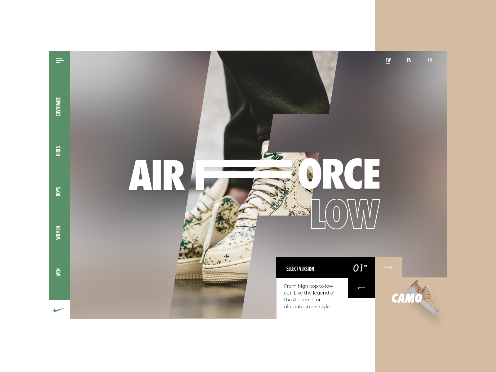
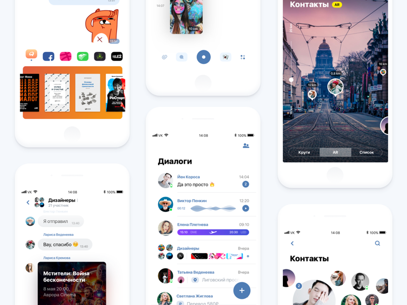
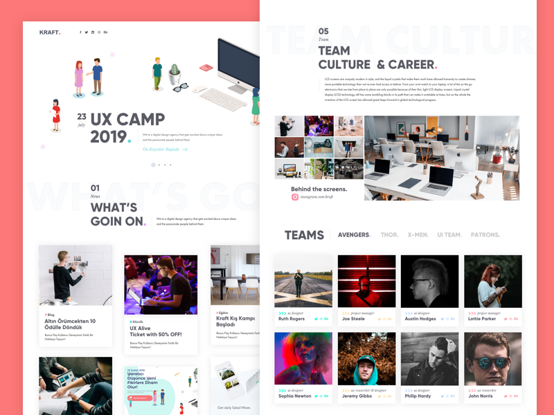
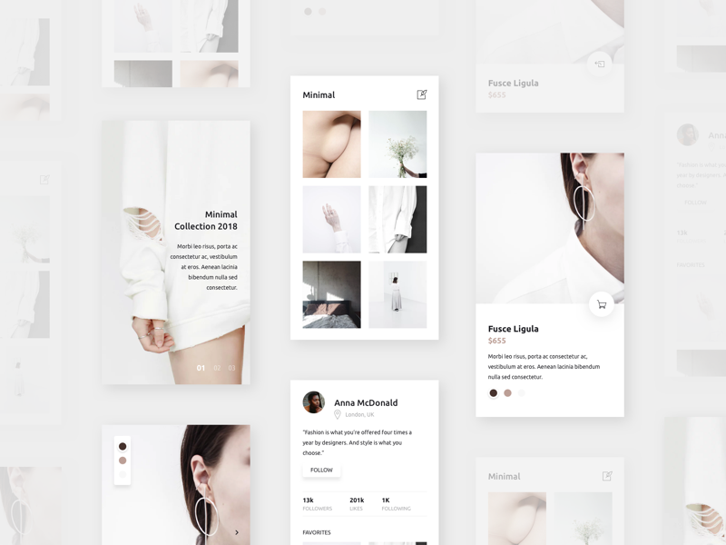
It’s that time of the week for our collection of UI/UX interactions to boost your UI inspiration. We are focusing on cool animations, layout designs, UX thinking and more. We are mixing it all from static, dynamic and even live prototypes, this might be a great weekly series to bookmark! This week, we again stayed away from animations/interactions but we have lots of beautiful UI static interfaces. I really enjoyed this week’s cover image of a UI design for the newly IGTV by Bradley Ziffer .
In this collection we are featuring the work from Bradley Ziffer, BrandBox, Jason, Rron Berisha and more.
More Links
- For more, check out Dribbble
- Follow my tweets @aoirostudio
- Follow my pictures on Instagram
via Dribbble
 Design by Bradley Ziffer
 Design by BrandBox
 Design by Jason
 Design by Rron Berisha
 Design by Asylab
 Design by Denis Abdullin
 Design by Darko Vujic
 Design by Daiana
 Design by Nicholas Green
 Design by Minami
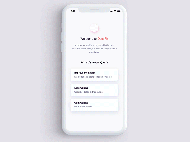
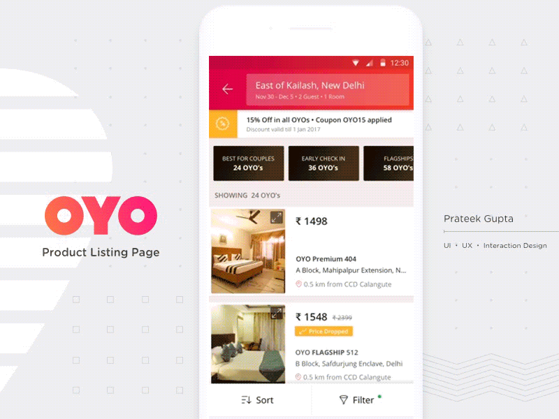 Design by Prateek gupta HFI CUA
 Design by Tran Thi Ngoc Anh
 Design by Vladimir Rakshâ
 Design by Davut Şala
 Design by Alex Banaga
 Design by Ronald Vermeijs
 Design by Martyna Kwiatkowska
 Design by Ervin Halebic
 Design by Hashan
 Design by Dalton
 Design by Yassar
 Design by Anton Kosarchyn
 Design by Dejan Markovic
 Design by Zhenya Rynzhuk
 Design by Luke Pachytel
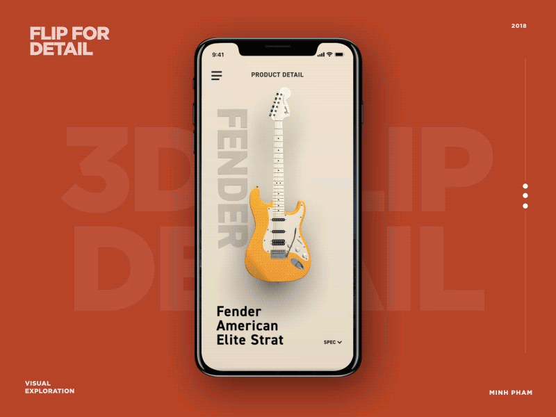 Design by Minh Pham
AoiroStudio
Jul 05, 2018
Source: Abduzeedo UI/UX
July 5, 2018
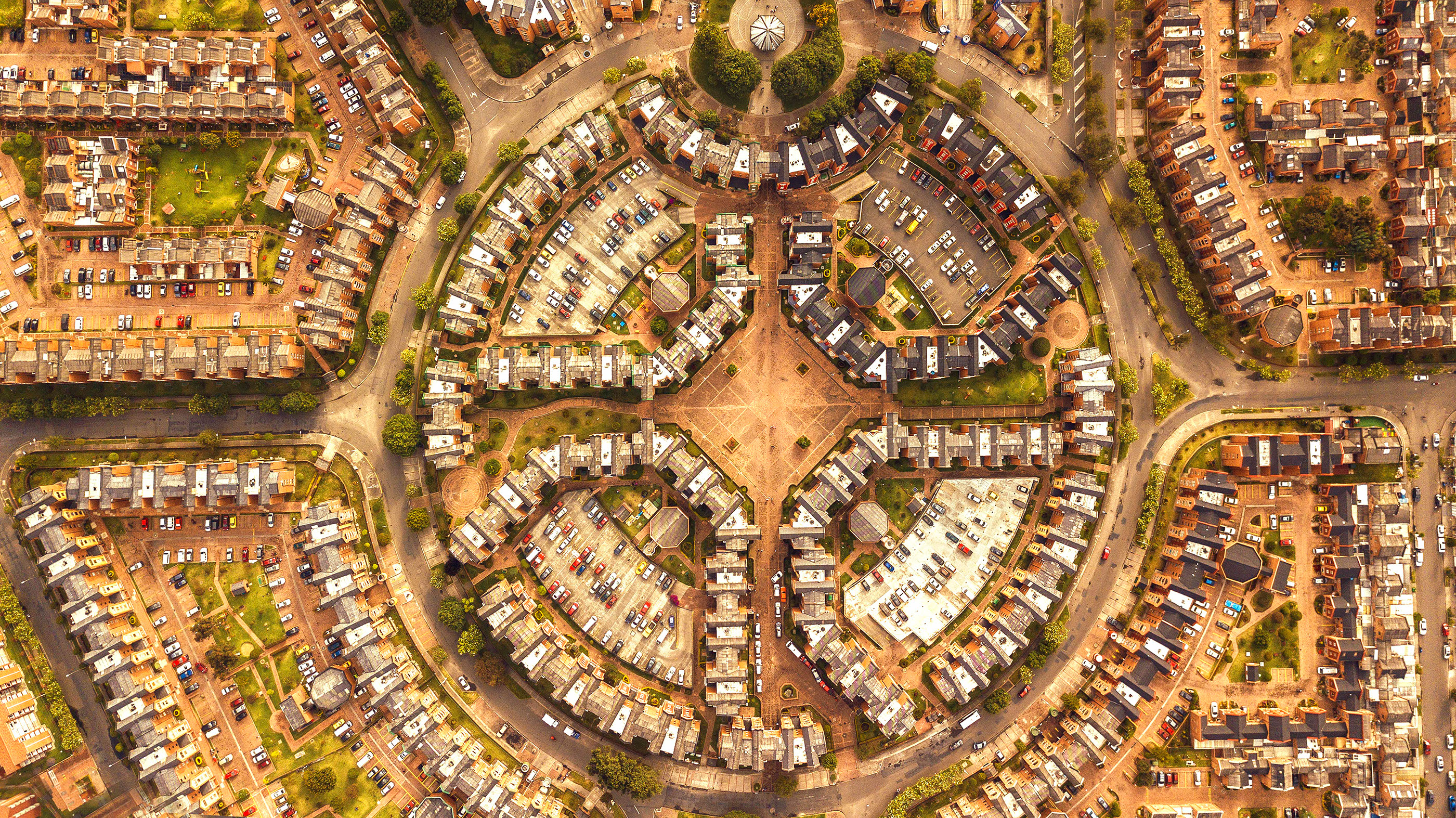
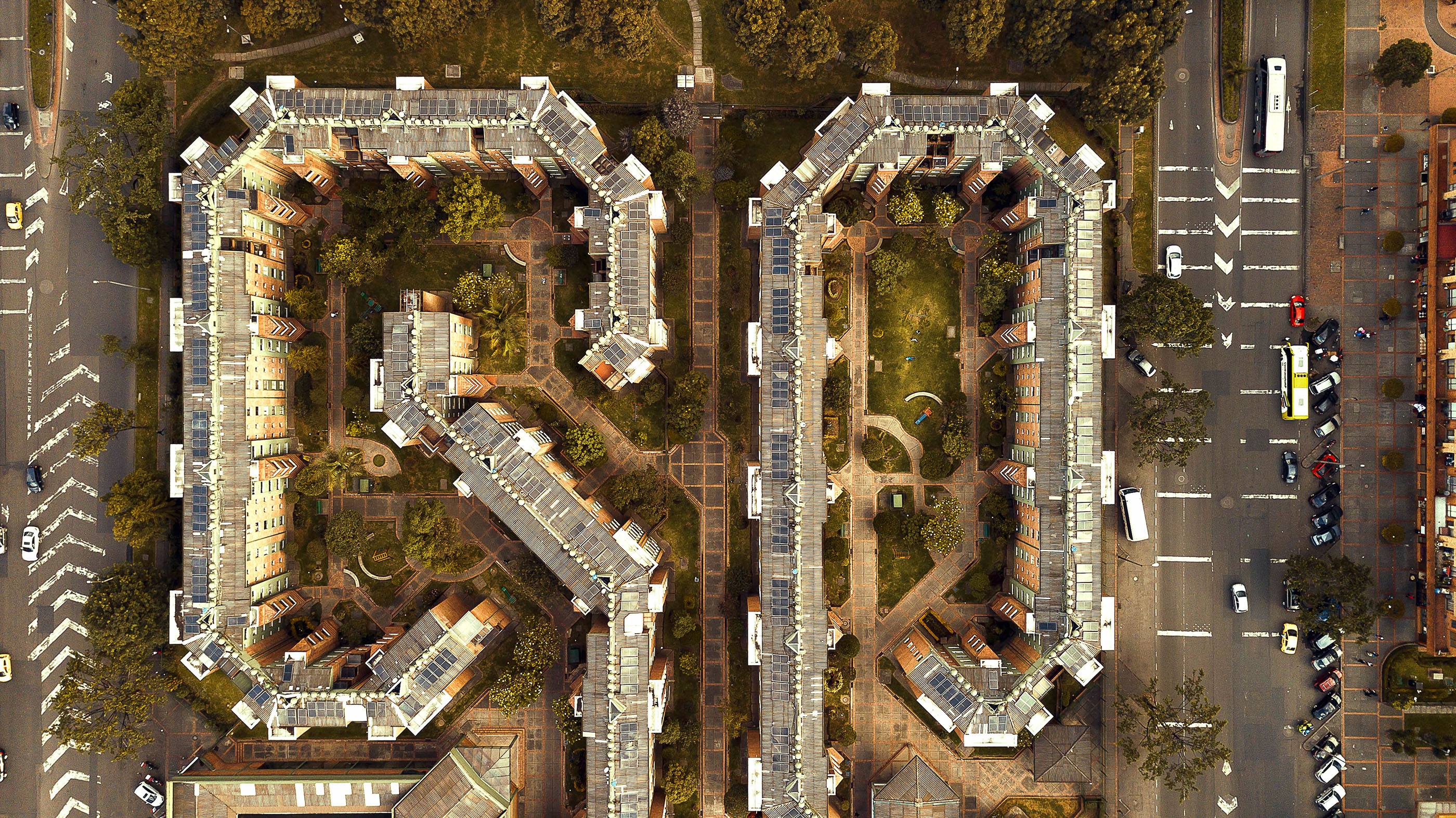
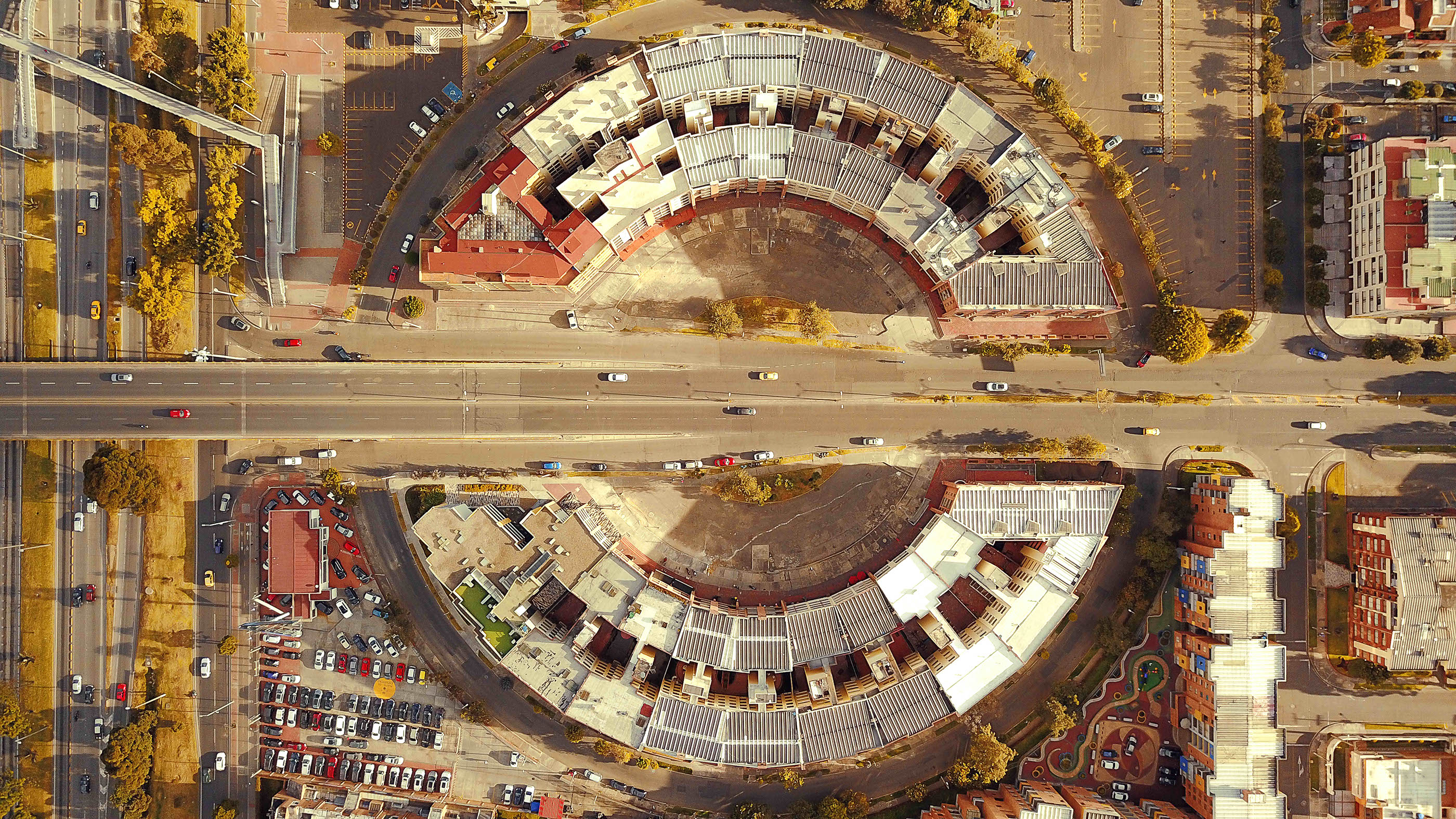
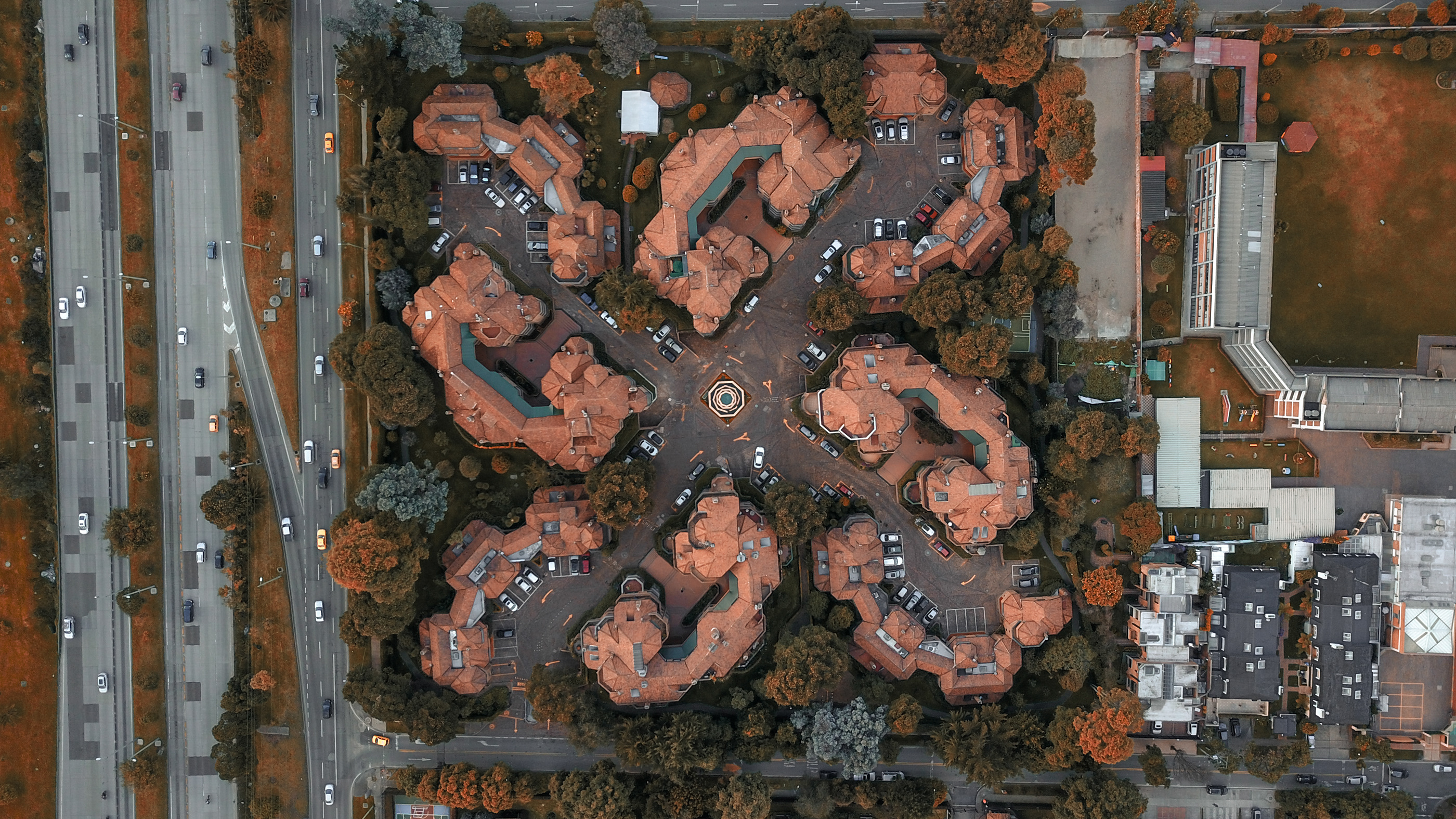
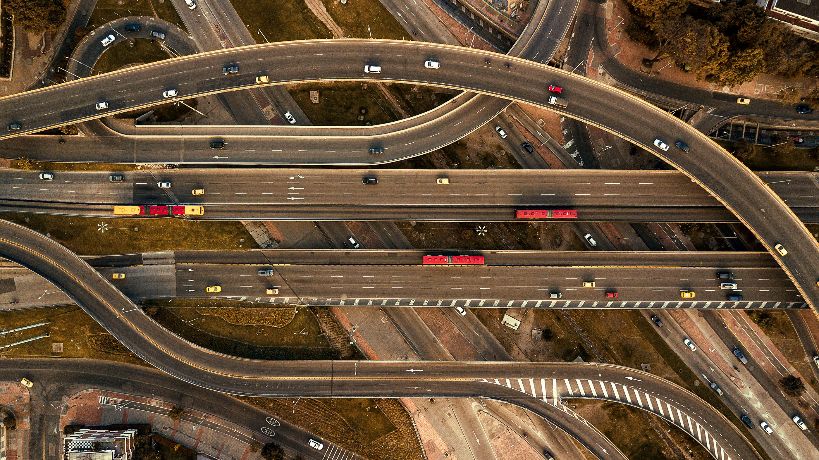
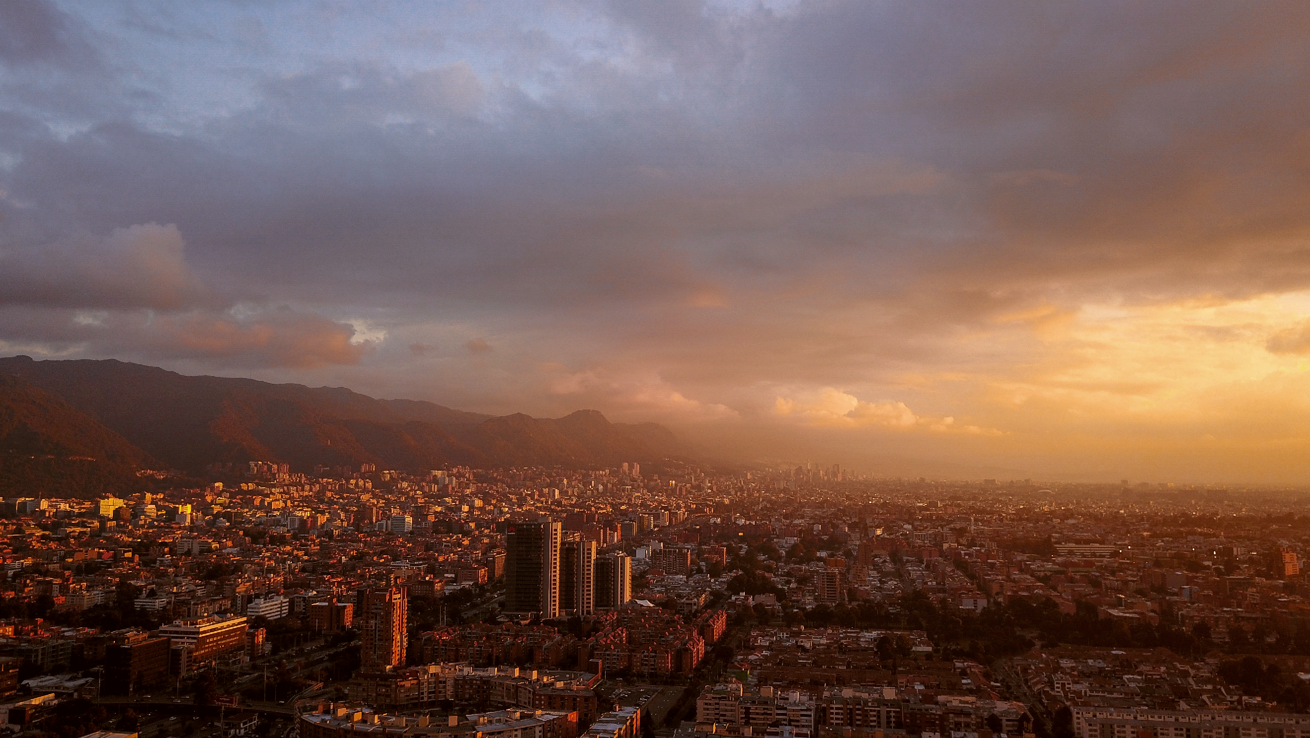
Drone Photography: Aerial Facades
Drone Photography: Aerial Facades
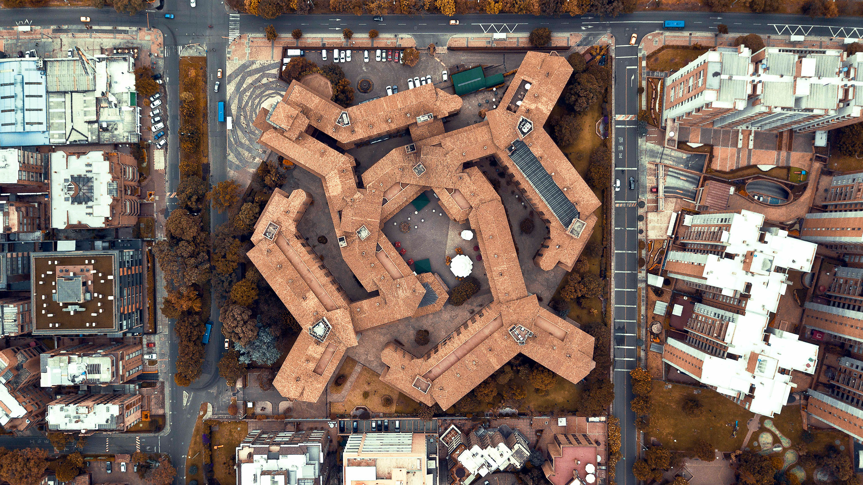
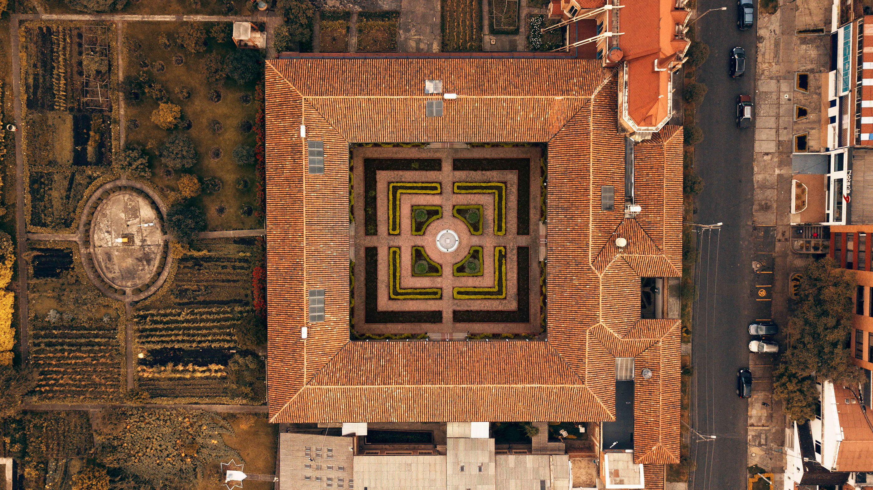
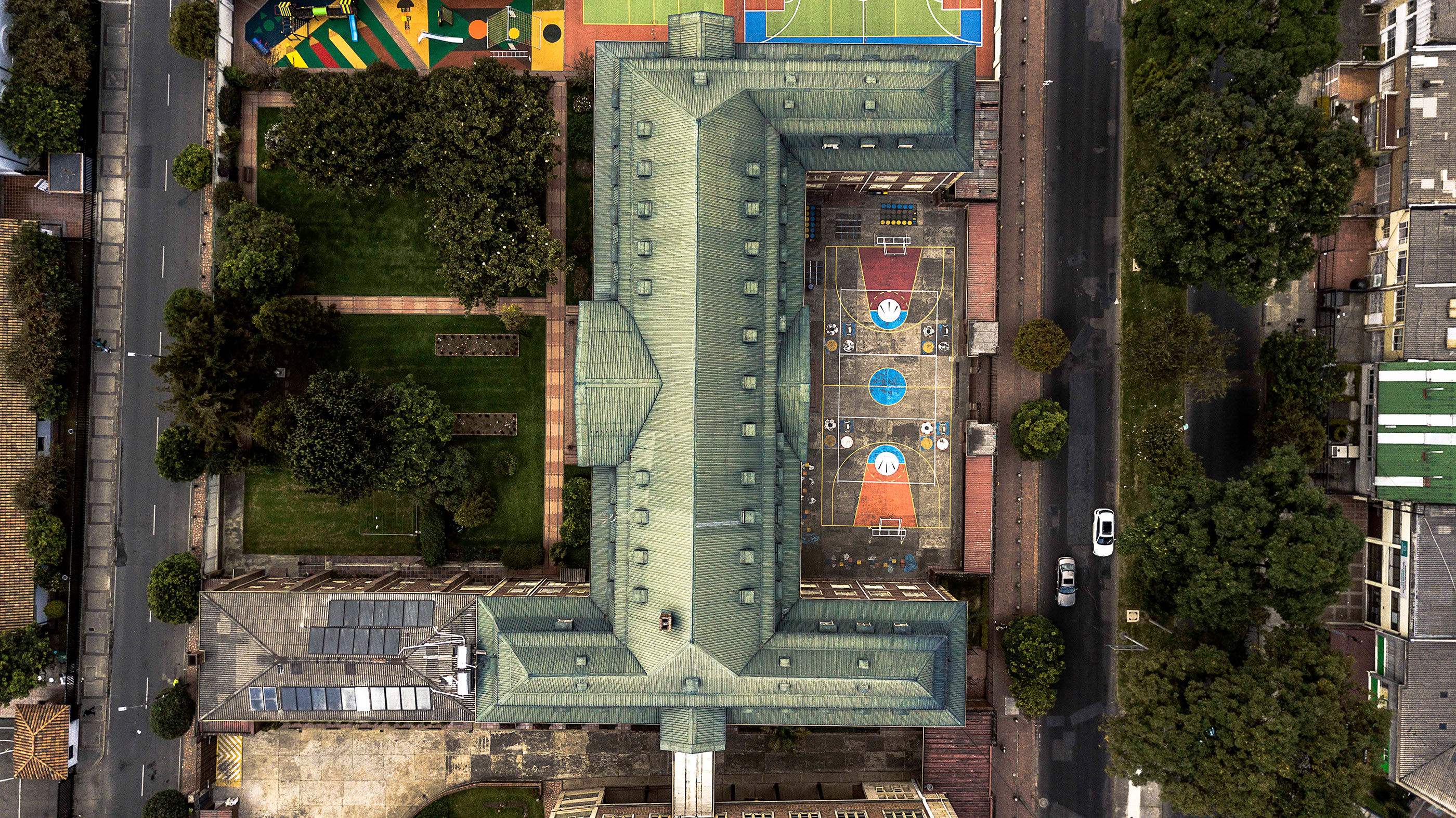
I don’t know if you are familiar to the Instagram hashtag: #StraightFacades, it’s a cool hashtag where users would take pictures of facades of buildings. Mostly all about architecture or even cityscape. But Camilo Monzón Navas took a different and unique direction as he called it: #AerialFacades. Shot mostly on a drone (Mavic Pro), you get to discover another angle and showcase really interesting results. Check it out!
More Links
- Learn more about on Camilo Monzón Navas
- Follow Camilo on Instagram


AoiroStudio
Jul 05, 2018
Source: Abduzeedo Photography
July 4, 2018
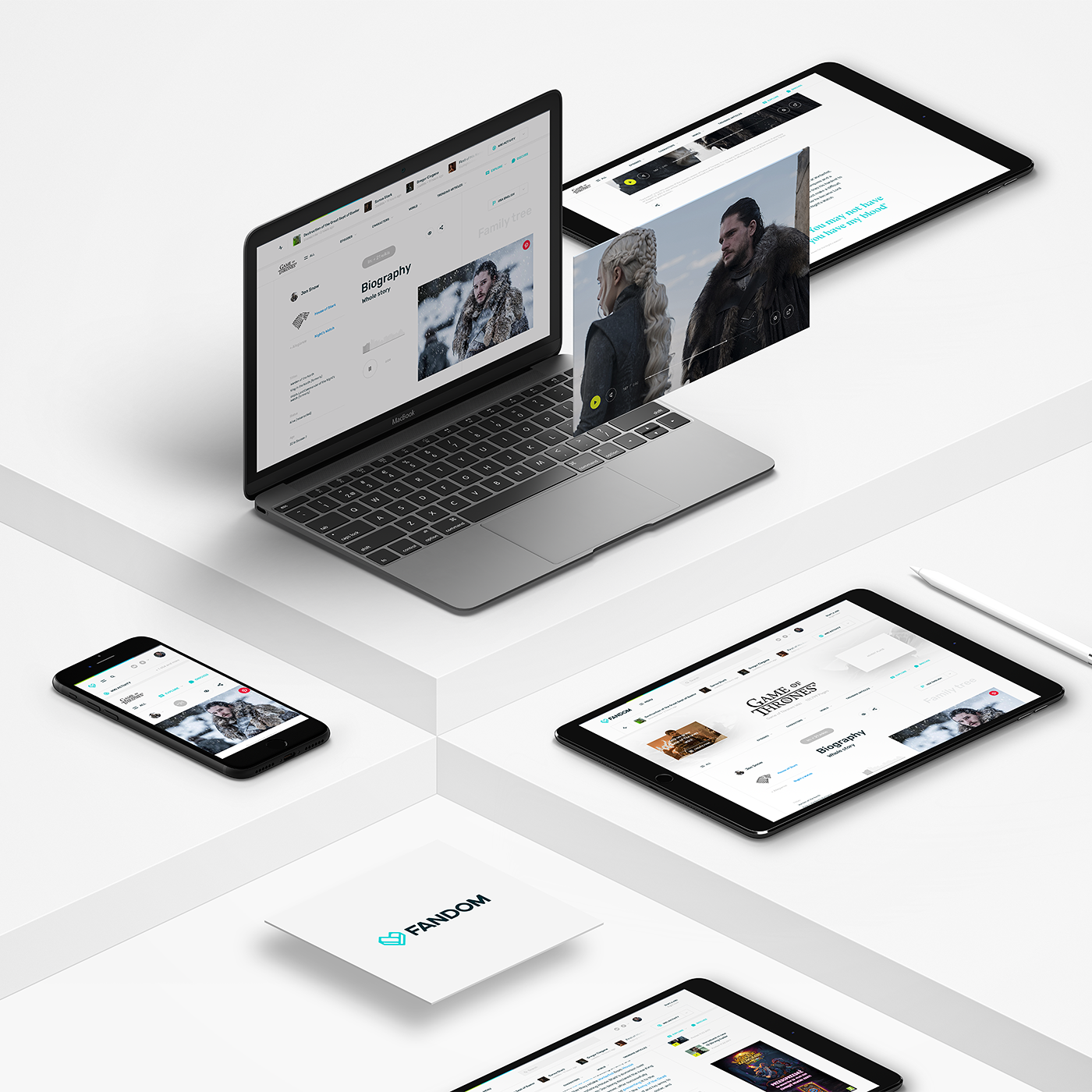
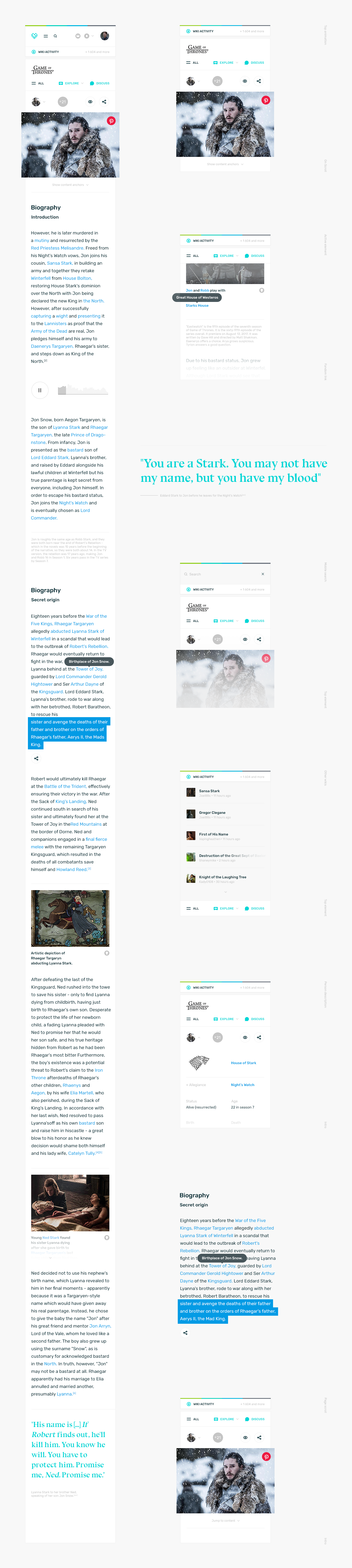
UI/UX: Redesigning a new look Wikipedia/Fandom
UI/UX: Redesigning a new look Wikipedia/Fandom
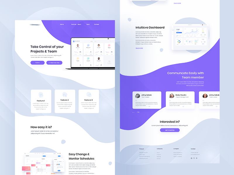
As we are currently playing with inspiration and concepts of the new ABDZ site and part of the process is to revisit what we love and hate from the current design. Also what can be improved in terms of reader experience as well, the blog has been alive for more than a decade now. We are going on the blog every single day but we have to remind ourselves not to build any bad habits. We are taking a look at the work of Piotr Kaźmierczak and Prowling Wolves. They are both based in Poznań, Poland and their task was to create a new look and feel for Wikipedias article based on Fandom colour scheme. Let’s check it out!
Credits
More Links
- See the full project on Behance

AoiroStudio
Jul 04, 2018
Source: Abduzeedo UI/UX
July 4, 2018
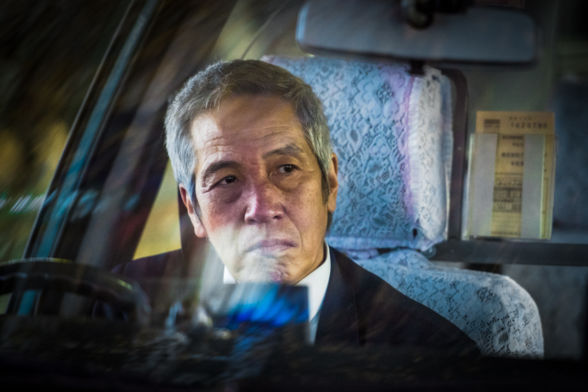
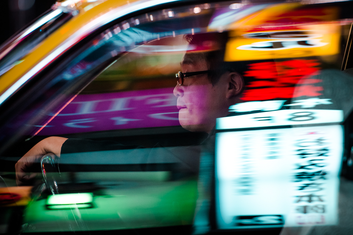
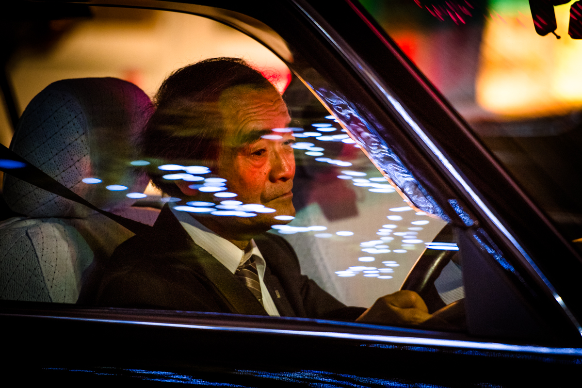
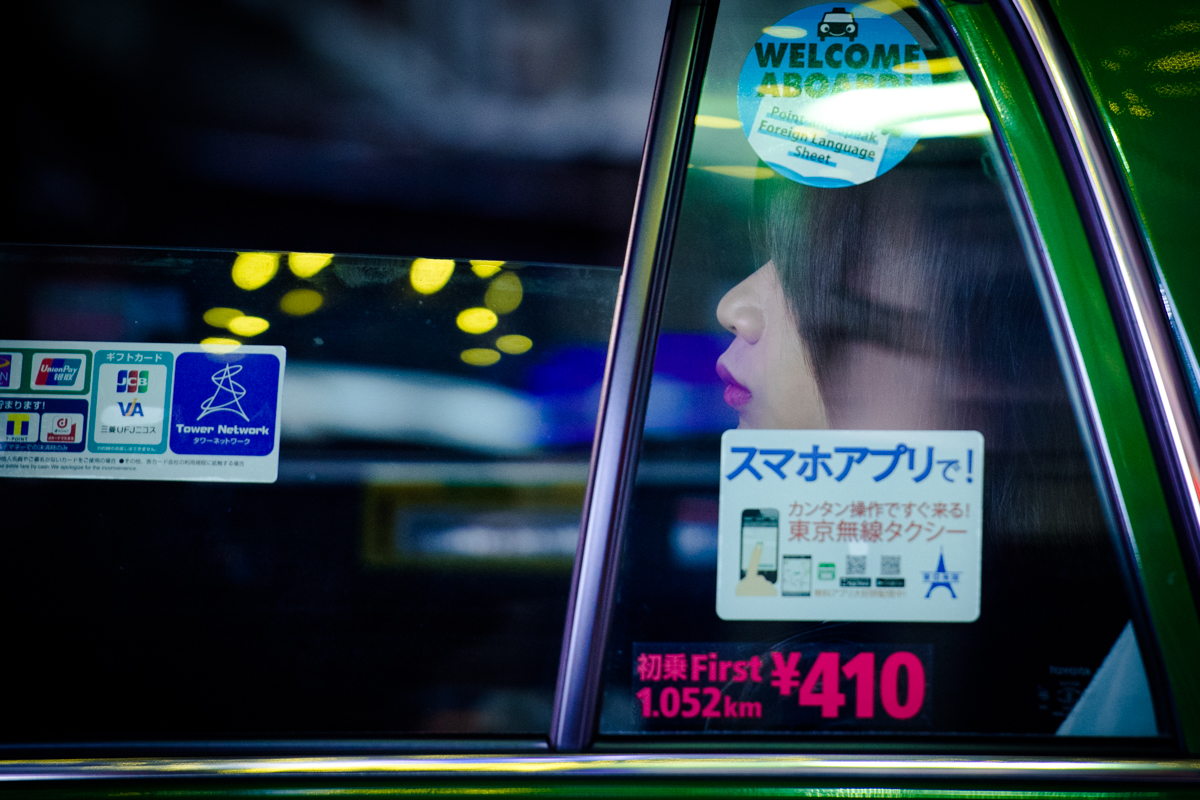
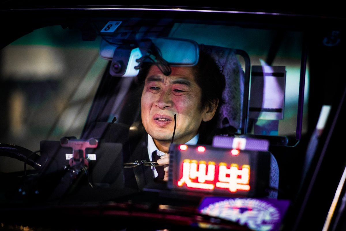
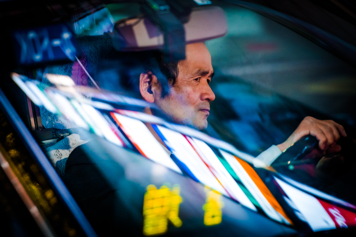
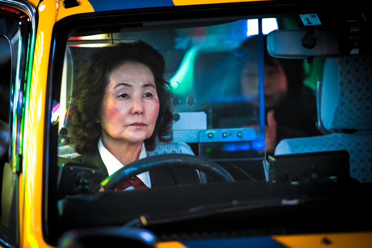
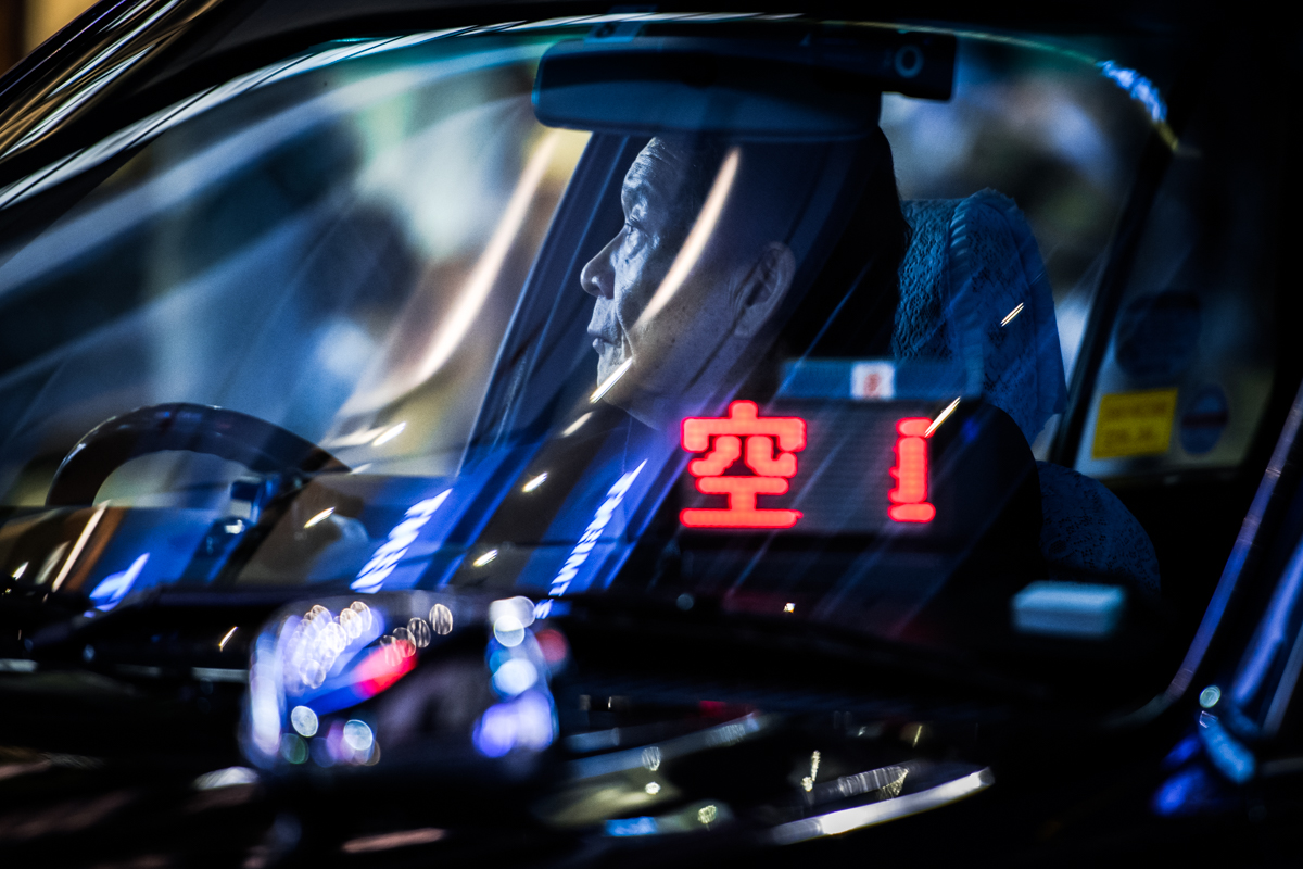
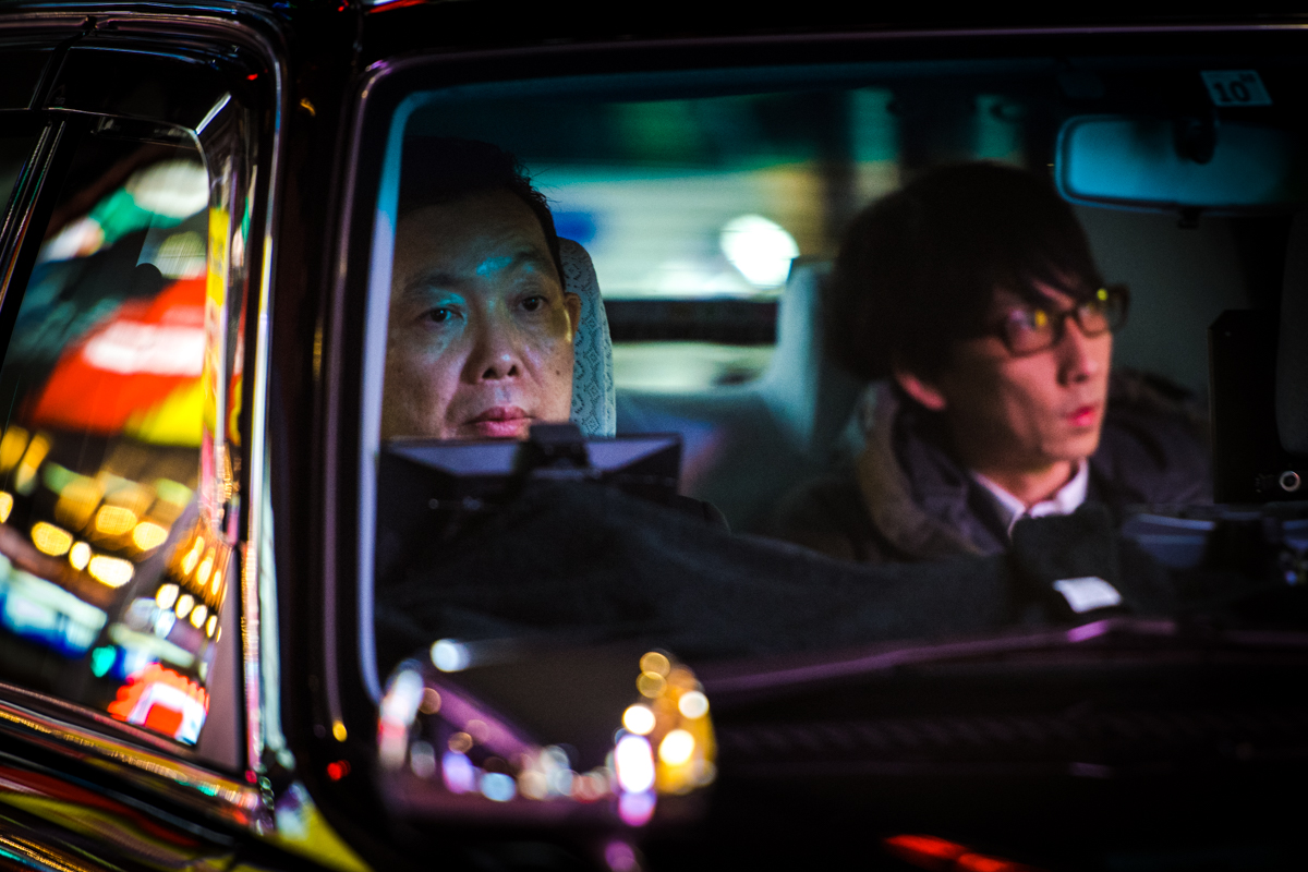
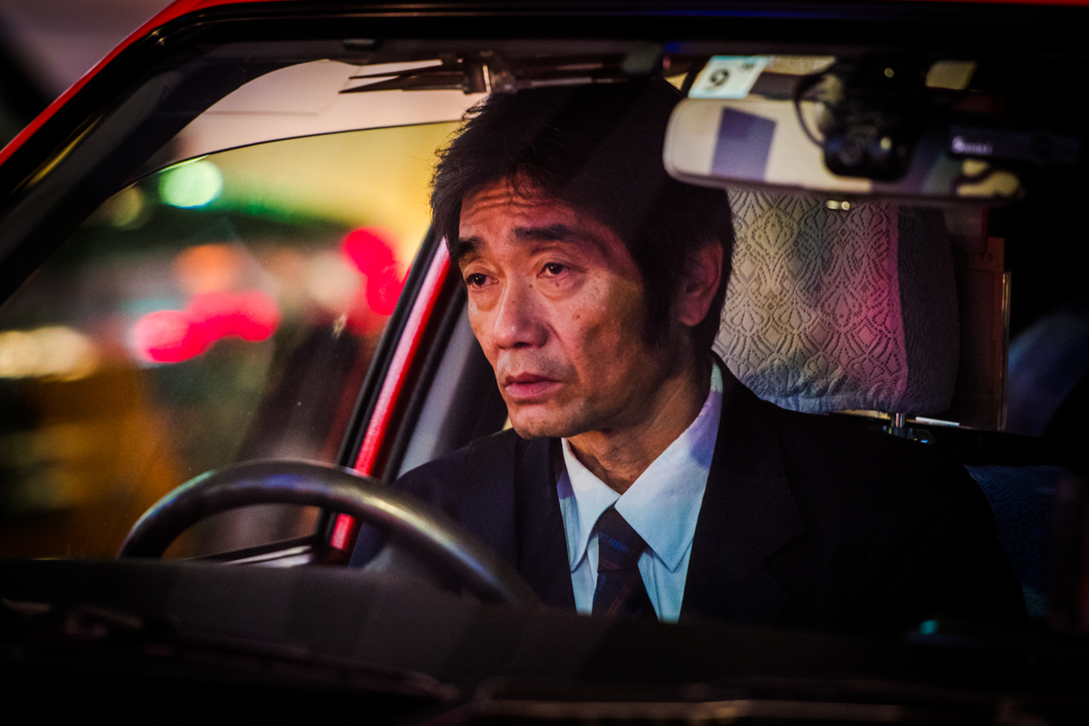
Who’s Driving Tokyo Photography Series
Who’s Driving Tokyo Photography Series
We have featured the work of Oleg Tolstoy before on ABDZ with the “The Tourist Trap” Series. Now he is back with a photography series entitled: Who’s Driving Tokyo from one of my favourite places on Earth. This series has been featured on many outlets and now here on Abduzeedo. I love the sight of a unique and silent world of the Japanese taxi drivers, it’s an interesting glimpse at their daily life.
I soon discovered that this aloofness is not just personal, but professional: drivers rated ‘ y ūryō untensha ’ – excellent driver – have their own stands at major stations and special markings on their cabs. As people, we naturally crave connection, but even in this tiny enclosed space, the line between driver and passenger persists. I was intrigued by these professionals who spend most of their days in silence, despite often being sat less than a metre from another human being
More Links
- Learn more about Oleg Tolstoy


AoiroStudio
Jul 04, 2018
Source: Abduzeedo Photography
July 3, 2018
Nvidia’s GTX 11 Series may get people ready for the next generation of VR
Unnamed sources claim that Nvidia’s upcoming GeForce GTX 1180 add-in graphics card for desktops will likely include a proprietary connector for virtual reality headsets to support 120Hz refresh rates over a single cable.
The post Nvidia’s GTX 11 Series may get people ready for the next generation of VR appeared first on Digital Trends.
Source: Digital Trends VR
July 3, 2018
‘The Legend of Zelda: Ocarina of Time’ boss Ganondorf is even scarier in VR
A YouTube user and Unreal Engine 4 VR developer has managed to create the entire Zelda: Ocarina of Time Ganondorf fight in virtual reality, and the results have us hoping for a full VR remake.
The post ‘The Legend of Zelda: Ocarina of Time’ boss Ganondorf is even scarier in VR appeared first on Digital Trends.
Source: Digital Trends VR
July 3, 2018
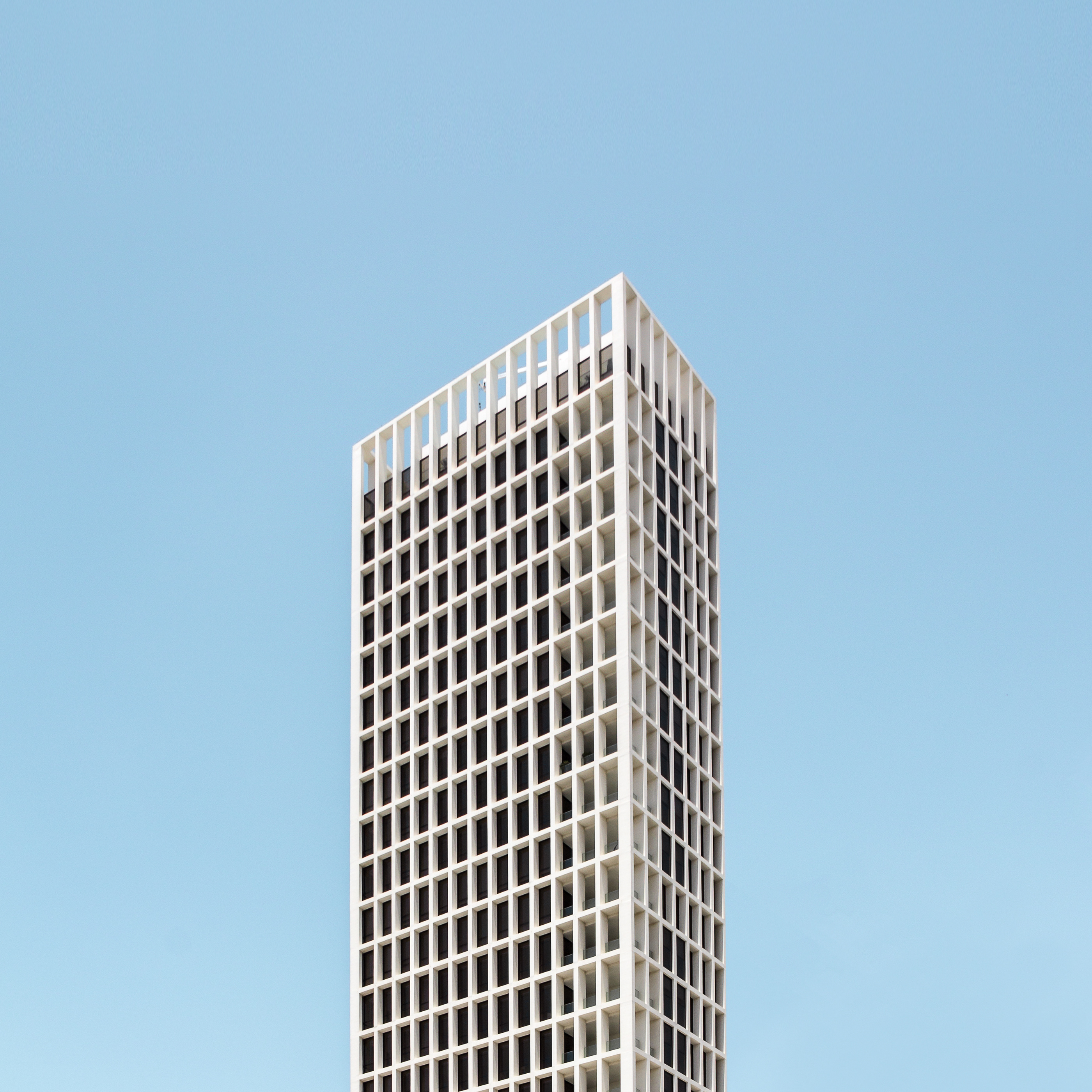
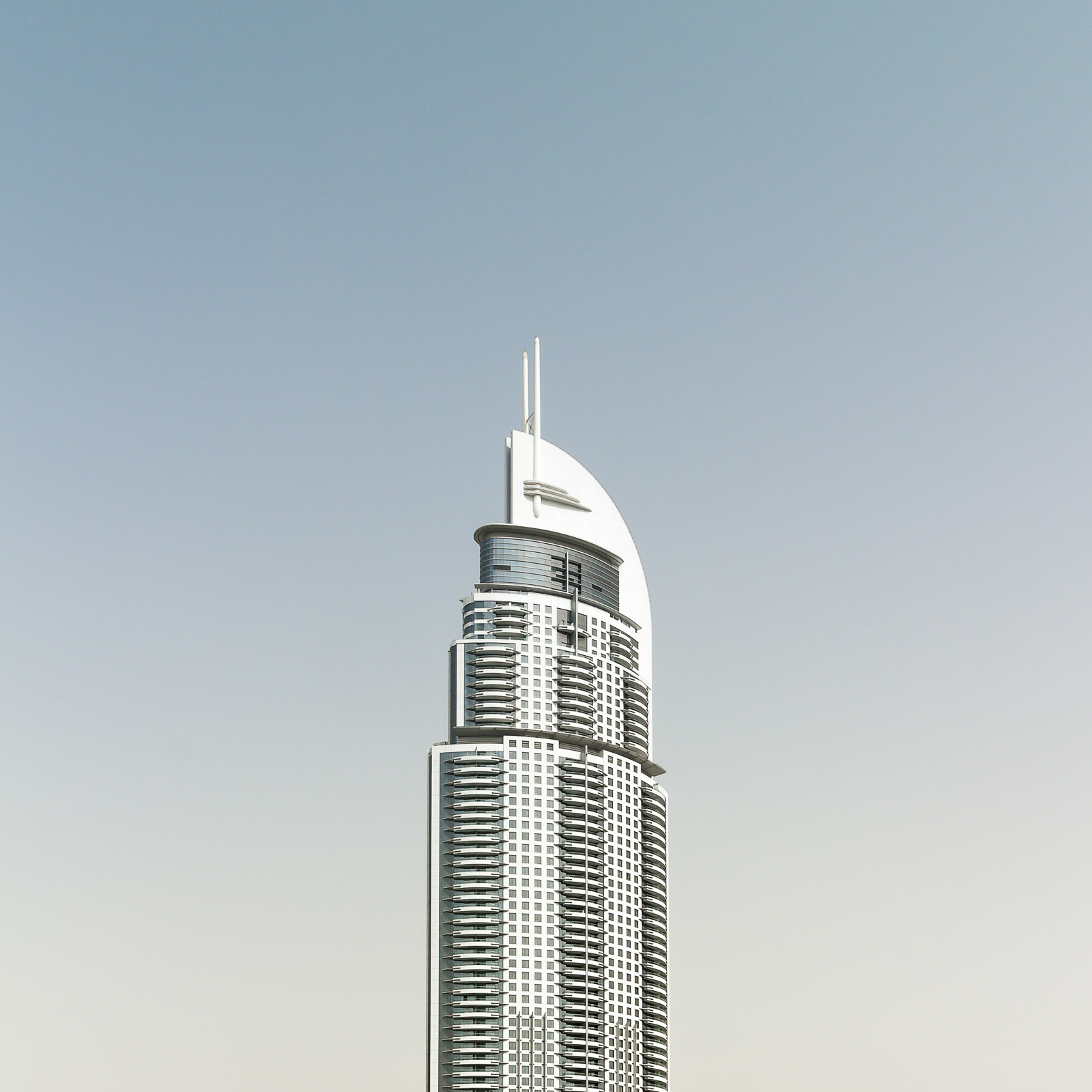
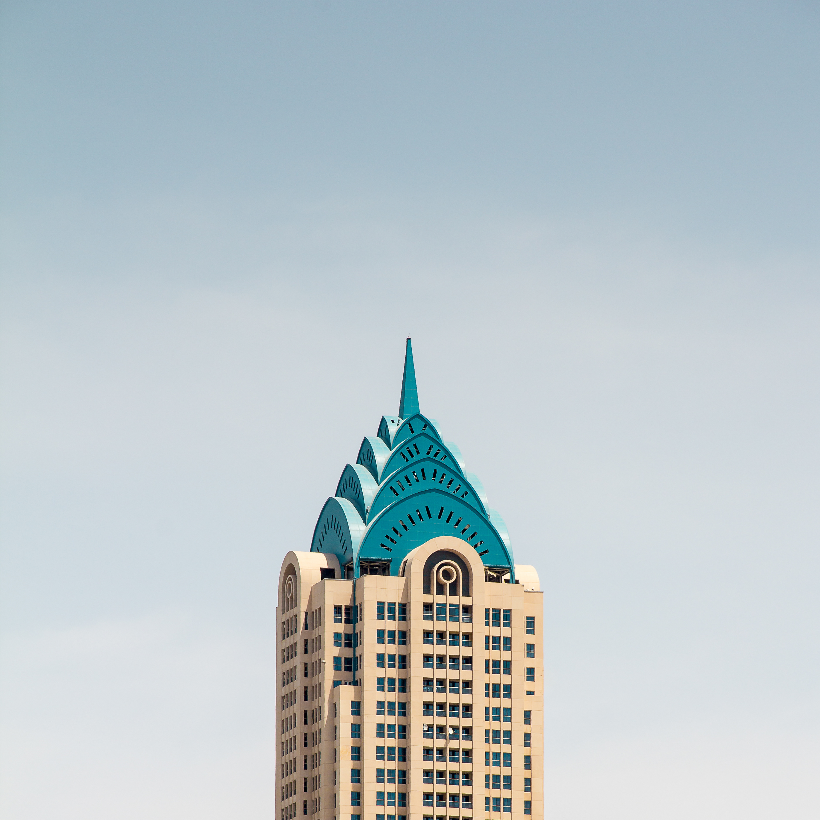
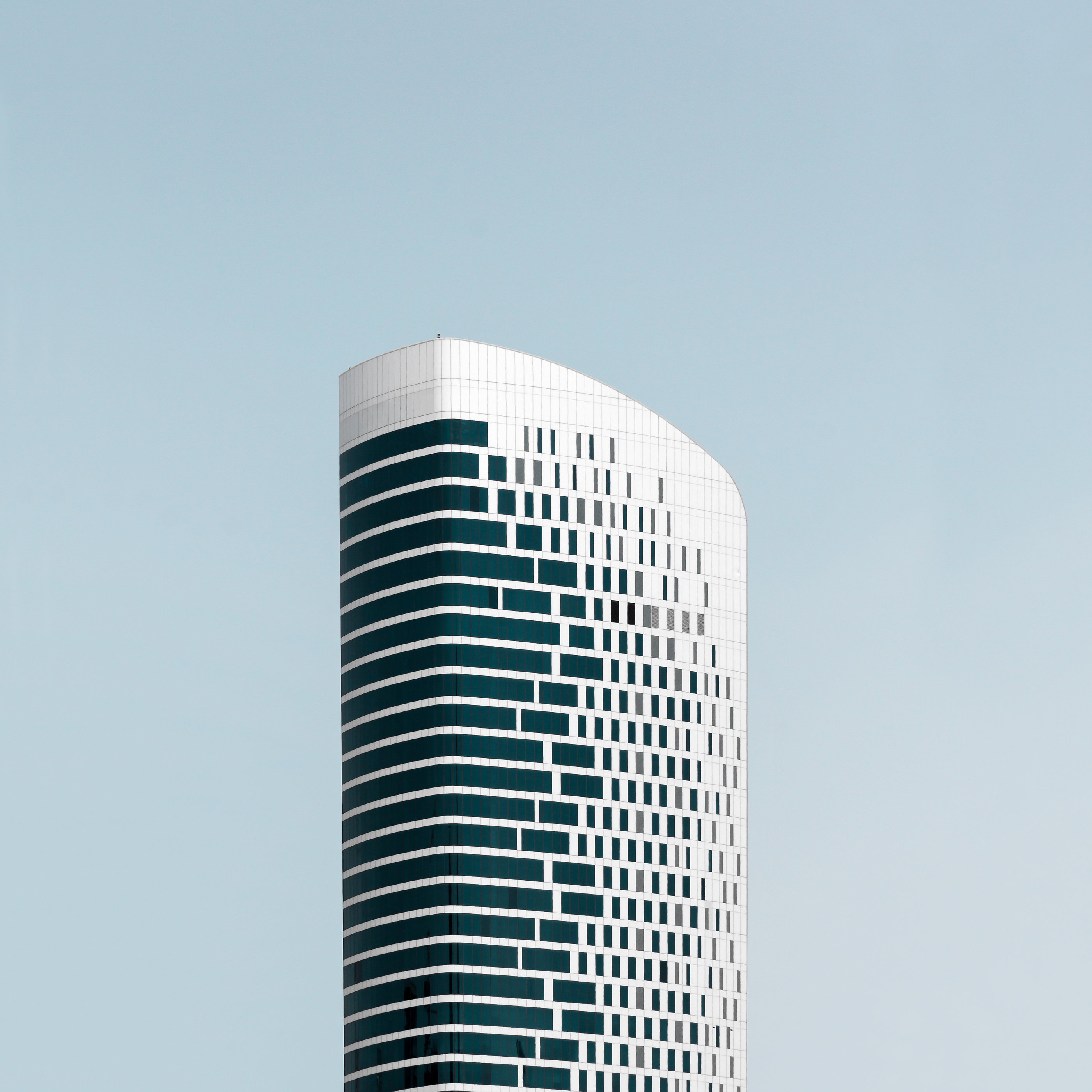
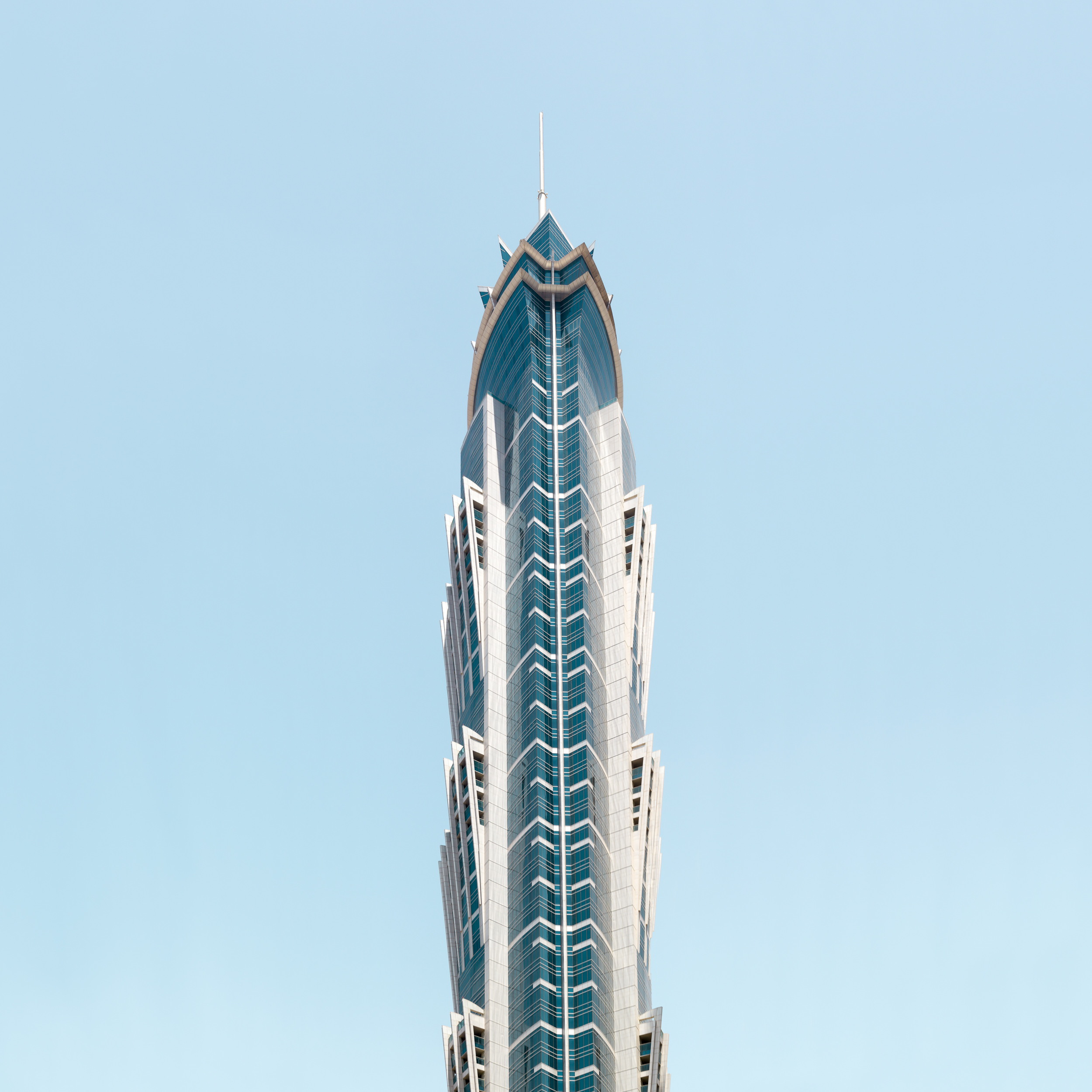
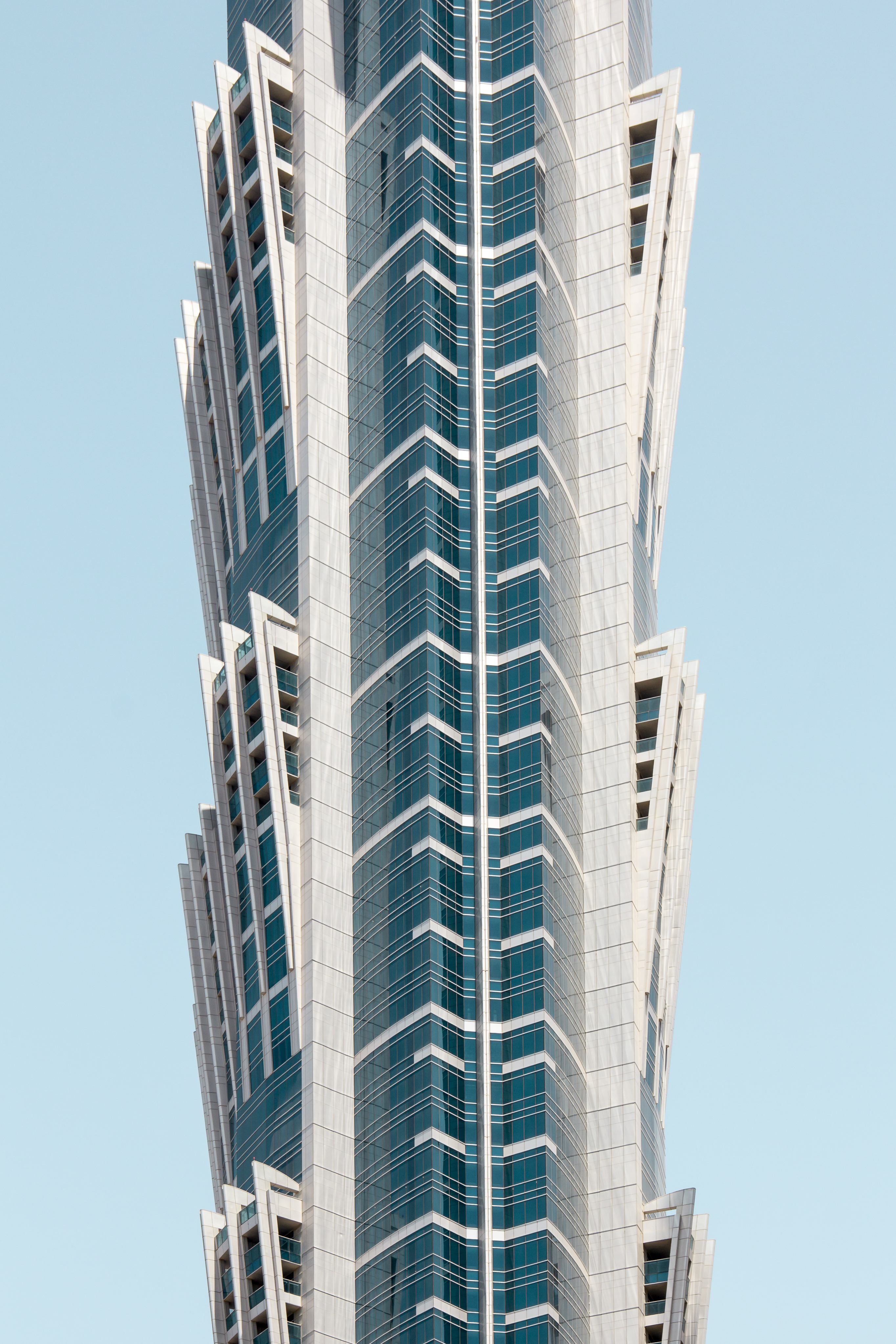
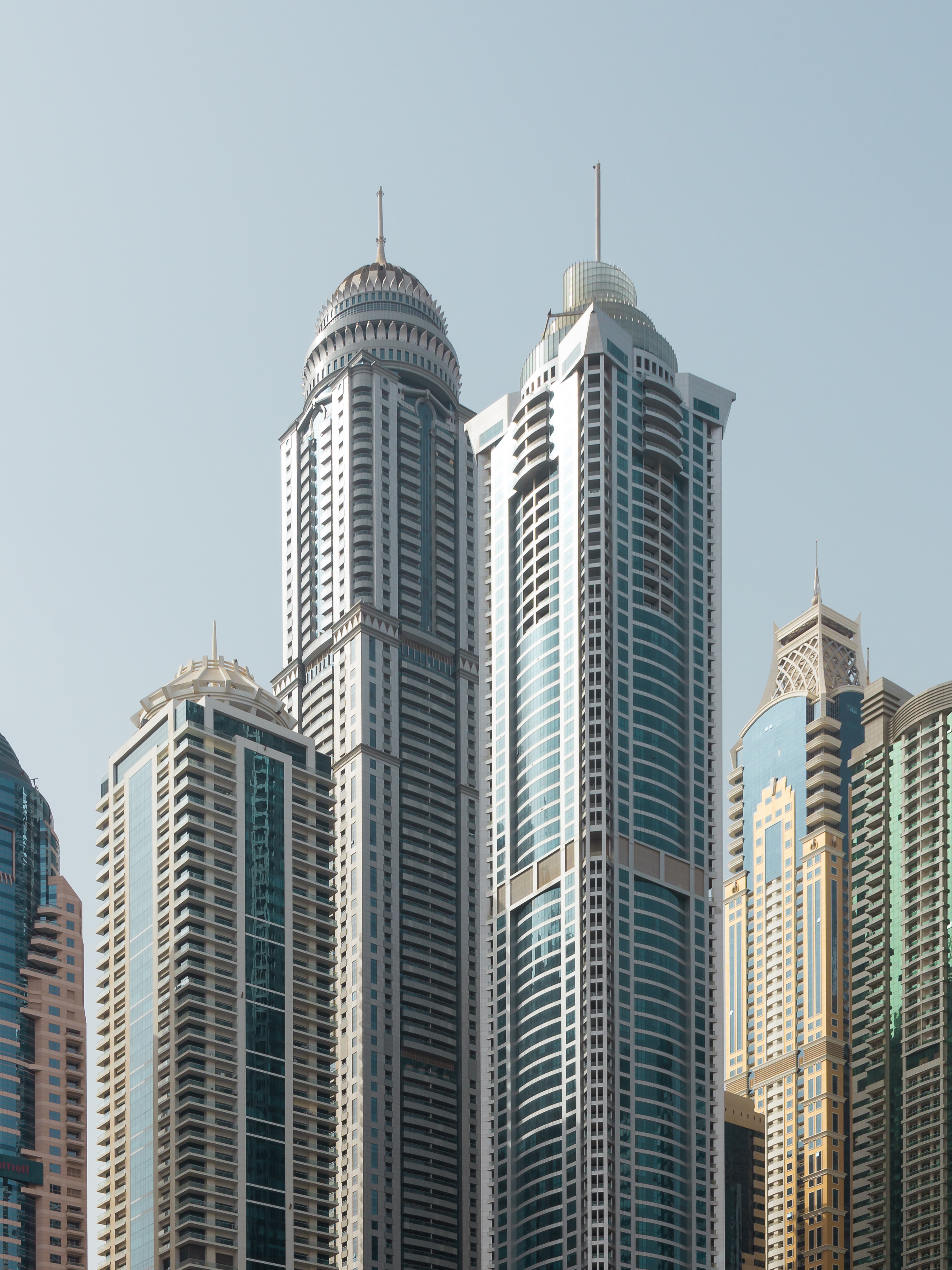
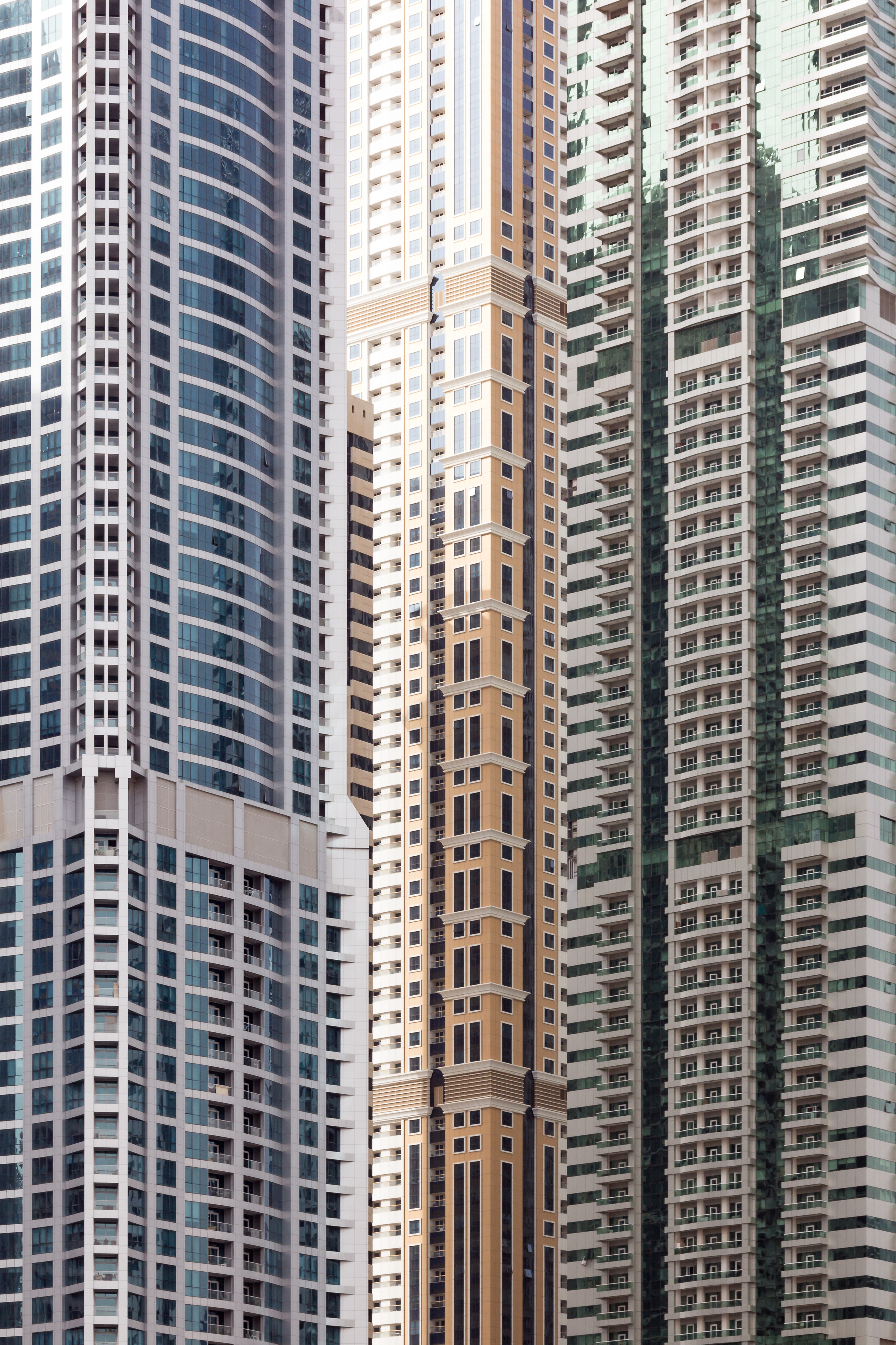
SimCity-Inspired Architecture Photography
SimCity-Inspired Architecture Photography
Do you guys remember the game SimCity? It was an open-ended city-building game series from back from the 1990s-2000s. It was quite popular back in the days! In relation of this game series, I really love this architectural photography series by Björn Witt of Dubai, UAE. Björn is originally from Hamburg, Germany and you just gotta appreciate his photographic vision of Dubai with the light and those endless repetitive building patterns. It’s stunning!
More Links
- Learn more about Björn Witt
- Follow Björn’s work on Behance

AoiroStudio
Jul 03, 2018
Source: Abduzeedo Photography
July 3, 2018
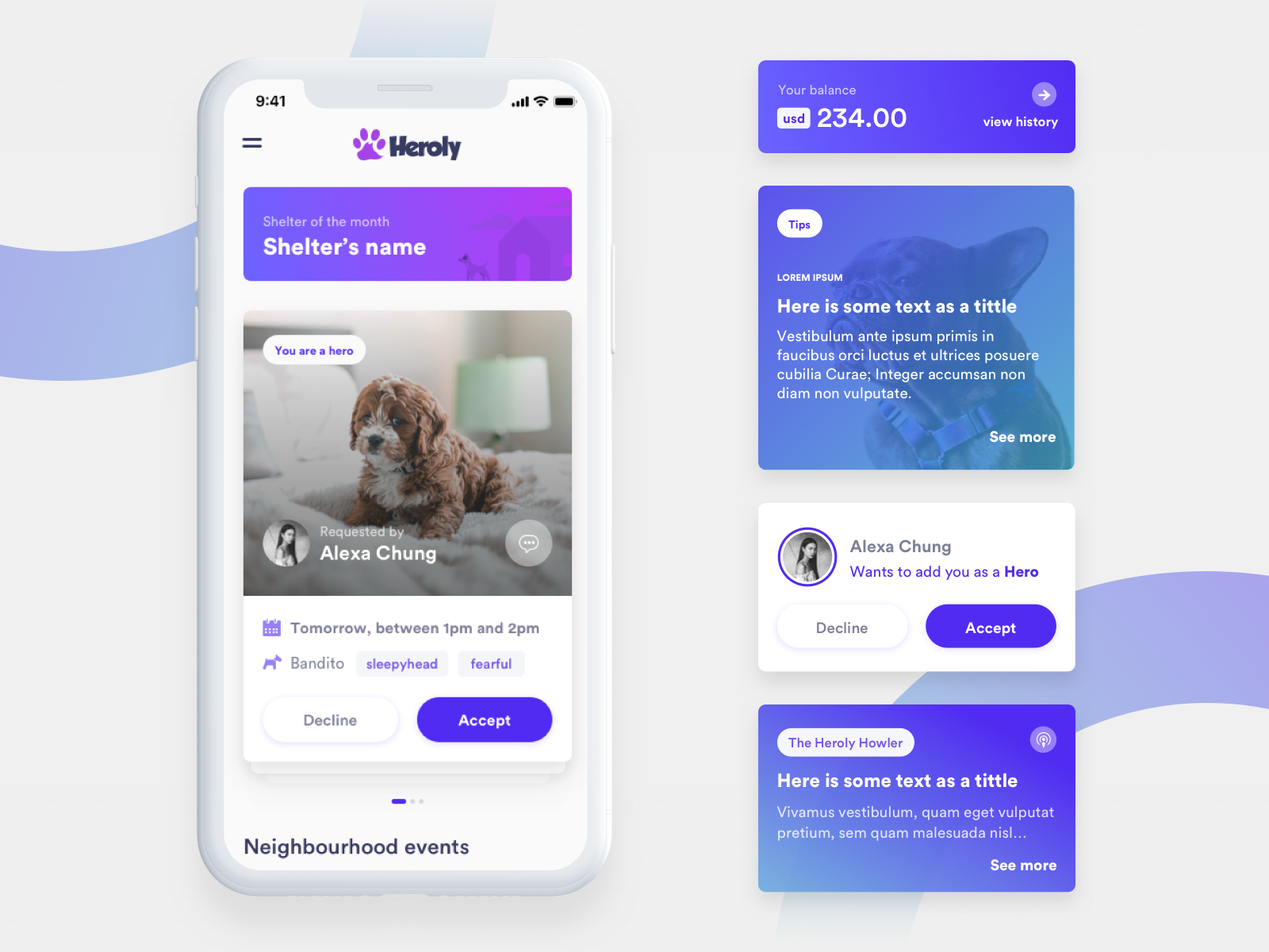
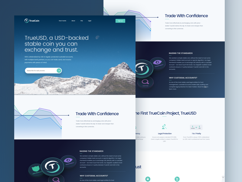
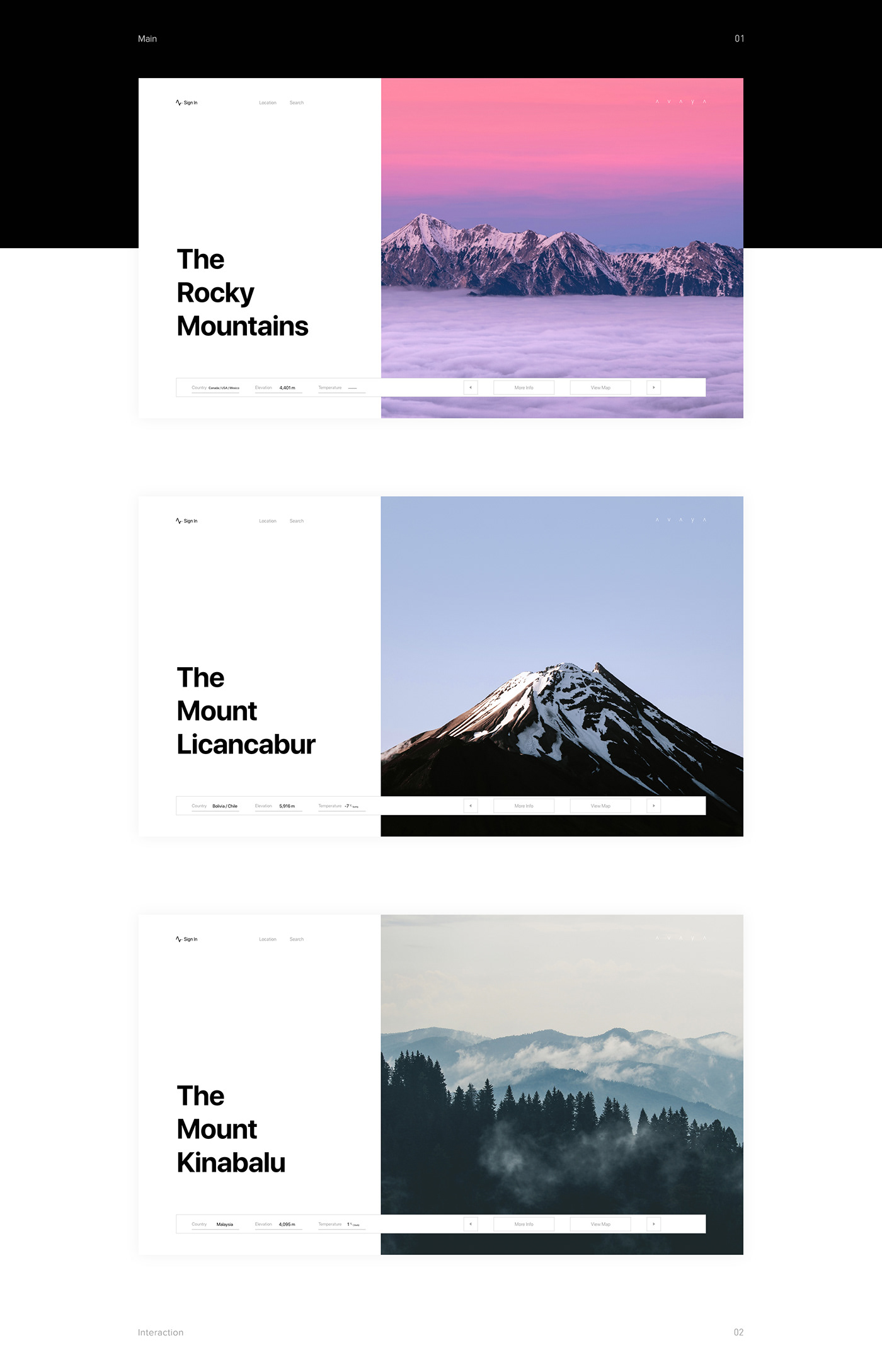
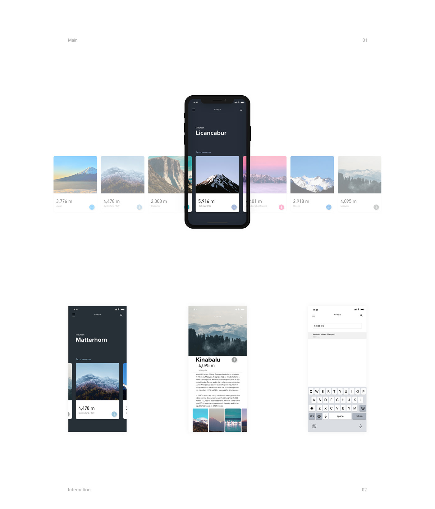
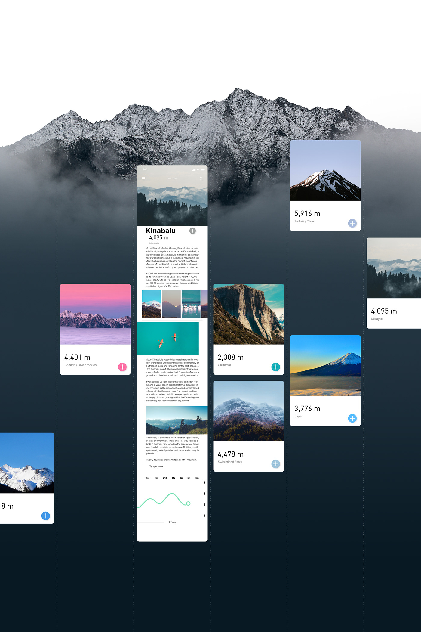
Minimalist UI/UX Design for Avaya
Minimalist UI/UX Design for Avaya
Munseong Yeom and Seongmin LEE shared an awesome UI/UX design post on their Behance profile. It is titled Avaya and it includes much more than just the interface, it’s actually a full branding project, including the logo. For this post, I want to feature it more because of the website and the interface, but below you can see the full description of the project.
Logo
Avaya intuitively shows the viewers about the mountains all over the world. The logo is designed with the motif of the shape of the mountain, expressed by the alphabet “A” in the center, and the vibrating frequency, and consists of the expressions “alive/vibration/young /aim” It intended to express the process of getting out of the repetitive and dull everyday life by feeling the living mountain and constantly reaching the youth and passion.
Situation
People today easily find and share information through media, such as many websites and social applications.But the social network works by exchanging and spreading the information rather than merely exposing a brand, it takes time to find the needed information.
Avaya will gather the scattered information and provide faster and intuitive information.Avaya is believed to be a sharing community that provides information about worldwide mountains and share the reviews by the users.
About UI/UX
There are functions to search mountains by its name, by location and also about unknown mountains. Each mountain page is composed of card-type content, and it provides basic information including altitude, temperature, traveling route and location, and you also can find photos, videos, and reviews by the users. It has been designed with a simple and optimized design to view the information easier and more intuitive.
UI/UX Design


abduzeedo
Jul 03, 2018
Source: Abduzeedo UI/UX
July 1, 2018
How the Coen Brothers Use Repetition to Create Comedy

We know that the Coen Brothers’ films are funny, but why?
Directors Joel and Ethan Coen have a unique brand of comedy. It’s witty, anecdotal, farcical, and at times, even silly, but it’s also dark and morbid, employing conventions of gallows humor and black comedy. Clearly, many different things are at work to make films like Fargo, A Serious Man, and Burn After Reading top-notch comedies, but one technique that the directing duo uses consistently throughout their filmography is repetition. In hopes of understanding the role repetition plays in their films, Julian Palmer of The Discarded Image explores this intriguing aspect of the Coen Brothers’ comedic sensibility in the video essay below.
This video essay is—well, it’s somethin’ else. It’s essentially a microcosm of the Coen universe in video essay form. Real meta stuff. I like it. But it’s also incredibly thorough in its explanation of how the directors use repetition to get laughs. Here are the techniques mentioned in the video, some of which might’ve been listed as a joke, but guess what, I’m including them anyway.
Source: NoFilmSchool
June 30, 2018
Deus Ex Machina, the Laziest Way to Spoil Your Screenplay
![]()
While a deus ex machina may save your character’s life, it’ll often kill your script.
There is no right or wrong way to write a screenplay—but there are some seriously lazy tropes that you may be unintentionally employing in your narrative. One of these is a plot device called deus ex machina. Even if you’ve never heard the term before, you’ve definitely seen it a thousand times and unless the move is self-aware and/or for laughs, it pretty much never leaves the audience satisfied.
In this video essay, Fandor’s Jacob T. Swinney dives into the concept of deus ex machina, what it is and how it different filmmakers have used it (sometimes successfully but mostly unsuccessfully) in their films. Check it out below:
Source: NoFilmSchool