-
News & Updates
camera
October 26, 2017
The Daily Chord Weekly Recap – Friday, October 27
Music is the focus of The Daily Chord, whether it be business developments or cultural phenomena. Six links each weekday provide an unique overview and a time-saving service. Subscribe to the Chord email blast to make your inbox more informative.
Monday, October 23
-
Stream-ripping doesn’t necessarily constitute ripping off, says EFF
Post from Complete Music Update -
Apple Music and Spotify will finally matter for the Billboard charts
Post from BGR -
Trans pioneer Jackie Shane: ‘I don’t bow down. I do not get down on my knees’
Story from The Guardian -
AC/DC producer and Easybeats musician George Young dead at 70
Obituary from Sydney Morning Herald -
All manner of Photoshop evisceration befalls Spoon singer Britt Daniel in new music video
Post from Gizmodo -
Loretta Lynn, recovering from stroke, makes surprise appearance for Country Hall Of Fame induction
Post from Billboard
Tuesday, October 24
-
SF MusicTech Summit tackles streaming, artist pay and more
Post from The Bay Bridged -
Pink’s ‘Beautiful Trauma’ bows at no. 1
Post from Billboard -
50 underground albums you’ve never even heard of
List from The Guardian -
Surviving R. Kelly
Story from Rolling Stone -
Meet the rock stars bringing YouTube to the stage
Post from CNET -
Joni Mitchell is pretty much peerless
Post from Noisey
Wednesday, October 25
-
Fats Domino, piano playing prodigy and rock and roll legend, dies at 89: Report
Obituary from NO Times-Picayune -
30 things you need to know about Texas music in 2017
Feature from Texas Monthly -
The music world’s reaction to sexual assault needs to keep changing
Commentary from Pitchfork -
Alice Glass accuses former Crystal Castles bandmate of sexual assault
Post from The Guardian -
UK rapper Little Simz’s me-first globalization
Post from Wired -
Before there was Bieber, The Monkees’ ‘Daydream Believer’ took the teen world by storm
Post from Variety
Thursday, October 26
-
The life and death of the indie rock heyday
Post from Vox -
‘Numb the pain with money’: How hip-hop turned nihilistic
Post from The Guardian -
Pharrell Williams named chief creative officer of UK startup Roli
Item from Variety -
Virtual reality music startup MelodyVR raises $20M, set to expand in US
Post from Music Business Worldwide -
Many of the biggest tech companies simply can’t compete when it comes to streaming music
Post from Forbes -
Dinosaur Jr.’s J Mascis selling over 100 pieces of gear
Post from Pitchfork
Friday, October 27
-
I can go for that: How soft rock finally got cool
Story from The Guardian -
Ajit Pai submits plan to allow more media consolidation
Post from Ars Technica -
You can now buy event tickets directly through Facebook with SeatGeek
Post from The Verge -
Latin music revenue up 44%, payouts still ‘despacito’
Post from Variety -
11 new companies innovating in the music industry
Post from Pigeons And Planes -
With dreadlocks, rhythm and flow, China embraces hip-hop
Story from NY Times
The post The Daily Chord Weekly Recap – Friday, October 27 appeared first on SXSW.
Source: SxSW Music
October 26, 2017
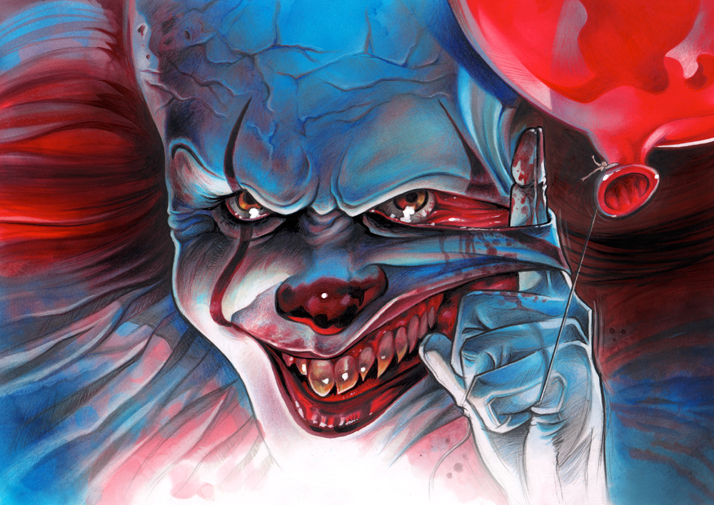
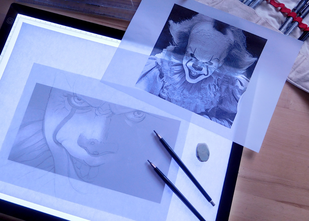
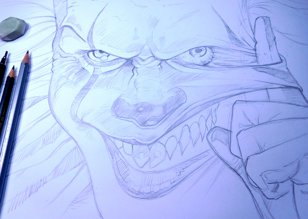
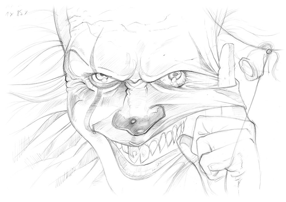
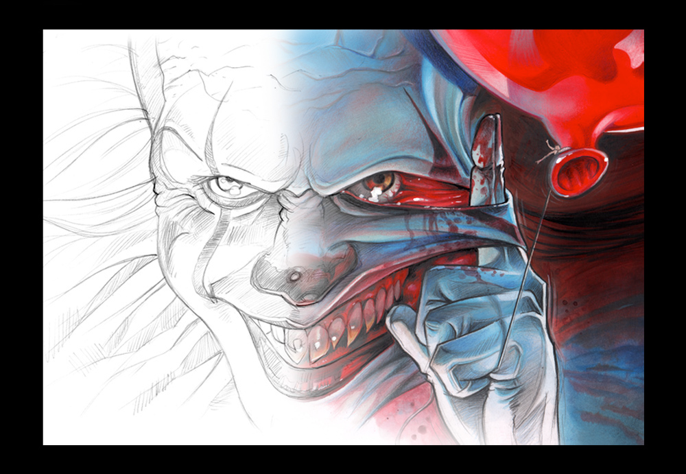
Halloween Illustration: Well That’s Pennywise!
Halloween Illustration: Well That’s Pennywise!
We are only a few days from Halloween, are you still trick and treating? Hah! I’ve been quite fascinated by the latest adaption from Stephen King’s movie “It”. With both events combined, it’s a nice occasion to revisit the main character of one of the scariest movies of the year. Hello Pennywise! Let’s take a look at this illustration for Halloween by Germany-based designer Martin Hoffmann, after having 3 days of free time between two jobs. Why not having fun taking a poke at Pennywise? What do you think?
Martin Hoffmann is a graphic & character designer and illustrator based in Stuttgart, Germany. Focusing his work into Book Illustration, Cover Design, Kids Art, Children Books, Visual Concepts, Scribbles, Story Board, Logo Design and more. Check him out on Behance.
More Links
- Learn more about Martin Hoffmann at illustration-und-design.com
- Follow Martin Hoffmann on Behance
Illustration

AoiroStudio
Oct 26, 2017
Source: Abduzeedo Illustration
October 25, 2017
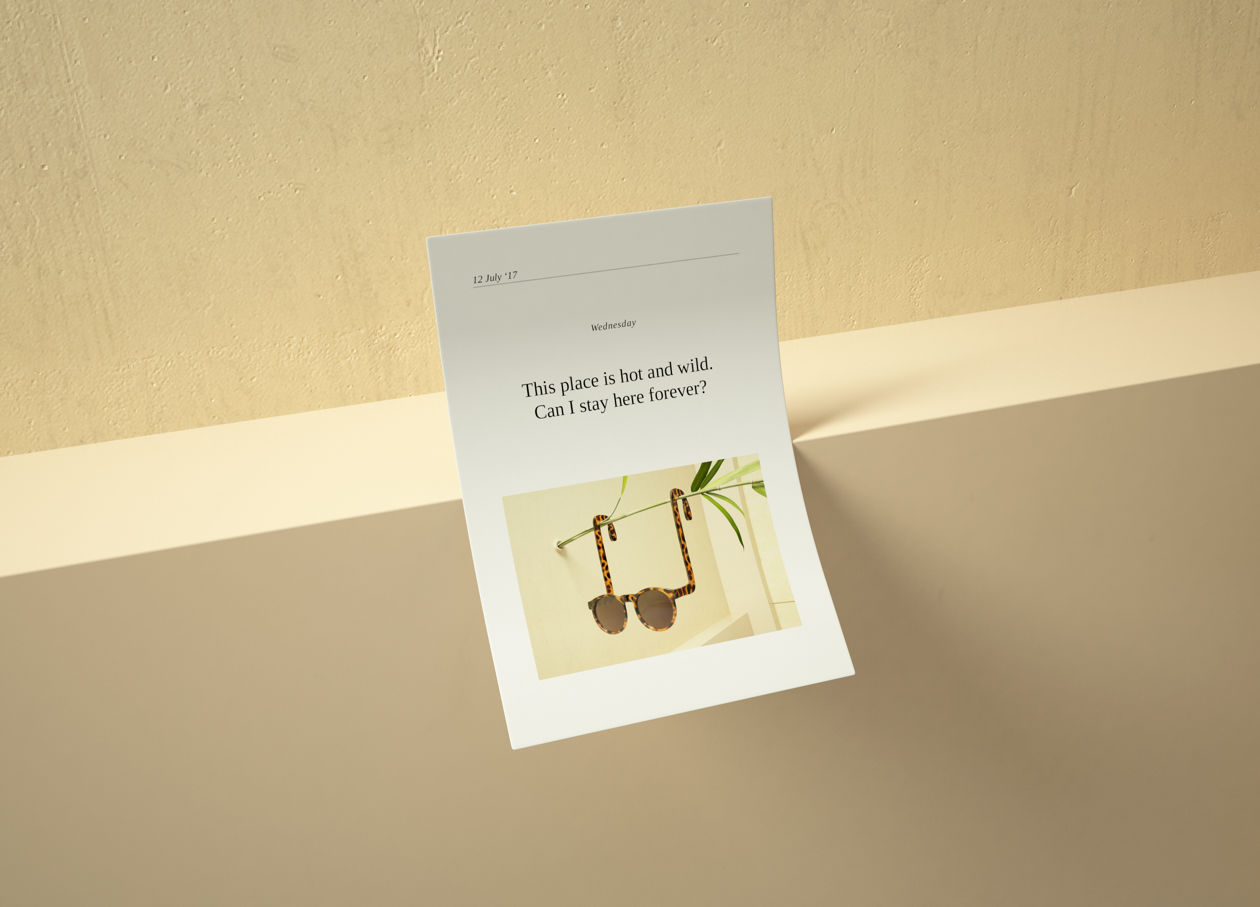
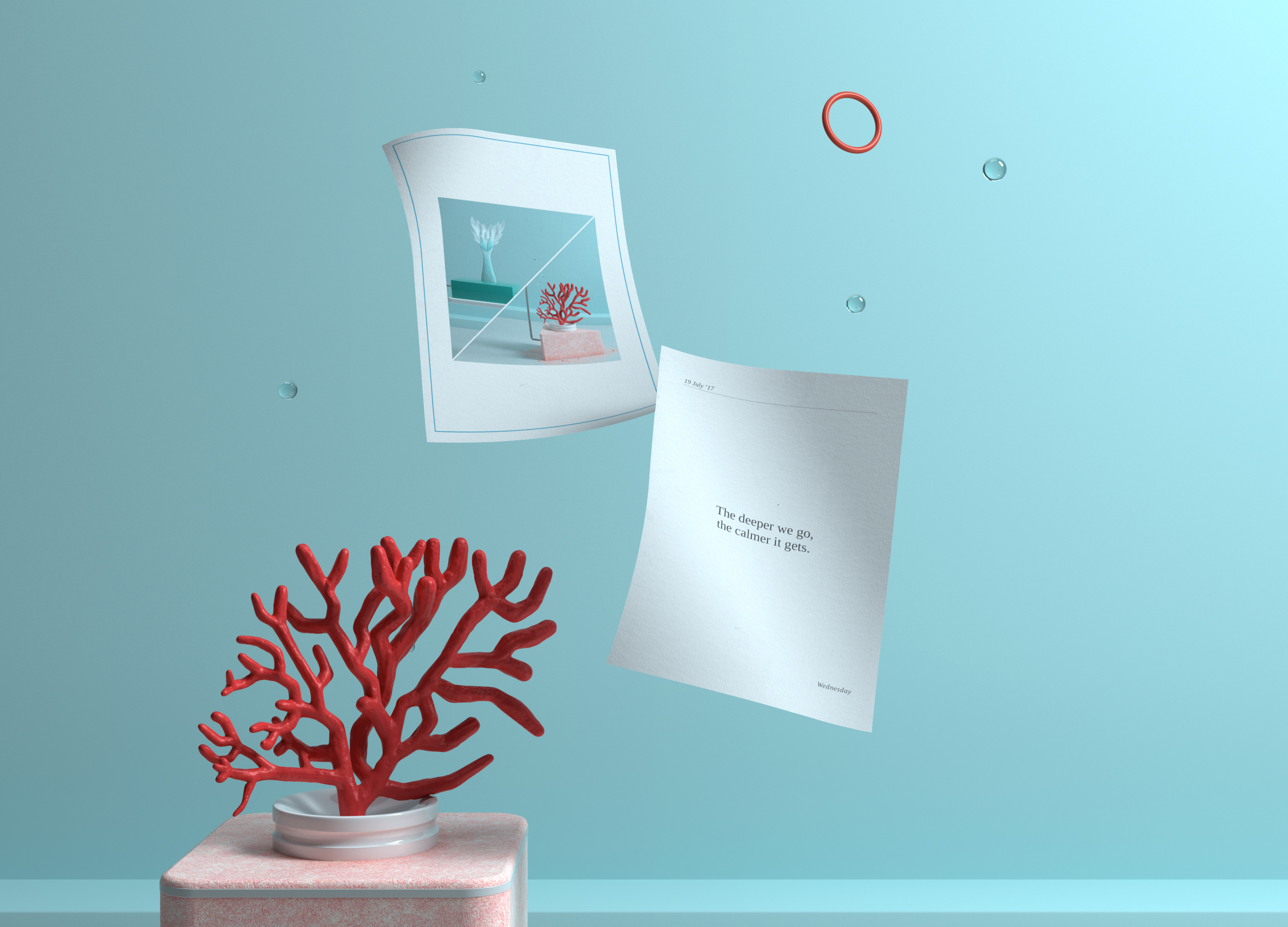
Digital Art & Illustration: Summer Diary Series
Digital Art & Illustration: Summer Diary Series
Summer might be over but it never is with Digital Art. That’s the idea behind the concept with the mighty folks from Hunky-Dunky. Let’s go through your beautiful summer memories through CGI and illustrative form, it’s definitely a cool series! I love the fact that they expressed it like a journal with dates and funny quotes. Hit it!
Hunky-Dunky is the creative studio of 3D Artist Yonito Tanu and the Art Director Jessica Chapiness. Based in Spain, you should follow their work on Behance for lots of digital art projects.
Summer may be over, but its hot fun memories will stay forever.
More Links
- Learn more about Hunky – dunky at hunky-dunky.com
- Follow Hunky – dunky on Behance
Digital Art & Illustration


AoiroStudio
Oct 25, 2017
Source: Abduzeedo Illustration
October 24, 2017
Interaction Design: Learn some basics of Sign Language with Uber
Interaction Design: Learn some basics of Sign Language with Uber
To me, it’s an interesting take on building your brand and at the same time listening to your community on what can be done to improve the overall experience. Let’s take Uber for example who recently built what they called a series of features in the effort of the Deaf or Hard of Hearing community. It’s a beautiful step in the right direction. We are taking a look at the interaction design of their new microsite where you can learn the basics of American sign language. You’ll learn how to sign: Thank you, Goodbye and even sign your name. The microsite is rightful simple to navigate and love the intention of expressing a mobile experience.
In their Words
Unemployment or underemployment in the Deaf or Hard of Hearing community is close to 70%. At Uber, we’re proud to provide earning opportunities to Deaf and Hard of Hearing drivers across the world and in more than 200 US cities. That’s why in 2015 we built a suite of features including flashing trip request notifications, text-only communication, and notifications so riders knew they were being matched with a Deaf or Hard of Hearing driver.
 Uber Sign Language
Today, we’re excited to introduce a tool that helps teach riders simple phrases in American Sign Language, including how to sign their name, hello, thank you, and goodbye. We hope this tool will help start a conversation between our riders and our Deaf and Hard of Hearing partners.
More Links
- Learn more about Uber Sign Language
ABDZ in Sign Language


AoiroStudio
Oct 24, 2017
Source: Abduzeedo UI/UX
October 24, 2017
Instagram Follow: Black & White Photography with @jasonmpeterson
Instagram Follow: Black & White Photography with @jasonmpeterson
Recently I noticed a few of my friends on social media hustling down on this black & white photography challenge. It was funny and interesting to see the results! Most of them simply add a filter to their pictures but we do understand there is a bit more conceptual thinking that goes into this style of photography. Let’s take a look at the work of Jason Peterson (@jasonmpeterson) who is a Chicago-based photographer that takes black & white photography to a whole different level. Take a look.
Behind the lens is the work of Jason Peterson, the Chief Creative Officer at Havas Chicago. Care to check out his legendary Instagram account, one of the few people I know that has 1M followers and who’s not a celebrity per se.
More Links
- Follow Jason Peterson on Instagram
Via Instagram
AoiroStudio
Oct 24, 2017
Source: Abduzeedo Photography
October 23, 2017
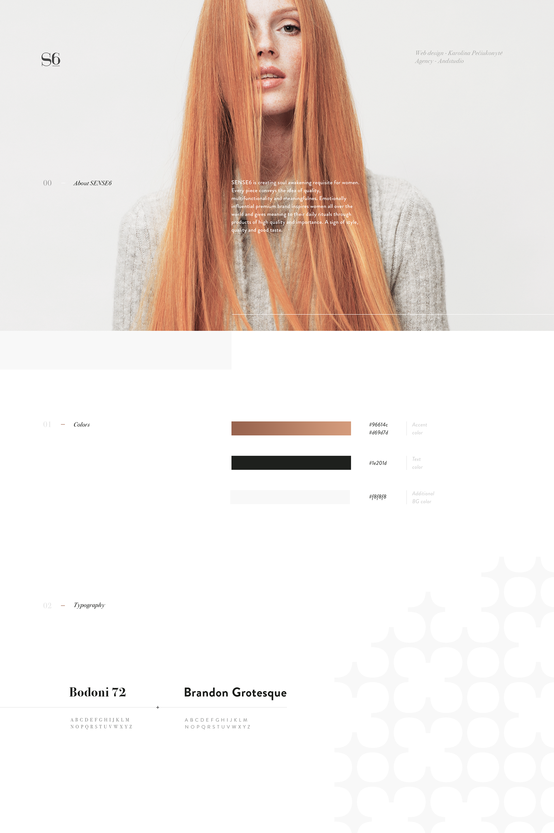
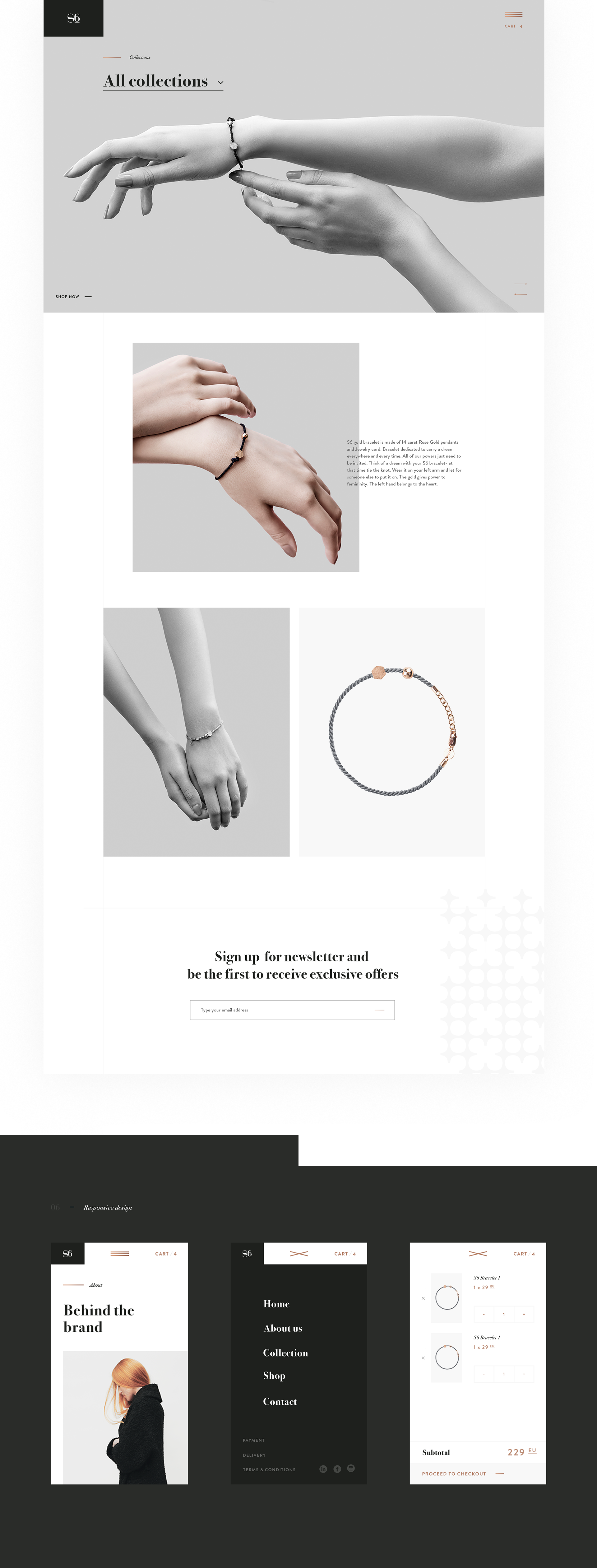
Web Design: Sense6 Fashion Website Design
Web Design: Sense6 Fashion Website Design
Let’s kick it off with a clean and simple web design project by Lithuania-based branding studio called: Andstudio. It’s a classy design with a nice flow and a little beautiful play on the typography with a combination of Bodoni 72 and Brandon Grotesque. The mixture of black & white pictures gives the website a light approach where you will be focusing on the items. The pictures are stunning and by Visvaldas Morkevičius.
Andstudio is a branding studio based in Vilnius, Lithuania. Focusing their work in graphic design, branding and art direction; you should definitely check out their work on Behance.
More Links
- Learn more about Andstudio at andstudio.lt
- Follow Andstudio on Behance
Web Design


AoiroStudio
Oct 23, 2017
Source: Abduzeedo UI/UX
October 23, 2017
Swing and a miss: Why virtual reality is striking out with sports fans
Virtual reality has the promise of truly improving the way we watch sports, but has yet to live up to that potential. I break down why VR’s marriage with sports is so rocky, and ways it can be fixed.
The post Swing and a miss: Why virtual reality is striking out with sports fans appeared first on Digital Trends.
Source: Digital Trends VR
October 22, 2017
Was Pennywise the Real Villain in ‘The Shining’?

Turns out that Kubrick using hidden imagery to hint at a fake moon landing isn’t the craziest theory surrounding “The Shining.”
Let me preface this article with the following statement: I am obsessed with the 2017 remake of It. The made-for-TV movie scared the ever-loving shit out of me as a kid (okay, as a teenager, too…okay, I’m still age-inappropriately terrified of Tim Curry’s Pennywise), so walking into the theater on the opening night of Andrés Muschietti’s film, I wanted to be as mentally prepared for the horrors that were about to befall me. After surviving (barely), I became entirely engrossed in the lore of Stephen King’s original story. I had not only went to see the film three times in three consecutive days, but I had watched every dag-blasted trailer, sneak peek, movie review, and film theory on the internet in hopes of better understanding what on earth had bewitched me so.
Source: NoFilmSchool
October 21, 2017
Mashup: 14 Parodies of One of the Most Famous Horror Scenes in Movie History

If imitation is the sincerest form of flattery, then Hitchcock must be tickled pink by all of the parodies of his most famous horror film.
When it comes to comedy, parody is my guiltiest pleasure when it’s mediocre and one of my most favorite devices of buffoonery when it’s great. From Saturday Night Live skits to Spaceballs to Scary Movie, works of parody can be used to do any number of things, whether it’s to make fun of individuals with great power or to call attention to a film genre tropes that have become tired and cliché.
Regardless of the comedic purpose, though, no film has been as perfectly and hilariously parodied than Alfred Hitchcock’s Psycho, particularly the infamous shower scene. This mashup by the folks at TIFF shows you not only how often it has been the target of parody, but how influential and fascinating it has been to filmmakers since it hit theaters.
Here are all of the films and TV shows that appear in the mashup (though I’m not so sure you’d call Gus Van Sant’s remake a parody).
Source: NoFilmSchool
October 21, 2017
Watch: Why Our Brains Don’t Explode at Film Cuts

Why is it so easy for us to process edits in films?
As the story goes, when audiences first saw the Lumiere Brothers’ The Arrival of a Train at La Ciotat Station, they screamed and ran to the back of the room to avoid what they thought to be a real-life train barreling toward them. You can’t really blame them, though; it was 1896 and people had never really seen anything like it before, and tall tale or not, it makes sense that a response like that could’ve been elicited by a bold, new, dynamic medium such as cinema.
But what about editing, then? Film editing came out not long after the inception of film, round around the turn of the century, but while movie-goers were scrambling to the back of theaters over an on-screen train, nobody really took notice when one picture cut to an entirely new one. Sure, nowadays this is expected and even a standard editors aim to achieve in their work, but back then, when the cinema was a novelty, why weren’t audiences in awe of the grand spectacle of the cut? Well, this video essay from Aeon Video explains it.
Source: NoFilmSchool