-
News & Updates
careering
July 9, 2017
‘A Ghost Story’ and ‘The Big Sick’ Sustain Indie Box Office Surge
“A Ghost Story” (A24) joined the recent surge of strong limited openers. Boasting top reviews, David Lowery’s offbeat Sundance hit nabbed a wider than usual arthouse audience. A24 is terrific with the right project at casting a wider specialized market net, so this should join several recent titles led by “The Big Sick” (Amazon Studios/Lionsgate) and “The Beguiled” (Focus Features) that have found wider interest as they expand.
This weekend, as breakout “The Big Sick” reaches a wider audience, it’s on its way to becoming the biggest specialized release of 2017 so far — and Amazon’s biggest grosser to date. It looks perfectly positioned for its nationwide break this Friday.
Syria documentary, likely Oscar-contender “City of Ghosts” (IFC) opened in New York only, landing high-end reviews for a reality-based theatrical release.
Opening
A Ghost Story (A24) – Metacritic: 87; Festivals include: Sundance, Seattle, BAM 2017
$108,067 in 4 theaters; PTA (per theater average): $27,017
The summer parade of specialized limited opening successes continues with Sundance entry “A Ghost Story.” Another in a series of films to open with top theater initial averages of over $25,000 in New York and Los Angeles (a rarity for most of this year), it is A24’s biggest platform opener of 2017 (their best since “20th Century Women” at Christmas).
Like indie breakout Colin Trevorrow, who followed a studio franchise smash with indie “The Book of Henry,” David Lowery (“Ain’t Them Body Saints”) followed Disney’s “Pete’s Dragon” with low-budget effort “A Ghost Story.” The supernatural tale of a dead husband returning in a sheet to observe his mourning wife rejoins “Saints” stars Casey Affleck (in his first film since his Oscar win) and Rooney Mara. This time, Lowery kept his feet as an emerging director working within his earlier milieu.
What comes next: Similar to other appealing recent successes, this will have a careful but aggressive expansion before reaching a nationwide footprint in a few weeks.

“City of Ghosts”
Photo courtesy of Amazon Studios / A&E IndieFilms / IFC Films.
City of Ghosts (IFC) – Metacritic: 86; Festivals include: Sundance, San Francisco, Tribeca, Seattle 2017
$16,240 in 2 theaters; PTA: $ 8,120
Also backed by Amazon, Matthew Heineman’s follow-up to Oscar-nominated “Cartel Land” shows first-hand recording of life under ISIS. The documentary scored strong reviews and a decent initial response in its two New York theaters. The spate of recent Middle East region war documentaries hasn’t been an easy sell, but this gross shows that with the right push they can be viable.
What comes next: Los Angeles, San Francisco and Washington D.C. come aboard next week

“The Little Hours”
Gunpowder & Sky
Week Two
The Little Hours (Gunsmoke & Powder)
$193,750 in 36 theaters (+34); PTA: $5,236; Cumulative: $282,023
The little bawdy nun comedy that could had a decent expansion with sufficient exposure that its further growth to over 100 theaters this Friday looks positioned for similar success.
The B-Side: Elsa Dorfman’s Portrait Photography (Neon)
$12,785 in 8 theaters (+5); PTA: $1,598; Cumulative: $40,318
Lesser results than normal for an Errol Morris documentary. This report on a woman whose art encompassed Polaroid pictures broadened to a handful of new cities to minor results.

“13 Minutes”
13 Minutes (Sony Pictures Classics)
$16,174 in 9 theaters (+6); PTA: $1,797; Cumulative: $36,374
Little traction for this 1939 Hitler assassination attempt recreation as it expanded into a handful of additional theaters.
Ongoing/expanding (Grosses over $50,000 in under 1,000 theaters)
The Big Sick (Lionsgate) Week 3
$3,650,000 in 366 theaters (+255); Cumulative: $6,920,000
With its third weekend, Amazon’s romantic cross-cultural dramedy looks to break out into a major mainstream success. In around 300 fewer theaters than “The Beguiled” last weekend, this grossed about $500,000 more, and placed #8 for the weekend despite its modest theater count. Lionsgate goes wide next weekend with a top five placement likely. This could easily become Amazon’s biggest hit yet.

“The Beguiled”
The Beguiled (Focus) Week 3
$2,086,000 in 941 theaters (+267); Cumulative: $7,436,000
The aggressive expansion of Sofia Coppola’s Civil War Gothic tale is accumulating a good total. The gross for the third weekend is slightly ahead of Focus’ “The Zookeeper’s Wife” a few months ago, which was at slightly more theaters (total: $10 million). This looks to reach somewhere in the low teens. That would make it Coppola’s third biggest film after “Lost in Translation” and “Marie Antoinette” (the latter’s adjusted gross is $21 million).
The Hero (The Orchard) Week 5
$651,330 in 447 theaters (+46); Cumulative: $2,810,000
Sam Elliott’s late career triumph as an aging actor summing up his life continues to attract moderate interest with a chance to get to $5 million.
Beatriz at Dinner (Roadside Attractions) Week 5
$518,765 in 417 theaters (-266); Cumulative: $5,980,000
Miguel Arteta’s zeitgeisty meeting of income disparate folks is winding down after a rapid wider release but still looks to end up somewhat over $7 million. Getting out ahead of several other films was a smart move for Roadside.
Maudie (Sony Pictures Classics) Week 10
$190,462 in 67 theaters (+35); Cumulative: $3,203,000
Now with most of its dates in the U.S. (this Canadian co-production opened earlier in the North, which still represents the majority of the total). This story about a rural painter is retaining word of mouth despite considerable competition as it expands wider.
Paris Can Wait (Sony Pictures Classics) Week 9
$158,766 in 131 theaters (-83); Cumulative: $5,065,000
Eleanor Coppola’s French road trip is declining late in its strong run as an early harbinger of the summer specialized revival.
The Book of Henry (Focus) Week 4
$ 96,550 in 154 theaters (-209); Cumulative: $4,218,000
Going wider initially boosted the total, but Colin Trevorrow’s return to smaller-scale film making is fading fast with few theaters left in only its fourth weekend.
The Exception (A24) Week 6
$69,900 in 48 theaters (no change); Cumulative: $518,962
Christopher Plummer as Kaiser Wilhelm II in exile continues to do modest business as another World War II related film tries to attract older audiences.
The Women’s Balcony (Menemsha) – Week 17
$53,469 in 23 (-4) theaters; Cumulative: $851,375
Slowly inching toward a possible $1 million gross, this Israeli religious drama continues to do decent business.
Also noted:
Lost in Paris (Oscilloscope) – $21,000 in 5 theaters; Cunulative: $38,666
Churchill (Cohen) – $13,402 in 17 theaters; Cumulative: $1,219,00
The Bad Batch (Neon) – $9,336 in 25 theaters; Cumulative: $169,546 (also available on Video on Demand)
My Journey Through French Cinema (Cohen) – $6,420 in 4 theaters; Cumulative: $36,360
Source: IndieWire film
July 7, 2017
Tech and Film: 7 Innovations Changing the Industry
These 7 technologies are poised to shape the film industry.
Source: CW’s Flipboard Feed
July 7, 2017
SXSW 2017 Closing Night Film LIFE Now Available [Video]
“We brought [LIFE] to SXSW because Austin is where it’s at these days and we were very honored to be a part of your closing night,” said Producer Bonnie Curtis.
LIFE, a frightening sci-fi thriller about a team of scientists aboard the International Space Station, follows a mission of discovery that turns to one of primal fear. The film features an ensemble cast of Jake Gyllenhaal, Rebecca Ferguson, Ryan Reynolds, Hiroyuki Sanada, Ariyon Bakare, and Olga Dihovichnaya and is available to watch now digitally and on DVD/Blu-Ray.
Read below for our interview with director Daniel Espinosa and check out our Q&A from the world premiere, moderated by Director of SXSW Film, Janet Pierson.
Q: Tell us a little about your film?
DE: It’s about a strange friendship that goes wrong… And it gets very scary very fast.
Q: What motivated you to tell this story?
DE: My fear of germs. Or, rather, the possibility of germs. They could take over, you know.
Q: What do you want the audience to take away from this film?
DE: To have a blast … and maybe think a little afterwards.
Learn More About SXSW 2018
Learn how to successfully submit your film to the 2018 SXSW Film Festival with our How to Submit Your Film video and find out more information about deadlines and fees on our submissions page. Stay tuned for more information about our programming for the season, and mark your calendars for Tuesday, August 1 when registration and housing opens.
Follow us on Facebook, Twitter, Instagram, and SXSW News for the latest SXSW coverage, recaps, late-breaking announcements, and updates.
The post SXSW 2017 Closing Night Film LIFE Now Available [Video] appeared first on SXSW.
Source: SxSW Film
July 7, 2017
HOW TO MAKE BETTER INFOGRAPHICS: TELL A SINGLE STORY
This article originally appeared on Column Five.
A lot of people want to know how to make infographics. We’ve made over 4,000 infographics for tons of companies over the last decade, so we know a thing or two about it. Most importantly, we know it’s not enough to make an infographic; you need to make a great infographic. But too often we see people sabotage their work. How? They try to do way too much, cramming as much as possible in.
- More stats!
- Another CTA!
- Product mentions!
- Another 10 sources!
The instinct is understandable. You want to get the most bang for your buck. You want to give your reader as much info as possible. But this overlooks the actual purpose of an infographic: to tell a succinct story and deliver it in a package that makes it as easy to understand as possible.
WHY LESS IS MORE IN INFOGRAPHICS
Although infographics always been around, it was only in this decade that marketers fell in love with them. This has prompted the revival of a wonderful and effective communication form, but many people are enamored with their flashy visuals and snazzy copy, overlooking their intended use. (In fact, we often have partners come to us asking for an infographic, when what they’re really looking for is information design. Learn more about the difference between them.)
An infographic combines copy, data, and visuals—all three of which work symbiotically—to help people comprehend and retain information more effectively. That’s why they’re so unique. But many people don’t understand what really makes a good infographic. Too many people think the infographic process is something like this:
- Slap together some copy.
- Sprinkle in some charts and graphs.
- Add a few illustrations, logo, and CTA.
- Sit back and relax.
We’re here to set the record straight. Just because you have copy, data, and visuals doesn’t mean you have a good infographic. The best, most effective infographics don’t just “deliver information” with these elements. They tell an interesting, enticing story.
Why story? When you are trying to deliver specific information or get a certain message across, wrapping it in story makes it more accessible to the people you’re trying to reach. It’s an intuitive formula, and they know what to expect: introduction, setup, payoff.
“Cool! I can make a story,” we hear people say. And that’s when things can go even more off the rails. They drown their infographic in data. They stuff it with a novel’s worth of copy. They pack it with picture-book visuals. The result? A Franken-graphic that is an unreadable eyesore. Here’s the thing about story: It’s a balance. Sometimes you have too much, too little, none at all, or something way off track.
To make sure you’re telling a solid story, you need the right ingredients.
HOW TO MAKE INFOGRAPHICS THAT TELL A STRONG STORY
A strong infographic contains many elements, from the narrative to the design. To help illustrate the example, let’s walk through an infographic we created with Upwork, a global freelancing platform.
This infographic is a great example of a well-crafted, well-designed piece that is perfect for its intended audience and, therefore, helps the brand connect with them. Here’s how to emulate it.
1) CHOOSE A SINGLE TOPIC (THAT PEOPLE ARE INTERESTED IN)
This may be broad or specific, depending on your goals, but it should have a specific angle. You might craft an infographic about overall industry trends or tell a story about a specific sector of the industry, but don’t try to cover every single aspect of your industry in one infographic. Either way, it should be relevant to people’s interests.
Tip: If you are interested in exploring a topic from many angles, craft an infographic series. These can be published all together or used to enhance other larger pieces of content, such as an e-book. To make sure your story ideas are actionable and interesting to people, create marketing personas of your target audience. Try our exercise to help you do it in an hour.

The Upwork infographic is effective because it addresses a very specific subject that isn’t too broad or too granular: finding and attracting remote development talent. For a freelancing platform, this is a highly relevant topic.
2) EXTRACT RELEVANT DATA INSIGHTS
Sometimes you will already have these insights, which will inspire the topic. Sometimes you’ll have to go looking for them. The key here is to include only the most relevant data.That doesn’t mean you cut out data that doesn’t “support” your story, but you should include only that which helps you communicate it effectively.
Tip: If you don’t know how to extract those insights, try our 5 tips for finding stories in your data. Not sure where to find data at all? Start with these 104 great sources of data.
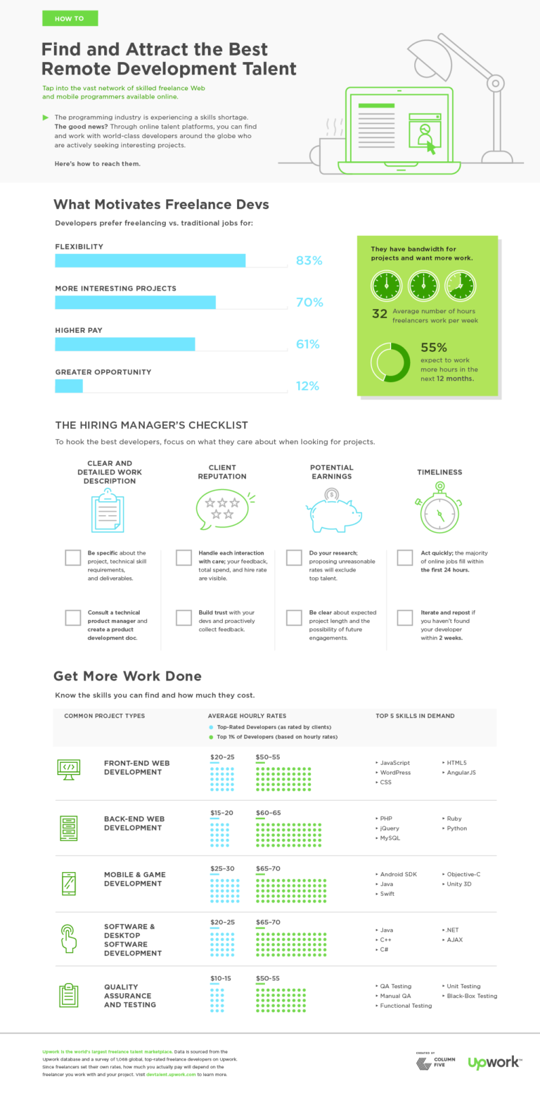
This graphic was created using Upwork company data and survey data from 1,068 top-rated freelance developers on Upwork. It provides fantastic insight into what motivates and concerns this segment of the workforce.
3) STRUCTURE A CLEAR NARRATIVE
The same grade-school writing rules apply:
- Introduce the topic.
- Guide readers through in an intuitive manner, with supporting data.
- Call out or provide context for any particularly relevant (or possibly unclear) data.
- Wrap it up with a simple, intuitive CTA.
When it comes to actually writing:
- Limit copy: Large blocks of text are an immediate turnoff. Data and design are meant to enhance and do some of the heavy lifting. Keep copy short, quick, and to the point.
- Kill redundancy: Again, let design to its job. Don’t over label charts. Don’t call out the same stat in the body copy, header, callout, and chart. Keep it clean and simple.
Tip: Here’s a good litmus test: Is it easy to write the headline for this story? Can you summarize your points in a few sentences? If not, you may need to simplify. Get more tips on crafting an infographic narrative, and check out these 101 resources for copywriters.
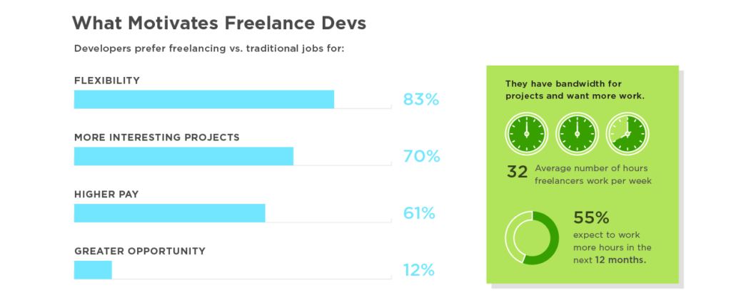
The Upwork graphic doesn’t just throw in a few random stats. It presents data and translates that data into useful and actionable tips for the target audience. This helps them not only understand those workers (through data) but understand how they can attract those workers.
4) DESIGN FOR STORY
Another common issue on the design side is over-designing: adding a ton of illustrations, getting too crazy with a visual metaphor, or including chart junk that distracts from data visualizations. Everything from the layout to the font choice affects how the reader absorbs the story. Design should never distract, only enhance. Never forget that white space is your friend!
Tip: Follow best practices for data visualization. Check out this e-book to learn how to design the most common types of charts and graphs, and make sure you avoid these 8 common design mistakes.
The infographic’s clean data visualization and modular design makes it easy to navigate. Each panel presents a certain aspect of the story, and it flows in a logical order.
Creating great infographics isn’t difficult, but it does take knowledge, practice, and skill. To make sure you’re on top of your game, stay educated and informed. Want to start now?
- Check out even more tips to make effective infographics, from brainstorm to distribution.
- Look at these 9 infographic design examples for inspiration.
- Learn more about the power of data visualization.
- Try Visage, our data design platform.
Source: Visual News
July 7, 2017
Oscar-Winning DP of ‘Life of Pi’ Claudio Miranda on Drones and Experimenting with New Technology
Oscar-winning DP Claudio Miranda, ASC discusses experimenting with drones and other technology.<p>As new technology influences the entertainment …
Source: CW’s Flipboard Feed
July 6, 2017
SXSW Alumni Film Releases – July 2017
Discover some of the SXSW alumni films on release this month, such as ATOMIC BLONDE, THE BIG SICK, and SONG TO SONG. Continue on for a complete list with trailers and more info.

ATOMIC BLONDE
Narrative Feature, World Premiere, 2017
Website | Trailer
An ass-kicking Charlize Theron tears up the screen in this brutal, neon-soaked thriller set in the gritty world of Cold War Berlin.
In Theaters July 18

BABY DRIVER
Narrative Feature, World Premiere, 2017
Website | Trailer
The latest film from cult favorite Edgar Wright stars John Hamm, Kevin Spacey and rising star Ansel Elgort in a relentlessly gripping thriller with a killer soundtrack.
Now in theaters

THE BIG SICK
Narrative Feature, 2017
Website | Trailer
Kumail Nanjiani draws on his own life story for this hilarious, painfully real look at the complexities of 21st century relationships.
Expanding Wide July 14

FREE FIRE
Narrative Feature, US Premiere, 2016
Website | Trailer
Pithy one-liners fly as fast as the bullets in Ben Wheatley’s grand guignol-meets-Peckinpah opus, Free Fire.
On Demand July 18
On Blu-ray/DVD July 18

NOBODY SPEAK: TRIALS OF THE FREE PRESS
Narrative Feature, 2017
Website | Trailer
Hulk Hogan takes on Gawker, and a rattled free press considers an uncertain future in this gripping documentary that unfolds like a thriller.
Now on Netflix

PERSON TO PERSON
Narrative Feature, 2017
Website | Trailer
Dustin Guy Defa’s breezy ensemble film brings together a collection of striking vignettes into a beautifully played and deeply affecting look at the absurdity of personal relationships.
In Theaters July 18

SONG TO SONG
Narrative Feature, World Premiere, 2017
Website | Trailer
Terrence Malick’s dreamy, Austin-set ode to love and music opened SXSW 2017 and is now available for home viewing.
Now On Demand
Now on Blu-ray/DVD
The post SXSW Alumni Film Releases – July 2017 appeared first on SXSW.
Source: SxSW Film
July 5, 2017
Explore Convergence Tracks for SXSW Conference & PanelPicker Tips

SXSW PanelPicker, the official SXSW user-generated session proposal platform, is now open, and accepting ideas through July 21.
The 2018 SXSW Conference will include 25 programming tracks comprised of Interactive, Film, Music, and Convergence. Every summer we ask the community to propose the ideas they are most excited to bring to SXSW, and these PanelPicker proposals become the foundation of the SXSW Conference programming. Convergence programming features a range of topics that straddle the cultural and technological intersection at the heart of SXSW. See what’s new for SXSW Convergence Tracks below!
2018 Convergence Tracks
Cities Summit (March 12-13) – The SXSW Cities Summit is an opportunity for civic leaders, creative citizens and urbanists of all disciplines to join together to learn, strategize and form coalitions to service and benefit the cities of tomorrow. The summit features two days of dynamic programming, performance, pop-up exhibits, and events exploring the future of our cities.
CLE (March 15-17) – Designed for attorneys, entrepreneurs, C-level executives, and beyond – Continuing Legal Education sessions discuss legal perspectives on industry trends. 12 hours of accredited sessions will be available at no extra cost to SXSW registrants.
Experiential Storytelling (March 12-14) – New technology has opened up exciting avenues for storytelling and immersive entertainment. This track investigates how these experimental strategies are redefining the ways in which audiences experience their world. Includes programming formerly known as Digital Domain.
Food (March 12-14) – The Food track brings together the food community’s most inspired entrepreneurs, chefs, data scientists, investors, filmmakers, and enthusiasts to connect and explore ways in which technology and innovation can be leveraged to transform the industry.
News & Journalism (March 10-15) – Information and how it gets to us is vital. Sessions in this track explore how news, journalism and analysis is dispersed, how it will be impacted by the future of technology and how this content will continue to inform and engage.
Social Impact (March 10-14) – This track highlights innovative ideas from creative industries that are contributing to a better, more equitable world. This programming offers opportunities to those working on social impact to identify and share solutions: from activists, storytellers and entertainers to philanthropic nonprofits, foundations and social enterprise.
Sports (March 9-11) – This three-day track tackles the future of sport—in all its forms—from a cultural and technological perspective, while exploring a diverse range of topics encompassing all sports across all levels of play.
Startup & Tech Sectors (March 9–15) – The Startup & Tech Sectors Track brings together entrepreneurs, founders, and funders, as well as established businesses to talk about today’s best practices and tomorrow’s most exciting trends. These sessions focus on US-based innovation as well as forward-thinking companies and technology ecosystems from around the world.
VR/AR (March 13-15) – Virtual reality and augmented reality technologies are finding new ways to enhance our ability to perceive the world that surrounds us, and in many instances they are redefining how we experience the world.
2017 Convergence Programming
There’s a variety of session formats to choose from when submitting your PanelPicker idea including, solo, dual, panel, and more. Here’s a few examples of stand out Convergence programming from SXSW 2017:
-
Swiping Right on Inclusivity with Tinder & GLAAD – This Featured Session from the Social Impact track discussed the reaction to Tinder’s update on gender identity features and what it means for the future of trans people and dating.
-
Augmenting Reality, For Real – This Solo Session from the Experiential Storytelling track investigated the new formats of “augmented” entertainment that have drawn hundreds of thousands of people together, out of their isolating screens, and back into the world.
-
Digital Content Demands New Security Mindset – This Panel Session from the News & Journalism track discussed how modern content consumption and delivery requires a new approach due to evolving security risks. Attendees learned how publications can better protect their websites and users, without sacrificing performance.
-
2017 Food Trends Meet Up – This Food Meet Up with Miriam Parker from the Austin Food & Wine Alliance analyzed food trends, how international trends impact American foodways, and the hottest dishes of the year.
PanelPicker Tips
For more information, visit the SXSW PanelPicker page to learn about the application process, watch our helpful PanelPicker Walkthrough video, and read the FAQ to gain valuable insight into making the most out of your proposal.
VR/AR Session during the 2017 SXSW Conference – Photo by Akash Kataria
The post Explore Convergence Tracks for SXSW Conference & PanelPicker Tips appeared first on SXSW.
Source: SxSW Film
July 5, 2017
Who Is The Warren Buffett Of The Meme Economy?
This article originally appeared on Priceonomics..
Memes have received a lot of attention following the surprising outcomes of elections across the globe in 2016—and the fiercely fought campaigns leading up to them. Sharing images and making cultural allusions were both common activities long before getting into heated political arguments with family members over the internet was.
But making those allusions in white block lettering superimposed on familiar images—the humble image macro—has burst beyond a niche internet hobby and thrust memes of all sorts into popular consciousness.
It’s only human, then, that someone would start a market to speculate on different memes’ futures. The traders of the subreddit r/MemeEconomy speculate on which memes will become popular, and which are headed toward obscurity. They are, as the subreddit name would suggest, on their way to creating a “Meme Economy.”
Naturally, we want to know who the biggest winner is among the meme traders of r/MemeEconomy. If the Meme Economy flourishes into a financial market, who in this forum is its Warren Buffett?
We analyzed data from Priceonomics customer Me.me, a search engine that indexing memes and their popularity over time. From across the internet we gathered instances that each meme was posted. We looked at the positions that the traders took between February 28 and April 27 on Reddit, and then analyzed whether those memes were rising or falling in our index.
The analysis we present here is a starting point for calculating returns in the Meme Economy, but by no means the final word. Part of the reason is meme market goes through drastic, sudden swings. The market increased 389% from February 28 through April 26, then fell 85% from April 26 to April 27. Because of that, the results we present here are very sensitive to the time period we are analyzing.
That said, during this time we looked at, 25 traders posted gains, 7 traders had no gains or losses, and 25 lost on their calls. 21 traders outperformed the market’s moving average growth. The highest performing trader, reddit user itsyaboieon, had a 1433% return.
***
We began by looking at the activity level of the overall meme market. We looked at every meme mentions in r/MemeEconomy and looked whether the tag associated with that meme was rising or falling in the Me.me search index. We indexed total posts to start at 100 on February 28, and plotted the day to day increases and decreases in the market.

Data source: Me.me
The popularity of the traded memes posted daily swings wildly.
Meme posting volume can fall by half, only to recover their losses and then some within a single week. The market posted a peak return of 389% on April 26. It closed April 27 at 72.7% of its starting value, a 85% drop from the high the day before. The market comprises many different memes.
To find out how well the traders performed in the market, we needed to look into changes in postings for individual memes.
We used the number of daily postings as the going-rate for a meme, and tracked the traders’ positions over the period. Any open positions are valued at their April 27 value. We then determined the gain on traders’ calls so we could calculate the percent return each trader generated.
The top trader timed the meme market, returning the original investment 14 times over. Meme trader itsyaboieon’s staggering 1433.3% increase is nearly twice the size of second-place investor GavinOriginals’ 800% gain. Like in other markets, the returns fall off sharply after the top few performers. Fifth-place trader Vipe777 is the lowest ranked who more than doubles the original investment. The next highest 15 earned between 21.4% and 95.2% returns—far better than interest on savings accounts, but a fraction of the top earnings.
We wanted to see what predictions provided itsyaboieon with such atmospheric returns. He placed a buy call on April 11 for texting, and held onto it through April 27. We graphed how the texting meme had performed compared to its posting frequency on February 28.

Data source: Me.me
The meme had doubled on three separate occasions between February 28 and April 11, when itsyaboieon placed the call to buy. Each time it fell back down to below starting value. Little more than two weeks after itsyaboieon predicted the texting meme would grow, it shot up beyond 9 times its starting value. That sudden growth generated itsyaboieon’s chart-topping 1433% return.
The top 20 traders all saw their fortunes increase, but we wanted to know how they compared to the rest. We split the range of trader performances into six evenly-spaced groups, and counted up how many fell into each group. We used different colors to separate the top traders from the rest.

Data source: Me.me
Trading results fit into a normal bell-shaped curve. Over half the traders fell into the middle two groupings, which range from decreasing by 50% to growing by 50%. Only 7 of the 57 traders tracked had returns or losses larger than their original investments. Outside of the top 20, there were 12 additional traders who avoided losses on their positions. The market got the better of the 25 worst performing traders, who would have more had they buried their meme money.
High performing traders outperformed others several times over. Do high performing memes outpace the market as a whole? We wanted to know, so we identified the top 10% highest growth memes, and calculated the percent change in aggregate daily posts from February 28 for that group and for the entire market. Then, we drew a line graph showing how those changes varied from day to day.

Data source: Me.me
The overall market swung higher and lower from day to day, but on average ended around the same volume as it began. The Top Decile Memes Portfolio, on the other hand, experienced massive growth. Top memes ended 183.5% higher than they began, peaking at gains of 1392.4% on April 26. The market crashed abruptly on April 27, erasing much of the Top Decile Memes Portfolio’s gains and shaving the overall market down to 72.7% of where it started.
Meme popularity changes quickly. Almost no meme steadily appears with more frequency. Investing in memes offers huge rewards to active investors with keen instincts, and nearly nothing for investors looking to buy and hold. We wanted to see how large portfolios of memes performed compared to the top investors. We took the percent gain for both the overall market and the Top Decile Memes Portfolio as of April 27, and ranked them with the gains that the top 20 traders made.

Data source: Me.me
While only the very best traders outperformed the high-growth memes, 37 traders beat the overall market. The market ended down 27%, still outperforming 20 traders. As seen earlier, 25 traders lost their shirts trying to time the market. Our Top Decile Memes Portfolio compares favorably with the median meme trader, who earned a return of 0%.
How do individual traders beat the market—even outperforming the highest growth memes—by so much? Memes often go viral, seemingly popping up overnight. They can become stale quickly, and almost disappear entirely. We looked into changes in daily posts over the 60 days we tracked to find the memes that grew and shrank the most.
The two top-growing memes, Arby’s and backyard sports, appeared 18 times more often on April 27 compared to on February 28. Some memes that were obscure at the end of February were showing up frequently 60 days later, other memes fell from regular use over that time. Memes that shrank the most—like first ranked meme of the month or runner up why not visit—nearly stopped appearing, dropping over 90%.
***
We investigated the Meme Economy, and calculated the gains and losses of the traders on r/MemeEconomy for the period between February 28 and April 27. A little over half the traders made profitable calls, and the very best made their investments back many times over. Compared to the highest earning trader, itsyaboieon, even a portfolio of the highest-growth memes offers modest returns. Memes can burst into frequent use over a short amount of time, and slip into obscurity just as quickly.
Source: Visual News
July 5, 2017
This Camera Comparison Chart Summarizes All of Your Camera Choices
Thomas Fletcher and Gary Adcock’s thorough camera comparison chart can help you choose what format to use for your production, whatever the size.<p>The …
Source: CW’s Flipboard Feed
July 4, 2017
HOW TO PICK THE BEST DATA VISUALIZATION FORMAT FOR YOUR STORY
This article originally appeared on Column Five.
If you want to tell a powerful story, data is the way to go. Whether it’s proprietary data, industry research, or public data, there are compelling stories all around. But even the best data story can lose impact if it isn’t presented the right way. That’s why it’s so important to choose the right data visualization format for your data.
We find that there is a lot of misinformation or misunderstanding around this topic. Many people think that throwing a few charts and graphs into an article is all they need to tell a good data story. Or they think they can stuff a trillion data points into an infographic and call it a day. While the intention might be right, the execution is so wrong.
We want you to tell the best data stories you can, so we’re breaking down the different types of storytelling formats to help you choose the best for your data. (Note: This isn’t entirely prescriptive, but it should send you in the right direction.)
DATA VISUALIZATION FORMATS/TOOLS
Before we dive in, let’s clear up a few terms to specify what we’re talking about. When it comes to data storytelling, people tend to use certain terms interchangeably (or misuse them entirely), but there are very different types of data mediums and data visualization formats. For the purposes of this post, here’s how we break it down.
Data visualization: In the strictest sense, this refers to the actual visual representation of data. This may mean basic charts and graphs or larger, more complicated visuals. But it is about the visual specifically.
Information design: Information design is the visual representation of information—with no data at all (think of an organizational flow chart). We won’t be talking about info design here, but we think it’s important to understand the distinction.
Infographic: An infographic is a graphic that includes data, copy, and visuals. These elements work symbiotically to tell the story. (That means your infographic may include data visualizations.)
Animated infographic: These are infographics that include motion or animation. These are not interactive (see below), because the viewer doesn’t control the motion or animation.
Interactive infographic: An interactive infographic is any web-based content that lets you interact with the data on the screen. You may scroll over, click, expand, or otherwise manipulate the on-screen data.
Motion graphic: These are animated graphics that tell a story. Motion stories can be told through kinetic text, animated visuals, or both.
Video: This is live-action film, which may also incorporate text, graphics, etc.
Luckily, you have more options than ever to tell your story. But this can also make it tricky to choose which is best.
BEFORE YOU CHOOSE A DATA VISUALIZATION FORMAT
There are many elements that influence how you might best present your story. Before you decide on a format, think of the bigger picture. Each of these may affect the route you take.
Goal: Before you create anything or even come up with an idea, you should always know what your goal is. This is just as important to data storytelling as anything else. Are you trying to increase brand awareness? Establish your expertise? Engage your social followers? Some formats can help you achieve these goals more than others.
Story: An effective data story isn’t just a smattering of stats. If you’ve done your job well and teased out the insights, you can craft a narrative to reveal that story. That said, the story you’re trying to tell will very much dictate the data visualization format you choose. Is there a clear message? Are people meant to uncover or assign their own meaning to the story? Are you creating a useful resource? Are you trying to guide them to a next action? Keep this in mind.
Volume of data: This is one of the biggest issues we see over and over. People can go data-crazy sometimes and extract a mountain of data to turn into a story. That’s nice, but you must consider how much data is really required to tell the story. Sometimes you have millions of data points, and that’s OK. Just don’t stuff those into the world’s longest infographic.
Audience: Who are you trying to reach with your data story? Who will be interested in it? What level of knowledge or understanding do they have? What data visualization formats are they accustomed to interacting with? If you are targeting older boomers, for example, a fancy interactive might not be the way to go.
Distribution: Where will your data story live? On your blog? On social? Published on an industry site? How will you drive traffic to the piece? Know this from the get-go. If you are trying to engage people on social, the format you choose sure as hell better be optimized for social. (We once designed a beautiful animated infographic only to find out the publisher’s platform didn’t support the format. Then we cried.)
CHOOSING YOUR DATA VISUALIZATION FORMAT
Each data story is unique, so there isn’t a single rule or formula for choosing the best presentation. However, some are better suited than others to help you achieve your goals.
DATA VISUALIZATION
A strong data visualization can be used alone or as part of a larger piece. The power of strict data visualization lies in, of course, the visualization. A stunning visual is not only aesthetically appealing but lets the viewer “see” the story. Sometimes, a simple data visualization can be even more powerful than a detailed story with additional copy or context.
Good for: Data visualizations are often used as one part of a larger story in an infographic, white paper, e-book, on social, etc. (Simple visualizations are especially useful for situations in which time or attention is limited and you need to tell the story “at first sight,” such as a visual at a tradeshow booth.)
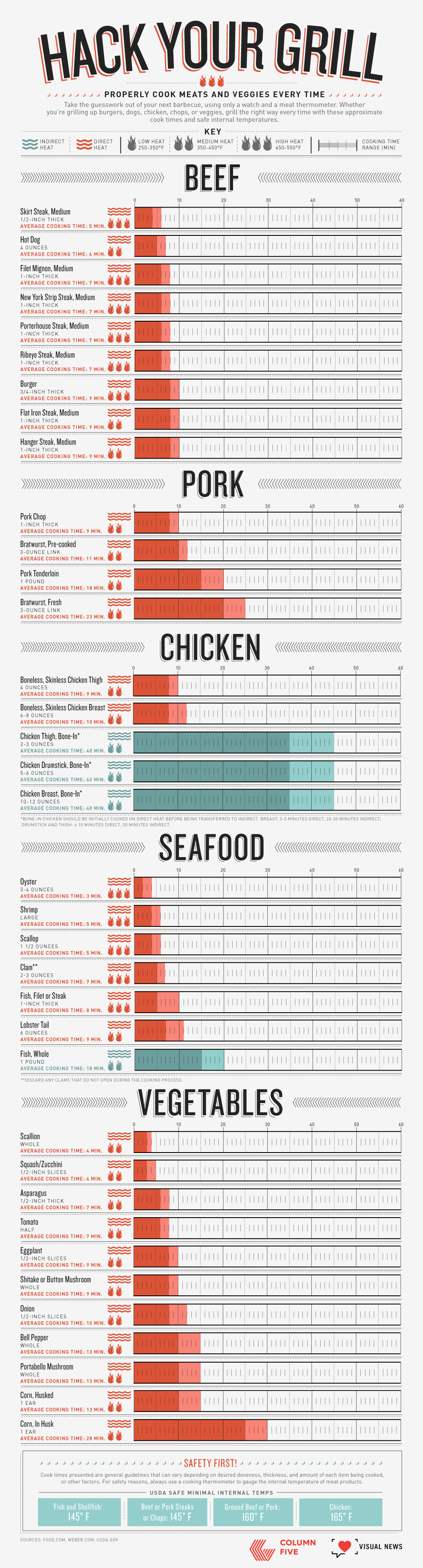
Example: This simple data visualization is a convenient guide to grilling meat. The data is depicted in chart form, making it easy for readers to get the info they need at a glance.
To make sure your data visualizations are effective, design them according to best practices. Find out how to do that with our Data Visualization 101 guide.
INFOGRAPHICS
Infographics are particularly useful to communicate in a simple, clear, and easy-to-understand way. They are aesthetically engaging and easy to share, making them a great tool for brand awareness. Publishers have become increasingly interested in infographics, as they visually enhance stories. Additionally, panels or slices from infographics can be repurposed as microcontent, helping to further promote the piece of content and give you more bang for your buck.
Good for: Social, content marketing, visual aids, editorial publishing, etc.
Example: This Jobvite infographic on paid parental leave tackles a relevant subject for their target audience and presents data in an easy-to-understand manner.

Learn more about how to craft an effective infographic narrative and get publishers to fall in love with your infographics.
ANIMATED INFOGRAPHICS
Animated infographics have all the same benefits of infographics, but the addition of motion makes them more attention-grabbing. They are a good option if you want to mix up your content and experiment with motion without creating a full-on interactive or motion graphic. Like infographics, motion elements can also be repurposed in other areas.
Good for: Social, advertorial, or editorial, specifically situations where you need to grab attention to attract people to the content.
Example: We helped Newscred visualize the results of their content marketing survey by creating an animated infographic. The modular design allowed panels to be used individually or together.

Learn more about the power of motion in visual content.
INTERACTIVE INFOGRAPHICS
Interactive infographics are ideal for instances in which you have an enormous amount of data that needs to be easily navigable. You may present that as an exploratory interactive, in which users can dive into the data to extract their own meaning, or as a narrative interactive, in which you guide them through the interactive. Interactives require the viewer to actively engage by physically inputting information or manipulating data. It also encourages the viewer to spend more time with the content.
Good for: Engagement, deep data exploration, and immersive storytelling.
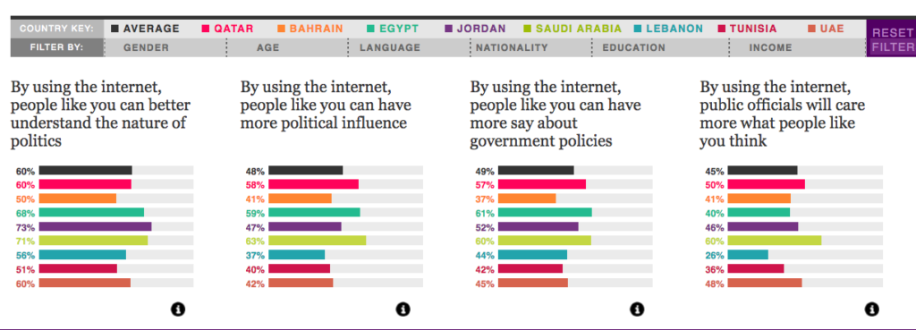
Example: We turned 10 million cells of data from a Northwestern University Qatar survey into a clean, colorful, easy-to-navigate piece. The interactive allows for exploratory storytelling, where the user can decide what data they are most interested in.
Learn more about the benefits of interactive stories.
MOTION GRAPHICS
Motion graphics are particularly useful when you have an abstract concept or a story that needs more context to connect the dots. It is a contained storytelling format, which makes it easier to deliver a succinct story or direct message. It is also passive, allowing the viewer to sit back and absorb.
Good for: Telling a succinct story in a short amount of time.
Example: We collaborated with NBC Universal to create a motion graphic encouraging Americans to reduce food waste, using data from the Natural Resources Defense Council.
Check out 6 awesome examples of storytelling through motion graphics.
VIDEO
Video has become an increasingly popular medium, largely thanks to social platforms. Like motion, video can also incorporate text, graphics, and data visualization and offers an opportunity to demonstrate creativity. However, perhaps its strongest selling point is its ability to put a “human” spin on data stories by putting actors front and center.
Good for: Telling a succinct story in a short amount of time, especially when you are trying to create an emotional connection with the content.
Example: We partnered with Foodbeast and Totino’s to help tell a data story about Americans’ binge-watching habits. Using the actual Totino’s product as a visual challenged us to come up with creative data visualization.
Learn more about why humans are so attracted to video.
REMEMBER: STORY FIRST
No matter what data visualization format you choose, remember the basics that will make it succeed: Strong data and a strong story. If you need a little help in that area, here are some things that might help:
- Learn more about why data storytelling is so powerful.
- Find out how audience personas make sure your data stories will capture people’s interest.
- Check out these 9 sources for great data.
- Dive deeper into data storytelling with our book Infographics: The Power of Visual Storytelling.
Source: Visual News