-
News & Updates
careering
June 18, 2017
‘On the Seventh Day’ Review: Jim McKay’s First Movie in a Decade is the Summer’s Surprise Crowdpleaser
The most satisfying aspect of “On the Seventh Day,” Jim McKay’s first feature in 12 years, stems from the way it combines a simple premise with profound concerns. Set across one week in the life of a Mexican immigrant in Brooklyn, it harkens back to classic neorealist traditions by providing a window into the everyday challenges of a lower-class existence all too often ignored in mainstream cinema. At the same time, it positions the drama as a feel-good crowdpleaser, a rousing sports movie about characters trapped by their surroundings and galvanized by their communal spirit.
It doesn’t take long to establish the plight of José (Fernando Cardona, a non-professional newcomer like the rest of the cast), who works a bland job as the deliveryman at a Mexican restaurant in Brooklyn’s Carroll Gardens when he’s not leading his soccer team to a championship in the nearby neighborhood of Sunset Park. A good portion of the movie takes place against the backdrop of the borough’s expansive streets and brick buildings, with José speeding around the city and engaging with the various locals who define his constrained environment. As with Sean Baker’s 2005 “Take Out,” which portrayed the struggles of a Chinese deliveryman, “On the Seventh Day” is as much focused on sketching out a self-contained universe as it is with the conundrum that emerges from it.
See More: IndieWire’s 2005 Interview With Jim McKay
But eventually that conundrum takes centerstage. José follows a reliable schedule, juggling life with his fellow immigrants from Puebla, Mexico — most of whom live together in a crowded apartment — with his fast-paced job, and dreaming of bringing his pregnant wife to the U.S. But José’s stern white boss complicates José’s stable routine by demanding he work on the same Sunday that his team’s scheduling to play in the finals. That’s a week away, and as recurring title cards count down to the encroaching deadline, José winds up caught between personal and professional allegiances, unsure where to begin. His boss shows no pity, his team could care less about employment issues, and José feels the tug on both sides: He doesn’t want to let his pals down, but sees his current gig as the ideal route to getting papers — and bringing his wife into the country in the process.
This setup could easily cascade into heavy-handed sentimentalism, but McKay’s too skilled a filmmaker to let that happen. While he’s spent the last decade and change directing television, he first launched his career with the minority-centric New York stories “Our Song” (which starred a young Keri Washington as a Crown Heights teen) and the HBO movie “Everyday People.” His measured approach to developing José’s story treasures understatement over bigger gestures, and even the suspenseful finale as José’s deadline arrives feels like an organic outgrowth of the moments leading up to it.
If “On the Seventh Day” overglamorized its characters or reduced them to archetypes of the struggling underclass, it might be more obvious that this movie is directed by a white guy. But that potential hurdle recedes to the background as McKay works within the confines of his setting, never creating the sense of an outsider looking in.
More than once, he pauses the story to allow for fly-on-the-wall observation: When José contends with obnoxious customers, or pauses in the midst of a busy day to grab a cheap meal, the small details inform the broader portrait of a fragile existence on the fringes of a crowded society. But there are plenty of warmer moments to offset the possibility of a pity party, from the lively evening scenes as the soccer players hang together at home to José’s tender video chat with his faraway wife. This scene marks the sole moment when McKay cuts away from the Brooklyn setting, briefly showing the woman at an internet café in a fleeting reminder of the larger world that exists beyond José’s reaches.
“On the Seventh Day” is filled with little hints to the broader disconnect that José and his fellow immigrants experience from their surroundings. Dropping off one order at a boutique office, he exchanges pleasantries with the Mexican receptionist in Spanish, only to find that she shifts to English the moment her employers pass by (it’s ostensibly a kind of code-switching). In private conversations, José and his peers blend traditional Spanish with the Mixtec dialect of their native Puebla, a reminder of the complex roots that inform their identity — and just how much it differs from the posh, vanilla land of gentrification in which they struggle to survive.
But they struggle together, and “On the Seventh Day” primarily works so well because it relegates the white characters — saviors and non-saviors alike — to supporting roles. José and his peers aren’t minorities because the movie allows them to dominate the frame. The narrative belongs to the way they process the highs and lows of working on the sidelines of an economy ignorant to their concerns. Rejected by an ambivalent job market, they build their own path. José’s allegiance to this defiant attitude runs headlong into his apparent desire to plant deeper roots, and the muted actor’s never better than when this conundrum registers on his subdued face.
If “On the Seventh Day” has any major setbacks, they stem from cheap production values and some shaky performances that distract from the sturdy narrative at hand. José’s story has some obvious qualities, but that’s part of its charm. A fantasy version of the studio system might greenlight this kind of energizing sports movie; instead, it’s microbudgeted and looks like it. In most cases, however, the rough edges contribute to its authenticity.
Once the movie arrives at its brilliant climax, the cumulative effects of passing details lead to sweeping payoff. As José must finally choose between competing interests, his team hopes for a happy ending. “José will save the day,” one of them asserts. Without spoiling anything, the welcome surprise of “On the Seventh Day” is that it wrestles with what a happy ending actually looks like in these circumstances — and finds a reasonable happy medium instead.
Its final moment is a form of masterful understatement, with the camera lingering on a solitary mariachi singer belting out a soulful tune on an city street, as if competing for attention with the rush of urbanity around him. As McKay cuts to black, it’s unclear whether the singer or the city has the upper hand.
Grade: A-
“On the Seventh Day” premieres as the centerpiece screening of the 2017 BAMcinemaFEST. It is currently seeking distribution.
Source: IndieWire film
June 18, 2017
As If ‘Tickled’ Weren’t Already Strange Enough, a New Conspiracy Theory Has Emerged In the Wake of Its Subject’s Death
We should have known that the bizarre story behind “Tickled” wouldn’t stop with either the film’s release or its subject’s death. Months after David D’Amato — the man behind the Competitive Endurance Tickling empire that David Farrier and Dylan Reeve delve into in their compelling documentary — died, some continue to wonder: Did he really?
READ MORE: ‘Tickled’ Directors React to David D’Amato’s Death: It ‘Has Hit Us Pretty Hard’
The two filmmakers put that conspiracy theory to rest in a new article for the Spinoff, writing unequivocally that “D’Amato has indeed died” and even going so far as to provide a copy of his death certificate. With that cleared up, however, they’re left to question how his company Jane O’Brien Media persists now that its founder has departed this mortal coil.
As with everything else related to this endlessly strange saga, the answer is as confusing as it is clarifying. Farrier and Reeve assert that a man named Louis Peluso has picked up where D’Amato left off, and though several aspects of the new Jane O’Brien have improved on what came before — the young men featured in what amount to fetish-porn videos are no longer being referred to by their full names, nor are they being harassed — Peluso hasn’t responded to the filmmakers’ inquiries with any more enthusiasm than his predecessor.
READ MORE: David D’Amato, the Villain of ‘Tickled,’ ‘Died Suddenly’ at Age 55
“We joked at the start of this whole thing that it was a bit like stepping into a tickling wormhole,” they write at the end of their piece, which deserves to be read in full. “What we failed to grasp at the time is that wormholes aren’t exactly short. In fact, they can go on for billions of light years.” Sounds like fodder for another documentary.
Stay on top of the latest breaking film and TV news! Sign up for our Email Newsletters here.
Source: IndieWire film
June 18, 2017
‘Cars 3’ is Stuck in Neutral, But ‘Wonder Woman’ and Tupac Shakur Come To the Rescue
“Rough Night” described the box office this weekend for too many movies. “Cars 3” (Disney), Pixar’s latest animated entry, took the top spot — but fell below opening estimates. “The Mummy” continued its domestic unraveling, falling to $13 million and number 4 in its second weekend. And then there’s Sony’s “Rough Night” — the latest attempt to replicate the “Bridesmaids” R-rated female comedy magic, and latest to fall short.
Winners were “Wonder Woman” (Warner Bros.) at number two, and two original, non-franchise films with Lionsgate’s Tupac Shakur biopic “All Eyez On Me” flying much higher than predicted, while the British sharks-in-the-water thriller “47 Meters Down” (Entertainment Studios) scored a surprisingly strong $11.5 million.
Next week, expect another sequelitis outbreak with “Transformers: The Last Knight” (Paramount, fifth in the series) the sole wide opener next week on Wednesday. “Despicable Me 3” (Universal), actually the fourth in its franchise, opens the following week; a few countries have opened already, with results on par with past entries.

“All Eyez on Me”
Open Road Films
The Top Ten
1. Cars 3 (Disney) NEW – Cinemascore: A; Metacritic: 59; Est. budget: $175 million
$53,547,000 in 4,256 theaters; PTA (per theater average): $; Cumulative: $53,547,000
2. Wonder Woman (Warner Bros.) Week 3; Last weekend #1
$40,775,000 (-30%) in 4,018 theaters (-147); PTA: $10,148; Cumulative: $274,602,000
3. All Eyez On Me (Lionsgate) NEW – Cinemascore: A-; Metacritic: 52; Est. budget: $40 million
$27,050,000 in 2,471 theaters; PTA: $10,947; Cumulative: $27,050,000
4. The Mummy (Universal) Week 2; Last weekend #2
$13,916,000 (-56%) in 4,034 theaters (-1); PTA: $3,450; Cumulative: $56,527,000
5. 47 Meters Down (Entertainment Studios) NEW – Cinemascore: C; Metacritic: 40; Est. budget: $
$11,500,000 in 2,270 theaters; PTA: $5,066; Cumulative: $11,500,000
6. Pirates of the Caribbean: Dead Men Tell No Tales (Disney) Week 4; Last weekend #4
$8,458,000 (-21%) in 2,759 theaters (-920); PTA: $3,066; Cumulative: $150,066,000
7. Rough Night (Sony) NEW – Cinemascore: C+; Metacritic: 56; Est. budget: $20 million
$8,040,000 in 3,162 theaters; PTA: $2,543; Cumulative: $8,040,000
8. Captain Underpants: The First Epic Movie (20th Century Fox) Week 3; Last weekend #3
$7,350,000 (-40%) in 2,968 theaters (-561); PTA: $2,476; Cumulative: $57,694,000
9. Guardians of the Galaxy (Disney) Week 7; Last weekend #5
$4,982,000 (-21%) in 1,813 theaters (-1,098); PTA: $2,748; Cumulative: $374,853,000
10. It Comes at Night (A24) Week 2; Last weekend #6
$2,617,000 (-57%) in 2,450 theaters (-83); PTA: $1,068; Cumulative: $11,140,000

“Wonder Woman”
Clay Enos
The Takeaways
Summer Struggles Continue
With a $178 million Top 10 total, this was the fourth-biggest weekend of 2017. That’s a modest achievement for a date that has seen the figure land far on the other side of $200 million.
It’s a bit unfair to compare to last year, when Pixar’s “Finding Dory” exploded to a $135 million start. The “Cars” series has never been a record breaker at the box office; merchandising is another story.
Not that it helps theaters; they can’t sell any merchandise, branded or otherwise, if they don’t get people through the doors. The $53 million initial weekend is by far the weakest of the series; adjusted, the first two opened to $81 million and $73 million. That’s more than a 25 percent fall from “Cars 2” in 2011 (on a similar date).
To date, 2017 is still up slightly in revenues, with ticket sales down a fraction. After “Spider-Man: Homecoming” (July 7) and “War for Planet of the Apes” (July 14), most of the release schedule consists of freestanding projects; the risk is there’s no built-in audience for most of them.

“Cars 3”
Where “Cars 3” Stands Among Pixar Releases
Pixar is now as likely to be mentioned as Disney as the leader among American animation studios; their Oscar haul and 18 years of strong box office make them an undisputed model in the field. But they no longer are king of the hill as Universal’s Illumination Entertainment, without the hype and much lower cost, has come on strong in recent years.
At $53 million, “Cars 3” is in line with “The Boss Baby” and “The LEGO Batman Movie,” both considered successes for DreamWorks and Warners Animation — but far below not only “Finding Dory” but also “The Secret Life of Pets.” Those were the two most-touted animated releases of last summer, which is the role “Cars 3” and “Despicable Me 3” play this year.
But what’s most telling is where it stands among Pixar’s films: It is their second-lowest opening ever in adjusted grosses. The only one that made less was last fall’s “The Good Dinosaur.” It did $39 million — but that came after already playing two days, for a five-day total of $55 million.
For a movie with a reported $175 million production budget, and prime playtime slot, this is not good — not that it really matters for Pixar. Any sort of normal multiple should get this to $160 million domestic, and “Cars 2” (which opened in June 2011, before the explosion in foreign grosses) did two-thirds of its business overseas. So “Cars 3” could head to a $500 million worldwide gross.
Throw in their lucrative toy and other revenues, and they’ll be fine. But for U.S. theaters, the luster is off the brand. Better days ahead though: Pixar has claimed the date for the next two years with “The Incredibles 2” and “Toy Story 4.”

“47 Meters Down”
Tough Indie Productions “All Eyez On Me” and “47 Meters” Pay Off
Plans for a Tupac Shakur biopic go back to 2008, going through several top name African-American directors, multiple producers, financing sources, and complications over music rights. That pent-up demand and Tupac’s enduring appeal led to an elevated $12 million initial gross, which fell 40 percent Saturday. (“Straight Outta Compton” fell 20 percent). The number is higher than anticipated, but not a surprise. With strong African-American support, “Central Intelligence” opened to $35 million this weekend in 2016.
Up next: How a rival distributor took advantage of Dimension Films’ mistake
Source: IndieWire film
June 18, 2017
The Onion Explains Why There Are So Few Women Directors in Hollywood — Watch
Never one to shy away from hot-button issues, the Onion has now seen fit to chime in on one of Hollywood’s most heated debates: the paucity of female filmmakers. A new video finds one Shaun Ditko, the Onion’s critic-at-large, offering a simple solution to a complex problem: “There just simply isn’t enough chocolate on set to keep them happy.”
“How does Hollywood expect to be more inclusive when a woman’s need to always have chocolate treats available to keep her calm and content goes completely ignored?” she asks as images of Sofia Coppola, Kathryn Bigelow and Ava DuVernay appear onscreen. A lack of chocolate-covered cherries isn’t the only barrier to entry, Ditko explains, as the film industry likewise fails to provide an adequate amount of silk pajamas, fuzzy slippers and seaweed-infused facial masks on set.
Until such a time as these humble request are met, she assures us, “progress is at a standstill.” Watch the video below and ponder Poe’s law.
Stay on top of the latest breaking film and TV news! Sign up for our Email Newsletters here.
Source: IndieWire film
June 18, 2017
Rob Schneider Blocking Seth Rogen on Twitter Is Pretty Funny, but Not as Funny as These Responses to the Drama
In hindsight, Twitter was probably a bad idea. When Donald Trump isn’t lying about his poll numbers and film critics aren’t arguing about movies they’ve yet to see, pettiness is still afoot — like, for instance, Rob Schneider blocking Seth Rogen. The move apparently came as a surprise to Rogen, who tweeted a screenshot of Schneider’s blocked profile along with the exclamation, “What the fuck?!”
To be sure, there are many valid reasons to block someone on Twitter. Harassment runs rampant on the egg-filled social-media platform, which frequently (and justifiably) takes heat for how slow to act it is on such matters. But if the star of “Knocked Up” and “Neighbors” has done anything to earn the ire of Deuce Bigalow himself, he isn’t sharing that information with us.
Luckily, a number of other actors and comedians chimed in with their own responses to the online drama, all of which made the situation significantly funnier:
What the fuck?! pic.twitter.com/aqZnvQ0FkD
— Seth Rogen (@Sethrogen) June 17, 2017
i love so much that you tweeted this at 3:30 AM
i appreciate you on such a deep level rn
— Max Landis (@Uptomyknees) June 17, 2017
u don’t remember that night u told him u loved him in rango?
— Taco (@oddfuckingtaco) June 17, 2017
oh so you’re part of “the grown ups cast doesn’t like me” club too now huh? welcome aboard buddy pic.twitter.com/hMwyHQZsqq
— will. (@WillTheManHalko) June 17, 2017
Don’t worry. He is a carrot. pic.twitter.com/mOVC66J2js
— Danny Clayton (@DannyjClayton) June 17, 2017
listen, he’ll unblock you if you buy some of those cheap, weird foreign CG cartoons he’s been dubbing lately pic.twitter.com/LId5bwqAl4
— Mike Toole (@MichaelToole) June 17, 2017
Stay on top of the latest breaking film and TV news! Sign up for our Email Newsletters here.
Source: IndieWire film
June 17, 2017
5 Techniques That Can Help You Find the Perfect Place to Edit a Shot
There are thousands upon thousands of cuts to make as an editor, but how do you know if you’re making them in the right spot?<p>Some editors, like …
Source: CW’s Flipboard Feed
June 17, 2017
Pro Tip: Cue Video Transitions with Sound Effects
Improve your transitions with this audio trick you don’t even know you should be using.<p><i>Top image via Shutterstock.</i><p>There are millions of ways you can …
Source: CW’s Flipboard Feed
June 16, 2017
EVERYTHING WE’VE LEARNED FROM MAKING 4,000 INFOGRAPHICS
This article originally appeared on Column Five.
With over 4,000 under our belt, we’ve learned a lot about how to make infographics in our time. (We even wrote a book about it.) It’s been almost a decade since we started, and although the publishing landscape has changed since our early days of million-view infographics on Digg, they’re still a great way for brands to build brand awareness and communicate with the world. The format has even evolved since we’ve been in the game, allowing us to create more exciting, dynamic infographics than ever.
But there are still a lot of awful infographics in the world. Some are made with good intentions, some could just use a little tweaking, and some are a straight-up nightmare. But most of those ineffective infographics could be great with the right direction.
HOW TO MAKE INFOGRAPHICS
We’ve made infographics for everyone from small startups to Fortune 100 companies. We’ve learned what works and what really throws a wrench in the infographic process, from that first brainstorm to the moment the project goes live.
We don’t want you to waste your time creating less-than-awesome content, so we’re sharing our best tips to create solid infographics, based on everything we’ve learned. Here’s our step-by-step breakdown of the process and what will help or hurt you at each stage.
THE PROCESS
In general, the infographic creation process looks like this:
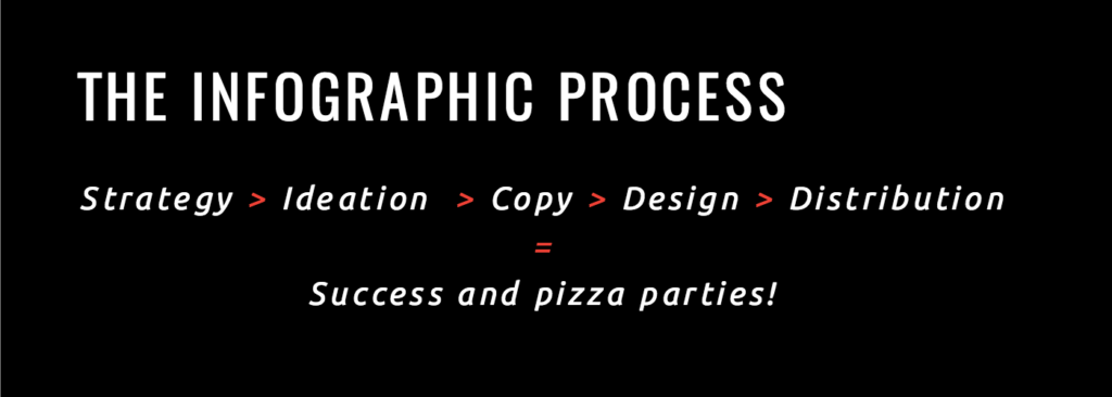
The most important thing to remember is that each stage builds on the other, so you need clear communication and sign-off at each stage to move things forward and create a piece of content that works for everyone. (Basically, by the time you see your first infographic design, you aren’t looking at an entire “first draft.” The idea and copy should have been locked and edited several times by the time you get to that stage.) There should be no surprises on the back end.
START WITH STRATEGY
The process to make a successful infographic starts way before you ever come up with an idea.
People often get excited at the idea of an infographic and want to head into design immediately, but this is the number one thing that sabotages an infographic. Whenever we kick off a fresh project with a partner, we start with a meeting to confirm what the project’s goal is.
At this stage, you’re setting the groundwork for the project. Your job is to ask the right questions to identify exactly what you want to achieve.
1) WHO ARE YOU TRYING TO REACH?
If you want your infographic to succeed, knowing who you want to reach is paramount. You should be able to identify who your audience is or who your audience segments are, as well as their pain points and desires. This will help you create an infographic they actually care about.
If you haven’t already, create audience personas that include demographic and psychographic information to guide these discussions. (Try our quick exercise to build your personas in less than an hour.)
2) WHAT IS YOUR GOAL?
What are you trying to achieve with this piece of content? How does it fit into your short- and long-term marketing goals? Wanting to create an infographic because they’re “cool” is not a reason. It can actually be a huge waste of time if it’s not tied to your larger strategy.
3) IS AN INFOGRAPHIC WHAT YOU NEED TO ACHIEVE THAT GOAL?
This is a big one. Way too often we see people get excited about a certain format or trend and go all in. Sometimes they want to create something because a competitor did. Other times they just want to appease a higher-up who wants what they want because they want it. Over and over, we remind people that format should be determined by the story you’re telling. An infographic may absolutely be the right format, but a GIF series, interactive infographic, motion graphic, or video might be the better solution.
4) HOW ARE YOU GOING TO DETERMINE SUCCESS?
Your KPIs will tell you whether or not your infographic worked; they should not be an afterthought. If you need tracking links or analytics set up, these are all things that should be locked down before you go into production.
Other things to consider:
- Who needs to weigh in on the content created? Too many cooks in the kitchen or a major edit right before publication is a pain in the ass.
- Who will own the project? Decide who will consolidate edits from stakeholders, who will coordinate with design and PR, who will make sure that what’s created aligns with the project goal, and who will problem-solve along the way.
- Where is this going to live? In our early years, we were always shocked to deliver a slick infographic, then find out our partner doesn’t even have a blog to post it on. Knowing where this is going to be displayed will also influence design. Don’t surprise anyone down the line.
Once your team understands the project goals, only then can you move into the fun part: coming up with awesome ideas.
FIND THE RIGHT IDEA
Too many brands try to make infographics for themselves—not for the people they’re trying to reach. Great ideas are only great if they work for the core audience. It’s easy to get hyped up on a fun or interesting idea, but it will ultimately fail if you forget who you’re creating it for.
STEP 1: BRAINSTORM
Bring the right stakeholders together at this stage, including your copywriter, art director or designer, and PR. PR is particularly important, as they know what publishers and influencers are interested in. They can also help facilitate co-partnerships, which is a strategy that we love to use. (Read more about how to approach publications for this type of content.)
Brainstorms can be tricky when you have a lot of stakeholders (or egos) in the room. Remind your team what the ultimate goal is to keep discussions on track. Something that helped us tremendously was learning about the 4 different types of creative brains. (Understanding what type of thinker you are and how to better communicate with others will save your sanity.) You can also try these 16 methods for coming up with great infographic ideas.
STEP 2: VET YOUR IDEAS
A freestyle brainstorm sounds fun, but you’re here to achieve a goal. Vet every idea to make sure it really will capture people’s interest.
- Does this solve a problem, expand their knowledge, or have a practical application?
- Is it relevant to them?
- Would they want to share it?
- Has this been done already? Can you do it better or give it your own spin?
STEP 3: WRITE A CREATIVE BRIEF
This document keeps everyone on the same page and outlines everything anyone working on the project needs to know. If you don’t have that information available, you might end up with an infographic optimized for web publication that was supposed to be an enormous visual for a tradeshow presentation (not that that’s ever happened to us—multiple times).
If you need a little help there, follow our guide to writing creative briefs your team can actually use.
Also, we find that there can be some confusion when talking about infographic creation. Before you head into production, make sure your team is all on the same page with the same language. A few terms to know:
- Data visualization: Strict visualizations of data, which include charts and graphs.
- Infographic: A graphic combining copy and data visualization.
- Information design: A graphic that visually displays information but not necessarily data (e.g., a flow chart).
- Interactive infographic: Web-based content that users can interact with and/or manipulate.
- Animated infographic: An infographic that features animation (aka movement). It’s sometimes called a GIFographic.
TELL YOUR STORY
A lot of people think infographics are eye-catching and therefore effective, but that’s way off. A well-crafted infographic is effective because it tells a story. Combined, the text and visuals make that story easier to understand. Your words are the backbone; design enhances your words. The stronger your story, the better your infographic.
Dig into your data: Data storytelling is a powerful way to communicate, but only if you have a strong data set that actually has a story. A few things to keep in mind:
- Proprietary data is gold: Your own data is one of the best sources for unique, original stories. Look at internal data, including research, studies, surveys, reports, etc. Here are 9 places to look for great data.
- A statistic is not data storytelling: Just adding a single stat to your infographic doesn’t mean you’re doing data right. A great data story extracts meaning and insight from a data set. Try these 5 tips to find stories in your data if you’re stuck.
- Data can be manipulated, misinterpreted, or misrepresented: You should always use a credible, non-biased source for data. Follow these 5 tips for sourcing infographics to stay legit.
- Provide context and insight: When you do have a strong story (ideally from a single, solid data set), provide context and insight to guide your reader through the content. BTW, please don’t stuff your infographic with every single data point just because you can.
Tell a single story: We’ve all encountered monster infographics that never seem to end. It’s tempting to cram as much as you can into your story, but an infographic is effective when it tells a strong and straightforward story that brings more clarity to a topic. If you have multiple angles or aspects of a story, it may be better told through a series of infographics.
Here’s a good litmus test: Is it easy to write the headline for this story? Can you summarize your message in a few sentences (or a PR pitch)? If you have trouble writing your story succinctly, people will have trouble understanding it.
For more help, find out how to craft a strong infographic narrative.
Structure content in a logical hierarchy: Good design starts with copy. The better you structure your content, the easier it is for users follow the story and the easier it is for designers to lay it out intuitively.
Write to your reader: You should be telling a story they want to hear—and telling it in their language. Write to their level of understanding, explain terms that may be unfamiliar, and, dear god, avoid buzzwords.
Channel your brand voice: Your brand is made up of humans. Your brand voice should be human, too. No one likes corporate speak or dry language. Always give your content a second edit for tone and word choice. Here are a few more ways to take the BS out of your content.
Don’t get too clever: Sometimes marketers get excited about a certain story concept or metaphor, but if it doesn’t fit the story, it will do more damage than good. (Would a beauty brand campaign be about “scoring a homerun”? Probably not.) The same goes for headers. Be careful with puns. People want to know what the infographic is about—not decipher some obscure reference.
Kill redundancies: Be as succinct as possible. Context is important, but there’s no need to over explain. Design is there to do the heavy lifting and bring elements to life, so let it do its job. If a graph shows a 50% increase, the body copy, subhead, and callout do not need to reiterate the 50% increase.
Watch your wordcount: Infographics are not term papers or opportunities to prove to the world that you went to grad school. In fact, they require much less text than you’d expect. Condense and cut as much as you can. This allows more breathing room for design and helps you keep your story tight.
Edit and approve: Save yourself headaches and make sure everyone signs off on copy before you go into design.
DESIGN A GREAT INFOGRAPHIC
Great infographic design is meant to enhance the copy, increase comprehension, and make the content as visually appealing as possible.
The number one question to ask when designing: Does this serve the story?
Know your specs: Are you designing for print? Social? Web? Mobile? Responsive? What’s your resolution? This is relevant not just for practical reasons but to help achieve your goal. If the goal is to increase FB followers, the infographic better be optimized for social.
Read the content before you design: It’s an obvious one, but it’s important. You need to know what you’re really trying to express and you need to double-check that all copy is there.
Design data according to best practices: Good data design doesn’t just depict data; it uses design to enhance comprehension and bring clarity to complicated subjects or concepts. The design elements and copy should work symbiotically to tell a cohesive story—rather than design just reiterating what the copy already communicates. To make sure your data visualization is on point, read up on best practices and find out how to design the most common charts and graphs.
Follow your visual language: Every brand needs a visual language. Imagery, photography, and iconography are all tools to communicate your brand story. That said, follow your brand guidelines! If your brand is all about minimal line drawings, a brightly colored photo-based infographic is a fail. For more on that, find out what 4 things your brand style guide needs.
Be consistent: Six different typefaces and sizes or 2D and 3D illustration combined in one infographic—these are the eyesores to avoid. Again, your brand’s visual language will likely have guidelines for these things, but keep an eye out for consistency. You should also avoid these 8 design mistakes in your visual content.
Experiment when you can: Not all infographics have to be static illustrations. If your visual language allows, you can try working with papercraft, photography, or motion. For example, we turned our infographic about the trends for the future of infographics into an animated infographic for INC, which helped us tell the story in an even more exciting way.

Solicit useful design feedback: Ask the team to tell you what they think is working and what is not working instead of what they like and don’t like.
Proof the infographic: Before you send your infographic into the world, triple check that the copy is clean and the design is on point.
- Is all copy there?
- Are there typos?
- Does it have a logical flow?
- Is everything aligned?
- Are data visualizations accurate and best represented?
- Is the resolution correct?
Nothing’s more embarrassing than a major error. (Let’s not forget the Fox News pie chart that totaled 193%.)
DISTRIBUTE YOUR INFOGRAPHIC
Writing a great story and designing a stellar infographic are only half the battle. Getting eyeballs on your work is what will help you ultimately succeed. To help your team distribute the infographic effectively, there are a few extra steps.
Optimize your infographic for SEO: Make sure you have the right file names and keywords to get the most SEO traffic. For a full rundown of everything you need to do, follow our guides to optimize your infographic for SEO and optimize your blog for infographic publishing.
Create shareable assets: Coordinate with your design team to get assets for your channels. Make sure you have the right resolution, file formats, and sizes, whether it’s going out via email, blog, or social. Breaking up an infographic into different assets is a great way to get more mileage from the content. You can read more about how to do that with a divisible content strategy.
Craft a compelling pitch: If you’re trying to get coverage (and you should be), you need a pitch that explains why your infographic is interesting and relevant to their readers.
- Use an attention-grabbing subject line: Journalists and influencers get a ton of email. Give them a reason to read yours.
- Keep your pitch personal and brief: Put the story front and center.
- Highlight key takeaways: Include a brief overview, as well as a few bullet-points or “tweetable” stats so the journalist doesn’t have to dig for them.
- Include multiple story angles: Pitch stories that will best align with their readers. If appropriate, offer to write a sample post for your infographic if the journalist is strapped for time.
We hope these tips help you create better infographics and think more critically about your current process. Things are always changing in the marketing world, and even some of these tips may be outdated in a few years, but we’ll do our best to share everything we learn. If you have some of your own tips, send them our way.
Need some more infographic inspiration?
- See 9 infographic design examples that will leave you inspired.
- Learn more about the power of data visualization.
- Find out the 5 great ways you can use infographics in your organization.
- Try Visage, our data design platform.
Source: Visual News
June 15, 2017
6 Premiere Pro Timeline Tips to Speed Up Your Workflow and Stay Organized
Become a Premiere Pro by mastering the timeline panel with these 6 tips.<p>After working in Adobe Premiere Pro for more than 10 years now, I’ve found a …
Source: CW’s Flipboard Feed
June 15, 2017
These Maps Do More Than Just Give Directions
Generally, city maps are used for navigating streets and subways but do little to inform about the experiences of a city. That’s where Tags and the City comes in. Created by Tin Fischer, David Goldwich, Jug Cerović, and Andrea Rohner, a journalist, software engineer, architect and map maker, and graphic designer respectively, the transit maps are labeled based on popular Instagram hashtags used near each station.

The hashtags analyzed by Fischer were chosen based on their proximity to a station and did not include tags that referenced temporary events or installations, neighborhood names, or station names. The purpose of the analysis was to determine what people were frequently photographing and sharing.
Looking at each map gives users a pretty decent idea of trending events and experiences around each city. For New York, there are plenty of food trends marked throughout the city like the #Cronut in SoHo and #RedRooster in Harlem, while Paris was considerably more defined by cultural landmarks rather than food.

For Fischer, the hashtags that he found most interesting weren’t ones labeling food or cultural landmarks but something completely different altogether. “What always surprises me is how popular it is to go and see filming locations from movies, like the fire station from #Ghostbusters in New York or the high rail from #Inception in Paris,” he says.
Unfortunately, since Instagram changed its open data policy, the data only covers images from 2014 and can no longer be updated but they do intend to make. For now, you can check out the maps they’ve already created for Berlin, London, New York, Paris, and San Francisco Bar Area.
Have a look around each of the cities here.

[Via: Co.Design]
Source: Visual News