January 31, 2017
Our parent company, Column Five, have talked at length about why annual reports are such an important piece of content for brands. Annual reports aren’t just satisfy a legal requirement; they are a bold statement about who you are, what you do, and how you are succeeding. And when well-executed, they can elevate your brand in ways you might not imagine.
Take Warby Parker. When the eyewear company debuted their 2012 annual report, an entertaining interactive infographic, they were almost overwhelmed by the results.
“We thought some people would find it interesting, but it was retweeted 2,000 times and led to our three highest consecutive day of sales—even more so than when we were in CBS Sunday Morning or The New York Times,” Warby Parker Cofounder Neil Blumenthal told Fast Company.
(The company has since taken the report offline, but you can check out our review of their 2013 annual report to see how great their reports are.)
For some brands, crafting an annual report feels intimidating or taxing. But we know that no matter how dull your industry or dry your data, you can create an annual report that is interesting, engaging, and authentic.
To help you do that, C5 is sharing some of their own tips to help you create a compelling report from cover to cover.
1) STREAMLINE YOUR STORY
It’s a shame when brands just compile their numbers, add a letter from the president, and call it a day. There is a lot of valuable content to be shared in an annual report, but if it isn’t presented appropriately, much of it goes to waste. As a cornerstone piece of content, your annual report should effectively communicate your brand story.
To do this, construct a core narrative. This may be a particular theme, an initiative, or an extension of your mission. Regardless, use every element of your annual report to anchor that story, from the cover design to the copy.
Example: C5 collaborated with Goodwill of Orange County to create an annual report that told the story of “The Good Effect,” how the organization and its contributors helped the community over the year.

2) DEMONSTRATE IMPACT
An annual report is an opportunity to highlight your accomplishments to build trust in your organization and show your stakeholders your success.
But to really make an impression, to help your audience emotionally invest in your brand, you need to highlight the impact of these accomplishments. How does your work affect individuals, businesses, communities, or even the world?
As you frame these successes, you might include data, as well as testimonials, quotes, individual stories, or other information that shows the real impact of your efforts.
Remember: Translate information into impact.
Example: C5 helped create the 2014 Robin Hood Annual Report, an interactive report that includes video and stories. The video below follows the story of the Robin Hood Veterans Initiative, allowing the people who worked on the initiative—and the direct recipients—to talk about the impact.
3) HUMANIZE YOUR WORK
Your audience appreciates transparency. This applies to your financials, of course, but it also means they want to know who you are and who (not just what) you’re helping. Strong brand relationships are built through human-to-human connection, so removing the curtain is crucial.
Think about how to make your brand voice come through in your content. And in addition to human stories, include photos, whether it’s your CEO, employees, or the people most affected by your work.
Example: C5 created the Krochet Kids intl. 2013 Annual Report, which included photos and stories of the women they work with around the world.

4) VISUALIZE YOUR NUMBERS
We’re huge proponents of data visualization because it is both aesthetically pleasing and an effective form of visual communication. Our brains are pre-wired for visual communication, so visualizing data makes the information presented easier to comprehend and recall.
Data is particularly useful to enhance your messaging; it also creates visual variety. Note: If there is particularly pertinent information that supports your story, include callouts or additional context to ensure your reader understands the significance of the data.
As you look for opportunities to visualize, make sure you follow best practices. (See our data visualization 101 series for more info on how to design common charts and graphs.)
Example: The data visualizations in the National Association of Realtors 2013 Annual Report show the organization’s social media growth in an easy-to-understand way.

5) USE A VISUAL LANGUAGE
The visuals you include tell your story as much as the words on the page. Your choice of illustrations, photos, colors, and fonts make your visual language an extension of your brand identity.
As you move forward with design, you may want to choose an overarching visual theme or metaphor that relates to your story. It may also be influenced by the format you choose.
This is an opportunity to get as creative as you like. However, if you have an established brand visual language, it should be consistent with the other pieces you create.
Example: C5 designed the Pacific Life 2015 Annual Report around an aquatic theme. It helped present the brand as a living, breathing, energetic entity to remind the audience that Pacific Life is more than a life insurance company.

6) INTRODUCE INTERACTIVITY
Annual reports have evolved in recent years. Whereas a print piece was the standard 25 years ago, they can now take many forms: print, digital, interactive—even video. (And we’ll surely see a VR version someday.) Depending on the story you’re trying to tell, consider which format will help you deliver it most effectively.
No matter what you choose, look for opportunities to engage readers. Interactivity is a great way to do this. The more time they get to spend “in” and with your content, the more invested they are.
You might consider an interactive infographic that lets them jump in and play around with the content. (This is particularly useful for data sets.) You can even create interactivity with a print piece. The Sonae 2012 Annual Report by Ivity Brand Corp. featured gears to turn and acetate overlays to bring the content to life.
Example: The Krochet Kids intl. interactive report allowed users to explore company data.

7) SURPRISE YOUR READERS
If you challenge yourself, you can really break the mold with your annual report. This extra layer upgrades your readers’ experience, making your annual report truly memorable. There are many ways to surprise or excite readers.
- Try an interesting presentation: The Banques Alimentaires Québec 2012-2013 Annual Report by LG2 Boutique came wrapped around a paint can.
- Share a delightful photo, story, or tidbit: Warby Parker’s 2013 annual report mentioned the time their team ordered so many sides of bacon from Seamless that the service was sure there’d been a mistake.
- Include a fun little freebie: Flywheel’s 2015 Year in Review showcased the CEO getting a tattoo of the company’s logo. In honor of the event, they made custom temporary tattoos to send to anyone who requested them.
- Create a totally jaw-dropping experience: The Well Done 2006 Annual Report by Bruketa & Žinić required readers to bake—yes, bake—a booklet to see images appear inside.
No matter your budget, you can always come up with something creative. Your annual report is a huge opportunity to make a bold statement—don’t waste it.
For more impressive annual reports, take a look at these 40 examples of truly inspiring annual report design. And if you need a little help with your own, C5 would love to chat.
Source: Visual News
January 30, 2017
DSLR cameras are fantastic for taking stunning photographs, but if you don’t understand how to use them, it’s an expensive purchase. There are so many settings to consider—shutter speed, aperture, exposure—that it can get a bit overwhelming. “Even speaking to a photographer friend of mine who works for a pretty prestigious company in London,” Simon Roberts says, “he spent a lot of university struggling to understand how his camera operated.”
Roberts, who is a freelance graphic designer and animator, ran into problems of his own while teaching himself how to use a DSLR for motion graphic projects. That’s why he created Photography-Mapped, a screen-printed graphic that lays out the various features of a DSLR camera and their functions. The website even includes an interactive that shows users what happens when the camera’s exposure is adjusted.

Normally, camera exposure is represented by an “exposure triangle,” a triangular graph that shows how aperture, shutter speed, and the sensor are all related. But for Roberts, this interpretation was too complex. He also felt that it, and other metaphors, were lacking a crucial component: time. In Roberts’s version, he simplified the approach to understanding exposure and then animated his diagram, creating a new digital tool for photographers.
The two-color diagram features the physical components of a camera with four columns detailing how the lens, aperture, shutter, and sensor operate. There is also a section about how an exposure is measured and its importance. The columns are arranged in the order of the sequence, further illustrating how all these components work together. The interactive gives users the opportunity to put their newfound knowledge into practice.
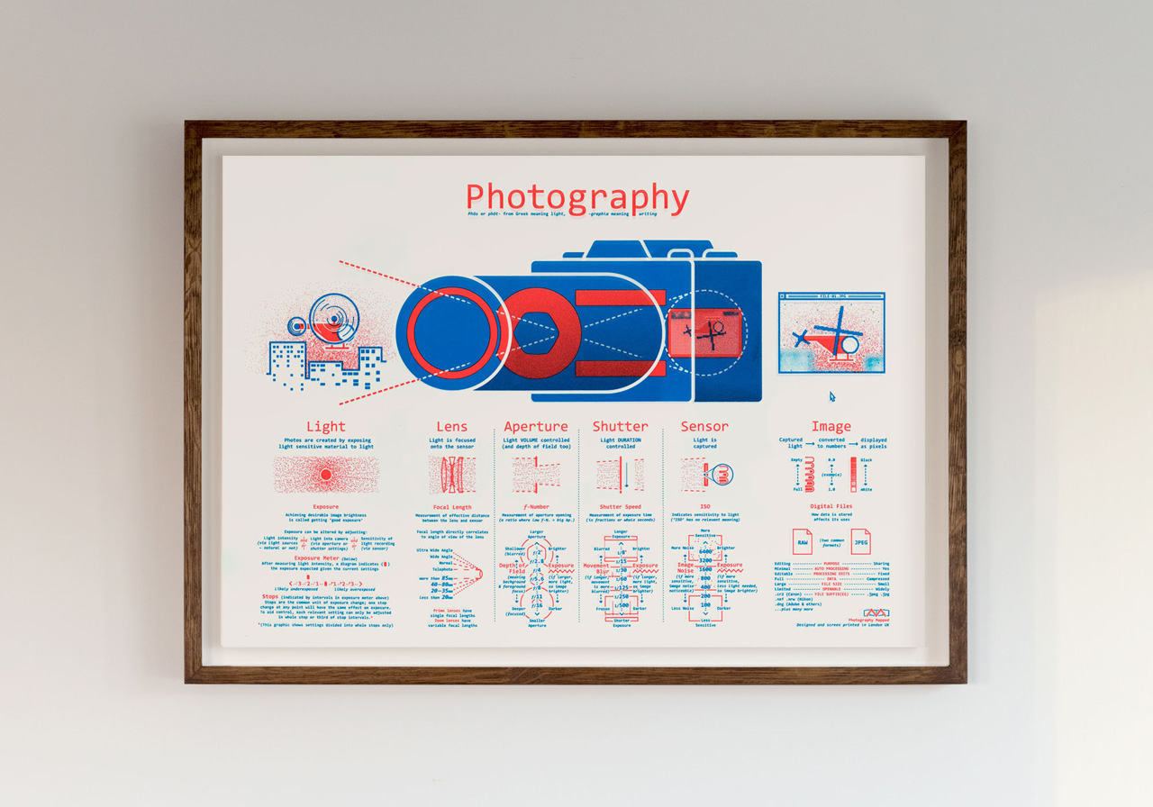
“Knowing the order in which the light comes in is important to me,” Roberts says. “You have the aperture that is restricting the volume of light coming in. The shutter restricting the time and the sensor emitting more or less light based on what you want. That sequence, and knowing that’s how it actually works, for me, was the ‘aha’ moment.”
Have a go at the interactive here.
[Via: Co.Design]
Source: Visual News
April 30, 2015

Sed ut perspiciatis unde omnis iste natus error sit voluptatem accusantium doloremque laudantium, totam rem aperiam, eaque ipsa quae ab illo inventore veritatis et quasi architecto beatae vitae dicta sunt explicabo.
Neque porro quisquam est, qui dolorem ipsum quia dolor sit amet, consectetur, adipisci velit, sed quia non numquam eius modi tempora incidunt ut labore et dolore magnam aliquam quaerat voluptatem. Ut enim ad minima veniam, quis nostrum exercitationem ullam corporis suscipit laboriosam.
At vero eos et accusamus et iusto odio dignissimos ducimus qui blanditiis praesentium voluptatum deleniti atque corrupti quos dolores et quas molestias excepturi.
Read More