-
News & Updates
June 9, 2017
UI/UX & Interaction Design: Meallow App
UI/UX & Interaction Design: Meallow App
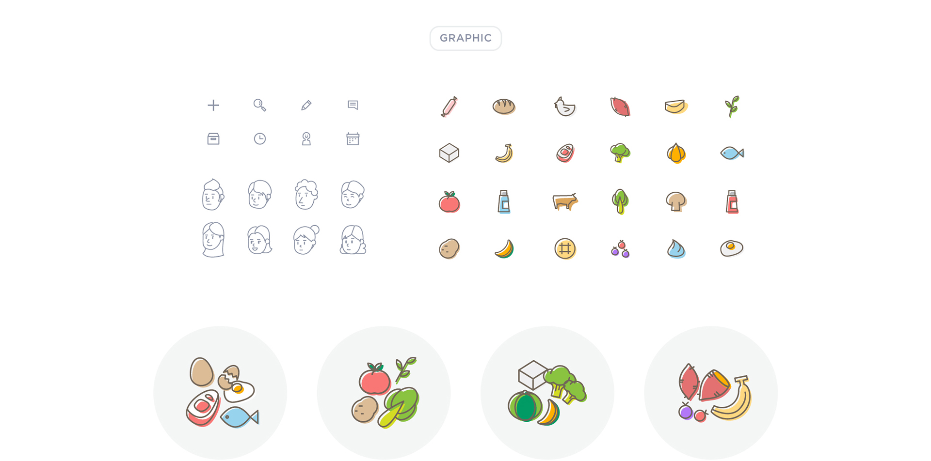
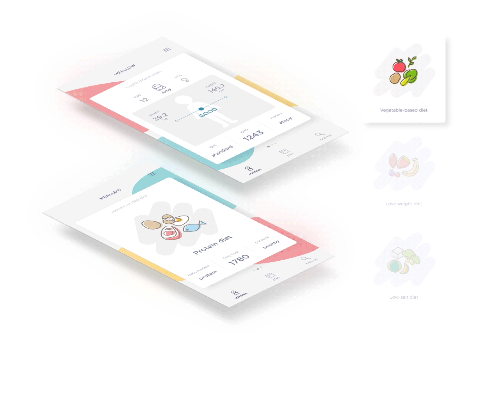
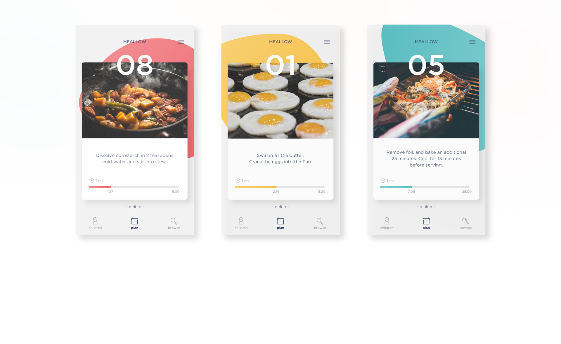
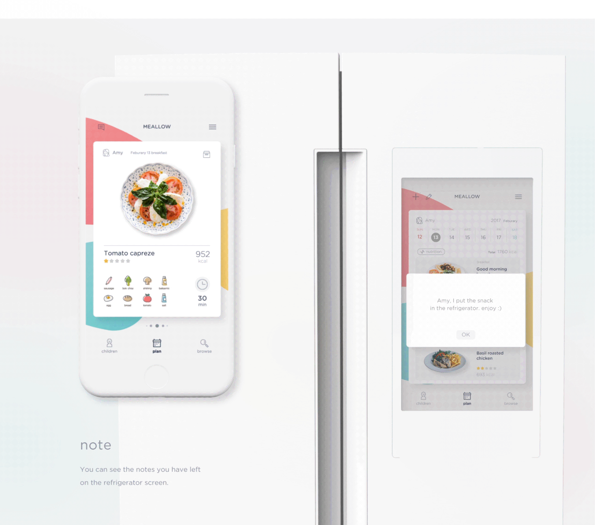
Let’s take a look at this UI/UX & Interaction Design project by Doeun Shin by an app concept called: Meallow. What is it? It’s an app that helps children in growing up at making their diet with the right food and etc. It’s an interesting concept where from the wireframes, Does start her thinking in child information (profile), meal planning and browsing. After setup the profile, you can a series of recipes and also given the difficulty of cooking where you can get suggestions as well. I liked the overall UI and also the user flow where you can be dispensable within the Meallow app for the better growth of your kids or in the near future.
Doeun Shin is a student in graphic design and UI based in Seoul, Korea. She just started her Behance, make sure to follow her.
MEALLOW is a service that helps children in growing up to make their diet with the nutrients they need. This is based on the health information of the user who wants to care and the ingredients. This helps children achieve balanced energy intake and assesses appropriate growth.
Photo Gallery


More Links
- Follow Doeun Shin on Behance
AoiroStudio
Jun 09, 2017
Source: Abduzeedo UI/UX
June 9, 2017
Watch: How to Pull Off the ‘Wolverine Healing’ Effect in After Effects
Whether you’re making a movie about a killing machine made of liquid metal or an ill-tempered mutant mercenary, this VFX tutorial will show you how …
Source: CW’s Flipboard Feed
June 8, 2017
Shooting 360-degree video with a GoPro is about to get epic with Fusion camera
Details remain scarce, but GoPro’s first all-in-one 360 camera will shoot in 5.2K resolution. Users can create traditional fixed-frame content in addition to spherical video. Here’s a look at GoPro’s new storytelling device.
The post Shooting 360-degree video with a GoPro is about to get epic with Fusion camera appeared first on Digital Trends.
Source: Digital Trends VR
June 8, 2017
A Conversation with Mick Fleetwood at the 2017 SXSW Conference [Video]
“I don’t have any regrets because it somehow has been worth a damn and a lot of great people have come onto the stage . . . they all have their own thing about who they are.” – Mick Fleetwood on the different lineups of Fleetwood Mac
Mick Fleetwood, drummer and a founding member of the iconic band Fleetwood Mac, shares anecdotes from his early career in the band with senior editor at Rolling Stone magazine, David Fricke, in this Featured Session at the 2017 SXSW Conference.
Fleetwood speaks at SXSW in the lead up to the release of his book Love that Burns – A Chronicle of Fleetwood Mac Volume One 1967 – 1974 from Genesis Publications. Music industry veteran David Fricke frames his questions chronologically, giving viewers of the session a unique perspective on the meteoric rise of Fleetwood Mac from playing the blues in small clubs to filling stadiums. Stories about the early formations of the band are entertaining, and demonstrate how a willingness to embrace change allowed for the band’s long-term success.
Watch the full SXSW 2017 Featured Session in the video above featuring a conversation between Mick Fleetwood (Fleetwood Mac) and David Fricke (Rolling Stone).

Explore More Content From SXSW 2017
Get inspired by a multitude of diverse visionaries at SXSW – browse more 2017 Keynotes, Featured Sessions, Red Carpets, and Q&A’s on our YouTube Channel.
Follow us on Facebook, Twitter, Instagram, and SXSW News for the latest SXSW coverage, recaps, late-breaking announcements, and updates.
Mick Fleetwood and David Fricke photo by Melissa O’Brien
The post A Conversation with Mick Fleetwood at the 2017 SXSW Conference [Video] appeared first on SXSW.
Source: SxSW Music
June 8, 2017
For $7 a month, Viveport now offers more than 150 VR titles to choose from
For $7 a month, you can now get access to more than 150 HTC Vive compatible games through HTC’s Viveport subscription. It now includes hit titles like Pierhead Arcade, Cosmic Trip and HordeZ.
The post For $7 a month, Viveport now offers more than 150 VR titles to choose from appeared first on Digital Trends.
Source: Digital Trends VR
June 8, 2017
Libraries to enable VR learning as Oculus plans 100 Rifts for California
Virtual reality learning is coming to California in a big way, with the introduction of 100 Oculus Rift headsets and VR-ready PCs in 90 libraries throughout the state. Oculus hopes it will improve access to the technology.
The post Libraries to enable VR learning as Oculus plans 100 Rifts for California appeared first on Digital Trends.
Source: Digital Trends VR
June 8, 2017
5 EASY WAYS TO FIND GREAT STORIES IN YOUR DATA
This article originally appeared on Column Five.
Data storytelling is one of the best tools out there for content marketers. But for data noobs it can seem super intimidating. Where do you get data? What do you do when you have it? How do you find stories in data? Relax. We’ve been doing this a while, and we’re here to help you get through it.
HOW TO FIND STORIES IN DATA
Good stories don’t just come from data; they’re actually hidden in data relationships. When you start to play with your data, you begin to see how each data point relates to another. The patterns you see (or don’t) help uncover what—if any—story is there. Understanding what type of data relationships to look for helps you find those stories faster. But first, let’s guide you through the steps to get to that point.
STEP 1: GET YOUR DATA
This is where most marketers get tripped up. You have a spreadsheet in front of you with a few or a million data points. The first step? Make sure it’s clean and organized.
Organize your data: Most of the time you’ll be working with data from a spreadsheet. The format of your data depends on what kind you have. Let’s talk about different kinds of data.
- Is this data one point in time? For example, If you have data from a 2017 survey, you’d have survey questions in the column and answers in the rows.
- Are there multiple time periods with only one observation? For example, if you have data on Apple stock prices from 1990-2016, the format would have years in the rows and the variable or stock prices in the columns. Note: If years and the variable are switched, no big deal. Spreadsheets have a function where you can paste the values “Transposed.” This will switch the rows and columns of the data.
- What if your data has multiple observations over a time period? Let’s say you have a dataset that has info on multiple countries from 1990-2016. This data will still have years in the rows, but each column will specify which observation is for that particular year. In this example, you would have a “country” variable that identifies which country the data is referring to.
Identify missing values or bad data: These make you a less credible source since your statistics will be wrong. Do a visual inspection to make sure that the data points make sense. For example, if the data set measures human weights, does it make sense for someone to be 2,000 pounds? Get rid of rows where there are tons of missing data.
Look for outliers in your data: These would be data points that don’t seem to fall into your range of expectations. Outliers are usually thought of as a nuisance, but they could also offer interesting stories and insights. For example, if we expect sales to go down in all counties, then a spike in sales in one county would be an outlier (more on that later).
STEP 2: VISUALIZE YOUR DATA
When we talk about data visualization at this stage, we’re not talking about the beautiful data visualizations your designers create. It’s simply the tools that let you literally “see” your data. (This is why we love data visualization so much—it’s an easy way for our brains to understand what we’re looking at.) Technically, this phase is referred to as exploratory data analysis, but we don’t want you to get too overwhelmed too quick.
For this example, we’re using Google Sheets.
1) Highlight the data you want to visualize.

2) Click on “Insert” and scroll down to “Chart.”

From the “Chart” editor you can use the recommended charts or choose your own graphs by clicking on the “Chart Types” tab. The “Customization” tab allows you to do things like rename your title and axes, change colors, or increase the font size.

Remember that different types of data are best represented with certain types of graphs. In the next section, we’ll cover what kinds of graphs can help you answer your data questions.
STEP 3: EXAMINE DATA RELATIONSHIPS
This is actually the fun part where you start to search for your story by examining relationships. As you play around with visualizations and analyze according to relationship, you’ll start to see behavior patterns that will lead you in the right direction.
But first, you need to understand what type of relationships to look for.
5 TYPES OF DATA RELATIONSHIPS
There are many different data relationships, but we’re going to cover the top 5 most common. These will most likely apply to the data you have at hand, and they’ll help you start to get a sense of what else you might like to explore in other data sets.
As you dive into these, consider what types of interesting angles your findings might support. A few questions to ask yourself as you go:
- Does the data support or disprove my hypothesis?
- Does it debunk a widely held belief?
- Did data increase, decrease, or flatline?
- Does the data show any differences between groups?
- What are the top 10 (or bottom 10) observations for a metric or variable?
RELATIONSHIP 1: CORRELATION
This is data with two or more variables that may demonstrate a positive or negative correlation to each other.
- Positive: An increase in one variable results in an increase in the other.
- Negative: An increase in one variable results in a decrease in the other.
Common chart types:
- Scatterplot
- Scatterplot with a fitted line
The strength of a correlation is measured by a correlation coefficient. A popular way to measure this is using the Pearson Correlation Coefficient of Pearson’s R ranging from -1 to 1. This measures how closely the points in your scatterplot resemble a line. A correlation coefficient of 1 means there is a perfect positive correlation. A correlation coefficient of -1 means there is a perfect negative correlation. A correlation coefficient of 0 means there is no correlation.
(In less technical terms, the more the dots on your scatterplot resemble a line, the higher the strength of a correlation.) You can also check out this game, which helps you identify the strength of correlation visually.

Here’s a scatterplot with a fitted line that shows the relationship between GDP per Capita and Coca-Cola prices for different countries. The line shows that there is a positive relationship. This means as GDP per Capita increases, the price of a Coke increases. Through visual inspection we can see the dots don’t make a perfect line, so we can say the correlation is only moderately strong. In fact, after calculating Pearson’s R, the correlation coefficient is 0.51.
What you want to look at here is how they interact. Do both variables influence each other? Do they increase, stay the same, or decrease? Remember: Correlation does not equal causation. (Just because there are more ice cream sales and shark attacks in the summer doesn’t mean that ice cream causes shark attacks.)
Example: You might wonder about the relationship between leads generated by a blog post and the number of hours spent writing the post.


Relationship 2: Trends
Look for noticeable trends, increasing or decreasing, in the data.
Common chart types:
- Bar chart
- Line chart
Example: You might look at how many page views your website gets every day in a month to identify which days of the week generate the most traffic.

RELATIONSHIP 3: DISTRIBUTION
This shows data distribution, often around a central value. Distributions are useful for understanding the minimum, maximum, mean, median, and range of a specific variable. Looking at a distribution lets you understand the shape of your data by looking at the average and end values.
Common chart types:
- Histogram
Example: You could group clients by how much revenue they generate for your company in a year. This way you can see what the average client spends, as well as the range a client might be expected to spend.

RELATIONSHIP 4: OUTLIERS
This is any data that acts unusually or outside the norm.
Common chart types:
- Scatterplots: Shown by points on the plot that lie away from the trending areas.
- Histograms: The tails of the histogram show if there are many outliers in the data.
- Bar charts: Any unusually high or low values.
Example: Going back to our previous example, the trend of the histogram we expect to see is that there are less clients in the first and the last groups. But this histogram shows us an outlier. There are actually a lot of clients that spend $51,000 – $55,000—even though we expected there to be less. It would be interesting to investigate why there are so many clients in that group.

RELATIONSHIP 5: COMPARISONS AND RANKINGS
Comparison: This is a simple comparison of the quantitative values of subcategories.
Common chart types:
- Bar chart
There are many ways to compare data. You can compare sets or look at subcategories within those sets.
Example: You might look data comparing click through rates for different colored CTA buttons. Which get higher clicks, and why?

Ranking: This shows how two or more values compare to each other in relative magnitude.
Example: Which content has the highest page views? Rankings help you easily compare how much traffic a page is generating.

5 DATA STORYTELLING DOS AND DON’TS
Once you think you’ve found your story, follow these tips to make sure you tell it effectively.
1) Have your audience in mind: Effective data storytelling doesn’t mean you tell whatever story you want. It means you find a story that is interesting for you audience. Consider:
- Is this relevant?
- Does it solve a problem or expand their knowledge?
- Have they heard this story before?
Sometimes you have a story that can be told to multiple (or larger) audiences. If you have the data, hone in on the most interesting angles.
2) Use a credible source: Your data should always be from a credible source and presented without spin. Follow these 5 tips to source correctly.
3) Don’t lie with your data: Data can be powerful; it can also be manipulated, misinterpreted, and misrepresented. Make sure you are telling the full story.
4) Design according to best practices: Data visualization doesn’t just visualize the data; it enhances comprehension. Make sure your designers are presenting it in its most optimized—and accurate—form. For more on this, see our guide to designing the most common graphs and charts.
5) Ditch your story if it isn’t actually there: Sometimes people have an idea for a data story and try to retroactively make their data fit that narrative. If the data isn’t there, the story isn’t there. Luckily, oftentimes searching for one story will lead you to another.
If you need to look for more data, check out:
- Kaggle Datasets
- UCI Machine Learning Repository
- US Open Data Project
- Financial Data
- Awesome Public Datasets
- Datasets Subreddit
- Google BigQuery Public Datasets
- Our roundup of 104 free data sources.
Data storytelling isn’t always easy, but it’s always worth it. Keep an eye out for more opportunities to flex your skills and you’ll find great stories to turn into great content.
For more on data storytelling:
- Learn more about why content marketers need data storytelling.
- See 9 great sources of data right in front of you.
- Find out how to craft an effective data narrative.
- Try Visage, our easy data design platform.
Source: Visual News
June 8, 2017
Graphic Design: Exotic Destinations On Earth Illustrations
Graphic Design: Exotic Destinations On Earth Illustrations
Exotic Destinations On Earth is a graphic design project created and shared by JIMMI TUAN and Bratus ™. The idea was to create a calendar and gift for students to get confident for an ESL english test. The restult is a set of beautiful illustrations about the most exotic destinations in our planet. From the desert to rout 66, there are many well-known and not so popular places, but the style and composition of the graphic design pieces are top notch. Below you can see them all.
Project description
Premium IELTS is an online English preparation course, helping Planet’s student take the IELTS test with confidence. Bratus was asked to come up with an idea for the Calendar as an Appreciation Gift . These special presents will be gratefully handed to each students when they enroll in the course. Live. Study. Explore. In collaboration and discussion with clients, Bratus come up with a concept of opening opportunities to students successfully achieving high scores in future IELTS examination . Exotic Destinations on earth is a collection of various Minimal Illustrations. Through Geometry, in combination of lighting and shadow, We would like to take readers on a Journey of Mystery Places, from the immense dessert to the deepest cave
Graphic design


Credits
- Creative Director / Art Direction: Jimmi Tuan
- Project Lead / Senior Graphic Designer: Trang Pham
- Illustration: Trang Pham, Tonbui
- Support Designer: Huynh Co
- Account: Thanh Diem, Hien Nguyen
- Client: IELTS Planet
- Design Agency: Bratus
abduzeedo
Jun 08, 2017
Source: Abduzeedo Illustration
June 8, 2017
Oculus says it has no news on MacOS VR support for now
Oculus has no immediate plans to bring the Rift virtual reality headset to the MacOS operating system, despite news of Valve and HTC making sure the Vive headset is compatible with Apple’s latest OS.
The post Oculus says it has no news on MacOS VR support for now appeared first on Digital Trends.
Source: Digital Trends VR
June 8, 2017
Mobile Photography: Exploring Dubai & the Burj Khalifa
Mobile Photography: Exploring Dubai & the Burj Khalifa
Mobile photography seems to be easy task because you are using your smartphone, that you carrying everyday but it’s not. Finding the right perspective, light setting, subject are all part of what goes through your mind before the shot. What if you’re using a 23 megapixels smartphone, would it help? Well, that was Mikael Buck‘s task during his latest traveling to London, Paris and Dubai for which we are featuring today with the Burj Khalifa. The world’s tallest building at 828 meters high, where Mikael explored Dubai for Sony’s #NewPerspectives campaign.
This photo series has been shot by Mikael Buck who is a photographer based in London, UK. We have featured his work before on ABDZ and you should definitely check out his site for more of his work.
The idea was to photograph the world’s most Instragrammed landmarks in a unique way to show how you can break out of tired cliches. I was lucky enough to get sent to cover Big Ben, The Eiffel Tower and the mighty Burj Khalifa (the world’s tallest building at a mere 828 meters high).
Photo Gallery


More Links
- Check out Mikael Buck’s Site: mikaelbuck.com
- Follow Mikael on Behance
AoiroStudio
Jun 08, 2017
Source: Abduzeedo Photography