-
News & Updates
Communication Design
October 19, 2018
Evercast Livestreams Any Post-Production Workflow to Creatives Around the World
Source: NoFilmSchool

October 18, 2018
Microsoft patent highlights a potential VR text input system
Source: Digital Trends VR
October 17, 2018
Announcing 240 Showcasing Artists for the 2019 SXSW Music Festival

Source: SxSW Music
October 16, 2018
These gloves will make virtual reality feel even more immersive
Source: Digital Trends VR
October 11, 2018
How to use ethnographic research to tell a meaningful brand narrative
Source: Visual Storytelling
October 9, 2018
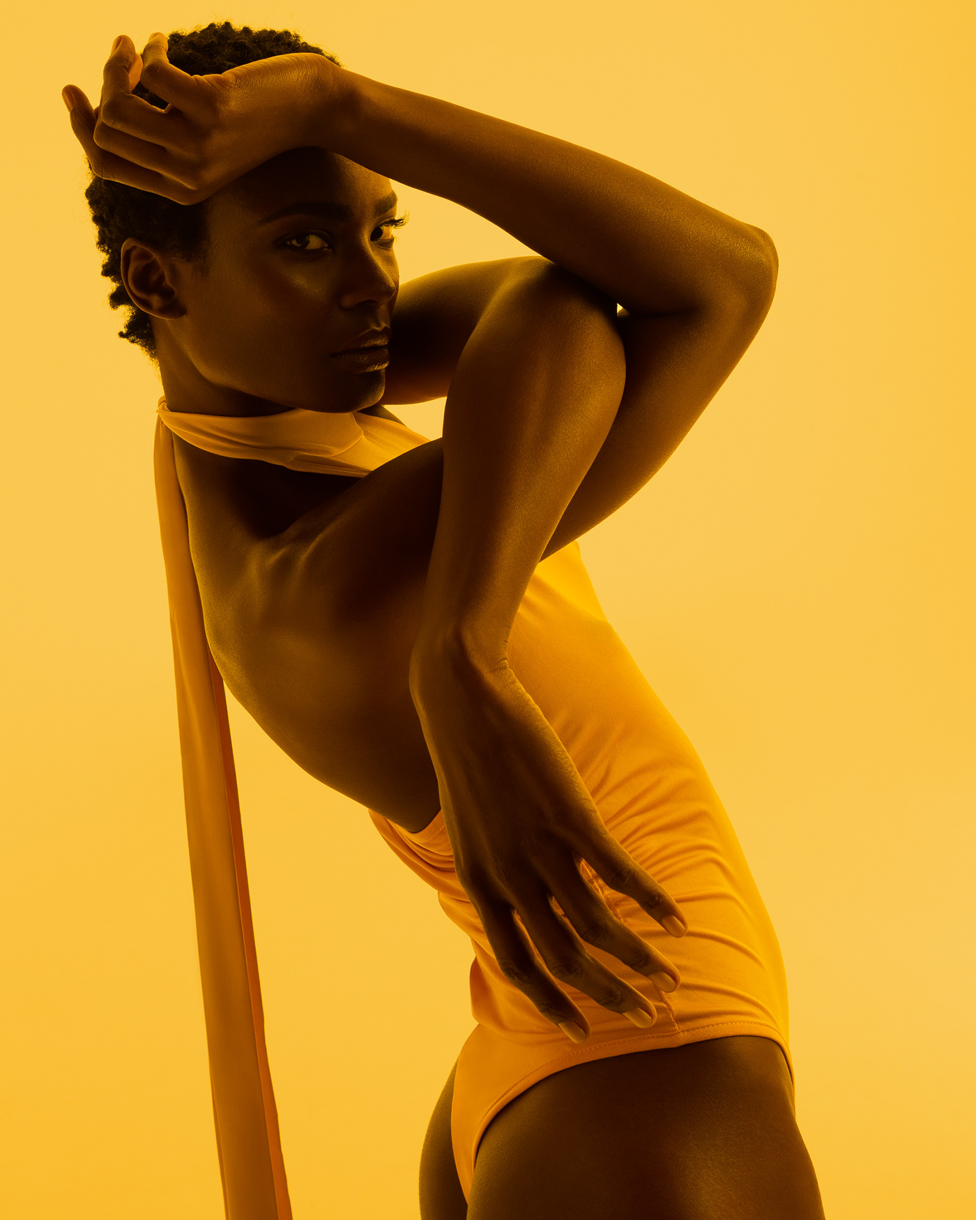
Super Stylish Portrait in Color Photography by Tim Tadder
Source: Abduzeedo Photography
February 1, 2017
These Clever Ads Will Make You Take A Second Look
Agency WCRS is no stranger when it comes to making powerful ads. The “Look at Me” billboards released back in 2015 for Women’s Aid combatted domestic violence by drawing viewers’ attention to the warning signs of domestic violence that often go unnoticed. The digital billboards featured a woman’s bruised face, but when more bystanders looked at her, her bruises would fade.
But domestic violence doesn’t always leave a physical mark. It can be hidden from the world in the form of a person who slowly dominates every aspect of your life—what you eat or what you wear or even how you spend your money. This is known as “coercive control” and it’s something that is quite difficult to recognize if you’ve never experienced it. That’s why Women’s Aid and WCRS released a new series of ads to shed more light on the role of coercive control in domestic abuse.
The ad from a distance:

A close-up view of the same ad:

“Coercive control is the heart of domestic abuse,” says Polly Neate, CEO of Women’s Aid. “Physical violence often comes at a later point in an abusive relationship; what comes first is the systematic destruction of a survivor’s self-esteem and autonomy, piece by piece.”


Utilizing the displacement effect, a technique that allows viewers to see different versions of the ad depending on where they are standing, the words on the billboards transform from loving sayings to controlling and abusive phrases.
The frightening part about coercive control is that the words can sound tender and caring, not only to those outside of the relationship but also to the person being abused. Because oftentimes the threats are hidden amongst loving words, victims even begin to question themselves.


The ads will be visible on roadside locations, donated by 8 Outdoor, with long dwell times in London, Birmingham, Leeds, and Edinburgh, making both messages easily viewed by drivers.
“The opportunity WCRS has always sought with Women’s Aid is to marry messaging with an element of the interactive,” says executive creative director of WCRS Ross Neil. “Interactivity on a media site that consumers speed past in seconds is therefore slightly limiting. Limiting can also be a challenge to creativity; that is why we are so proud of this piece of work. It uses the displacement illusion to deliver hidden messages to consumers, depending on their distance to the media site. Super simple, super effective.”


“Women’s Aid campaigned to have coercive control recognized in law, and we are thrilled to have the support of 9 Outdoor and WCRS in communicating what coercive control is to the world in such a cutting-edge way,” says Neate. “If we do not understand the nature of domestic abuse, we cannot reduce or prevent it—but this powerful campaign will go a long way to helping many more people understand that reality.”
[Via: AdWeek]
Source: Visual News
January 26, 2017
Find Some Of The Best Color Combinations From This Twitter Account
Selecting the perfect color combination is extremely important when creating a new design or devising the right tone of a piece. It’s also quite difficult since you’ve got to understand color theory and have some type of artistic sense. But one Twitter bot account, @colorschemez, is composing striking color combinations based on an algorithm.
Three colors are chosen at random and and joined together in a square image. Although some color combinations are atrocious, others are quite enjoyable and nice to look at. The names chosen for the combinations are also created by an algorithm that randomly selects adjectives, making them entertaining as well.
The genius who built the bot is Los Angeles Times’ graphics editor Joe Fox. Inspired by “The Dress” meme that went viral back in February 2015, the original version of the bot only paired two colors together and had few followers. It wasn’t until the current was created that the Twitter account began to gain popularity.
The algorithm works by picking three colors from xkcd’s 2010 color-naming survey, which asked 222,500 participants to name 5 million colors in their own terms, i.e., “purpleish.” With the chosen colors, Fox then programmed the bot to modify the color names even further by selecting a few words from a collection of 8,000 adjectives.
You can see some of the bots color combinations below:
executory light periwinkle
Sicilian battleship grey
rakehell cool grey pic.twitter.com/VAhGOe44M2— colorschemer (@colorschemez) January 2, 2017
inconsiderate olive yellow
unclothed spearmint
nestlike sandstone pic.twitter.com/ieG8t4hban— colorschemer (@colorschemez) January 2, 2017
aliped hot green
supernaturalistic lime green
lanciform vibrant purple pic.twitter.com/DBy1drmgs5— colorschemer (@colorschemez) January 2, 2017
disquieted purpleish
diplomatic heliotrope
snail-paced turquoise pic.twitter.com/yX74iiozCN— colorschemer (@colorschemez) January 2, 2017
[Via: Co.Design]
Source: Visual News