-
News & Updates
Uncategorized
January 25, 2017
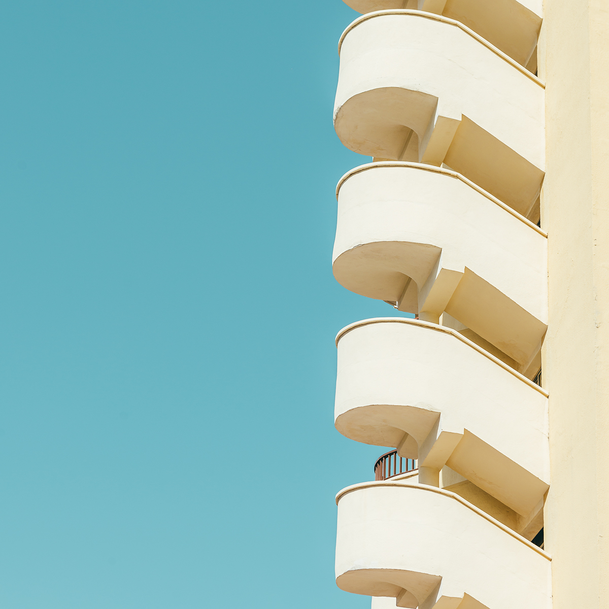
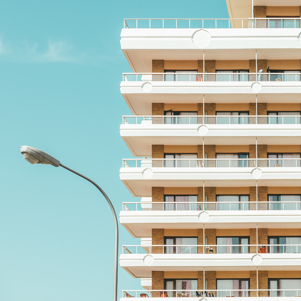
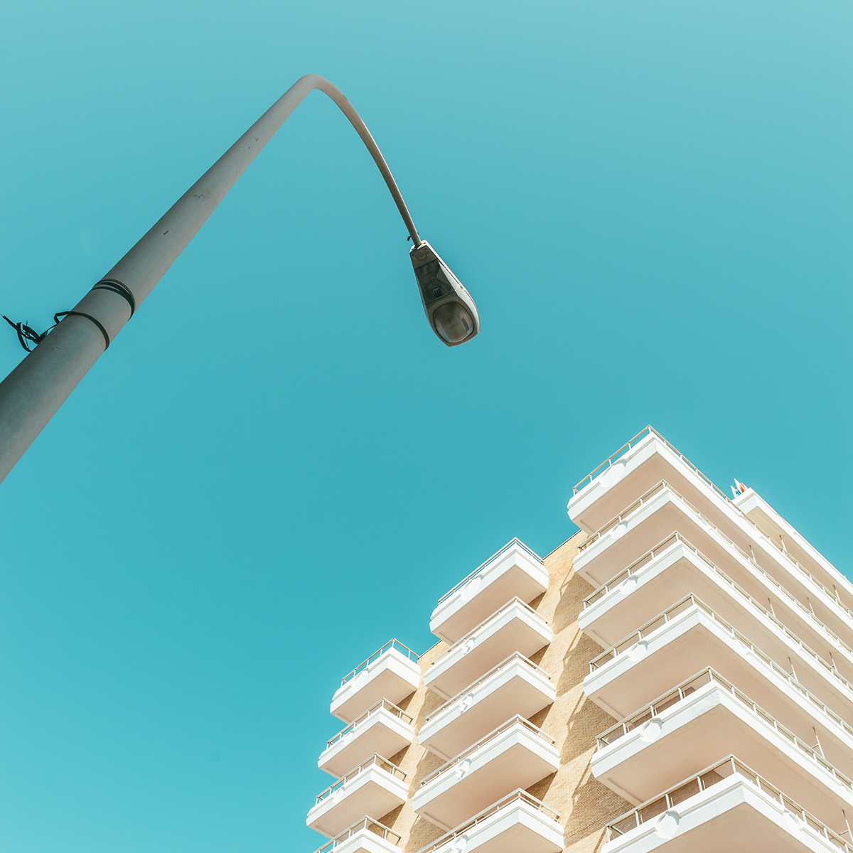
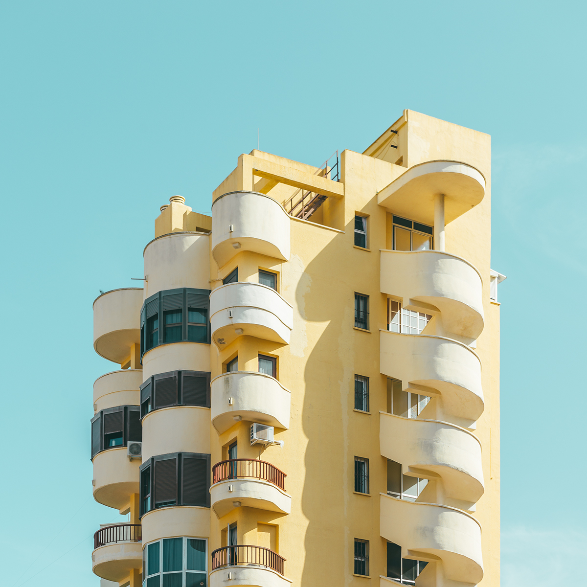
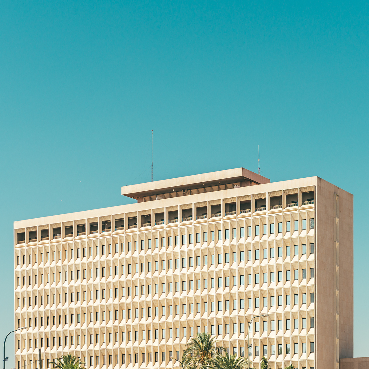
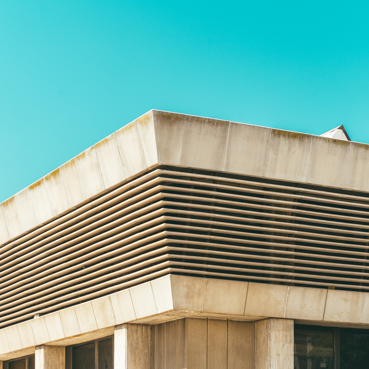
Architectural Photography by Andrei Tudoran
Architectural Photography by Andrei Tudoran
Bold is a architectural photography post with the main subject being buildings and architecture. It was shared by Andrei Tudoran and it is a series of photos on building details with a very warm mood. The contrast between the building and the cyan sky is quite beautiful, especially the contrast with the white or beige concrete structures. I have been trying to take a photo a day this year and buildings with the sky in the background is my number one choice. I wouldn’t consider my entries as architectural photography, but what Andrei did here quite well is what I have been trying to achieve with no much success. Well, it’s been raining here in Northern California quite a bit.
Andrei Tudoran is a self-taught urban and architectural photographer based in Bucharest, Romania. He has showcased his work in exhibitions like:
- 2016 – Ciao Bucarest – Unique exhibition highlighting Italian influences in Bucharest. Muzeul Municipiului Bucureşti – Palatul Suțu.
- 2016 – UR.BASM FESTIVAL featured in UR.REALITY – an interactive exhibition by Bucuresti Realist popular Bucharest Facebook page.
- 2016 – UR.BASM FESTIVAL featured in UR.SWITCH – An initiative to raise awareness regarding Park & Ride facilities and increasing intermodal transport in Bucharest.]
For more information make sure to check out his website at http://andreitudoran.com/
Architectural Photography

abduzeedo
Jan 25, 2017
Source: Abduzeedo Photography
January 11, 2017
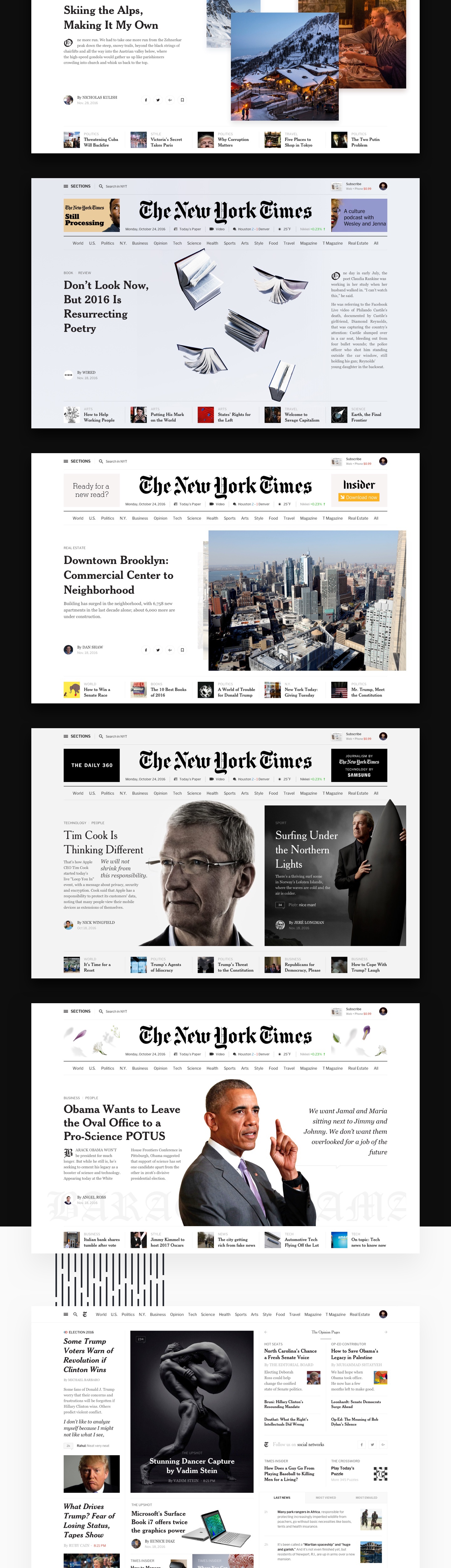
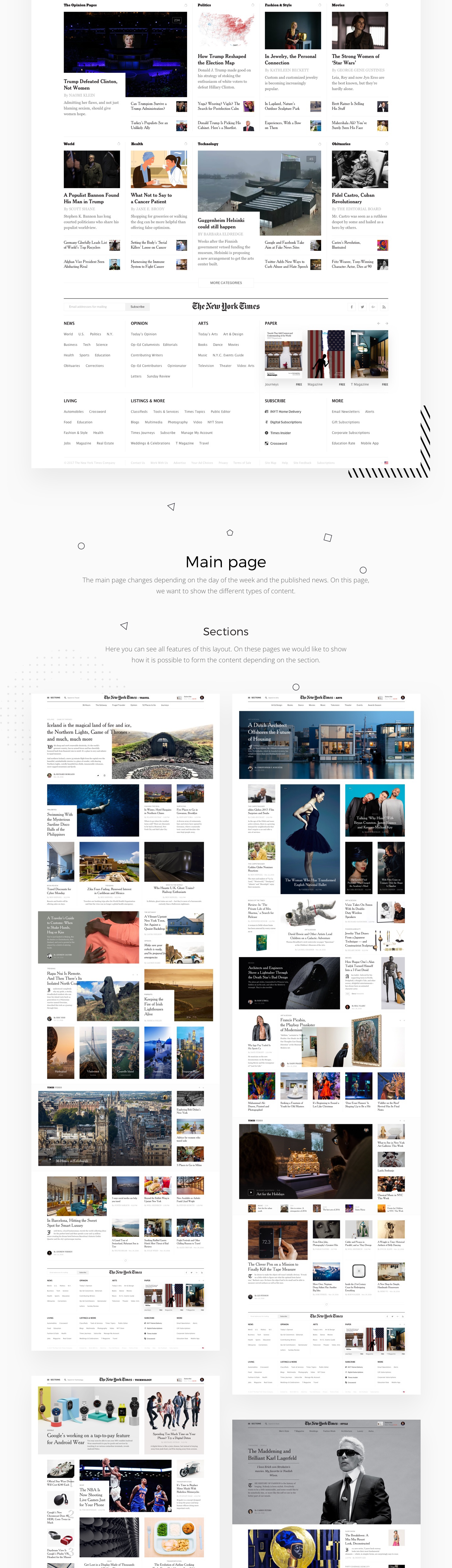
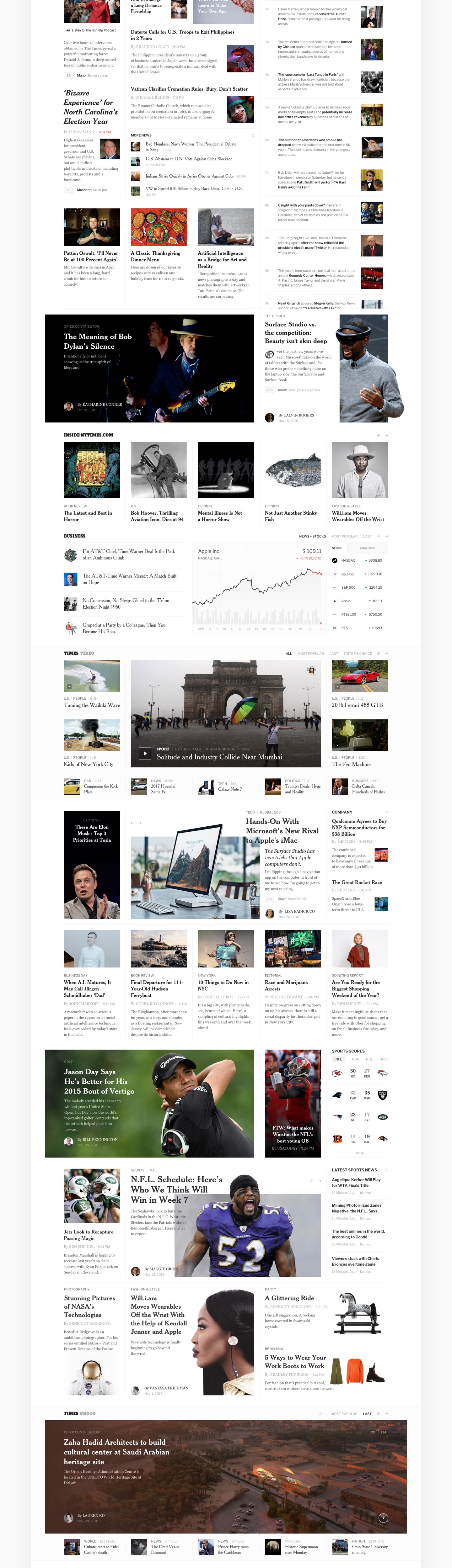
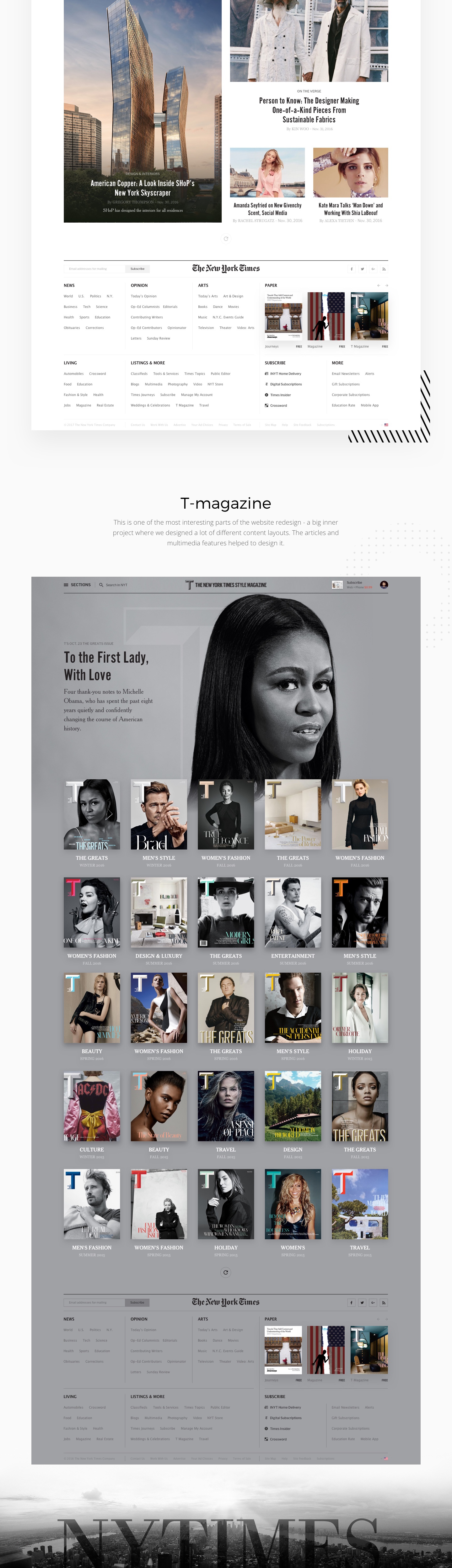
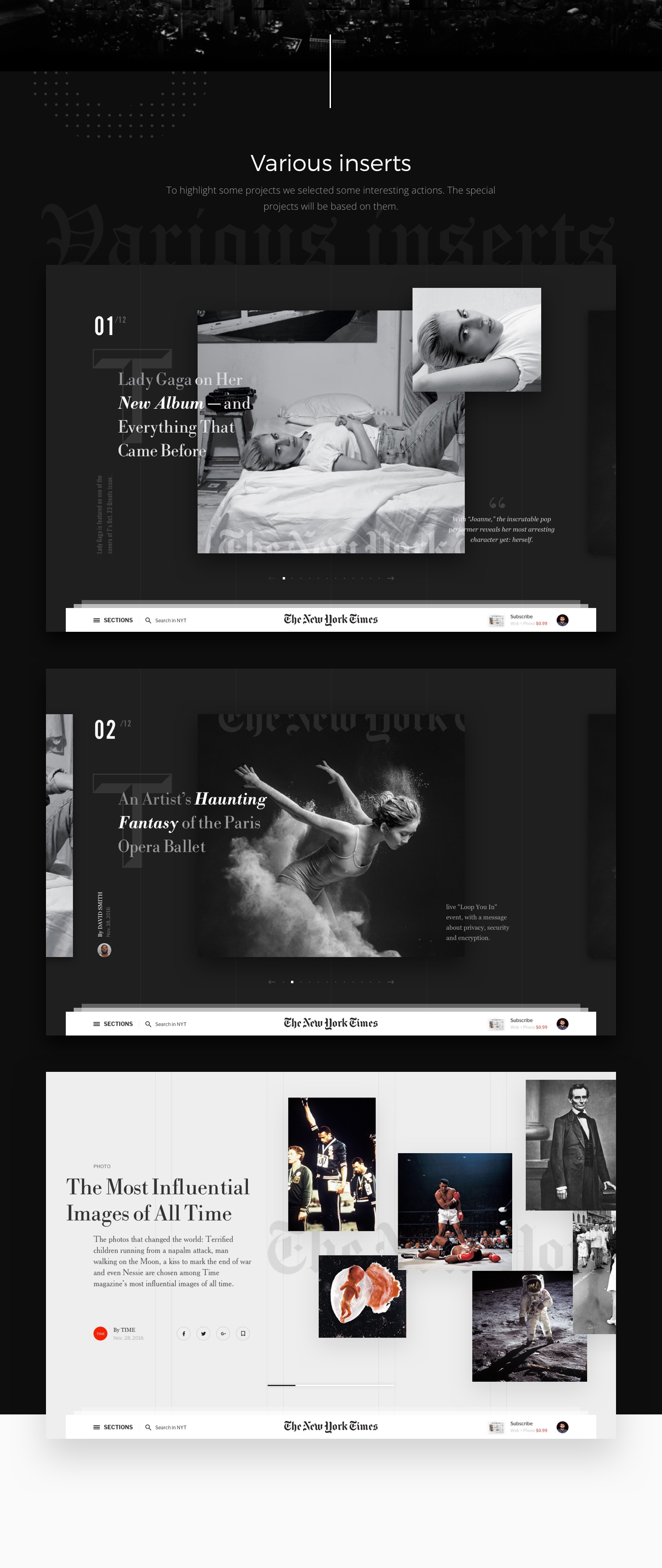
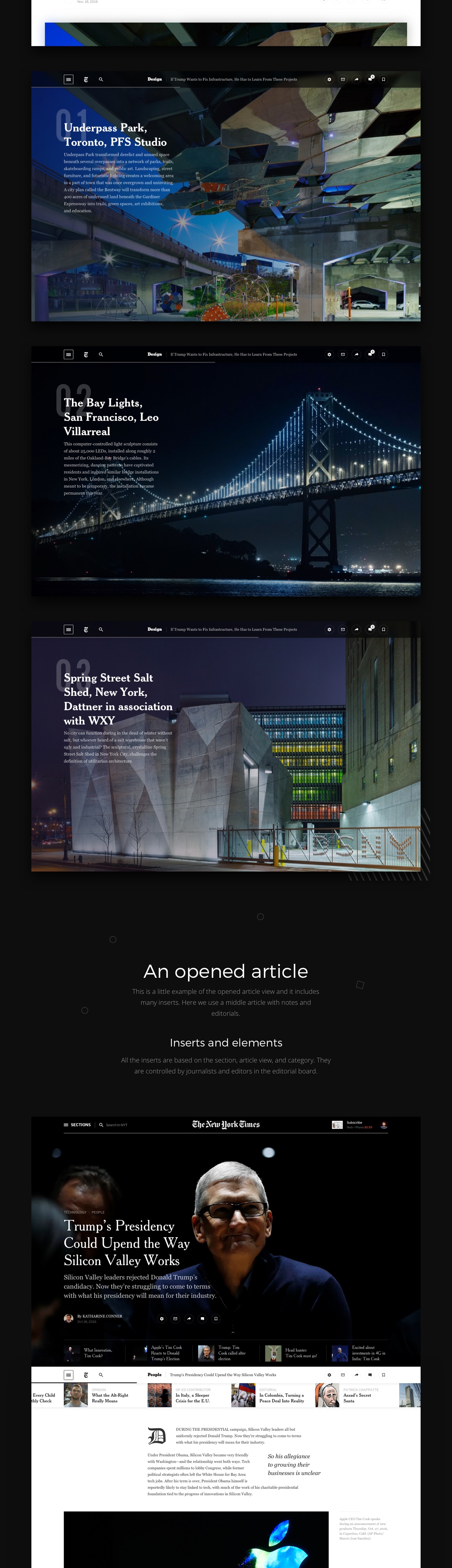
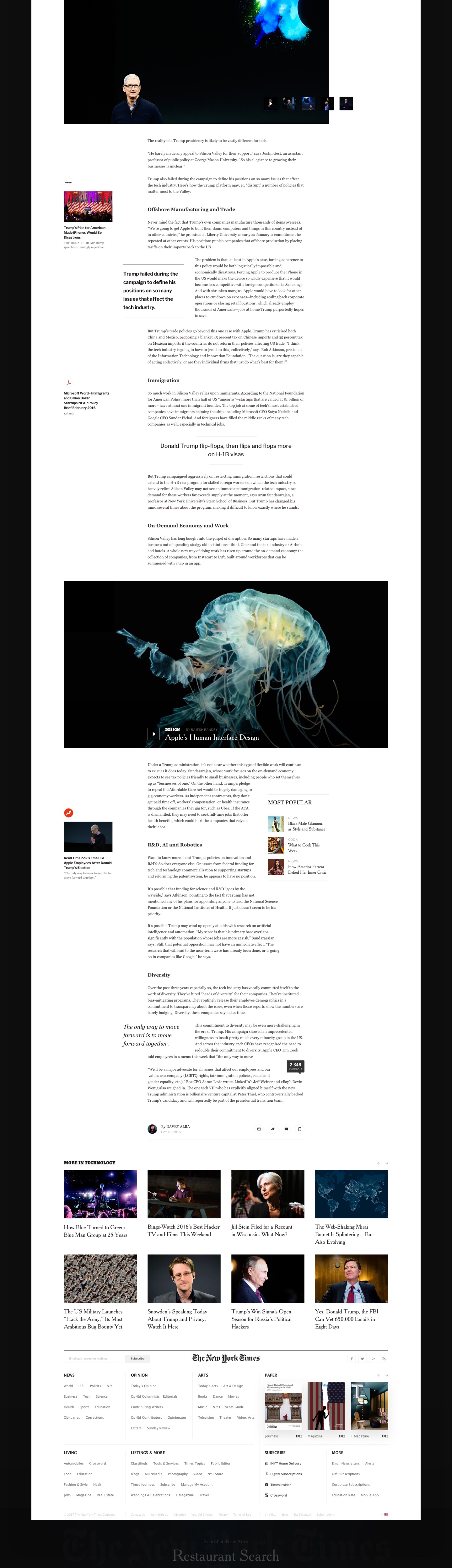
Editorial Design: The New York Times Redesign Concept
Editorial Design: The New York Times Redesign Concept
The New York Times Redesign is concept editorial design project shared by Slava Kornilov and Bohdan Kononets on their Behance page. I have to say, I have seen quite a few of concept projects but as extensive as this one I still have to see. I understand the value of an exercise like this, but I cannot imagine the amount of time necessary to put something that detailed together. I also love to see what people can come up with when you don’t consider some important factors like density and monetization. Nevertheless, it’s a great editorial design project and quite inspiring in many aspects.
Slava Kornilov is a web designer from Moscow, Russia. He is specialized in Web Design, UI/UX and Art Direction. Bohdan Kononets is a designer based in Lisbon, Portugal. He also is specialized in Web Design, UI/UX and Art Direction. For more information about them check out http://flatata.com/
Editorial design


abduzeedo
Jan 11, 2017
Source: Abduzeedo Editorial Design
January 10, 2017
Design Books: Suggestions for the New Year
Design Books: Suggestions for the New Year
This week is the second or first, in my case, week of work in 2017. With every new year there’s a lot of resolutions made, areas that we want to improve or things we want to change. I feel that for me I want just to focus on less and the practice of minimalism. For that reason I am also trying to focus more on design books rather than just online. I am trying to savor the information a bit more instead of gobbling up everything I might think will be inspiring or useful. Most of the time that ends up not being the case, but just the fear of missing out, resulting in a pile of articles to read or links that, without context, have little to no value.
So, for this post I will highlight a few design books that are on my list for 2017. Some I have already in my library, others I might purchase along the way. The books are about design, branding, photography, interface and topics that we try to cover here on the blog.
Design Books
Designing Design
Representing a new generation of designers in Japan, Kenya Hara (born 1958) pays tribute to his mentors, using long overlooked Japanese icons and images in much of his work. In Designing Design, he impresses upon the reader the importance of “emptiness” in both the visual and philosophical traditions of Japan, and its application to design, made visible by means of numerous examples from his own work: Hara for instance designed the opening and closing ceremony programs for the Nagano Winter Olympic games 1998. – Amazon

Draplin Design Co.: Pretty Much Everything
Esquire. Ford Motors. Burton Snowboards. The Obama Administration. While all of these brands are vastly different, they share at least one thing in common: a teeny, little bit of Aaron James Draplin. Draplin is one of the new school of influential graphic designers who combine the power of design, social media, entrepreneurship, and DIY aesthetic to create a successful business and way of life. – Amazon

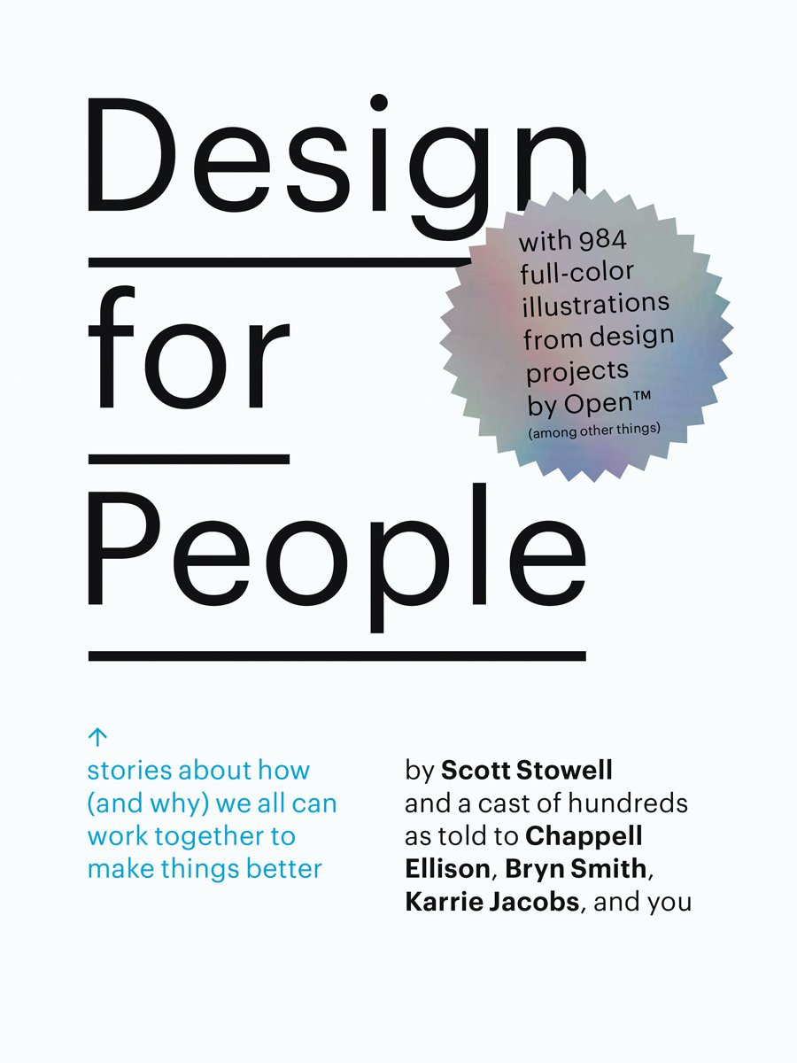
Design for People: Stories About How (and Why) We All Can Work Together to Make Things Better
Most design books focus on outcome rather than on process. Scott Stowell‘s Design for People is groundbreaking in its approach to design literature. Focusing on 12 design projects by Stowell’s design firm, Open, the volume offers a sort of oral history as told by those involved with each project–designers, clients, interns, collaborators and those who interact with the finished product on a daily basis. – Amazon
The Grid: A Modular System for the Design and Production of Newpapers, Magazines, and Books
Inspirational guide to understanding principles of proportion and their relation to layout design. – Amazon

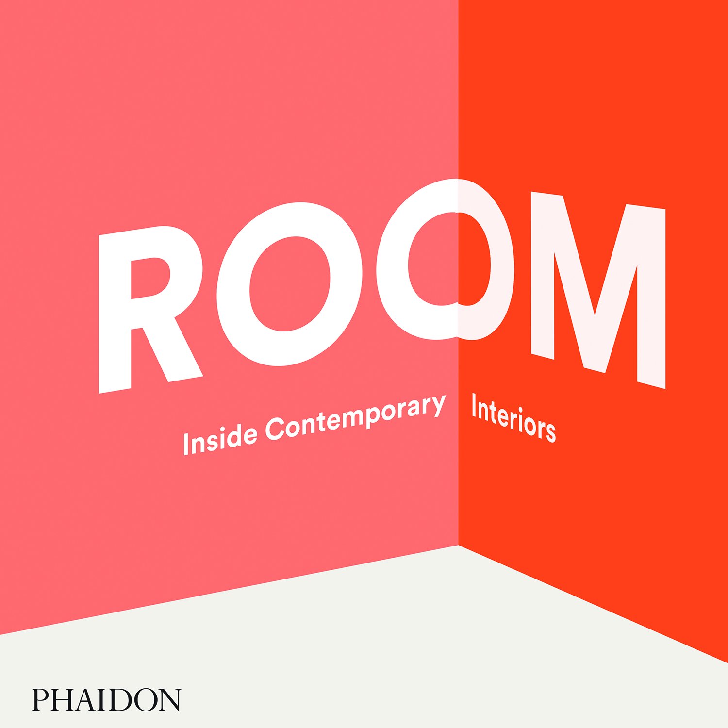
Room: Inside Contemporary Interiors
ROOM: Inside Contemporary Interiors explores a curated selection of exceptional spaces, ranging from retail concept stores, pop‐up dining experiences, and art installations, to hotels and private residences. – Amazon
The Best Interface Is No Interface: The simple path to brilliant technology (Voices That Matter)
In his insightful, raw, and often hilarious criticism, Golden reveals fascinating ways to think beyond screens using three principles that lead to more meaningful innovation. Whether you’re working in technology, or just wary of a gadget-filled future, you’ll be enlighted and entertained while discovering that the best interface is no interface. – Amazon

150 Best Eco House Ideas
The newest volume in the highly successful “150 Best” series—joining 150 Best House Ideas and 150 Best Apartment Ideas—150 Best Eco House Ideas is a comprehensive handbook showcasing the latest in sustainable architecture and environmentally-friendly home design. Perfect for architects, designers, interiors decorators, and homeowners alike. – Amazon

How to Use Graphic Design to Sell Things, Explain Things, Make Things Look Better, Make People Laugh, Make People Cry, and (Every Once in a While) Change the World
The first monograph, design manual, and manifesto by Michael Bierut, one of the world’s most renowned graphic designers—a career retrospective that showcases more than thirty-five of his most noteworthy projects for clients as the Brooklyn Academy of Music, the Yale School of Architecture, the New York Times, Saks Fifth Avenue, and the New York Jets, and reflects eclectic enthusiasm and accessibility that has been the hallmark of his career. – Amazon

abduzeedo
Jan 10, 2017
Source: Abduzeedo Books
January 5, 2017
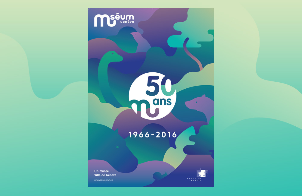
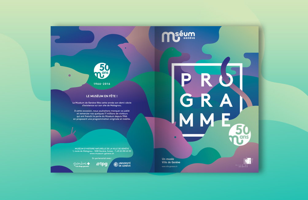
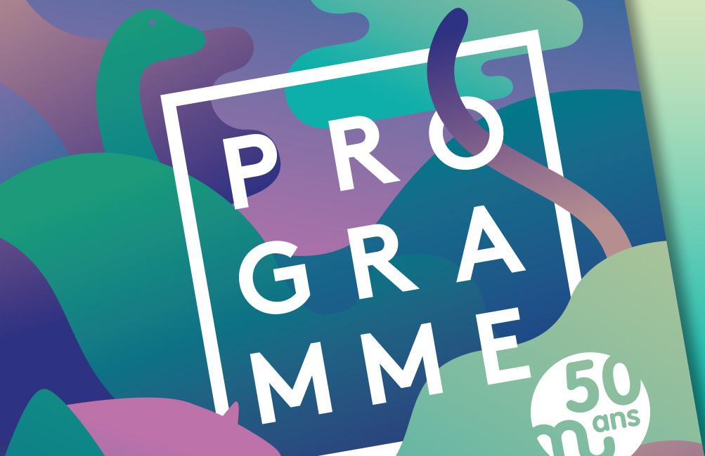
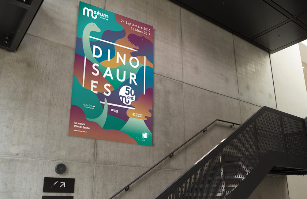
Editorial Design: The Work of Anaïs Coulon
Editorial Design: The Work of Anaïs Coulon
Editorial Design has being around for a long time and we really do enjoy that sometimes we see projects that takes to another level OR even where you just gotta spend a couple more minutes to admire at the details. Let’s take a look at the work from Anaïs Coulon that is really stepping it up with her work. Let’s break it down!
Anaïs Coulon a swiss & french graphic designer working who is currently based in Geneva, Switzerland. Focusing her work in art direction, graphic design and illustration; it’s great to see her play on the grid layout, typography and also the trendy touch of gradients.
I imagined a coloured and playful universe where books aren’t only meant to be read but where they become the central graphic or architectural element of the set.

AoiroStudio
Jan 05, 2017
Source: Abduzeedo Editorial Design
December 22, 2016
Editorial Design: Awoke Magazine
Editorial Design: Awoke Magazine
Awoke Magazine is a branding and editorial design project shared by Lucas Berghoef. Awoke is a digital and traditional lifestyle magazine focussing on a different view on fashion, music and art. As a fan of black and white themes, Lucas really put together something quite beautiful. The typography is quite modern and the little text effect to increase contrast works quite well. It also gave me some ideas for the new version of Abduzeedo.
Editorial Design
About the designer
Lucas is a young passioned graphic designer currently working in Amsterdam, The Netherlands.
I work as a freelance designer and I’m always interested in collaborating with other passioned designers & agencies with fresh ideas.
For more information check out http://www.lucasberghoef.com/
abduzeedo
Dec 22, 2016
Source: Abduzeedo Editorial Design
December 16, 2016
#Happy10Abduzeedo – Past Tutorials
#Happy10Abduzeedo – Past Tutorials
This month, we are celebrating the 10th anniversary of Abduzeedo. This is very special to us, Fabio Sasso created the blog as a side-project after he lost everything from a robbery back in 2006. It was in his way for him to backup files but also bookmark things he liked and inspired him. Since then his work has been used, shared and featured many times but beyond all, his goal was to inspired us to create and make more. That’s the philosophy and minset of Abduzeedo that will always lives on. Part of the celebration, we would love to take you guys on a trip down the memory lane about our past tutorials. We’ve been getting lots of requests to have more tutorials on the blog, we’ll work twice as hard in 2017. By the meantime, enjoy this collection of some of the most popular tutorials on Abduzeedo.
I never imagined or planned to get to 10 years. I started the blog after my studio got robbed and I lost everything. After that day I tried to focus on the present more than ever, life is too unpredictable and we can get frustrated if something happens that weren’t in our plans. That happened to me, it sucks, but I learned a lot. Sometimes things are much worse in our heads and imagination than in reality. – Fabio Sasso


Find out more about our tutorials: http://abduzeedo.com/tutorial.
AoiroStudio
Dec 16, 2016
Source: Abduzeedo Tutorials
December 15, 2016
#Happy10Abduzeedo – Interview with our Founder Fabio Sasso
#Happy10Abduzeedo – Interview with our Founder Fabio Sasso
This month, we are celebrating the 10th anniversary of Abduzeedo. This is very special to us, Fabio Sasso created the blog as a side-project after he lost everything from a robbery back in 2006. It was in his way for him to backup files but also bookmark things he liked and inspired him. Since then his work has been used, shared and featured many times but beyond all, his goal was to inspired us to create and make more. That’s the philosophy and minset of Abduzeedo that will always lives on. Part of the celebration, we would love to share a sit-down we had with Fabio about his life, 10 years of inspiration and more. Hope you will enjoy it!
I never imagined or planned to get to 10 years. I started the blog after my studio got robbed and I lost everything. After that day I tried to focus on the present more than ever, life is too unpredictable and we can get frustrated if something happens that weren’t in our plans. That happened to me, it sucks, but I learned a lot. Sometimes things are much worse in our heads and imagination than in reality. – Fabio Sasso
Tell us about yourself? What do you do for living now?
I am a designer from Brazil currently living in Oakland, California. I moved to the US in 2011 when I got an offer from Google. After almost 6 years a lot of things have happened, I got maried, became a father. I still work for Google, I have a lot of fun and love Google’s mission and their products. It’ really makes a difference in terms of motivation.
How do you feel about reaching this milestone of 10 years of Abdz?
Abduzeedo started as a side project, a way for me to backup files but also bookmark things I liked and inspired me. That was in 2006, iPhone was a rumour, Tablets a sci-fi idea. Things were very different. The Web 2.0 was at reaching its peak of fame, everything was moving towards the web with web apps. Of course everything changed with the introduction of the iPhone, and especially one year after that, when native apps were announced.
I never imagined or planned to get to 10 years. I started the blog after my studio got robbed and I lost everything. After that day I tried to focus on the present more than ever, life is too unpredictable and we can get frustrated if something happens that weren’t in our plans. That happened to me, it sucks, but I learned a lot. Sometimes things are much worse in our heads and imagination than in reality.

What was the biggest Abdz moment so far that you remember?
There were so many fun moments. I used to do a lot of talks around 2008-2010 about the blog. At a particular moment around 2008 I was the person with most Twitter followers in Brazil I believe. I believe, however the biggest moments were always meeting new people. People from all over that I still talk and became friends. Like you Francois 🙂
Do you remember what was your feeling when you posted the first article back in December 21, 2006?
Yes, it was summer in Brazil. I was recovering from the awful loss of my laptop and all backups. I was just posting things to fill the blog and try to create a routine. I posted about designing a web 2.0 blog. It was a project I did for my brother. It’s crazy just to go back and see that, it’s a lesson of humility because you can see how much you have learned. I hope in 10 years to look back at my work and have the same sensation that I kept learning.
What is your ideology behind your work? What’s driven you all the time?
There’s no ideology, the only thing that drives me to do things like blogging or being a designer is curiosity and desire to learn more about things. I am an introvert, very shy and insecure. I always think I am wrong and that sort of helps me to try more I think. It’s not a good thing but it definitely helps a lot. It keep my feet on the ground.

Do you get creative satisfaction on your work? How much time do you give yourself for personal work and blogging? Do you have a system?
I love what I do and my job. I love working on product and trying to solve not only the problems we are trying to solve for our users but also how to improve our process. How can we reduce churn and frustrations from all sides, UX and engineers.
In terms of blogging, I use Abduzeedo now more as a bookmark/curation tool. There are so many design blogs now doing tutorials and other things that we used to do in the past. I believe the best thing right now due to the overload of information is try to be more like a filter. Try to help featuring new designers and help the community.
Who were your creative heroes at the start of your career and how has it changed over the years?
That’s a great question. I think my heroes are still the same, the difference though, is that I added many more. I admire more people rather than just designers. For example, engineers, PMs, entrepernours.
What is the one thing you learned at the beginning of your career, that you still go by today?
In terms of career, for me, it is always think about not only the design, put the production process. I graduated in Industrial Design and in school our projects were always focus not only on the final design, but how to optimize the manufaturing process. Materials, bugdgeting, supliers, those were things we had to consider. Today when I design I still keep that in mind, it just changes the roles. Now we have to think about engineering work, legacy code, platforms, localization and a bunch of other things.

How does Social Media affect your work these days?
Not as much as in the past. I was an avid Social Media user but either I am getting too old and got a bit tired of it or it is definitely slowing down. I also believe that social media became really about showing off, rather than sharing useful things or knowledge.
Where do you see Abduzeedo evolving in the next few years?
I have no idea. I believe it will get smaller because blogs are becoming things of the past. I love the idea of keeping something that I can change the design, learn a bit more about coding and also sharing things. With that in mind I think Abduzeedo will be around.
On the last note, what is the common mistake that most designers always make these days?
I think I am not the one to judge because I make a bunch of mistakes too. If I could point something, it would be that designers, for some reason, became a bit selfish. They tend to focus only on the design part and forget a bit about the rest. I’d say focus more on understanding how things are build and how people really use products, than following trends.
Some Moments


I believe it will get smaller because blogs are becoming things of the past. I love the idea of keeping something that I can change the design, learn a bit more about coding and also sharing things. With that in mind I think Abduzeedo will be around. – Fabio Sasso
AoiroStudio
Dec 15, 2016
Source: Abduzeedo Interviews
December 6, 2016
Case Study: Trampa Logotype
Case Study: Trampa Logotype
Over the last month, we have featured the lettering work from Joe Sutton and today he is back with a case study. I shall add that he is sharing a full complete A to Z case study from the start and finish. Thank you Joe for taking the time to give us a demonstration of his experience and also sharing his process for everyone. Let me stop talking and give him the mic and hope you will enjoy his breakdown.
This is a client project of mine broken down from start to finish, I share all the details that was discussed with the client and let you know about design decisons and process. I’ve always wanted to offer a sneak peak inside my process as I’ve seen it done before in other disciplines and found it highly valuable. I want to put something together that wold have helped me when I first started.

In his Words
I was contacted to create a Logotype for Trampa. Trampa is an Urban Cycling Clothing Brand in its infancy. Their products have a Swedish design influence and a minimal and clean look that is functional, stylish and not out of place in a casual setting. Their target market is 16-30 year old male and females. I put together a document for the client to start with that broke down the the brand, goals, usage, keywords and competition. We put our focus on these as we found them to be the most important factors to focus on.

After this I asked if everything align with their thughts and what kewords represented Trampa best. They wanted to try and represent Urban, Cycling, Swedish, Movement,Ffreedom, Exploration, Clean. Thet also also provided me with a few logos that he liked, they were very varied in style and so I knew that identifying which direction early on would be important.
Sketching
When I go into sketching I just write the word out in a few go-to style, all caps, all lowercase, joined, unjoined and cursive script with a mix of character variations etc. Through this you can quickly understand where the issues might be between letters and where there are opportunities to create some unique ligatures. I’ll list the points that I discovered below:
The ‘r’-‘a’ gives an opportunity for a ligature.
• The two a’s could be interesting to experiment making the feature point
• The ‘p’-‘a’ join could be an issue
• We could join the ’t’-‘r’
• The capital ‘R’ or ‘P’ could be legs pedalling (Huge Gimmick)
• Type of ‘a’ and ‘r’ were open for experimentation.
• Capital or Lowercase T

Sorry if those sketches have made your eyes hurt, but it’s all part of the process. After Identifying these I can target each one and try and make something interesting. I had a feeling the best way to go would be with a very simple san serif type with a slant, I felt like it’d be the most simple and reflective of the clothing and brand. Howver, I still sketched lots of other styles incase I found something better. Once I had exhausted all my options I selected 9 sketches, there’s no specific number I choose.
Usually below 10 as too many options can confuse the client and with this I refined them to an acceptable standard, still very far from perfect. The reason I choose at the early stage is usually they are so rough I’m the only one who knows where they could potentially end up like. So by choosing the best based off my judgement, with the project goals etc in mind, I offer the client more accurate optinons. You need to realise they aren’t lettering deigners and that you probably understand your vision more than anyone else, so explain everything.

Presenting First Concepts
Now I had all my first sketches to a point where it’s clear enough for the client to understand. Also not too far that it’d be a waste of time, I was ready to display them all. So I scanned the versions in and then played around with them in photoshop until they are darkened but not distorted, I find this again aids the client in visualising the options clearer. At this stage you’re sharing the work to really to gain a better understanding of what the client’s preferences are so you can get on the same page in regards to stylistic direction. It’s also the first point to explain my thoughts on how each one relates to the goals for the project. After initial discussions with the client and with the research I had done, I was pretty confident I knew which ones would appeal to them the most. They did select the ones which I advised towards being the best, which is always a relieving moment. I know that some designers don’t offer the options to their client at this early stage. I think it’s so important to keep them engaged from the beginning so that you don’t go off on the wrong path and face the revisions at the end.

The client chose options 2, 3, 6, and 7 as his favourites and you can see the reasons below.
2: I love the underline, and the slight slant works well conveying movement. Maybe slightly harsh on the eye though.
3: I think it’s interesting and could be really cool or could be a bit odd. I think you could experiment a lot with it.
6: Is similar to 2 but feels more understated. Experimenting with the underline could work well here.
7: Surprised I liked this one but it feels like it has some flow to it. The capital T works well.
They agreed that 5 and 9 were not clear enough and I agreed with what he said so onto the next stage.
Refining Chosen Sketches
I take the scanned sketches, scale them up a bit and print them off so I can go into more detail and refine them. I use a light pad to trace versions rather than using tracing paper, that’s just my preference. Along with this I have some notes for each sketch with what to focus on initially improving. I work on this until I have them to a point where they are almost as refined as I can get them on paper. With this particular project it was more straight lines due the preference of the more simple, san serif style. So I think the computer is where the larger refinements could be seen properly. On projects where the style is more rounded and cursive then I like working on paper and creating nice smooth curves for longer as I feel like you can capture more personalitly on paper.

I offered each option with variations to show which ones could be experimented with further. The aim is exhaust all possible directions narrowing your way down to the perfect final logotype. The client decision was to take 1 and 3 further. I decided that making a quick digital rough would give a clearer idea of the final and help finalise it down to 1 version.
Digital Roughs
Starting in illustrator now I made both versions to a point where they were slightly refined but not nearly perfect. I also came up with a 3rd version which stemmed from option 3. This is now the point where you can really start to see what you’ve envisioned them to look like coming together.

We decided that 1 would be the best option to refine completely. It had been the stand out for me all the way. It offered lots of options to experiment with underlines, fullstops etc. I made some small changes to it from the sketch, but it maintains the same character and basic overall look and feel. I added a fullstop as I know the client mentioned something about it. I think that we had a strong base to work off from here and now it was just down to the final refinements.
Final Refinements
Now it’s all about the details. The main thing I discover when refining is when I tested what we had on a dark value, it looked too bold. This logo needs to be versatile and work in many usage cases, so I concurred with the client and displayed thinner version, we both felt that even making the line weight a little thinner helped with that issue and we kept pushing on.

When I come to create the final version firstly, I create a grid so that I can align all the horizontal and diagonal lines. After this I look at the letter spacing and the kern the final version. Finally I go over making use the letter endings are all the same. Not forgetting the most important part which Is checking the logotype optically and how it looks to the eye. Sometimes the grid might force things that don’t look natural enough so making sure it looks optically perfect and not just grid perfect is important.

The adjustments I had to make to this were the curves in the m, they were too thick and similarly with the p. I also did a lot of playing around with the a’s as they were becoming a distinguishable feature in the logo. As we planned to do, I also showed thick and thinner options with underlines and small changes which you can see below. We ended up going with a rounded full stop which you can see on the final version.

Final Logotype
Here is the final version, on a dark and light value. There isn’t a colour palette yet as the project is in its very early stages. I’ve tried to share all the details I could, and hope this has been useful to some of you. Don’t hesitate to contact me if you have any further questions.

More Information: http://joesutton.co and make sure to follow him on Dribbble.
AoiroStudio
Dec 06, 2016
Source: Abduzeedo Tutorials
October 24, 2016
Android Prototyping for Designers – Shapes and Click Event
Android Prototyping for Designers – Shapes and Click Event
Prototyping has become a very important part of the UI/UX design process. With mobile applications taking over the web it is imperative for designers to find ways to test their designs on the devices. In the beginning most designers, including myself, relied on HTML, CSS and Javascript to emulate the native experiences that the users would see. It worked quite well and still does, however it’s not a very reliable approach if you really want to understand the constraints and complexities that a developer may face when translating your designs into the final product. With that in mind, I decided to focus my efforts on the Android Platform and Java to be able to create truly native prototypes. In addition, I wanted to deliver more than redlines but reusable assets that could reduce the churn and bug fixes because of differences in the jargon used by designer tools compared to the developers.
Android doesn’t have the same fame that its counterpart iOS has, however it’s a great platform and it’s not that complicated to learn for simple prototypes. Dare I say that it’s easier than investing in learning Framer, for example, if you are designing for Android.
The benefits of learning the right tool are enormous. Here are a few points I want to highlight
- Truly knowledge of platform constraints
- Much better communication with developers
- Reusable assets and styles
- Real craftsmanship workflow
Well, enough pontificating, let’s go straight to the tutorial.
Android Prototyping for Designers
Step 1
Open Android Studio and start a new project. The Application name I used is Shapes.
Step 2
For prototyping I don’t have to worry to much about older versions of Android. Of course it’s important to know which one to choose. You can use the “Help me choose” option. But API 21 is the one that has the Material Design specs, so let’s go with that one. You can have the spec running on older devices with the Support Library, but that is for another post. It’s quite geeky, I don’t understand either 🙂
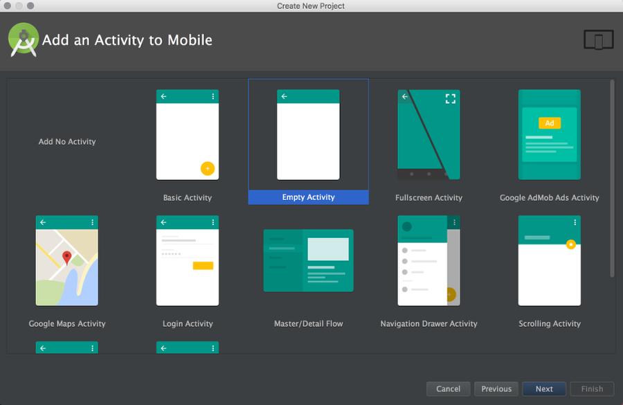
Step 3
You can select some templates to start with. For this project let’s start with an Empty Activity. It will have Action Bar and some theme assigned, I will talk about that on a next post. For now, let’s just play with shapes.
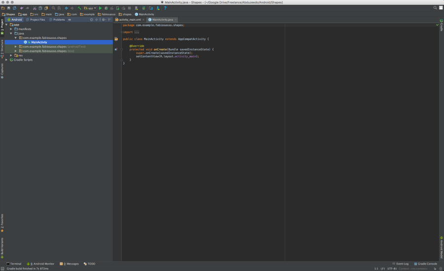
Step 4
Okay, now it’s when things get overlwhelming. Don’t worry it’s simpler thant it looks. What you see below is the Java file, or the behavior of our prototype.
Step 5
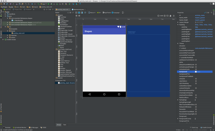
For now let’s focus on the design. On the left side, in the project tree column, select the folder “res” and then “layout”. Click on “activity_main.xml”. That’s the layout of our prototype.
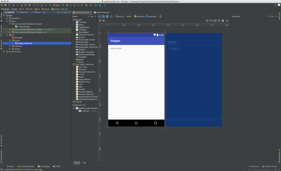
Step 6
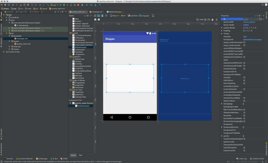
Delete that “Hello world” string. We won’t need that for this prototype. In this screen we have the layout of our app. We have a column with widgets and right below a panel called “Component tree”. You see that there’s a component called “activity_main (RelativeLayout)”. That is the main container of our prototype. We will add more components inside this one. Note also on the right side there’s a column called properties. There will will find all the properties for the component selected. I bet it sounds a bit more familiar. Especially for the Dreamweaver users out there 🙂
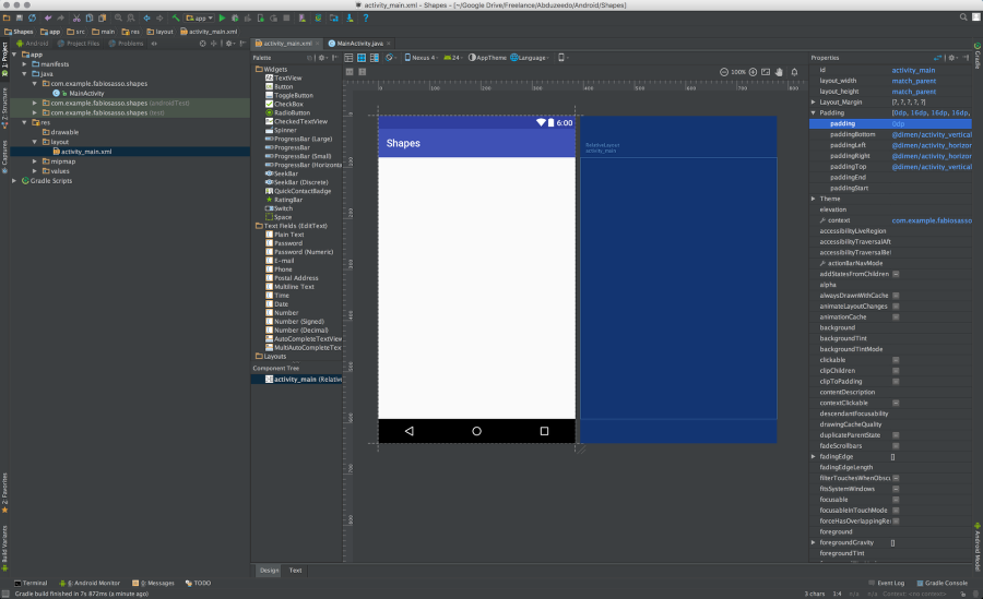
Step 7
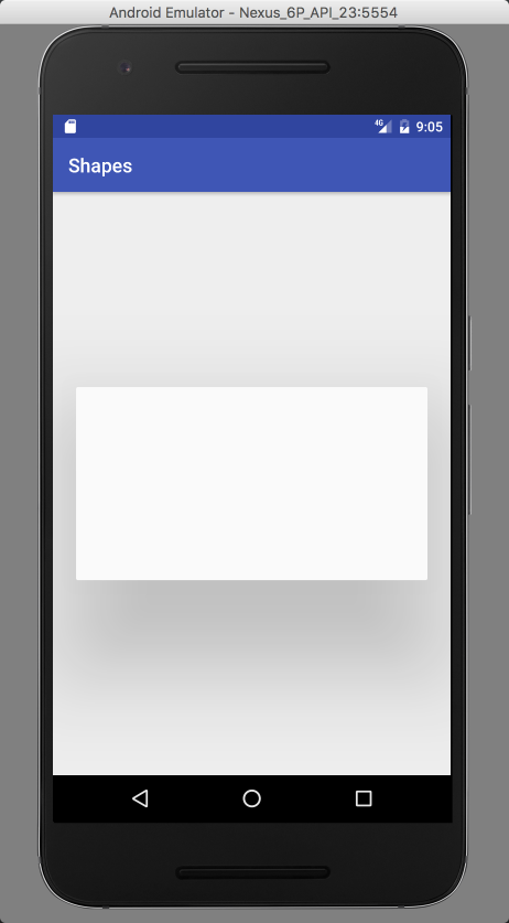
Let’s change the background color of the “activity_main” to #eee. Just select the background option and enter the value.
Step 8
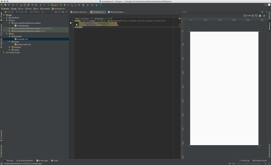
Now let’s create our rounded rectangle. In order to do that we will create a “drawable” for it. It’s like a vector that can be used as background and will scale accordingly to the component we use it with. So, select the “drawable” folder and click with the right click of the mouse. Select “New” and then “Drawable resource file”.
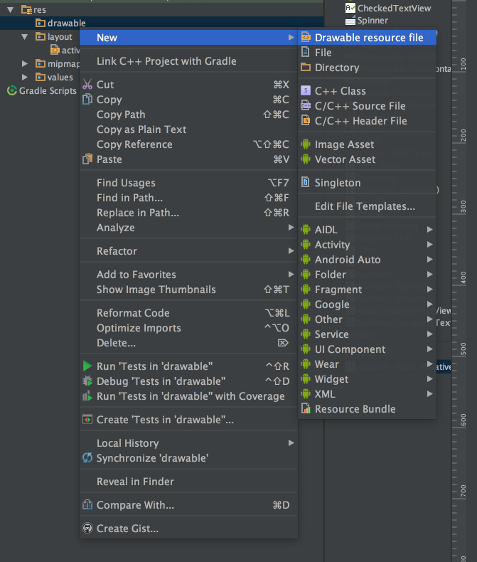
Step 9
Name it rectangle.xml. In android pretty much all the files in the “res” folder will be .xml. With exception of bitmaps.
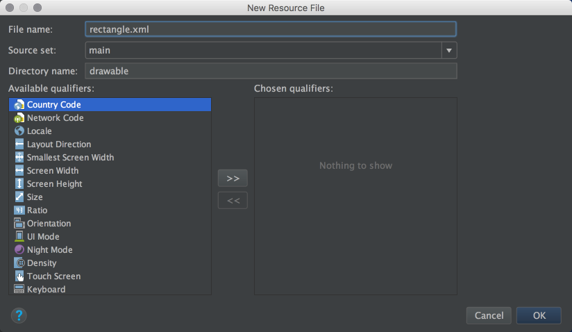
Step 10
This is the default file created. It has the XML tag and a tag called “selector”
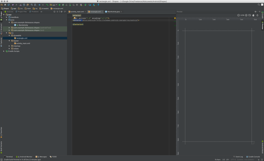
Step 11
Just rename the “selector” to shape. Add a property called “shape” and use “rectangle”. Inside of the shape tag add a item called “solid” with the color you want to use and another one called “corners” with the radius of the rounded corners you want. Use the image below for reference. Also take advantage of the Android Studio autocomplete. It will save you so much time.
Step 12
Back to the “activity_main.xml” file. Now let’s add a new component to our layout. But before make sure the activity_main component has 0dp for padding.

Step 13
Just drag a RelativeLayout component to the center of the screen. Change its height to 200dp and use 24dp for margins.
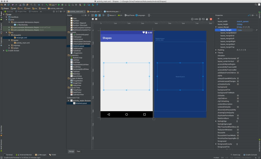
Step 14
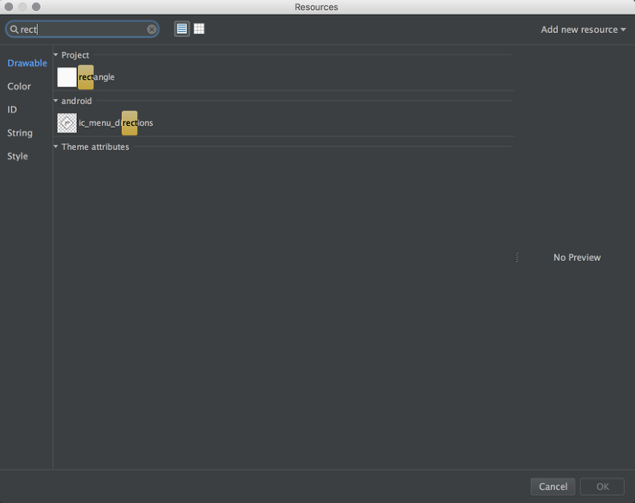
Now let’s use our drawable for the background. Find the “background” property and click on the “…” icon to open the “Resources” dialog box.

Step 15
Search for the “rectangle” drawable we created and selected it.
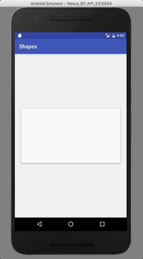
Step 16
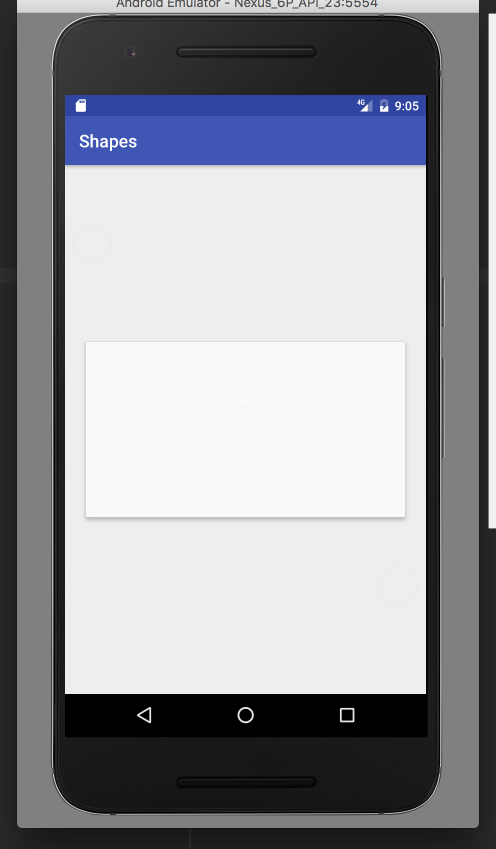
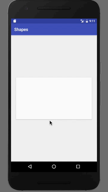
There you go, you have a card designed in Android Studio and ready to be deployed. Now comes the fun part. With Material Design we have the light properties that we can play with. Android renders that in real time. You can use either “elevation” or “translationZ” to cast shadows.

Step 17
Let’s try elevation. Set it to 4dps and Run your prototype in the emulator.

Step 18
And there you have it. A nice card, rendered natively using nothing but XML. It’s as easy if not easier than using HTML and CSS.
Step 19
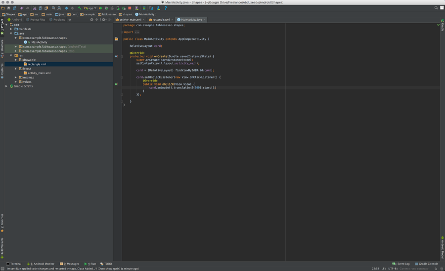
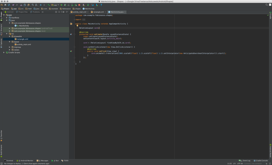
Now let’s get a bit more advanced and try to add a click event to this card. The first thing we need is an “ID”. Enter and id name “card” to the card, very creative 🙂
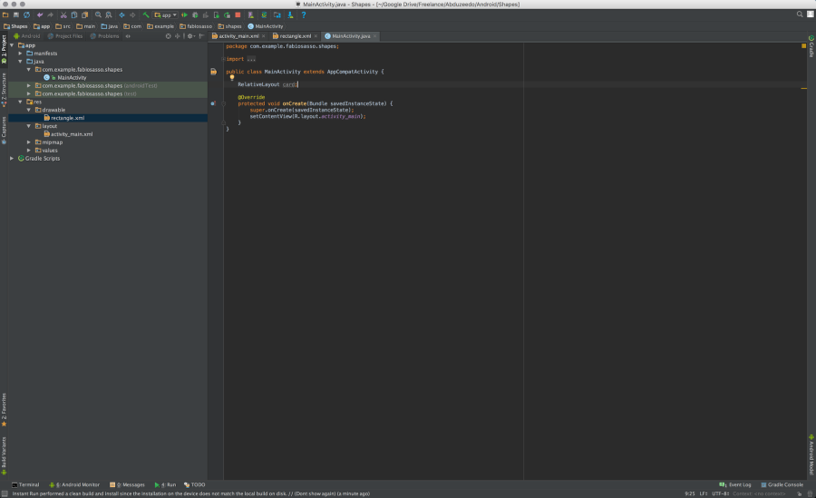
Step 20
Now open the MainActivity.java and let’s write some JAVA code. In order to access the card layout from the XML file we need to declare and bind the data. The first thing to do is to create a JAVA variable that will be a RelativeLayout like the component we use. To do that just write “RelativeLayout card;” Use the image below for reference. Note the position of that variable is important, write before the OnCreate method.
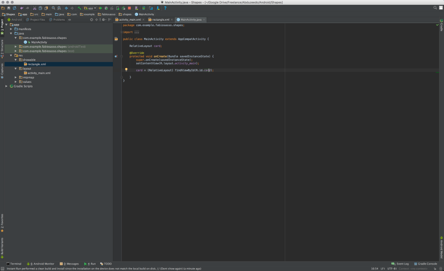
Step 21
Once we have the “card” variable created, let’s linked to our xml card. To do that bind it using the ID. The code is quite simple: “card = (RelativeLayout) findViewById(R.id.card);” – Don’t ask me what the “R” is. I still don’t know.
Step 22
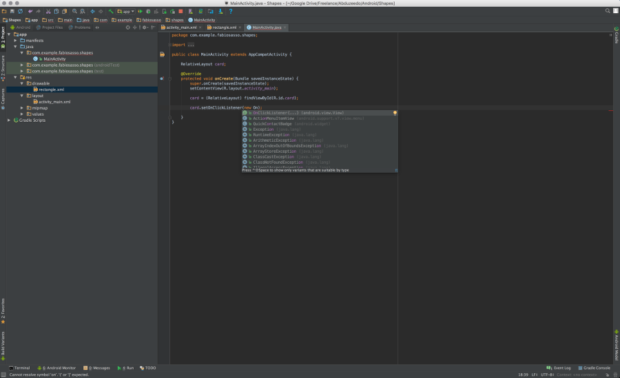
After that, it’s almost like JavaScript. Just create a ClickListener event. Use the auto-complete. Note, every time you see the red underline alert press “Command+Return” to show the options.
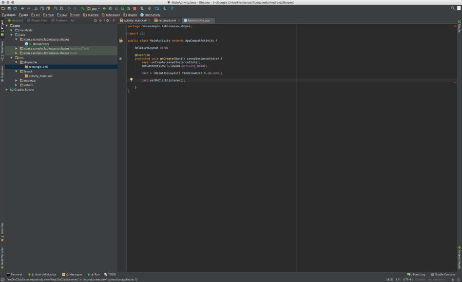
Step 23
Here’s the auto-complete OnClickEventListener{…} – once you select that it will create the necessary methos and overrides for you.
Step 24
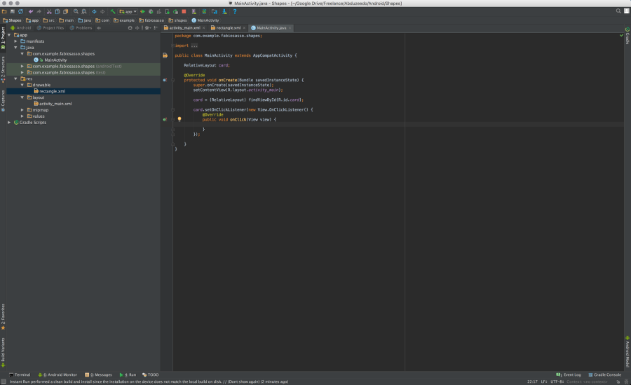
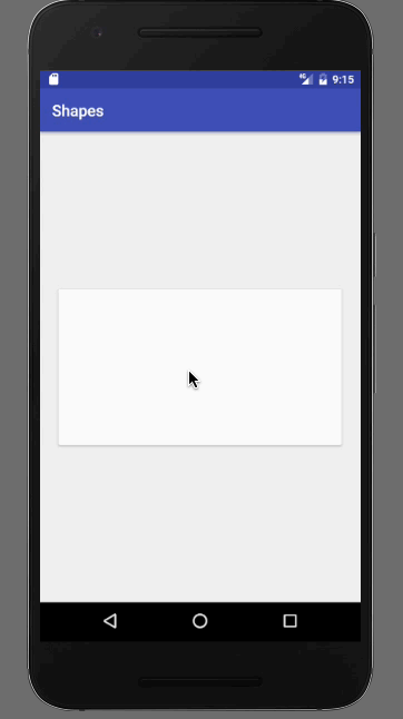
Step 25
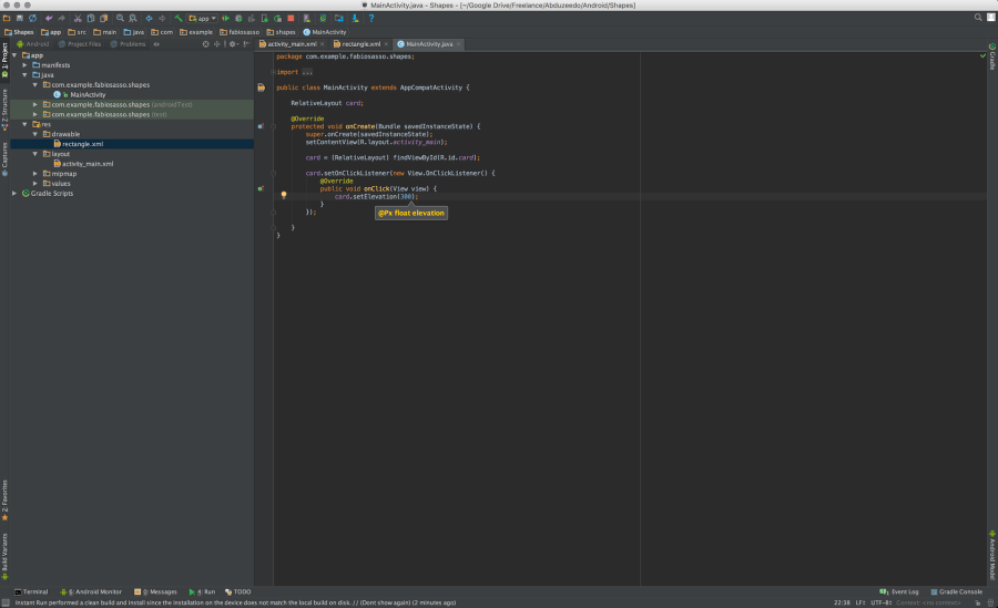
Now just change the cards properties. Here I just set the elevation to 300. So when you click the card will pop out.
Step 26
So let’s get a bit fancy. Instead of using setElevation, let’s animate. To do that is even simpler. Just write “card.animate().translationZ(300).start(). That will animate with the click.
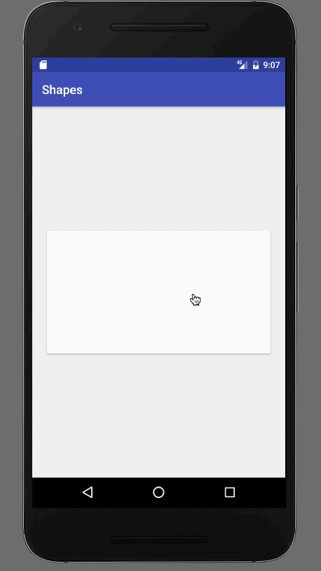
Step 27
Let’s also make the card scale X and Y.
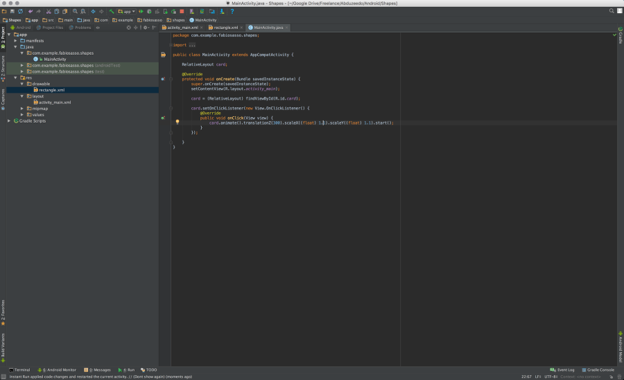
Step 28
In order to change the curves in android we have to use something call Interpolator. Here I am using a subtle elastic one called “AnticipateOvershootInterpolator()”. It’s pretty much the same thing as translation, you just add “setInterpolator(new AnticipateOvershootInterpolator())”.
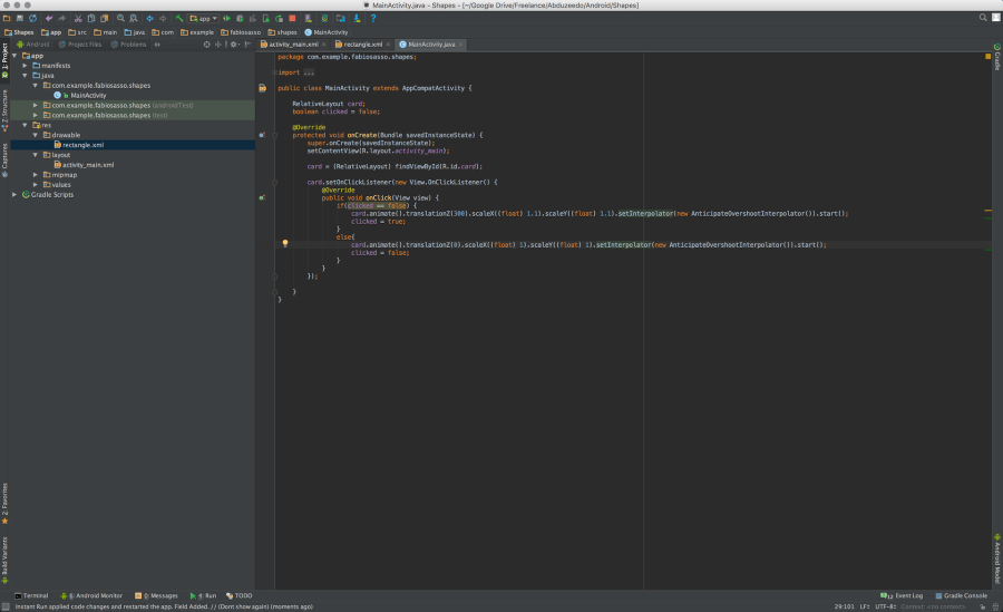
Conclusion
If you want to get fancier you can create an “if” statement with a “boolean” value to go back from one state to the other. Again, it’s quite similar to JavaScript in my bad coding knowledge. The best thing is that you get full native experience and understanding about the medium you are working with. That, for me, is the true definition of craftsmanship. Knowing the tools, the materials and having the skills to do it. I hope you enjoy this uber long tutorial. I’ll endeavor to write shorter ones for the forthcoming parts.
abduzeedo
Oct 24, 2016
Source: Abduzeedo Tutorials
October 14, 2016
The Great Thanksgiving Listen 2016: Keywording 101
Recording with the StoryCorps app is about sitting down with a someone you care about, asking them a few important questions about their thoughts and the life they have lived, and then listening. It is a great opportunity to learn something new about someone you think you already know so much about, and as importantly, it’s a chance for the two of you to connect. 
In 2015, we launched The Great Thanksgiving Listen and thousands of schools from all 50 states participated and helped preserve over 50,500 individual recordings at the Library of Congress.  Since the app debuted in March 2015, more than 100,000 individual interviews have been uploaded.
The StoryCorps.me website and the archive at the American Folklife Center at the Library of Congress are both crucial parts of The Great Thanksgiving Listen. The StoryCorps.me website allows current users to search all interviews recorded during The Great Thanksgiving Listen in order to learn more about our shared humanity. The Library of Congress, as our long-term preservation partner, will preserve these amazing interviews and family histories to live beyond our lifetimes and into the future for our great, great, great grandchildren to learn about where they came from through our own voices and first-person accounts.
But to access the voices in the StoryCorps archive, you need a key—a keyword to be exact!
Keywords are descriptive tags that will help current StoryCorps App users and future generations of friends and loved ones, historians, and researchers find interviews and information on StoryCorps.me. Keywords are shortened versions of the classic who, what, when, where, and why questions. Adding meaningful keywords will help make your interview accessible for years to come!
Tips for Great Keywording:
When you participate in an interview directly through the StoryCorps app, you will be prompted to enter keywords and a summary when you have finished recording. You can edit keywords through the app before you publish your interview, and on the StoryCorps.me website at any time.
The StoryCorps app and the StoryCorps.me website ask you to provide four types of keywords: General, Organizations, Places, and Location.
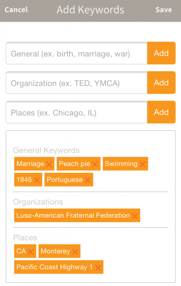
General: Keywords that describe the major themes discussed in the interview (marriage, peach pie, swimming, 1940s), as well as any recording languages other than English (Portuguese).
Organizations: Keywords that connect your interview with organizations and schools that you have recorded in partnership with, or that are mentioned in the interview so that your stories can be part of a much larger collection. (Luso-American Fraternal Federation)
Places: Keywords that describe the locations discussed during the interview (Monterey, CA, Pacific Coast Highway 1).
Location: Keywords that provide the city and state where your interview was recorded.
To edit your title, summary, or keywords from a smartphone: Log on to the app, click [ … ] in the lower right hand corner of your interview, and select “Edit Info.”
To edit your title, summary, or keywords from a desktop computer: Log on to your StoryCorps.me account, go to “View Profile,” and click on the edit icon in the upper right hand corner of the interview.
Try to provide between five and 15 total keywords per interview, and don’t forget to include TheGreatListen2016 as a “General” keyword, and your state abbreviation as a “Place” keyword.
Share your keywording tips of the trade with us on Twitter and Facebook.
Source: SNPR Story Corps