-
News & Updates
camera
March 22, 2018
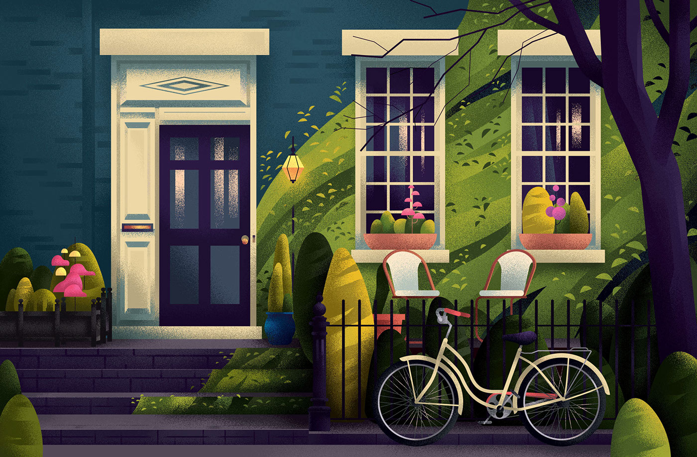
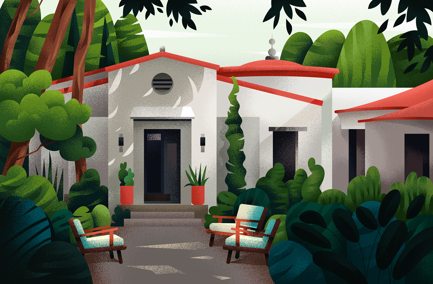
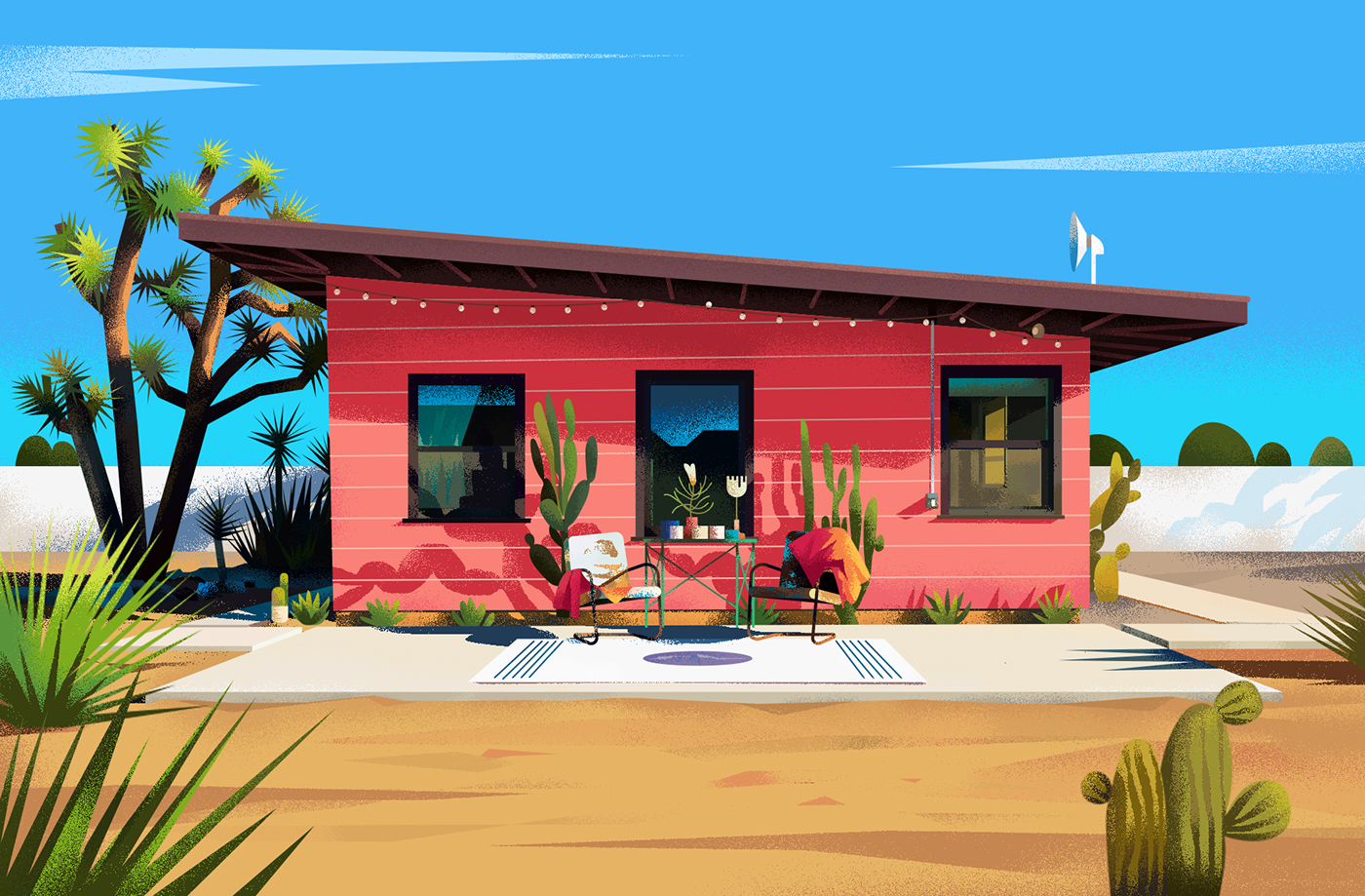
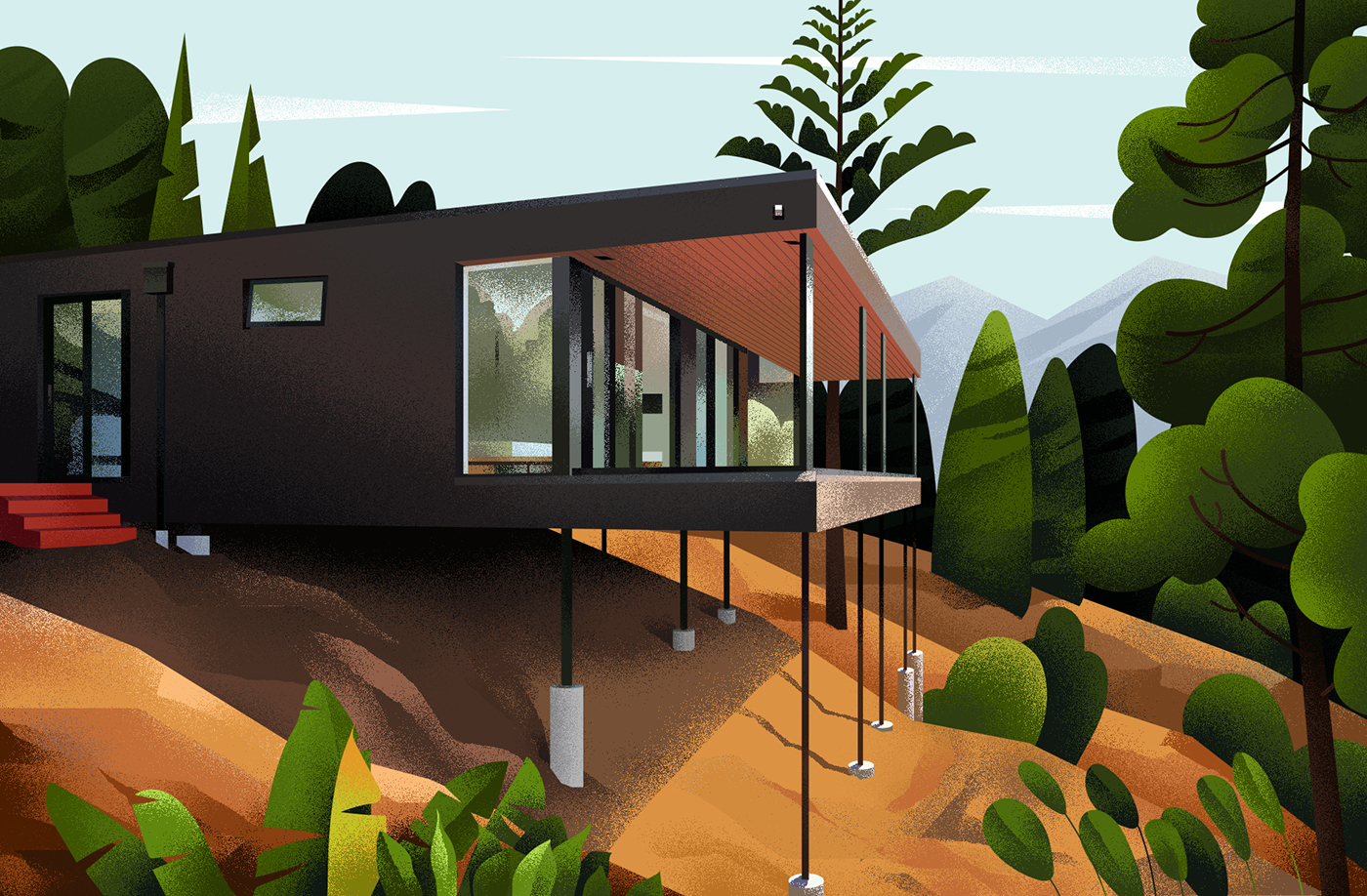
Home is a Colorful Set of Illustrations by Muhammed Sajid
Home is a Colorful Set of Illustrations by Muhammed Sajid
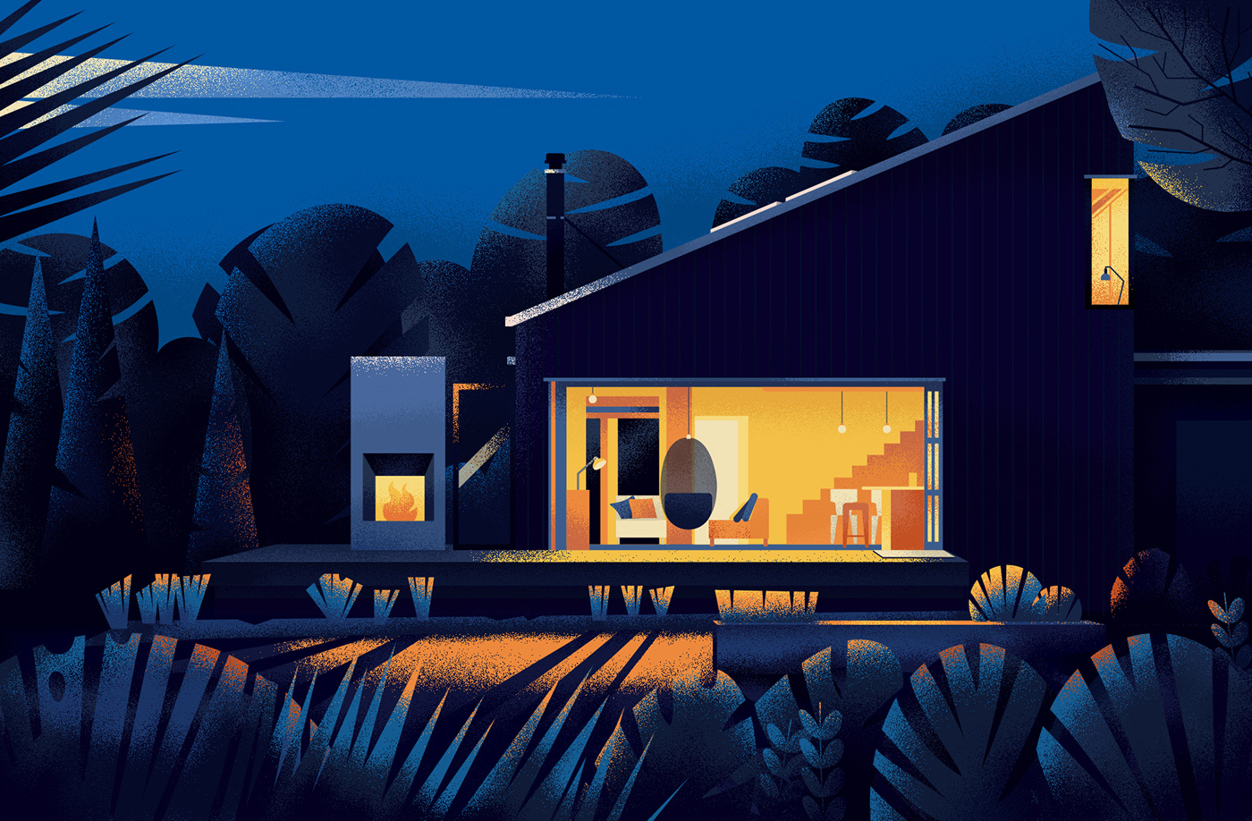
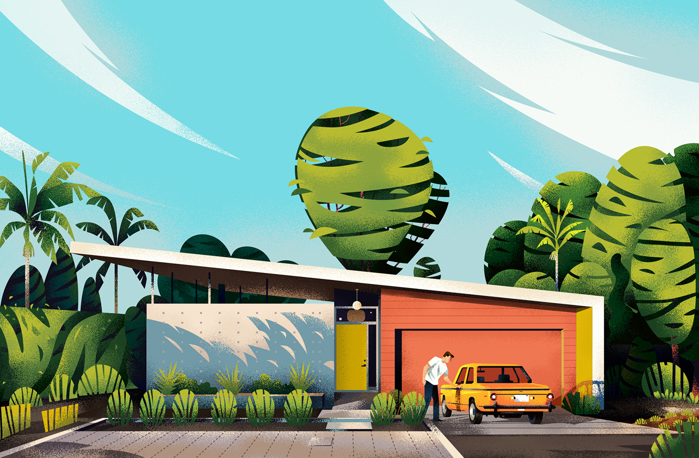
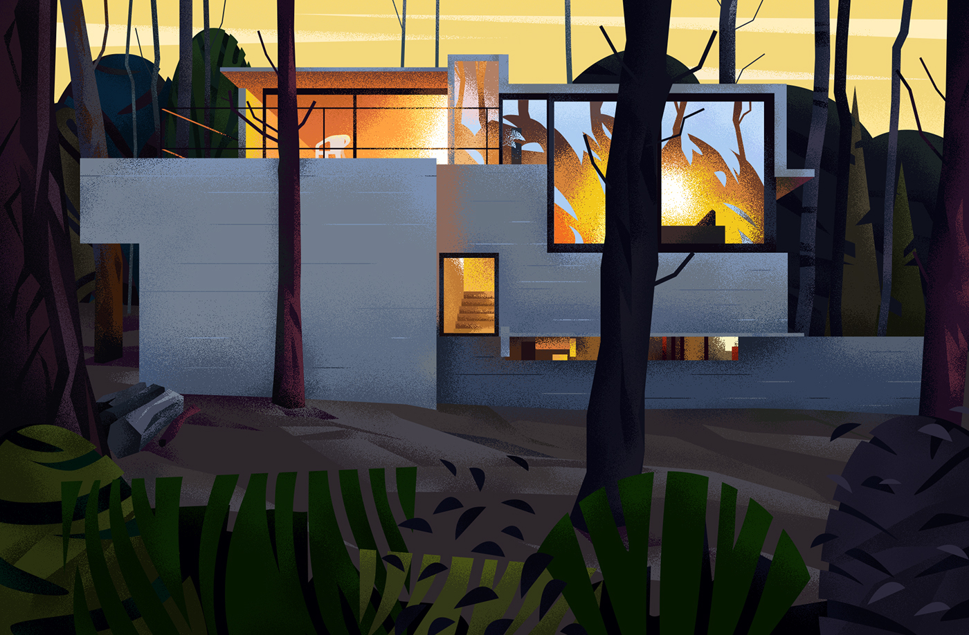
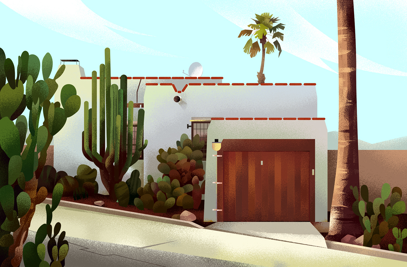
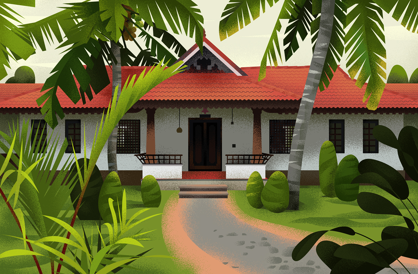
Muhammed Sajid is an illustrator from Bangalore, India and he shared a beautiful set of illustrations titled Home on his Behance profile. As the name suggests it’s about houses but the cool thing is that he illustrated all sorts of different house styles from classic, to modernist to mid-century to Spanish style, he got them all. I particular like the use of color and texture applied to his work. There’s a lot of character as well so check them out.
An artist, I want to draw every second. I am also interested in illustrations and animation. – Muhammed Sajid
Illustrations


For more information check out:
abduzeedo
Mar 22, 2018
Source: Abduzeedo Illustration
March 21, 2018
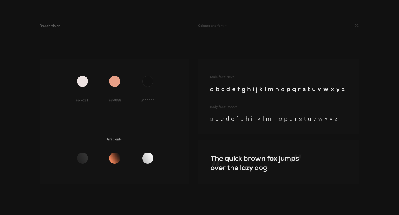
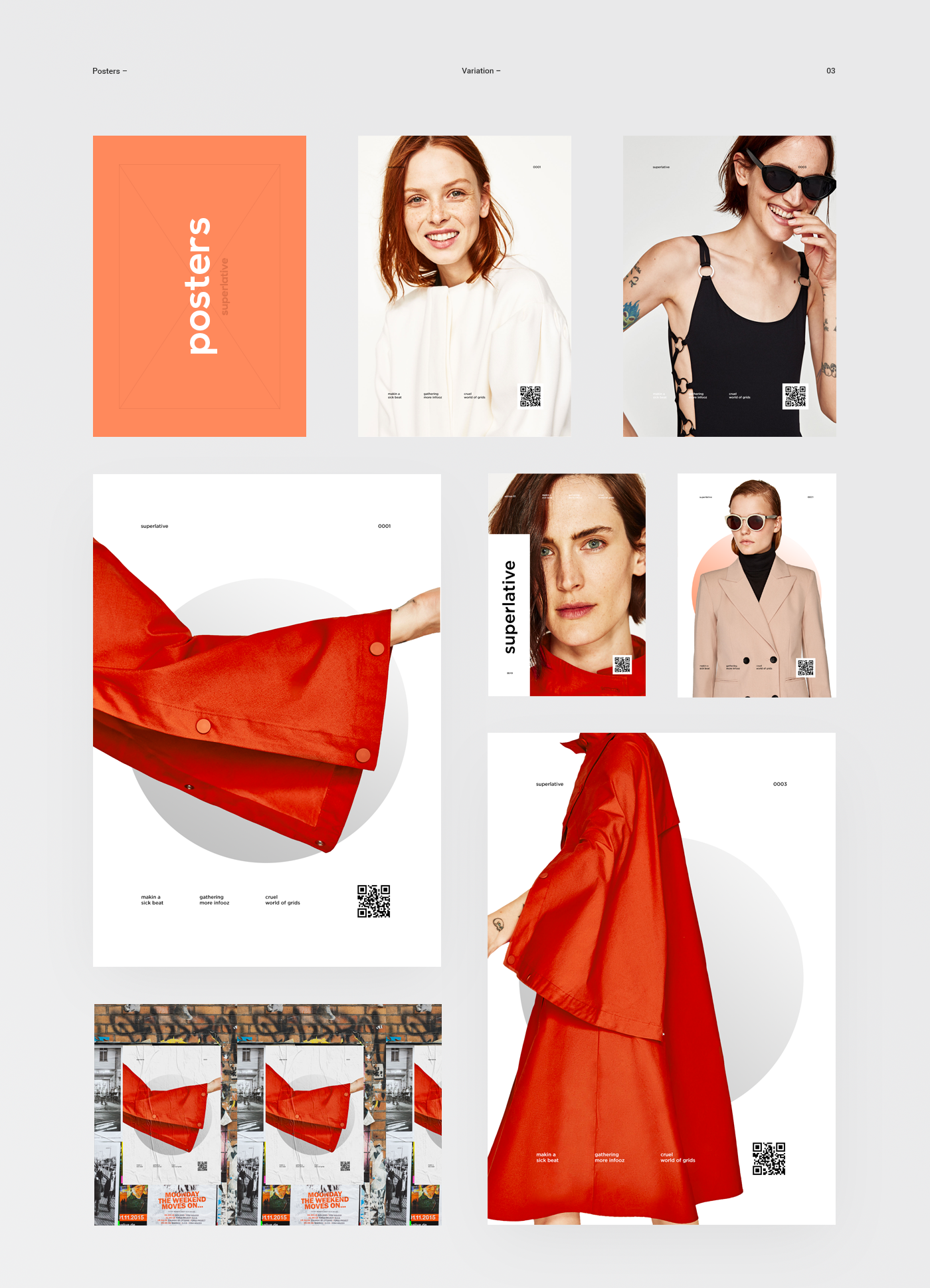
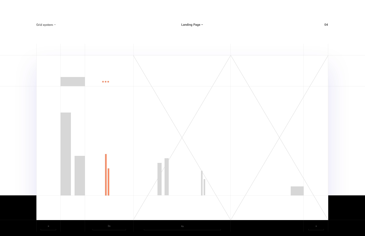
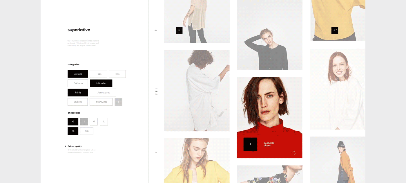
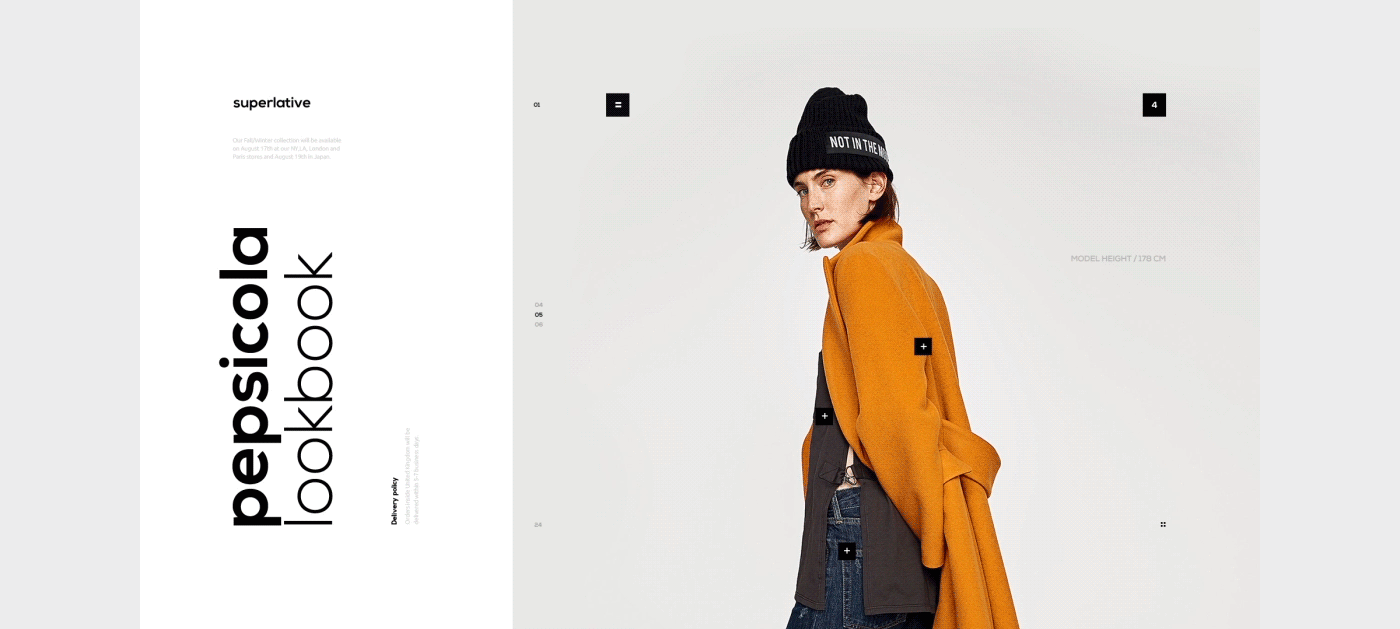
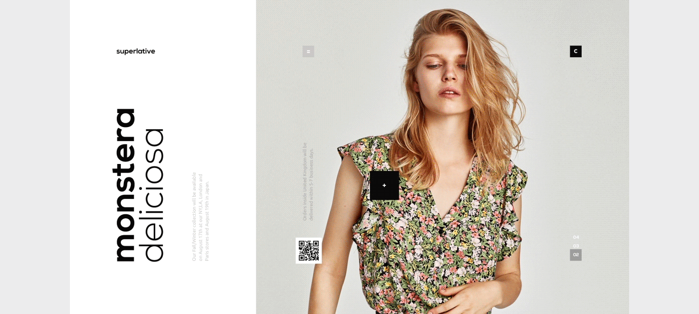
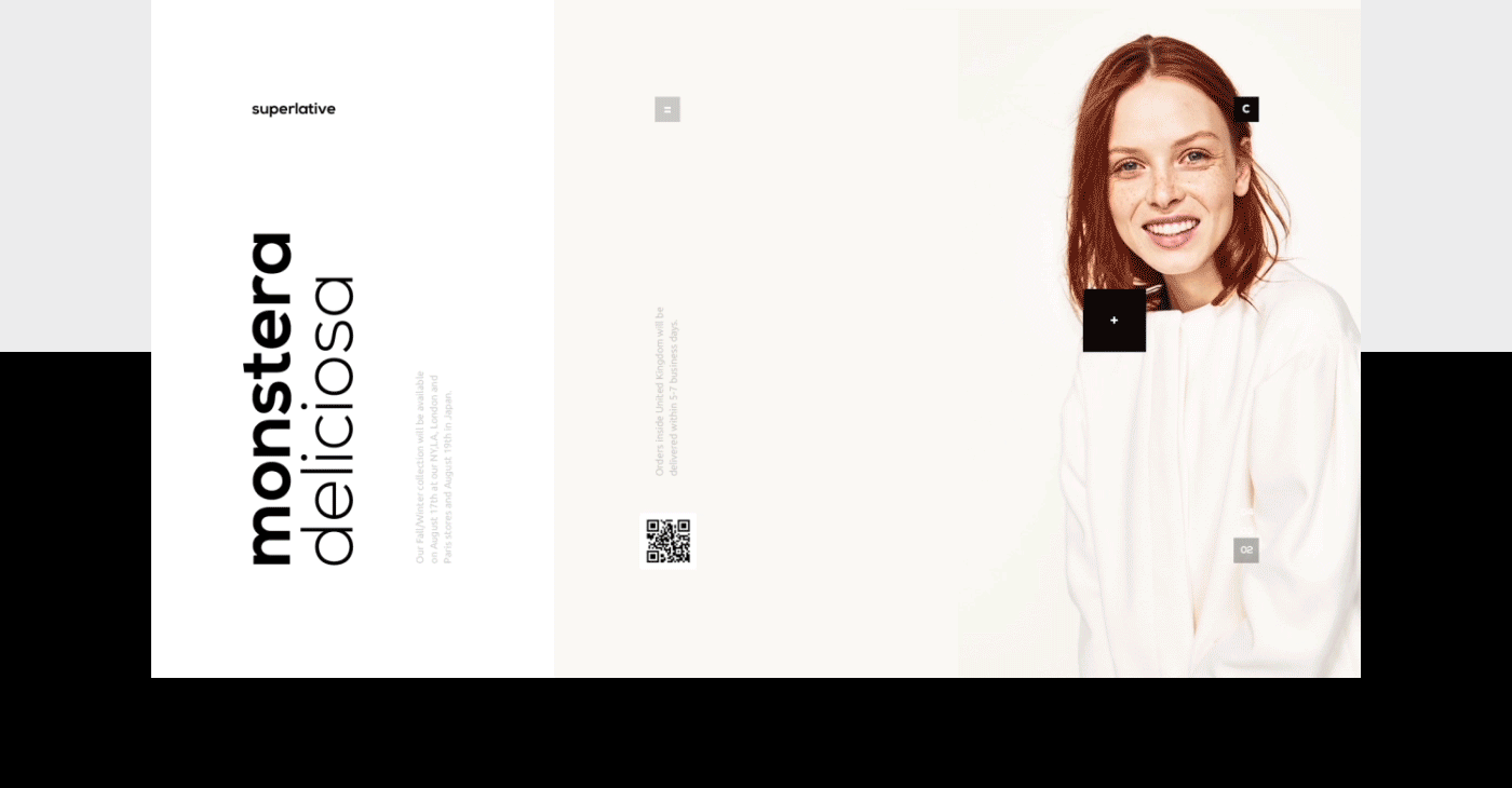
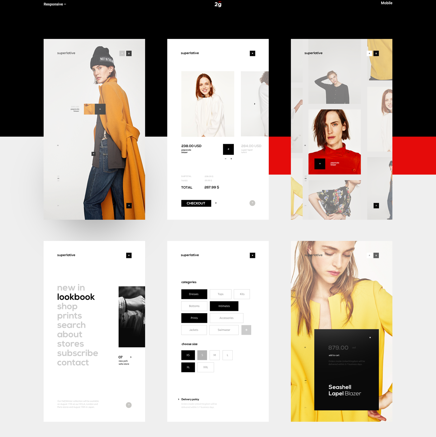
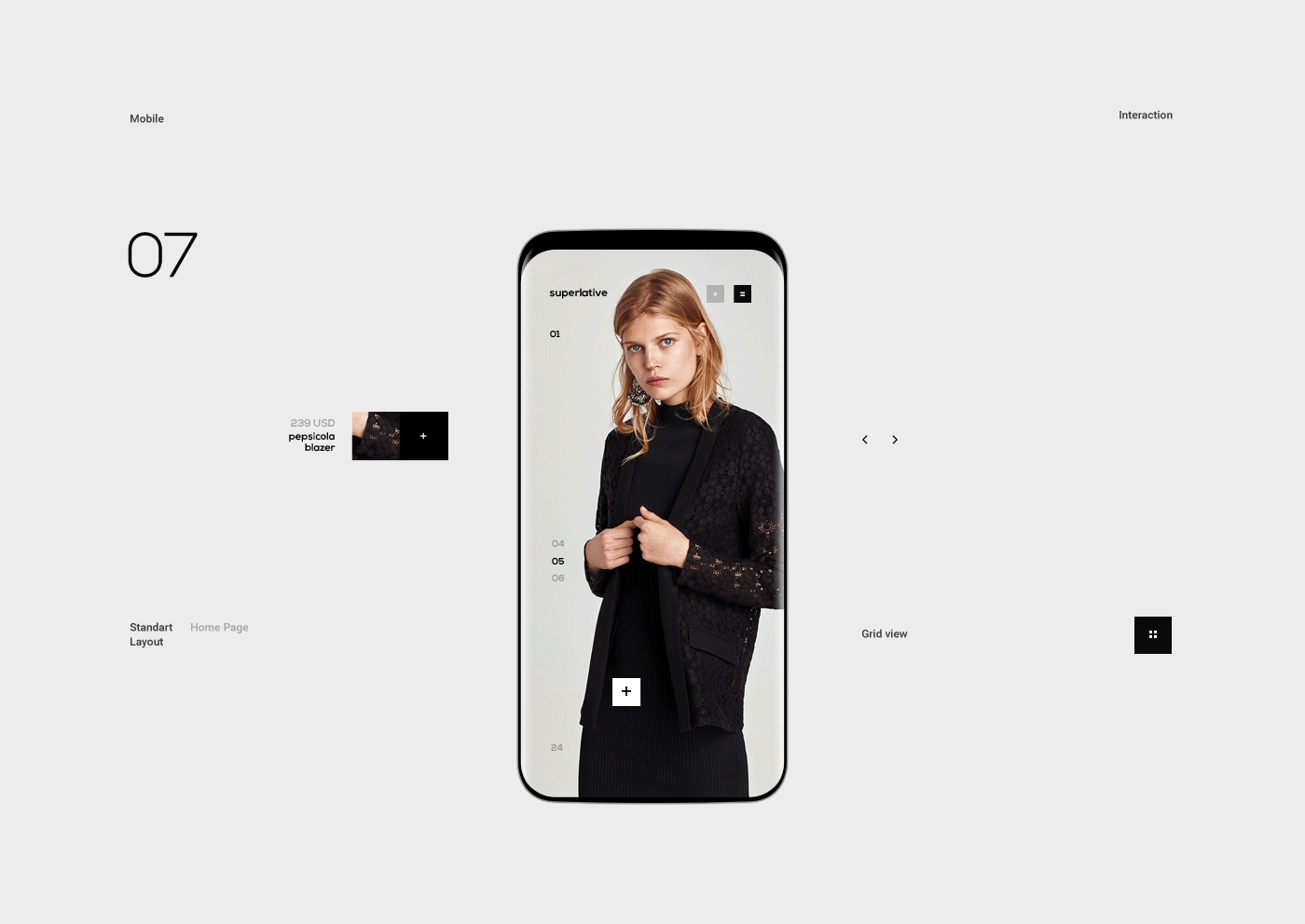
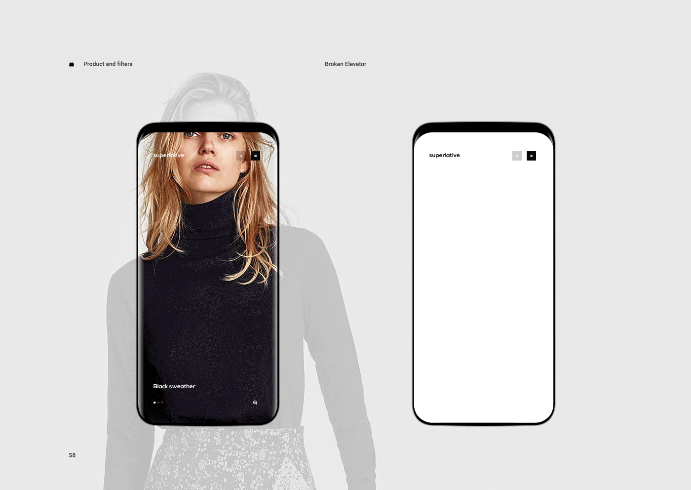
Playful Web Design & UI/UX for Superlative Store Concept
Playful Web Design & UI/UX for Superlative Store Concept
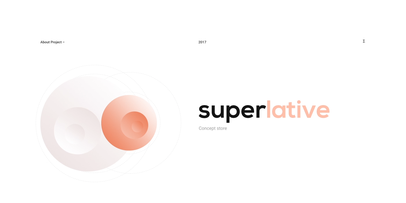
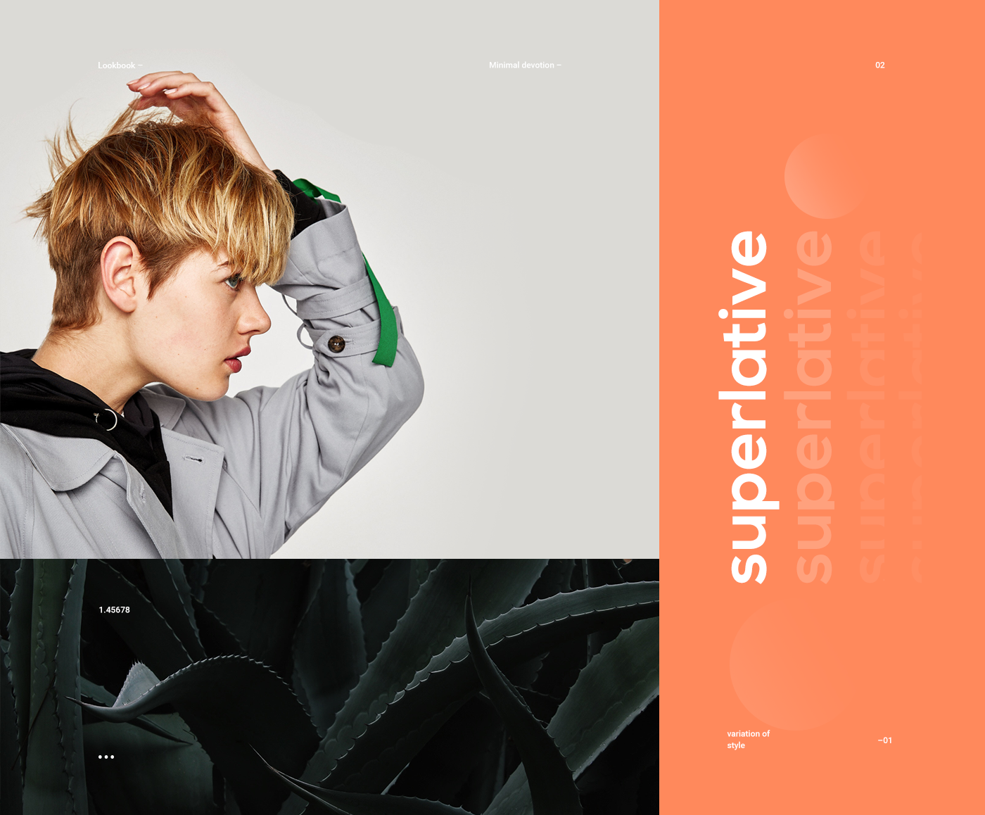
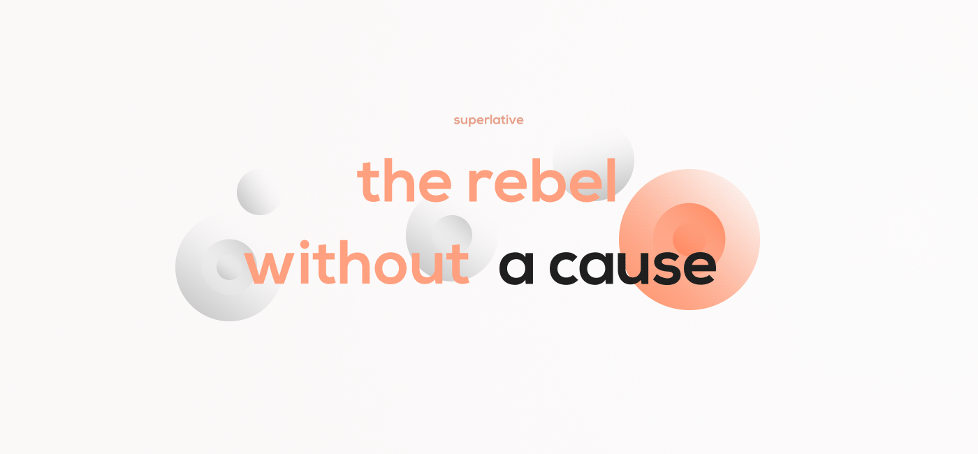
We are taking a look at the concept by designers Stugbear and Shota Xaxaleishvili on a store concept called: Superlative. They have worked on the web design, UI/UX and also the interaction design. The desktop experience is clean and I love the interactions especially on the menu. It totally enhances the shopping experience. One thing though, I wouldn’t see this concept work for a fashion brand because the overall experience might be long for some but it’s quite playful which is always inspiring to note. There is also the concept of the filters which are nice, this direction makes it even more clear and it reduces the number of clicks for the user.
More Links
- See full project on Behance
- Learn more about Stugbear . on Instagram
- Learn more about Shota Xaxaleishvili on Dribbble
Web Design & UI/UX
AoiroStudio
Mar 21, 2018
Source: Abduzeedo UI/UX
March 19, 2018
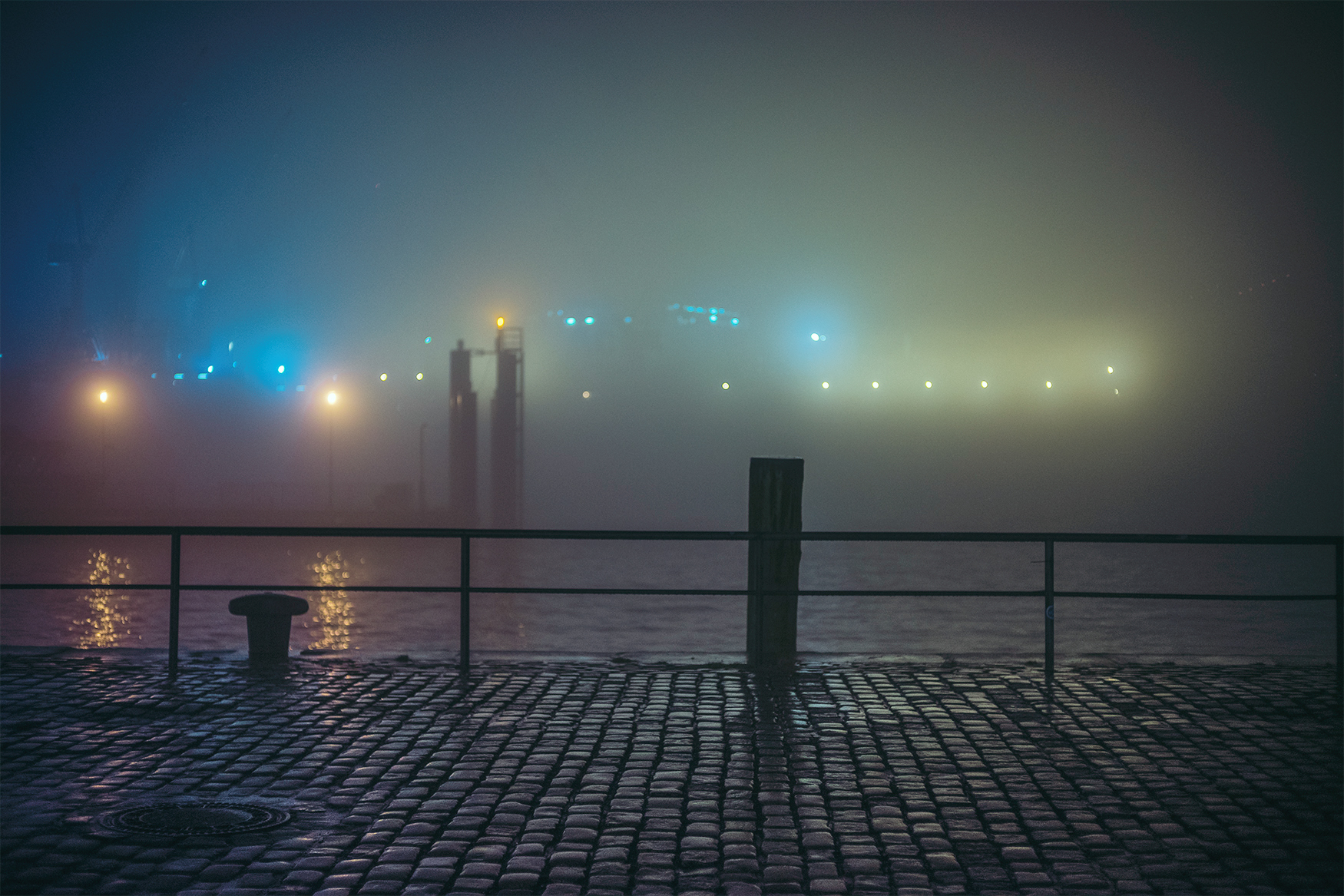
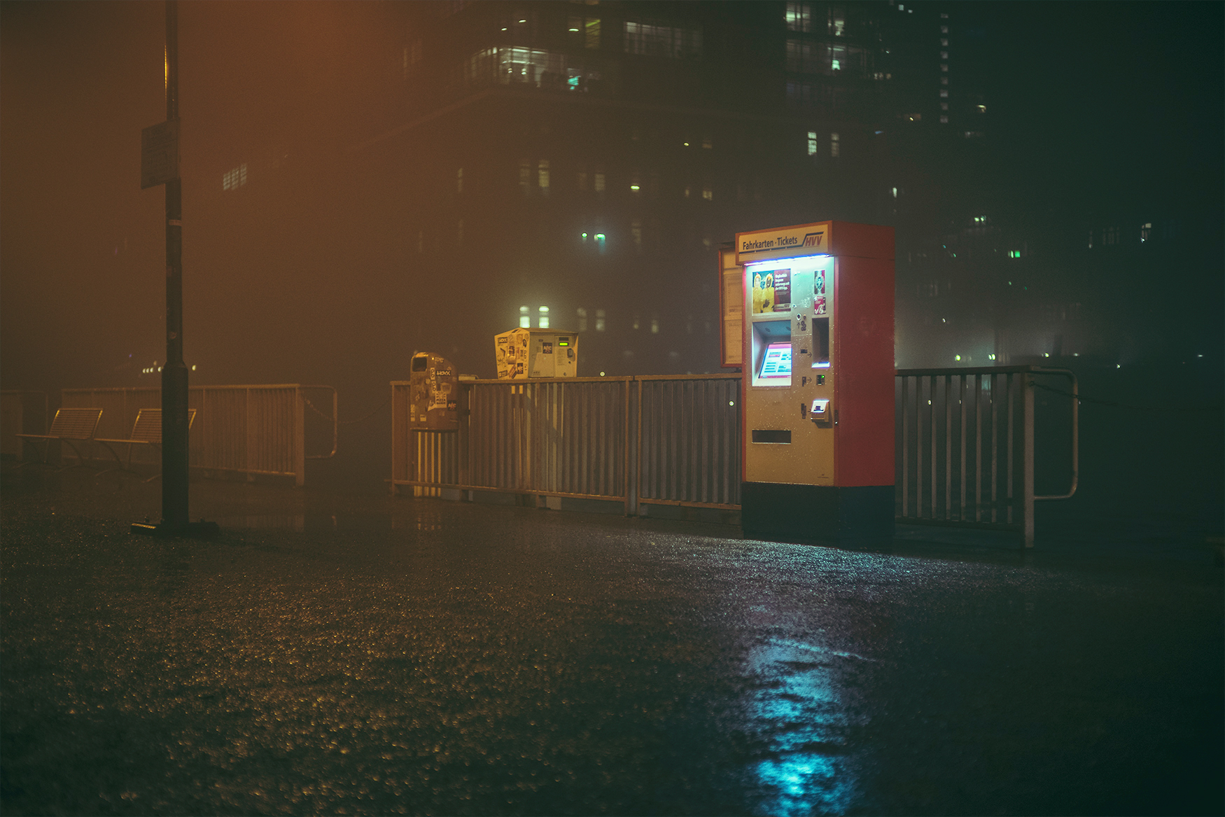
Continuing to explore foggy Hamburg at Night with Mark Broyer
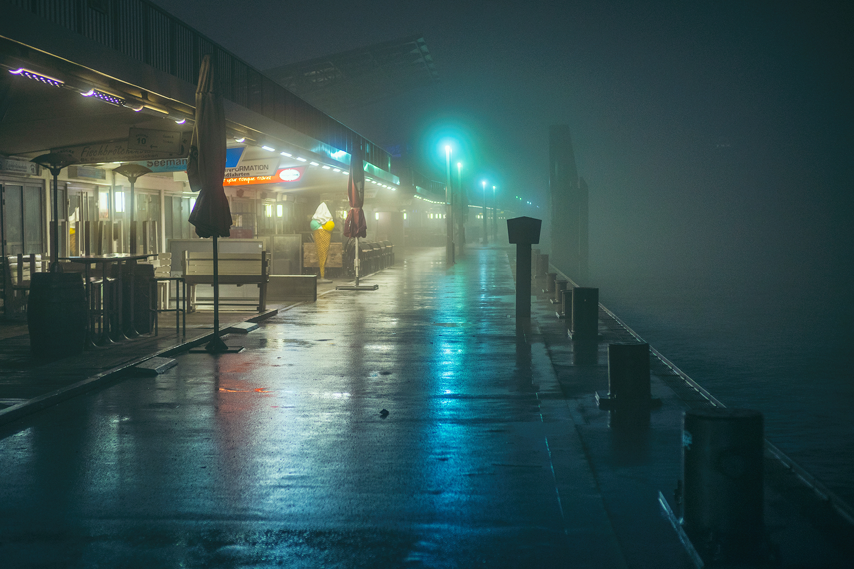
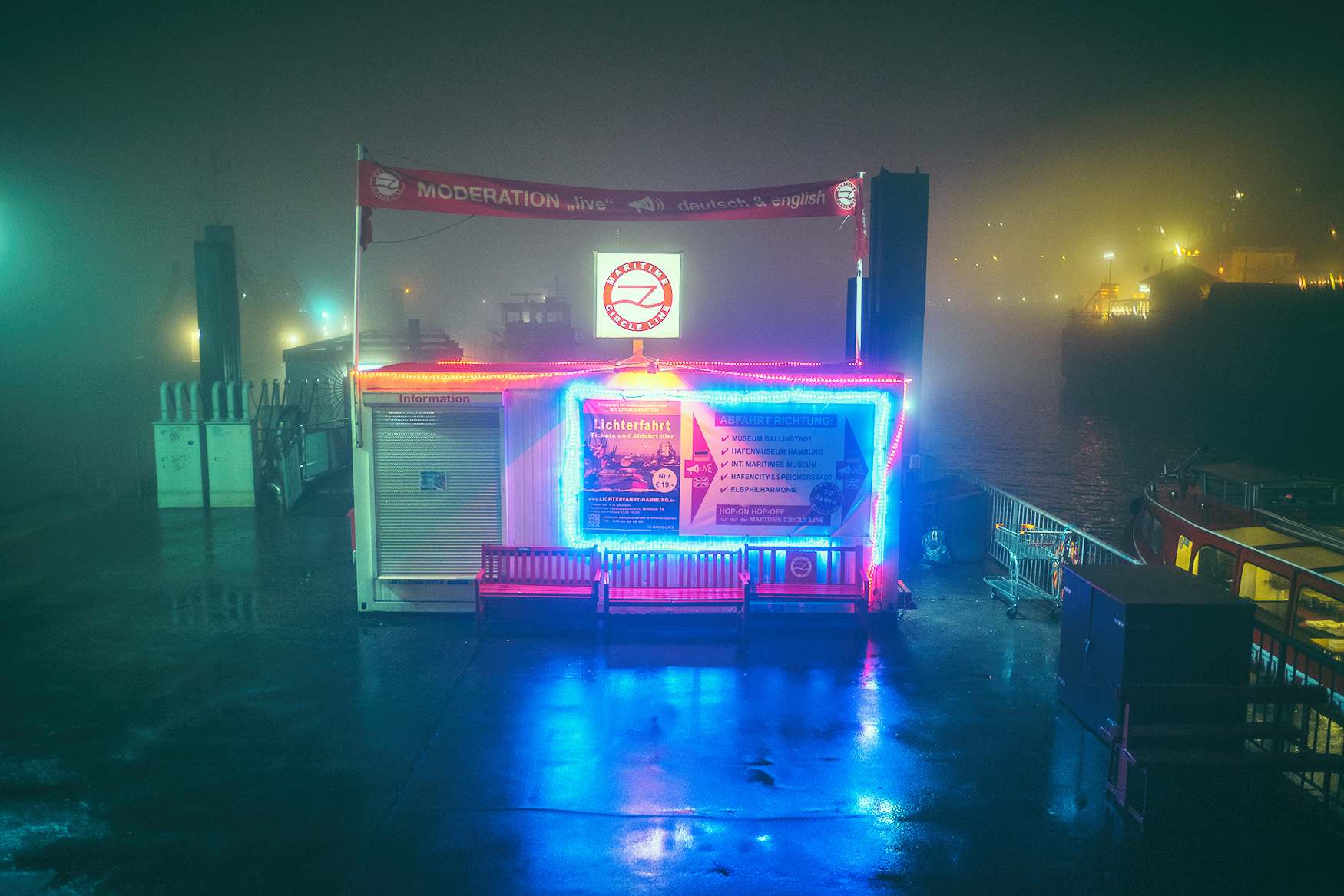
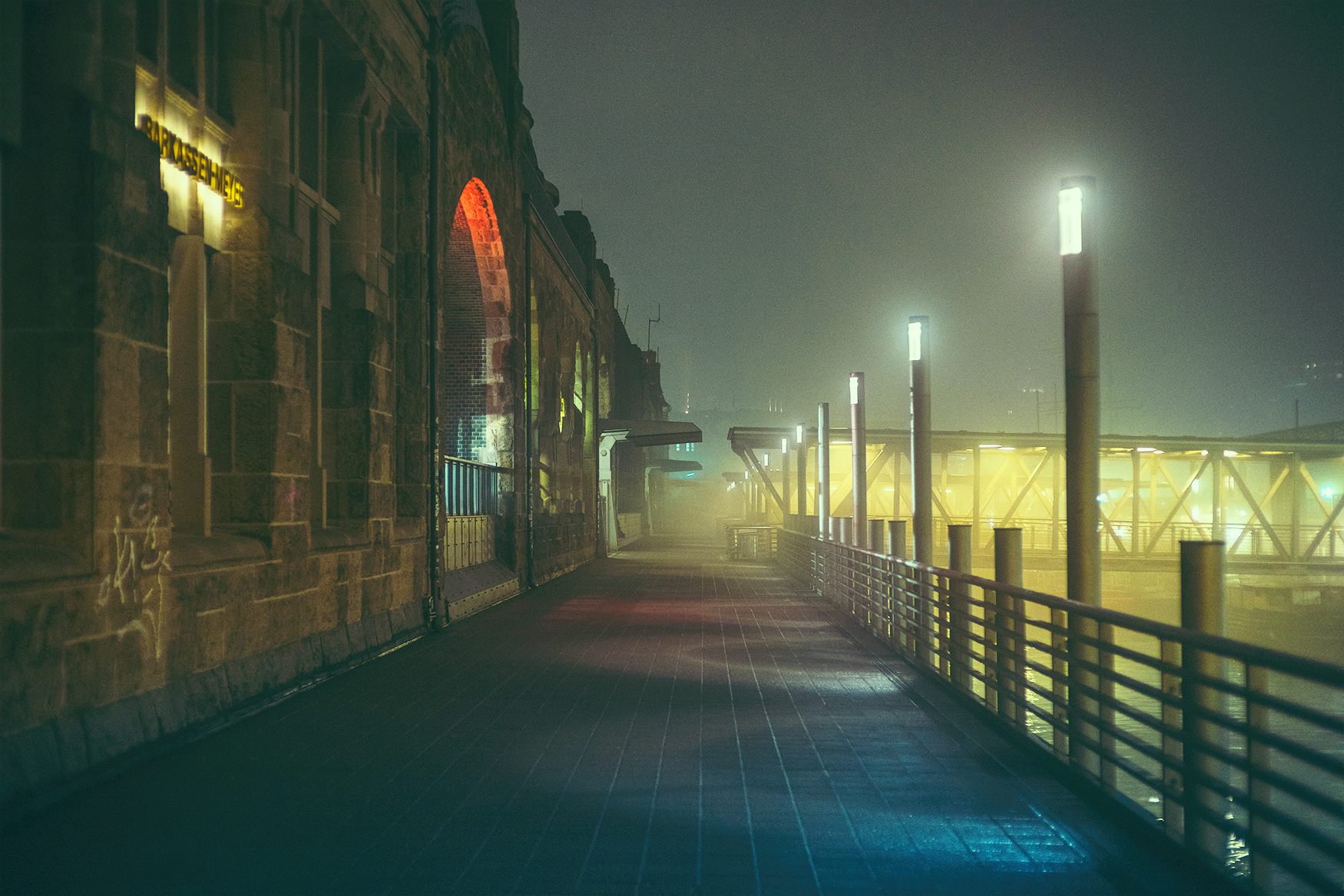
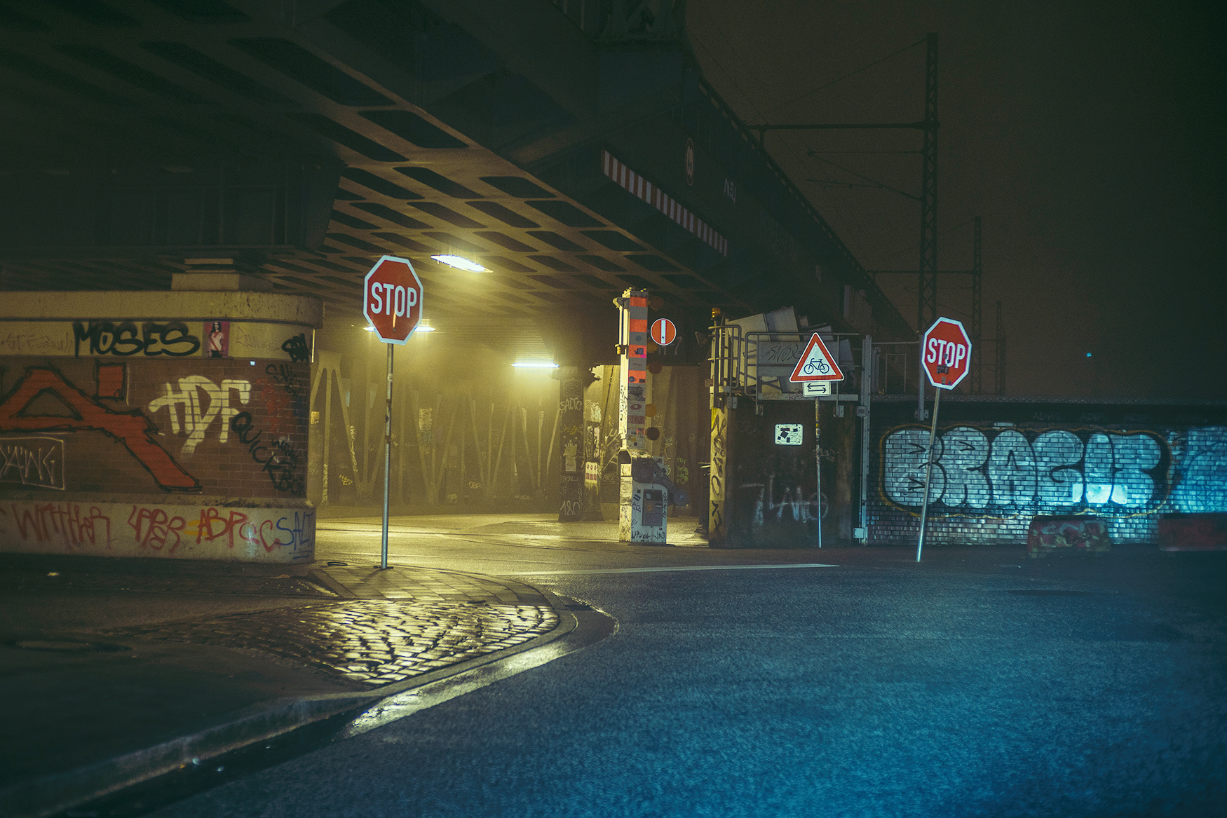
Continuing to explore foggy Hamburg at Night with Mark Broyer
A couple months ago we have featured the work of Mark Broyer on his photowalk at night from the foggy streets of Hamburg. We have loved his first series and really enjoyed Mark’s return with another collection. Mark is a photographer based in Hamburg, Germany and again with the fog being the main subject, you get to explore Hamburg again with on another mysterious and intriguing atmosphere.
More Links
- Learn more about Mark Broyer at intothelife.de
- Follow Mark on Behance
- Previous feature on ABDZ
Digital Photography


AoiroStudio
Mar 19, 2018
Source: Abduzeedo Photography
March 18, 2018
This Hilarious Spoof Shows How Paul Thomas Anderson Uses Hotdog Shapes to Create Mood

Only a master filmmaker like Paul Thomas Anderson would know how to harness the aesthetic power of the hotdog shape.
When we think of filmmaking, we don’t often think about the science behind the aesthetics, despite its incredibly important role. Take, for instance, the geometry behind many of our favorite compositions: the vectors, the proportions, and yes, even the shapes help communicate different things to audiences that aren’t easy conveyed through words alone.
There are plenty of video essays that explain how geometry and shapes can be used to tell better visual stories, and this video from Clickhole, which explores Paul Thomas Anderson’s use of hot dog shapes to convey mood in his films—is not one of them.
Source: NoFilmSchool
March 17, 2018
Capture Beautifully Disorienting POV Shots with This DIY SnorriCam

Let’s build some DIY SnorriCams!
You know those weird POV shots where everything but your actor seems to be moving? You know what I’m talking about—you rig a camera to your actor, which is also facing them, so when they move around, it looks like they’re completely still while the world around them is moving?
Yeah, that’s what’s known as a “SnorriCam” shot. Though director Darren Aronofsky famously used it in his 2000 psycho drama Requiem for a Dream, many filmmakers use it these days to convey a sense of disorientation, drunkenness, or paranoia.
If you’re still unsure of what I’m talking about, here’s a video that will get you up to speed.
That shot is not only really effective at communicating a sense of disorientation but it is also incredibly fun to do. But how exactly do filmmakers pull it off? Well, in this tutorial, filmmaker Zach Ramelan and cinematographer Karl Janisse explain in great detail how to build one of these SnorriCam rigs from scratch, using some wood, a couple of 750 base plates, straps, grip heads, and Magic Arms. Check it out below:
Source: NoFilmSchool
March 17, 2018
How Filmmakers Use Aspect Ratios to Tell Better Stories

Everything within a frame tells a story…even the frame itself.
Aspect ratios may not be the most exciting or sexy thing to talk about in regards to the aesthetics of cinema, but they are important. As the exhibition of films evolved from early peep-show machines to contemporary movie cineplexes so did the size and shape of the cinematic frame, with the square 1:1:33 ratio stretching to 2:40:1 anamorphic.
But despite the close link between aspect ratios and the time period in which they were used, there are actually many stylistic and narrative reasons filmmakers choose particular aspect ratios, whether it’s to convey a sense of claustrophobia or to add context to the story that’s unfolding within the frame.
In this video from Fandor, Jacob T. Swinney explores the many ways some of the most highly regarded filmmakers have used different aspect ratios as a storytelling device.
Source: NoFilmSchool
March 17, 2018
Small LED Shootout: Can You Replace Your Big Studio Lights with Tiny LEDs?

These tiny LEDs really pack a punch.
One of the trickiest and most frustrating tasks on a film set is choosing, setting up, and adjusting all of those big, bright lights. It takes a lot of time, space, and money to work with a professional lighting kit, but what if you were able to scale down the size of your lights without losing output or even one red cent of your lighting budget?
In this video, Caleb Pike of DSLR Video Shooter reviews five small LED lights that not only work really well with low-light cameras, like the a7S II, D5, and GH5, but also won’t force you to deal with a ton of grain. Check it out below:
The five small LEDs Pike demos in the video are the Aputure M9 ($45), the Viltrox L132T ($37), the Aputure H198 ($58), the Came-TV Boltzen B30S ($328), and a pre-release mystery light that he’ll talk about in a future video. (Links to all of these lights are in the video description.) He also uses some 4x4s for diffusion and bounce.
Source: NoFilmSchool
March 17, 2018
‘First and Final Frames’ Is Back to Show Us the Power of Bookending Films

Ready for round three of “First and Final Frames?”
A few years back, video essayist Jacob T. Swinney captured our attention in a big way with a simple video that juxtaposed the first frames of a film with the last, offering little more than gentle music to pair with the side-by-side images. Well, after 2 1/2 years, he’s back with the third installment of his popular “First and Final Frames” series, complete with some of the best films of the year, to give us the chance to explore, once again, the way films are bookended and what can be learned from it.
What can a supercut like this teach us about filmmaking? Well, potentially a lot. Some of these examples reveal how the first frame mirrors the final frame, like in Jean-Luc Godard’s Breathless, indicating that, perhaps, the “end” is just like the “beginning” or that the hero’s journey has come full circle. Other examples, like in Sofia Coppola’s Marie Antoinette, reveal a stark contrast that shows the audience how much the protagonist’s circumstances have changed. Still, others reveal nothing at all, at least not intentionally.
Source: NoFilmSchool
March 15, 2018
Qualcomm’s stand-alone VR headset design uses Tobii eye-tracking
Tobii said that Qualcomm’s latest reference design for stand-alone VR headsets includes its eye-tracking technology. This component will enable foveated rendering, a method of “blurring” everything outside your field of view.
The post Qualcomm’s stand-alone VR headset design uses Tobii eye-tracking appeared first on Digital Trends.
Source: Digital Trends VR
March 15, 2018
Lenovo Mirage Solo with Daydream hands-on review
The Lenovo Mirage Solo is the first Daydream VR headset that doesn’t need a smartphone. Powered by Google’s VR software and WorldSense technology, you benefit from six degrees of freedom and the lack of smartphone constraints.
The post Lenovo Mirage Solo with Daydream hands-on review appeared first on Digital Trends.
Source: Digital Trends VR