-
News & Updates
May 5, 2017
This Month’s 18 Best Gifographics Inspiration
If you’re not familiar with them yet, gifographics, or infogifs, are the upgraded version of the infographic. Infographs have long been the visual content standard used by marketers and content creators alike, but the gifographic adds a little bit more to the classic graphic visual.
Gifographics are perfect for mobile displays and produce a more interactive and engaging experience than the traditional infographic. Like the name suggests, gifographics are infographics with the moving parts of a GIF. Similar to infographs, they present viewers with a wide range of information in a minimal amount of space but with the inclusion of animated components. This addition leads to greater engagement with viewers, making it an extremely effective form of visual content.
Take a look at these beautiful examples of gifographics we’ve rounded up below to see why they’ve become so popular:
1. The Cost Of Being The Ultimate Harry Potter Fan by MoneySuperMarket
This is a perfect example of how gifographics can be more engaging.There is a great deal of information provided without being cluttered and the subtle animations of the various aspects on this infogif is enough to catch the eye without being overwhelming.

2. How To Build A Human by Eleanor Lutz
The continuous animation of the spiral is striking and helps to make the process more understandable. The GIF essentially speaks for itself and is a perfect visual representation of the information provided.

3. How To Win The Content Marketing Game by kapost and Salesforce
This gifographic incorporates animated parts to produce an 8-bit “game” feel, tying together the title and the visual design. This makes the infogif more compelling and playful while still being able to express the important information provided.

4. How Google Works by Quicksprout
The animated details perfectly bring to life the visual representations of the information on this gifographic to help readers understand all of the data. This type of GIF use is an excellent example of using images and animations to speak for the material.

5. Virtual Reality: A Fresh Perspective For Marketers by Column Five
This gifographic uses animation to call attention to important aspects of the content. The subtle GIF details make it refreshing and lively without detracting from the ample amount of information presented.

6. How To Perform CPR by Carrington
This example uses a step-by-step GIF to explain a process in a small amount of space. Rather than creating a long visual like traditional infographs, the sections are condensed into one frame with each stage of the technique scrolled through on a loop.

7. How To Throw A Perfect Strike With Your Marketing Communications by Wyzowl
This is another excellent example of using animation to tie the visual to the title of the content. The images are playful and illustrate the advice in a way that a cursory readthrough of the infogif would be enough to understand the recommendations given.

8. Three Different Ways To Breathe by Eleanor Lutz
Another beautiful example by Eleanor Lutz, this gifographic utilizes animation to demonstrate the information presented. The GIFs in this particular example show how animation can be used to help explain a concept that can be otherwise difficult to describe with static images and data.

9. How Social Signals Impact Search Engine Rankings by Quicksprout
The simple animations featured on this infogif prove that sometimes less is more. This example is not inundated with lots of moving parts, but the sections that are are enough to draw attention to the meaningful bits of information.

10. Infographics vs. Gifograhics by SEO Expert Page
If you’re trying to decide what type of visual content would work best for you, this gifographic breaks down the pros and cons of infographics and gifographics. They cleverly leave the images pertaining to infographs static and animate the images referring to gifographs. This is a good example of how the two types of visual content can be merged.

11. The Author Rank Building Machine by Vertical Measures
This is another example of how a well animated infogif can enhance the information and style and design of a visual. As viewers move through this gifographic, the images and animations build upon each other further highlighting the theme of the visual.

12. The Future Of Infographics by Column Five
The moving parts in this particular gifographic demonstrates the information being presented in the visual. The static components explain the material while the animated elements provide the visual example of the material.

13. The Science Of Successful Content by Kantar
This particular infogif utilizes the animated elements to make the visual more engaging and interesting. The GIFs are subtle but stimulating enough to make the visual content and accompanying information stand out.

14. Innovative Animations by Wyzowl
If you’re looking to get better interaction with your audience, animation is the way to go. This infogif breaks down various animation methods into easy to understand sections with animated images to illustrate the different methods being described. The use of GIFs in this example perfectly spotlight how animation can work to enhance visual content.

15. 7 Influencer Marketing Insights You Need To Know Today by gifographics.co
The GIFs in this example make the visual content more visually stimulating and wacky in a way that captivates viewers. The use of the same colors in every animation ties everything together to produce a theme and prevent the visual from being too cluttered and overwhelming.

16. The Growth Hacking Model by Evolve!
The very subtle animated aspects of this infogif is a prime example of how even simple animations can make a difference to visual content. There are no complicated moving parts in this example but the slight changes in the images are enough to lead the viewers on a journey through the information.

17. How Wind Turbines Work by Save On Energy
This example makes use of animation to illustrate how a wind turbine works and the benefits of wind farming. The GIFs provide the perfect visual representation and explanation of that various components of a wind turbine to make the information easier to understand.

18. Are You Slacking Off? by Column Five
Each of the moving components of this example provide visual representations of the data being presented. With a lot of facts being administered in a small amount of space, the animations help to break up the numbers and create a more interesting atmosphere.

Source: Visual News
May 5, 2017
Facebook shuns VR content creation with closure of Oculus Story Studio
Facebook has turned its back on efforts to develop in-house virtual reality content with the closure of Oculus Story Studio, marking a shift in …
Source: CW’s Flipboard Feed
May 5, 2017
Thanks Obama! For recording this awesome VR tour of the White House
Barack Obama is back in the White House, but this time as a guide offering a look around the famous building in 360-degree video. The immersive content is the work of Emmy Award-winning Felix & Paul Studios.
The post Thanks Obama! For recording this awesome VR tour of the White House appeared first on Digital Trends.
Source: Digital Trends VR
May 5, 2017
1 Min Illustrator & Photoshop Tutorials by Adobe Creative Cloud
1 Min Illustrator & Photoshop Tutorials by Adobe Creative Cloud
When we started Abduzeedo we focused a lot on design tutorials, especially Photoshop tutorials. Later we started adding more tools like Illustrator, Pixelmator and others. That was 10 years ago and there weren’t many resources where people could find content on those subjects. Nowadays, it’s much easier, you can find Photoshop training videos, Illustrator from well-known professionals, including the mighty folks over at Adobe, the mastermind behind the most popular design software in the world. Today, I noticed that they have an amazing Youtube channel called Adobe Creative Cloud and they have already shared some very useful videos with Illustrator and Photoshop tutorials.
The quality of the videos is incredible, they are short, 1 minute walkthroughs explaining interesting techniques to create 3D typography, double exposure effects, composite effects. Everything is really well done. I think they made all the other tutorials sort of obsolete after that. Below you can see the videos.


Illustrator and Photoshop tutorials
For more information and to subscribe for more videos make sure to check out https://www.youtube.com/playlist?list=PLD8AMy73ZVxUuKFHp5BTdVKW37-k6Qhcj
abduzeedo
May 05, 2017
Source: Abduzeedo Tutorials
May 4, 2017
IMR’s innovative approach to wireless VR involves data compression
When wireless virtual reality comes to a headset near you, it may operate on your standard Wi-Fi network thanks to clever compression. IMR’s solution can compress the data by as much as 95 percent.
The post IMR’s innovative approach to wireless VR involves data compression appeared first on Digital Trends.
Source: Digital Trends VR
May 4, 2017
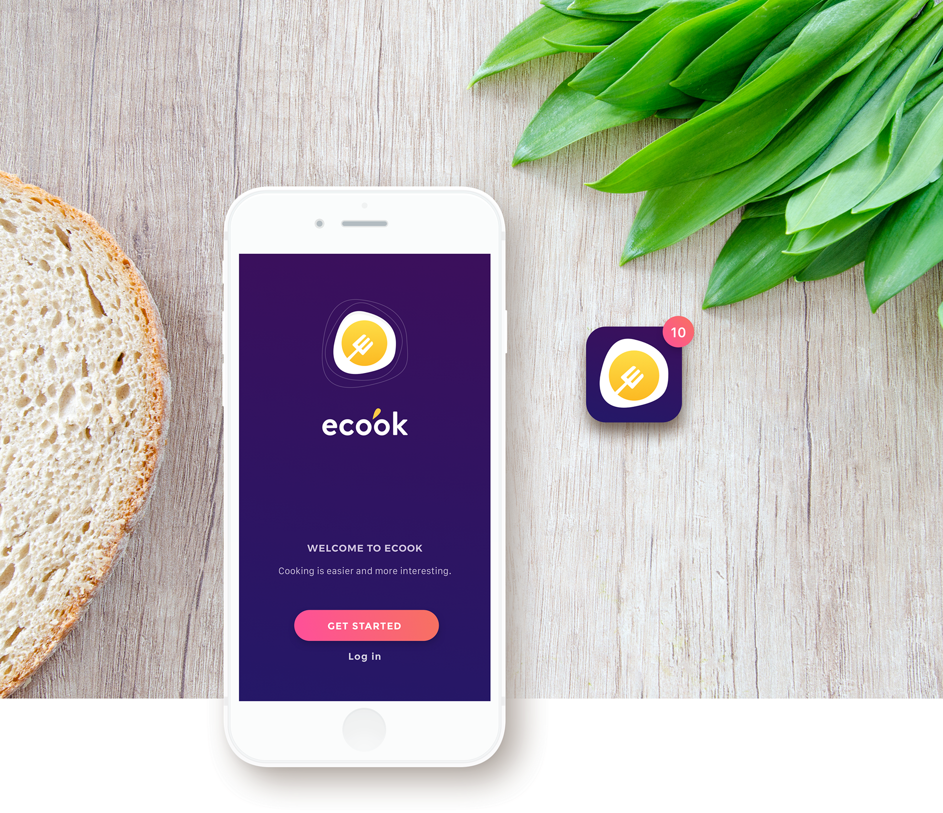
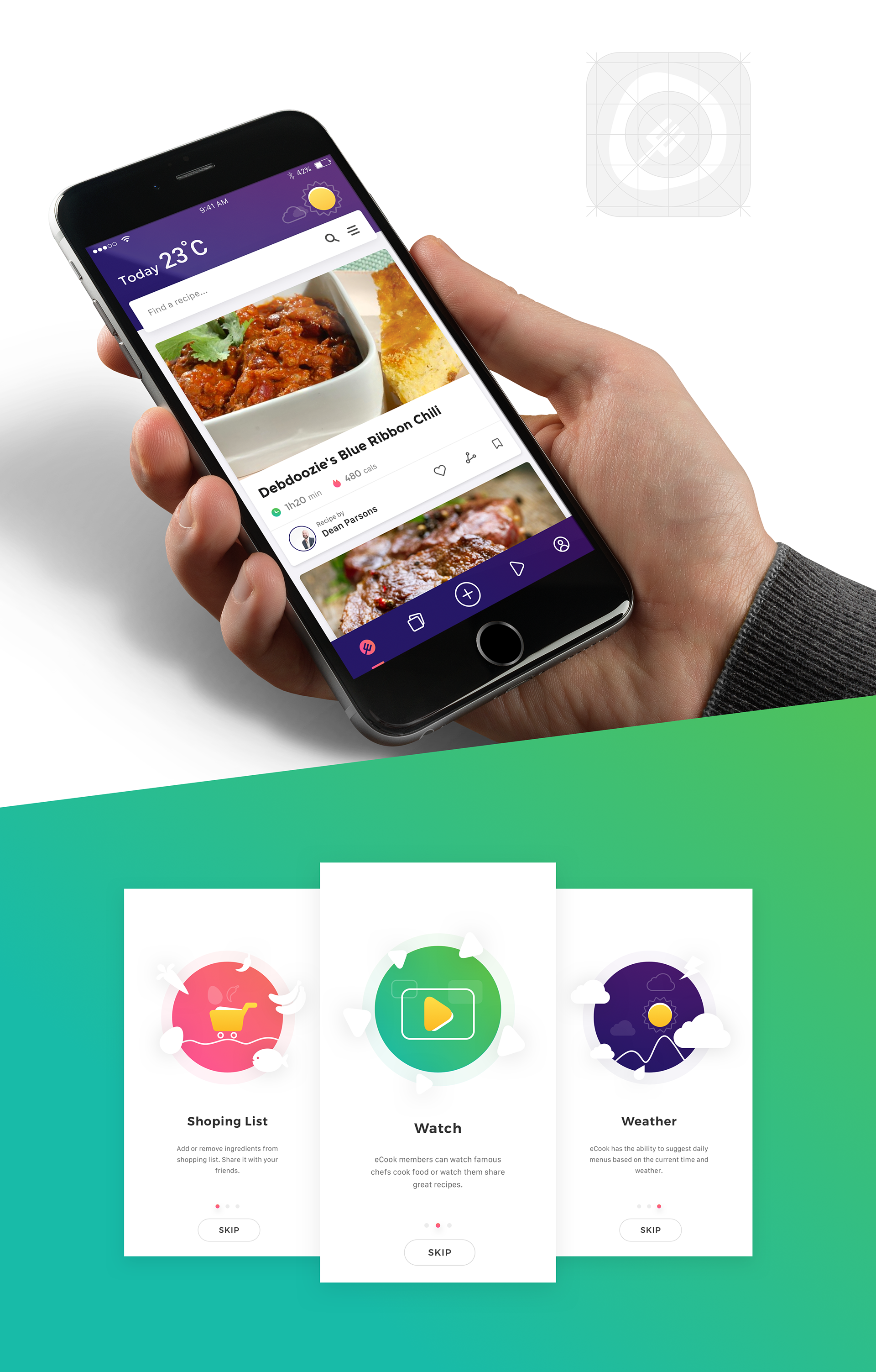
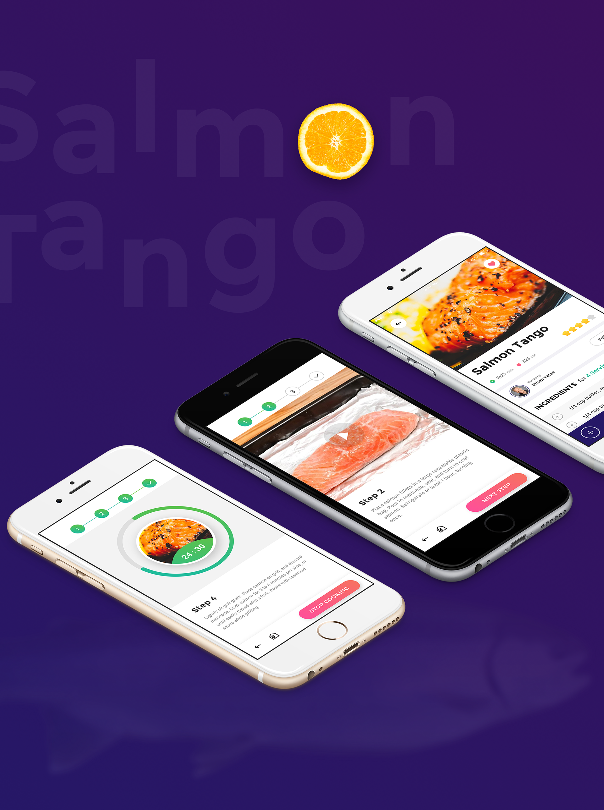
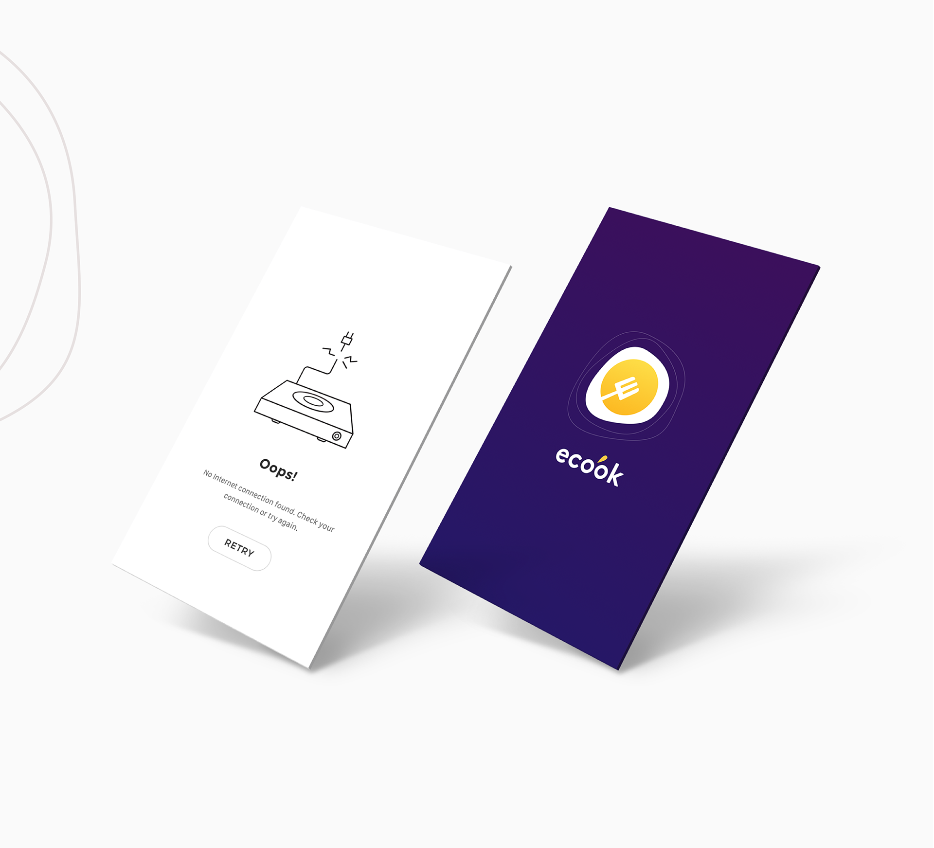
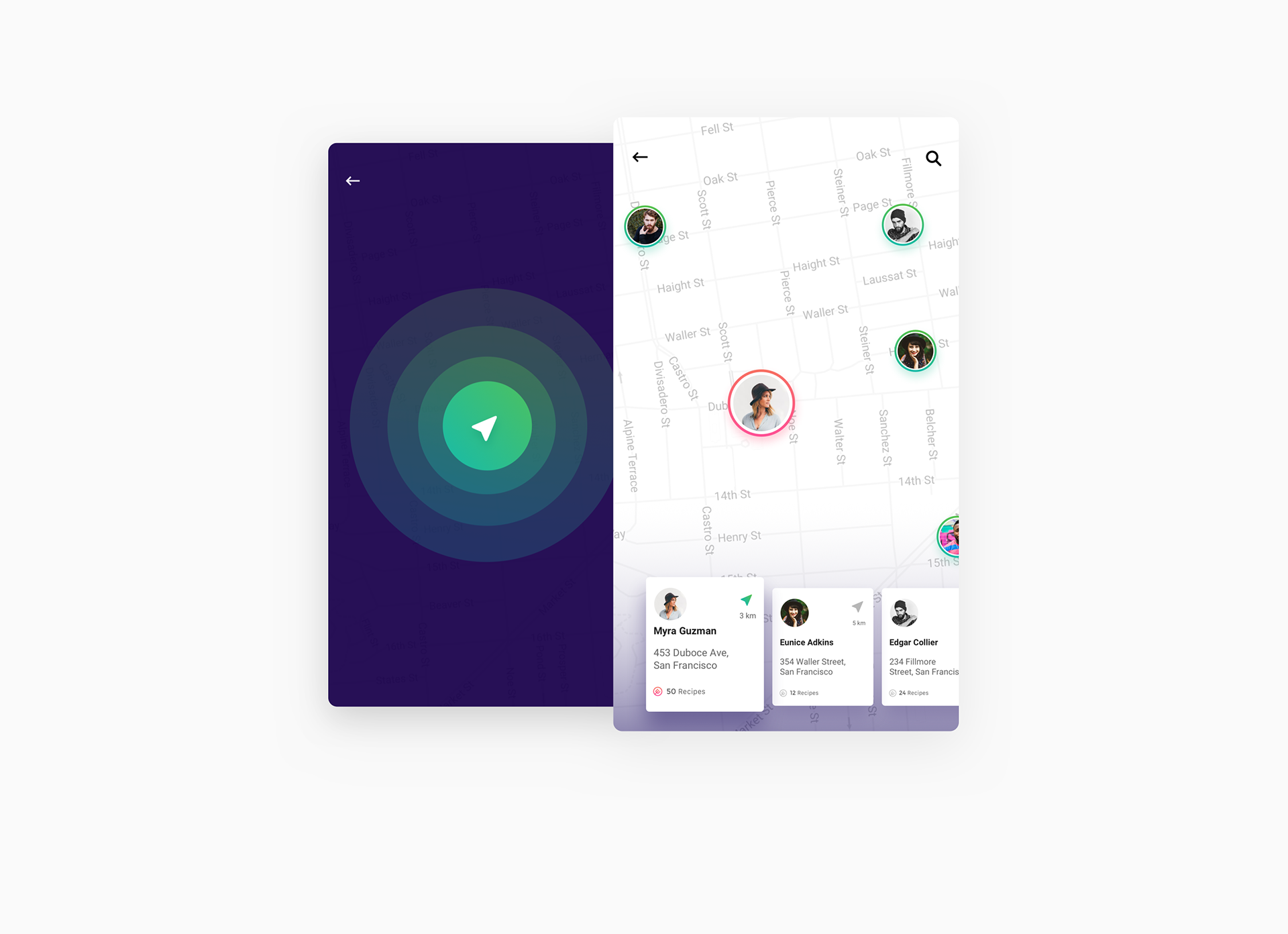
Interaction Design & UI/UX of the Ecook App Concept
Interaction Design & UI/UX of the Ecook App Concept
Let’s share our first interaction design project this week of a cooking app concept named: Ecook. Designed by Ha Truong, we are approached with an app that can help you cook more through daily menus and suggestions depending on the weather or whatnot. What’s cool about this concept is the integration of watching what famous chefs are sharing as recipes, on the other hand I really liked this user flow from the shopping list to the actual cooking. Check it out!
Behind this concept, we are sharing the work from Ha Truong who is a designer based in Hanoi, Vietnam. He is shifting his work lately into interaction design, you get to experience his thinking through his concepts and ideas that are pretty great. Definitely worth following on Behance.
Ecook is an application that helps users find and share recipes with the community. In addition, Ecook has the ability to suggest daily menus based on the current time and weather, helping users find and choose the most suitable and the best food. You can plan to cook delicious meals for your family with delicious dishes from ecook. Ecook members can watch famous chefs cook food or watch them share great recipes. Cooking is easier and more interesting with Ecook.


AoiroStudio
May 04, 2017
Source: Abduzeedo UI/UX
May 4, 2017
5 WAYS TO EDUCATE YOUR CUSTOMERS THROUGH CONTENT
This article originally appeared on Column Five.
Content marketing is not about talking about yourself; it’s about creating content that delivers true value to your audience—the content they need and want. No matter who your audience is, I can guarantee that what they need and want is information that helps them learn, grow, and improve in some way.
When your brand provides that information, you’re providing an education—and that is a truly valuable service.
“Education” through content marketing can take many forms: practical (how-tos and tutorials), theoretical (deep dives into specific subjects), or brand-specific (product information and features). Most importantly, it delivers useful information in the right context, at the right time.
Unfortunately, over the last decade, we’ve seen too many marketers focus on what they want to say instead of what their audience wants to learn. This is a huge mistake; if you want to succeed in content marketing, focusing on education is crucial. It’s also not that hard. Here are five ways to create education-based content that delivers great value to your audience.
1) PROVE THAT YOU FEEL THEIR PAIN
People want help from those who know what they’re going through, who can help them navigate those issues. Therefore, the best way to make yourself attractive to a customer is to help solve their problems via content.
An added benefit: Creating this type of content not only shows your audience that you care about educating them but proves that you can educate them, positioning your brand as a helpful resource.
How do you get familiar with your clients’ pain points? Ask. Email them. Call them. Take them out to lunch, dinner, or drinks.
Whichever way you do it, use this information to fuel your content.
We’ve created audience personas with the information we’ve gleaned from our conversations with clients, which we reference during every brainstorm. This helps us ensure that each idea addresses as specific pain point. (Here’s how to make your own personas if you haven’t done it already.)
2) LET THEM LEARN FROM YOUR MISTAKES
In addition to wanting help from people who understand their problems, your customers want to know that you have personally overcome their struggles (or personally know how to solve them).
Customers respect industry leaders who can speak authoritatively on the issues they face. Yes, “thought leadership” is a term that gets tossed around a lot, and so it has been cheapened, but the original idea behind it is to showcase your experience, share the lessons you’ve learned, and prove that you know your stuff.
Seth Godin has said, “The lessons we remember are the lessons we learn the hard way.” Even if you don’t think you are the expert, you probably still know more than your customers and thus are in a good position to educate them.
On that note, if you feel like an impostor because someone has 10 more years of experience than you do, here’s the good news: Everyone deals with this syndrome—myself included. (Here’s a great piece to help you overcome impostor syndrome.)
3) HELP THEM GET TO KNOW YOU
Showcasing your unique point of view is truly the only way to stand out from your competitors. No one has had the same set of experiences and life lessons you’ve had, and this is truly your best value prop.
Sure, there’s a company with more website visitors than you have. Sure, they may have more e-books than you do. And, sure, they may have more speaking gigs than you do. But what they don’t have is your exact experience or perspective. They don’t have your same personality, values, client service style, or goals.
Don’t try to be Tim Ferriss, Seth Godin, or Tony Robbins. Learn from them, but forge your own path.
The more you can showcase who you are through content and educate your audience through interaction with your brand, the more your audience will forge a more unique, personal connection with you.
This content will also attract people who have similar perspectives or philosophies, which means that audience is more likely to convert (as opposed to other methods, such as paid search or radio advertising, which reaches broader audiences).
At Column Five, we produce informative content for our clients, but we also create content to showcase our company’s values and personal passions (e.g., our People for Periods interactive infographic to help destigmatize menstruation).
4) TEACH THEM A PRACTICAL SKILL
Thought leadership is important, but sometimes brands get a little too esoteric, musing in long blog posts or philosophizing on a podcast. That knowledge is valuable, but if it isn’t immediately applicable to your audience’s life, it can take a backseat.
Instead, try repackaging that knowledge into smaller, shareable content your audience can put to use. Even a small tidbit via a tweet can help. Seek to educate through tutorials, how-to guides, hacks, and tips, but remember that practicality is key for this type of content.
You can also use this type of helpful microcontent to promote your larger pieces. For example, we created this infographic on how to optimize your blog for publishing to help promo an e-book on content distribution.
5) LEARN TOGETHER
You are an expert in your industry. You know your stuff. But you’re also eager to expand your knowledge to give your audience the best information possible at all times. Demonstrating that you are also an active student teaches your audience that you aren’t just resting on your laurels. It helps them learn new things, too.
To help educate ourselves and our audience, we conduct Q&As with industry leaders we think are doing great work and are successful in their own lanes. For example, a few members of our team were so enamored of PopSugar’s Snapchat stories, we interviewed them to find out everything about their production process and provide a few tips to our readers.
REMEMBER: VALUE COMES FIRST
Expanding your reach, exploring new ideas, and fostering a learning community through content can only help your brand, as long as you’re focused on providing value. Remember the wise words of Zig Ziglar: “You can have everything in life you want if you will just help enough other people get what they want.”
To learn more about creating better content, check out our team’s top tips to make you a better content marketer and take a look at our best fixes for your biggest content marketing problems. Of course, if you need help with your content efforts, we’re always happy to chat.
Source: Visual News
May 4, 2017
Everything to Know About NAB 2017: Cameras, Lenses, Gear, and More
Another NAB is in the books. We recap the biggest gear and software announcements and check out the new toys.
Source: CW’s Flipboard Feed
May 4, 2017
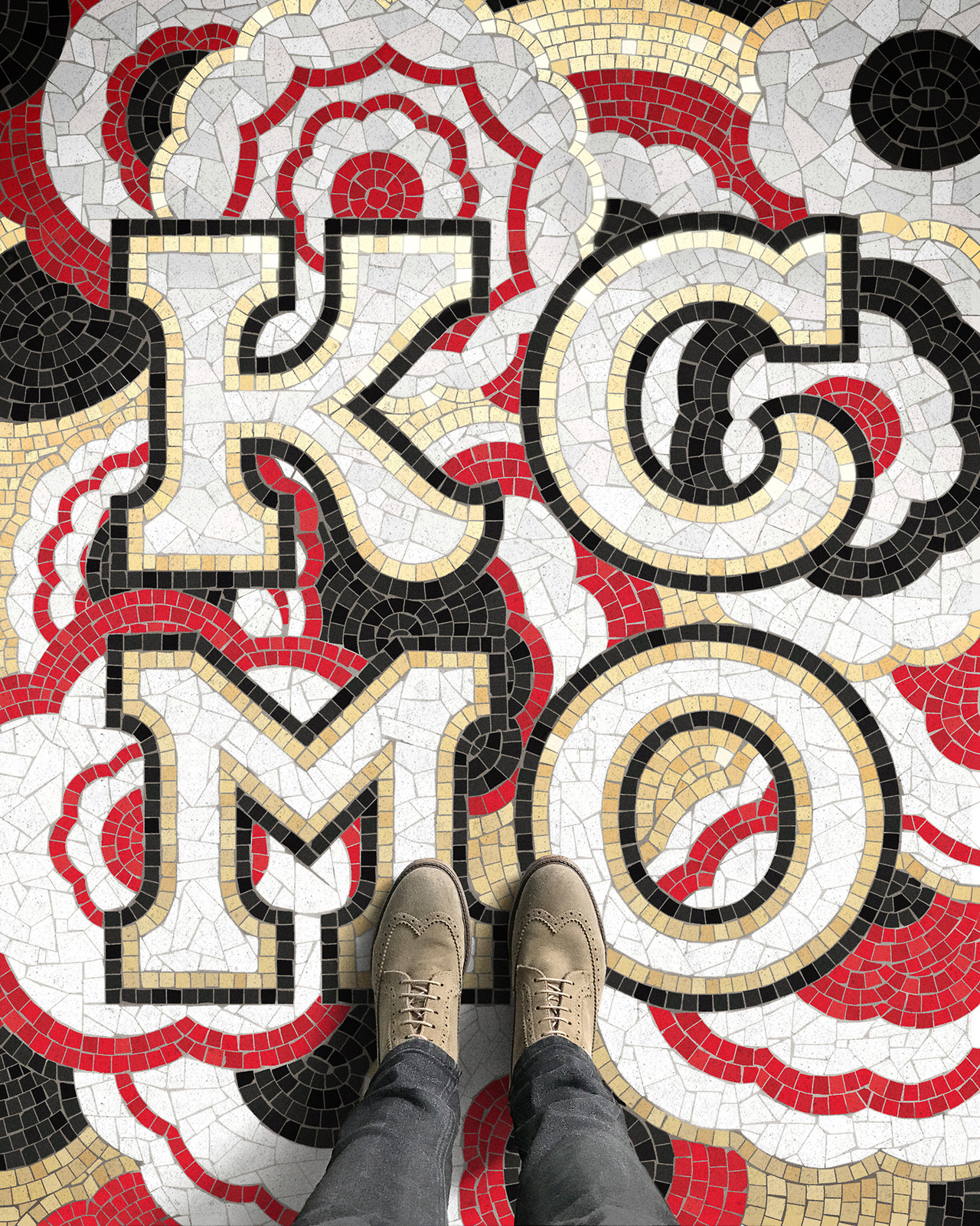
Fauxsaics: a Series of Typographic Mosaic Illustrations
Fauxsaics: a Series of Typographic Mosaic Illustrations
We are sharing a typographic series that just makes you go Wow! just by its splendid concept and even more about the execution. Have you ever took a picture of a mosaic tile composition and try to position the shot with your shoes? I know I did! That’s basically the concept behind Fauxsaics , a series of typographic mosaic illustrations designed by New York-based designer Nicholas Misani. What I love about this series is not only there’s a good amount of work in the typography, there’s also even more details to the mosaic as well. These are the kind of projects we love seeing on Abduzeedo!
Behind this fun series is the stunning work from Nicholas Misani who is a designer based in New York, USA. Passionate about typography and calligraphy; he’s also working at Louise Fili Ltd as a senior designer. A place where he gets and as I quote: “create quintessentially Italian, historically-inspired design and lettering every day”.
Fauxsaics are lettering-based, mosaic illustrations where the form is dictated by the limitations of traditional mosaic technique.


AoiroStudio
May 04, 2017
Source: Abduzeedo Illustration
May 4, 2017
The Contemplative Artworks of Elicia Edijanto
The Contemplative Artworks of Elicia Edijanto
One thing I love about art is that an illustration is like a window into an artist’s mind, soul, or whatever you might call it. Some artworks and paintings are super happy, with bright, colorful details right at your face. Some others express deep meaning through fewer elements and simpler colors.
Elicia Edijanto is one of those artists that tell us a lot through her artworks. From Jakarta, Indonesia, she comes up with these beautiful illustrations that are so contemplative that it might reach the deepest corner of one’s soul and have an effect on it. This is the kind of art that makes you trip, wonder, dream, all at once, wherever you are. Something very powerful indeed… well, some might say that art is a weapon of mass destruction. Destruction of an ugly, lifeless world. Let there be art, let there be more of Elicia’s beautiful mind.
Elicia’s artworks


For more of Elicia’s artworks, please visit her personal website, Instagram or portfolio at Behance! I hope you enjoy these as much as I did! Cheers. 😉
PauloGabriel
May 04, 2017
Source: Abduzeedo Illustration