-
News & Updates
July 5, 2017
Who Is The Warren Buffett Of The Meme Economy?
This article originally appeared on Priceonomics..
Memes have received a lot of attention following the surprising outcomes of elections across the globe in 2016—and the fiercely fought campaigns leading up to them. Sharing images and making cultural allusions were both common activities long before getting into heated political arguments with family members over the internet was.
But making those allusions in white block lettering superimposed on familiar images—the humble image macro—has burst beyond a niche internet hobby and thrust memes of all sorts into popular consciousness.
It’s only human, then, that someone would start a market to speculate on different memes’ futures. The traders of the subreddit r/MemeEconomy speculate on which memes will become popular, and which are headed toward obscurity. They are, as the subreddit name would suggest, on their way to creating a “Meme Economy.”
Naturally, we want to know who the biggest winner is among the meme traders of r/MemeEconomy. If the Meme Economy flourishes into a financial market, who in this forum is its Warren Buffett?
We analyzed data from Priceonomics customer Me.me, a search engine that indexing memes and their popularity over time. From across the internet we gathered instances that each meme was posted. We looked at the positions that the traders took between February 28 and April 27 on Reddit, and then analyzed whether those memes were rising or falling in our index.
The analysis we present here is a starting point for calculating returns in the Meme Economy, but by no means the final word. Part of the reason is meme market goes through drastic, sudden swings. The market increased 389% from February 28 through April 26, then fell 85% from April 26 to April 27. Because of that, the results we present here are very sensitive to the time period we are analyzing.
That said, during this time we looked at, 25 traders posted gains, 7 traders had no gains or losses, and 25 lost on their calls. 21 traders outperformed the market’s moving average growth. The highest performing trader, reddit user itsyaboieon, had a 1433% return.
***
We began by looking at the activity level of the overall meme market. We looked at every meme mentions in r/MemeEconomy and looked whether the tag associated with that meme was rising or falling in the Me.me search index. We indexed total posts to start at 100 on February 28, and plotted the day to day increases and decreases in the market.

Data source: Me.me
The popularity of the traded memes posted daily swings wildly.
Meme posting volume can fall by half, only to recover their losses and then some within a single week. The market posted a peak return of 389% on April 26. It closed April 27 at 72.7% of its starting value, a 85% drop from the high the day before. The market comprises many different memes.
To find out how well the traders performed in the market, we needed to look into changes in postings for individual memes.
We used the number of daily postings as the going-rate for a meme, and tracked the traders’ positions over the period. Any open positions are valued at their April 27 value. We then determined the gain on traders’ calls so we could calculate the percent return each trader generated.
The top trader timed the meme market, returning the original investment 14 times over. Meme trader itsyaboieon’s staggering 1433.3% increase is nearly twice the size of second-place investor GavinOriginals’ 800% gain. Like in other markets, the returns fall off sharply after the top few performers. Fifth-place trader Vipe777 is the lowest ranked who more than doubles the original investment. The next highest 15 earned between 21.4% and 95.2% returns—far better than interest on savings accounts, but a fraction of the top earnings.
We wanted to see what predictions provided itsyaboieon with such atmospheric returns. He placed a buy call on April 11 for texting, and held onto it through April 27. We graphed how the texting meme had performed compared to its posting frequency on February 28.

Data source: Me.me
The meme had doubled on three separate occasions between February 28 and April 11, when itsyaboieon placed the call to buy. Each time it fell back down to below starting value. Little more than two weeks after itsyaboieon predicted the texting meme would grow, it shot up beyond 9 times its starting value. That sudden growth generated itsyaboieon’s chart-topping 1433% return.
The top 20 traders all saw their fortunes increase, but we wanted to know how they compared to the rest. We split the range of trader performances into six evenly-spaced groups, and counted up how many fell into each group. We used different colors to separate the top traders from the rest.

Data source: Me.me
Trading results fit into a normal bell-shaped curve. Over half the traders fell into the middle two groupings, which range from decreasing by 50% to growing by 50%. Only 7 of the 57 traders tracked had returns or losses larger than their original investments. Outside of the top 20, there were 12 additional traders who avoided losses on their positions. The market got the better of the 25 worst performing traders, who would have more had they buried their meme money.
High performing traders outperformed others several times over. Do high performing memes outpace the market as a whole? We wanted to know, so we identified the top 10% highest growth memes, and calculated the percent change in aggregate daily posts from February 28 for that group and for the entire market. Then, we drew a line graph showing how those changes varied from day to day.

Data source: Me.me
The overall market swung higher and lower from day to day, but on average ended around the same volume as it began. The Top Decile Memes Portfolio, on the other hand, experienced massive growth. Top memes ended 183.5% higher than they began, peaking at gains of 1392.4% on April 26. The market crashed abruptly on April 27, erasing much of the Top Decile Memes Portfolio’s gains and shaving the overall market down to 72.7% of where it started.
Meme popularity changes quickly. Almost no meme steadily appears with more frequency. Investing in memes offers huge rewards to active investors with keen instincts, and nearly nothing for investors looking to buy and hold. We wanted to see how large portfolios of memes performed compared to the top investors. We took the percent gain for both the overall market and the Top Decile Memes Portfolio as of April 27, and ranked them with the gains that the top 20 traders made.

Data source: Me.me
While only the very best traders outperformed the high-growth memes, 37 traders beat the overall market. The market ended down 27%, still outperforming 20 traders. As seen earlier, 25 traders lost their shirts trying to time the market. Our Top Decile Memes Portfolio compares favorably with the median meme trader, who earned a return of 0%.
How do individual traders beat the market—even outperforming the highest growth memes—by so much? Memes often go viral, seemingly popping up overnight. They can become stale quickly, and almost disappear entirely. We looked into changes in daily posts over the 60 days we tracked to find the memes that grew and shrank the most.
The two top-growing memes, Arby’s and backyard sports, appeared 18 times more often on April 27 compared to on February 28. Some memes that were obscure at the end of February were showing up frequently 60 days later, other memes fell from regular use over that time. Memes that shrank the most—like first ranked meme of the month or runner up why not visit—nearly stopped appearing, dropping over 90%.
***
We investigated the Meme Economy, and calculated the gains and losses of the traders on r/MemeEconomy for the period between February 28 and April 27. A little over half the traders made profitable calls, and the very best made their investments back many times over. Compared to the highest earning trader, itsyaboieon, even a portfolio of the highest-growth memes offers modest returns. Memes can burst into frequent use over a short amount of time, and slip into obscurity just as quickly.
Source: Visual News
July 5, 2017
This Camera Comparison Chart Summarizes All of Your Camera Choices
Thomas Fletcher and Gary Adcock’s thorough camera comparison chart can help you choose what format to use for your production, whatever the size.<p>The …
Source: CW’s Flipboard Feed
July 4, 2017
HOW TO PICK THE BEST DATA VISUALIZATION FORMAT FOR YOUR STORY
This article originally appeared on Column Five.
If you want to tell a powerful story, data is the way to go. Whether it’s proprietary data, industry research, or public data, there are compelling stories all around. But even the best data story can lose impact if it isn’t presented the right way. That’s why it’s so important to choose the right data visualization format for your data.
We find that there is a lot of misinformation or misunderstanding around this topic. Many people think that throwing a few charts and graphs into an article is all they need to tell a good data story. Or they think they can stuff a trillion data points into an infographic and call it a day. While the intention might be right, the execution is so wrong.
We want you to tell the best data stories you can, so we’re breaking down the different types of storytelling formats to help you choose the best for your data. (Note: This isn’t entirely prescriptive, but it should send you in the right direction.)
DATA VISUALIZATION FORMATS/TOOLS
Before we dive in, let’s clear up a few terms to specify what we’re talking about. When it comes to data storytelling, people tend to use certain terms interchangeably (or misuse them entirely), but there are very different types of data mediums and data visualization formats. For the purposes of this post, here’s how we break it down.
Data visualization: In the strictest sense, this refers to the actual visual representation of data. This may mean basic charts and graphs or larger, more complicated visuals. But it is about the visual specifically.
Information design: Information design is the visual representation of information—with no data at all (think of an organizational flow chart). We won’t be talking about info design here, but we think it’s important to understand the distinction.
Infographic: An infographic is a graphic that includes data, copy, and visuals. These elements work symbiotically to tell the story. (That means your infographic may include data visualizations.)
Animated infographic: These are infographics that include motion or animation. These are not interactive (see below), because the viewer doesn’t control the motion or animation.
Interactive infographic: An interactive infographic is any web-based content that lets you interact with the data on the screen. You may scroll over, click, expand, or otherwise manipulate the on-screen data.
Motion graphic: These are animated graphics that tell a story. Motion stories can be told through kinetic text, animated visuals, or both.
Video: This is live-action film, which may also incorporate text, graphics, etc.
Luckily, you have more options than ever to tell your story. But this can also make it tricky to choose which is best.
BEFORE YOU CHOOSE A DATA VISUALIZATION FORMAT
There are many elements that influence how you might best present your story. Before you decide on a format, think of the bigger picture. Each of these may affect the route you take.
Goal: Before you create anything or even come up with an idea, you should always know what your goal is. This is just as important to data storytelling as anything else. Are you trying to increase brand awareness? Establish your expertise? Engage your social followers? Some formats can help you achieve these goals more than others.
Story: An effective data story isn’t just a smattering of stats. If you’ve done your job well and teased out the insights, you can craft a narrative to reveal that story. That said, the story you’re trying to tell will very much dictate the data visualization format you choose. Is there a clear message? Are people meant to uncover or assign their own meaning to the story? Are you creating a useful resource? Are you trying to guide them to a next action? Keep this in mind.
Volume of data: This is one of the biggest issues we see over and over. People can go data-crazy sometimes and extract a mountain of data to turn into a story. That’s nice, but you must consider how much data is really required to tell the story. Sometimes you have millions of data points, and that’s OK. Just don’t stuff those into the world’s longest infographic.
Audience: Who are you trying to reach with your data story? Who will be interested in it? What level of knowledge or understanding do they have? What data visualization formats are they accustomed to interacting with? If you are targeting older boomers, for example, a fancy interactive might not be the way to go.
Distribution: Where will your data story live? On your blog? On social? Published on an industry site? How will you drive traffic to the piece? Know this from the get-go. If you are trying to engage people on social, the format you choose sure as hell better be optimized for social. (We once designed a beautiful animated infographic only to find out the publisher’s platform didn’t support the format. Then we cried.)
CHOOSING YOUR DATA VISUALIZATION FORMAT
Each data story is unique, so there isn’t a single rule or formula for choosing the best presentation. However, some are better suited than others to help you achieve your goals.
DATA VISUALIZATION
A strong data visualization can be used alone or as part of a larger piece. The power of strict data visualization lies in, of course, the visualization. A stunning visual is not only aesthetically appealing but lets the viewer “see” the story. Sometimes, a simple data visualization can be even more powerful than a detailed story with additional copy or context.
Good for: Data visualizations are often used as one part of a larger story in an infographic, white paper, e-book, on social, etc. (Simple visualizations are especially useful for situations in which time or attention is limited and you need to tell the story “at first sight,” such as a visual at a tradeshow booth.)
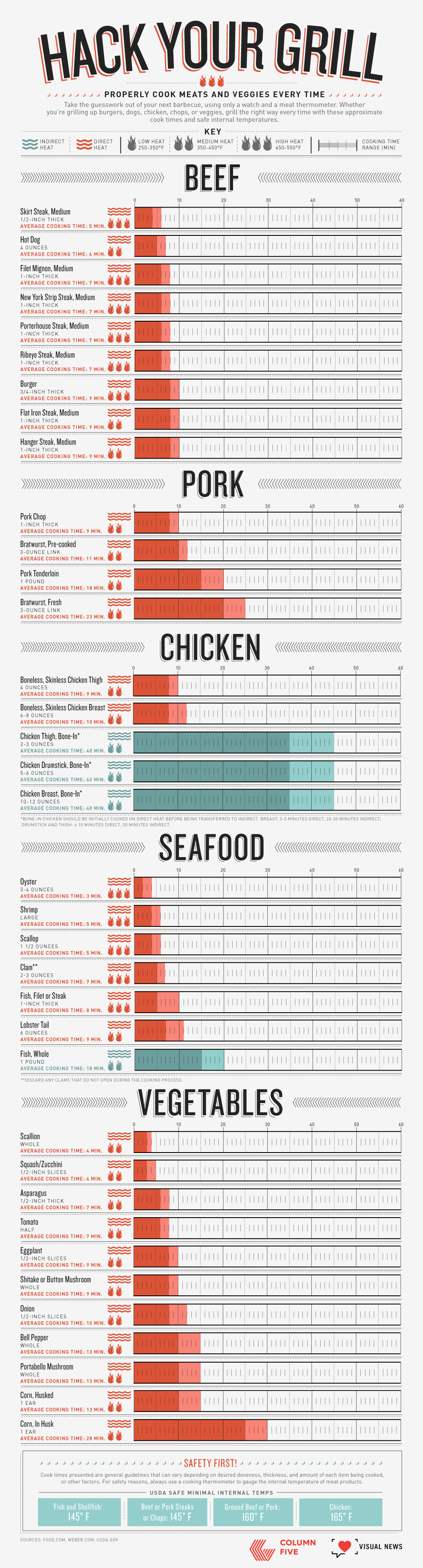
Example: This simple data visualization is a convenient guide to grilling meat. The data is depicted in chart form, making it easy for readers to get the info they need at a glance.
To make sure your data visualizations are effective, design them according to best practices. Find out how to do that with our Data Visualization 101 guide.
INFOGRAPHICS
Infographics are particularly useful to communicate in a simple, clear, and easy-to-understand way. They are aesthetically engaging and easy to share, making them a great tool for brand awareness. Publishers have become increasingly interested in infographics, as they visually enhance stories. Additionally, panels or slices from infographics can be repurposed as microcontent, helping to further promote the piece of content and give you more bang for your buck.
Good for: Social, content marketing, visual aids, editorial publishing, etc.
Example: This Jobvite infographic on paid parental leave tackles a relevant subject for their target audience and presents data in an easy-to-understand manner.

Learn more about how to craft an effective infographic narrative and get publishers to fall in love with your infographics.
ANIMATED INFOGRAPHICS
Animated infographics have all the same benefits of infographics, but the addition of motion makes them more attention-grabbing. They are a good option if you want to mix up your content and experiment with motion without creating a full-on interactive or motion graphic. Like infographics, motion elements can also be repurposed in other areas.
Good for: Social, advertorial, or editorial, specifically situations where you need to grab attention to attract people to the content.
Example: We helped Newscred visualize the results of their content marketing survey by creating an animated infographic. The modular design allowed panels to be used individually or together.

Learn more about the power of motion in visual content.
INTERACTIVE INFOGRAPHICS
Interactive infographics are ideal for instances in which you have an enormous amount of data that needs to be easily navigable. You may present that as an exploratory interactive, in which users can dive into the data to extract their own meaning, or as a narrative interactive, in which you guide them through the interactive. Interactives require the viewer to actively engage by physically inputting information or manipulating data. It also encourages the viewer to spend more time with the content.
Good for: Engagement, deep data exploration, and immersive storytelling.
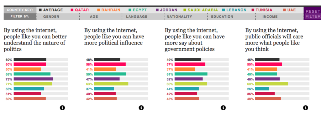
Example: We turned 10 million cells of data from a Northwestern University Qatar survey into a clean, colorful, easy-to-navigate piece. The interactive allows for exploratory storytelling, where the user can decide what data they are most interested in.
Learn more about the benefits of interactive stories.
MOTION GRAPHICS
Motion graphics are particularly useful when you have an abstract concept or a story that needs more context to connect the dots. It is a contained storytelling format, which makes it easier to deliver a succinct story or direct message. It is also passive, allowing the viewer to sit back and absorb.
Good for: Telling a succinct story in a short amount of time.
Example: We collaborated with NBC Universal to create a motion graphic encouraging Americans to reduce food waste, using data from the Natural Resources Defense Council.
Check out 6 awesome examples of storytelling through motion graphics.
VIDEO
Video has become an increasingly popular medium, largely thanks to social platforms. Like motion, video can also incorporate text, graphics, and data visualization and offers an opportunity to demonstrate creativity. However, perhaps its strongest selling point is its ability to put a “human” spin on data stories by putting actors front and center.
Good for: Telling a succinct story in a short amount of time, especially when you are trying to create an emotional connection with the content.
Example: We partnered with Foodbeast and Totino’s to help tell a data story about Americans’ binge-watching habits. Using the actual Totino’s product as a visual challenged us to come up with creative data visualization.
Learn more about why humans are so attracted to video.
REMEMBER: STORY FIRST
No matter what data visualization format you choose, remember the basics that will make it succeed: Strong data and a strong story. If you need a little help in that area, here are some things that might help:
- Learn more about why data storytelling is so powerful.
- Find out how audience personas make sure your data stories will capture people’s interest.
- Check out these 9 sources for great data.
- Dive deeper into data storytelling with our book Infographics: The Power of Visual Storytelling.
Source: Visual News
July 4, 2017
5 UX tips from Facebook’s VP of Design
Julie Zhuo, VP of product design for Facebook, has been at the company since 2006. Since joining, she’s helped grow the service from eight million college and high school kids to over one billion people worldwide.<p>How’d she do it?<p><b>Do more</b><p>Julie is a huge proponent for getting your hands dirty. When …
Source: CW’s Flipboard Feed
July 3, 2017
Transform your room into a real-life Holodeck with this 360 VR projector
Fancy a Star Trek-style Holodeck in your own home? A VR startup based in Barcelona, Spain, wants to make such a thing a (non-virtual) reality, courtesy of its awesome 360-degree projector.
The post Transform your room into a real-life Holodeck with this 360 VR projector appeared first on Digital Trends.
Source: Digital Trends VR
July 3, 2017
Queen’s ‘VR the Champions’ delivers a live show to your virtual reality headset
VR the Champions gives Queen fans the chance to completely immerse themselves in a live performance recorded in Barcelona last year, thanks to 4K 360-degree video and ambisonic audio.
The post Queen's 'VR the Champions' delivers a live show to your virtual reality headset appeared first on Digital Trends.
Source: Digital Trends VR
July 3, 2017
4th of July Illustration by Brian Miller
4th of July Illustration by Brian Miller
BBQs, sunset gazing, fireworks are the little things experienced on this 4th of July long weekend celebration. Others have something else in mind, let’s look at this 4th of July illustration by Brian Miller where you have a sunset, a lake and kayaks. Love how this illustration is separated in three parts from the far mountain down till the lake. We love also how Brian Miller shares his illustration process as well, make sure to check it out on his Behance.
Brian Miller is an illustrator based in Erie, Colorado, USA. Being the artist behind Orlin Culture Shop, we have featured his work before on ABDZ, make sure to follow his work on Behance.
Next up in the OCS’s series for REI is the 4th of July Clearance Sale illustration. This piece was a favorite to work on because I couldn’t help imagining what it would be like to paddle a kayak on those serene sunset waters…


As always, I want to thank REI and the fine folks who gave me the opportunity to create. These kinds of pieces are so special to me and I am honored to work with them. I also want to thank my agent, Deborah Wolfe, and her tireless efforts to keep the business machine running.
Links
- Find out more about Brian Miller: orlincultureshop.com
- Follow Brian Miller on Behance
AoiroStudio
Jul 03, 2017
Source: Abduzeedo Illustration
July 2, 2017
‘Step Brothers’ Sequel: Will Ferrell Says There’s Still a Chance for More Activities — Watch
If you’re hoping for a “Step Brothers” sequel, don’t give up hope just yet. Will Ferrell appeared on “Watch What Happens Live with Andy Cohen” a few nights ago, and as part of the After Show he fielded questions about follow-ups. It took him a while to get serious, of course: “I’ve got great news for you: no,” Ferrell responded after being asked about future installments of “Elf” and/or “Night at the Roxbury.”
After the actor also replied in the negative to “Old School,” Cohen asked whether there’s any movie Ferrell would like to see get a follow-up. He rubbed his chin for a bit before finally responding, “I’d love to see a sequel of ‘Kramer vs. Kramer.’”
“We talked a little bit about ‘Step Brothers,’” Ferrell finally admitted to cheers from the audience. “So who knows? But, at the same time, you like to create new things.” “Daddy’s Home 2” hits theaters later this year, in case you were wondering.
READ MORE: Marion Cotillard On ‘Step Brothers’: ‘I Always Cry At the End’
Ferrell also talks about being cut from “Romy and Michele’s High School Reunion,” whether “Saturday Night Live” was right to have Donald Trump host the show and a strange Twitter rant he was the focus of. Watch the full segment below.
Stay on top of the latest breaking film and TV news! Sign up for our Email Newsletters here.
Source: IndieWire film
July 2, 2017
‘Solaris’ Video Essay Looks at Past & Present in Andrei Tarkovsky’s Masterpiece — Watch
“Solaris” is among the most melancholy sci-fi movies ever made, which makes sense given its conception — Andrei Tarkovsky is said to have loathed “2001: A Space Odyssey” for being too cold and unfeeling, and so he sought to make something more humane. The result was as emotional as it was cerebral, and utterly haunting.
READ MORE: Stanley Kubrick & Andrei Tarkovsky’s Cinematic Styles Are Compared In Beautiful Video Essay
A new video essay from Jack’s Movie Reviews focuses on past and present in “Solaris,” arguing that the film’s protagonist, Kris, chooses to ignore his past while on earth — something he’s unable to do on the space station hovering above the semi-sentient ocean planet of the title. That manifests itself in the form of Hari, his deceased wife who appears with Kris on the space station; it isn’t his actual spouse, of course, and attempting to reconcile what’s real and what it isn’t slowly wears him down.
This doesn’t have a happy ending, though it initially seems like it might. Watch the full video below.
Stay on top of the latest breaking film and TV news! Sign up for our Email Newsletters here.
Source: IndieWire film
July 2, 2017
Here’s an Easy (and Free) Way to Stop Zoom Lens Creep

Sometimes the most helpful solutions are the easiest.
For anyone who has ever shot with an old, low-quality, or extra long zoom lens, you might be familiar with lens creep. This happens when the lens barrel extends, or creeps, due to its own weight when it’s pointed up or down. It’s incredibly annoying and can actually cost you big time when you need to get a particular shot for a project. There are several inexpensive items out there that help stop lens creep, including the Lensband which is specifically made for it, but if you want to keep your zoom lens in place and not spend a penny doing it, this video by Dr. Jake Newman offers a free solution.
Ah, good ol’ rubber bands—always saving filmmakers when they’re in a pinch. As Newman points out, this idea seems almost too simple to share, but to be honest, I’ve never thought to do this before. In my early days, I had a few temperamental kit zooms that gave me the business every now and again, and like a true noob I had no idea what to do other than keep my hand firmly against the lens barrel to keep it in place.
Source: NoFilmSchool