-
News & Updates
camera
February 16, 2017
Illustration: Colorful Work of Romain Trystram
Illustration: Colorful Work of Romain Trystram
Romain Trystram is an illustrator from Morocco with an incredible portfolio. What really catches my eye is his illustration style with colorful, I dare say, 80s color palette sometimes. There is a mix of abstract and more conventional illustrations. The abstract is the the one that I particularly tend to prefer, however most of them seem to be inspired by architecture or urban scenes. I selected a few illustrations for this post to highlight that.
Romain has done work for major clients, such as IBM, Adobe, Mercedes-Benz, Affinity, Panasonic, Virgin Atlantic and many others. For more information make sure to check out his portfolio at https://romaintrystram.myportfolio.com/
Illustration


abduzeedo
Feb 16, 2017
Source: Abduzeedo Illustration
February 14, 2017
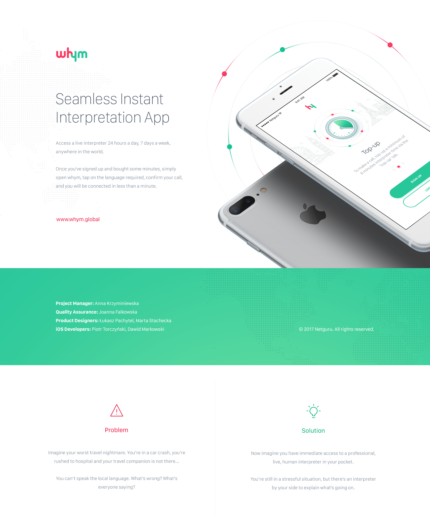
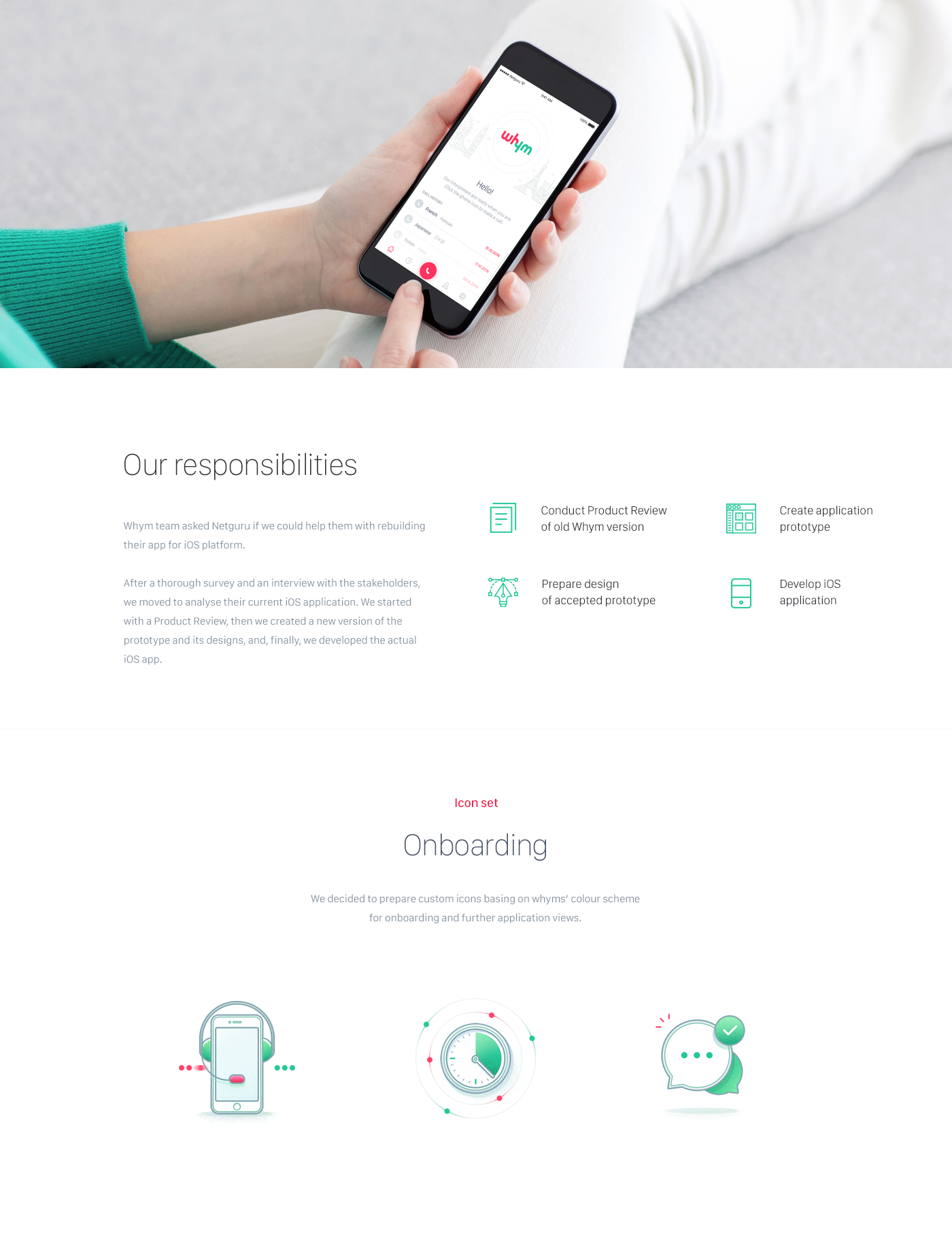
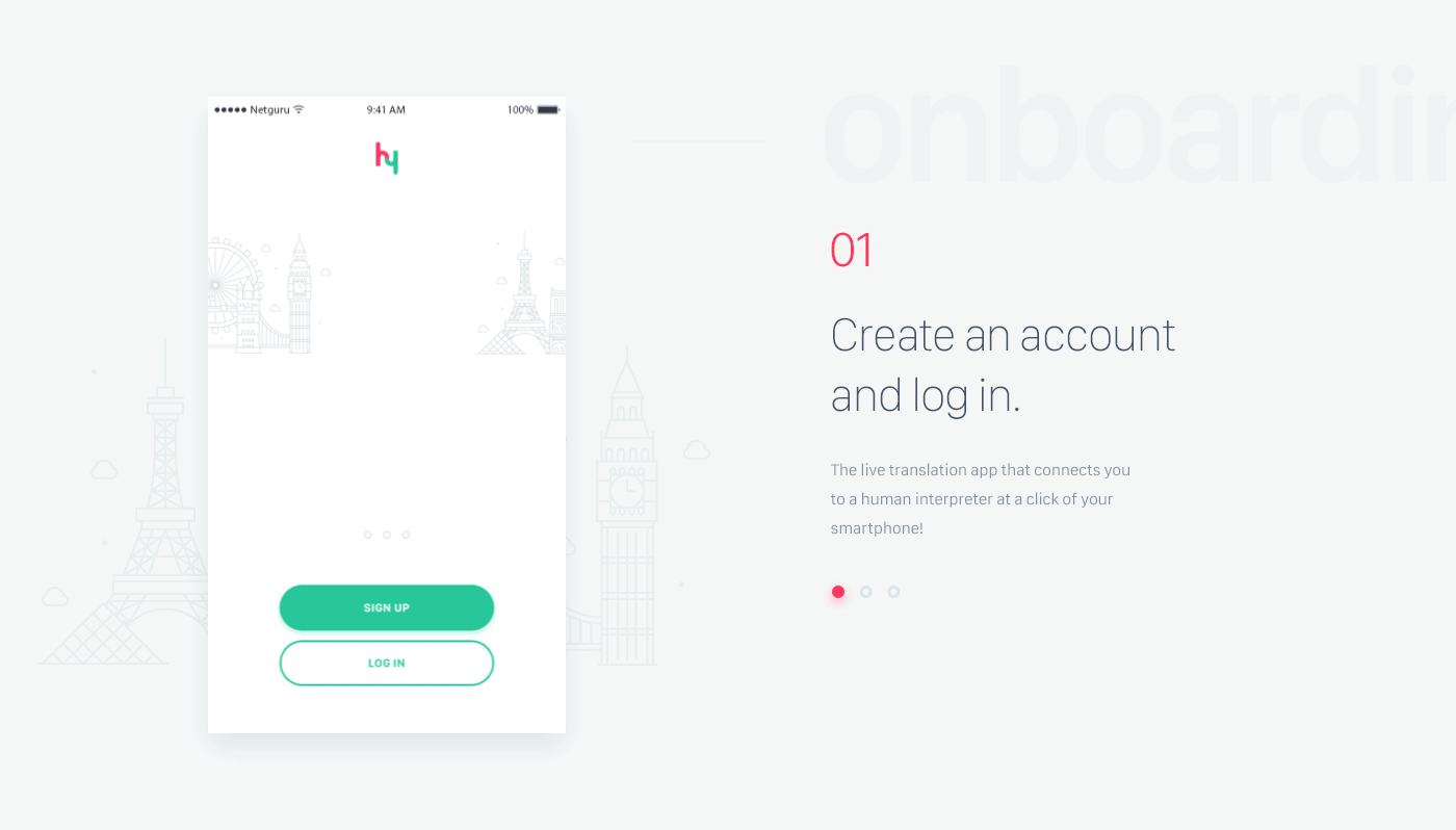
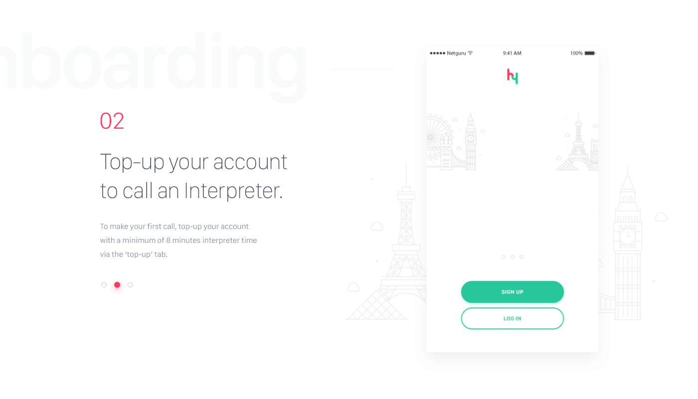
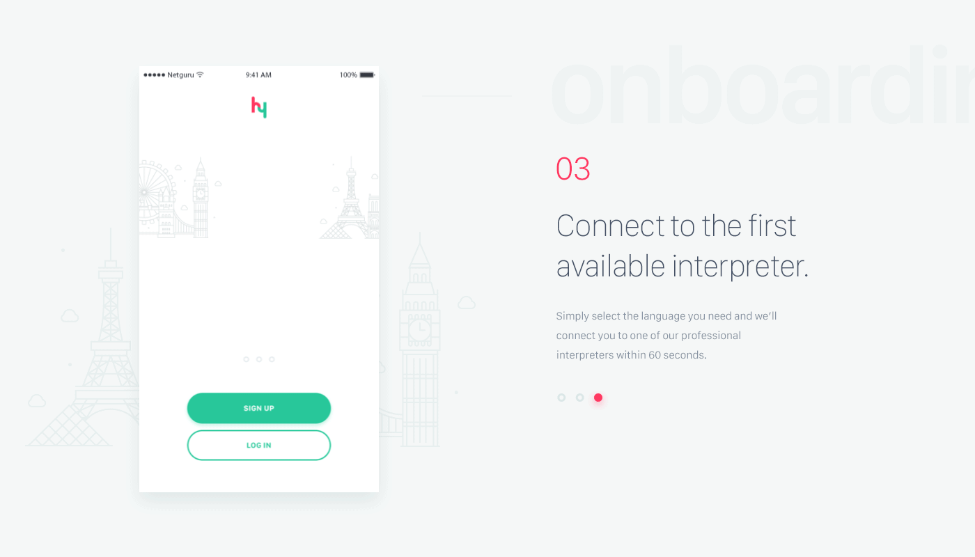
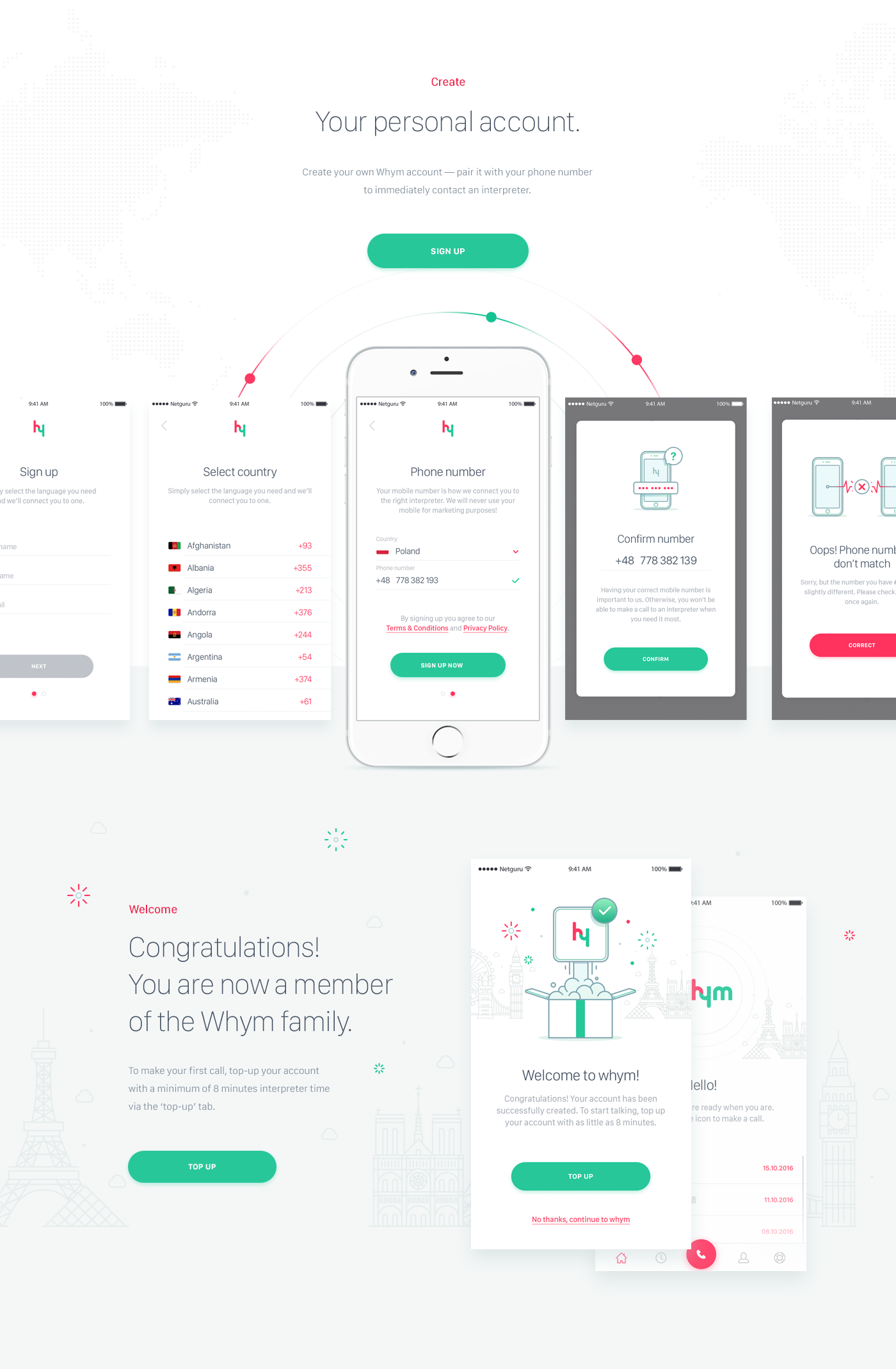
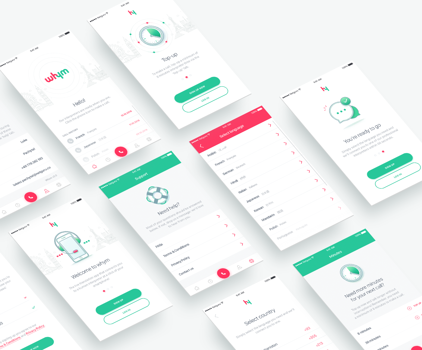
Product Design: Whym – Seamless Instant Interpretation App
Product Design: Whym – Seamless Instant Interpretation App
Whym – Seamless Instant Interpretation App is a product design project shared by the Netguru Team on their Behance profile. As the name suggest the idea is simple, you have an app that provided you access to a live interpreter 24 hours a day, 7 days a week. Simple ideas tend to be the most difficult to execute well but, visually at least (I have not had time to download and play with it yet) it looks quite beautiful. This project covers some of the main user journeys like: onboarding, call and connect with an interpreter and purchase more minutes. It is a quite good example of product design presentation.
Use case
Imagine your worst travel nightmare. You’re in a car crash; you’re rushed to hospital; your travel companion has been arrested by the police. Then imagine you can’t speak the local language. You can’t understand what’s being said; you can’t get people to understand you. What’s wrong? What’s everyone saying?
Now imagine you have immediate access to a professional,live, human interpreter in your pocket. You’re still in a stressful situation, but there’s an interpreter by your side to explain what’s going on.
Product design solution

About Netguru
Netguru is one of Europe’s fastest growing mobile and web development groups. We’ve helped partners scale existing projects and build MVPs. For more information check out: http://netguru.co/
abduzeedo
Feb 14, 2017
Source: Abduzeedo UI/UX
February 13, 2017
Motion Design for UI by Michal Sambora
Motion Design for UI by Michal Sambora
There’s a clear shift or I would say evolution of interface design that relies more in motion design to make it easier for people to understand how to use the application. In addition to that motion design can enhance the visual experience tremendously. Michal Sambora has great examples of subtle and not so subtle animations to illustrate that. There are some quite interesting experiments, especially the real weather project that uses 3D to create dramatic icons for a weather app. Some of the projects seem to be experimental only, but even if they are not based on real implementations, they are still worth checking them out.
Michal Sambora is a interface designer from Cracow, Poland. For more information check out his Dribbble profile at https://dribbble.com/samborek
Motion design for UI


abduzeedo
Feb 13, 2017
Source: Abduzeedo UI/UX
February 10, 2017
Web Design: Redesign of Lux Capital
Web Design: Redesign of Lux Capital
Lux Capital is a web site redesign project shared by Christopher Reath on his Behance profile. This web design effort is an excellent example of graphic design and UI/UX done properly, at least in my opinion. You guys might already know how much I appreciate simple black and white themes for UI and Lux Capital has a lot of that, with a pop of color with the accent red color.
The website was designed to be screen agnostic, so that anyone was able to experience the site regardless of their device or screen size. Typography wise, the site features a bold, Swiss style with Brown and Aktiv Grotesk for the typefaces.
Credits:
- Branding Agency: Mucho
- Digital Agency: Purple, Rock, Scissors
Web design


About the designer
Christopher Reath is a designer at Purple Rock Scissors, a design agency based in Orlando, Florida. Christopher’s work is focused on Graphic Design, Branding and Art Direction. For more information check out his Behance profile at: https://www.behance.net/chrisreath
abduzeedo
Feb 10, 2017
Source: Abduzeedo UI/UX
February 9, 2017
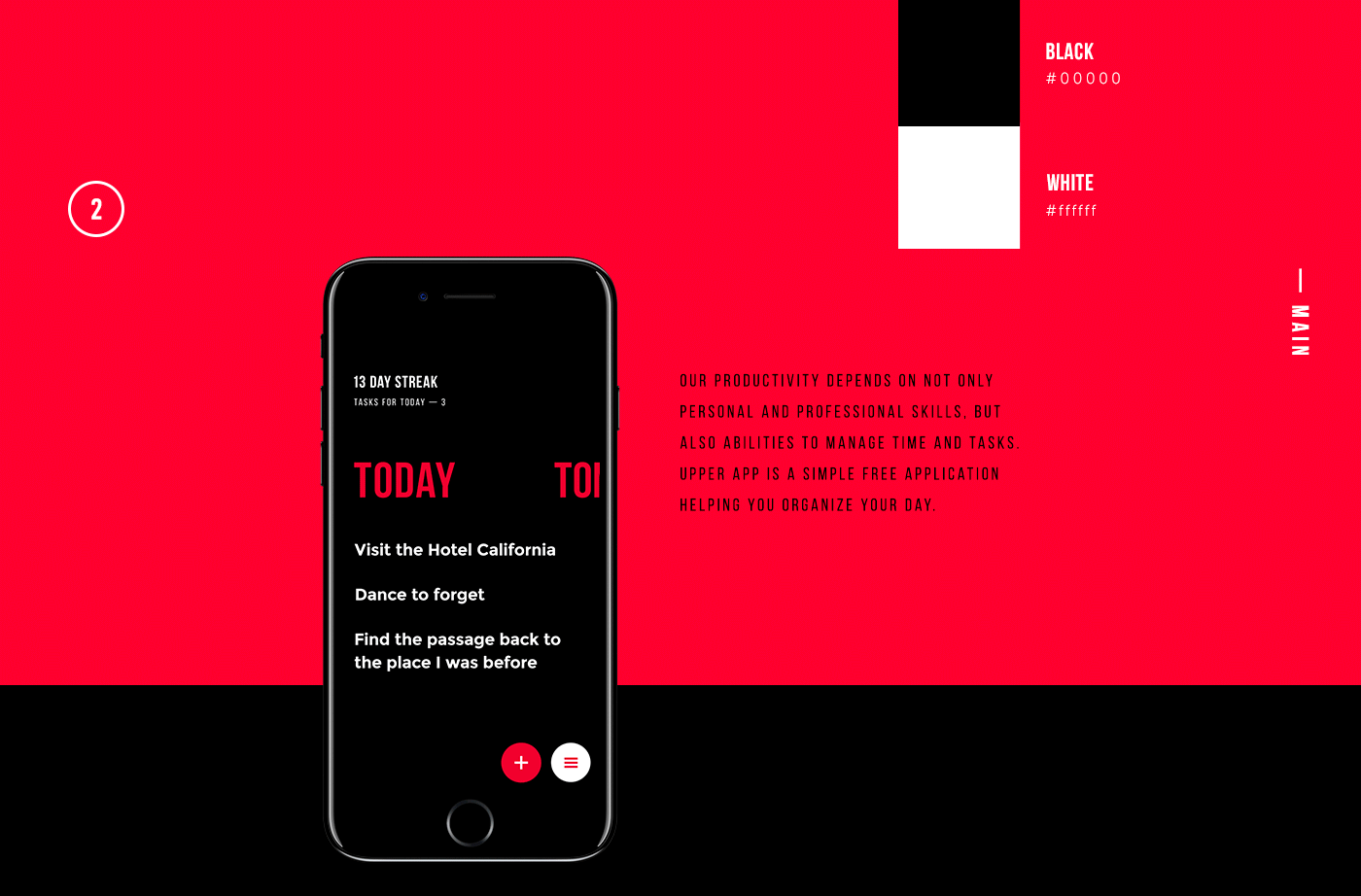
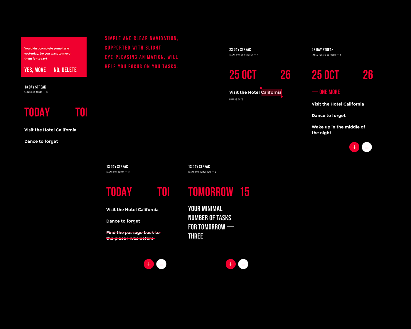
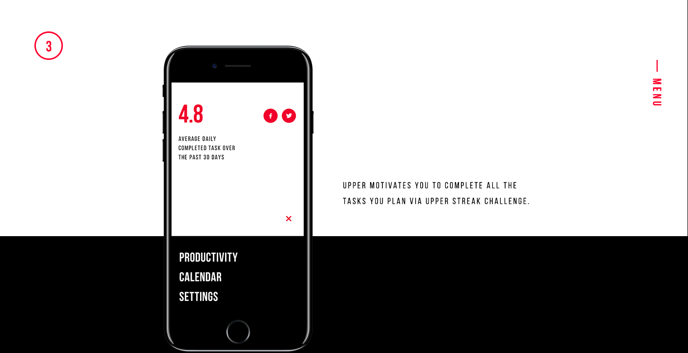
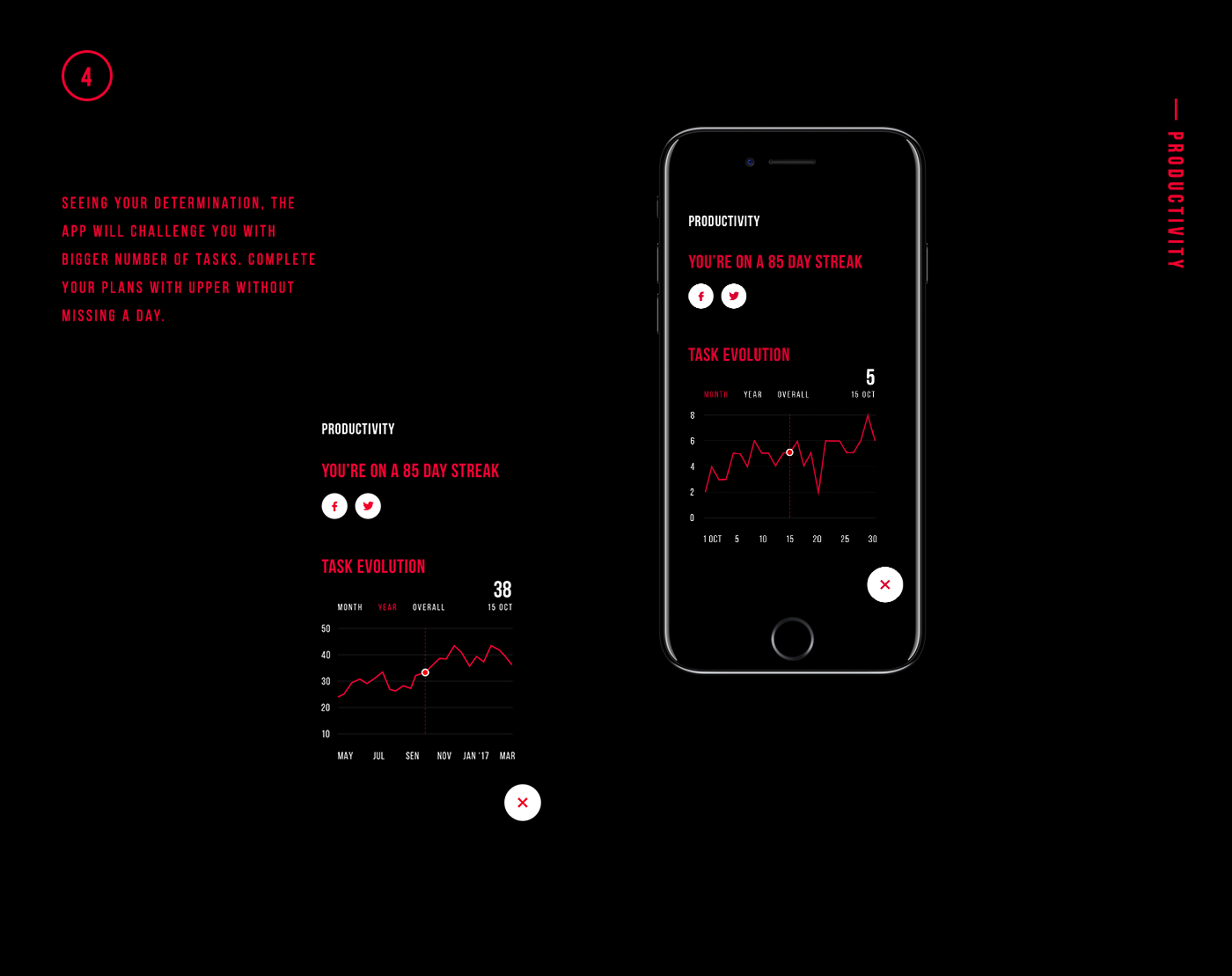
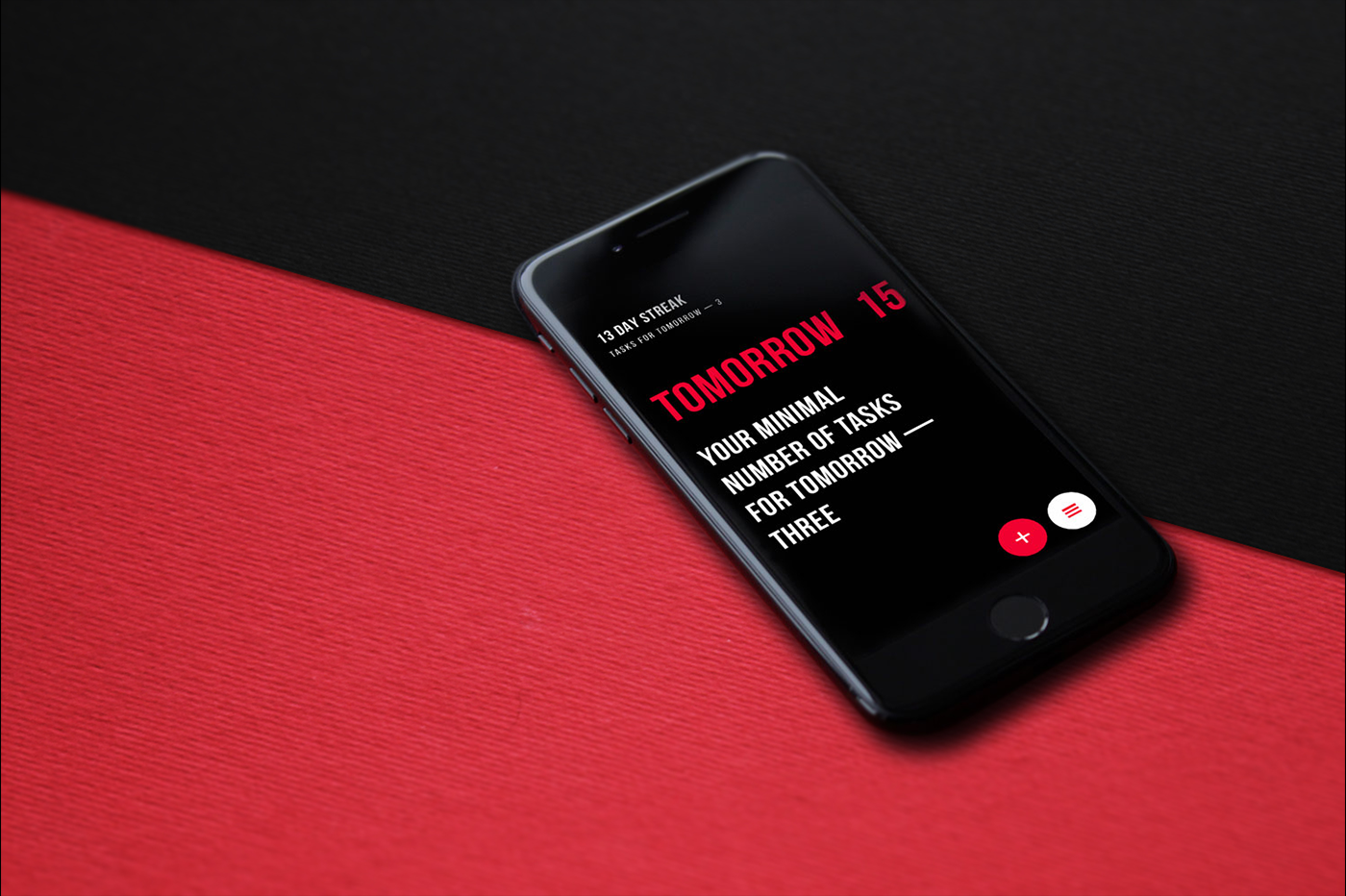
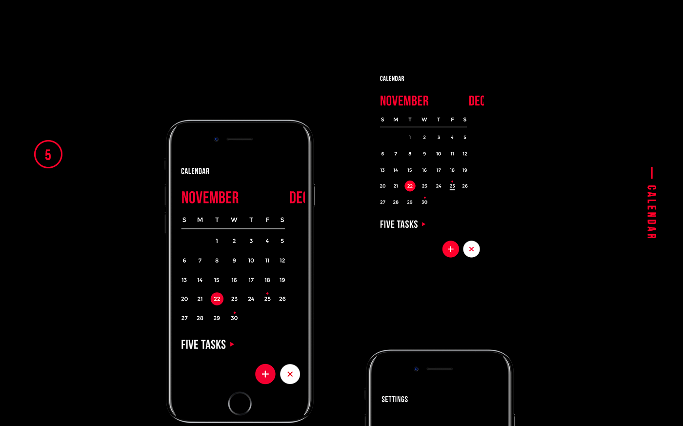
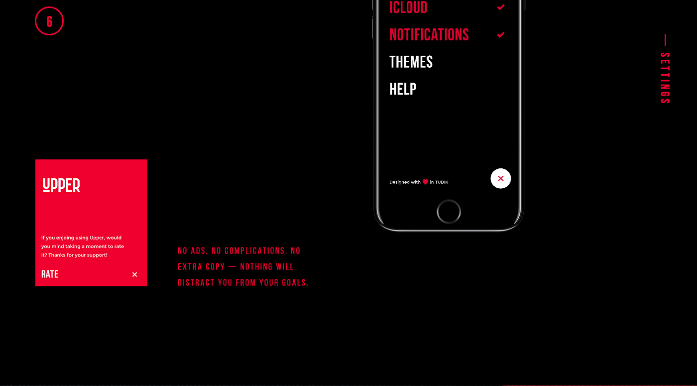
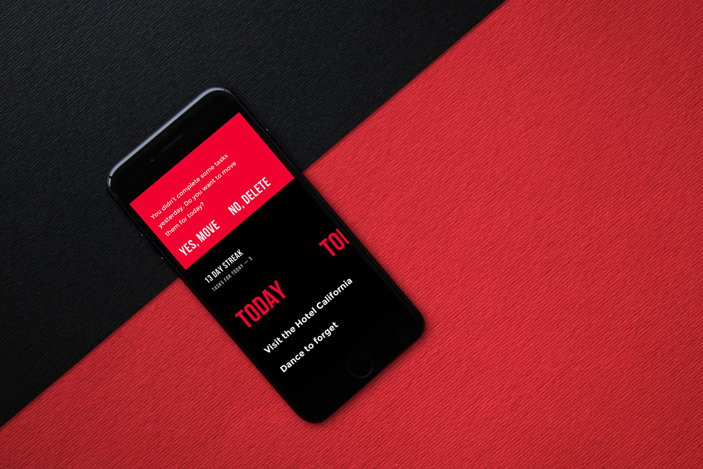
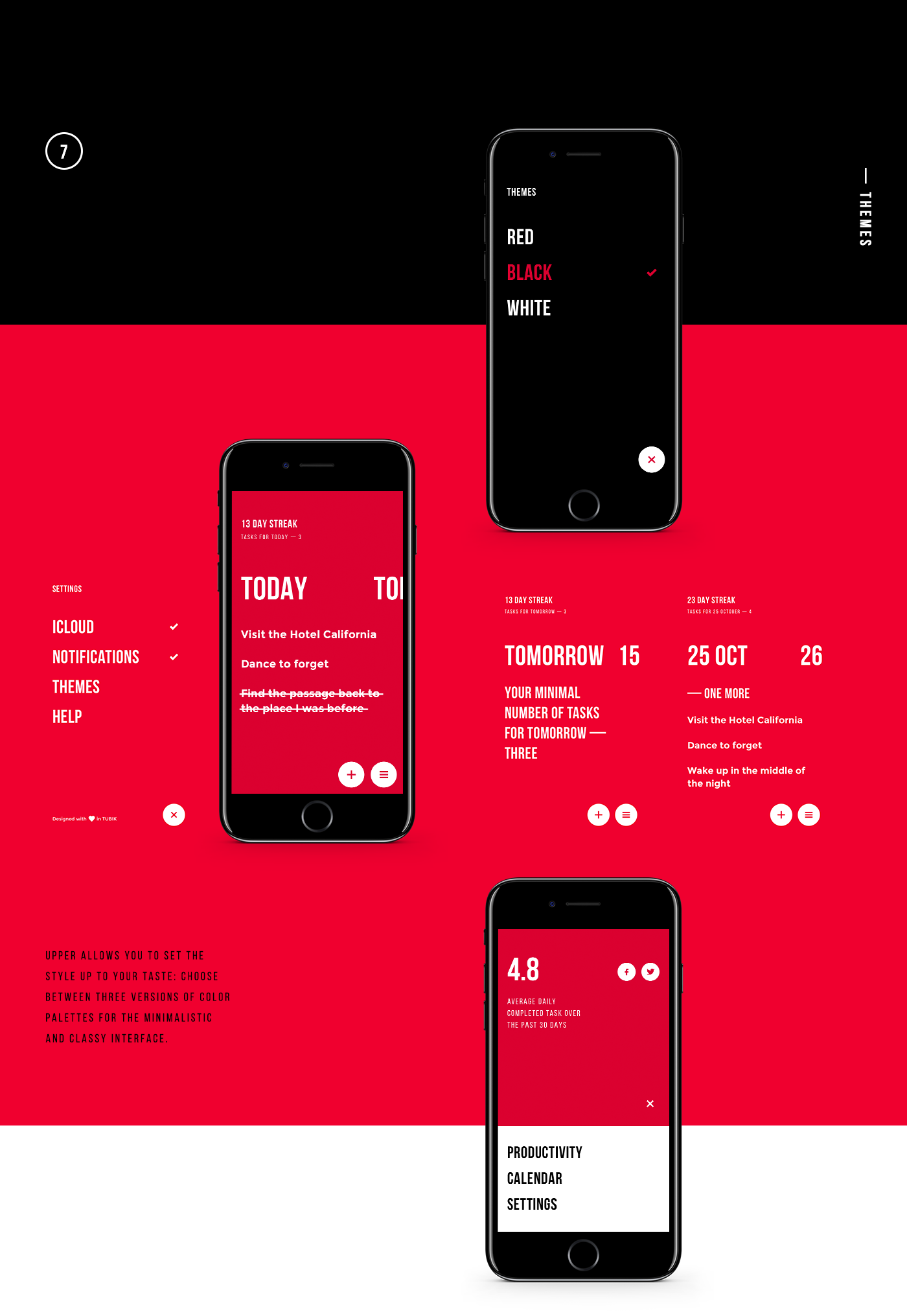
Interaction Design: Upper, Simple To-Do List
Interaction Design: Upper, Simple To-Do List
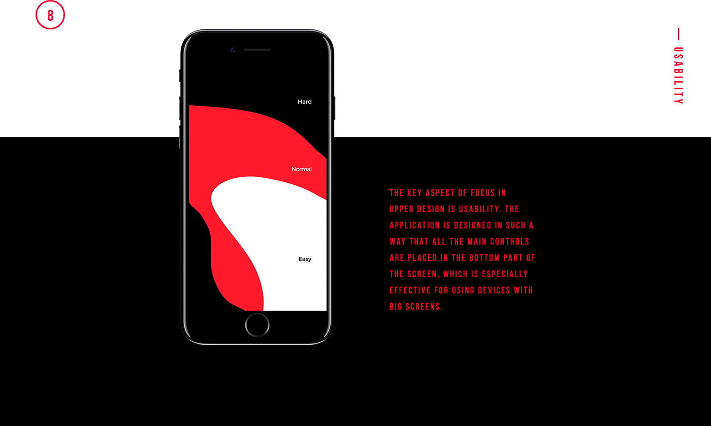
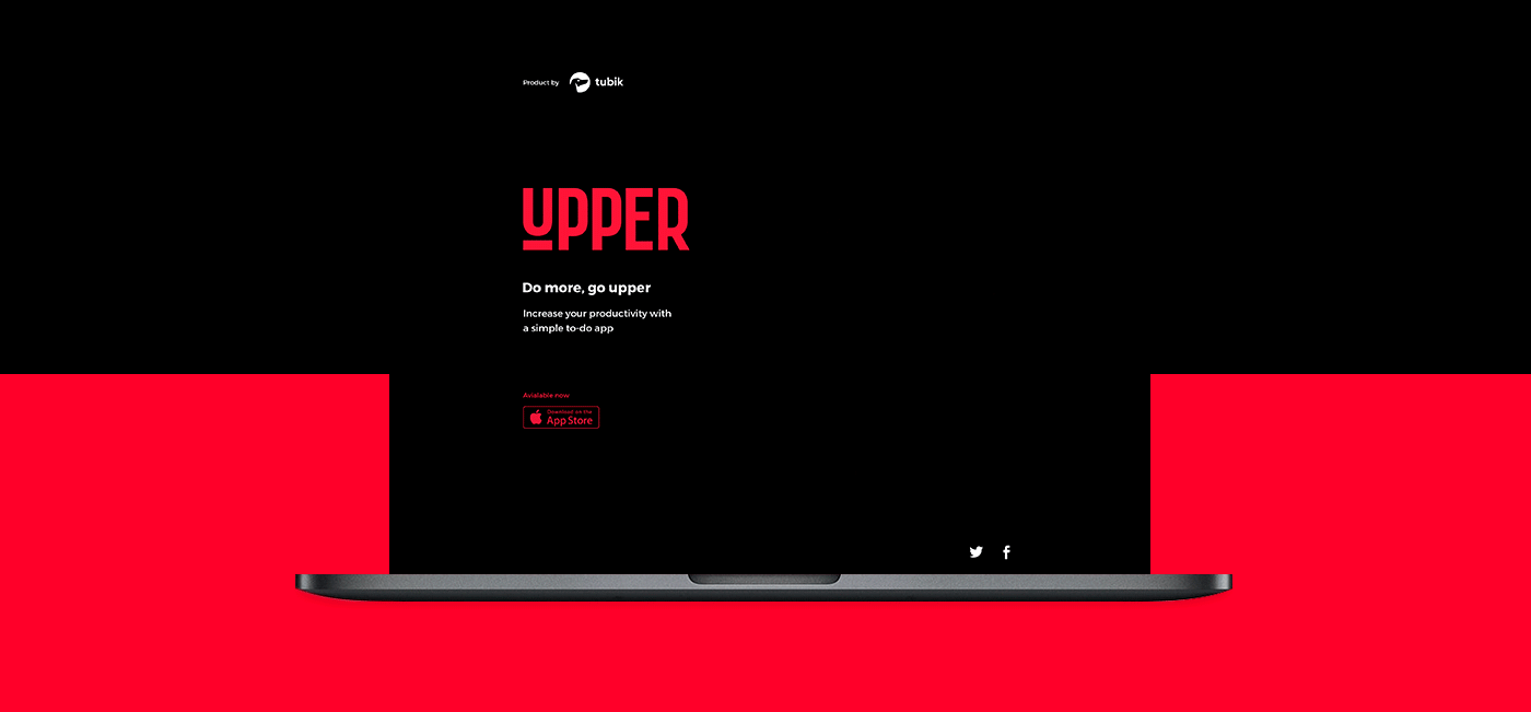
To-Do List apps, I’ve tried them all and have many of them on my phone. Obviously, all my notes are scattered and lost all over. We are taking a look at this interaction design by Tubik Studio. It’s elegant, simple and that’s what is all about right? I would definitely try it after writing this article. You gotta love the interactions and the work on the typography with almost no strokes anywhere making it less looking like a boring table. Give it a look!
Tubik Studio is a studio based in Dnipropetrovsk, Ukraine and they work in multiple parts like web & mobile UI/UX, interface animation, iconography, logo, branding and more. We are great fans of Tubik Studio and they always share the best of what they do and it’s always informative to go through.
Today’s presentation marks out another milestone here in TUBIK: the official launch of our new mobile application for iPhones. Meet Upper, simple and elegant to-do list motivating users and boosting productivity. And it’s totally free for all the users. Here we unveil the details on user interface design for the app: the main objective behind it was to create a stylish and efficient to-do list without any distractions, concentrating user’s attention on their goals. Welcome to get it directly via App Store and try all the features. Productive day to everyone!

AoiroStudio
Feb 09, 2017
Source: Abduzeedo UI/UX
February 9, 2017
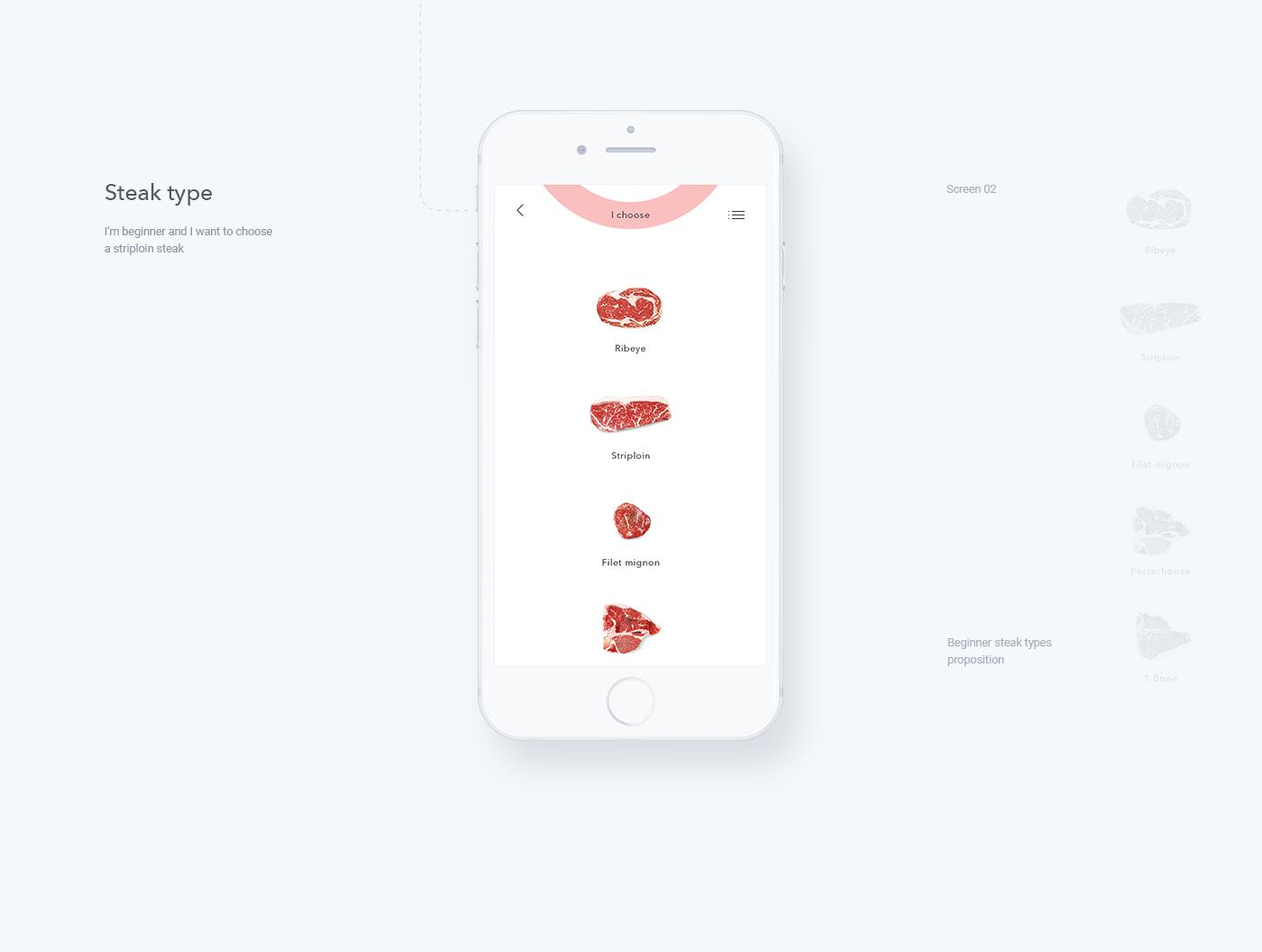
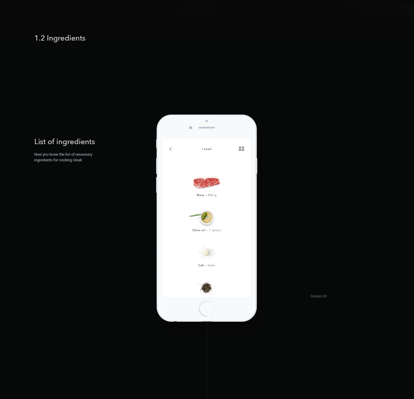
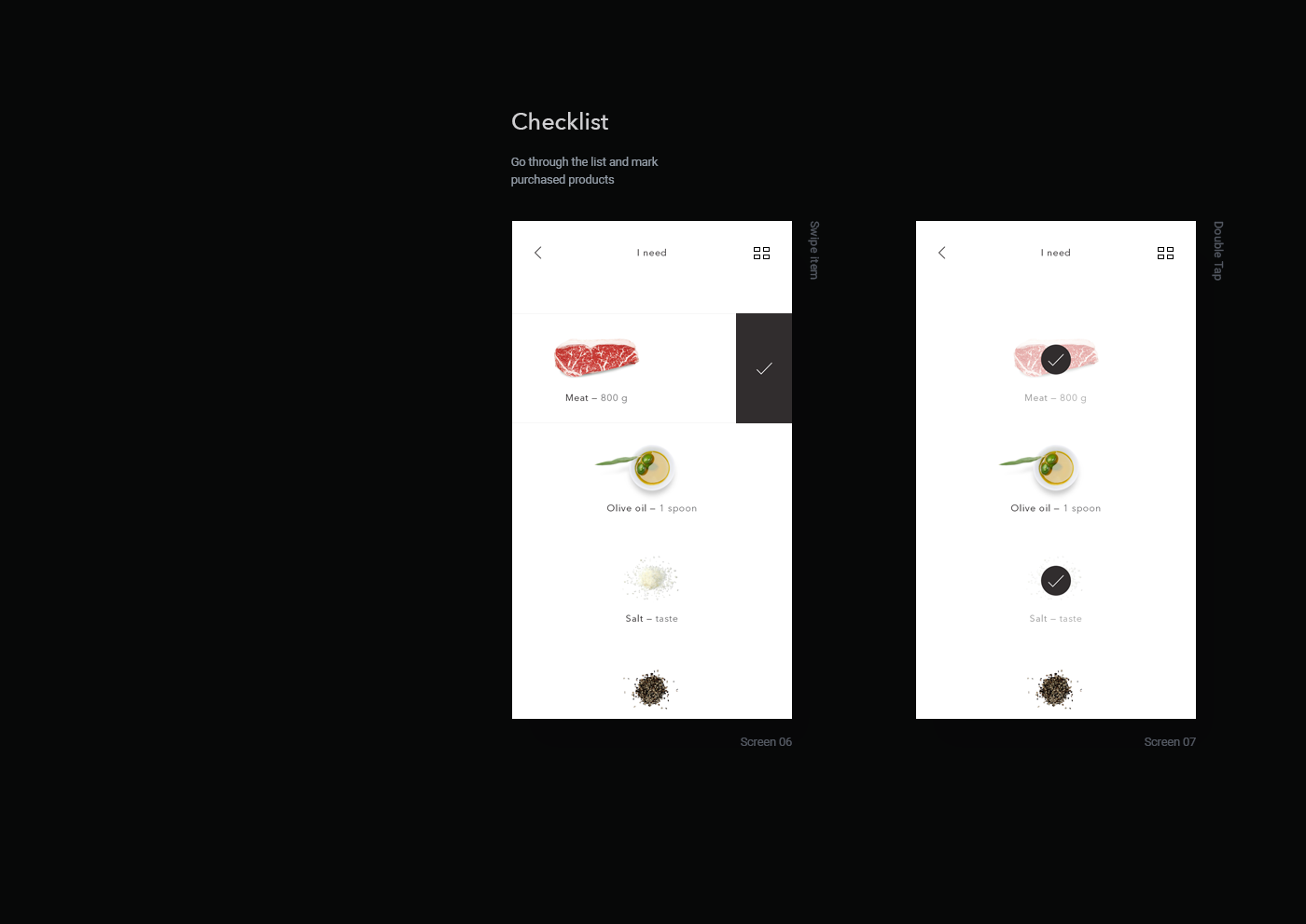
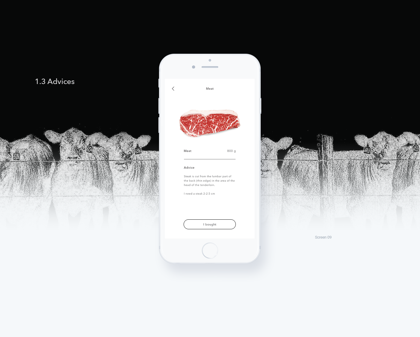
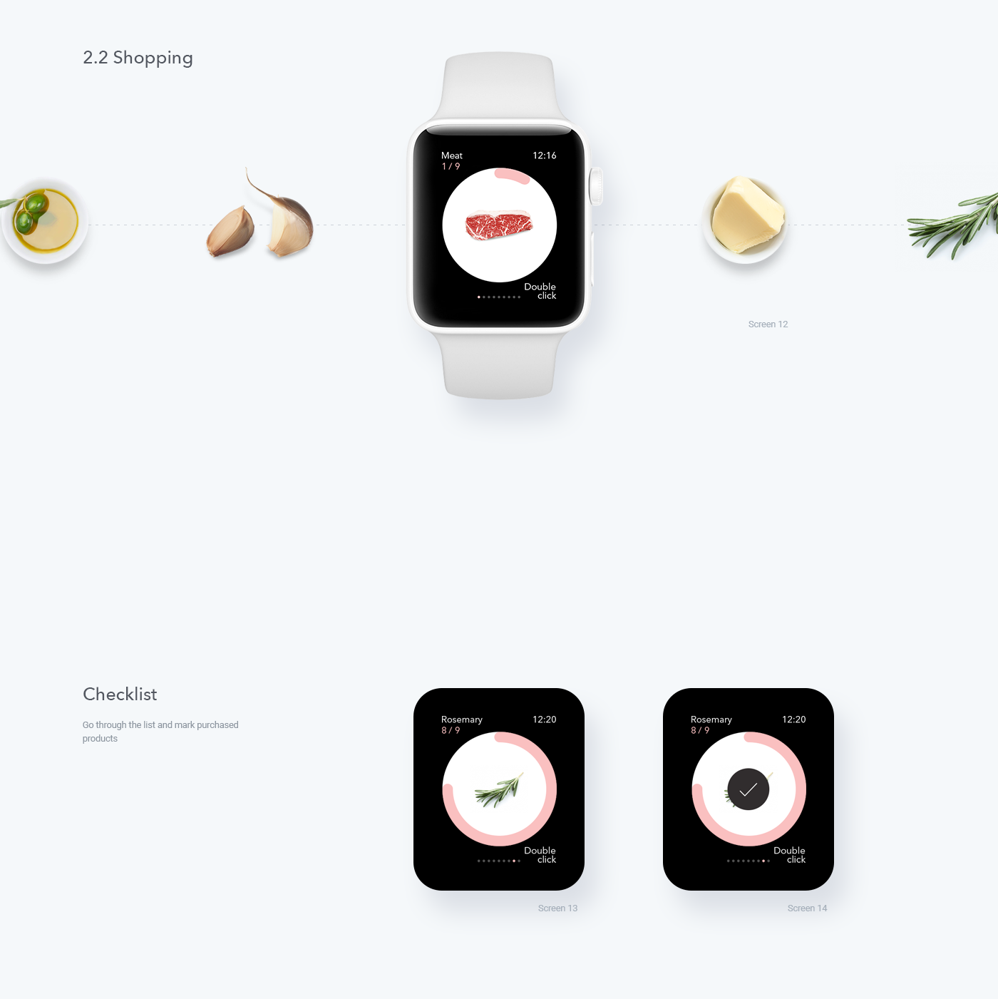
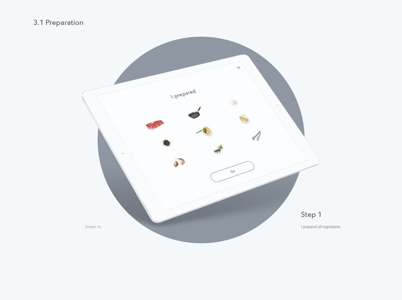
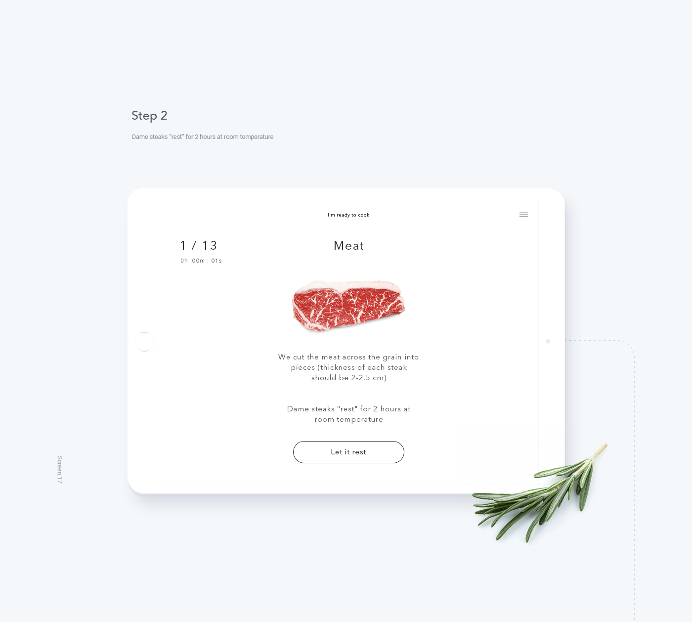
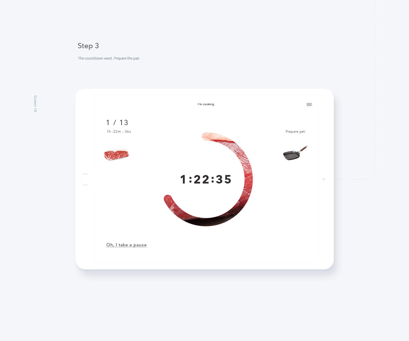
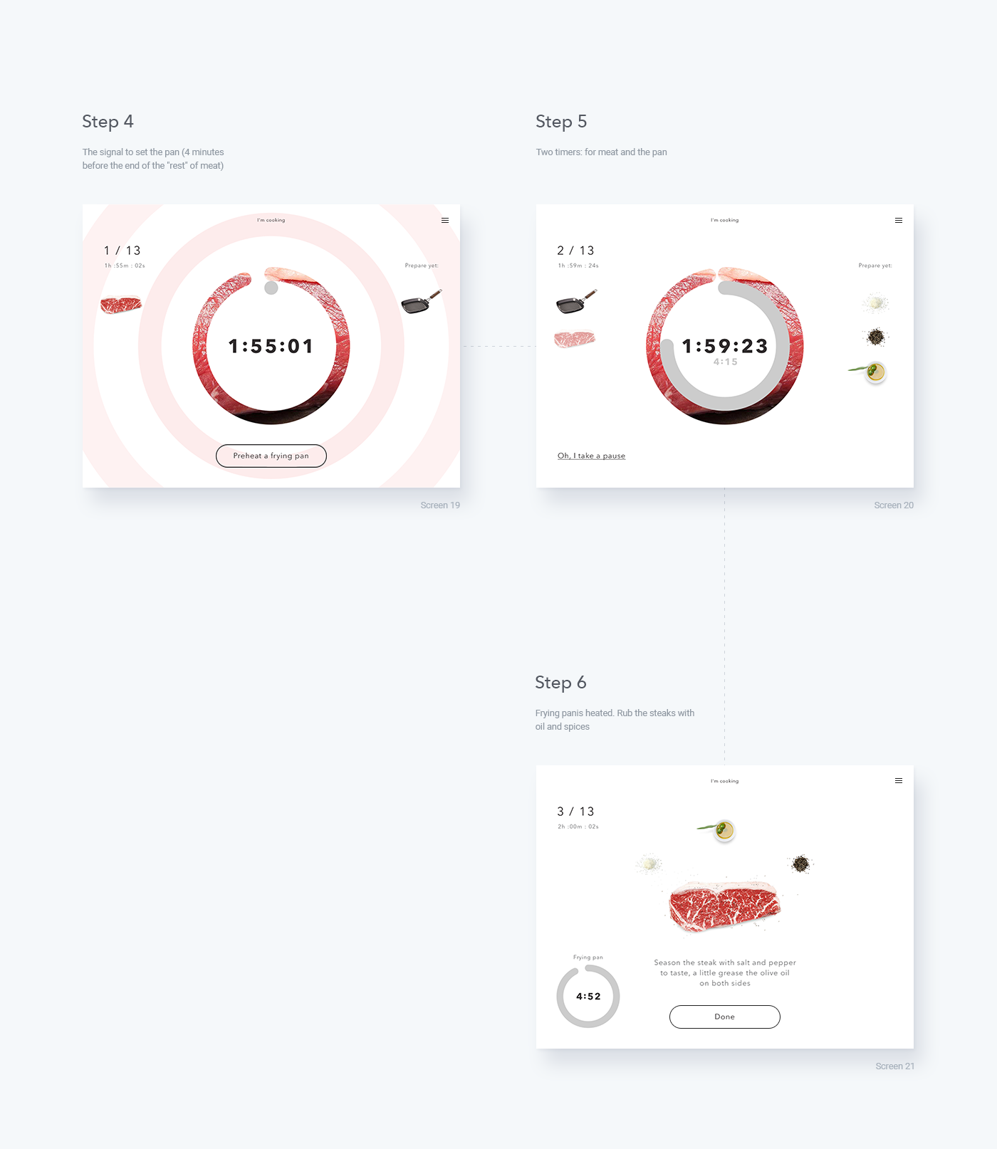
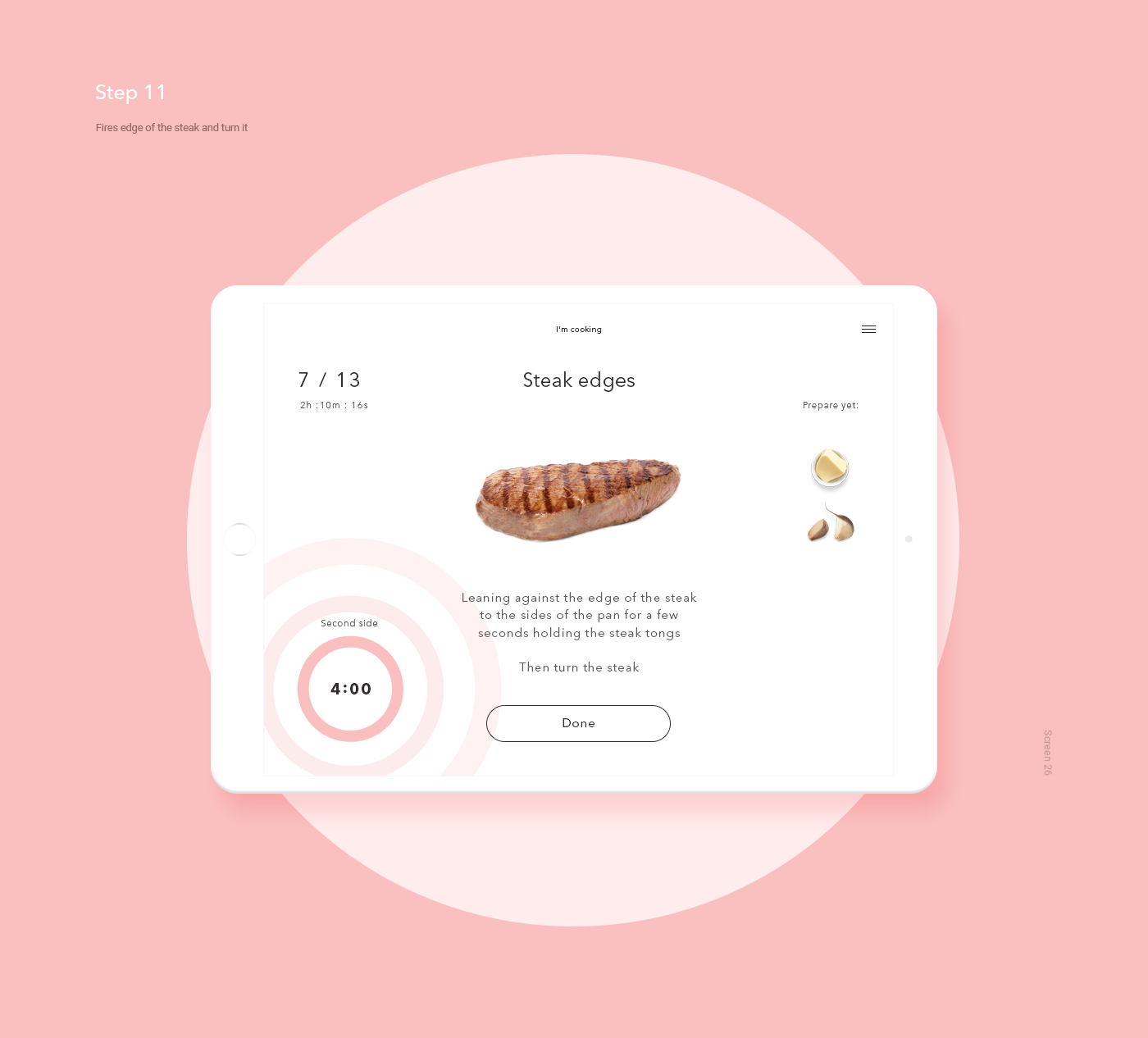
Interaction Design: I, Steak Mobile App
Interaction Design: I, Steak Mobile App
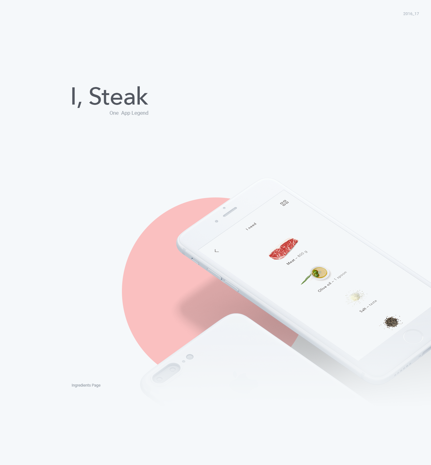
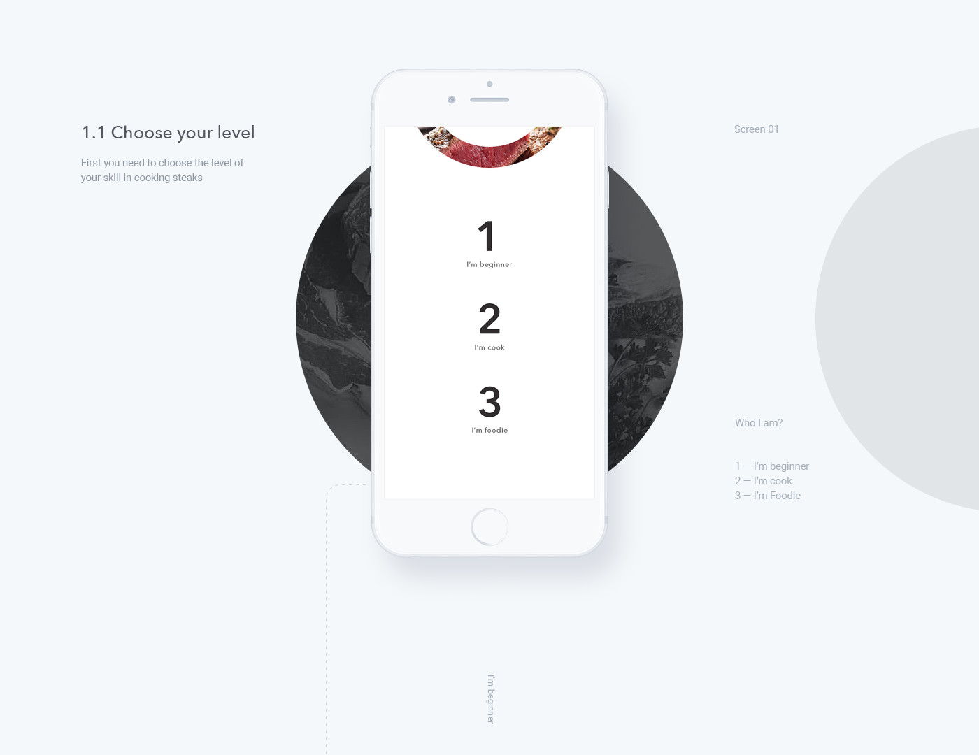
Nowadays, cuisine is something that we have less and less time to give during the day. Even some of us, don’t even how to boil an egg! We are featuring this interaction design about an app called: I, Steak. It’s an assistant app that will help cook the perfect steak! It’s a pretty cool idea since it is quite a task from the picking, shopping and of course cooking. I love the minimal approach!
Published via Behance , Alex Yurkov is a UI/UX web designer based in Moscow, Russian Federation. It’s great of him to focus his work into UI/UX, Web Design and Interaction Design especially early in his career. We are looking forward to see more of his work in the future.
AoiroStudio
Feb 09, 2017
Source: Abduzeedo UI/UX
February 8, 2017
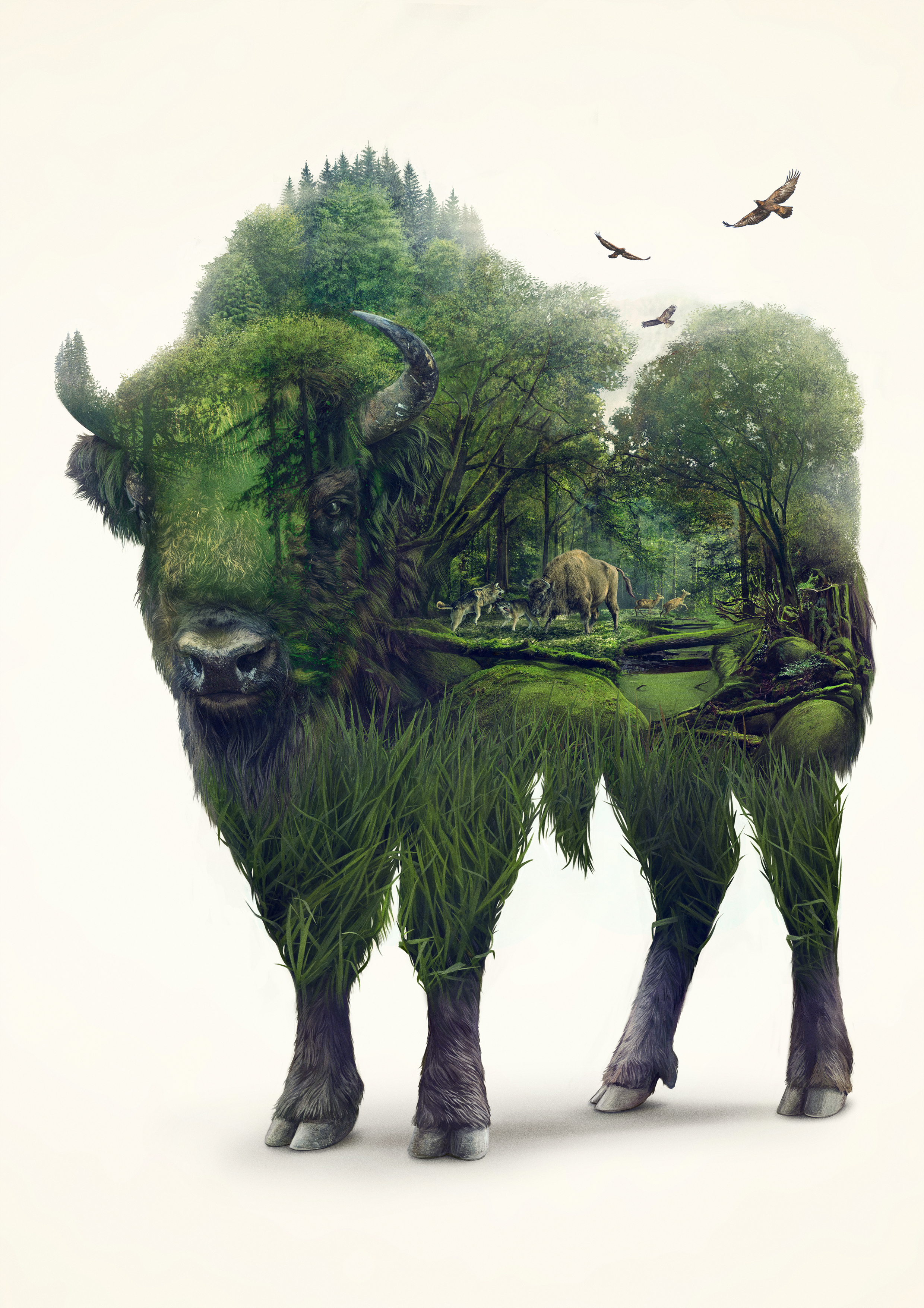
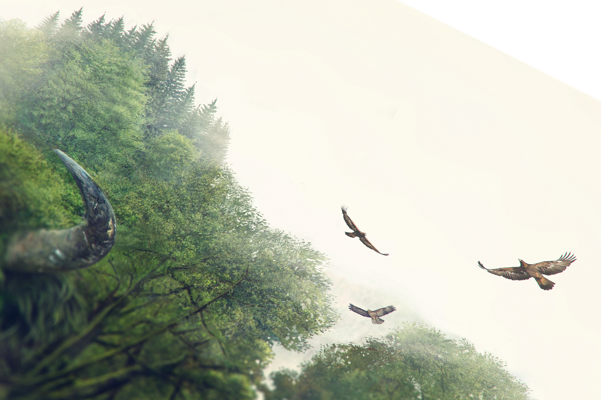
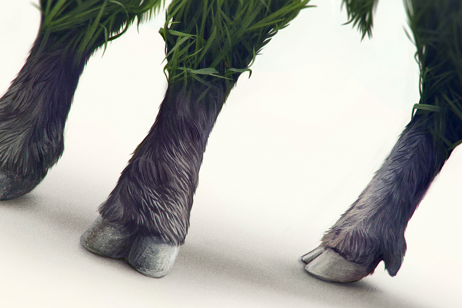
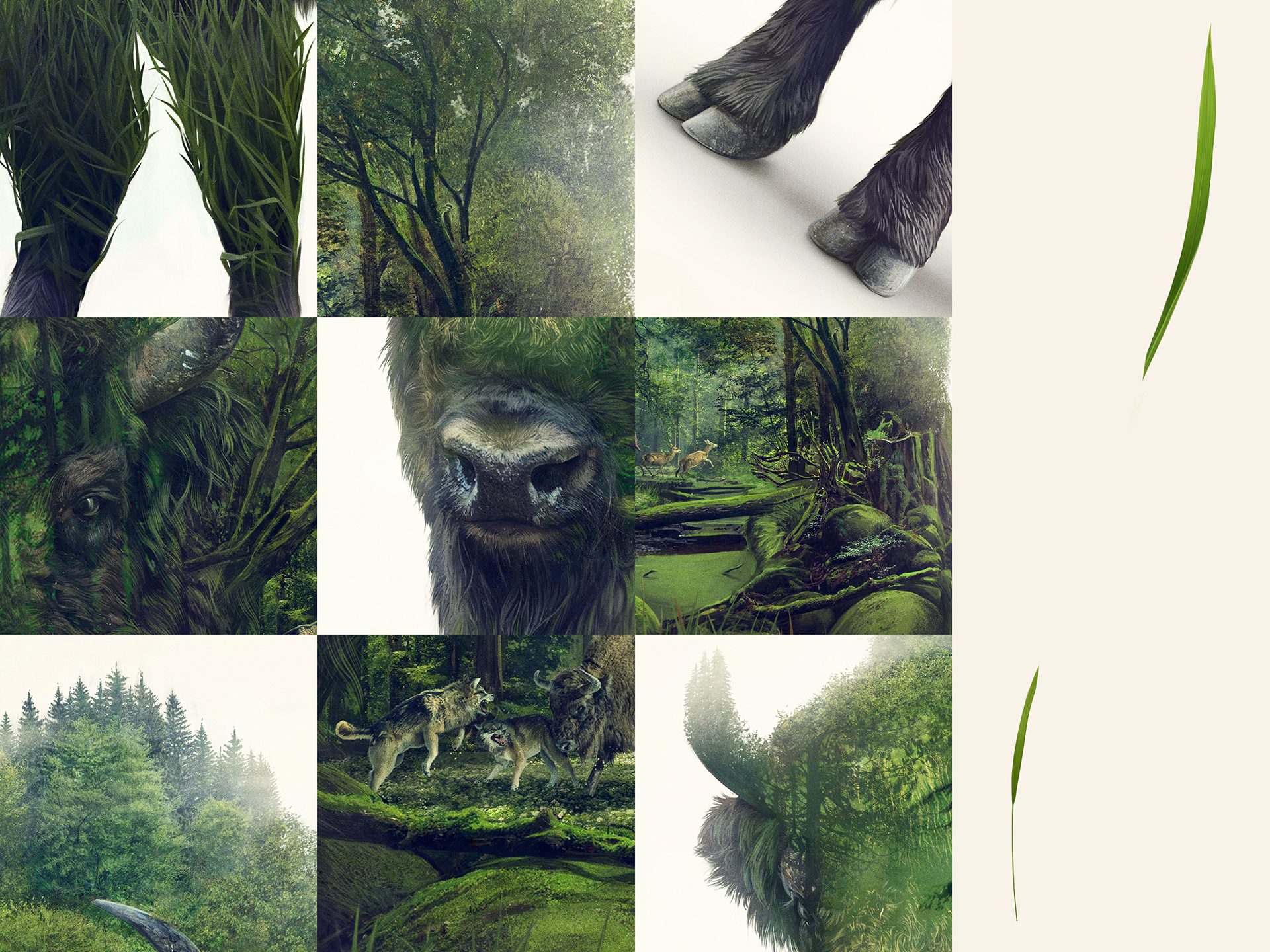
Digital Art: Bison by Lukasz Poslad
Digital Art: Bison by Lukasz Poslad
We would like to share this digital art illustration by Lukasz Poland for a limited edition gift pack tube. There’s something quite powerful about this illustration and I love the use of Double Exposure mixed with a level of details that can only make you stop and appreciate every single part of this image. Stunning work and I wish this was a series with multiple animals. Maybe in the near future!
Published via Behance , Lukasz is an illustrator based in Toruń, Poland. There isn’t much information about him but we look forward to see more of his work.


AoiroStudio
Feb 08, 2017
Source: Abduzeedo Illustration
February 8, 2017
Mobile Photography: Introducing the Next-Gen Moment’s Cases and Lens
Mobile Photography: Introducing the Next-Gen Moment’s Cases and Lens
On Abduzeedo, we do enjoy brands especially independent brands that are the game changers in their areas of expertise, for the main reason to always bring the best to they can accomplish. It is the case for Moment a brand that we dearly love. They are back with a Kickstarter campaign to introduce their latest novelty for mobile photography by bringing to production: a Battery Photo Case, Photo Case and an all-new Wide Lens. Let’s give it a look.
Currently on Kickstarter , Moment is a small company of makers that has one goal and motto. To make the best products in the World for mobile photography. It’s that simple!
We believe that the future of photography is in your pocket. The best camera is the one you have with you, and that camera is your phone. At Moment, we want to make your phone work more like a camera. This is our most ambitious project yet. Introducing not one, but three new products.


Battery Photo Case


Photo Case


New Wide Lens


Video
Make sure to check out and support their Kickstarter Campaign.
AoiroStudio
Feb 08, 2017
Source: Abduzeedo Photography
February 7, 2017
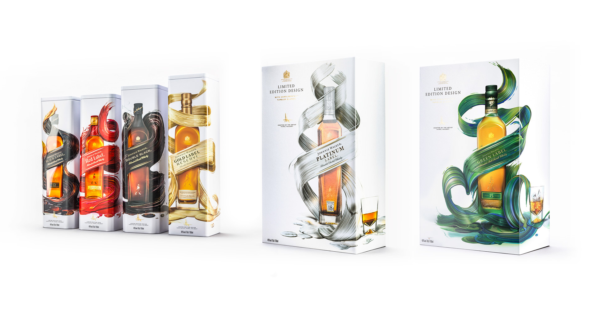
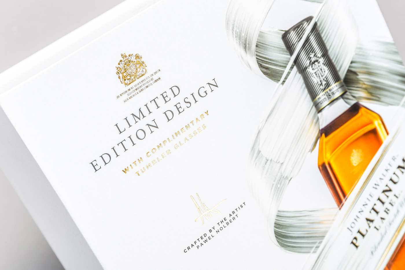
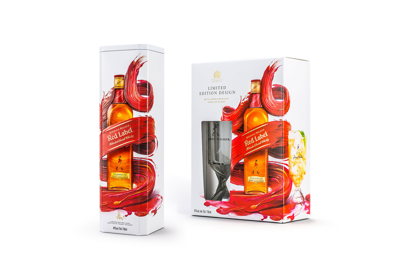
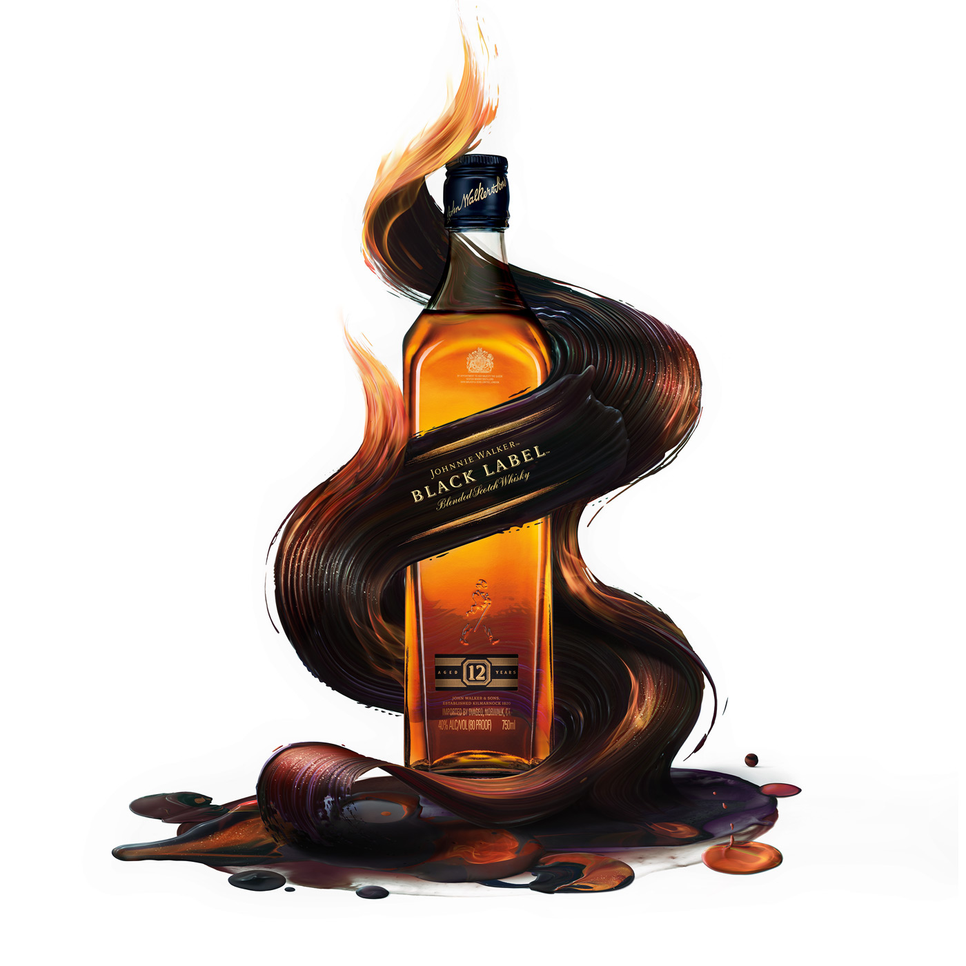
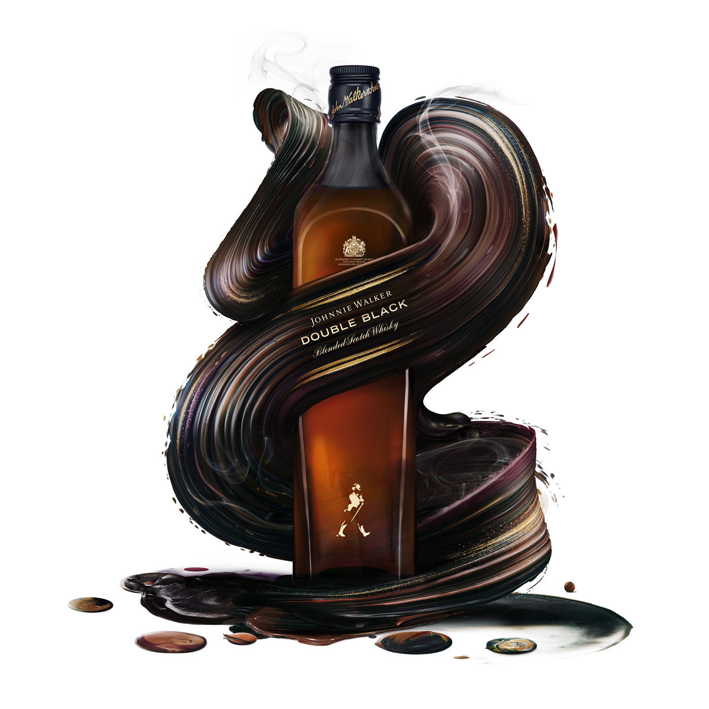
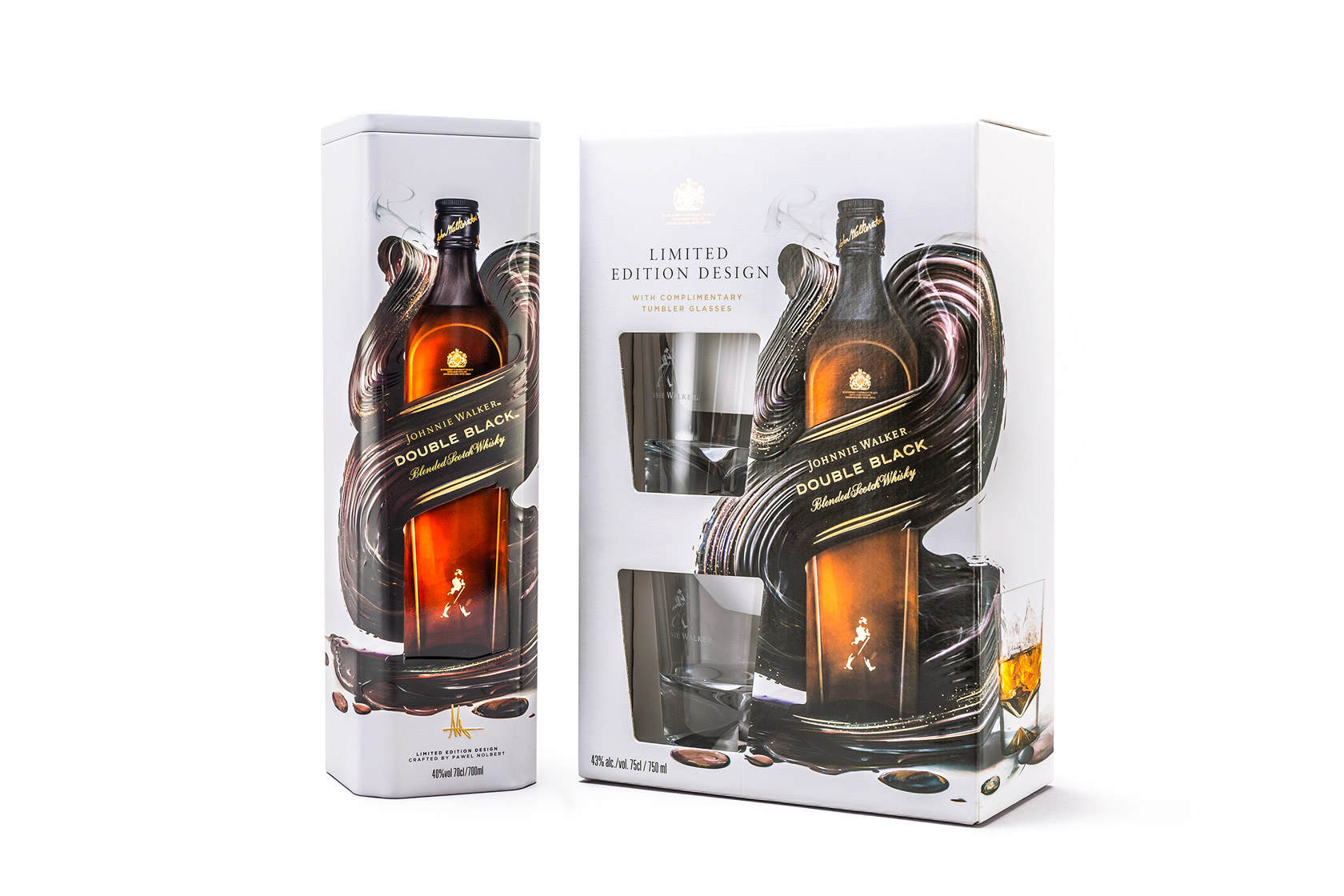
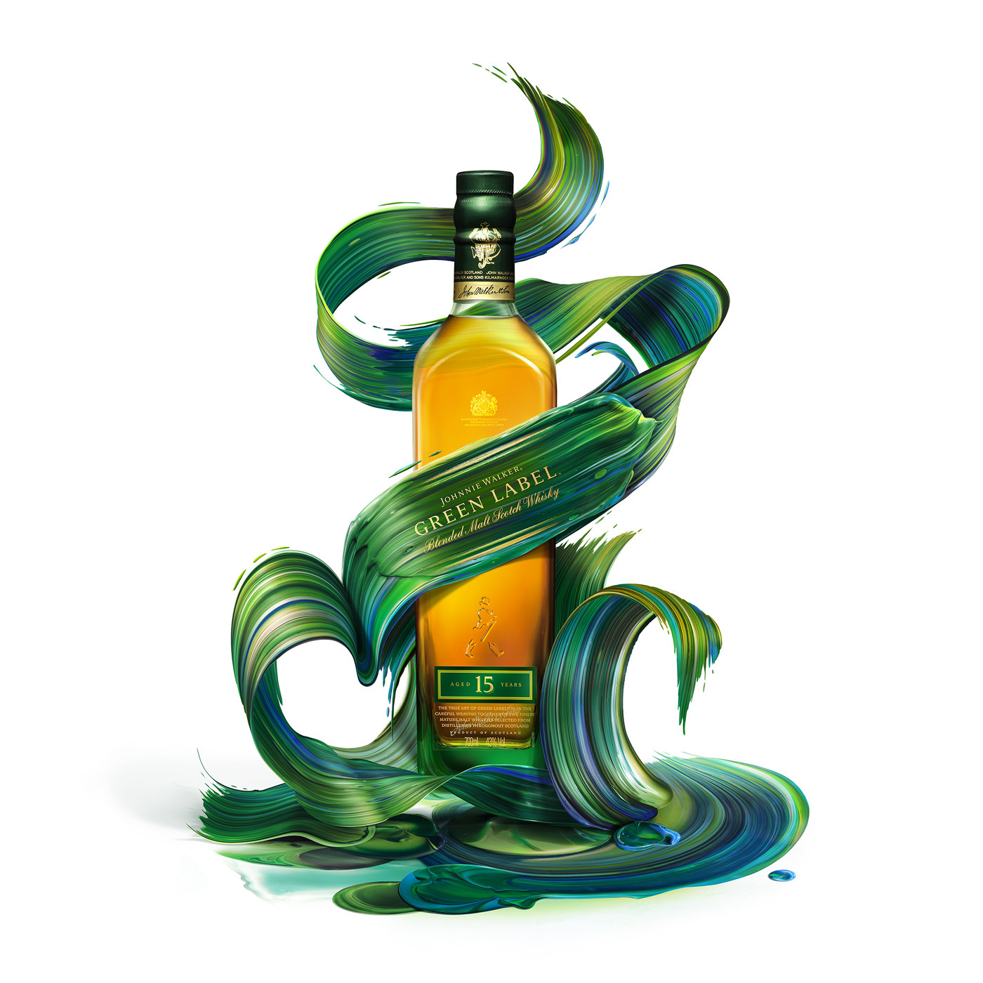
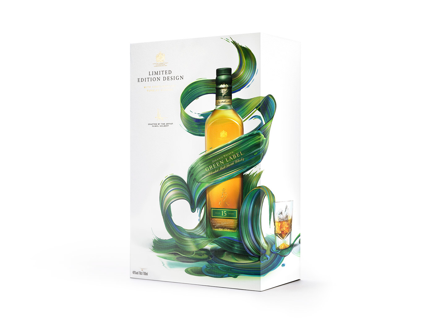
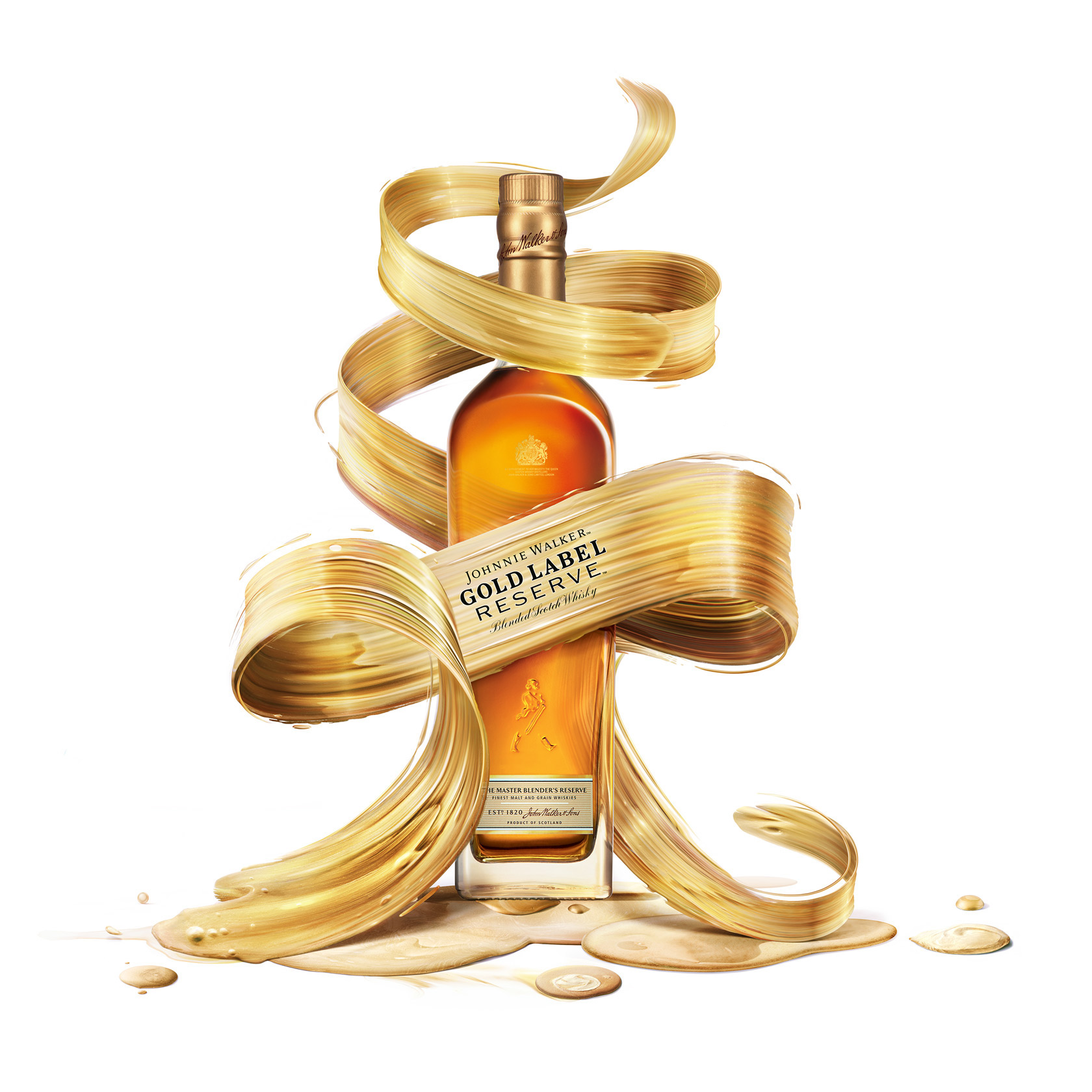
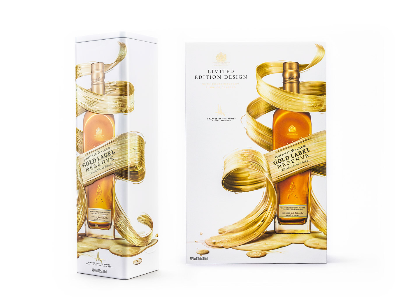
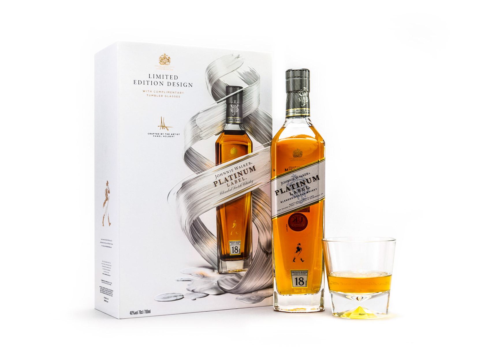
Illustration: Johnnie Walker x Pawel Nolbert
Illustration: Johnnie Walker x Pawel Nolbert
We would like to share this illustration project by the talented Pawel Nolbert for his work with the known Whisky brand Johnnie Walker. Approached by Diageo/LOVE, his work was applied to multiple labels from Johnnie Walker but also for limited edition gift packs. Going through this project ad you can’t help to notice how gorgeous it is and it’s great that Pawel shared some of his process on his Behance. Make sure to check it out!
Published via Behance , we have always been fans of Pawel Nolbert. And from all the mediums that he ever used on his projects, he has a distinct style that is like easily recognizable like a trademark.
The idea was to create 6 designs to be applied across the range of Johnnie Walker variants: Red Label, Black Label, Double Black Label, Gold Label, Green Label and Platinum Label. The result of the collaboration is a selection of limited edition gift packs available around the globe.


AoiroStudio
Feb 07, 2017
Source: Abduzeedo Illustration
February 4, 2017
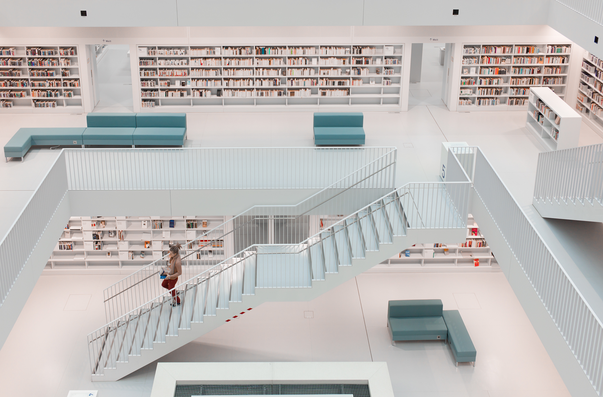
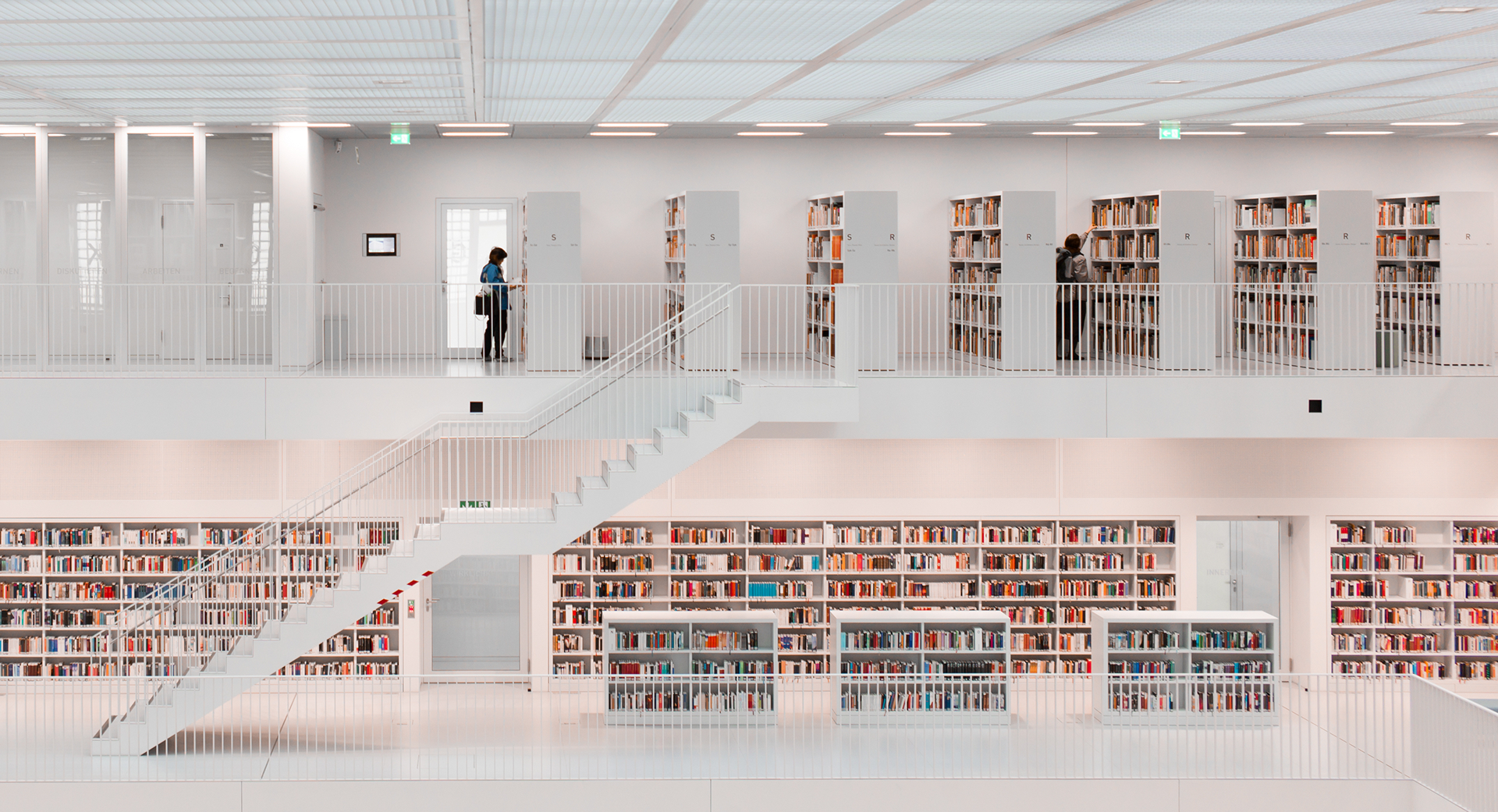
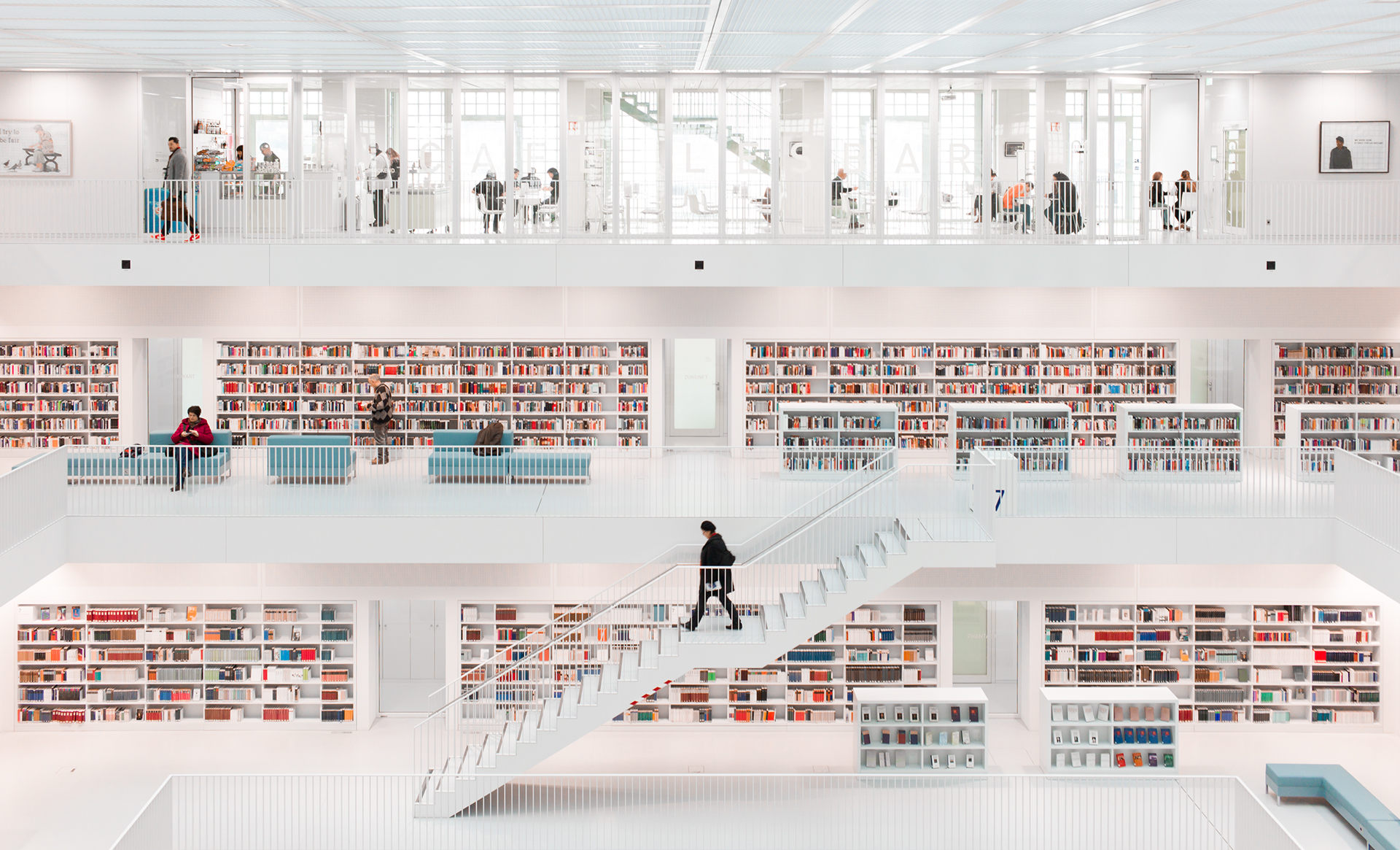
Architecture: Stuttgart City Library
Architecture: Stuttgart City Library
Back when I was in Berlin for Abduzeedo, I was mapping locations that I have loved to see in Berlin. The Stuttgart City Library was a spot that I would have loved to see but with distance constraint and little time; I wasn’t able to. Unfortunately. One day, I would definitely be back to photograph its splendid architecture but by the meantime, let’s go through Hans-Martin Dölz’s experience of this library.
Published on Behance , this project is part of the work from Hans-Martin Dölz. He’s a passionate photographer based in Leonberg, Germany. Looking forward of seeing more work from Hans-Martin in the future.
The Stuttgart City Library in Germany is a location which is frequently visited by photographers. The building was designed by the German-based Korean architect Eun Young Yi. The opening ceremony of the library took place on October 21, 2011, and since then countless photographs have already been taken of both the exterior and the interior. I visited the library in September 2013 for the first time and was deeply impressed by the atmosphere inside the library. The visitor faces completely new visual impressions when compared to other famous older libraries.


AoiroStudio
Feb 04, 2017
Source: Abduzeedo Photography