-
News & Updates
camera
February 3, 2017
Illustration Process: I Lift My Lamp Beside the Golden Door
Illustration Process: I Lift My Lamp Beside the Golden Door
I Lift My Lamp Beside the Golden Door is an illustration created by Jennifer Hom. She was very kind to share with us a little bit of her illustration process from the main goal of the project, to sketches to the final design. It’s always wonderful to see that step by step, especially from an incredible illustrator like Jennifer. I hope you enjoy it and make sure to get one of the prints at: http://jenniferhom.bigcartel.com/product/i-lift-my-lamp-beside-the-golden-door
Illustration Process by Jennifer Home
Through all the changes in America over the last several weeks, it is clear that the country needs to remain true to our spirit. Immigration is the heart of this land and I wanted to do what little I can to protect it. What started as a way cope turned into something that I hope will help support the American Civil Liberties Union. I will donate all profits from the sale of this piece to the ACLU.
Sketches
Like all my concept sketches, this is a nearly indecipherable color pencil drawing. I knew I wanted to feature the Statue of Liberty because of my own mother’s love for it.

Tightening up the sketch to a line drawing in Photoshop, I started to give the people in the torch a little more character. I even drew in some personal loved ones who immigrated to America.

Adding color was simple enough considering I had to stick to the statue’s iconic oxidized copper hues. The final stage was tedious and obsessive color correction.


I hope this inspires others to make a united contribution bigger than our individual means.
-Jennifer Hom
Jennifer Hom began life as a Chinese American girl in suburban Long Island, New York. As a minority with few friends, she found happiness in drawing fairies, unicorns, magical flying unicorns, princesses, and flowers. With the help of a terribly optimistic mother, she used her countless drawings of magical beings to enroll at the Rhode Island School of Design. Now graduated with a BFA in illustration, a grad degree in doodling at Google, and a gig at Uber, she managed to find a home with climate control. She is still Chinese American, but wants to be a Broadway star.
For more information about Jennifer check out her website at http://jenniferhom.com/
abduzeedo
Feb 03, 2017
Source: Abduzeedo Illustration
February 2, 2017
Illustration: Daily Renders: Dimensional UI
Illustration: Daily Renders: Dimensional UI
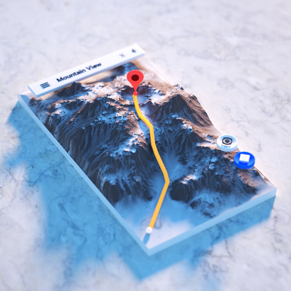
Daily Renders: Dimensional UI is an illustration, motion graphics and UI/UX project created and shared by Fyn Ng on his Behance profile. There’s a not a lot of information shared by Fyn but the illustrations are quite descriptive in terms of what the project is all about. Basically Fyn created three dimensional user interface, literally. The toggles, map and Instagram examples are quite clever and beautiful. I don’t believe there is any desire on having interfaces like that, however it’s a lovely daily challenge and I am sure Fyn learned quite a bit by doing it.
In terms of tools, Maxon Cinema 4D and Octane were using to create the illustration pieces shared in this post.
About Fyn Ng
Fyn is a motion designer from Singapore, currently based in New York working at Razorfish. For more information make sure to check out his website at http://fynng.com/
Perhaps due to my INFJ personality, my passion towards design heightened after being introduced to user-centered design during an internship at Apple. I am intrigued by how it can provide people with smooth, meaningful experiences. Defining a brand’s motion language greatly enhances emotional connection with its users. I look forward to the day I can apply my Motion Design skills in a user-centered company to help build its brand and bring joy to users.
Illustration


abduzeedo
Feb 02, 2017
Source: Abduzeedo Illustration
February 2, 2017
How ‘La La Land’ Cinematographer Linus Sandgren Taught His Cameras to Dance
Oscar nominated cinematographer Linus Sandgren breaks down how he and director Damien Chazelle created long camera movements designed to play an …
Source: CW’s Flipboard Feed
February 1, 2017
Photography: Minimalist Compositions of thismintymoment
Photography: Minimalist Compositions of thismintymoment
This year, once again, I will try to finally achieve my photography goal of posting one photo a day on Instagram. In the past the idea was to take a photo a day but I’ve learned that it gets pretty difficult to conciliate that with work, blog and some rest. Another important thing is having good references, for some reason I was quite passive in that area until Francois, the chief editor of ABDZ sent me some of the photographers he follows on Instagram. One of them was the Minh T aka, @thismintymoment. He became my favorite. I love the style of the photos, the art direction and the subjects. Mixing minimalism with urban style, a lot of concrete and architecture, he is really an inspiration for me to keep practicing.
About Minh T.
Minh T. is an art director and photographer based in California. For more information make sure to check out his work at:
Photography from Instagram


© All rights reserved to Minh T (thismintymoment)
abduzeedo
Feb 01, 2017
Source: Abduzeedo Photography
January 25, 2017
Editorial Design: Typeface Felice the Book
Editorial Design: Typeface Felice the Book
Nico Inosanto is a graphic designer based in Neuchâtel, Switzerland. He focus his work mainly on typography for the making of new typefaces. We are taking a look at actually a book about an elegant and classy typeface of Nico’s called Felice. Taking on the approach of its editorial design work, the book is simply beautiful and conservative with its minimal pages and some highlighting the font with composition to devour.
Nico Inosanto is graphic designer that works mostly with type. Having a passion for typography, Nico spend much of his time making new typefaces. Make sure to follow his work on Behance .
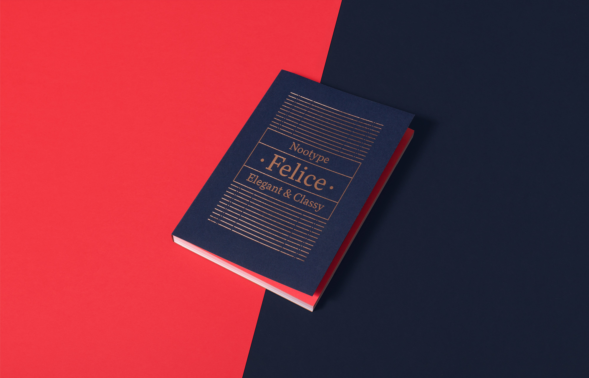
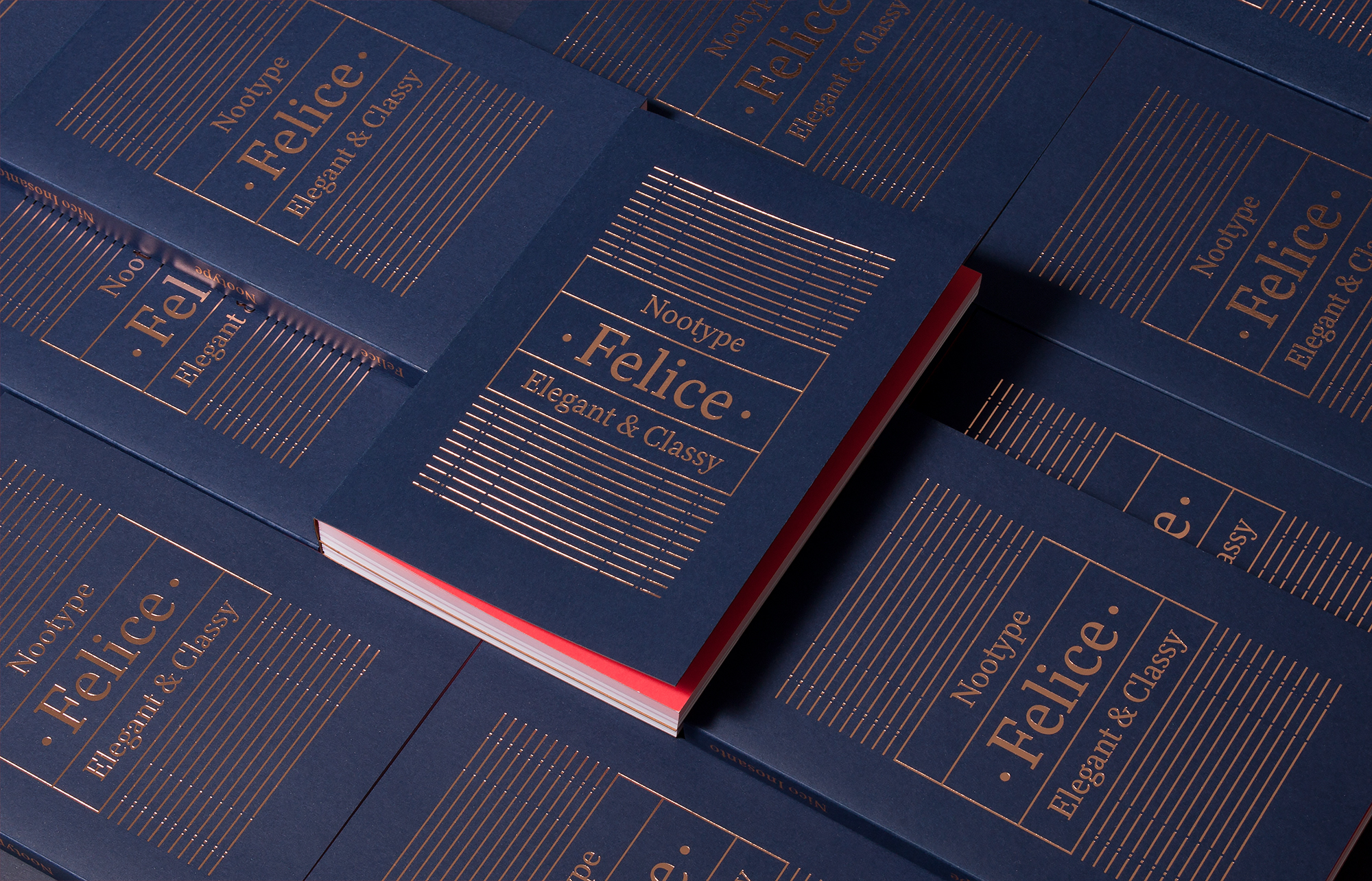


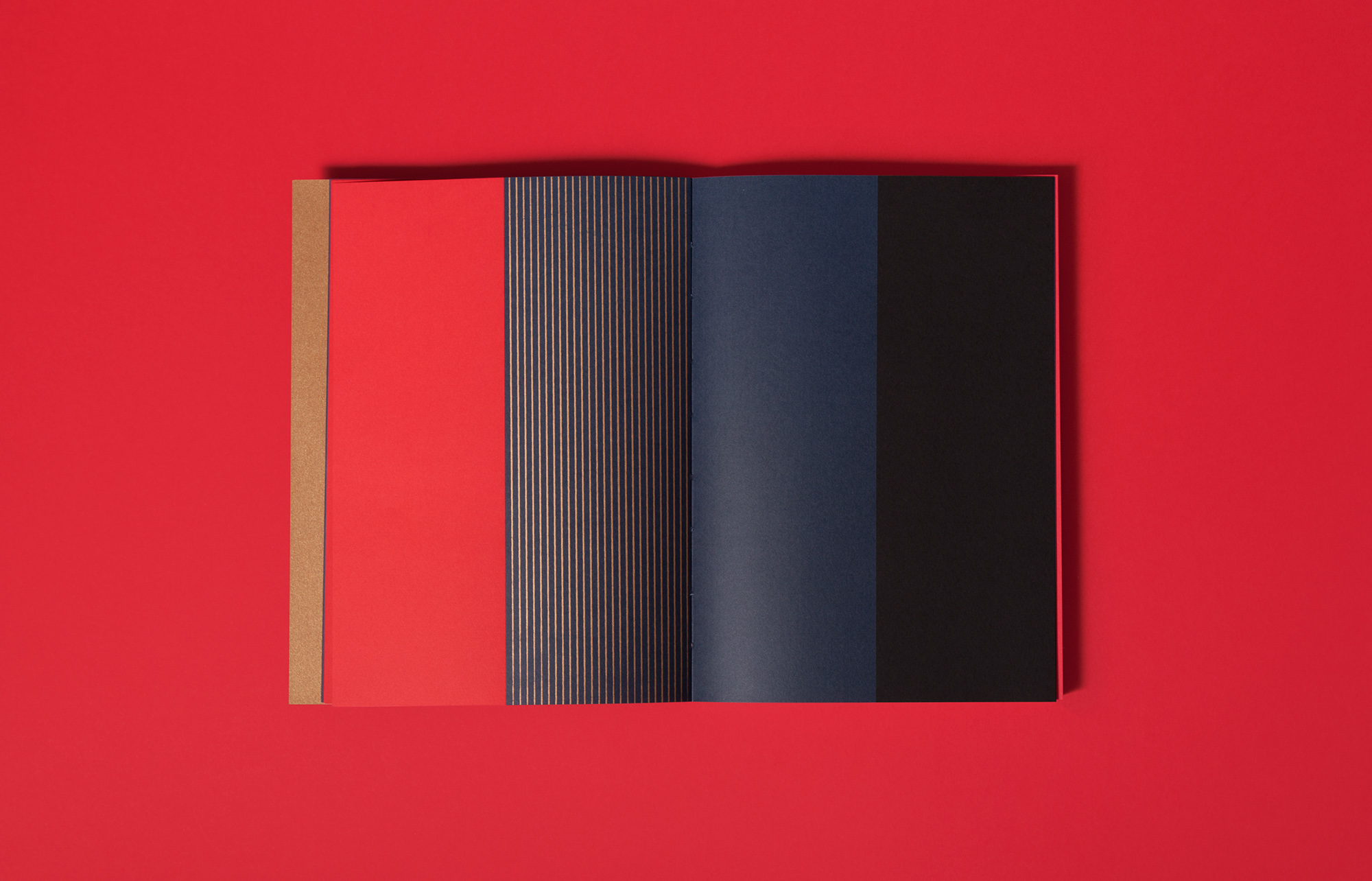

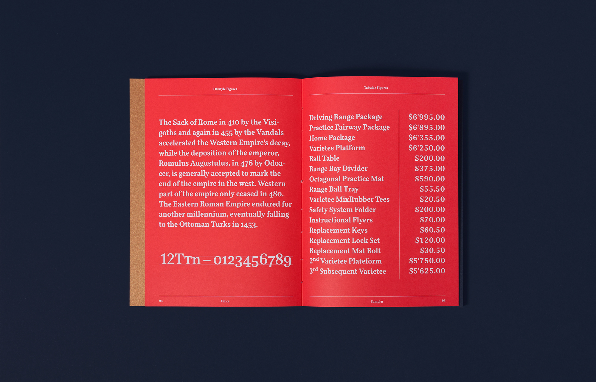
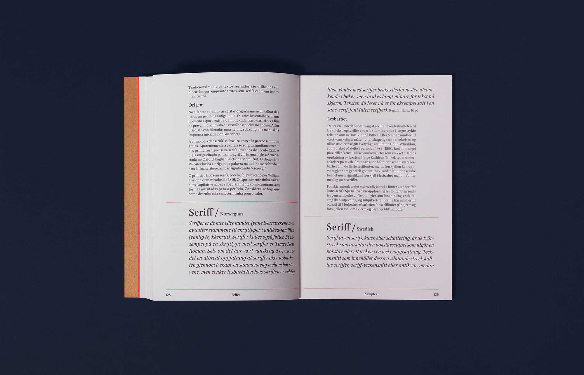

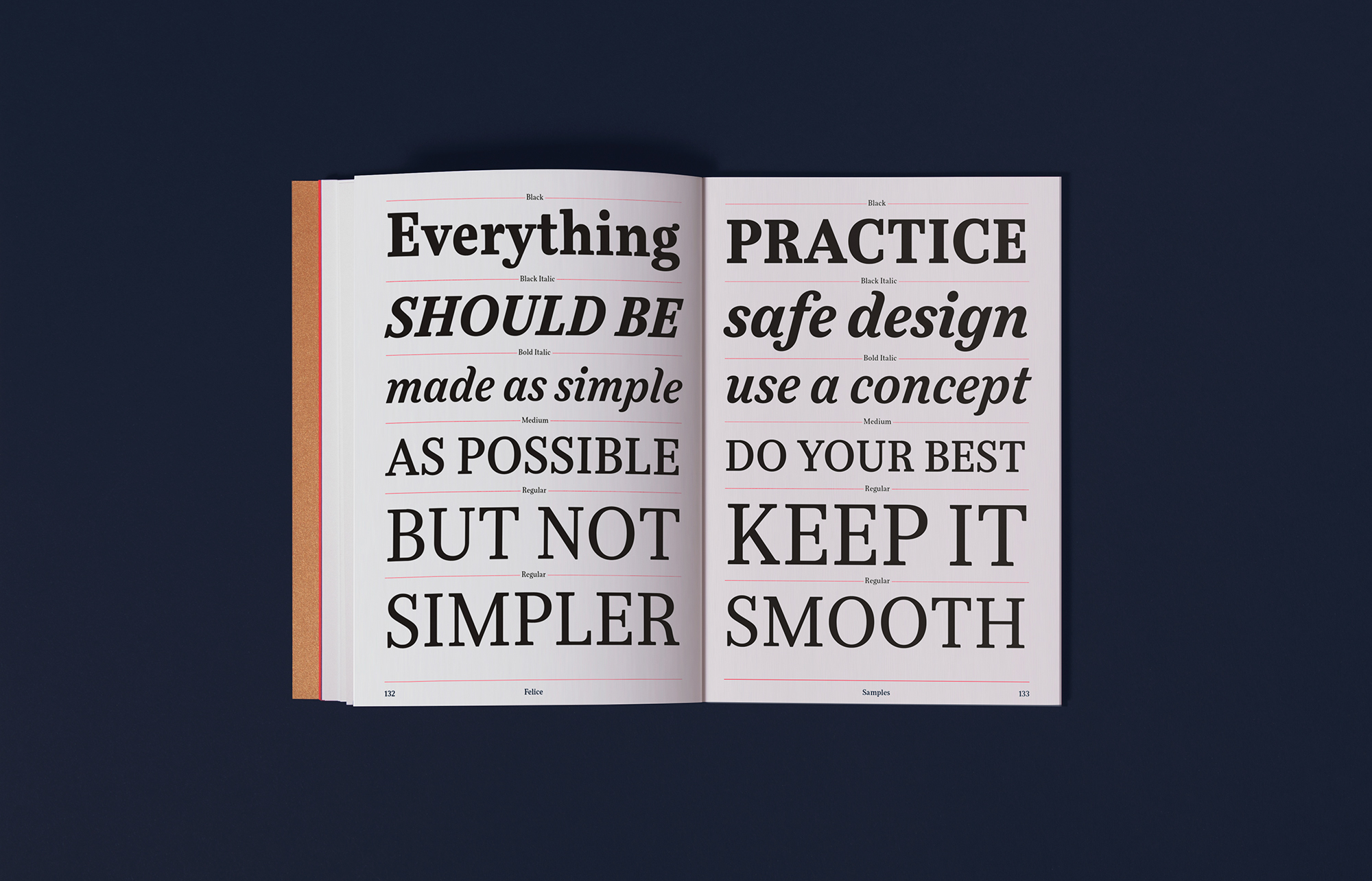
Credits
- Cover printed by Spind
- Intern page, HP Indigo, Z Studio
- Binding by Olivier Molleyres, Neuchâtel
- Cover: Malmero Bleu – 300g/m²
- Intern: Rives Sentation Tradition Matt, bright white – 120g/m²
- Printed in 10 copies
AoiroStudio
Jan 25, 2017
Source: Abduzeedo Editorial Design
January 25, 2017
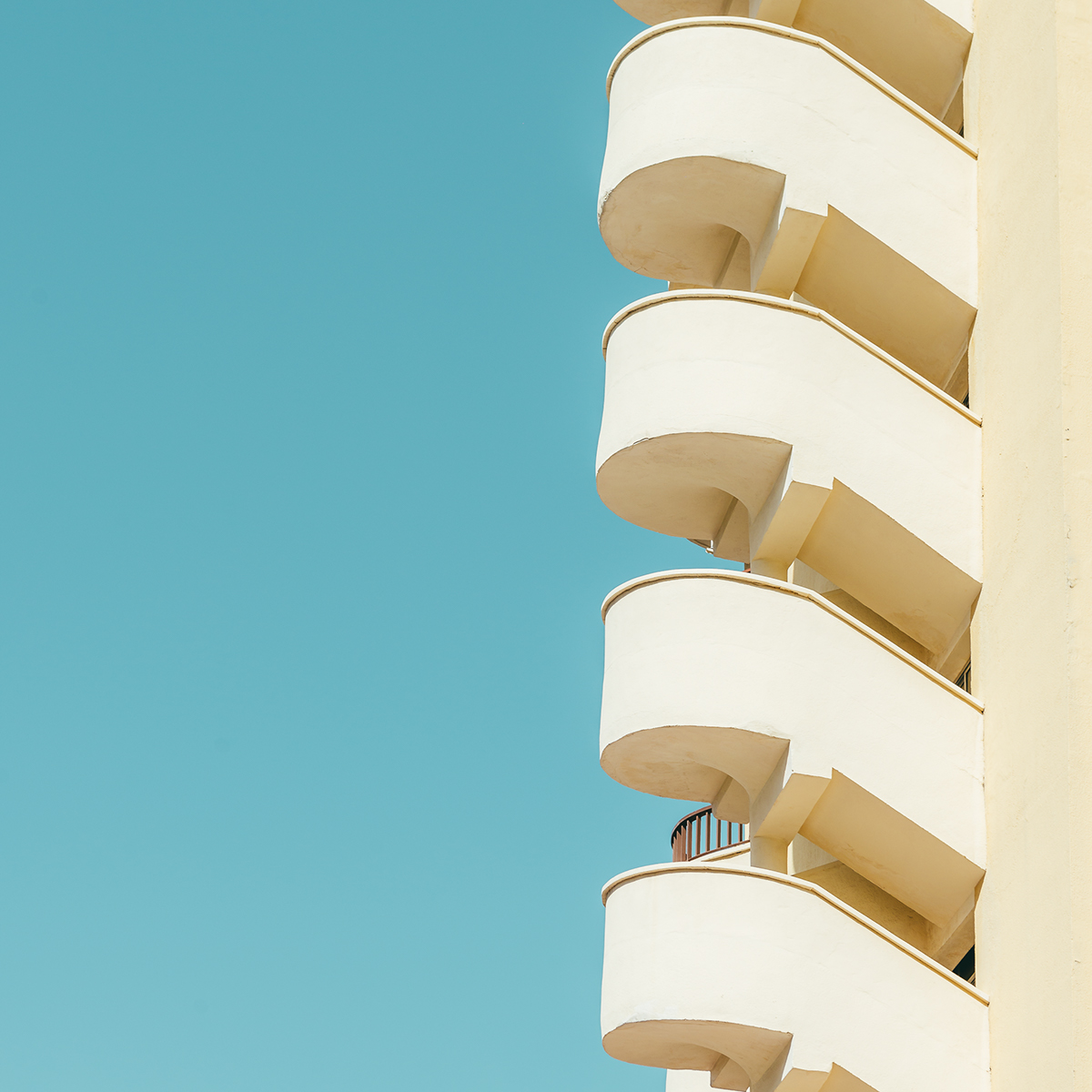
Architectural Photography by Andrei Tudoran
Architectural Photography by Andrei Tudoran
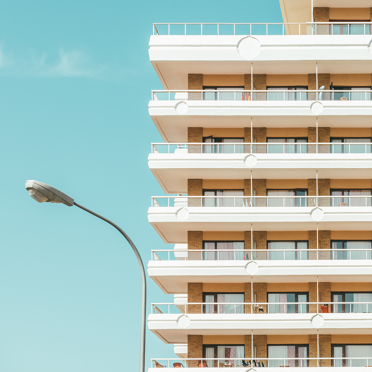
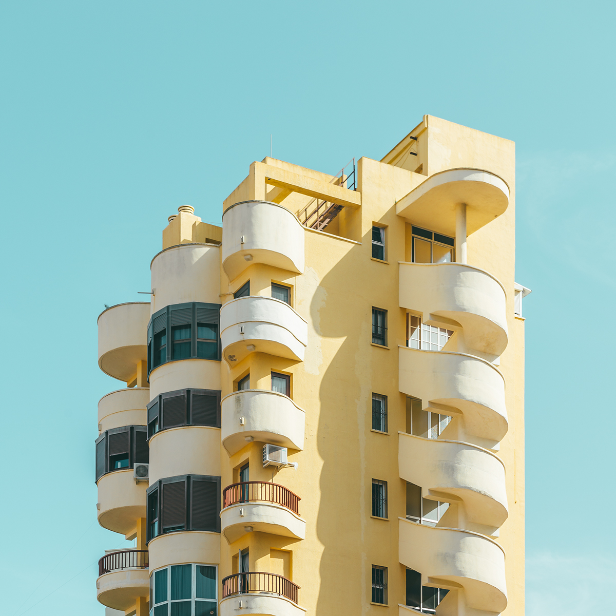
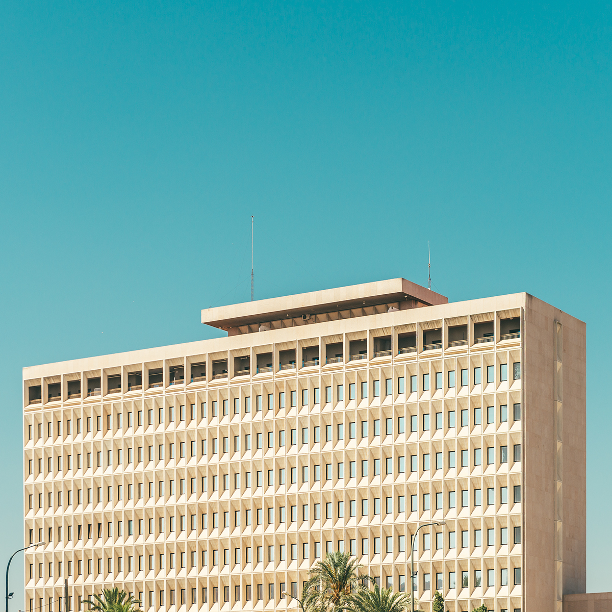
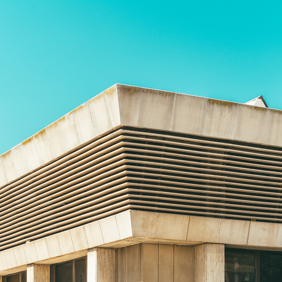
Bold is a architectural photography post with the main subject being buildings and architecture. It was shared by Andrei Tudoran and it is a series of photos on building details with a very warm mood. The contrast between the building and the cyan sky is quite beautiful, especially the contrast with the white or beige concrete structures. I have been trying to take a photo a day this year and buildings with the sky in the background is my number one choice. I wouldn’t consider my entries as architectural photography, but what Andrei did here quite well is what I have been trying to achieve with no much success. Well, it’s been raining here in Northern California quite a bit.
Andrei Tudoran is a self-taught urban and architectural photographer based in Bucharest, Romania. He has showcased his work in exhibitions like:
- 2016 – Ciao Bucarest – Unique exhibition highlighting Italian influences in Bucharest. Muzeul Municipiului Bucureşti – Palatul Suțu.
- 2016 – UR.BASM FESTIVAL featured in UR.REALITY – an interactive exhibition by Bucuresti Realist popular Bucharest Facebook page.
- 2016 – UR.BASM FESTIVAL featured in UR.SWITCH – An initiative to raise awareness regarding Park & Ride facilities and increasing intermodal transport in Bucharest.]
For more information make sure to check out his website at http://andreitudoran.com/
Architectural Photography


abduzeedo
Jan 25, 2017
Source: Abduzeedo Photography
January 11, 2017
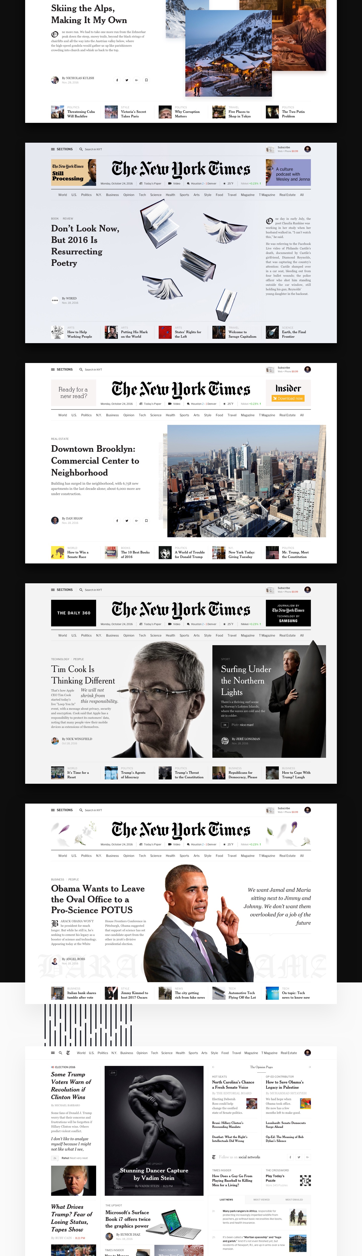
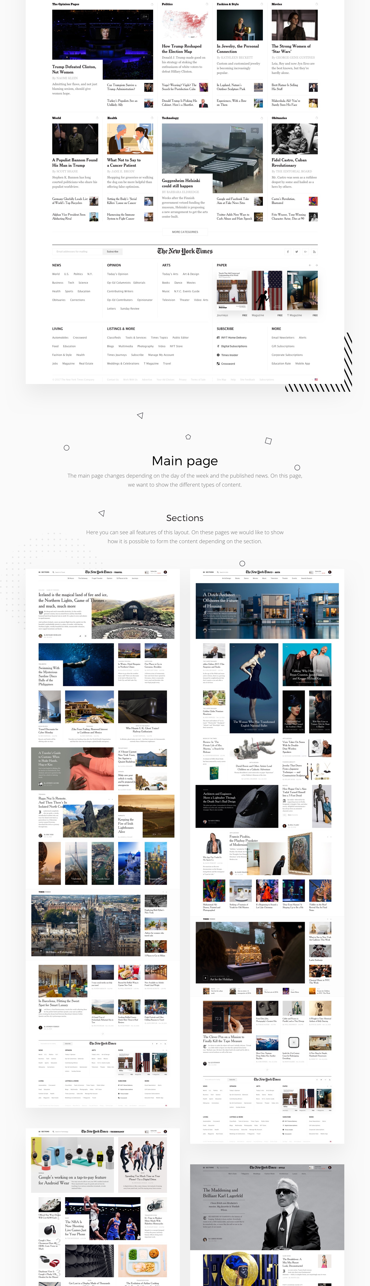
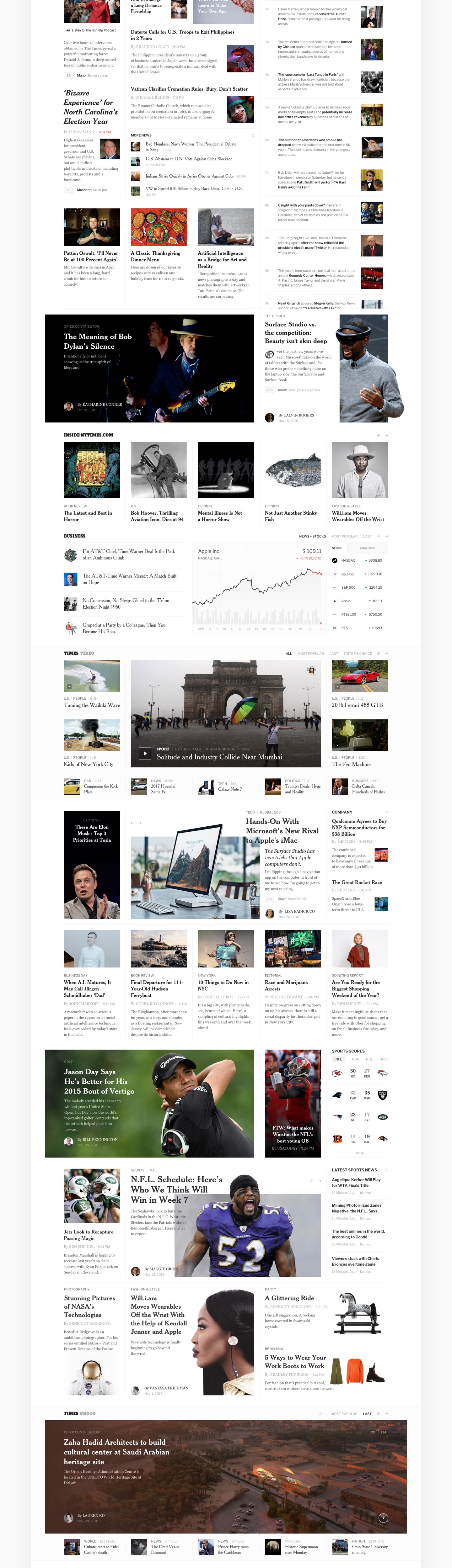
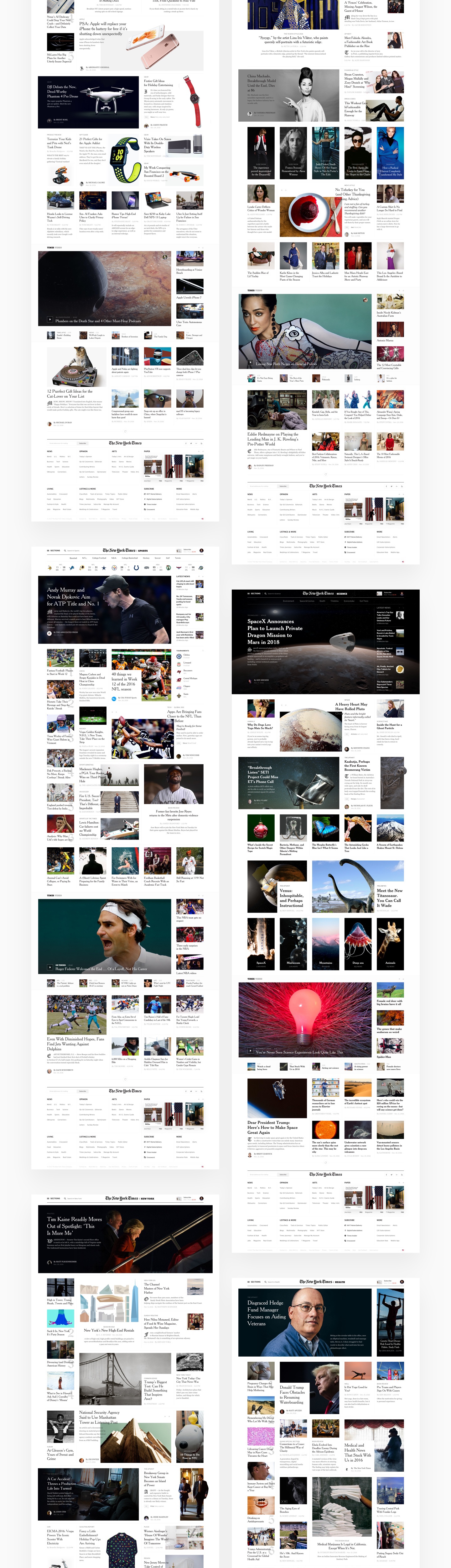
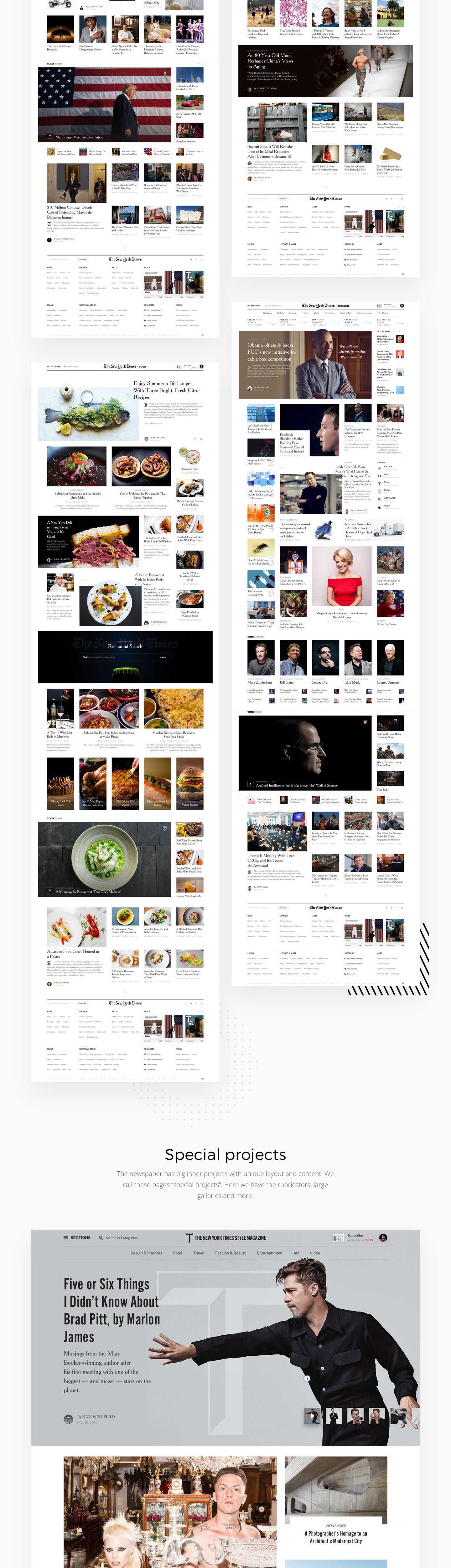
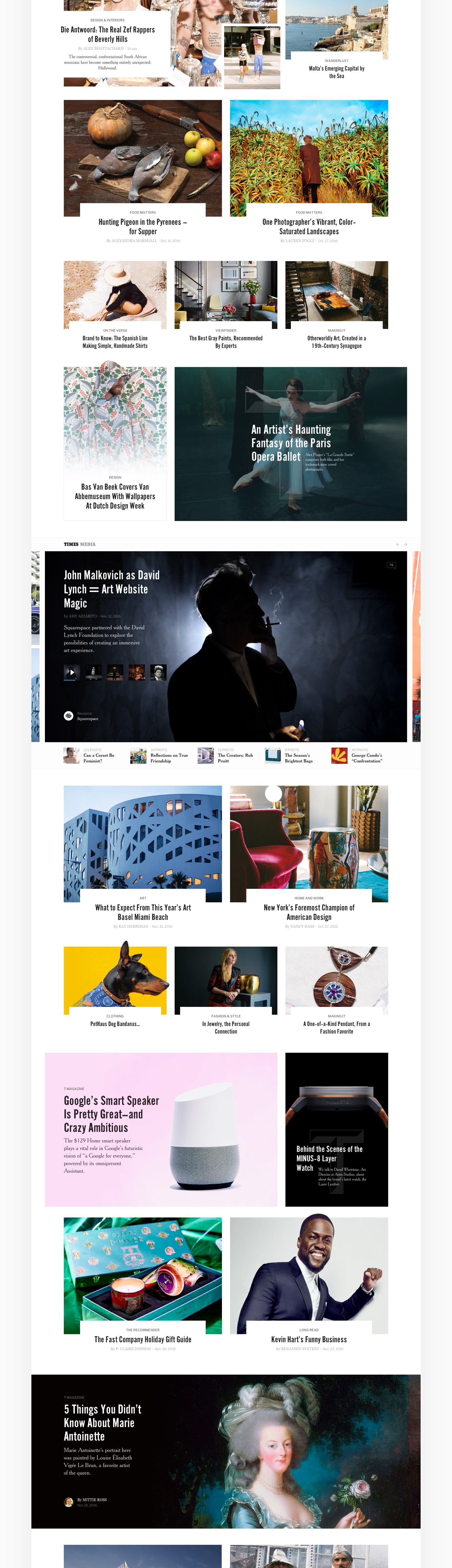
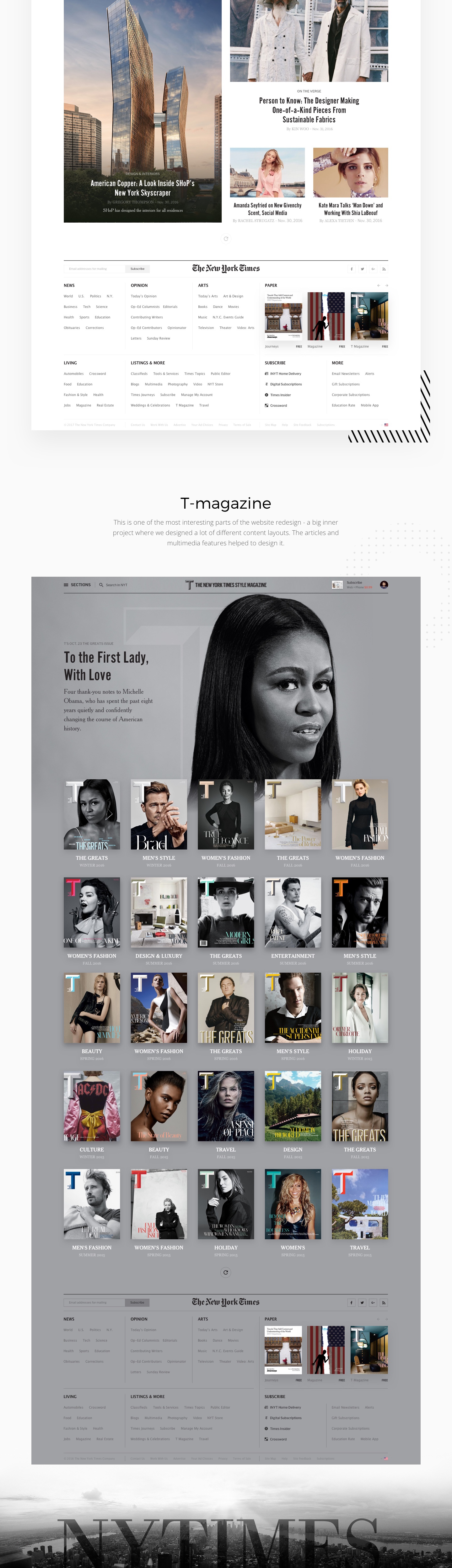
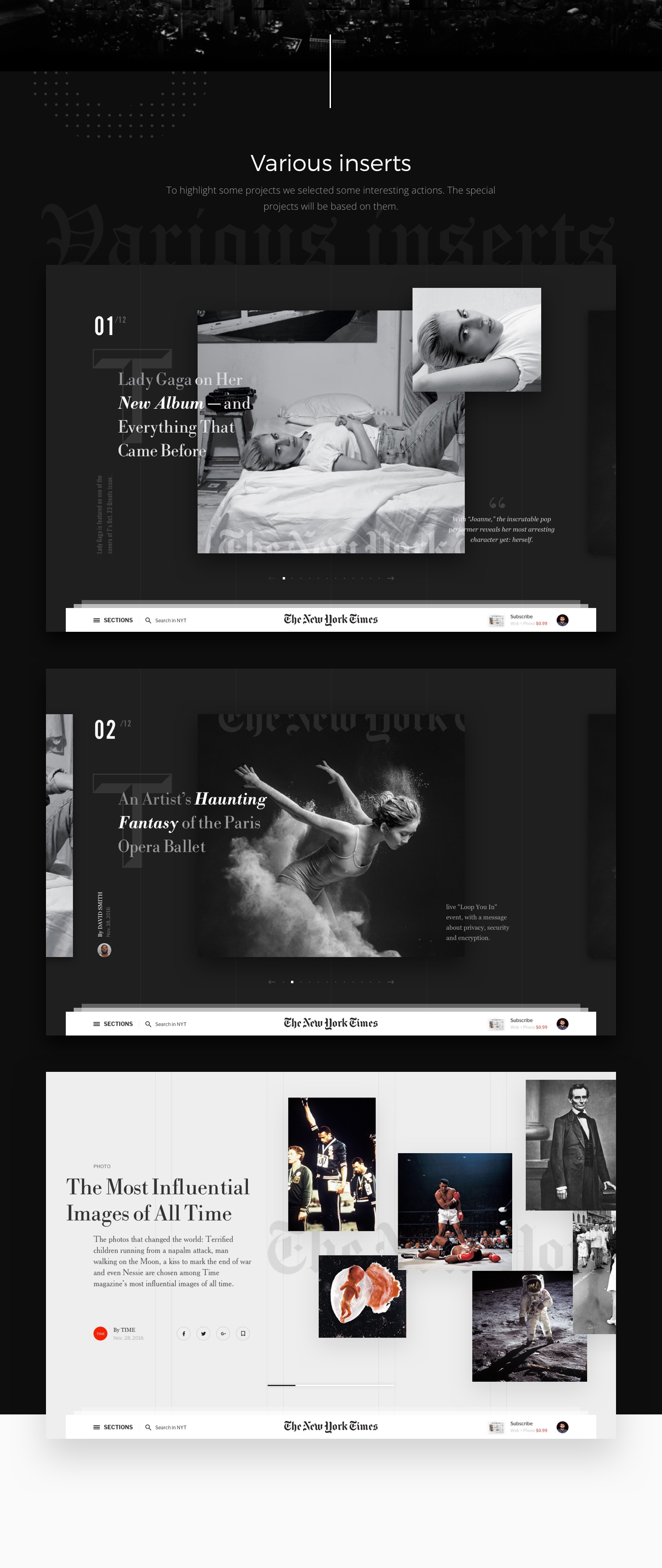
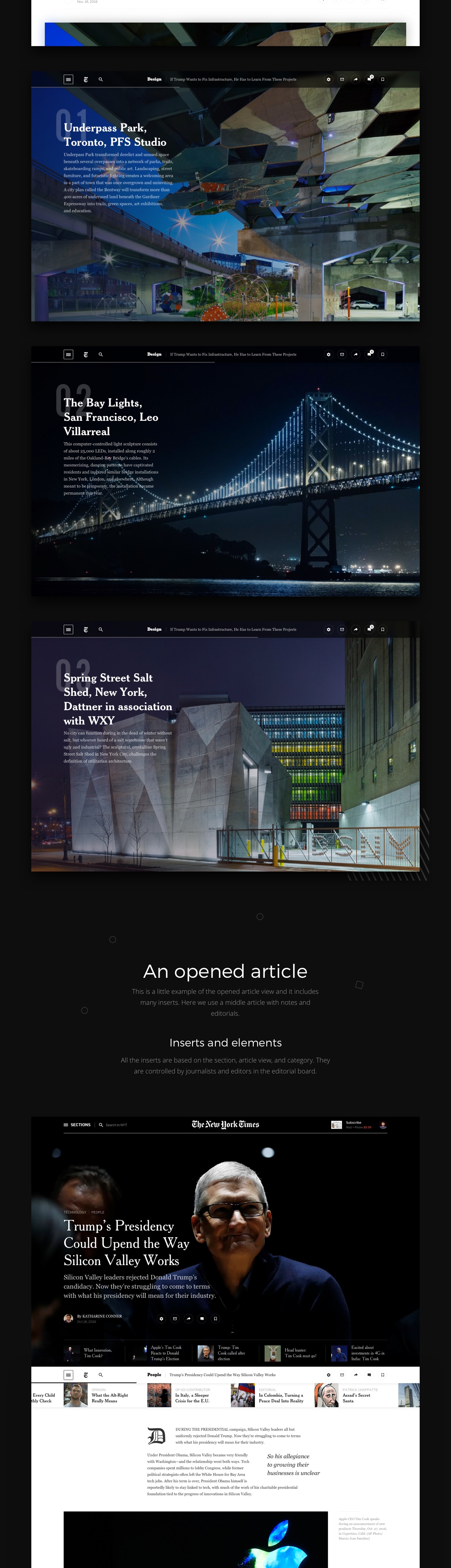
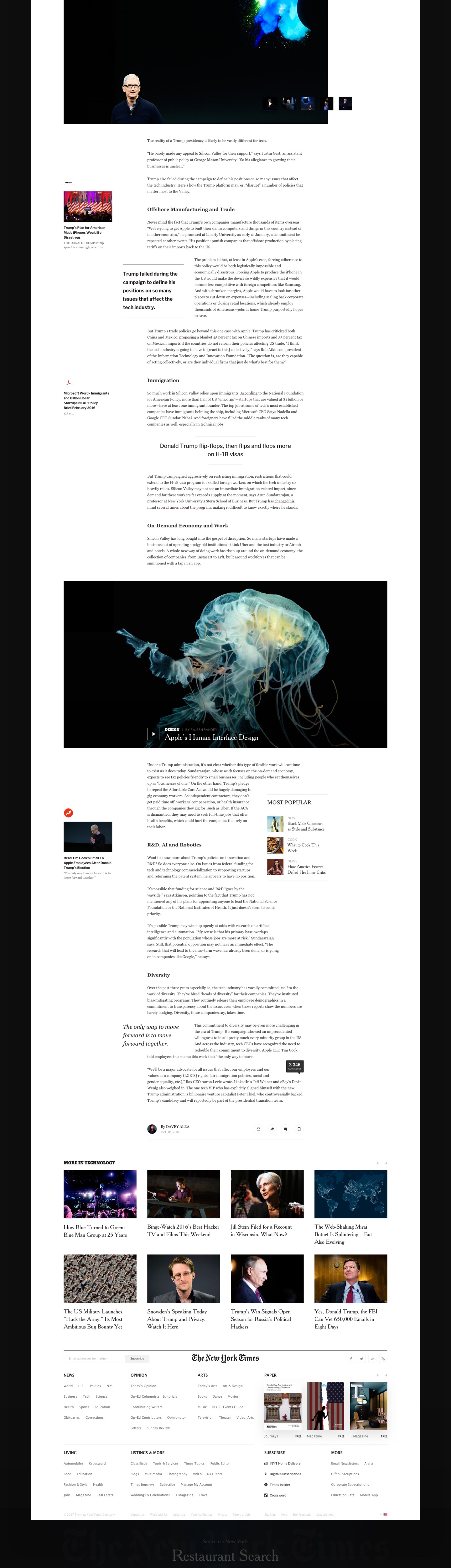
Editorial Design: The New York Times Redesign Concept
Editorial Design: The New York Times Redesign Concept
The New York Times Redesign is concept editorial design project shared by Slava Kornilov and Bohdan Kononets on their Behance page. I have to say, I have seen quite a few of concept projects but as extensive as this one I still have to see. I understand the value of an exercise like this, but I cannot imagine the amount of time necessary to put something that detailed together. I also love to see what people can come up with when you don’t consider some important factors like density and monetization. Nevertheless, it’s a great editorial design project and quite inspiring in many aspects.
Slava Kornilov is a web designer from Moscow, Russia. He is specialized in Web Design, UI/UX and Art Direction. Bohdan Kononets is a designer based in Lisbon, Portugal. He also is specialized in Web Design, UI/UX and Art Direction. For more information about them check out http://flatata.com/
Editorial design


abduzeedo
Jan 11, 2017
Source: Abduzeedo Editorial Design
January 10, 2017
Design Books: Suggestions for the New Year
Design Books: Suggestions for the New Year
This week is the second or first, in my case, week of work in 2017. With every new year there’s a lot of resolutions made, areas that we want to improve or things we want to change. I feel that for me I want just to focus on less and the practice of minimalism. For that reason I am also trying to focus more on design books rather than just online. I am trying to savor the information a bit more instead of gobbling up everything I might think will be inspiring or useful. Most of the time that ends up not being the case, but just the fear of missing out, resulting in a pile of articles to read or links that, without context, have little to no value.
So, for this post I will highlight a few design books that are on my list for 2017. Some I have already in my library, others I might purchase along the way. The books are about design, branding, photography, interface and topics that we try to cover here on the blog.
Design Books
Designing Design
Representing a new generation of designers in Japan, Kenya Hara (born 1958) pays tribute to his mentors, using long overlooked Japanese icons and images in much of his work. In Designing Design, he impresses upon the reader the importance of “emptiness” in both the visual and philosophical traditions of Japan, and its application to design, made visible by means of numerous examples from his own work: Hara for instance designed the opening and closing ceremony programs for the Nagano Winter Olympic games 1998. – Amazon

Draplin Design Co.: Pretty Much Everything
Esquire. Ford Motors. Burton Snowboards. The Obama Administration. While all of these brands are vastly different, they share at least one thing in common: a teeny, little bit of Aaron James Draplin. Draplin is one of the new school of influential graphic designers who combine the power of design, social media, entrepreneurship, and DIY aesthetic to create a successful business and way of life. – Amazon

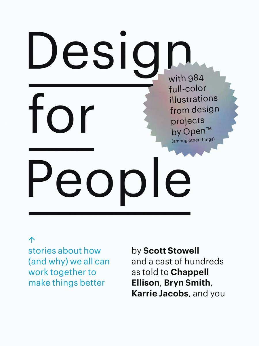
Design for People: Stories About How (and Why) We All Can Work Together to Make Things Better
Most design books focus on outcome rather than on process. Scott Stowell‘s Design for People is groundbreaking in its approach to design literature. Focusing on 12 design projects by Stowell’s design firm, Open, the volume offers a sort of oral history as told by those involved with each project–designers, clients, interns, collaborators and those who interact with the finished product on a daily basis. – Amazon
The Grid: A Modular System for the Design and Production of Newpapers, Magazines, and Books
Inspirational guide to understanding principles of proportion and their relation to layout design. – Amazon

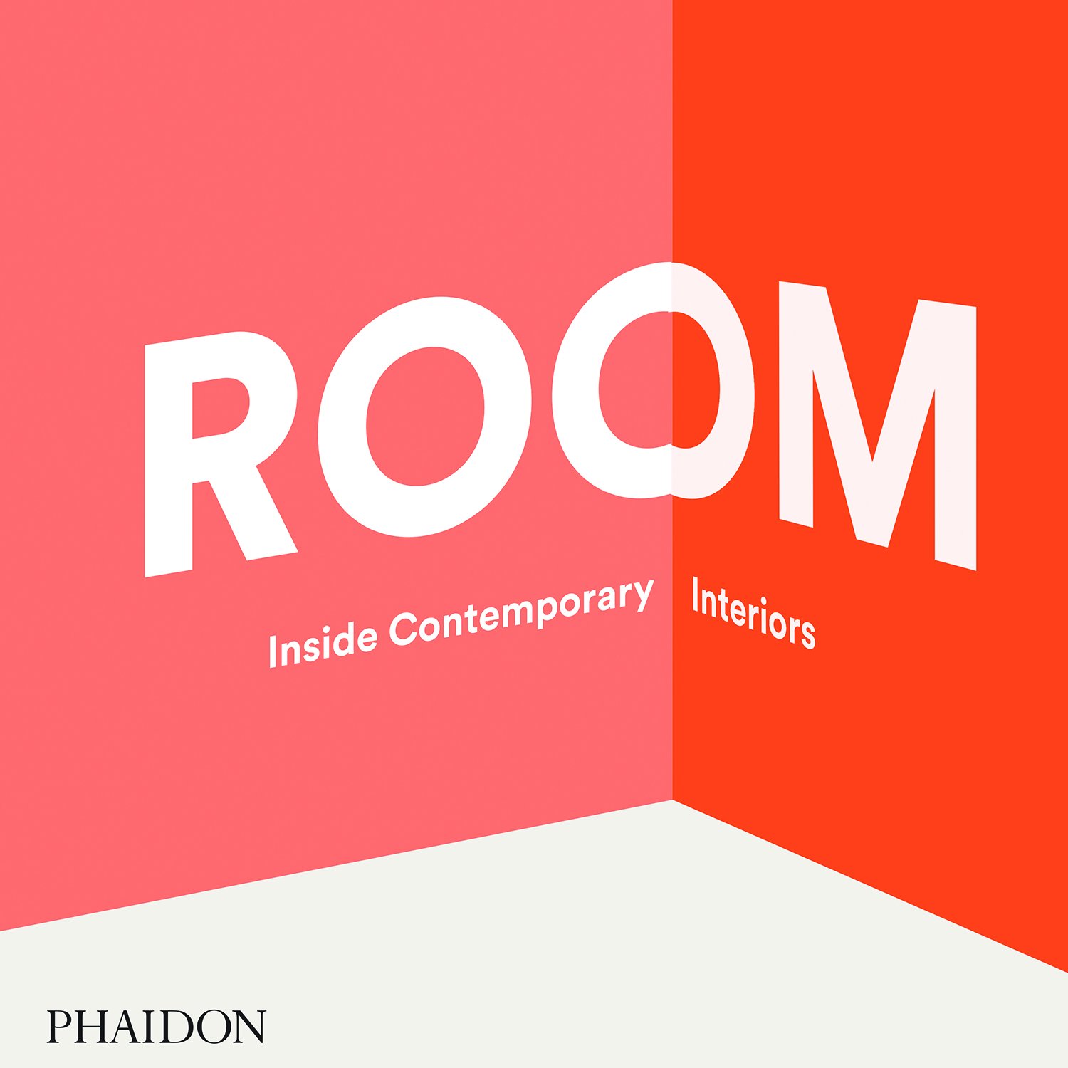
Room: Inside Contemporary Interiors
ROOM: Inside Contemporary Interiors explores a curated selection of exceptional spaces, ranging from retail concept stores, pop‐up dining experiences, and art installations, to hotels and private residences. – Amazon
The Best Interface Is No Interface: The simple path to brilliant technology (Voices That Matter)
In his insightful, raw, and often hilarious criticism, Golden reveals fascinating ways to think beyond screens using three principles that lead to more meaningful innovation. Whether you’re working in technology, or just wary of a gadget-filled future, you’ll be enlighted and entertained while discovering that the best interface is no interface. – Amazon

150 Best Eco House Ideas
The newest volume in the highly successful “150 Best” series—joining 150 Best House Ideas and 150 Best Apartment Ideas—150 Best Eco House Ideas is a comprehensive handbook showcasing the latest in sustainable architecture and environmentally-friendly home design. Perfect for architects, designers, interiors decorators, and homeowners alike. – Amazon

How to Use Graphic Design to Sell Things, Explain Things, Make Things Look Better, Make People Laugh, Make People Cry, and (Every Once in a While) Change the World
The first monograph, design manual, and manifesto by Michael Bierut, one of the world’s most renowned graphic designers—a career retrospective that showcases more than thirty-five of his most noteworthy projects for clients as the Brooklyn Academy of Music, the Yale School of Architecture, the New York Times, Saks Fifth Avenue, and the New York Jets, and reflects eclectic enthusiasm and accessibility that has been the hallmark of his career. – Amazon

abduzeedo
Jan 10, 2017
Source: Abduzeedo Books
January 5, 2017
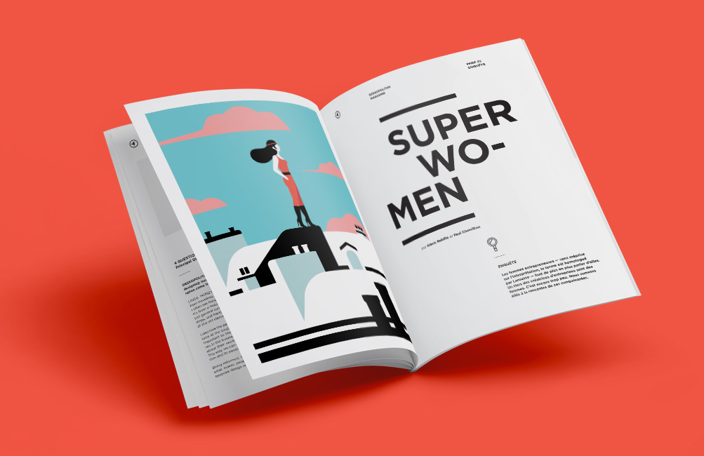
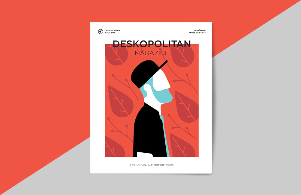
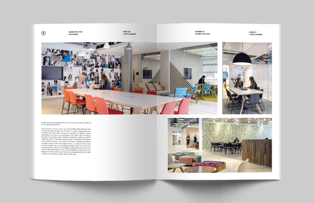
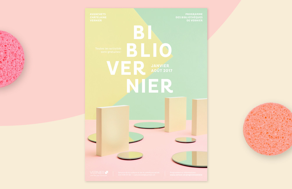
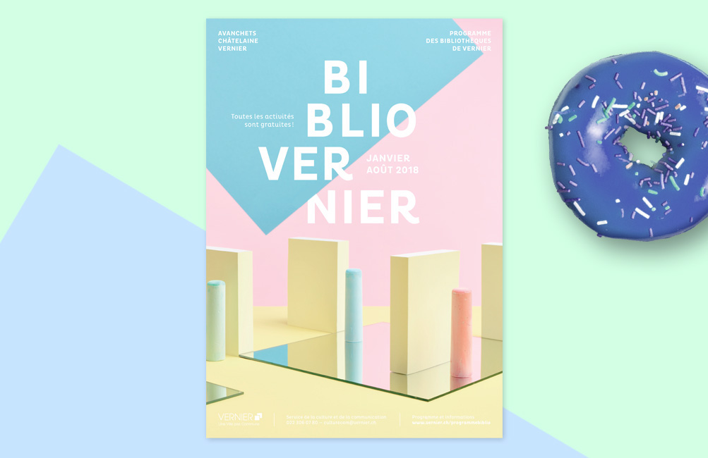
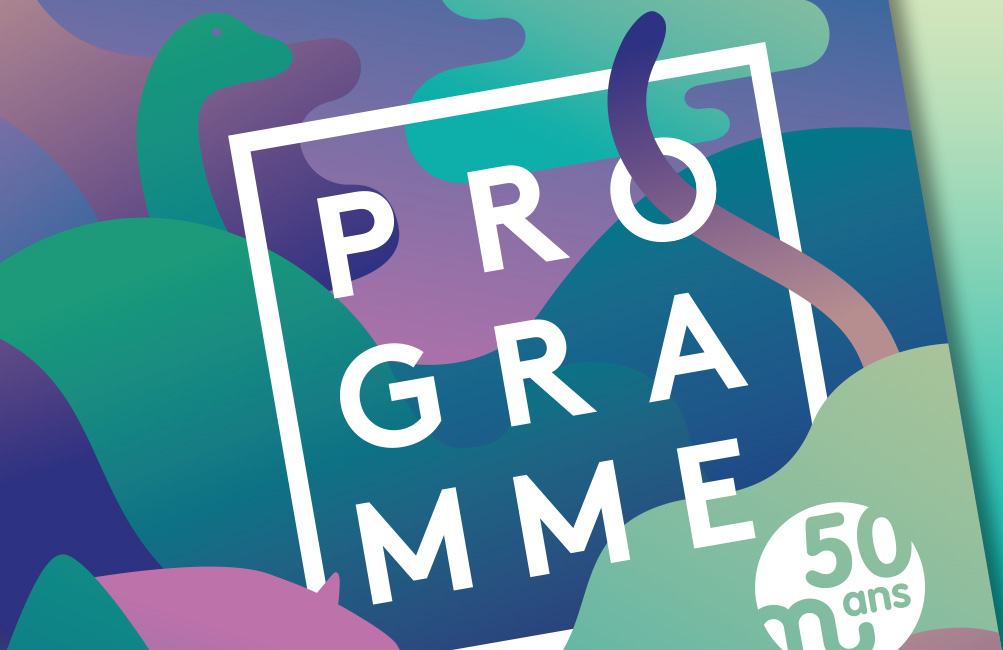
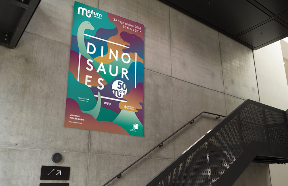
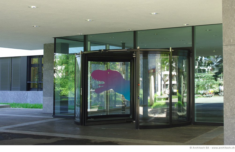
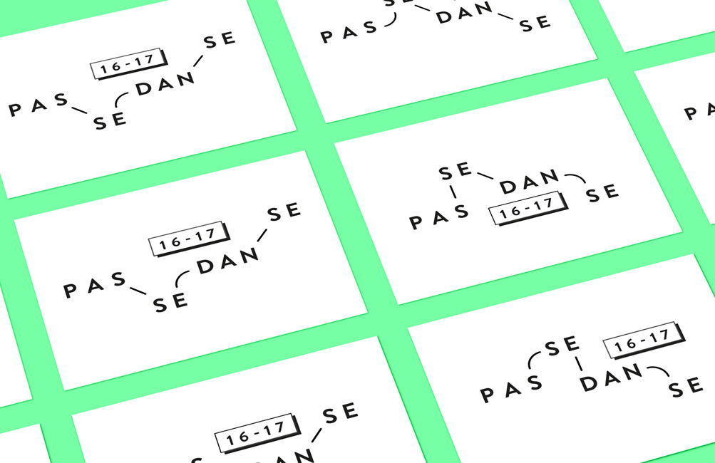
Editorial Design: The Work of Anaïs Coulon
Editorial Design: The Work of Anaïs Coulon
Editorial Design has being around for a long time and we really do enjoy that sometimes we see projects that takes to another level OR even where you just gotta spend a couple more minutes to admire at the details. Let’s take a look at the work from Anaïs Coulon that is really stepping it up with her work. Let’s break it down!
Anaïs Coulon a swiss & french graphic designer working who is currently based in Geneva, Switzerland. Focusing her work in art direction, graphic design and illustration; it’s great to see her play on the grid layout, typography and also the trendy touch of gradients.
I imagined a coloured and playful universe where books aren’t only meant to be read but where they become the central graphic or architectural element of the set.

AoiroStudio
Jan 05, 2017
Source: Abduzeedo Editorial Design
December 22, 2016
Editorial Design: Awoke Magazine
Editorial Design: Awoke Magazine
Awoke Magazine is a branding and editorial design project shared by Lucas Berghoef. Awoke is a digital and traditional lifestyle magazine focussing on a different view on fashion, music and art. As a fan of black and white themes, Lucas really put together something quite beautiful. The typography is quite modern and the little text effect to increase contrast works quite well. It also gave me some ideas for the new version of Abduzeedo.
Editorial Design
About the designer
Lucas is a young passioned graphic designer currently working in Amsterdam, The Netherlands.
I work as a freelance designer and I’m always interested in collaborating with other passioned designers & agencies with fresh ideas.
For more information check out http://www.lucasberghoef.com/
abduzeedo
Dec 22, 2016
Source: Abduzeedo Editorial Design