-
News & Updates
camera
December 16, 2016
#Happy10Abduzeedo – Past Tutorials
#Happy10Abduzeedo – Past Tutorials
This month, we are celebrating the 10th anniversary of Abduzeedo. This is very special to us, Fabio Sasso created the blog as a side-project after he lost everything from a robbery back in 2006. It was in his way for him to backup files but also bookmark things he liked and inspired him. Since then his work has been used, shared and featured many times but beyond all, his goal was to inspired us to create and make more. That’s the philosophy and minset of Abduzeedo that will always lives on. Part of the celebration, we would love to take you guys on a trip down the memory lane about our past tutorials. We’ve been getting lots of requests to have more tutorials on the blog, we’ll work twice as hard in 2017. By the meantime, enjoy this collection of some of the most popular tutorials on Abduzeedo.
I never imagined or planned to get to 10 years. I started the blog after my studio got robbed and I lost everything. After that day I tried to focus on the present more than ever, life is too unpredictable and we can get frustrated if something happens that weren’t in our plans. That happened to me, it sucks, but I learned a lot. Sometimes things are much worse in our heads and imagination than in reality. – Fabio Sasso


Find out more about our tutorials: http://abduzeedo.com/tutorial.
AoiroStudio
Dec 16, 2016
Source: Abduzeedo Tutorials
December 15, 2016
#Happy10Abduzeedo – Interview with our Founder Fabio Sasso
#Happy10Abduzeedo – Interview with our Founder Fabio Sasso
This month, we are celebrating the 10th anniversary of Abduzeedo. This is very special to us, Fabio Sasso created the blog as a side-project after he lost everything from a robbery back in 2006. It was in his way for him to backup files but also bookmark things he liked and inspired him. Since then his work has been used, shared and featured many times but beyond all, his goal was to inspired us to create and make more. That’s the philosophy and minset of Abduzeedo that will always lives on. Part of the celebration, we would love to share a sit-down we had with Fabio about his life, 10 years of inspiration and more. Hope you will enjoy it!
I never imagined or planned to get to 10 years. I started the blog after my studio got robbed and I lost everything. After that day I tried to focus on the present more than ever, life is too unpredictable and we can get frustrated if something happens that weren’t in our plans. That happened to me, it sucks, but I learned a lot. Sometimes things are much worse in our heads and imagination than in reality. – Fabio Sasso
Tell us about yourself? What do you do for living now?
I am a designer from Brazil currently living in Oakland, California. I moved to the US in 2011 when I got an offer from Google. After almost 6 years a lot of things have happened, I got maried, became a father. I still work for Google, I have a lot of fun and love Google’s mission and their products. It’ really makes a difference in terms of motivation.
How do you feel about reaching this milestone of 10 years of Abdz?
Abduzeedo started as a side project, a way for me to backup files but also bookmark things I liked and inspired me. That was in 2006, iPhone was a rumour, Tablets a sci-fi idea. Things were very different. The Web 2.0 was at reaching its peak of fame, everything was moving towards the web with web apps. Of course everything changed with the introduction of the iPhone, and especially one year after that, when native apps were announced.
I never imagined or planned to get to 10 years. I started the blog after my studio got robbed and I lost everything. After that day I tried to focus on the present more than ever, life is too unpredictable and we can get frustrated if something happens that weren’t in our plans. That happened to me, it sucks, but I learned a lot. Sometimes things are much worse in our heads and imagination than in reality.

What was the biggest Abdz moment so far that you remember?
There were so many fun moments. I used to do a lot of talks around 2008-2010 about the blog. At a particular moment around 2008 I was the person with most Twitter followers in Brazil I believe. I believe, however the biggest moments were always meeting new people. People from all over that I still talk and became friends. Like you Francois 🙂
Do you remember what was your feeling when you posted the first article back in December 21, 2006?
Yes, it was summer in Brazil. I was recovering from the awful loss of my laptop and all backups. I was just posting things to fill the blog and try to create a routine. I posted about designing a web 2.0 blog. It was a project I did for my brother. It’s crazy just to go back and see that, it’s a lesson of humility because you can see how much you have learned. I hope in 10 years to look back at my work and have the same sensation that I kept learning.
What is your ideology behind your work? What’s driven you all the time?
There’s no ideology, the only thing that drives me to do things like blogging or being a designer is curiosity and desire to learn more about things. I am an introvert, very shy and insecure. I always think I am wrong and that sort of helps me to try more I think. It’s not a good thing but it definitely helps a lot. It keep my feet on the ground.

Do you get creative satisfaction on your work? How much time do you give yourself for personal work and blogging? Do you have a system?
I love what I do and my job. I love working on product and trying to solve not only the problems we are trying to solve for our users but also how to improve our process. How can we reduce churn and frustrations from all sides, UX and engineers.
In terms of blogging, I use Abduzeedo now more as a bookmark/curation tool. There are so many design blogs now doing tutorials and other things that we used to do in the past. I believe the best thing right now due to the overload of information is try to be more like a filter. Try to help featuring new designers and help the community.
Who were your creative heroes at the start of your career and how has it changed over the years?
That’s a great question. I think my heroes are still the same, the difference though, is that I added many more. I admire more people rather than just designers. For example, engineers, PMs, entrepernours.
What is the one thing you learned at the beginning of your career, that you still go by today?
In terms of career, for me, it is always think about not only the design, put the production process. I graduated in Industrial Design and in school our projects were always focus not only on the final design, but how to optimize the manufaturing process. Materials, bugdgeting, supliers, those were things we had to consider. Today when I design I still keep that in mind, it just changes the roles. Now we have to think about engineering work, legacy code, platforms, localization and a bunch of other things.

How does Social Media affect your work these days?
Not as much as in the past. I was an avid Social Media user but either I am getting too old and got a bit tired of it or it is definitely slowing down. I also believe that social media became really about showing off, rather than sharing useful things or knowledge.
Where do you see Abduzeedo evolving in the next few years?
I have no idea. I believe it will get smaller because blogs are becoming things of the past. I love the idea of keeping something that I can change the design, learn a bit more about coding and also sharing things. With that in mind I think Abduzeedo will be around.
On the last note, what is the common mistake that most designers always make these days?
I think I am not the one to judge because I make a bunch of mistakes too. If I could point something, it would be that designers, for some reason, became a bit selfish. They tend to focus only on the design part and forget a bit about the rest. I’d say focus more on understanding how things are build and how people really use products, than following trends.
Some Moments


I believe it will get smaller because blogs are becoming things of the past. I love the idea of keeping something that I can change the design, learn a bit more about coding and also sharing things. With that in mind I think Abduzeedo will be around. – Fabio Sasso
AoiroStudio
Dec 15, 2016
Source: Abduzeedo Interviews
December 6, 2016
Case Study: Trampa Logotype
Case Study: Trampa Logotype
Over the last month, we have featured the lettering work from Joe Sutton and today he is back with a case study. I shall add that he is sharing a full complete A to Z case study from the start and finish. Thank you Joe for taking the time to give us a demonstration of his experience and also sharing his process for everyone. Let me stop talking and give him the mic and hope you will enjoy his breakdown.
This is a client project of mine broken down from start to finish, I share all the details that was discussed with the client and let you know about design decisons and process. I’ve always wanted to offer a sneak peak inside my process as I’ve seen it done before in other disciplines and found it highly valuable. I want to put something together that wold have helped me when I first started.

In his Words
I was contacted to create a Logotype for Trampa. Trampa is an Urban Cycling Clothing Brand in its infancy. Their products have a Swedish design influence and a minimal and clean look that is functional, stylish and not out of place in a casual setting. Their target market is 16-30 year old male and females. I put together a document for the client to start with that broke down the the brand, goals, usage, keywords and competition. We put our focus on these as we found them to be the most important factors to focus on.

After this I asked if everything align with their thughts and what kewords represented Trampa best. They wanted to try and represent Urban, Cycling, Swedish, Movement,Ffreedom, Exploration, Clean. Thet also also provided me with a few logos that he liked, they were very varied in style and so I knew that identifying which direction early on would be important.
Sketching
When I go into sketching I just write the word out in a few go-to style, all caps, all lowercase, joined, unjoined and cursive script with a mix of character variations etc. Through this you can quickly understand where the issues might be between letters and where there are opportunities to create some unique ligatures. I’ll list the points that I discovered below:
The ‘r’-‘a’ gives an opportunity for a ligature.
• The two a’s could be interesting to experiment making the feature point
• The ‘p’-‘a’ join could be an issue
• We could join the ’t’-‘r’
• The capital ‘R’ or ‘P’ could be legs pedalling (Huge Gimmick)
• Type of ‘a’ and ‘r’ were open for experimentation.
• Capital or Lowercase T

Sorry if those sketches have made your eyes hurt, but it’s all part of the process. After Identifying these I can target each one and try and make something interesting. I had a feeling the best way to go would be with a very simple san serif type with a slant, I felt like it’d be the most simple and reflective of the clothing and brand. Howver, I still sketched lots of other styles incase I found something better. Once I had exhausted all my options I selected 9 sketches, there’s no specific number I choose.
Usually below 10 as too many options can confuse the client and with this I refined them to an acceptable standard, still very far from perfect. The reason I choose at the early stage is usually they are so rough I’m the only one who knows where they could potentially end up like. So by choosing the best based off my judgement, with the project goals etc in mind, I offer the client more accurate optinons. You need to realise they aren’t lettering deigners and that you probably understand your vision more than anyone else, so explain everything.

Presenting First Concepts
Now I had all my first sketches to a point where it’s clear enough for the client to understand. Also not too far that it’d be a waste of time, I was ready to display them all. So I scanned the versions in and then played around with them in photoshop until they are darkened but not distorted, I find this again aids the client in visualising the options clearer. At this stage you’re sharing the work to really to gain a better understanding of what the client’s preferences are so you can get on the same page in regards to stylistic direction. It’s also the first point to explain my thoughts on how each one relates to the goals for the project. After initial discussions with the client and with the research I had done, I was pretty confident I knew which ones would appeal to them the most. They did select the ones which I advised towards being the best, which is always a relieving moment. I know that some designers don’t offer the options to their client at this early stage. I think it’s so important to keep them engaged from the beginning so that you don’t go off on the wrong path and face the revisions at the end.

The client chose options 2, 3, 6, and 7 as his favourites and you can see the reasons below.
2: I love the underline, and the slight slant works well conveying movement. Maybe slightly harsh on the eye though.
3: I think it’s interesting and could be really cool or could be a bit odd. I think you could experiment a lot with it.
6: Is similar to 2 but feels more understated. Experimenting with the underline could work well here.
7: Surprised I liked this one but it feels like it has some flow to it. The capital T works well.
They agreed that 5 and 9 were not clear enough and I agreed with what he said so onto the next stage.
Refining Chosen Sketches
I take the scanned sketches, scale them up a bit and print them off so I can go into more detail and refine them. I use a light pad to trace versions rather than using tracing paper, that’s just my preference. Along with this I have some notes for each sketch with what to focus on initially improving. I work on this until I have them to a point where they are almost as refined as I can get them on paper. With this particular project it was more straight lines due the preference of the more simple, san serif style. So I think the computer is where the larger refinements could be seen properly. On projects where the style is more rounded and cursive then I like working on paper and creating nice smooth curves for longer as I feel like you can capture more personalitly on paper.

I offered each option with variations to show which ones could be experimented with further. The aim is exhaust all possible directions narrowing your way down to the perfect final logotype. The client decision was to take 1 and 3 further. I decided that making a quick digital rough would give a clearer idea of the final and help finalise it down to 1 version.
Digital Roughs
Starting in illustrator now I made both versions to a point where they were slightly refined but not nearly perfect. I also came up with a 3rd version which stemmed from option 3. This is now the point where you can really start to see what you’ve envisioned them to look like coming together.

We decided that 1 would be the best option to refine completely. It had been the stand out for me all the way. It offered lots of options to experiment with underlines, fullstops etc. I made some small changes to it from the sketch, but it maintains the same character and basic overall look and feel. I added a fullstop as I know the client mentioned something about it. I think that we had a strong base to work off from here and now it was just down to the final refinements.
Final Refinements
Now it’s all about the details. The main thing I discover when refining is when I tested what we had on a dark value, it looked too bold. This logo needs to be versatile and work in many usage cases, so I concurred with the client and displayed thinner version, we both felt that even making the line weight a little thinner helped with that issue and we kept pushing on.

When I come to create the final version firstly, I create a grid so that I can align all the horizontal and diagonal lines. After this I look at the letter spacing and the kern the final version. Finally I go over making use the letter endings are all the same. Not forgetting the most important part which Is checking the logotype optically and how it looks to the eye. Sometimes the grid might force things that don’t look natural enough so making sure it looks optically perfect and not just grid perfect is important.

The adjustments I had to make to this were the curves in the m, they were too thick and similarly with the p. I also did a lot of playing around with the a’s as they were becoming a distinguishable feature in the logo. As we planned to do, I also showed thick and thinner options with underlines and small changes which you can see below. We ended up going with a rounded full stop which you can see on the final version.

Final Logotype
Here is the final version, on a dark and light value. There isn’t a colour palette yet as the project is in its very early stages. I’ve tried to share all the details I could, and hope this has been useful to some of you. Don’t hesitate to contact me if you have any further questions.

More Information: http://joesutton.co and make sure to follow him on Dribbble.
AoiroStudio
Dec 06, 2016
Source: Abduzeedo Tutorials
October 24, 2016
Android Prototyping for Designers – Shapes and Click Event
Android Prototyping for Designers – Shapes and Click Event
Prototyping has become a very important part of the UI/UX design process. With mobile applications taking over the web it is imperative for designers to find ways to test their designs on the devices. In the beginning most designers, including myself, relied on HTML, CSS and Javascript to emulate the native experiences that the users would see. It worked quite well and still does, however it’s not a very reliable approach if you really want to understand the constraints and complexities that a developer may face when translating your designs into the final product. With that in mind, I decided to focus my efforts on the Android Platform and Java to be able to create truly native prototypes. In addition, I wanted to deliver more than redlines but reusable assets that could reduce the churn and bug fixes because of differences in the jargon used by designer tools compared to the developers.
Android doesn’t have the same fame that its counterpart iOS has, however it’s a great platform and it’s not that complicated to learn for simple prototypes. Dare I say that it’s easier than investing in learning Framer, for example, if you are designing for Android.
The benefits of learning the right tool are enormous. Here are a few points I want to highlight
- Truly knowledge of platform constraints
- Much better communication with developers
- Reusable assets and styles
- Real craftsmanship workflow
Well, enough pontificating, let’s go straight to the tutorial.
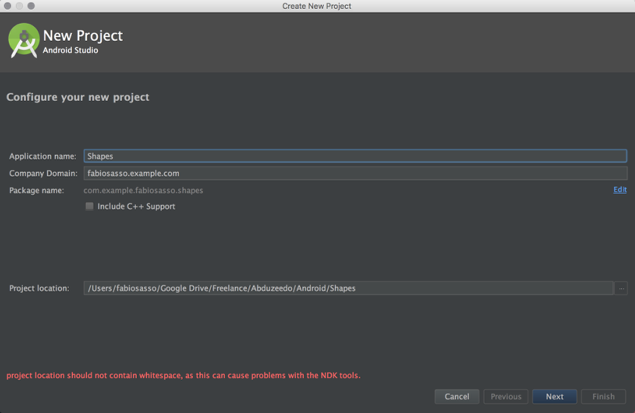
Android Prototyping for Designers
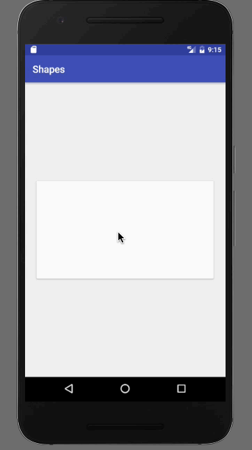
Step 1
Open Android Studio and start a new project. The Application name I used is Shapes.
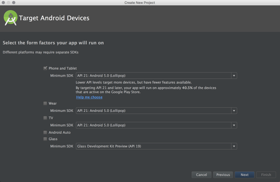
Step 2
For prototyping I don’t have to worry to much about older versions of Android. Of course it’s important to know which one to choose. You can use the “Help me choose” option. But API 21 is the one that has the Material Design specs, so let’s go with that one. You can have the spec running on older devices with the Support Library, but that is for another post. It’s quite geeky, I don’t understand either 🙂
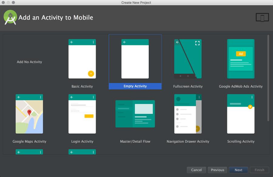
Step 3
You can select some templates to start with. For this project let’s start with an Empty Activity. It will have Action Bar and some theme assigned, I will talk about that on a next post. For now, let’s just play with shapes.
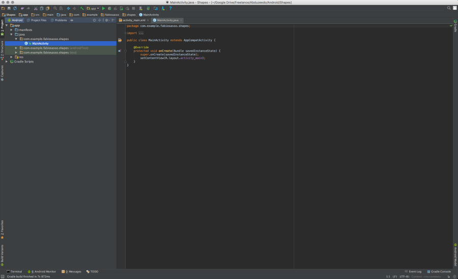
Step 4
Okay, now it’s when things get overlwhelming. Don’t worry it’s simpler thant it looks. What you see below is the Java file, or the behavior of our prototype.
Step 5
For now let’s focus on the design. On the left side, in the project tree column, select the folder “res” and then “layout”. Click on “activity_main.xml”. That’s the layout of our prototype.
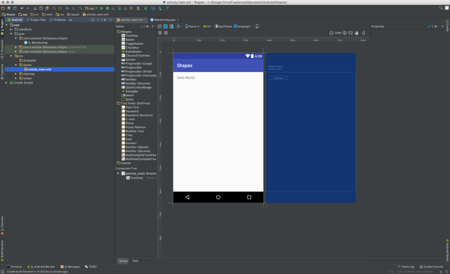
Step 6
Delete that “Hello world” string. We won’t need that for this prototype. In this screen we have the layout of our app. We have a column with widgets and right below a panel called “Component tree”. You see that there’s a component called “activity_main (RelativeLayout)”. That is the main container of our prototype. We will add more components inside this one. Note also on the right side there’s a column called properties. There will will find all the properties for the component selected. I bet it sounds a bit more familiar. Especially for the Dreamweaver users out there 🙂
Step 7
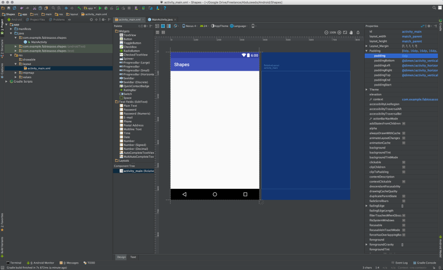
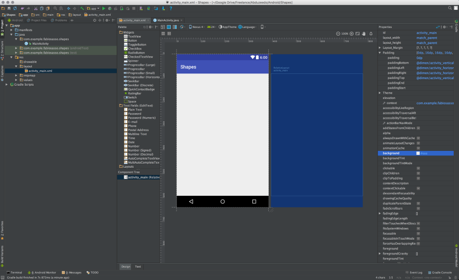
Let’s change the background color of the “activity_main” to #eee. Just select the background option and enter the value.
Step 8
Now let’s create our rounded rectangle. In order to do that we will create a “drawable” for it. It’s like a vector that can be used as background and will scale accordingly to the component we use it with. So, select the “drawable” folder and click with the right click of the mouse. Select “New” and then “Drawable resource file”.
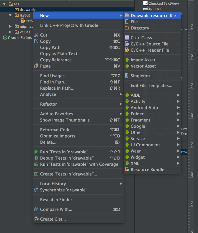
Step 9
Name it rectangle.xml. In android pretty much all the files in the “res” folder will be .xml. With exception of bitmaps.
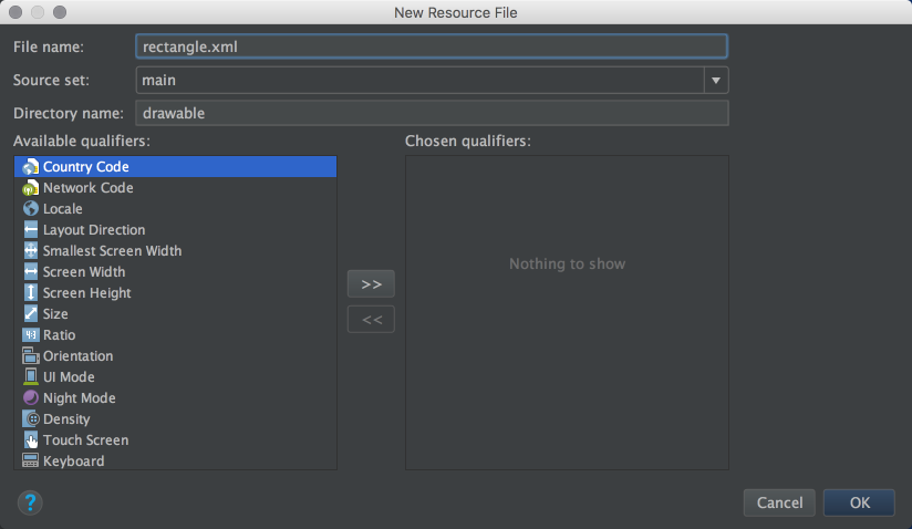
Step 10
This is the default file created. It has the XML tag and a tag called “selector”
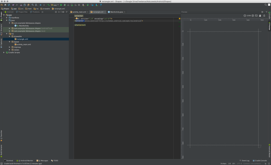
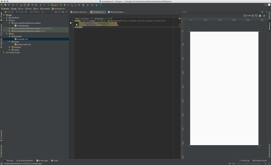
Step 11
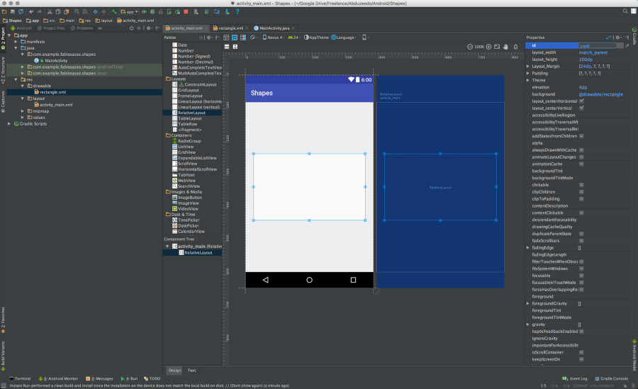
Just rename the “selector” to shape. Add a property called “shape” and use “rectangle”. Inside of the shape tag add a item called “solid” with the color you want to use and another one called “corners” with the radius of the rounded corners you want. Use the image below for reference. Also take advantage of the Android Studio autocomplete. It will save you so much time.
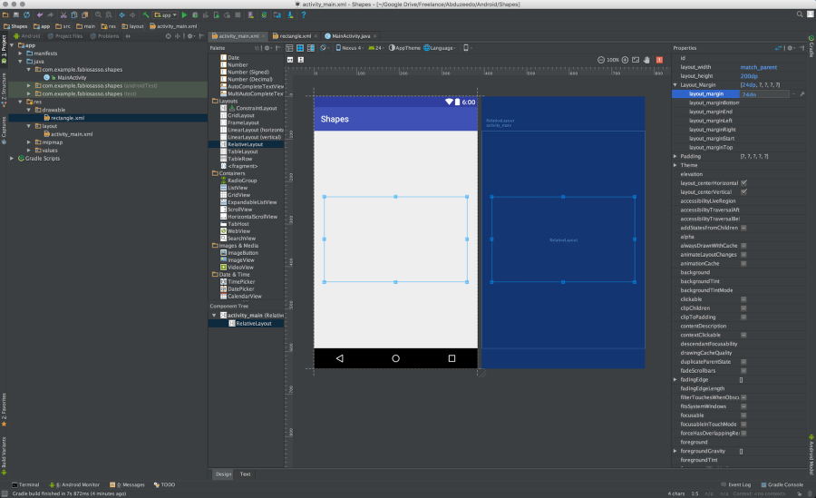
Step 12
Back to the “activity_main.xml” file. Now let’s add a new component to our layout. But before make sure the activity_main component has 0dp for padding.

Step 13
Just drag a RelativeLayout component to the center of the screen. Change its height to 200dp and use 24dp for margins.
Step 14
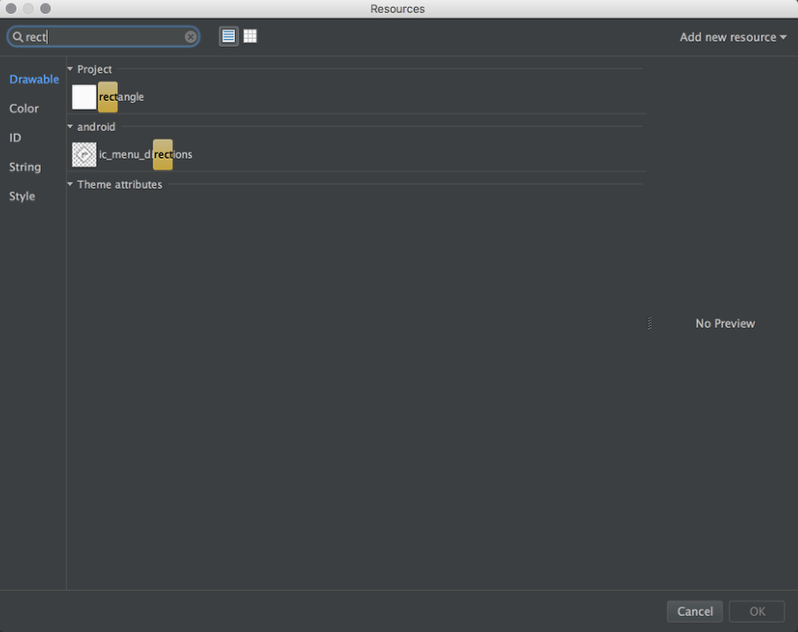
Now let’s use our drawable for the background. Find the “background” property and click on the “…” icon to open the “Resources” dialog box.

Step 15
Search for the “rectangle” drawable we created and selected it.
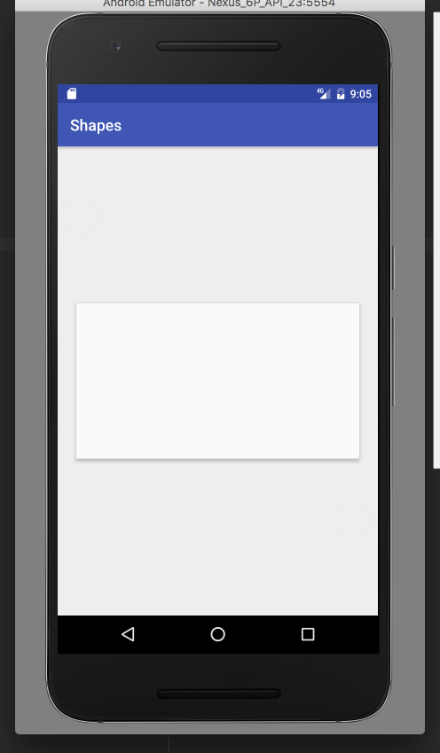
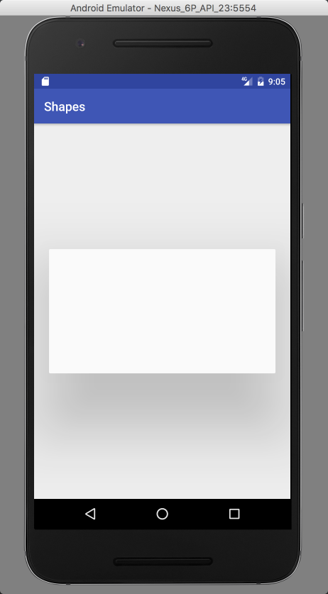
Step 16
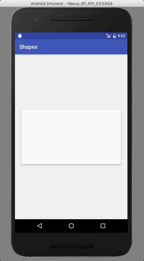
There you go, you have a card designed in Android Studio and ready to be deployed. Now comes the fun part. With Material Design we have the light properties that we can play with. Android renders that in real time. You can use either “elevation” or “translationZ” to cast shadows.

Step 17
Let’s try elevation. Set it to 4dps and Run your prototype in the emulator.

Step 18
And there you have it. A nice card, rendered natively using nothing but XML. It’s as easy if not easier than using HTML and CSS.
Step 19
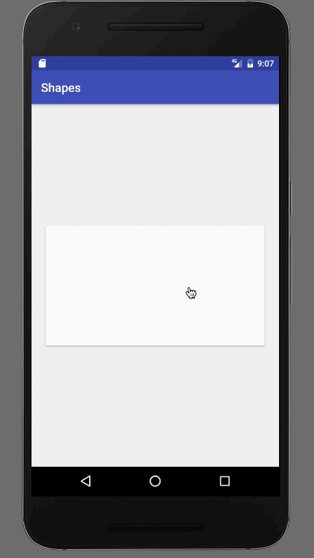
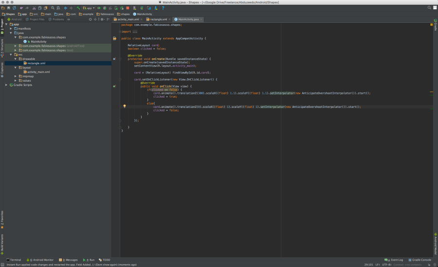
Now let’s get a bit more advanced and try to add a click event to this card. The first thing we need is an “ID”. Enter and id name “card” to the card, very creative 🙂
Step 20
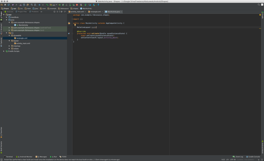
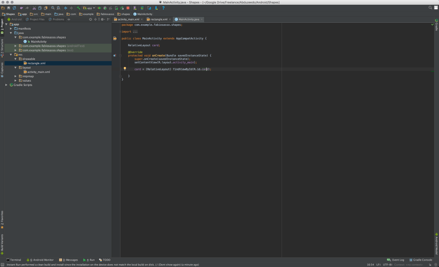
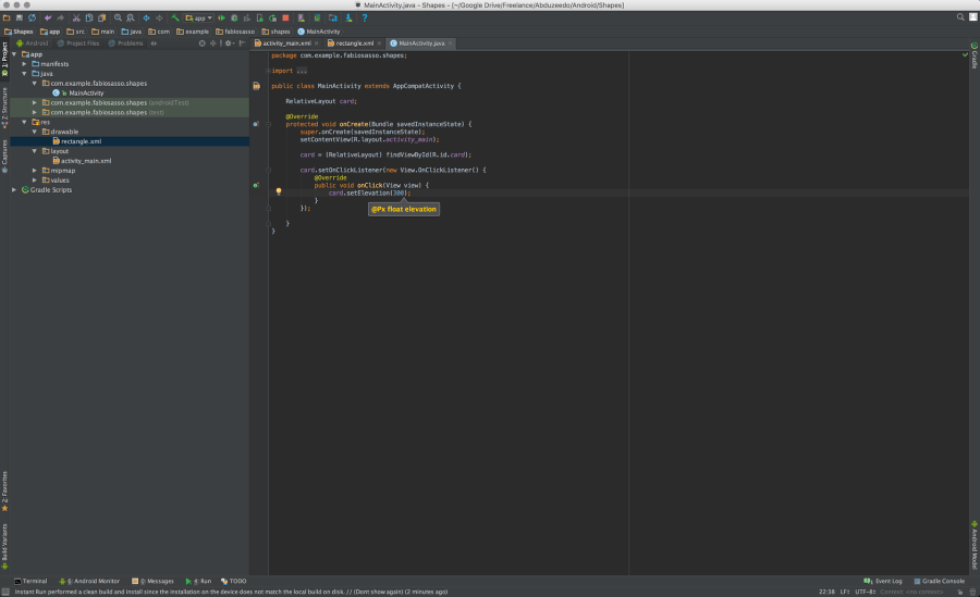
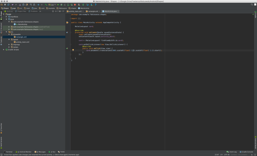
Now open the MainActivity.java and let’s write some JAVA code. In order to access the card layout from the XML file we need to declare and bind the data. The first thing to do is to create a JAVA variable that will be a RelativeLayout like the component we use. To do that just write “RelativeLayout card;” Use the image below for reference. Note the position of that variable is important, write before the OnCreate method.
Step 21
Once we have the “card” variable created, let’s linked to our xml card. To do that bind it using the ID. The code is quite simple: “card = (RelativeLayout) findViewById(R.id.card);” – Don’t ask me what the “R” is. I still don’t know.
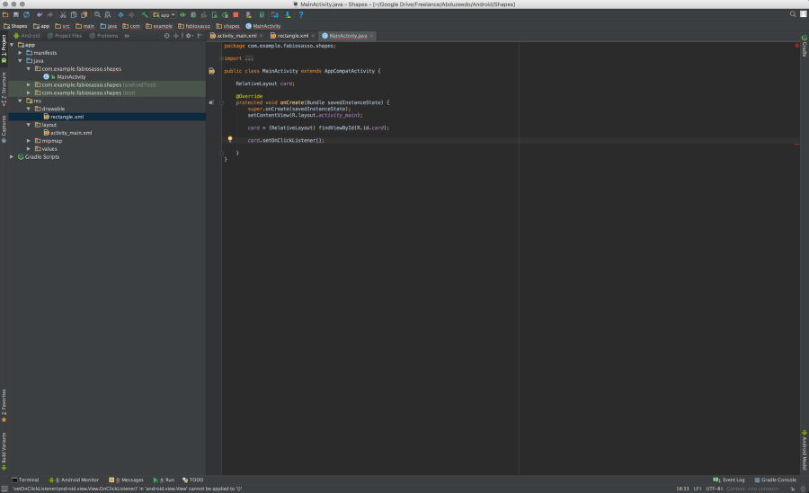
Step 22
After that, it’s almost like JavaScript. Just create a ClickListener event. Use the auto-complete. Note, every time you see the red underline alert press “Command+Return” to show the options.
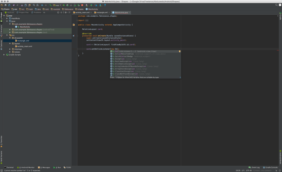
Step 23
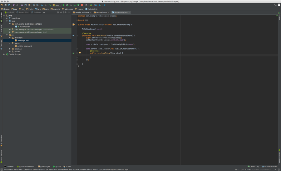
Here’s the auto-complete OnClickEventListener{…} – once you select that it will create the necessary methos and overrides for you.
Step 24
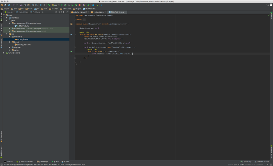
Step 25
Now just change the cards properties. Here I just set the elevation to 300. So when you click the card will pop out.
Step 26
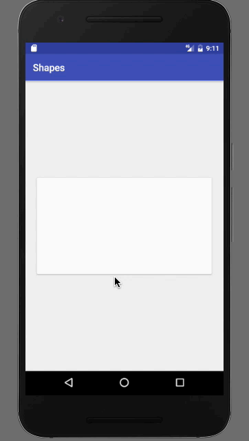
So let’s get a bit fancy. Instead of using setElevation, let’s animate. To do that is even simpler. Just write “card.animate().translationZ(300).start(). That will animate with the click.
Step 27
Let’s also make the card scale X and Y.
Step 28
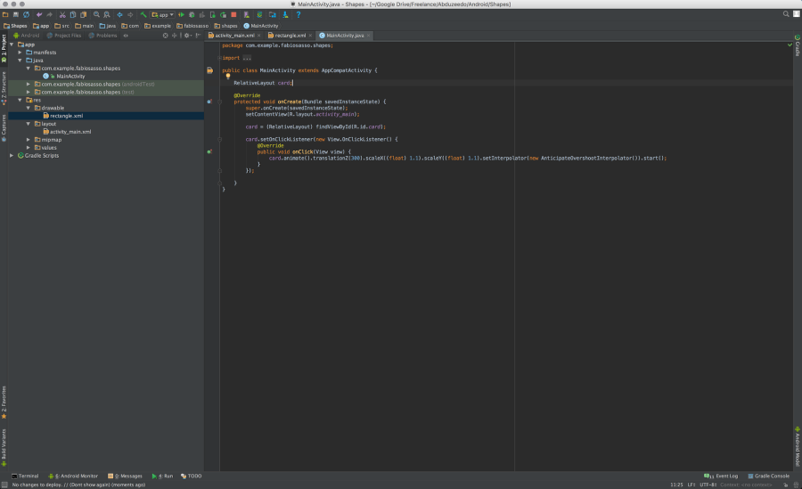
In order to change the curves in android we have to use something call Interpolator. Here I am using a subtle elastic one called “AnticipateOvershootInterpolator()”. It’s pretty much the same thing as translation, you just add “setInterpolator(new AnticipateOvershootInterpolator())”.
Conclusion
If you want to get fancier you can create an “if” statement with a “boolean” value to go back from one state to the other. Again, it’s quite similar to JavaScript in my bad coding knowledge. The best thing is that you get full native experience and understanding about the medium you are working with. That, for me, is the true definition of craftsmanship. Knowing the tools, the materials and having the skills to do it. I hope you enjoy this uber long tutorial. I’ll endeavor to write shorter ones for the forthcoming parts.
abduzeedo
Oct 24, 2016
Source: Abduzeedo Tutorials
October 10, 2016
BramTalks on How to Create New Digital Art
BramTalks on How to Create New Digital Art
We’ve been fans of the work of designer & maker Bram Vanhaeren for quite a while. Based in Antwerp, Belgium, he has been creating and making many works with that distinct style of his with a vibrant colorful palette coming together with unique vector shapes.
About 4 months ago, Bram made his debut with a YouTube Channel where you can find interesting videos on different insights on the industry and some of this life experiences. It’s quite lovely to follow along, definitely give it a watch. For today’s feature, Bram is sharing his process on making new digital art, hope you will enjoy!
Wonder how I create a new portrait? How I exactly work? Today I’m really excited to share precisely how I create new work and show you my process. Starting with an idea, a hyper time-lapse shot – to give you a glimpse on all the magic that happens in Illustrator & some insights how I pick my photographic material.
Watch the Video

More information: http://www.bramvanhaeren.com.
AoiroStudio
Oct 10, 2016
Source: Abduzeedo Tutorials
August 30, 2016
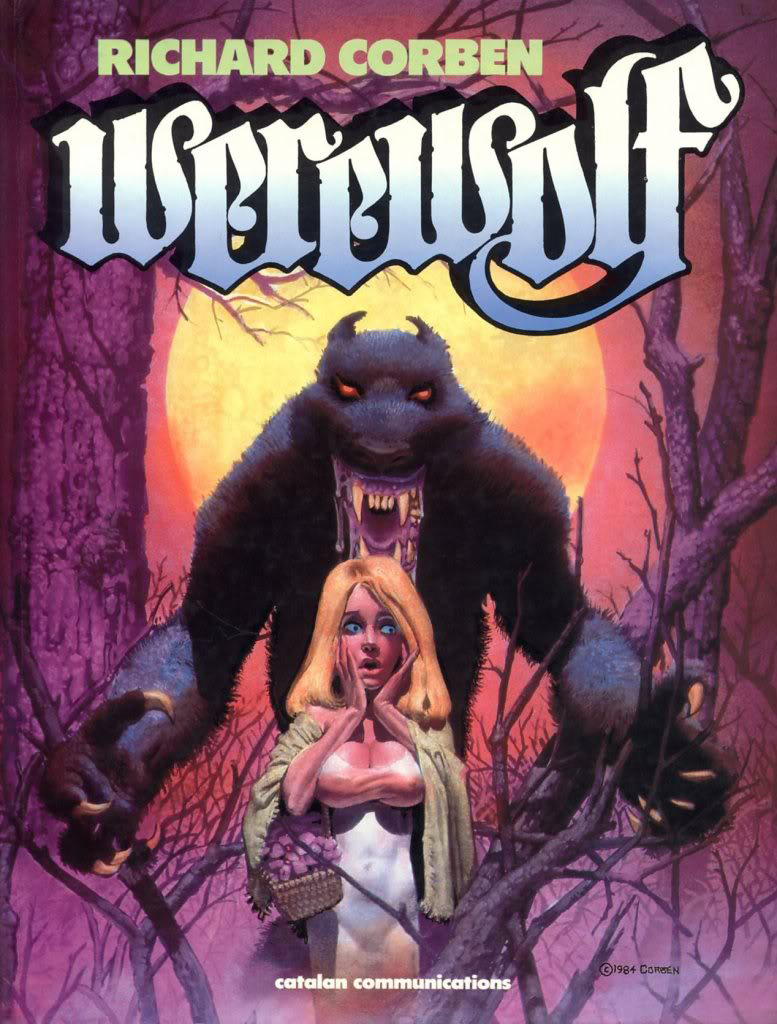
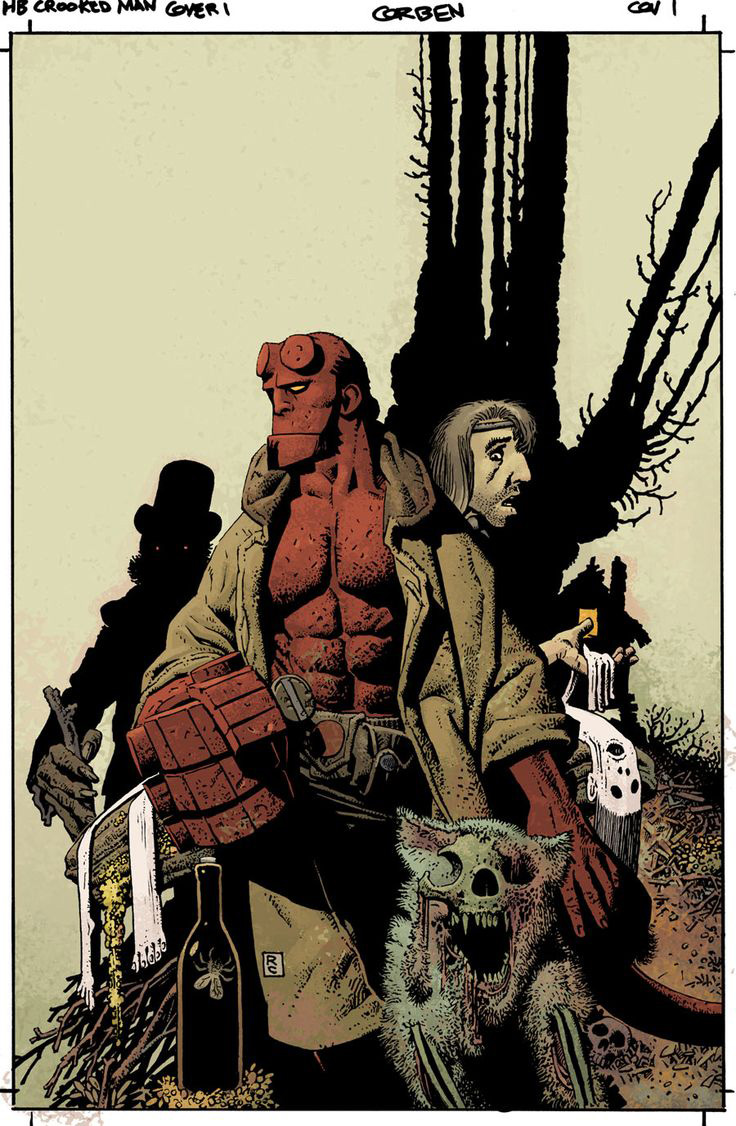
Interview with Comic Book Legend Richard Corben
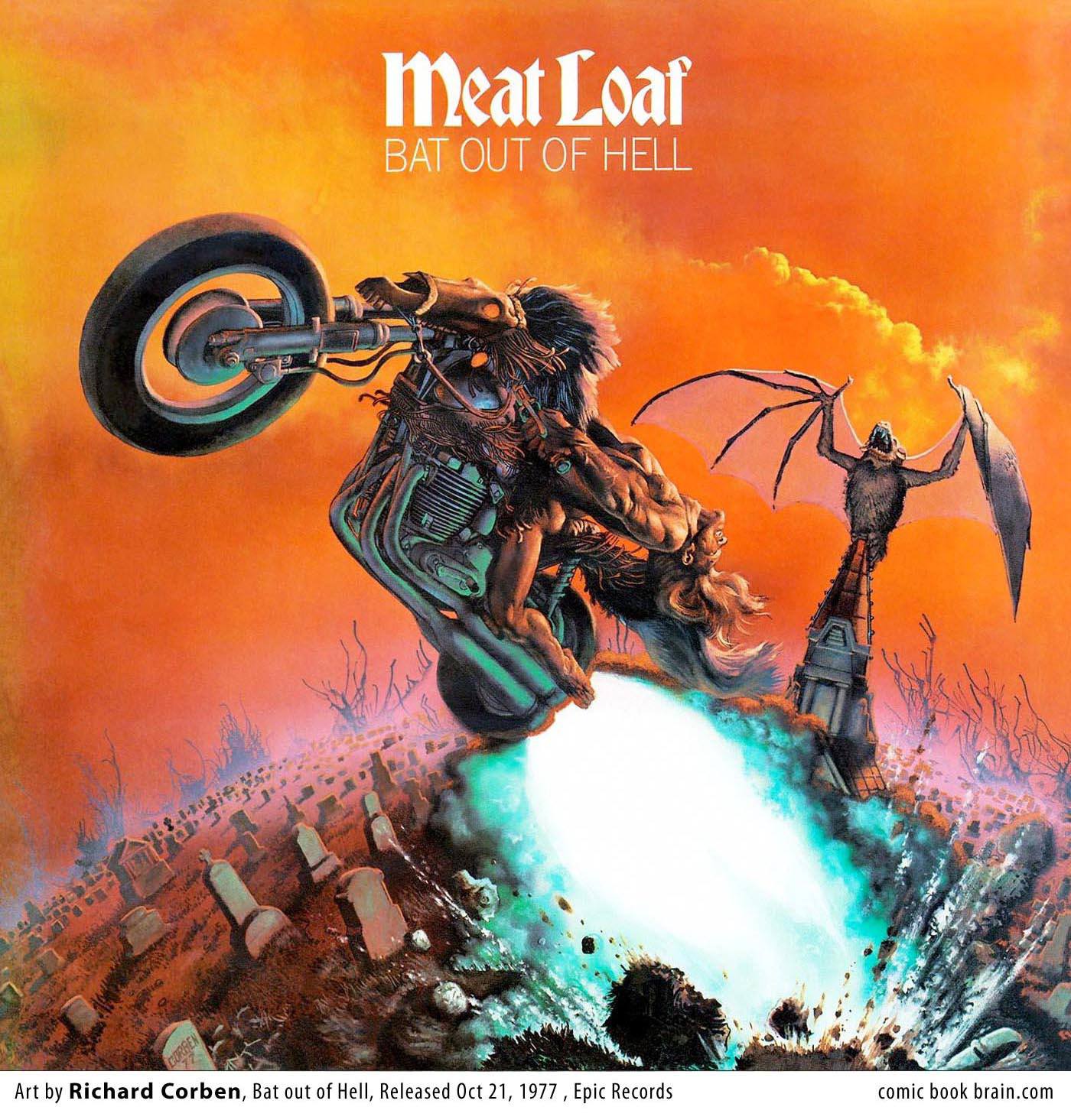
Interview with Comic Book Legend Richard Corben
In all these 5 years doing interviews here for Abduzeedo, I always felt blessed for having the opportunity to contact and to know more about such great established artists and also some young artists full of talent. And today it’s a great day, we had the amazing opportunity to interview one of the living legends of comic books, Richard Corben. I hope you guys appreciate the wise words and stories of this pencil magician.
You can reach Richard on the following links:
1) It’s really a pleasure to interview such a legend of comics. Since you’re pretty much a overachiever, we really would like to know how it all started, tell us more how your journey as a comic book artist started?
I’ve always been interested in comics, not only as a pleasant pastime, but as a medium that I could use for my own visual stories. The earliest comic books I remember were Superman and some westerns. All during this early period, I drew my own comics such as TRAIL, THE DOG.
As a boy, I started collecting the EC Horror and Science Fiction titles. When they were hounded into oblivion I moved on to Tarzan during the Jesse Marsh years. Then I went to Art college and I put away my comic interests to study “serious” art. My earlier goals transformed from a career in comics to one in illustration and filmmaking. When Creepy (the horror comic) appeared everything changed again.
It was about that time that a new phenomenon emerged, the underground comix. This had an incredible effect on me. Suddenly life was filled with amazing possibilities. The editors at Creepy finally started sending me scripts, after much courting I might add. So doing underground comix and drawing for Warren’s horror books allowed me to resign from my regular day job and became a professional comic book artist.
2) Although you already have a really district style and imagery, please tell us who were the masters you got inspiration for your art?
Of course comic strip and comic book artists were my first inspirations. They would include V. T. Hamlin (Alley Oop), Wally Wood, Alex Toth, and Graham Ingles of the E.C. books. During my “serious” phase I was most inspired by the Post-Renaissance artists, Durer, Michelangelo, Carravagio and Vermeer. Art Gods, one and all!
3) Having worked with comics, movies, animation and art, could you tell us what was the work you’re more proud of?
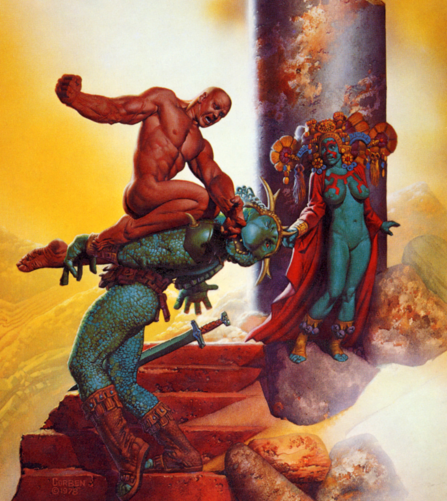
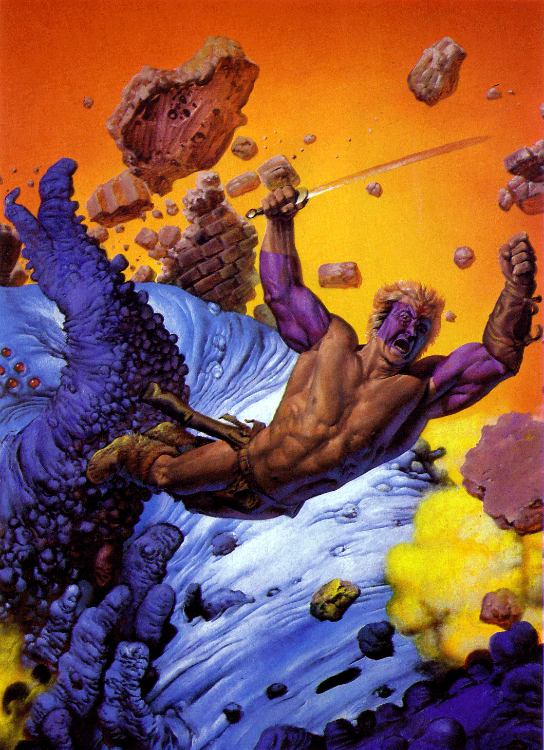
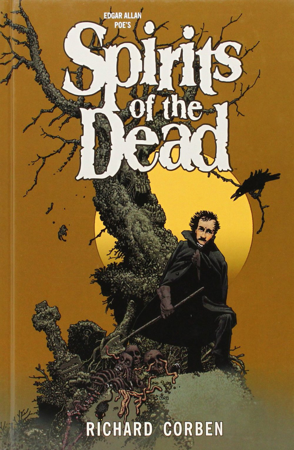
All those disciplines are demanding, but I feel I’ve been more successful at doing comics. My favorites would include Bloodstar, Den, and more recently, Spirits of the Dead, a collection of my adaptations of several Edgar Allan Poe stories and poems.
4) Describe us a bit about your creative process while creating a piece.
I’m doing more writing these days, including my current project. Roughly, I start with a short story concept; the ideas can come from anywhere. Sometimes it might be based on a character I’d like to develop. From that concept, I sketch ideas. Then scenes must be developed and edited to fit into the number of pages, usually 8.
From there some thumbnail panel breakdowns are done including some necessary dialogue and narration. Next, research is done and reference material gathered for more sketches. Finally, the artwork itself is started. When completed, the pages are scanned into the computer and additional tones or color are applied. Then the final text is written and set to the art with balloons. The last thing is to upload the files to the publisher’s storage web page.
5) How do you describe your daily routine?
Being semi-retired and not desperate to maintain a strict daily output, I’m more casual about scheduling than in former times. I work a couple of hours before lunch and about 3 to 5 hours after lunch. Regular exercise, dinner, then relax with TV or work on hobbies in the evening.
6) You’re still active on the comics business, having done some recent work for publishers as Dark Horse. Tell us what projects can we expect from you in the near future?
Nothing has come out by me in over a year, but I’m hard at work on an anthology series, which I’m not supposed to specify. I can say there will be 8 issues of black and white tonal comics. At this point I’m over halfway through issue 5.
7) Being a comic art veteran, you already saw a lot of trends come and go. Could you tell us what you think about the future of comics?
Predicting future comic trends is like trying to predict the weather; I really don’t worry about it. I just draw my comics the best I can and hope they will find an appreciative audience.
8) Being a multimedia artist, please tell us what’s your favorite media to work with? Why?
An ideal medium for me would be one that is fast, direct, and able to render all the qualities I wish to include. For most comic artists it’s the simple technique of pen or brush and ink. I’m known for adding tonal modeling to my comic art. I do this normally with Prismacolor gray pencils on slightly soft paper that will allow some smear blending. Of course I’ve tried many techniques including computer tools, but I keep going back to the pencils.
9) Finally, what advice would you give to the youngsters trying to break into the comics business?
To make a career doing comic art, drawing pretty much has to be easy for you. It can be challenging, but always meet the challenge. Skill with heads and faces is of upmost importance, followed by hands, figures, linear perspective, architectural and mechanical effects. And, of course, a sense of dramatic storytelling is vital. I’ve always drawn from life, photos, and imagination. Attending life drawing sessions for both training and relaxation is regularly part of my schedule. Such a career can be full of pitfalls. It helps to be stubborn.
marcos333
Aug 30, 2016
Source: Abduzeedo Interviews
August 15, 2016
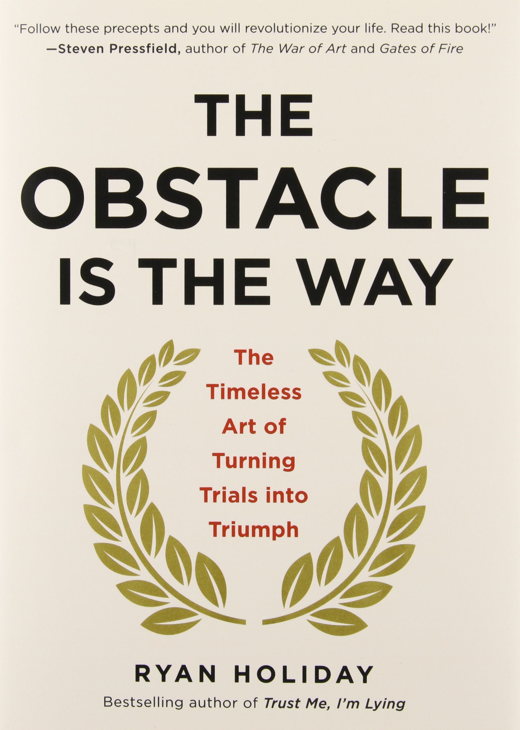
The Obstacle is the Way – Book Suggestion
The Obstacle is the Way – Book Suggestion
These past few months I’ve read quite a few books of varying topics, from simple fiction to alchemy. Among these books I’ve read two from Ryan Holiday, his latest I believe, Ego is the Enemy and the most popular The Obstacle is the Way. Both books are quite good but I’ll focus this book suggestion post solely on The Obstacle is the Way. I recommend this not only because of the difficult time I have been going through personally but because it has really good insights on how to deal with situations in life.
The Obstacle is the Way is a great portrayal of stoicism, the ancient Greek philosophy of enduring pain or adversity with perseverance and resilience. Stoics focus on the things they can control, let go of everything else, and turn every new obstacle into an opportunity to get better, stronger, tougher. As Marcus Aurelius put it nearly 2000 years ago: “The impediment to action advances action. What stands in the way becomes the way.”
The book is rife with amazing quotes and I feel the greatest takeaway is that obstacles are part of our lives, we don’t choose them. Once you think that that’s the only way you stop questioning why that happened to you. I’d say that it’s not that the obstacle is the way, but life is the way. We need to be adaptable. We need to learn to face adversities not as setbacks but learning opportunities.
I know you might say, it is easier said than done. I agree, but I believe we are always ready for what is given to us. The problem is that we neglect that or we try to reason why instead of moving forward, adapting and learning.
“Ryan Holiday, the author, shows us how some of the most successful people in history—from John D. Rockefeller to Amelia Earhart to Ulysses S. Grant to Steve Jobs—have applied stoicism to overcome difficult or even impossible situations. Their embrace of these principles ultimately mattered more than their natural intelligence, talents, or luck.” — amazon.com
“If you’re feeling frustrated, demoralized, or stuck in a rut, this book can help you turn your problems into your biggest advantages. And along the way it will inspire you with dozens of true stories of the greats from every age and era.” — amazon.com
Heres a video from Ryan about stoicism: Stoic optimism: Ryan Holiday at TEDxUChicago 2014
abduzeedo
Aug 15, 2016
Source: Abduzeedo Books
June 13, 2016
Adobe Take 10 Challenge: A Sit-Down with Joshua Davis
Adobe Take 10 Challenge: A Sit-Down with Joshua Davis
The folks over at Adobe have been putting together a pretty interesting challenge entitled: Take 10 Challenge. In this challenge, you have to create an artwork using 10 Adobe Stock images and you can win a lot of great prizes. For the 2nd take, they are going with the word Weightless and all the submissions will be judge by the mighty Joshua Davis. For the occasion, we had the opportunity to share a few questions with him, hope you’ll enjoy this interview.
Tell us about yourself? What do you do for living?
My Name is Joshua Davis. I’m the Media Arts Director at a studio in New York called Sub Rosa. Since 1995, I’ve been using computers as a medium to create work, lately focusing on the collaboration between hardware and software to create physical interactive experiences.
Tell us about the Adobe “Take 10” Challenge. What was your involvement and how did Adobe approach you to be a judge?
Over my career as a designer, I’ve had a long relationship with Adobe. The software they make helps me deliver the best visual experiences possible. The company reached out to me and threw me an interesting challenge: “you get 10 images from Adobe Stock and get to make whatever you want.” It sounded like a fun project. Given I’ve never worked with Adobe Stock, or with any kind of stock photography, this seemed like the perfect opportunity to do something out of my comfort zone. I agreed to collaborate on 10 Adobe Stock pieces of content and to make something that sings with my style and voice and then to challenge the community to do the same. Then, I become a judge to award winners with some great prizes.


What criteria did you look for while looking at the submissions?
For this Adobe Take 10 Challenge the keyword was “weightless.” The common reaction was to create something that embodied this word. Instead, I chose to use the word as a property in an animation algorithm. What would it look like if I suspended all this Adobe stock in a state of weightlessness and observed and rendered its composition? I wanted the challenge to inspire and push me.
I would hope my finalists embody this same thinking. I want to be inspired by the risks they take. To me, a winning piece of work should always invoke jealousy for not having thought of what they made.
Tell us your process behind reviewing all those submissions?
I want to stop in my tracks and say, “Damn I wish I would have made that.” This doesn’t always mean beauty. To me the most beautiful work might not be the winner. Being unique don’t always mean being pretty and I’m looking for unique.
Aside from this challenge, do you get creative satisfaction on commercial projects? How much time do you give yourself for personal work?
Much of my time in the Sub Rosa lab is split. Half of the time, I’m researching new code, new hardware, or new ways of remixing things to create visual aesthetics. This allows us to spend the other fifty percent of our time applying this research to commercial clients. Our goal in the lab is always to strive to innovate not replicate.


How does social media affect your work these days?
I have a website, but I imagine that no-one ever goes to it. Rather, social is 100% the megaphone by which I broadcast the things I’m working on to the world. Funnily enough, I have pretty strict rules about which content lives where and what purpose it serves.
My hierarchy is as follows:
I have 77k+ followers on Instagram. I use this space to permanently document thinking in flux, projects in motion. The content is usually somewhat final. This Instagram content gets pushed to 27k followers on Twitter and 24k followers on Facebook. If the work is really rocking me, I create larger selections from a series to post exclusively on Ello.
Generative animation is a huge component of what I do, and longer, better quality animation renders go on Vimeo.
After all this is done, and a body of work is complete, it gets packaged up as a final project on Behance.
I use Snapchat to show day-to-day through my eyes. It includes mistakes, crazy ramblings, late night dance parties; stuff that should definitely evaporate after 24 hours, especially when you scream at your followers that you’re a wizard, while fully dressed up as a wizard, etc.
Where do you see your work/style evolving in the next few years?
I’m mostly following the evolution of gaming boxes these days. The evolution of gaming video cards has allowed me to explore using the GPU to render meshes and textures and animate in ways I never thought I would be able to do. Having just demo’d Microsoft’s Halolens in Barcelona, I’m much more excited about Augmented Reality-related experiences than Virtual Reality-related experiences.
On a last note, what is a common mistake that most designers always make these days?
I’d say, having taught in an art university for 10 years, a lot of education systems are about replication, rather than innovation. We teach, “copy Van Gogh” or, “copy Picasso.” This can be fine to a point but what gets lost is finding your voice.
Following your industry on the internet can be a slippery slope. Replicating those you admire only gets you farther away from who you are.
Find you. It’s actually easier than you think, because you are pretty good at being you.
For more information about Joshua Davis: http://www.joshuadavis.com and about the Adobe Take 10 Challenge: http://create.adobe.com/2016/2/17/take_10.html
AoiroStudio
Jun 13, 2016
Source: Abduzeedo Interviews
June 9, 2016
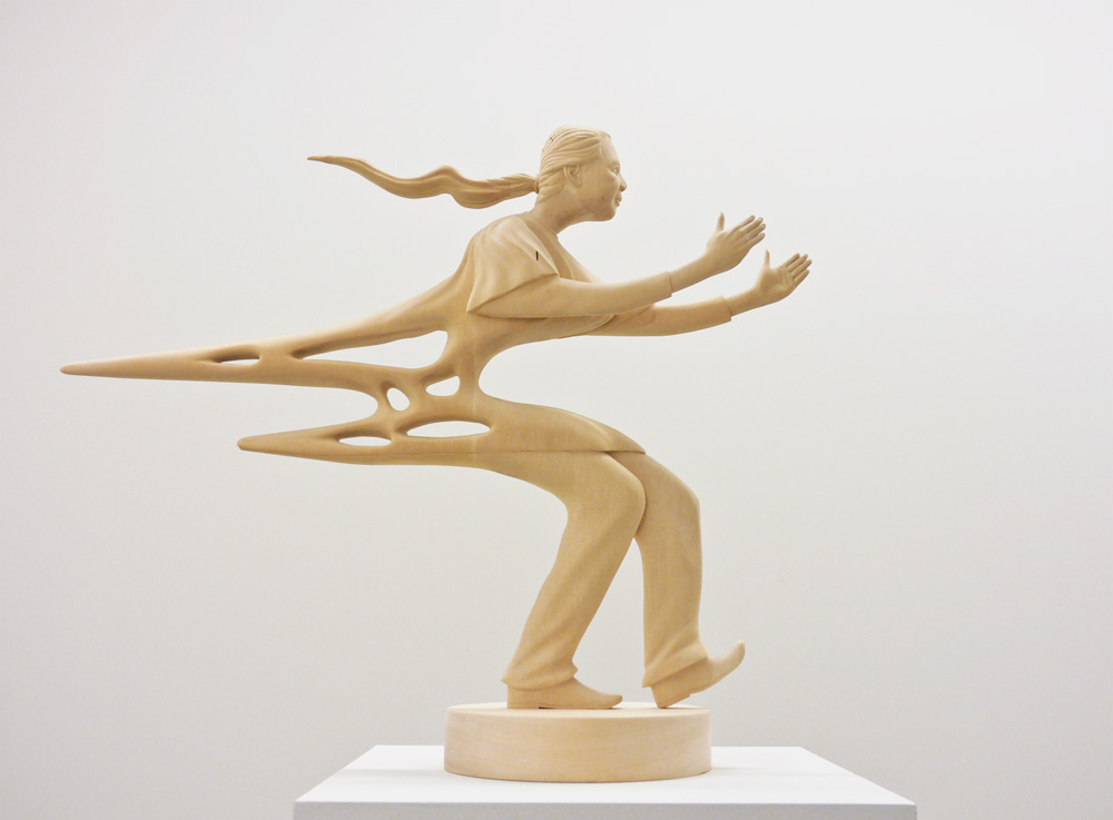
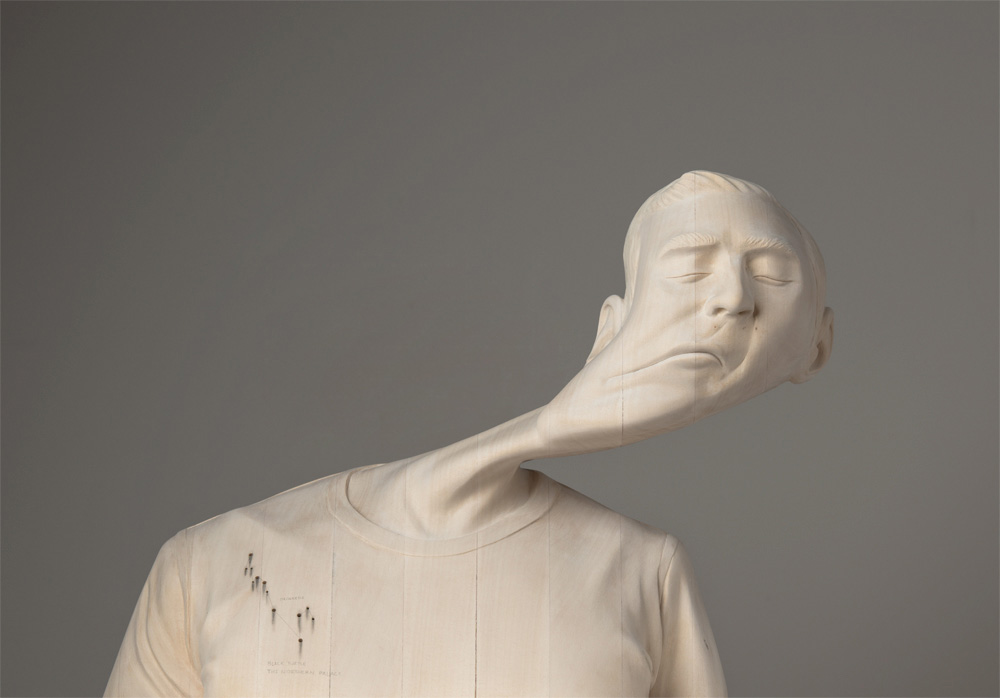
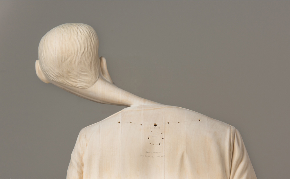
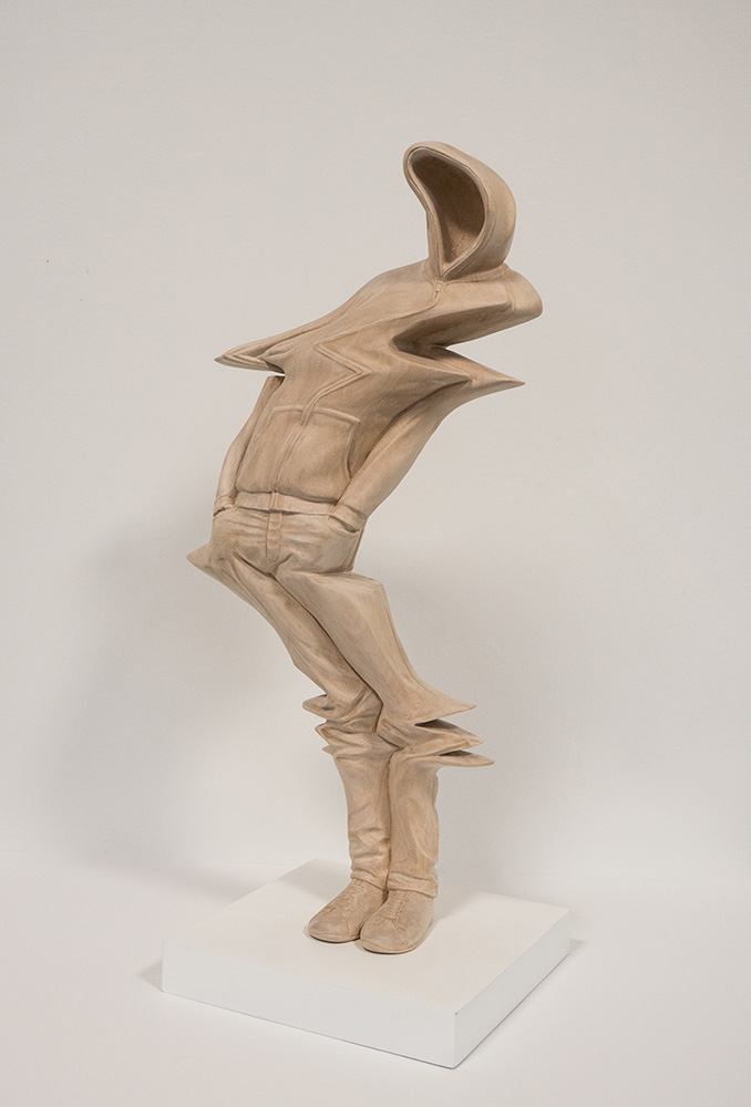
Interview with Paul Kaptein
Interview with Paul Kaptein
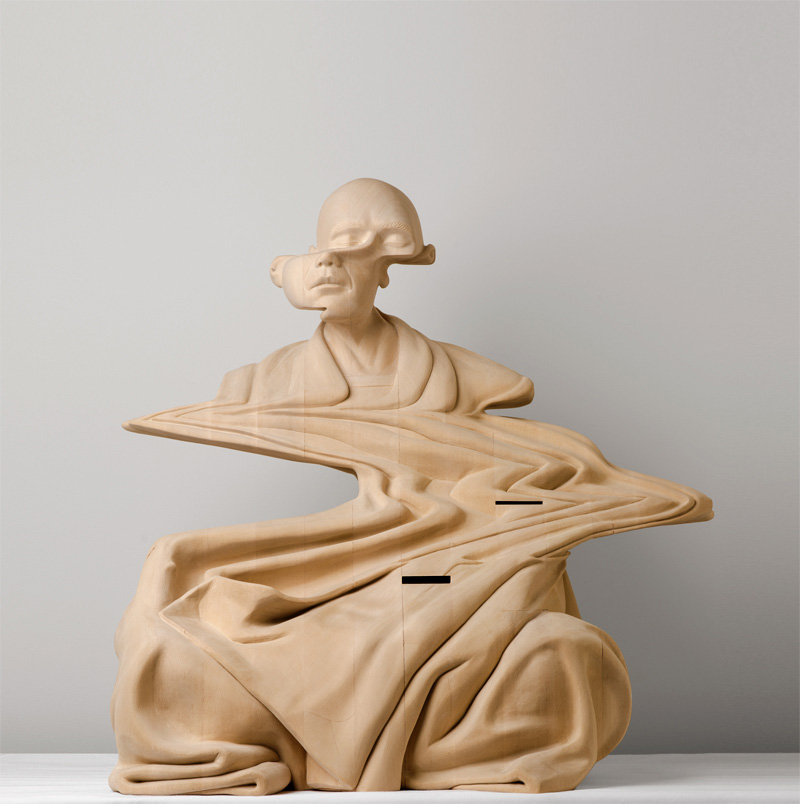
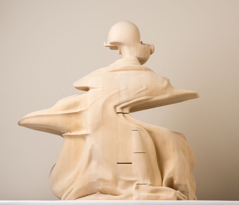
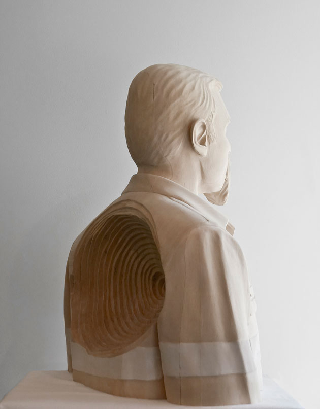
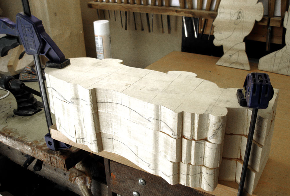
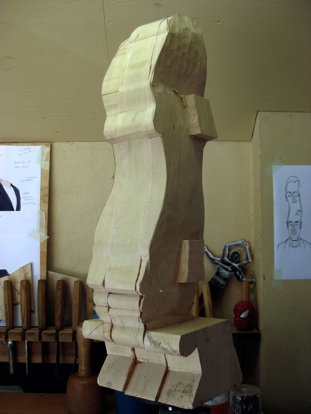
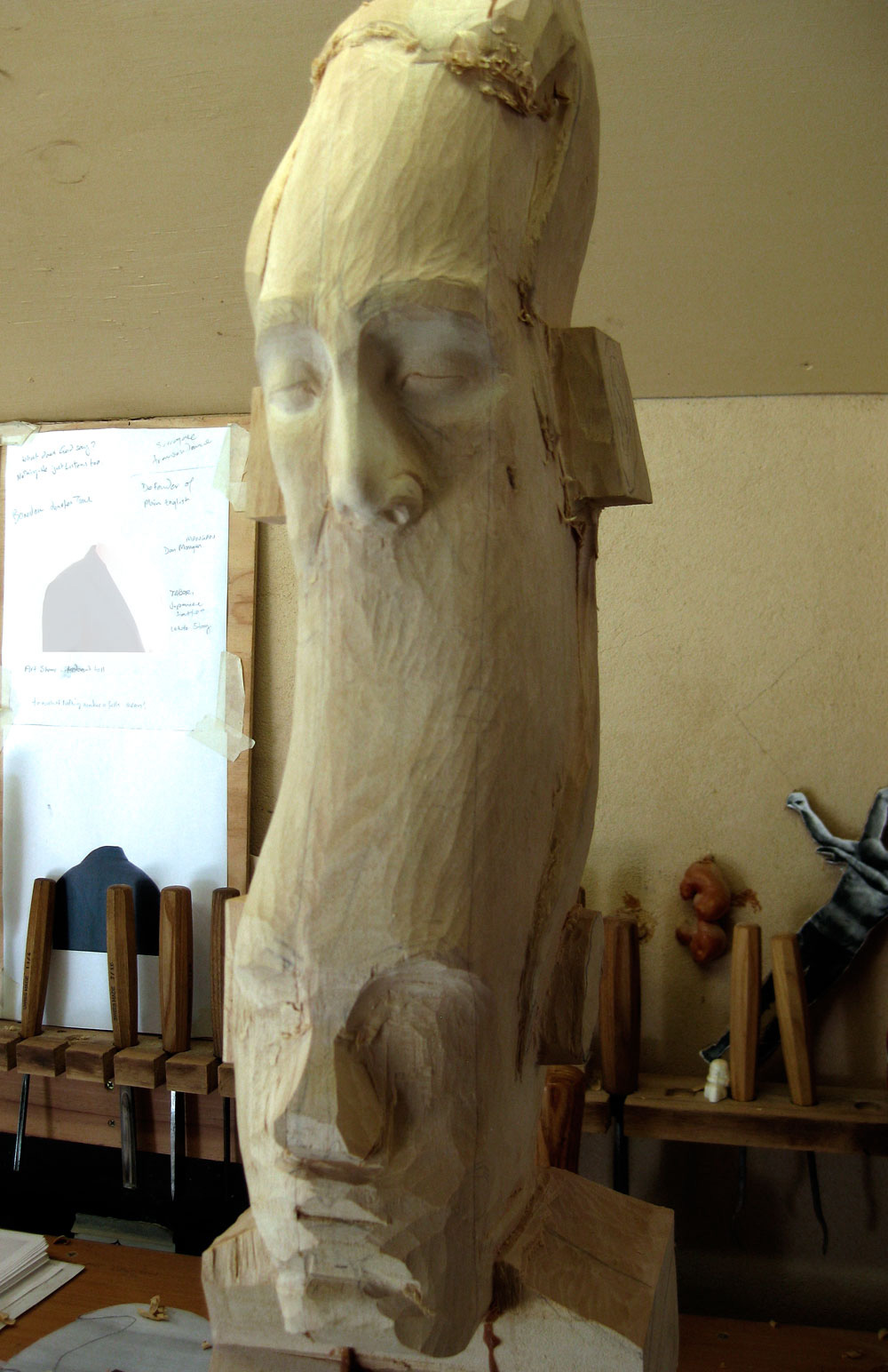
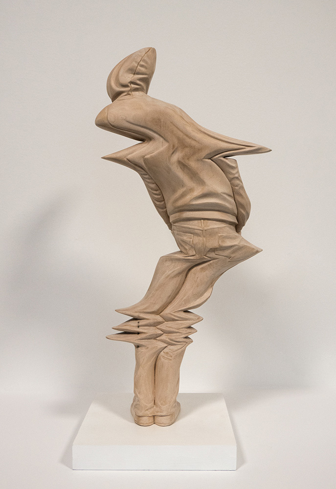
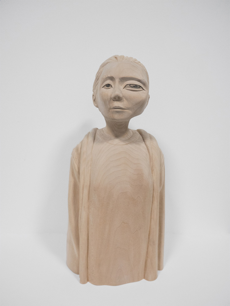
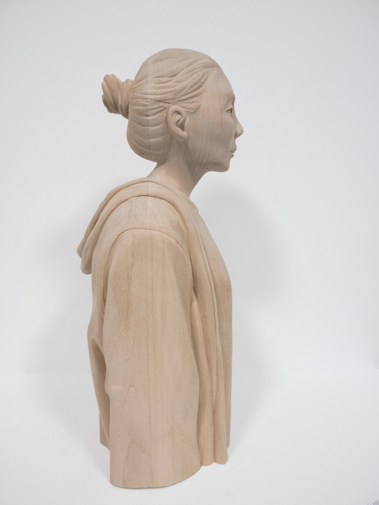
I’m always fascinated by technological advances that mix more and more the real world with the virtual world. Whether through the already common resources such as augmented reality or the recent Oculus Rift. Paul Kaptein has a artwork that lives in this intersection, having worked for years in the digital world, his vision of art applies into several concepts that are still abstract in the real world.
You can reach Paul on the following links:
First of all I would like to thank you for doing this interview, it’s an honor for us to present more about you to our readers. I would like to start asking you about when your interest for carving and art started?
Thanks for having me!
I think at some point I really wanted to challenge myself as a sculptor. I’d been working across design and animation and video in my working life and that sort of drove my arts practice for a long time – and it became really comfortable and safe. I was also a bit tired of slick, manufactured works everywhere.
There was an ‘outsourced aesthetic’ proliferating and I was resisting that a bit. I figured carving was sufficiently out of fashion and worthy of pursuing.

2) Which artists do you use as reference?
Ricky Swallow was the first artist I knew of that had used carving in the contemporary art world. He still casts a long shadow in that respect. And he was also the reason not to try carving for many years! Stephen Balkenhol is another whose work is also really great from a carving point of view. Anthony Gormley, Tony Cragg and William Kentridge were the major points of reference when I started out. I didn’t imagine I’d become a figurative artist though.
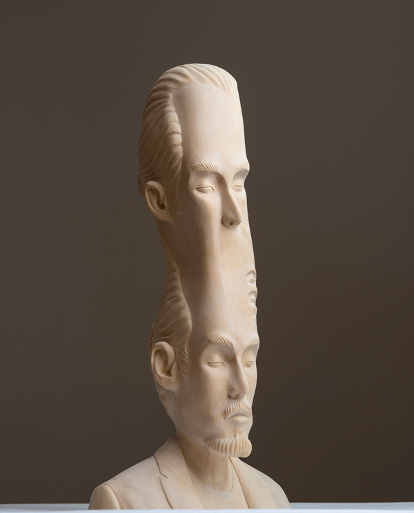
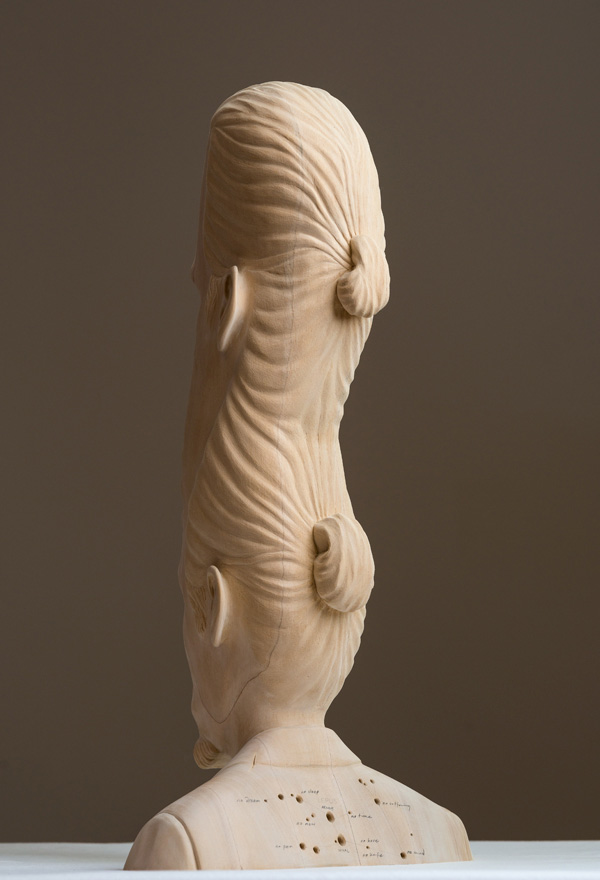
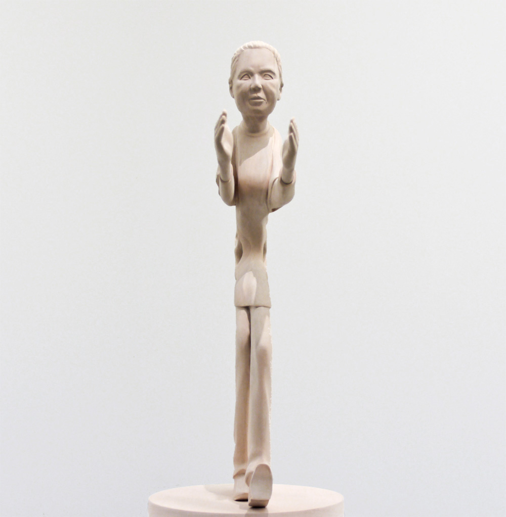
3)Your style is quite influenced by glitch and surreal art. How did you develop this style and how would you describe it?
Please don’t call it surrealism. It’s more ‘wonky realism’ than surrealism. I’ve never been a fan of surrealism. Ever! Apart from Magritte and small doses of De Chirico perhaps.
Um…I became interested in the glitch aesthetic as consequence of working in video and animation and they sometimes you’d get these little disruptions and distortions and corrupted files that had a certain charm. I’d been looking at the paradoxical nature of time and the ‘now’ and onion skinning and playhead scrubbing were simple ways of disrupting the linear flow of time and I’ve tried to apply these media based conditions to sculpture embedded in the physical world as a way of extending the idea of how something sits in the world and occupies space.

4) Describe us a bit about your creative process while creating a piece
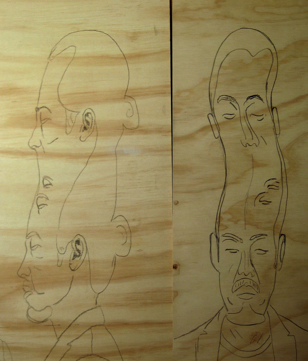
I usually start with some photographs as reference and play around in Photoshop to get the frontal distortions. I don’t have any 3D software skills so I have to work out the missing information as I go. I don’t really have much scope for changing anything once I’ve started though. It might be nice to have someone run some algorithms on a 3D model and see what came of that. If you know anyone?
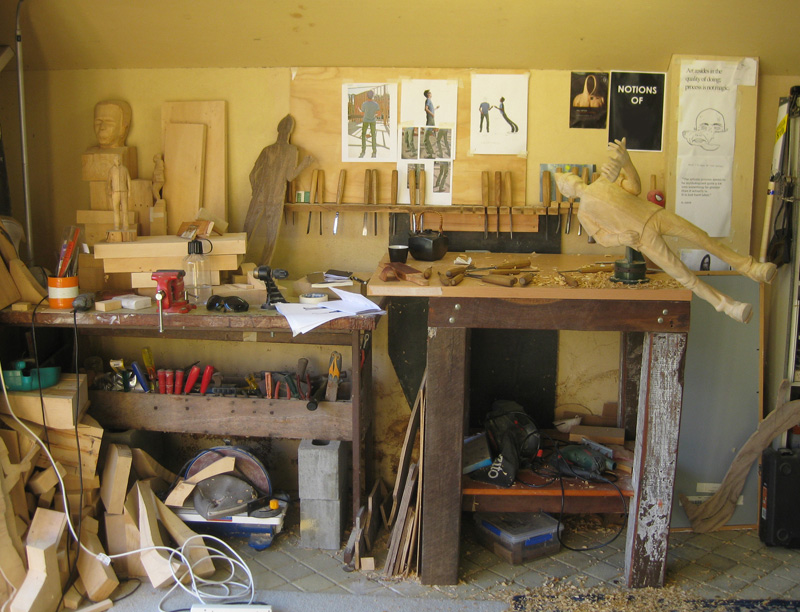
Apart from some band sawing at the start to get the basic shape, it’s all hand done.
I believe in the deep, dark mystical world of traditional carving though I’d forfeit the right to call it a carving as I finish the work with sandpaper.
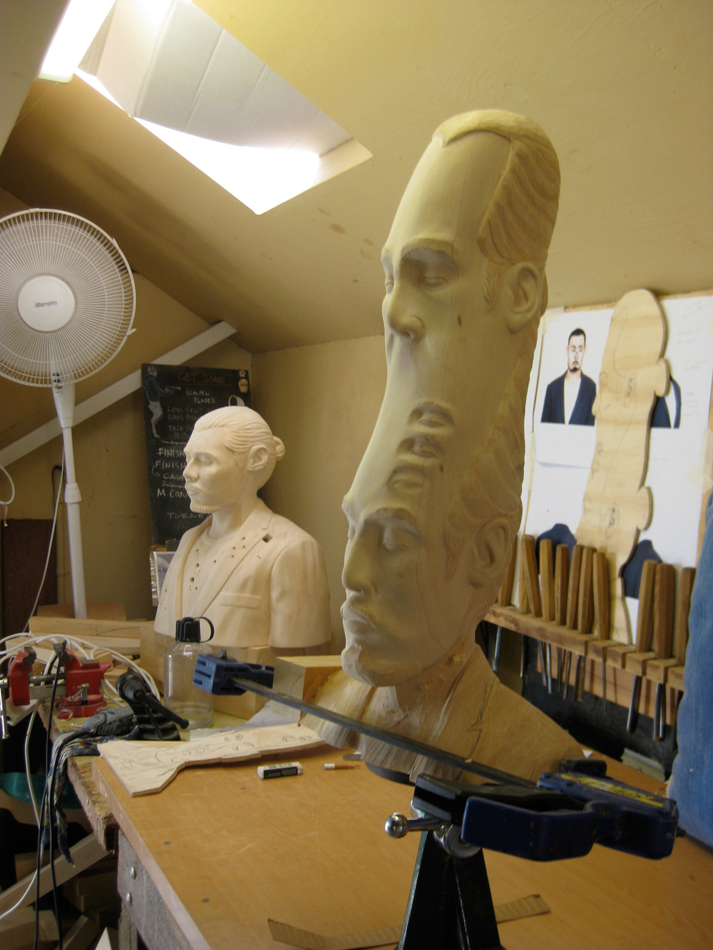
5) What would you consider the best moment on your career till now?
Having my work acquired by a few major public collections has been great in terms of validating my practice. Also winning a few art awards has many great side effects, not the least of which being income. Receiving email from around the world with offers of exhibiting is something I never expected and I hope it continues.
6) How do you describe your daily routine?
I usually start with ride to the beach and swim, or surf if there is a wave. Getting to the beach as often as possible is great for clearing the head and sets the tone for the day. I get into the studio by 8.30 – 9 and work until 5 or 6. Time appears to move pretty quickly when I’m working.

7) Being a multimedia artist, please tell us what’s your favorite media to work with? Why?
At the moment it’s wood. It hasn’t refused me! I’ve been wanting to return to sound as well. Maybe this year…
8) Tell us five lessons you believe are really important for every artist.
Work
Play
Take risks
Work harder
Schmooze
9) Tell us websites that you like to visit.
Local surf report. I also check Instagram a few times a day, but I generally try and stay of the net. After emails are dealt with it’s time get going.
10) Thanks again for your time, please leave a final message for the ones who are starting out on this kind of business.
Work hard and lower your expectations.
marcos333
Jun 09, 2016
Source: Abduzeedo Interviews
June 1, 2016
Interview with Javier de Riba
Interview with Javier de Riba
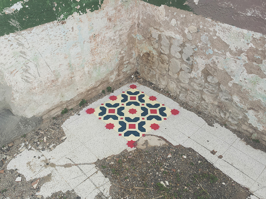
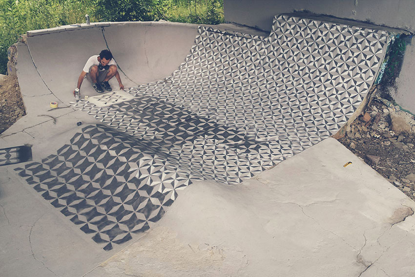
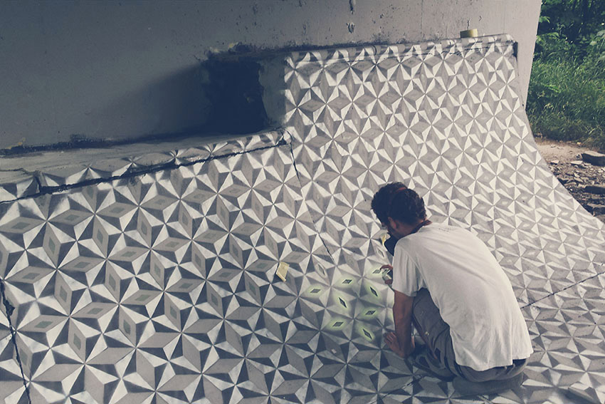
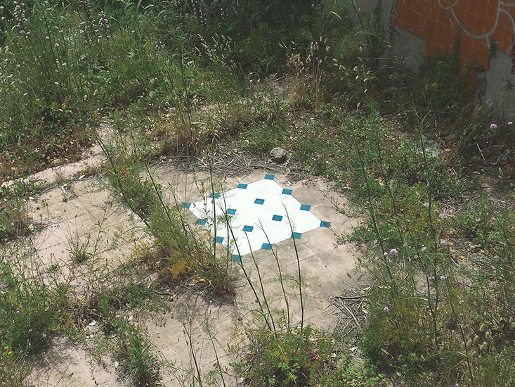
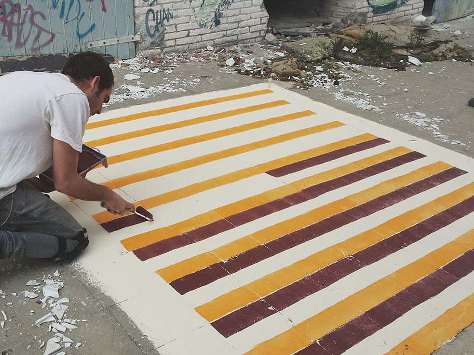
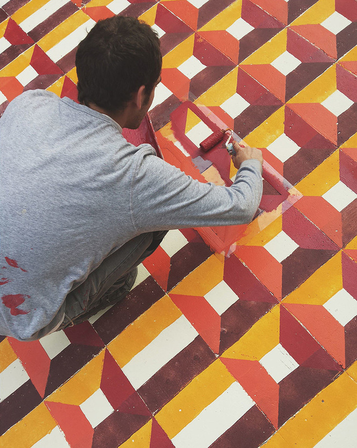
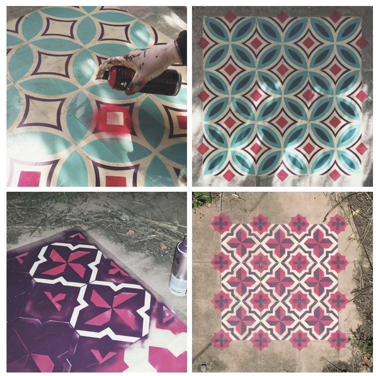
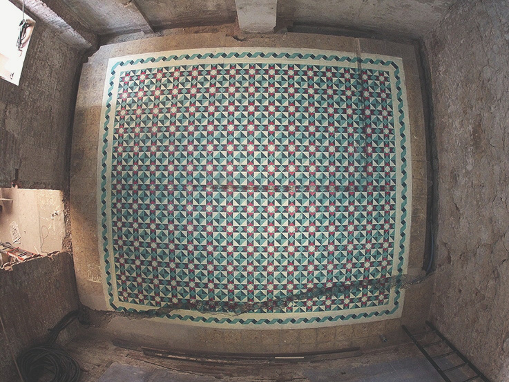
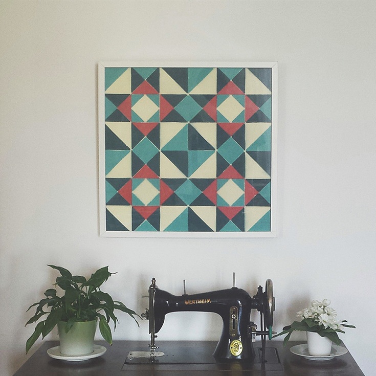
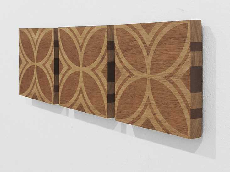
It’s really interesting to see a revival of old techniques into new medias, Javier de Ribas is an artist that brought cement tiles into street art, using them to enhance abandoned ambients adding some color and shapes. We had the opportunity to talk with this rising talent.
You can reach Javier on the following links:
1) First of all I would like to thank you for doing this interview, it’s an honor for us to present more about you to our readers. I would like to start asking you about when your interest for street art and patterns started?
I always enjoy seeing art in the public space, how it relates with the enviroment and how it proposes a dialogue with the viewer.
I studied graphic design and in 2010 with Mará López and Edu Pi started a project called Reskate Boards & Illustrators. It’s about recycling skates. We take old skateboards and reshape them, sand them and give to visual artists to recostumize them. This direct contact with illustrators, painters and visual artist makes me learn a lot and start developing my art.
The interest for the patterns comes from other point. At the end of the 19th century, hydraulic mosaic factories began to appear in the Catalan countries. Many homes in this area feature this type of tile, and I have lived with them all my life.
2) Which artists do you use as reference?
What inspires me a lot is looking how others work. I’m thankfull with internet I can see really good people and meet them. Collaborating with people makes me get a lot of inspiration. I don’t use to give names but Aryz makes me cry :D.
3) Your style is quite influenced by patterns design / retro geometric art. How did you develop this style and how would you describe it?
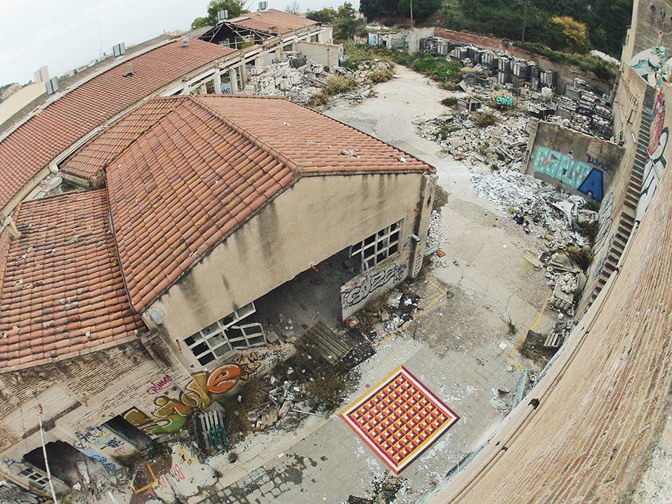
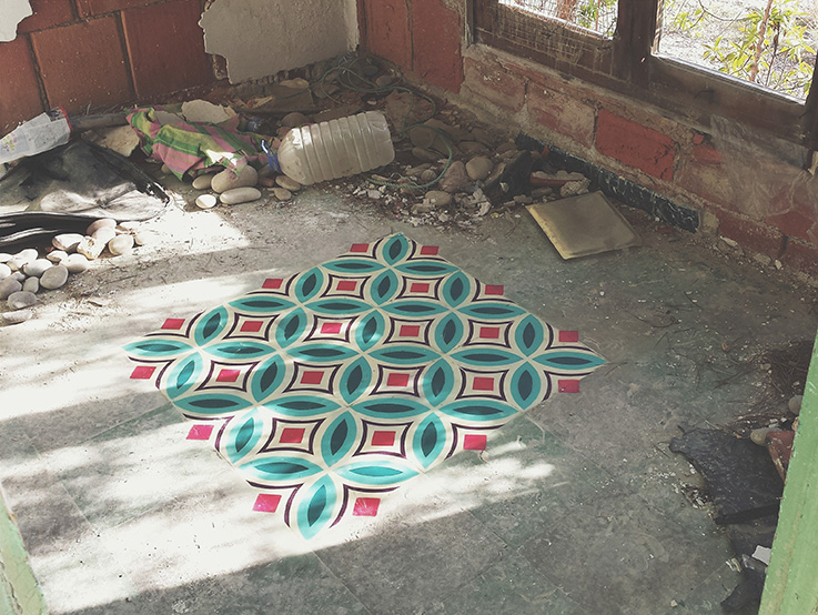
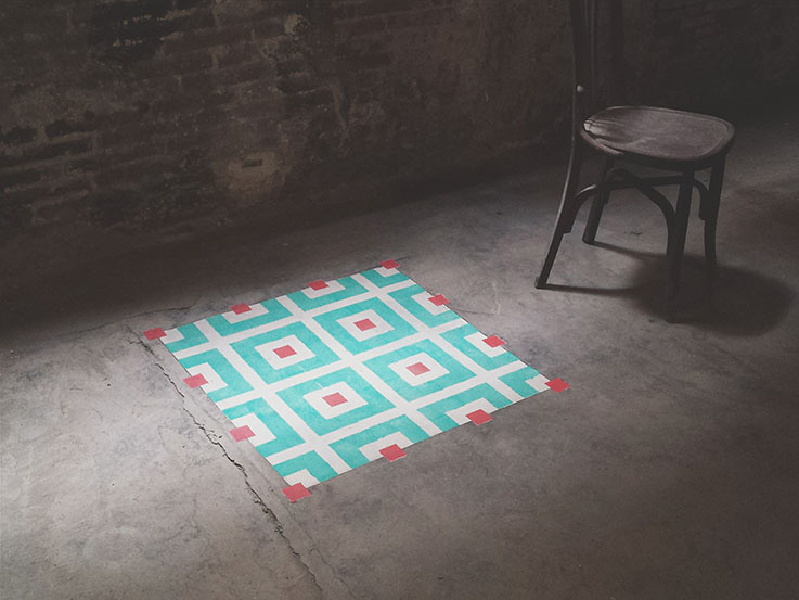
I love patterns! They add personality and fill the space with a unique rhythm. I’ve work with geometrical patterns because it was the first kind of designs that appeared. Are synthetic way to represent flowers. Each tile is identical, but the repetition generates new forms, born out of how each of the tiles join and intersect. Like in abandoned tiled floors, flowers usually appear between the tiles. Is for this reason that the name of my project is “FLOORS,” comes not only from the use of flooring as a canvas, but also from “flors,” the Catalan word for flower.
4) Describe us a bit about your creative process while creating a piece
For the Floors project, I don’t spend so much time painting. I work more previously planning and less on the painting, taking measures and looking for the location, then making the stencils. Sometimes I paint in various days/nights. Each day one layer (one Color) but other times i do all on the same day/night, it depends on where is the action. The biggest one that I did I spend 8 hours painting with kneepads. Sometimes I also spend time taking photos and video editing. The documentation of this action showing the space I think that is a big part of the project.
In other projects I see what the projects asks and try to work their necessities. I believe that the medium is the message. So when I find a message to share I will look for the medium that express better it’s message.
5) What would you consider the best moment on your career till now?
There are many! The first exhibition of the “Reskate Boards & Illustrators”, the week with Minuskula and Guim Tió, the day that we present in Vienna the Harreman project with photoluminescent paint.
6) How do you describe your daily routine? (Send me a pic of your office). I don’t have, sorry!
Unstable! I’m working now on my future studio. At the moment I’m working wherever I can. Every day is different and I adapt myself.
7) Being a multimedia artist, please tell us what’s your favorite media to work with? Why?
I love all of them. I think that the point is to diversify and take each medium an canvas with the motivation of the first time.
8) Tell us five lessons you believe are really important for every artist.
1. Research
2. Do what you say
3. Say what you do
4. Prove it
5. Ignoring the lessons of others and build yours working
9) Tell us five websites that you like to visit.
I work a lot with www.behance.com but I don’t have a lot of websites that I visit regularly. For me internet is a place to get lost.
10) Thanks again for your time, please leave a final message for the ones who are starting out on this kind of business.
One day I red a sentence that says: “Art change the people and the people change the world” . We should keep it real!
marcos333
Jun 01, 2016
Source: Abduzeedo Interviews