-
News & Updates
camera
April 7, 2018
How to build a cheap VR-ready PC
Once you get past the sticker shock of picking up a headset, the rest of the hardware you’ll need for a basic VR rig is relatively inexpensive. Whether you’re using the Oculus Rift or the HTC Vive, these suggestions will help you make the right choices for your PC build.
The post How to build a cheap VR-ready PC appeared first on Digital Trends.
Source: Digital Trends VR
April 7, 2018
Learn How to Make Your Own DIY Sound Panels for Your Home Studio

If your audio isn’t up to snuff in your home recording studio, these DIY acoustic sound panels might help.
One key to recording great audio in a studio, whether it’s in a professional space or your home office, is by reducing the amount of reverberation in the room. This can be tricky to pull off, especially if the space is large, empty, and full of reverberant surfaces. There are some quick DIY solutions to cut down on echoes and reverb, like covering surfaces with heavy blankets, clothes, or towels, but if you want a more permanent solution, like something you can actually install, check out this tutorial from Ray Ortega. In it, he teaches you step-by-step how to build your very own acoustic sound panels using a few boards and some relatively inexpensive rockwool insulation. Check it out below:
Source: NoFilmSchool
April 7, 2018
No Macro Lens? Here Are 3 Ways to Get Macro Shots Without One for Under $20

Macro lenses might be spendy but these alternatives are definitely not.
We all know the limits of our lenses, but that doesn’t mean we still don’t try to push them way beyond their capabilities. Personally, I try to turn all of mine into macro lenses—I get close to my subject, focus, move a little closer, try to focus, and move closer still, but eventually, all I’ve got is some useless blurry mess. Unless you’ve got a dedicated macro lens, I assume you’ve done this too, and I bet you’ve considered buying one until you saw the price tag.
Well, if you’re on a tight budget but still want to capture some macro shots, Caleb Pike of DSLR Video Shooter has shared three alternatives that will do a pretty decent job under $20. Check out his video down below:
Here are the inexpensive macro alternatives Pike mentions in the video
Source: NoFilmSchool
April 6, 2018
Watch: How to Pull Off a Stylish Whip Pan Transition in Adobe Premiere Pro

If you want to add some flavor to your edit, try a whip pan transition. They’re stylish, attractive, and relatively easy to create.
Whip pan transitions are all the rage right now in part because they’re a great way to disorient your audience or hide an edit with a little flair and style. The best thing about them, at least on a technical level, is that they’re relatively simple to pull off. In this tutorial, Zach Ramelan of PremiumBeat walks you through the process of creating a seamless whip pan transition in Adobe Premiere Pro.
Now that you know one way to create a whip pan transition, you might be wondering how to put this nifty little effect to work on your own projects. Here are just a few ideas to get some ideas flowing.
Source: NoFilmSchool
April 6, 2018
‘The First Purge,’ ‘Night School,’ Paul Schrader, & More Trailers You May Have Missed

Staying on top of the trailer circuit is a full-time job in and of itself. We’re here to help.
There’s no better way to kick off your weekend then by looking ahead to what’s arriving in theaters in the coming months. In this edition of Trailer Watch, we feature the latest from master auteurs Spike Lee and Paul Schrader, a new documentary by Betsy West and Julie Cohen, a creepy children’s film by horror maestro Eli Roth, a new fall comedy that reunites Malcolm D. Lee with Tiffany Haddish, and a prequel to the politically conscious horror franchise, The Purge. Take a gander below and let us know which of the six you’re most looking forward to.
Pass Over (dir. Spike Lee)
Source: NoFilmSchool
April 6, 2018
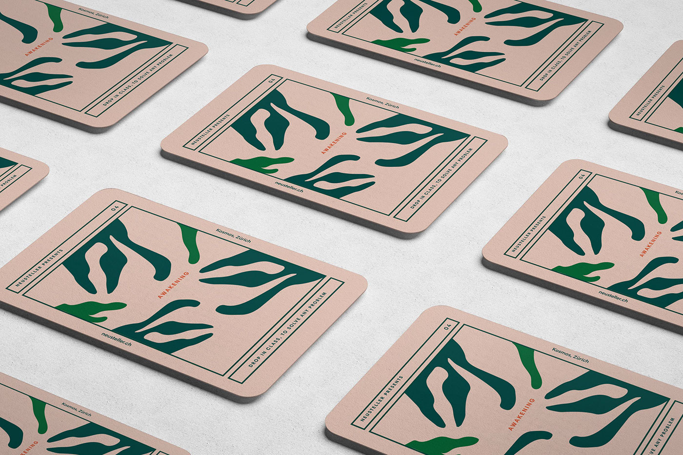
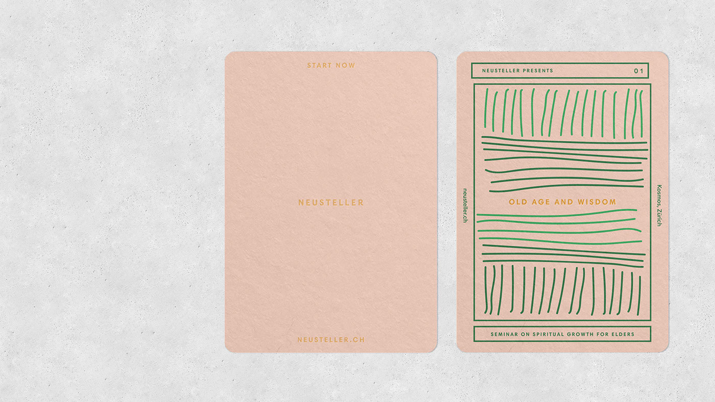
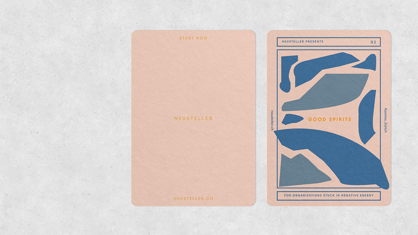
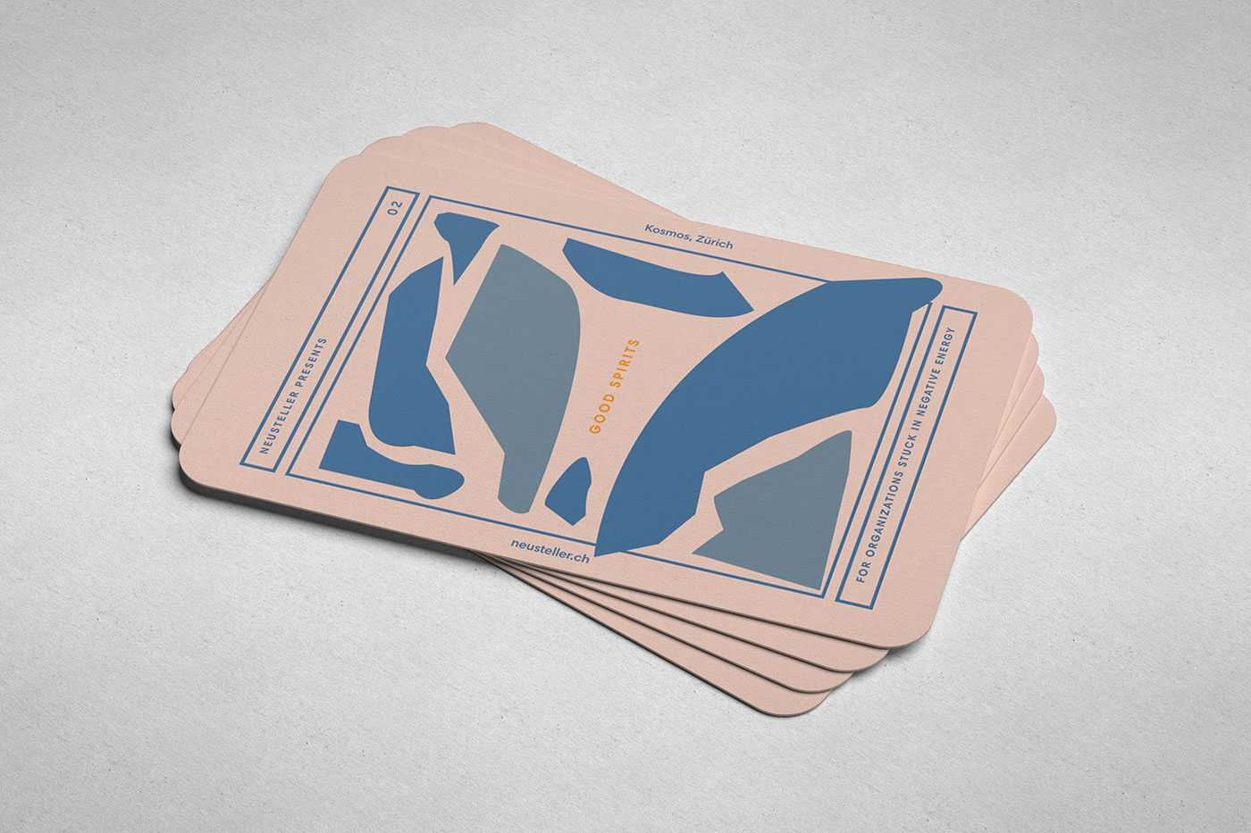
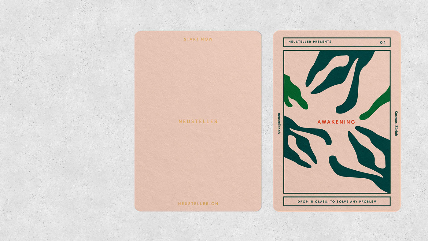
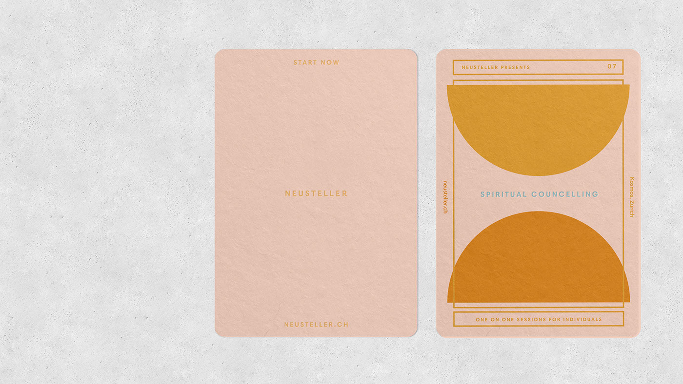
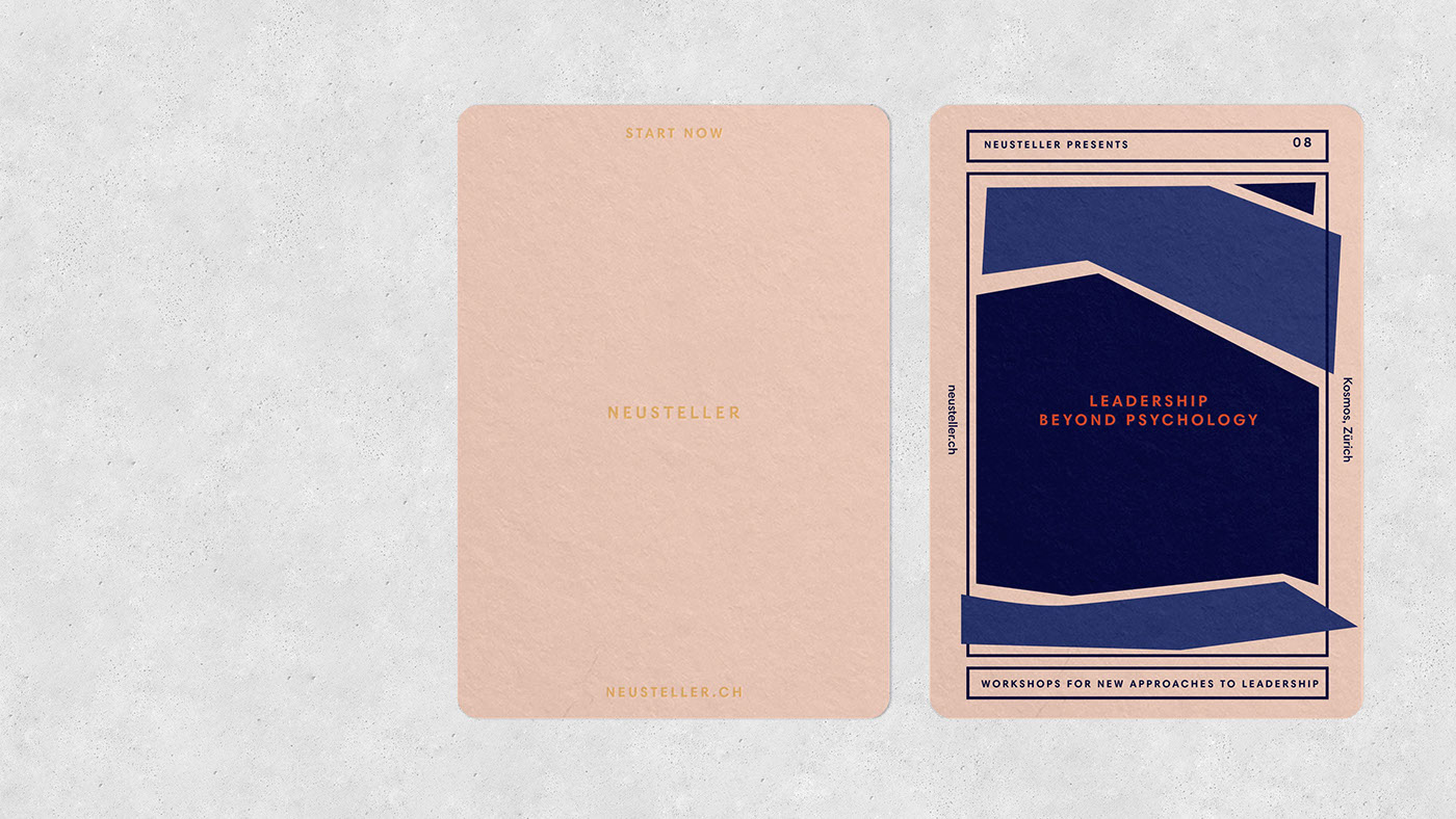
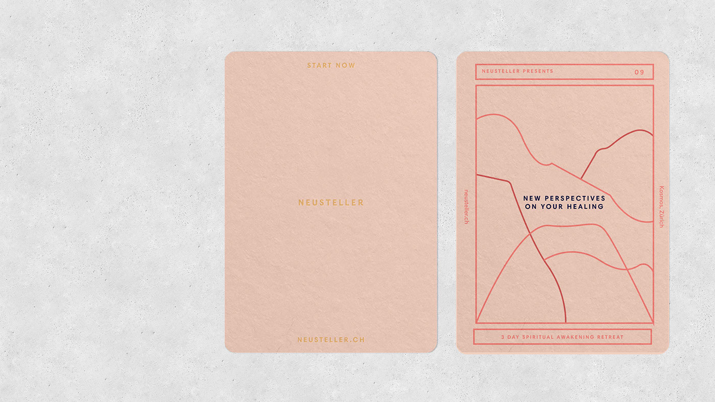
Gorgeous Tarot Card Design by Caterina Bianchini
Gorgeous Tarot Card Design by Caterina Bianchini
We’re totally digging these gorgeous Tarot cards designed for Neustellar, a Swiss organization run by Andreas Graf that provides spiritual teaching, mindfulness workshops and counseling. The creative talent behind the work is the lovely Caterina Bianchini, a multi-award winning designer and art director based in London. Tarot cards may not be the first place you look for drawing inspiration but we hope these have moved you just as much as they have us.
These beautiful Tarot cards were designed to promote each of Neustellar’s classes ranging from old age and wisdom to crisis intervention. The concept behind creating designs that referenced Tarot cards was that tarot cards are used to indicate the future, give a sense of what might be ahead, to allow for the individual to plan or accept. Specifically, the designs were created to be a graphic interpretation of each class offered. You’ll notice tree lifelines symbolizing the old age and wisdom cards while outlines of mountainous shapes convey new perspectives for the healing card. Each card was designed using this thought process to create designs that were authentic to their specific healing power. Enjoy and check out more work by Bianchini here.


ABOUT CATERINA BIANCHINI
Caterina Bianchini, is a multi-award winning designer and art director based in London.
Working across the field of creative direction, from design to art direction. Each project challenges current design norms by experimenting with unique typographic layouts and carefully curated colour palettes.
Projects are approached with conceptual and strategic thinking, creating work that is considered, charismatic and beautiful.
Clients include Levi’s, Diesel, Lush. Red Bull Music Academy, Red Bull Studios, Nike and Adidas.
ibby
Apr 06, 2018
Source: Abduzeedo Illustration
April 5, 2018
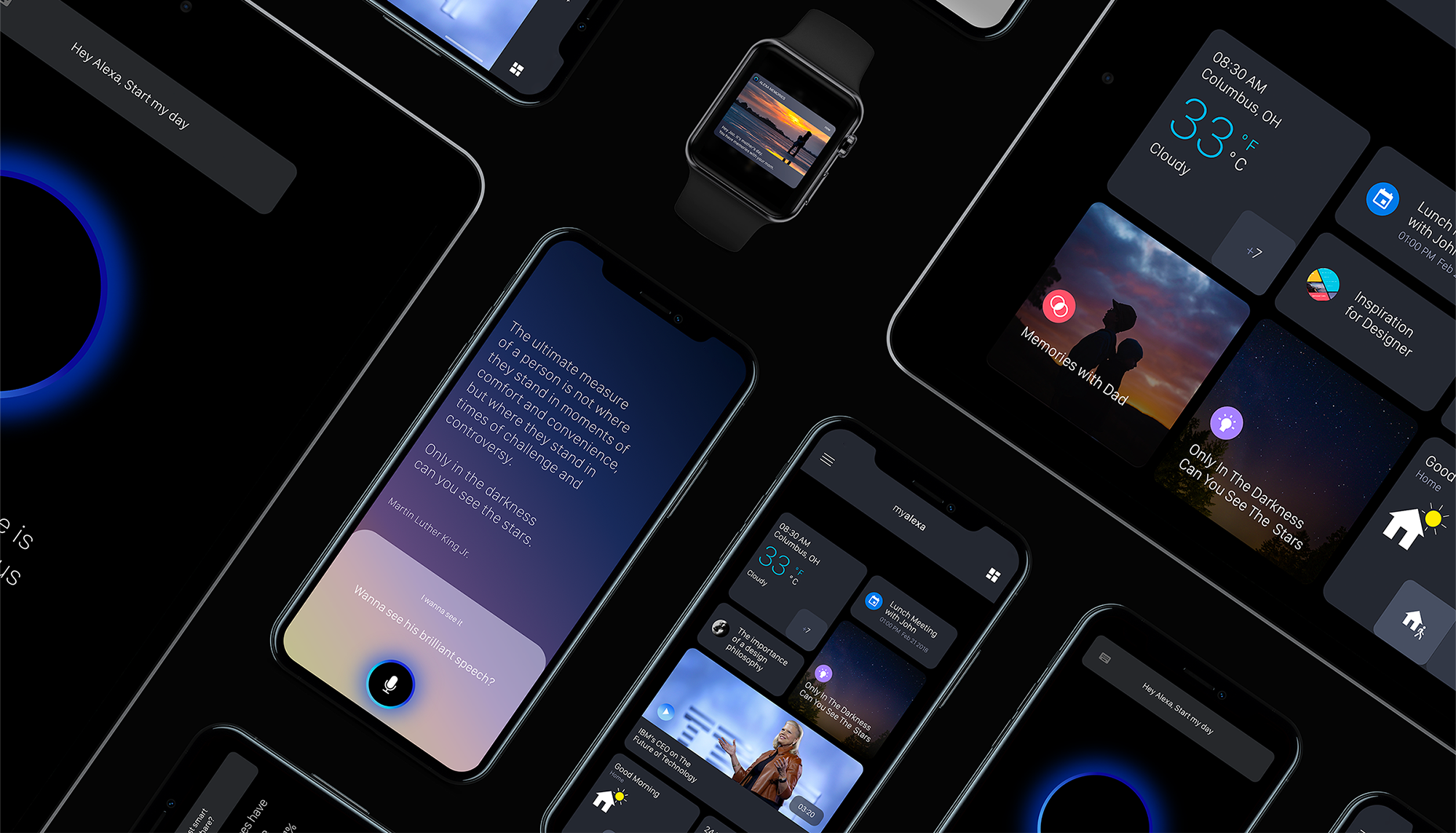
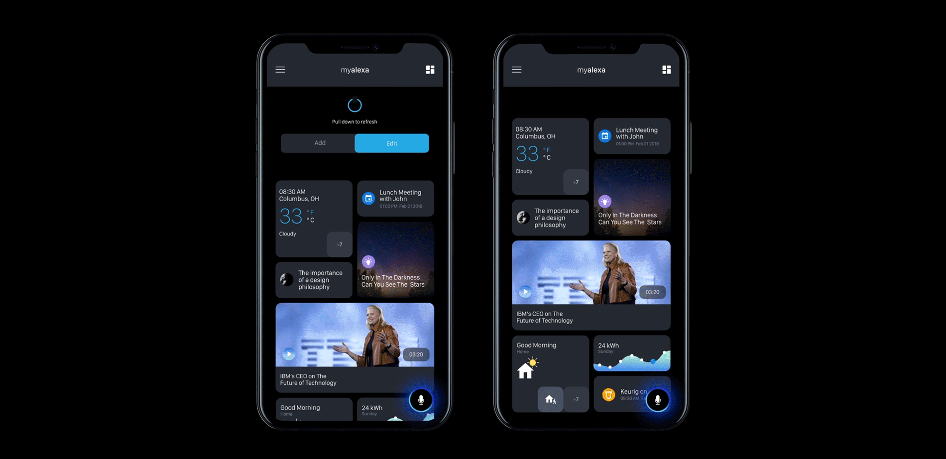
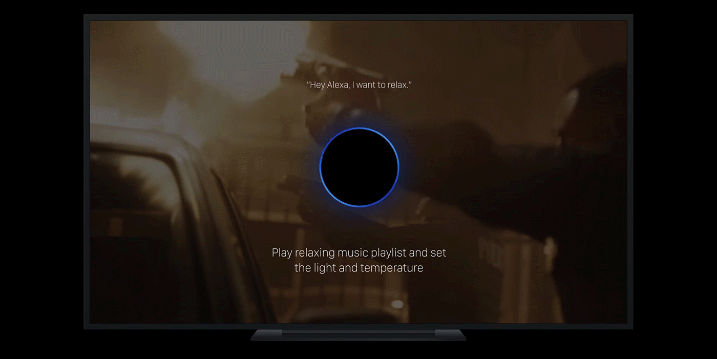
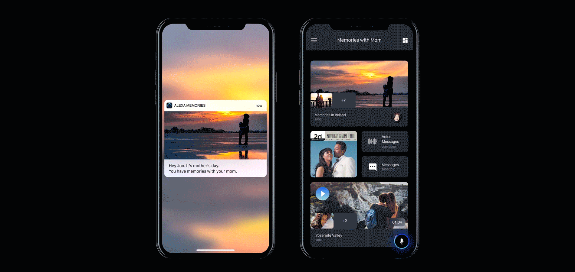
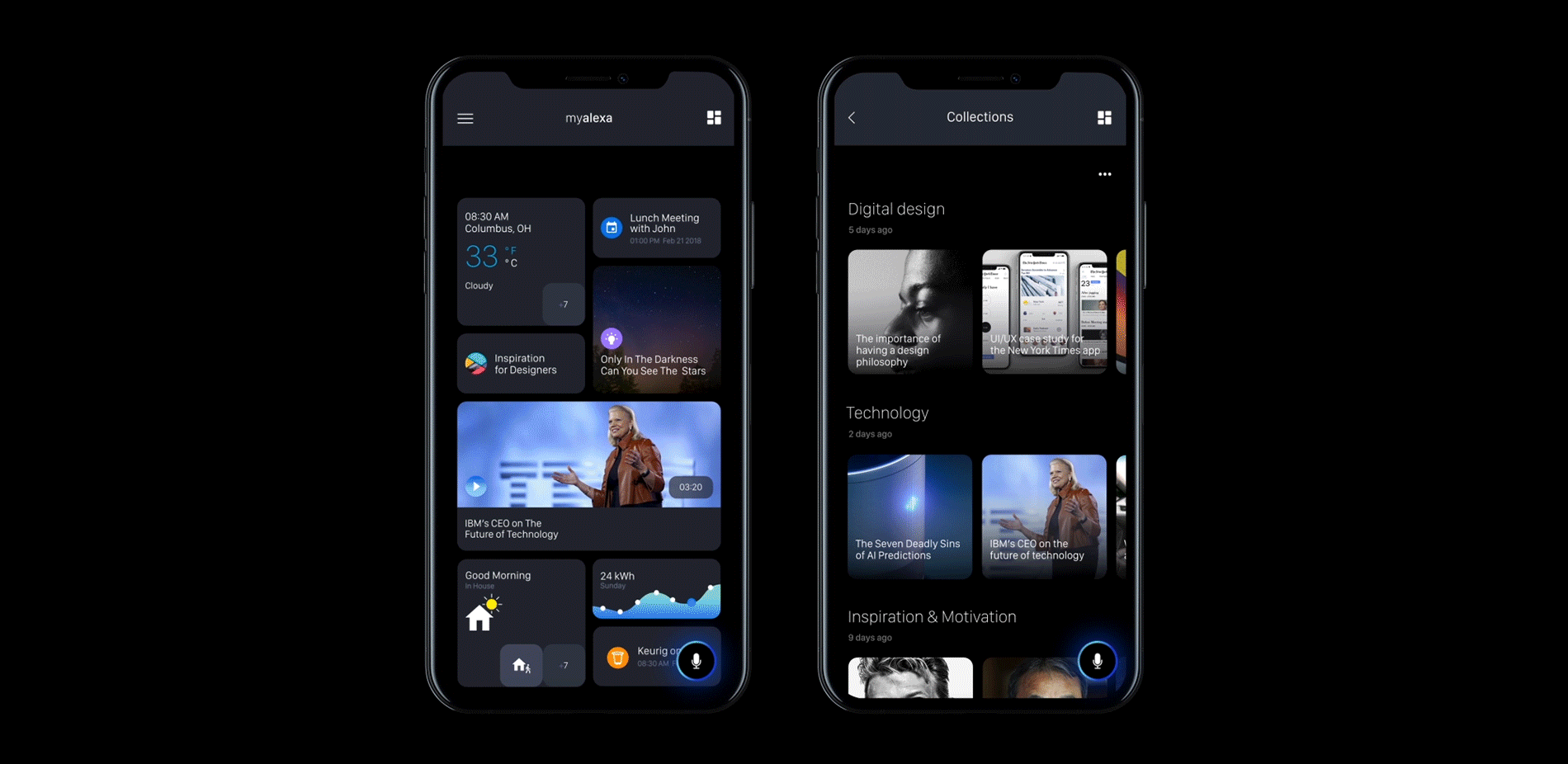
UI/UX & Interaction Design: Amazon Alexa App Concept
UI/UX & Interaction Design: Amazon Alexa App Concept
On ABDZ, it’s rarely a case where we will feature a project that shares some of the thinking behind the design. We mostly see beautiful UI but most of the times are incomplete or misleading in terms of design thinking. But today, we are taking a look at this concept for Amazon Alexa App by Jooyoung Joung, what I liked about his concept is that he designed this experience based on problems from the current Alexa experience. To me, where the work from Jooyoung truly shines inside his user flow, super well-thought-out and totally defines his vision of the experience. In UX, we spend most our time working on building an experience or redesigning one.
My Alexa is a suggestion of new concept for Amazon Alexa app. This project has new visual and empathic interface. My Alexa will empower user’s daily life with inspiration, motivation, insight and empathy. The whole concept was inspired by Maslow’s Hierarchy of Needs.
More Links
- Learn more about Jooyoung Joung
- Follow Jooyoung’s work on Behance
UI/UX & Interaction Design


AoiroStudio
Apr 05, 2018
Source: Abduzeedo UI/UX
April 5, 2018
Microsoft’s HoloLens could be gearing up to kick Intel to the curb
Microsoft’s next HoloLens headset is still in the works but according to leaks, it could feature some significant internal changes — including a new processor and some new computing capabilities.
The post Microsoft’s HoloLens could be gearing up to kick Intel to the curb appeared first on Digital Trends.
Source: Digital Trends VR
April 5, 2018
Learn How to Create Paper Cut Effect with this Photoshop Tutorial
Learn How to Create Paper Cut Effect with this Photoshop Tutorial
Lidia Lukianova shared a simple but quite awesome Photoshop tutorial. She shows us how to create a beautiful Paper Cut effect using the Pen Tool and Layer Styles in Photoshop. The result is quite realistic and below you can see a step-by-step. Lidia was also kind to share the source file, just in case you want to check it out.
You can download a practice file here: http://adobe.ly/1I2kW2C
Photoshop Tutorial
Step 1
Use the Pen tool to create the letter shapes and fill them with color.

Step 2
To add a shadow to the top part of your letter, double-click its layer in the Layer panel and choose Drop Shadow. Adjust the settings to achieve the desired effect. Uncheck the Use Global Light checkbox.
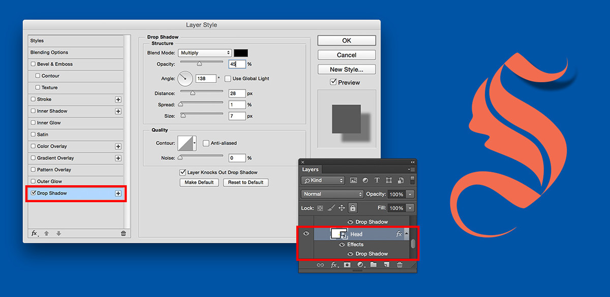
Step 3
Add Inner Shadow to the center part of your letter.
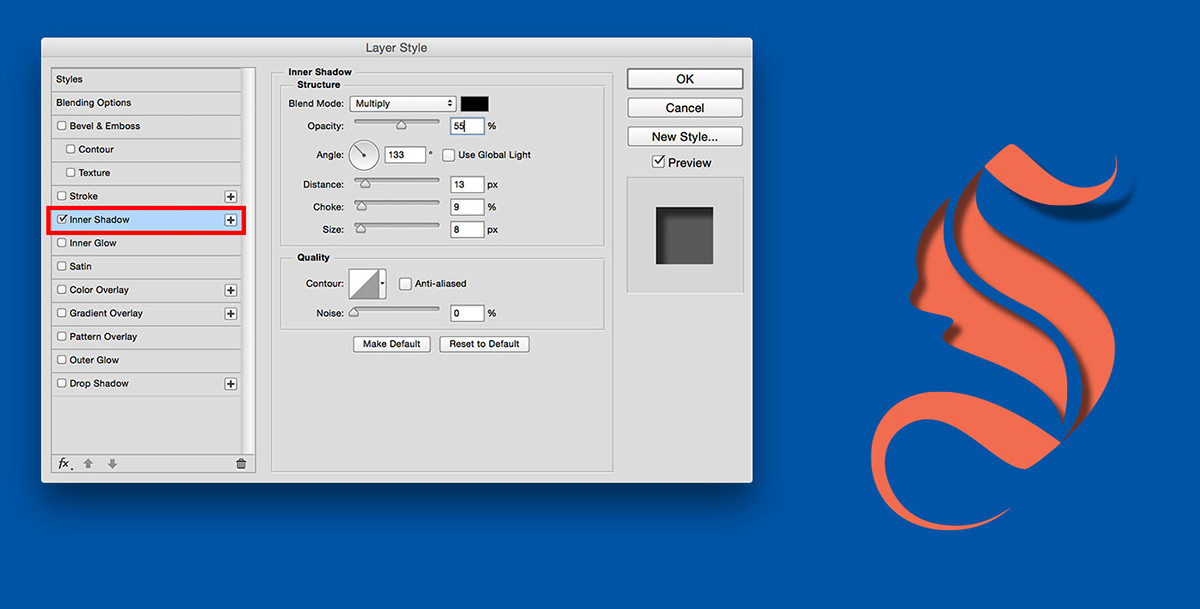
Step 4
Repeat Step 2
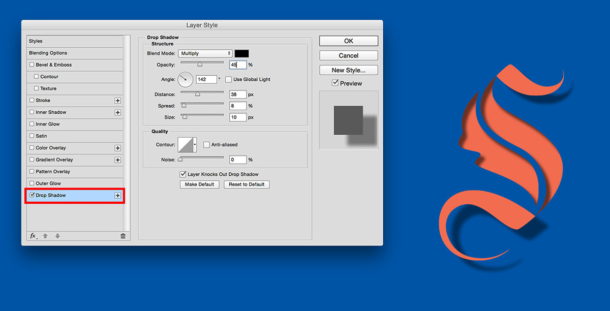
Step 5
To edit the shadow separately from the fill layer, go to Layer > Layer Style and choose Create Layer. In the Layer panel you’ll now have two layers: a shape layer and a Drop Shadow layer.
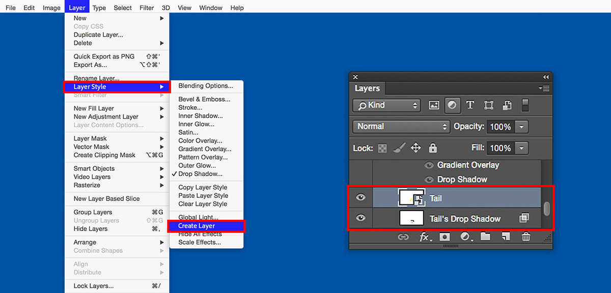
Step 6
Use the Eraser tool to remove parts of the shadow.
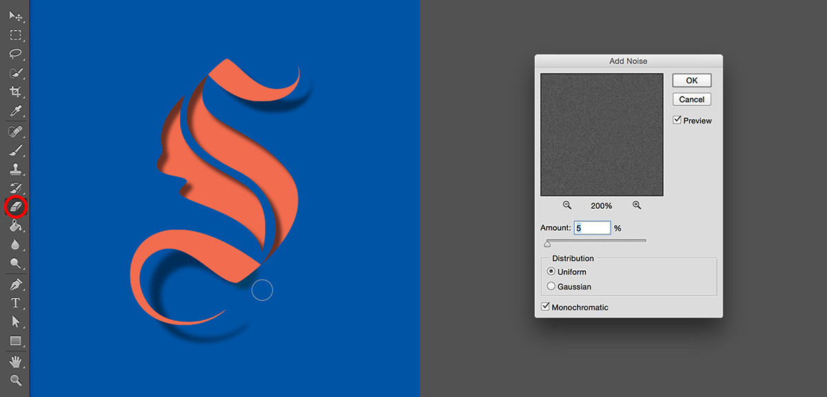
Next, let’s create a grainy paper texture. Make a new layer and fill it with grey color. Then go to Filter > Noise > Add Noise.
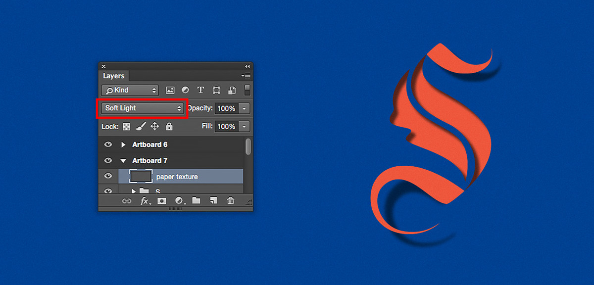
Step 7
To add a paper texture feel to your image, choose Soft Light in the Layer panel.
LEARN MORE:
- Turning sketches into vector shapes with Adobe Capture CC and using them in other Adobe applications: link
- Working with type in Photoshop and getting fonts from Typekit: link
- Syncing fonts from Typekit in Photoshop: link
Also make sure to check out Lidia Lukianova work at https://www.behance.net/lidialukianova
abduzeedo
Apr 05, 2018
Source: Abduzeedo Tutorials
April 4, 2018
Editorial Design: The Big E newspaper
Editorial Design: The Big E newspaper
Jordan-River Low shared a great editorial design post on his Behance profile. The work was made for a university brief called Advanced editorial. For the project they were supposed to come up with our own unique, or local newspaper, with their own curated information, sections and contents related to the style of the newspaper.
I chose to create The Big E. This is a newspaper for the east londoners. The people who are lucky enough to live with in the E (Hackney Borough). The news, articles, information and general content is curated specifically towards this area and the people that live there. It is supposedly a newspaper printed daily, therefore works the generic role of a high-end popular newspaper, such as The Independent, or The Guardian. Although it is a paper for the people of East London, it however is for all forms of audience, as I feel the content within it applies to wider demographics, and those interested in the culture of East London may be intrigued by this style of newspaper. I tried to translate this through the design of the magazine, representing the ‘edgy’ aesthetic of like of Shoreditch, Dalston, Hackney and elsewhere. I think their thriving creative and art culture and influence was something I wanted to incorporate in the style, therefore a sort of retro style associates with this, while remaining to be viewed as a traditional working newspaper that can be easily navigated and read.
Editorial Design


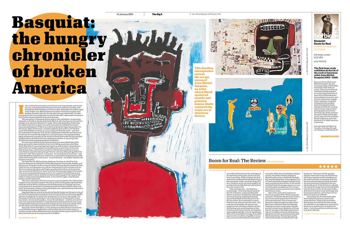


Printed version


abduzeedo
Apr 04, 2018
Source: Abduzeedo Editorial Design