-
News & Updates
camera
January 18, 2018
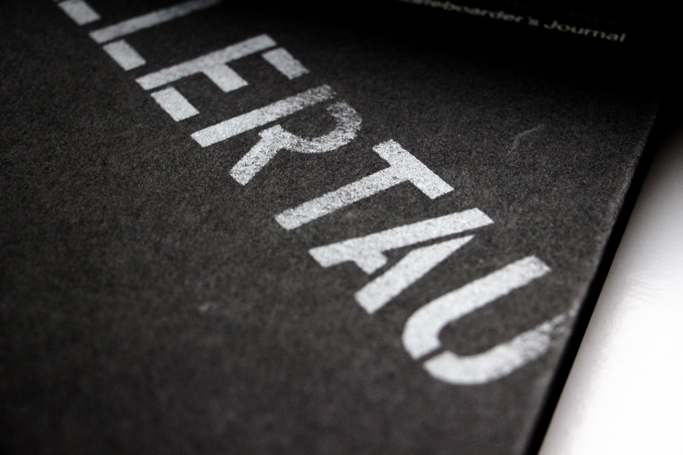
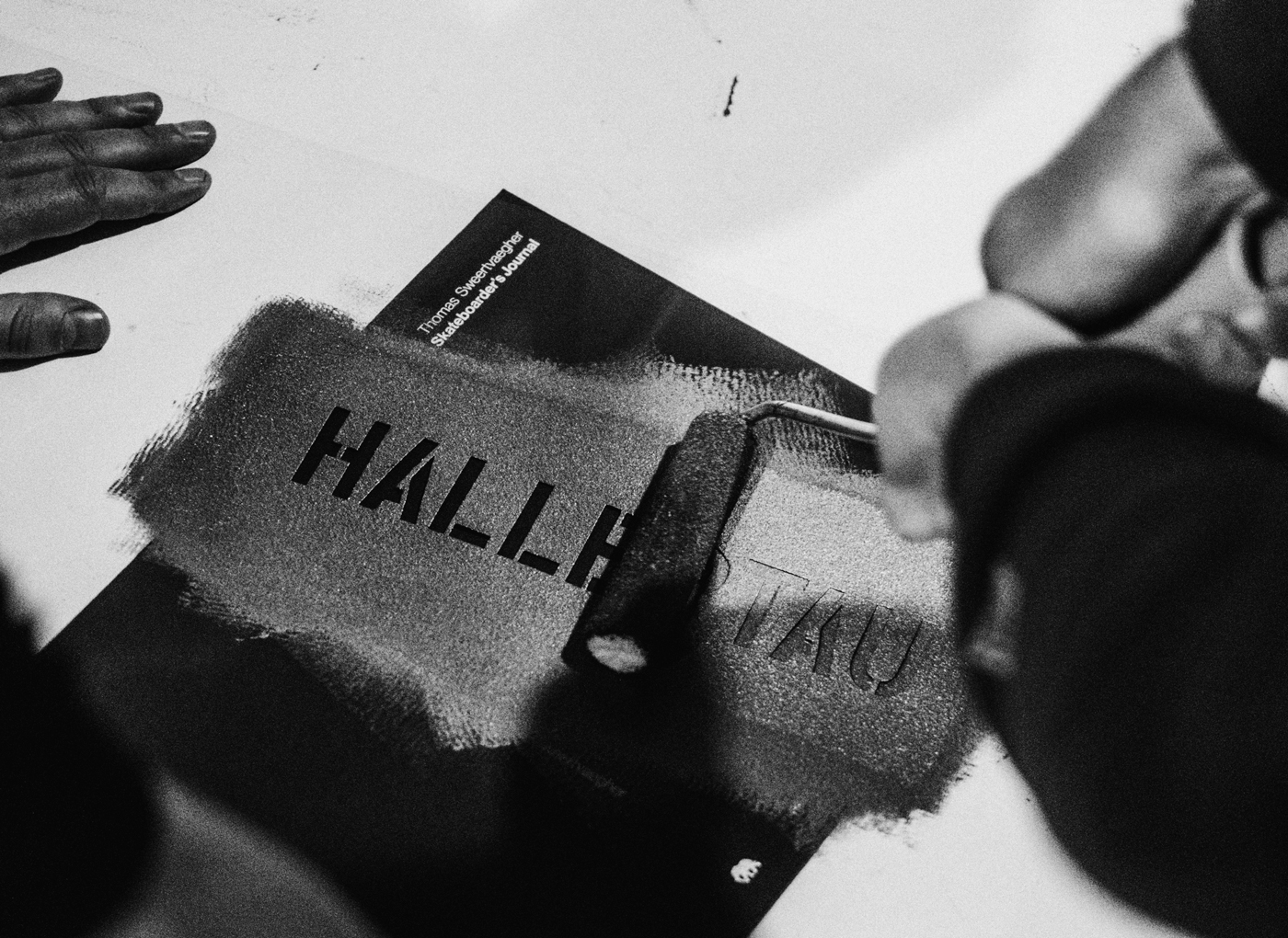
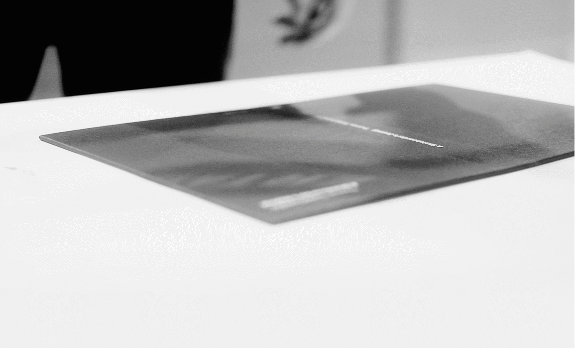
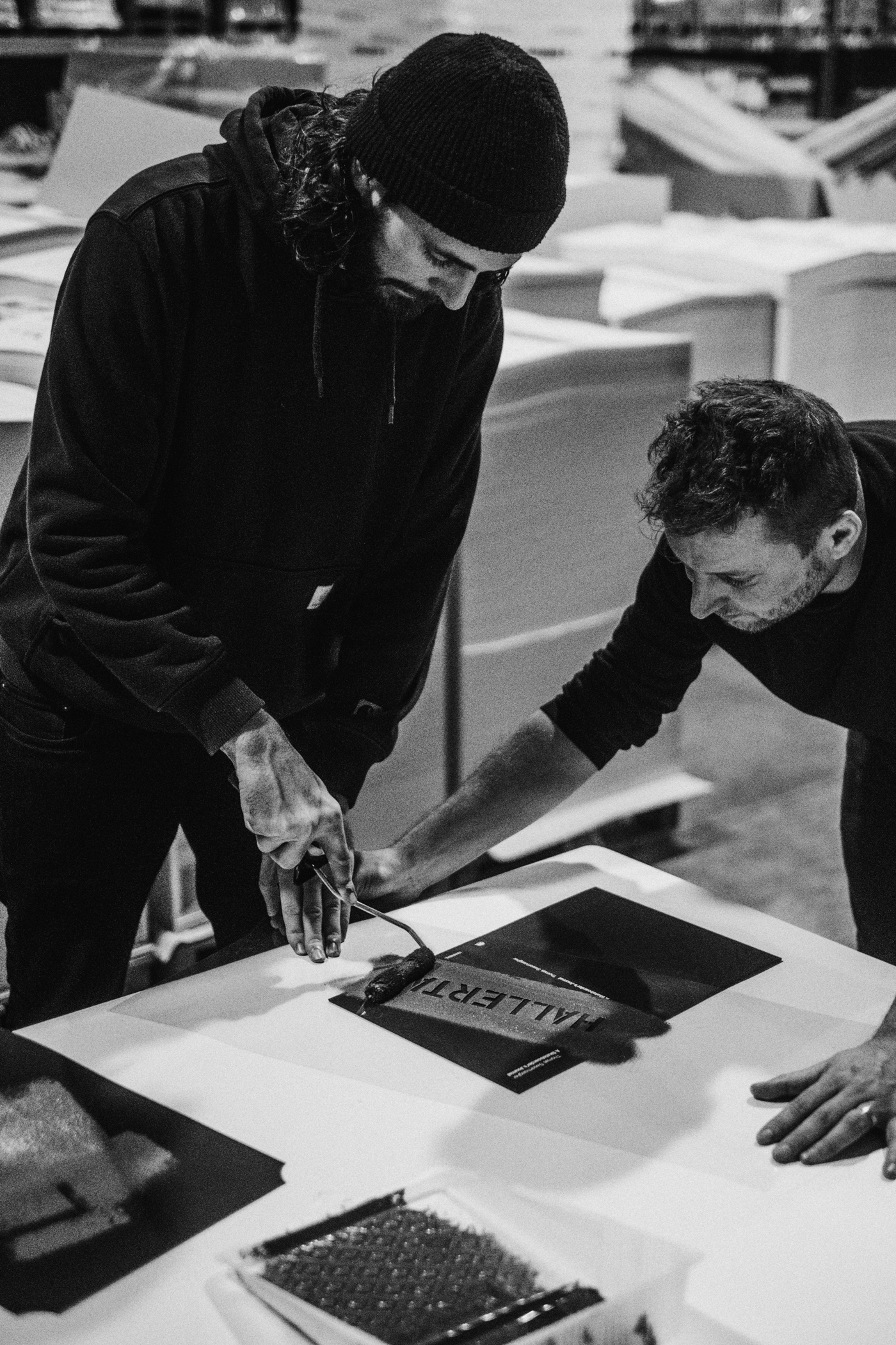
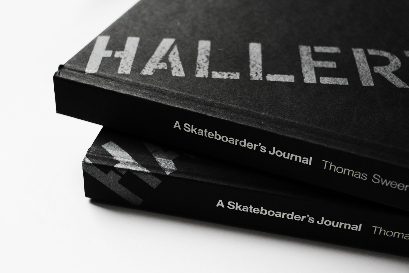
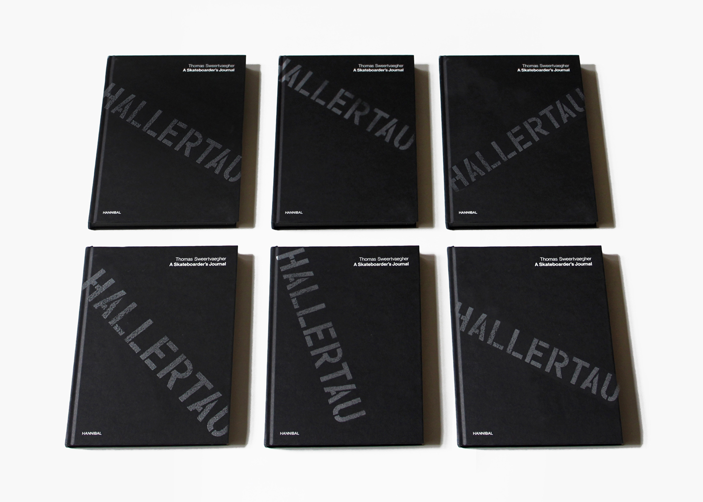
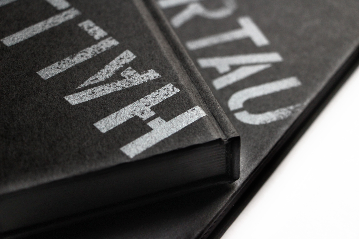
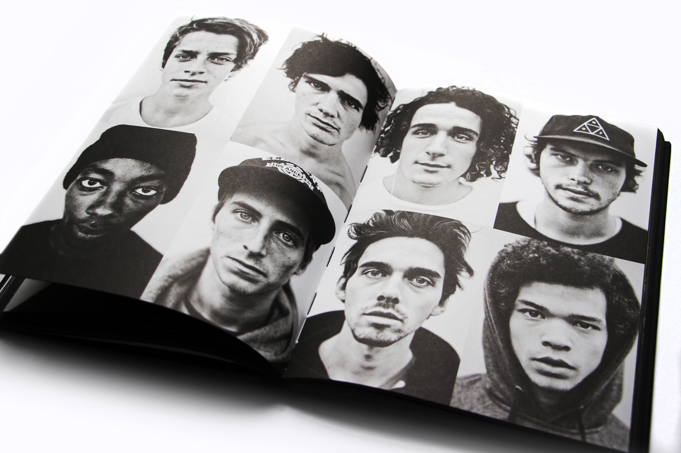
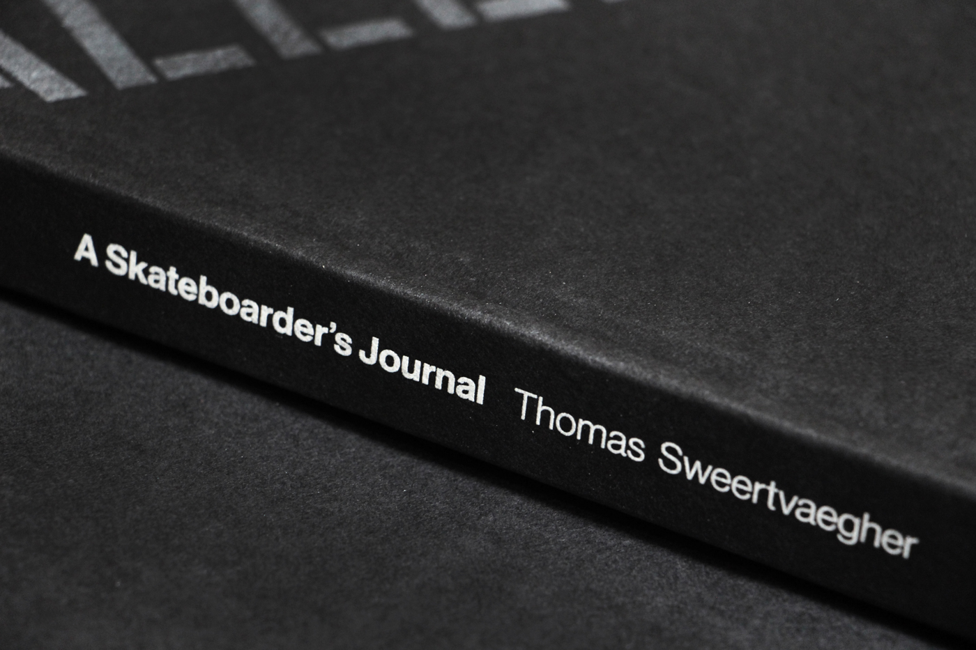
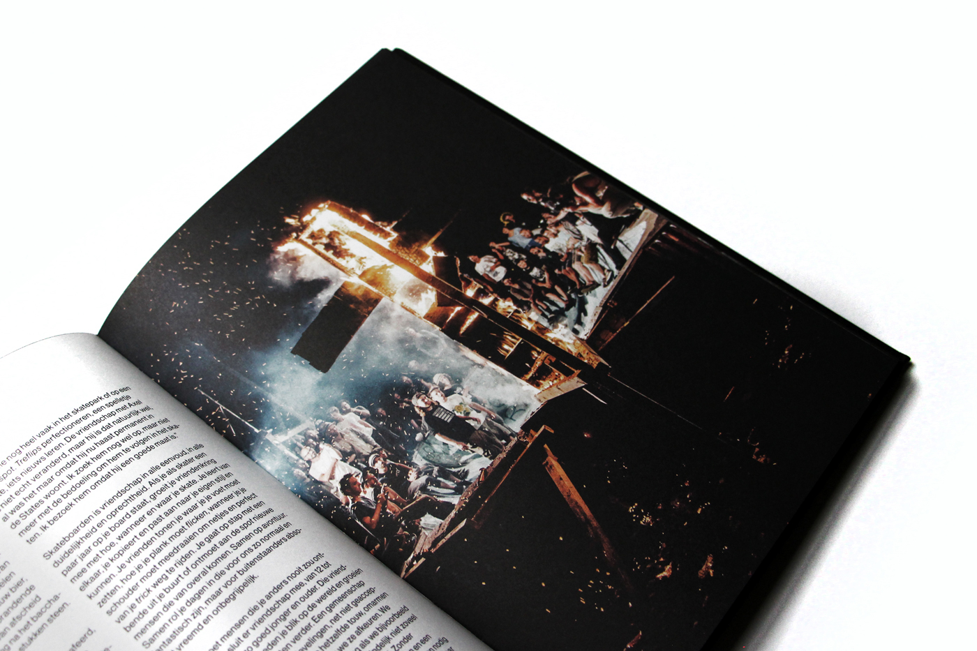
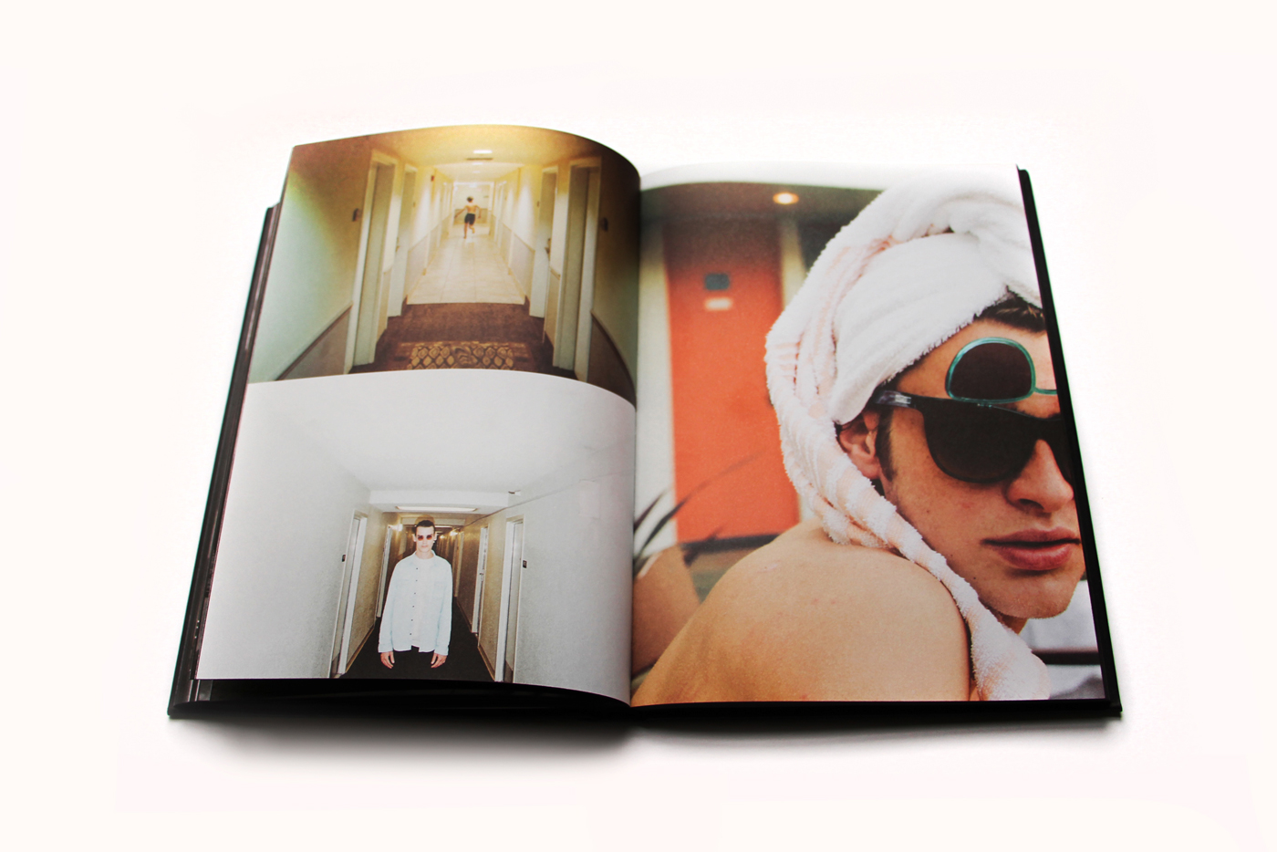
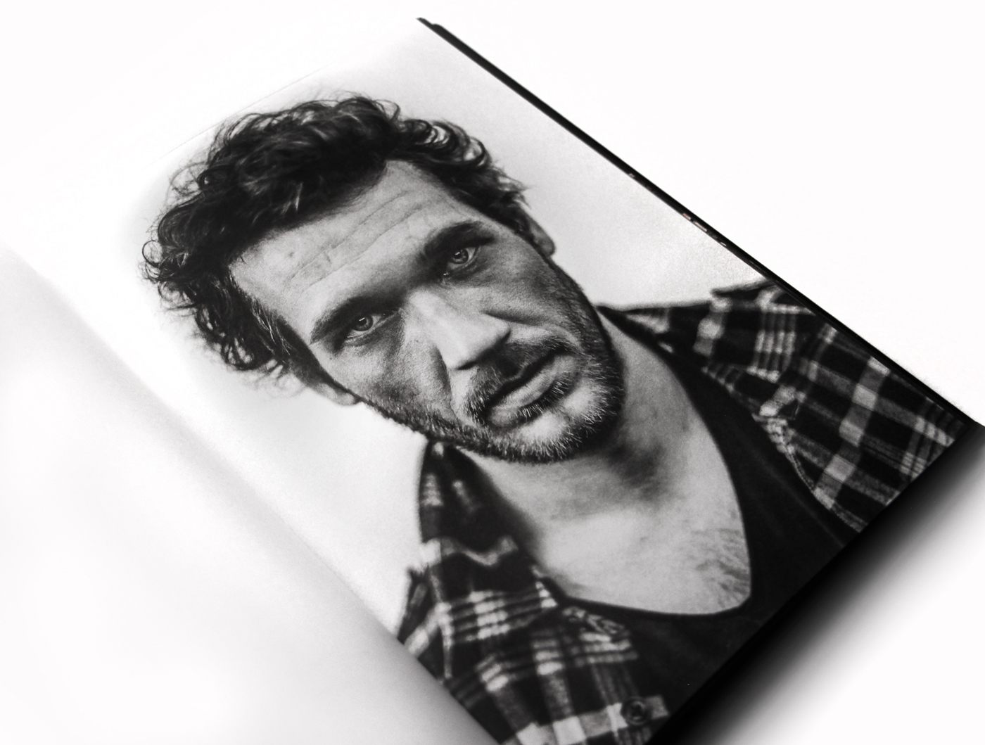
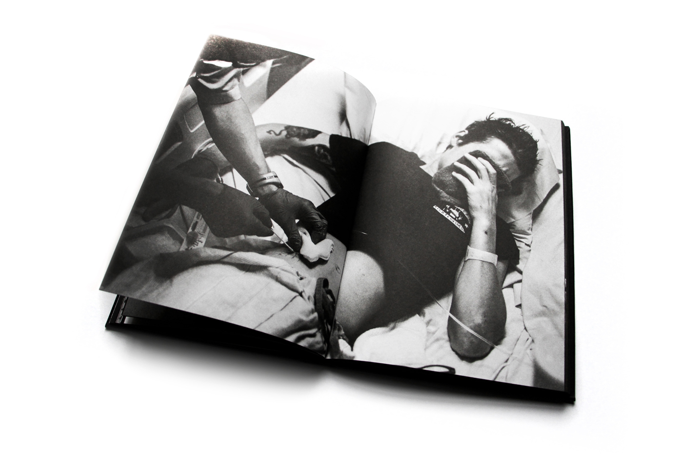
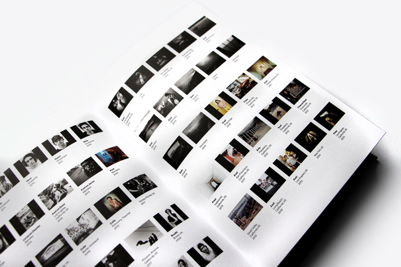
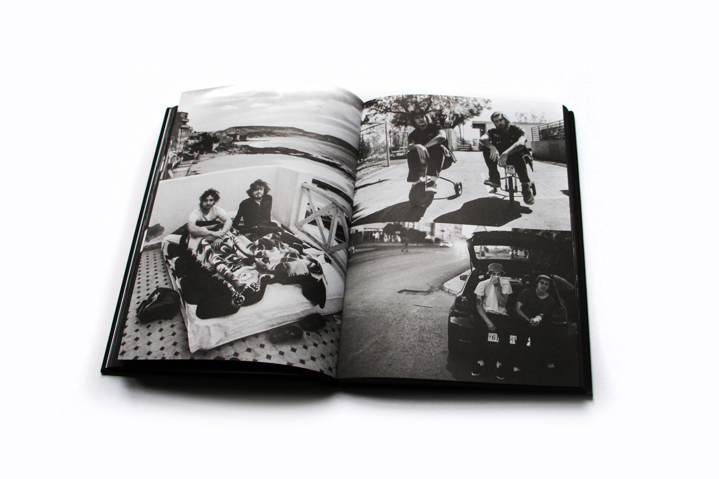
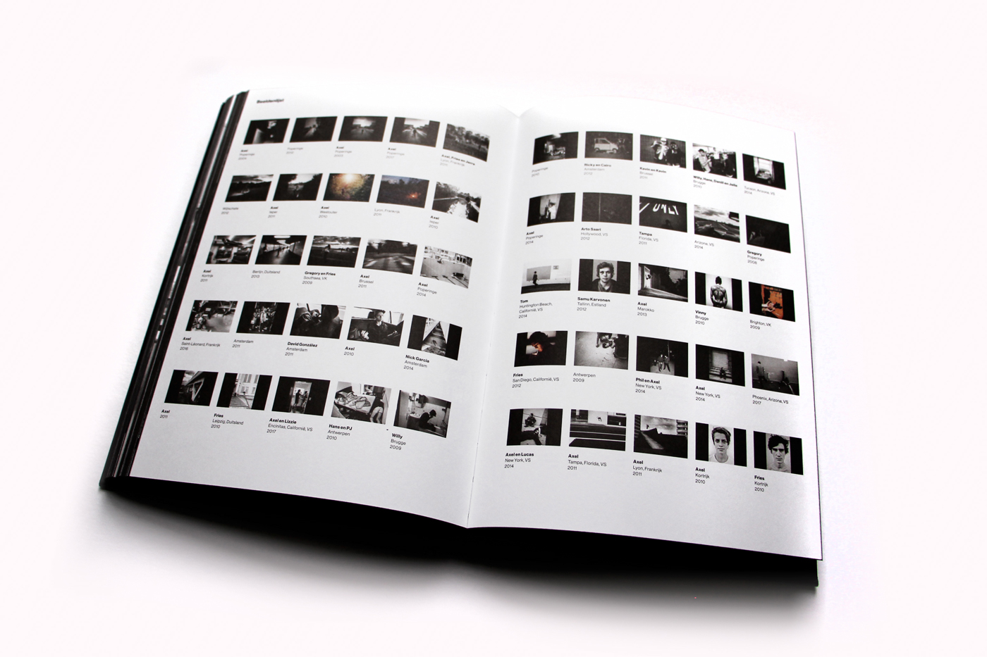
A Skateboarder’s Journal Book Cover Design Process
A Skateboarder’s Journal Book Cover Design Process
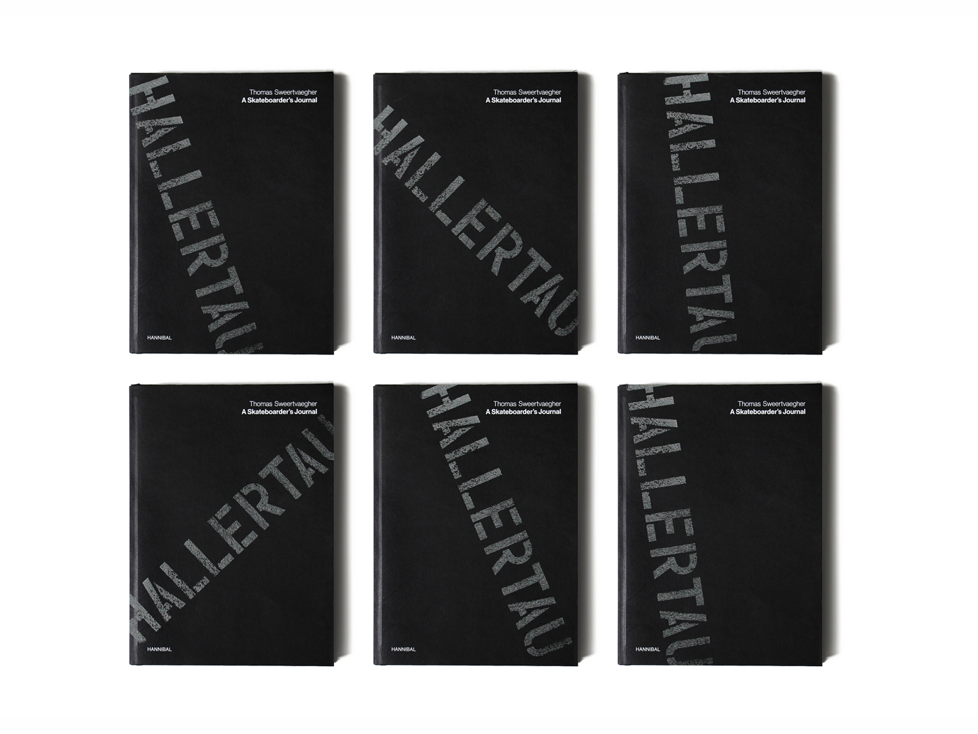
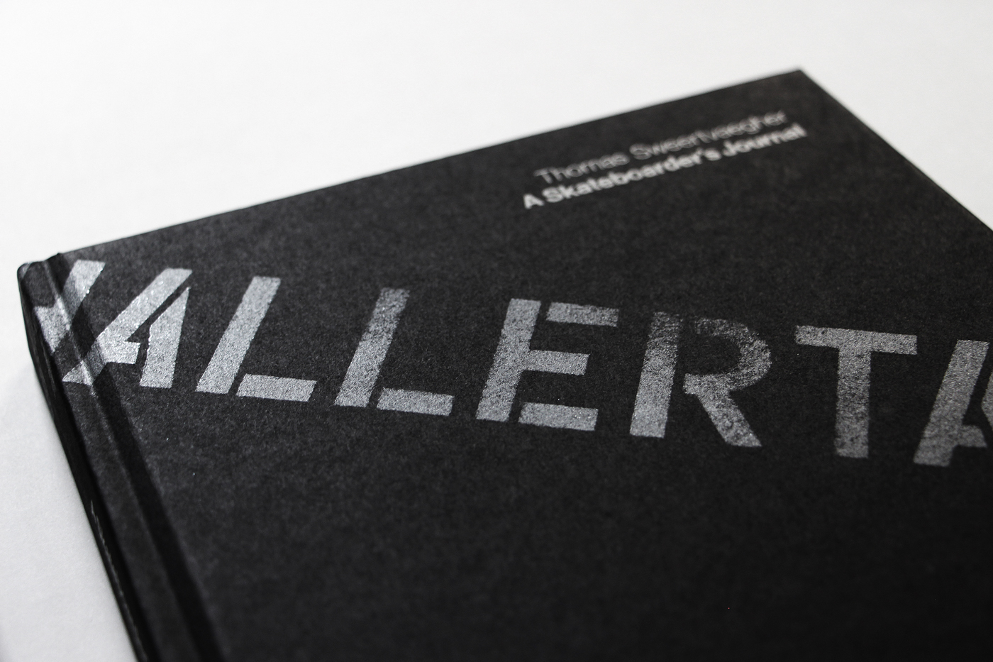
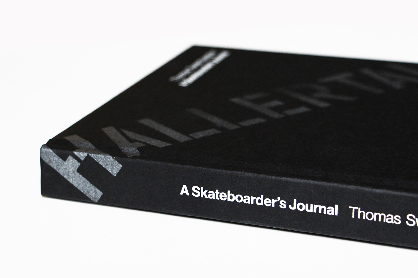
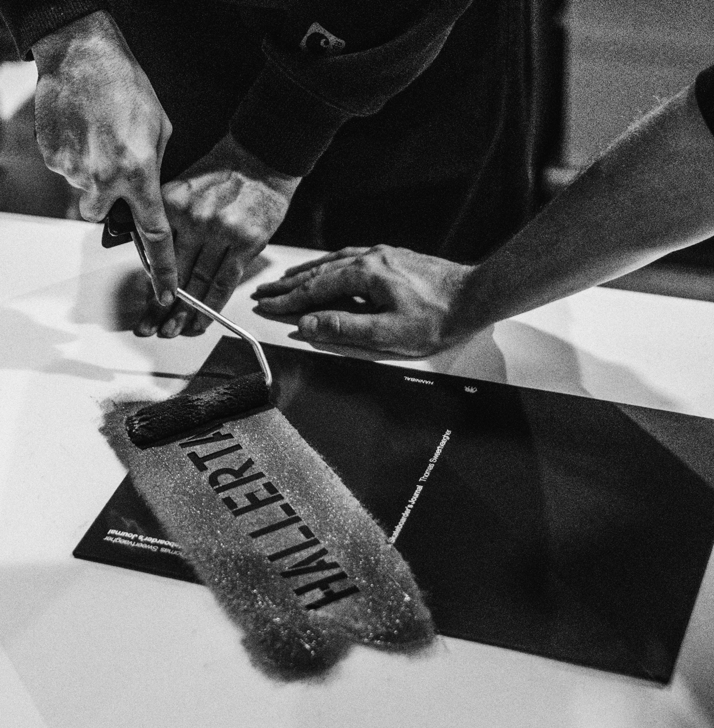
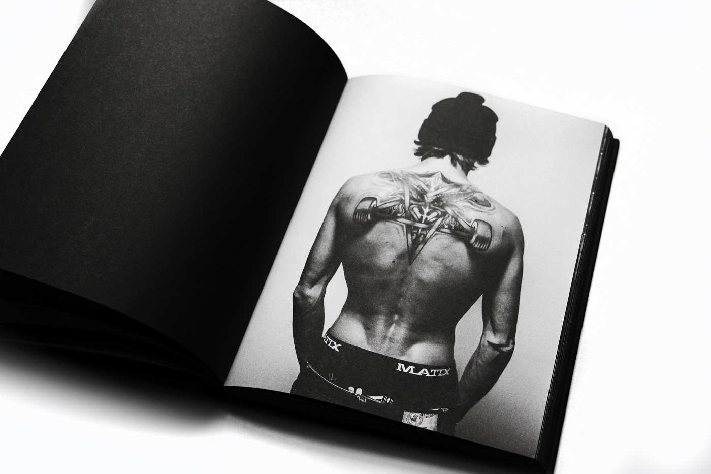
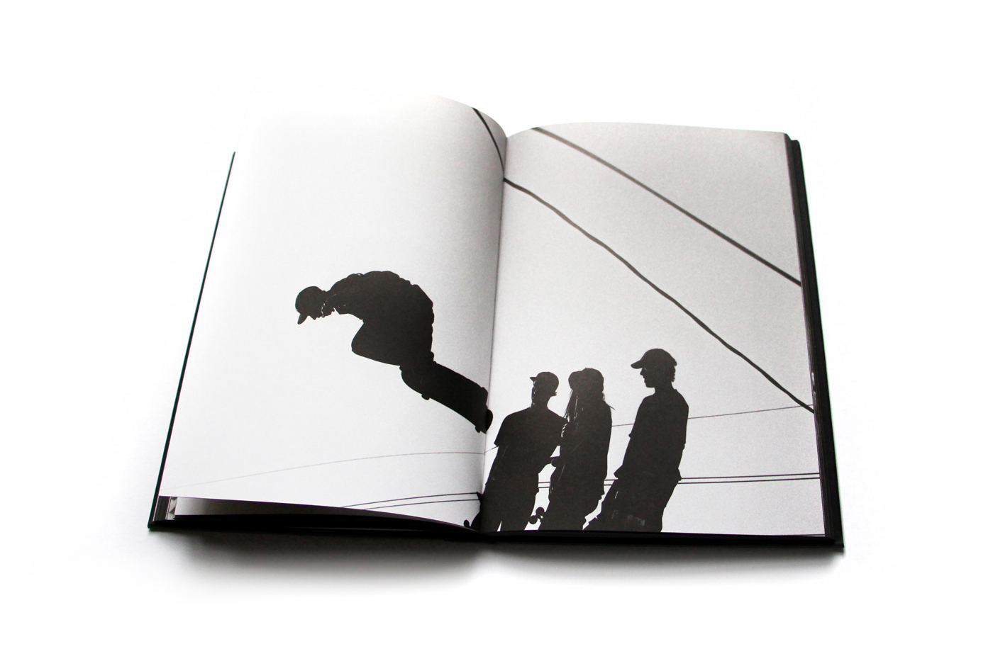
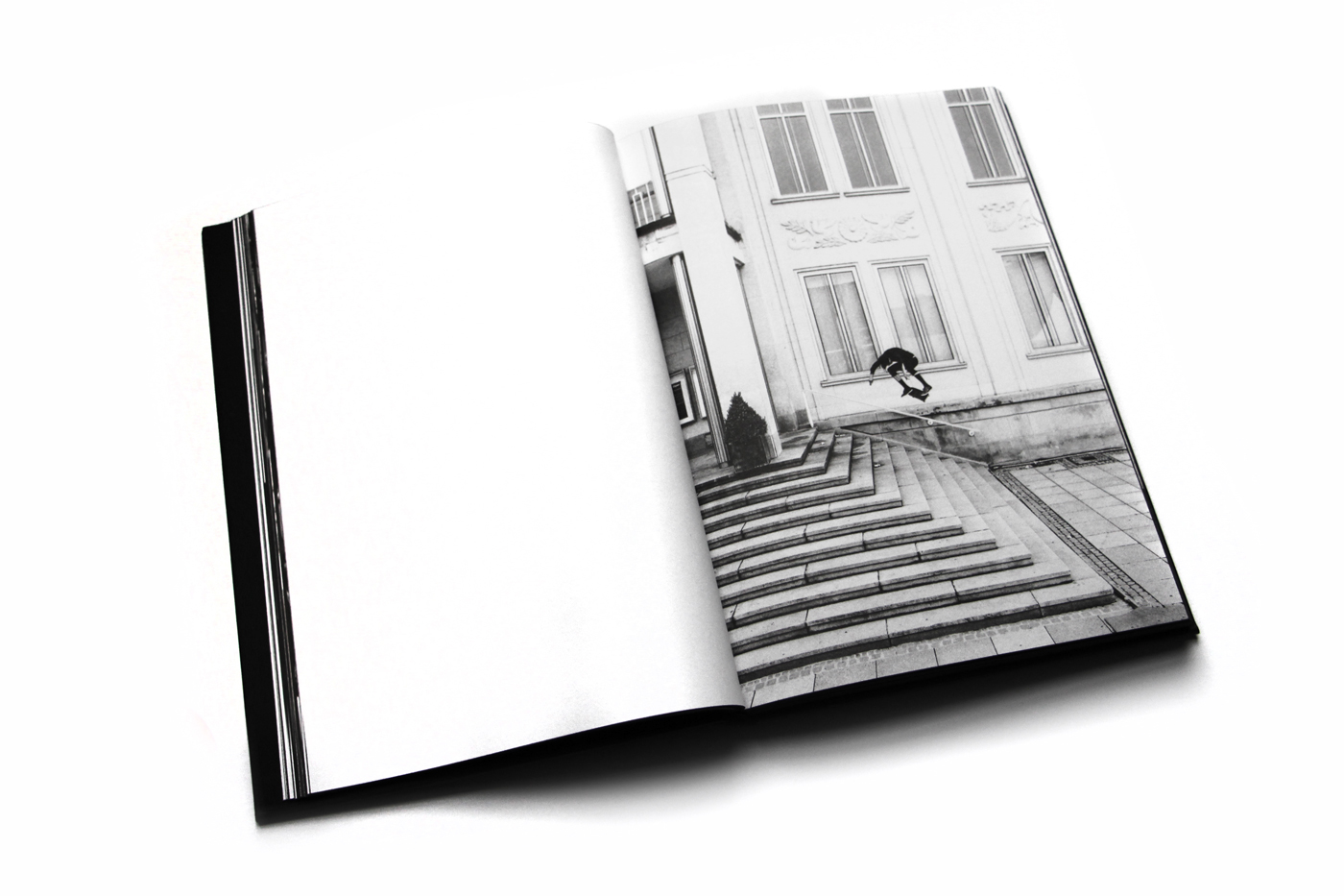
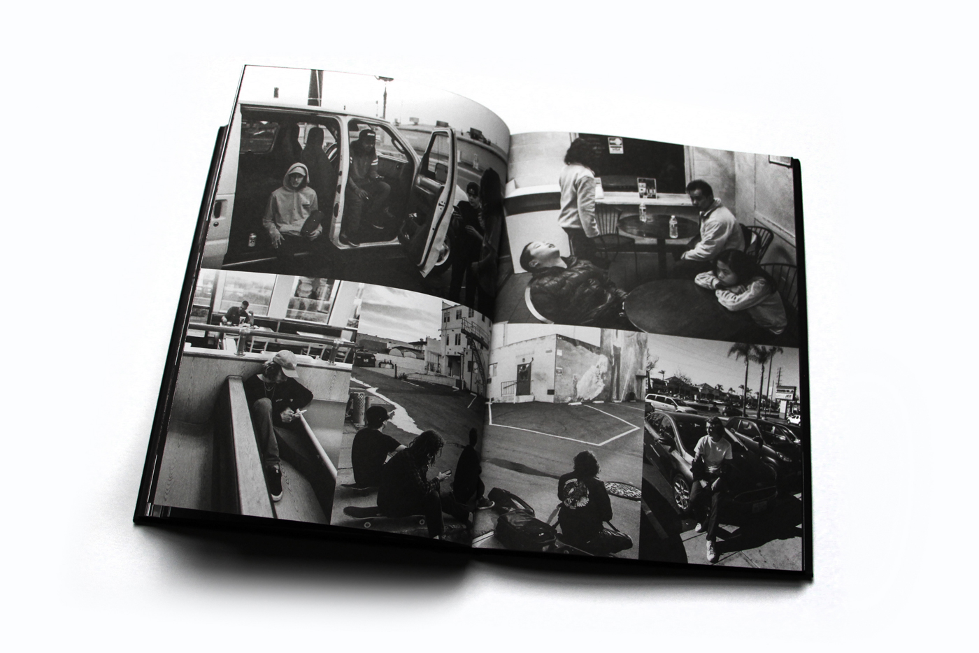
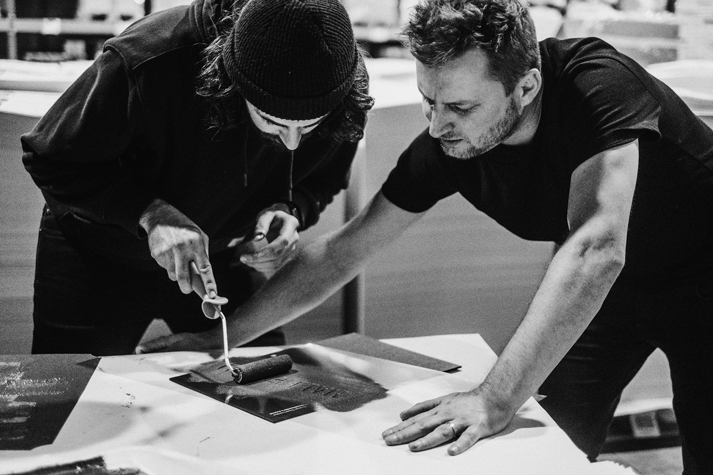
As a former skateboarder and still avid fan of the sport I try to follow what’s going on in that industry especially because, in my opinion, I believe they set a lot of trends in style. I have fond memories of the skateboarding magazines I used to collect in the 90s like Trasher and Transworld. When I saw the post that Tim Bisschop about a hand painted book cover for the “A Skateboarder’s Journal” I knew I had to post about it. Tim was also super cool to share a bit of how he did that. It seems simple but the result is like the essence of skateboarding. It’s all about the style and simplicity.
Tim Bisschop is a graphic designer from Belgium wit an inspiring portfolio focused on Editorial Design, Graphic Design and Typography. We highly recommend that you check it out at http://www.timbisschop.be/
A Skateboarder’s Journal Book Cover


abduzeedo
Jan 18, 2018
Source: Abduzeedo Editorial Design
January 17, 2018
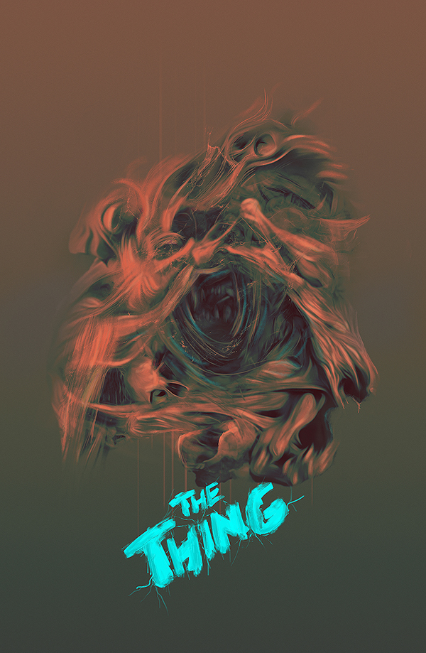
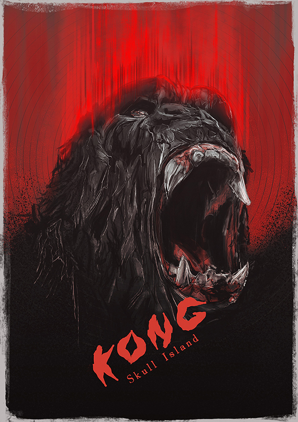
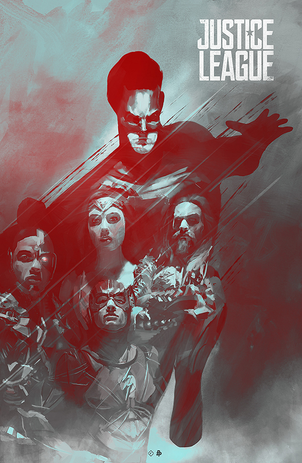
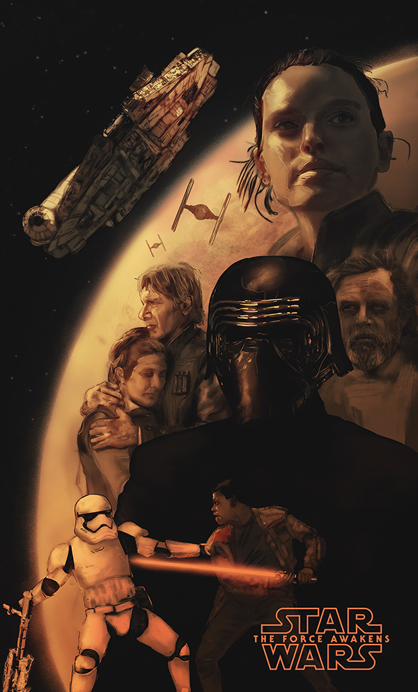
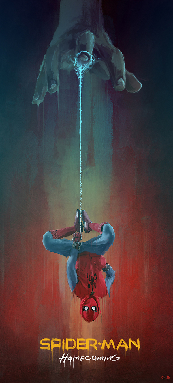
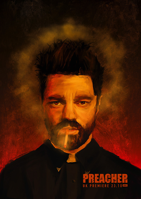
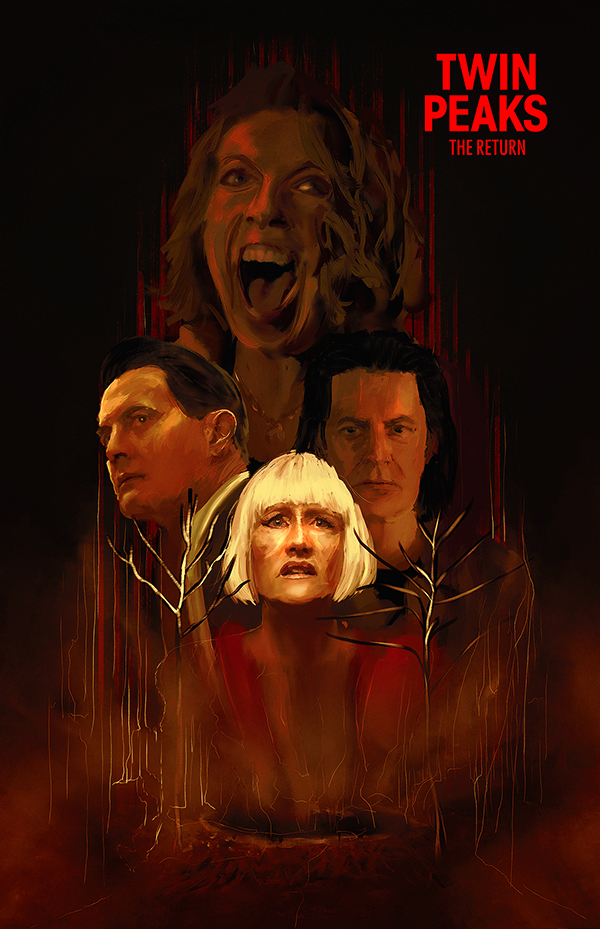
Awesome Illustration for Movie Posters by Rafal Rola
Awesome Illustration for Movie Posters by Rafal Rola
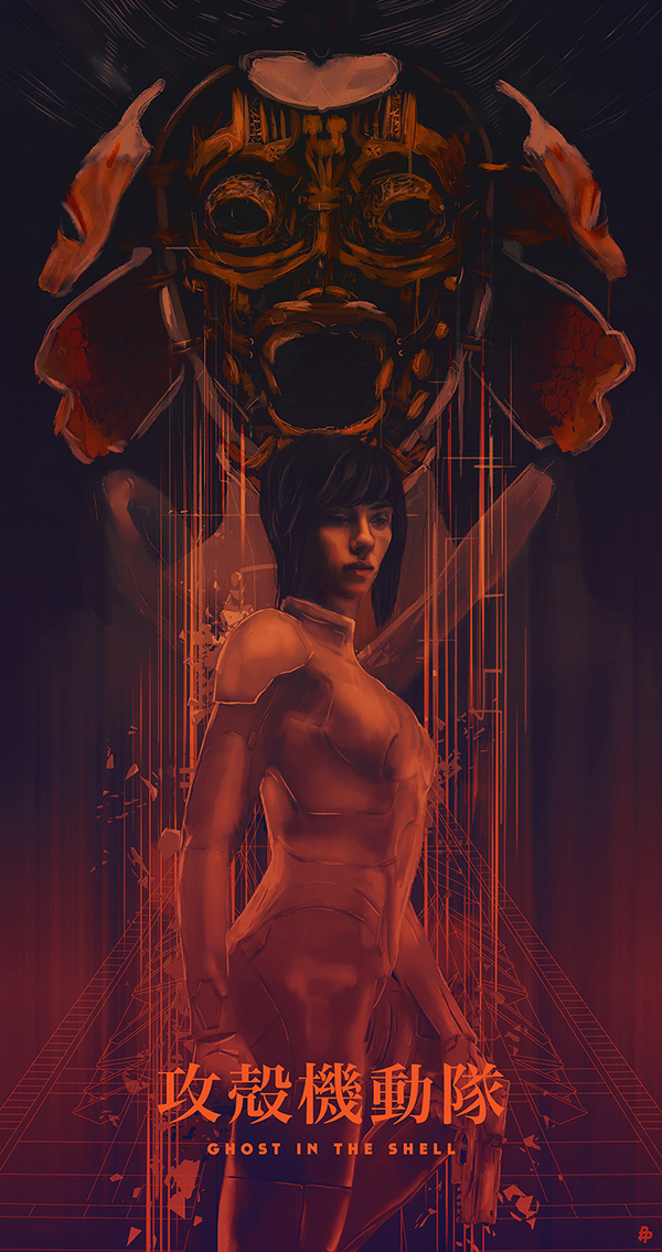
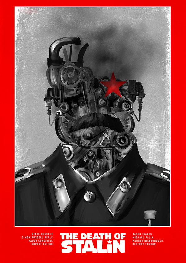
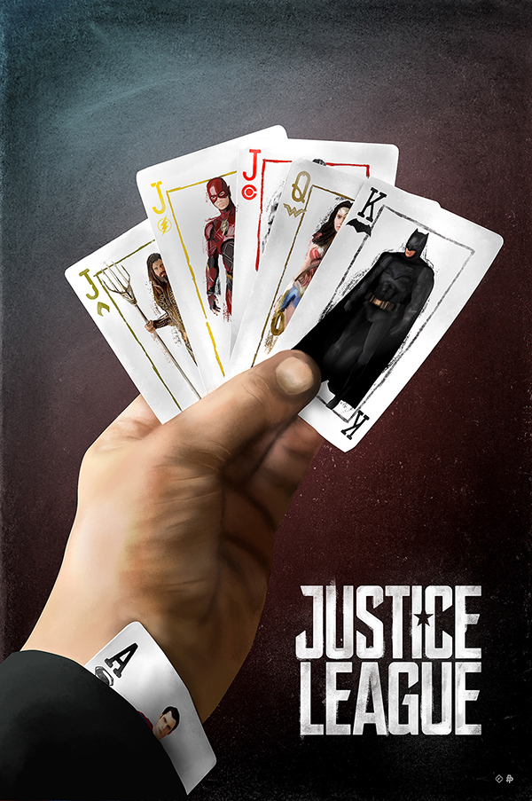
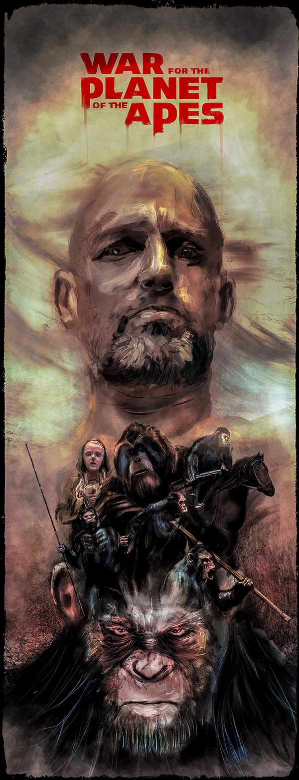
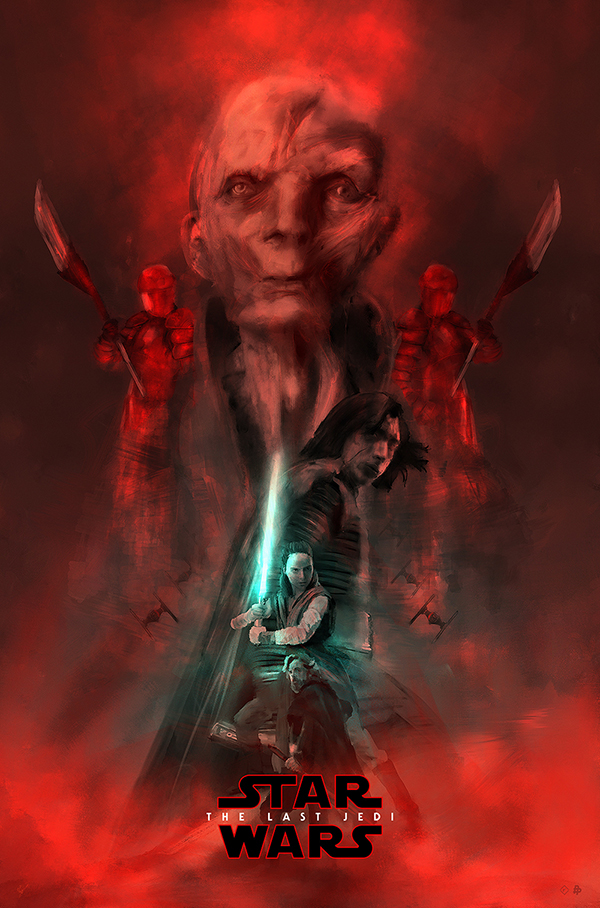
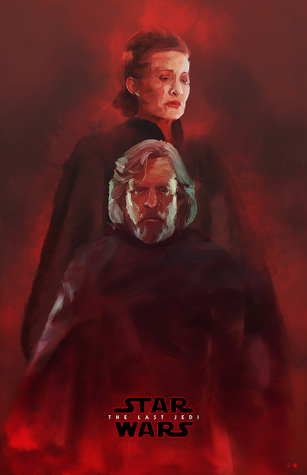
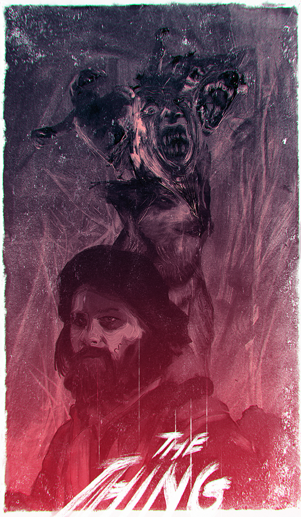
Rafał Rola, a super prolific designer from Lublin, Poland shared an incredible post on Behance sharing some beautiful posters created in 2017. The posters are for movies like Blade Runner 2049, Justice League, Star Wars Last Jedi, Ghost in the Shell, War for the Plane of the Apes, Wonder Woman and many other super popular movies and TV shows in 2017. The highlight though, is the style. They all feel like oil and watercolor painted but it was all done digitally with Adobe Sketch, Illustrator and Photoshop. For me it’s always awesome to see something that feels unique and fresh, moving a bit away from the minimalism or highly detailed vector illustration. I think it’s a good way to bring a bit more variety to ABDZ in 2018.
Make sure to check out Rafal Rola’s website for a full portfolio and some more awesomeness in illustration and design at http://www.rafalrola.pl/
Posters & Illustration


abduzeedo
Jan 17, 2018
Source: Abduzeedo Illustration
January 17, 2018
UI Inspiration: This week’s selections from Samuel Medvedowsky, Barbara Morrigan and more
UI Inspiration: This week’s selections from Samuel Medvedowsky, Barbara Morrigan and more
It’s that time of the week for our collection of UI/UX interactions to boost your UI inspiration. We are focusing on cool animations, layout designs, UX thinking and more. We are mixing it all from static, dynamic and even live prototypes, this might be a great weekly series to bookmark! For this week, we are taking a step back from cool transitions. But Samuel Medvedowsky made a beautiful and useful UI kit, check it out. I loved the “Category Page Interaction” from Dannniel where it’s always a good challenge to build a great experience for online retail.
In this collection we are featuring the work from Samuel Medvedowsky, Barbara Morrigan, Sasha Turischev, Dann Petty and more.
More Links
- For more, check out Dribbble
- Follow my tweets @aoirostudio
- Follow my pictures on Instagram
via Dribbble
 Design by Samuel Medvedowsky
 Design by Barbara Morrigan
 Design by Sasha Turischev
 Design by Dann Petty
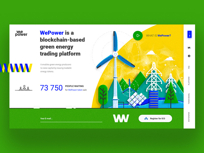
 Design by Giel Cobben
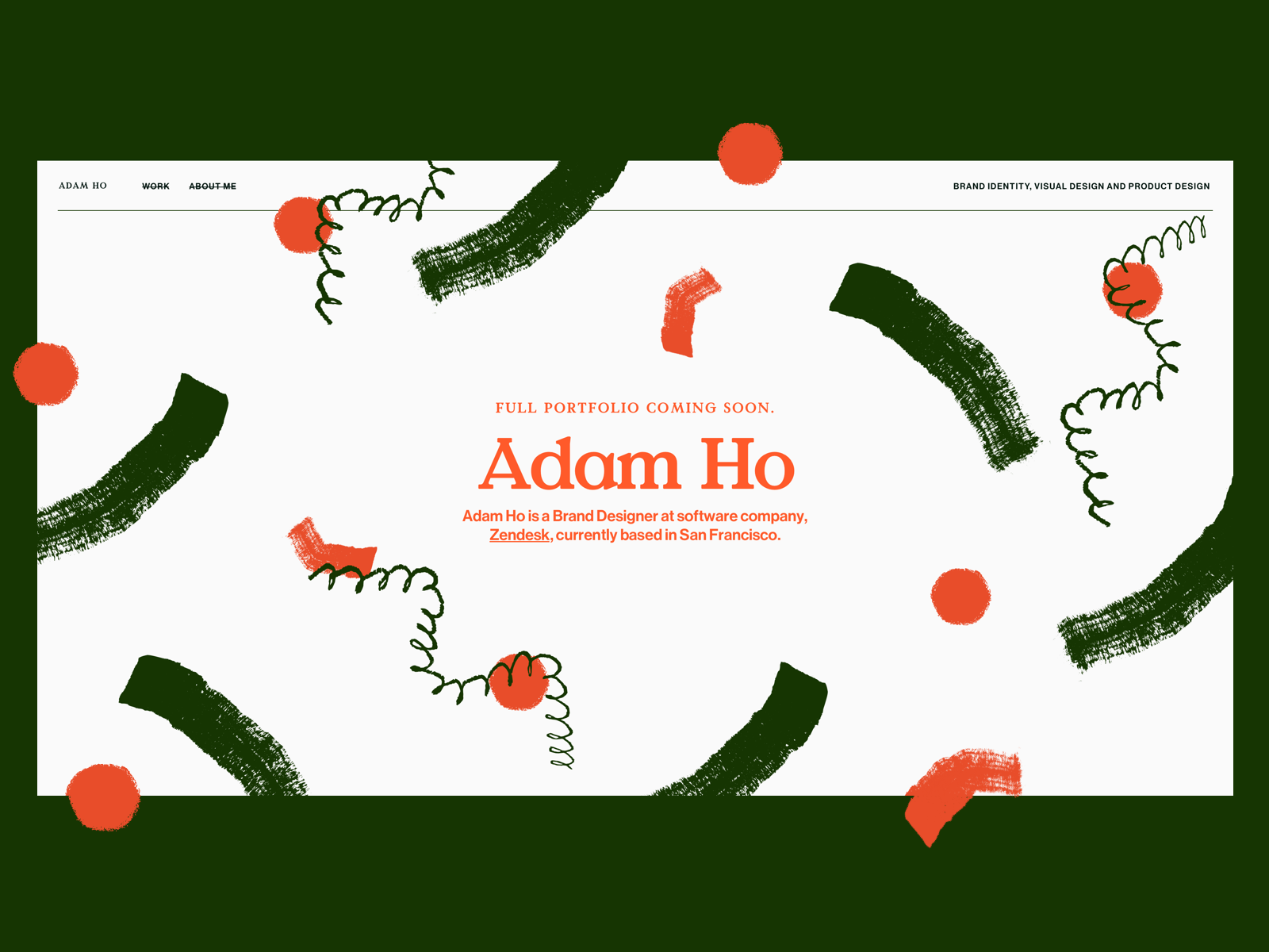 Design by Adam Ho
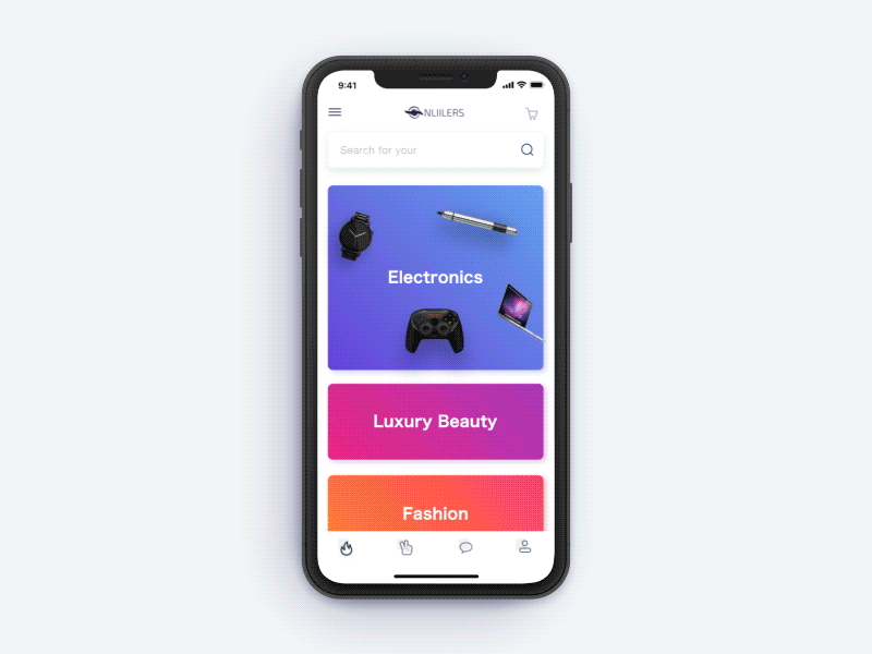 Design by Dannniel
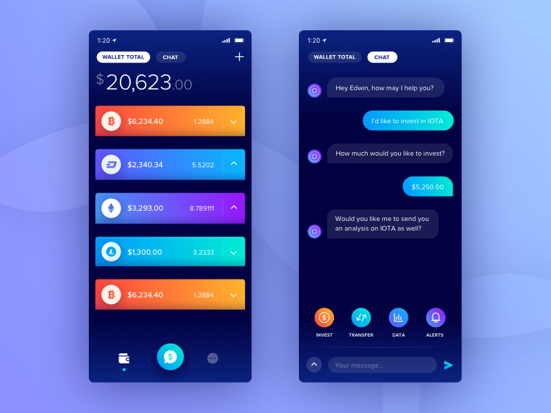
 Design by Pavel Tsenev
 Design by Jon Ezell
 Design by Dmitri Litvinov
 Design by Mo
 Design by Dmitry Neugasimov
 Design by Christian Vizcarra
 Design by João Torres
 Design by Minh Nguyen
 Design by tranmautritam
AoiroStudio
Jan 17, 2018
Source: Abduzeedo UI/UX
January 17, 2018
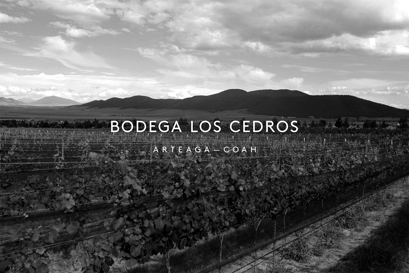
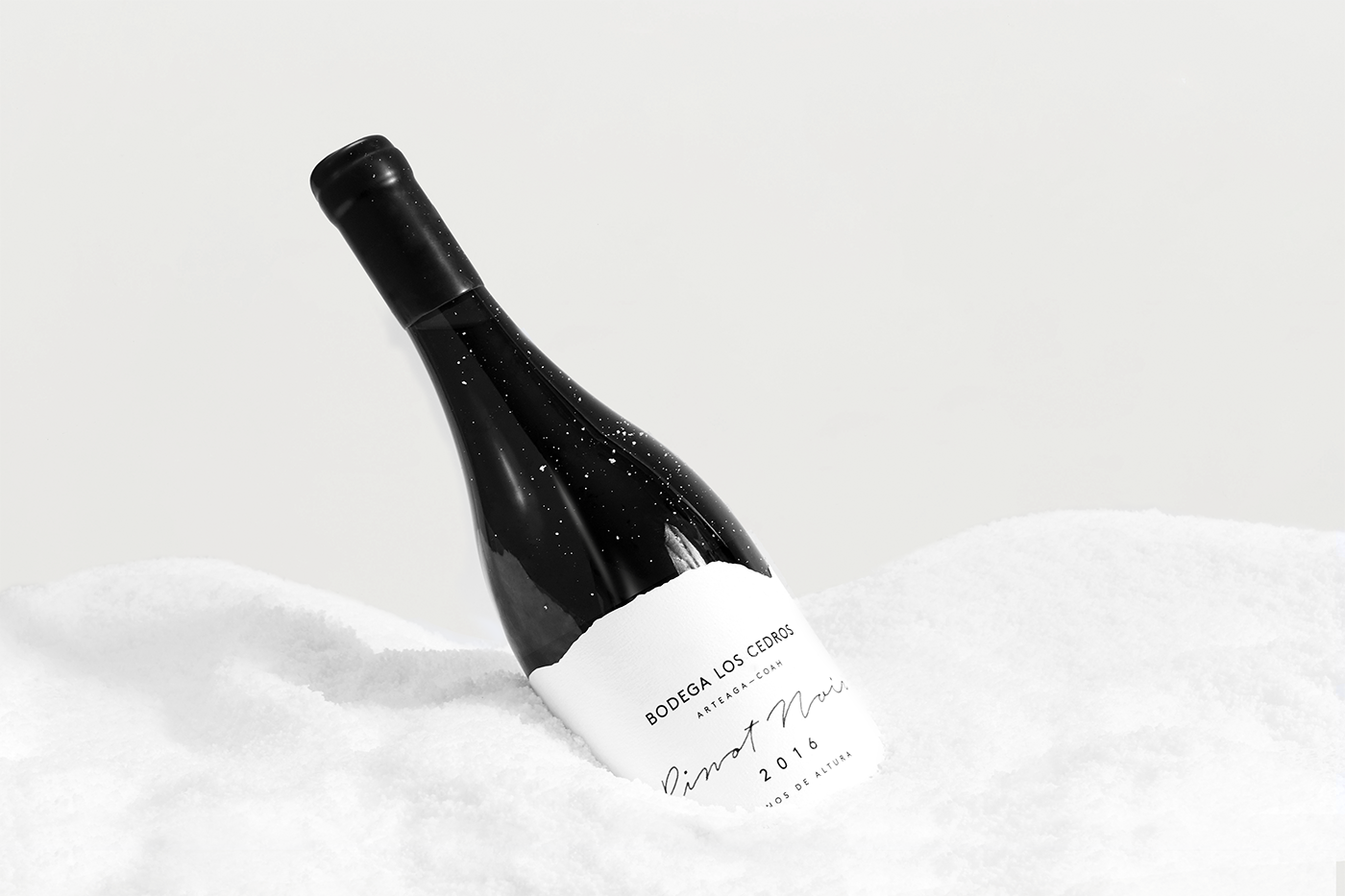
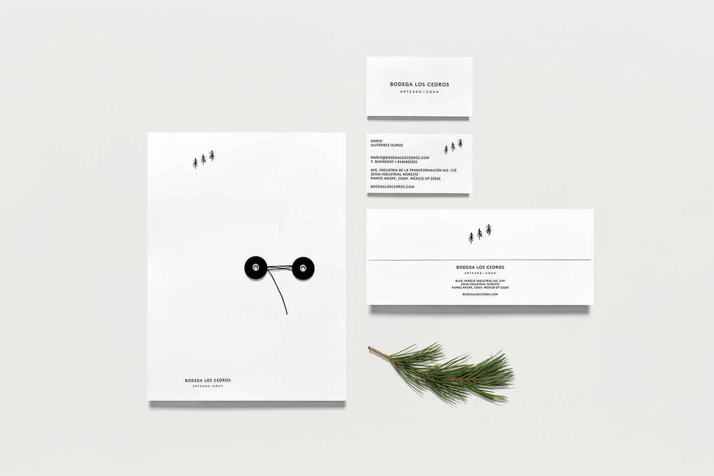
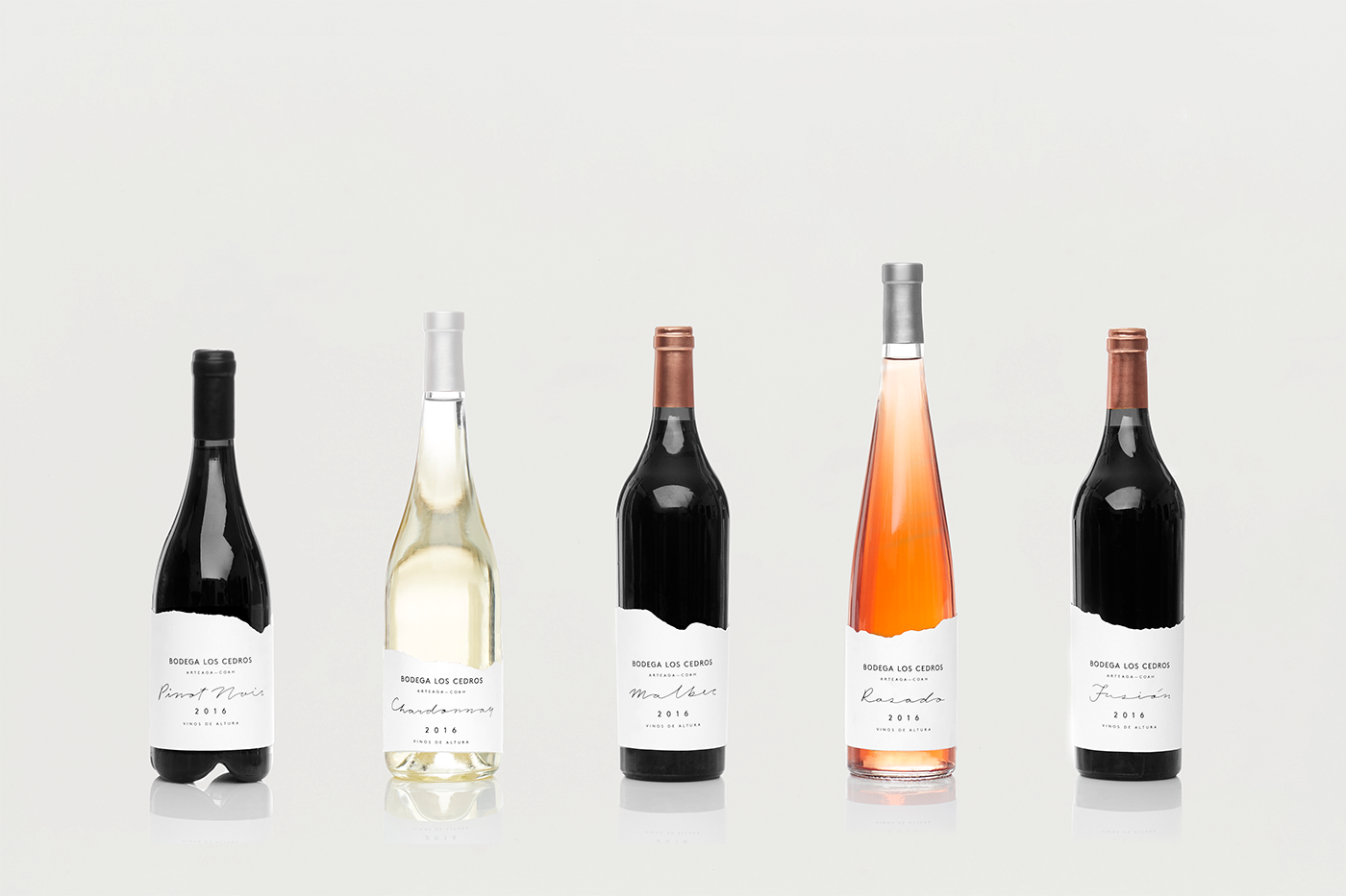
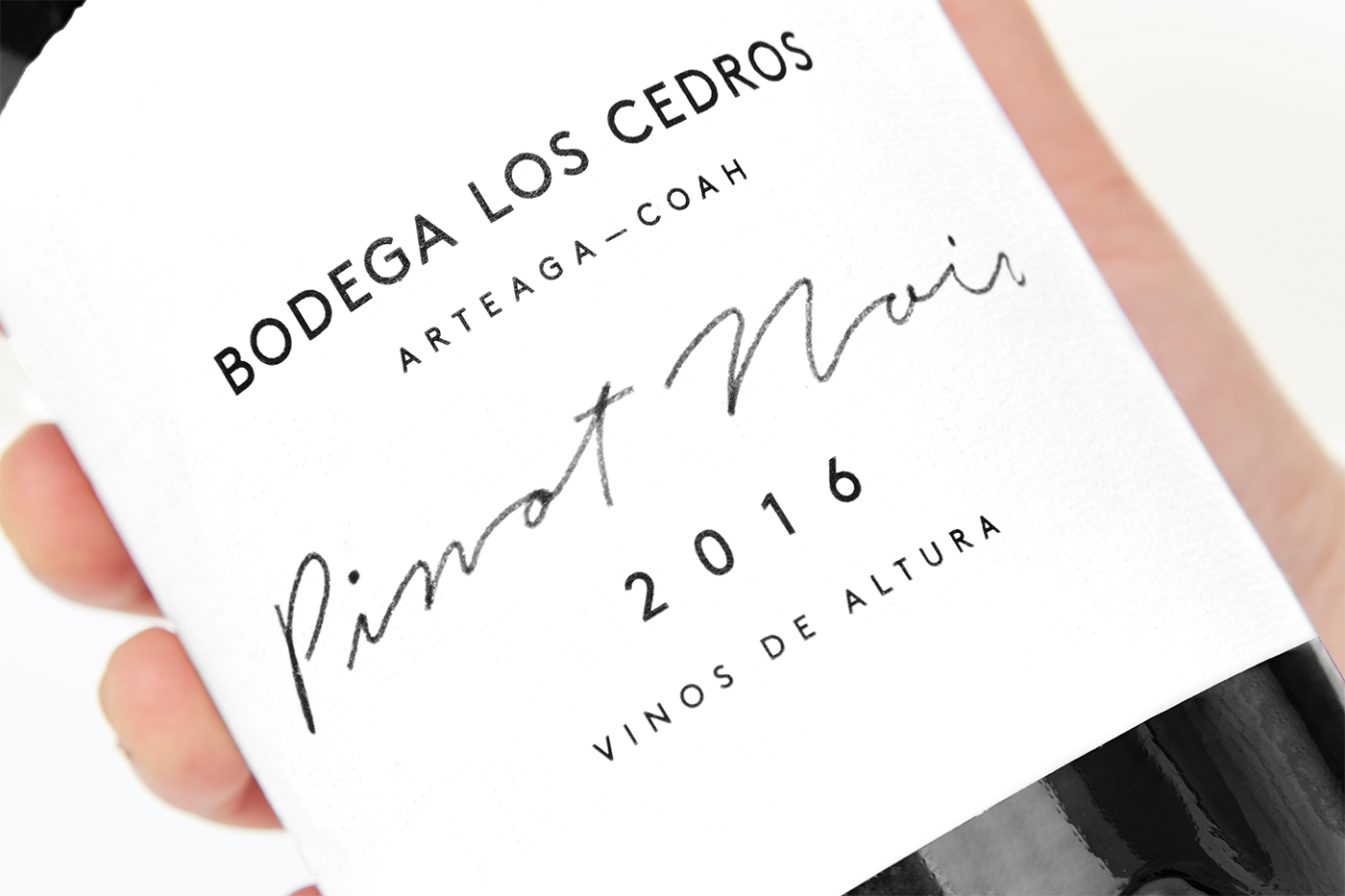
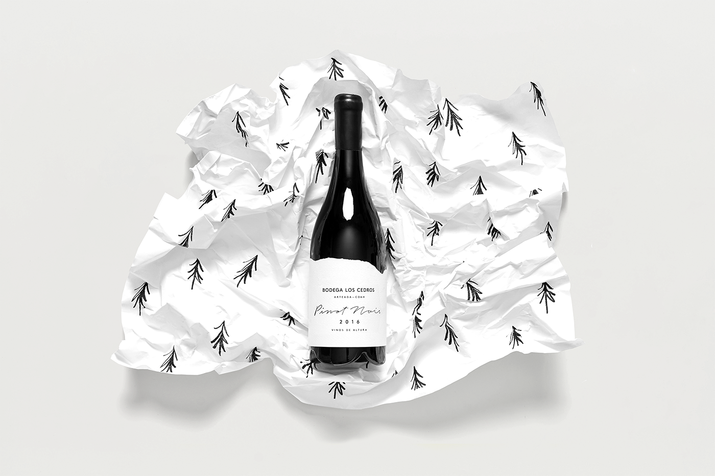
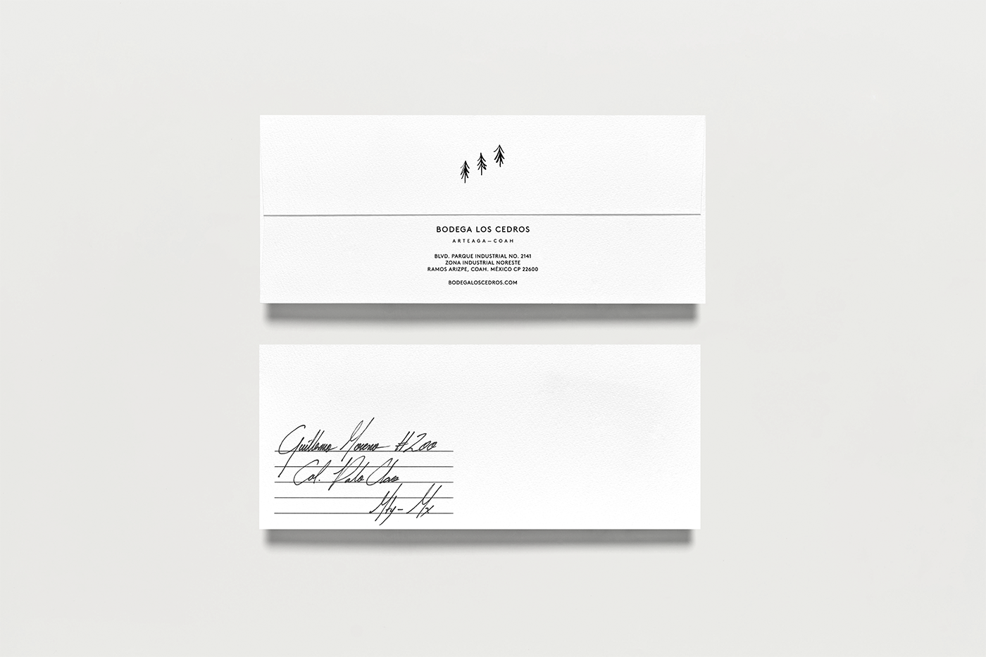
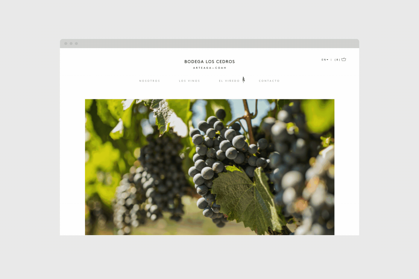
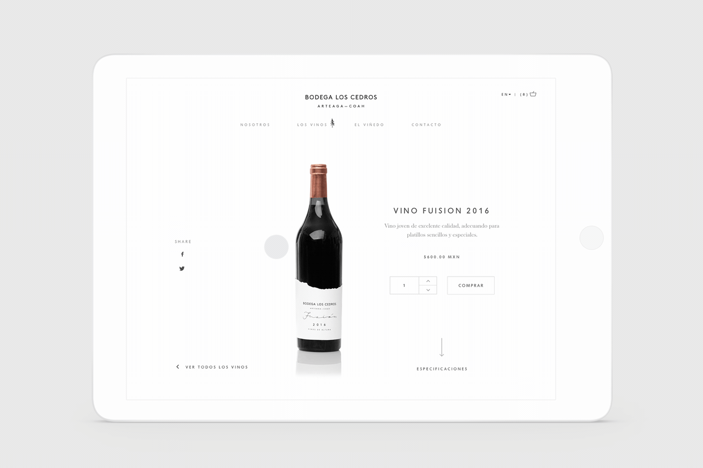
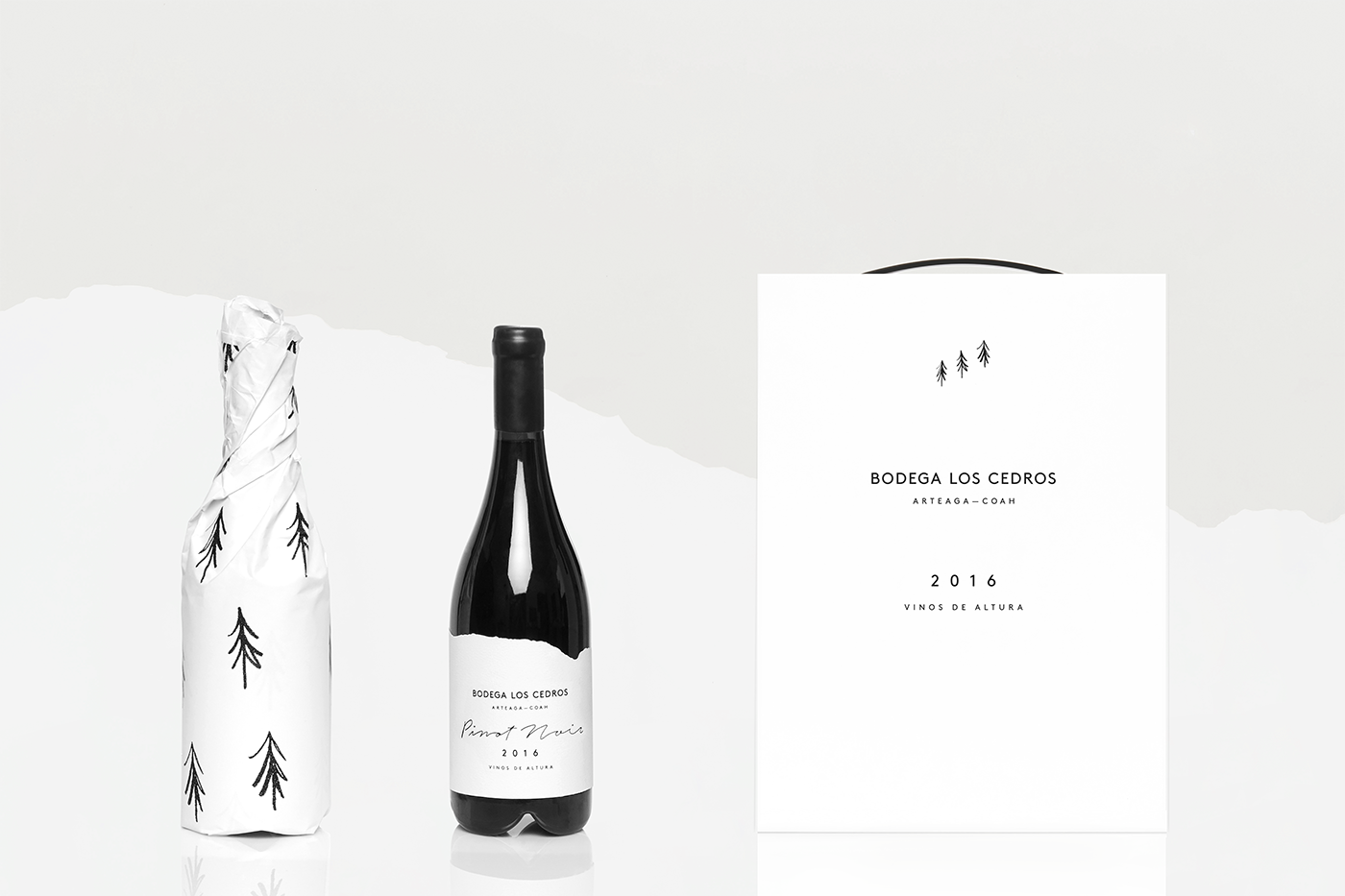
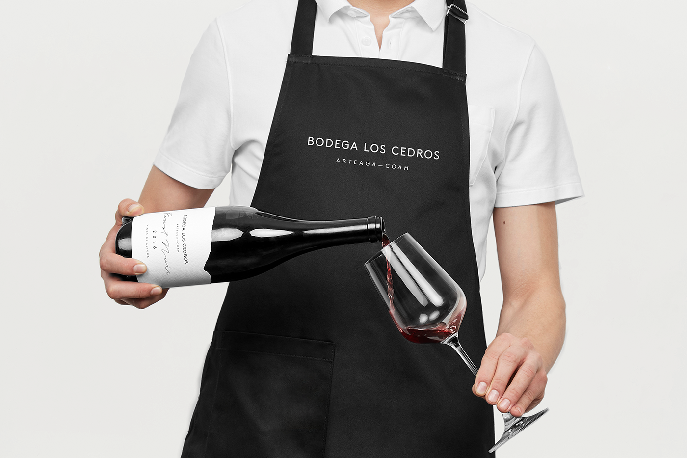
Product Design Love: Bodega Los Cedros by Anagrama Studio
Product Design Love: Bodega Los Cedros by Anagrama Studio
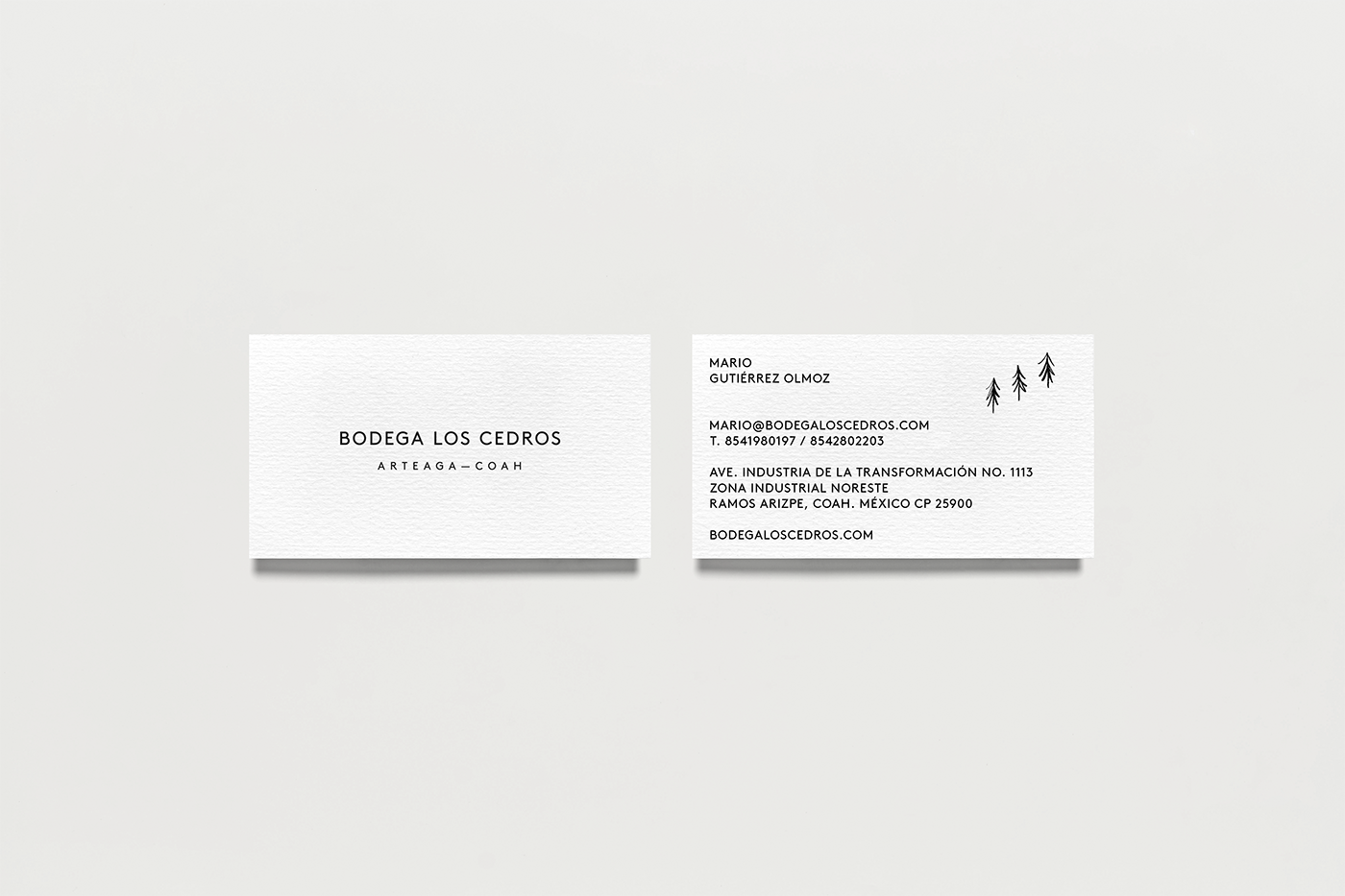
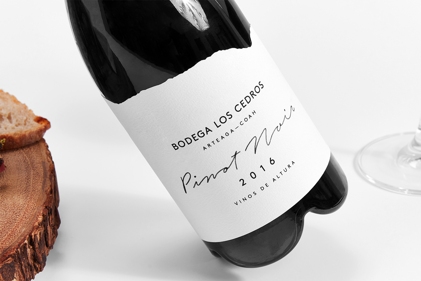
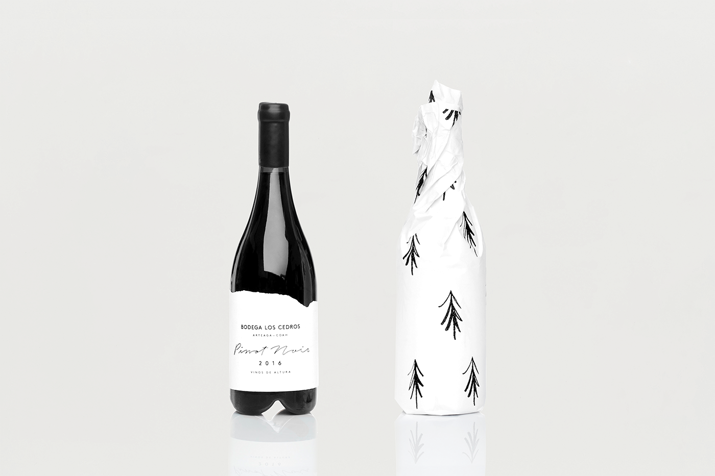
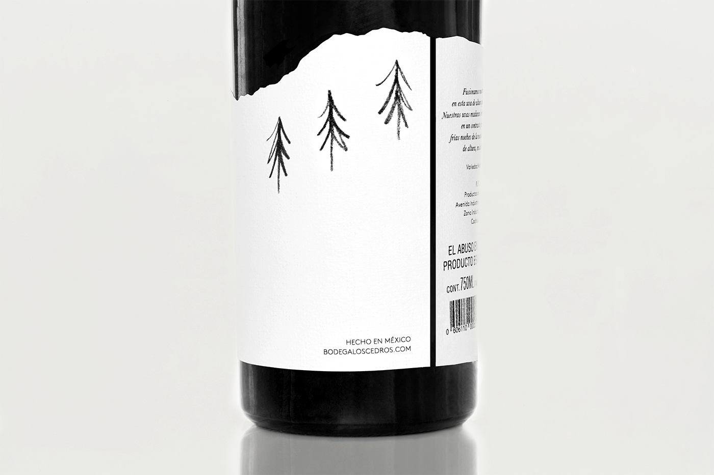
Bodega Los Cedros is a Mexican vineyard located in the mountains of Arteaga, Coahuila. The origins of the name derive from a passion and dream of a family to produce high quality wines within a region more than 100 years old named “El Cedrito.” Enter the talented team at Anagrama Studio to bring the branding vision of this magical place to life by tapping into the geographical location of the vineyard for inspiration. The end result, a beautiful brand identity that employs the characteristic components of the area such as climate, altitude, flora and fauna. We particularly love the simplicity of the logo highlighting three pine trees as the brand’s distinctive icon along with the wine label and die-line mimicking cloud shapes. From a typographic standpoint, we can enjoy a sans serif that adds a touch of modernity while the script gesture preserves a more organic touch showcasing the brand’s marriage of simplicity and elegance. The color palette is nice and neutral enabling a spotlight on the diverse wine color tones while accentuating the contrast between bottle and label. Cheers to the Anagrama team for a beautiful execution celebrating this beautiful wine label.


ibby
Jan 17, 2018
Source: Abduzeedo UI/UX
January 16, 2018
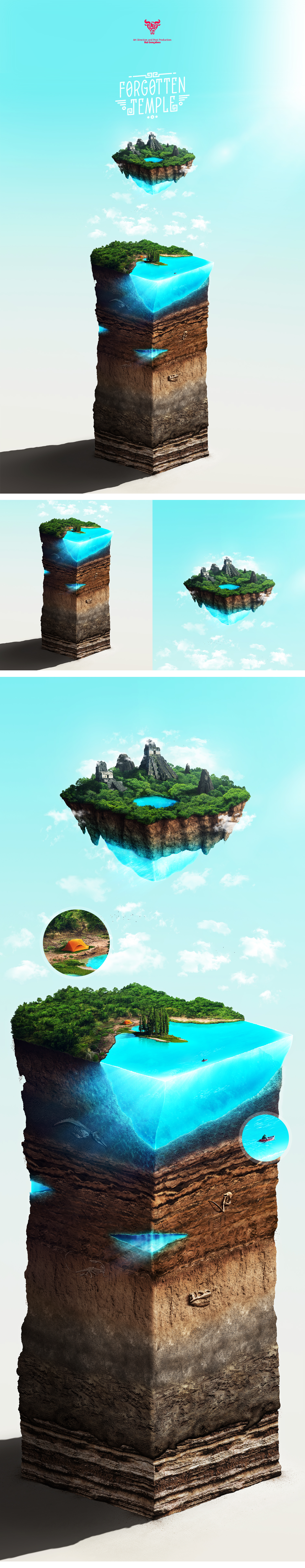
Forgotten Temple Illustration by Rui Gonçalves
Forgotten Temple Illustration by Rui Gonçalves
Let’s take a look at this rather cool illustration by art director/graphic designer Rui Gonçalves. Based in Barcelona, Spain, Rui is a true passion when it comes to graphic design and also art direction. Judging by his Behance Profile, ideas and concepts seems to be his forté. Today we are a case study at the Forgotten Temple Illustration, a commission project ended up being a personal experimentation. My favourite part of this illustration is the layers of details from what’s underneath the sea, the dinosaur fossil is quite a nice touch. This illustration also reminds me of his Everything is okay, until it’s not. project that we have featured on ABDZ.
What started as a commission ended in a personal project. I wanted to push my isometric illustration skills a bit more so i decided to turn this idea, which originally was designed for a client, into a personal project – “Forgotten Temple”. Hope you guys like it!
More Links
- Learn more about Rui Gonçalves at ruimgoncalves.com
- Follow Rui’s work on Behance
- Previous Feature on ABDZ
Illustration & Process
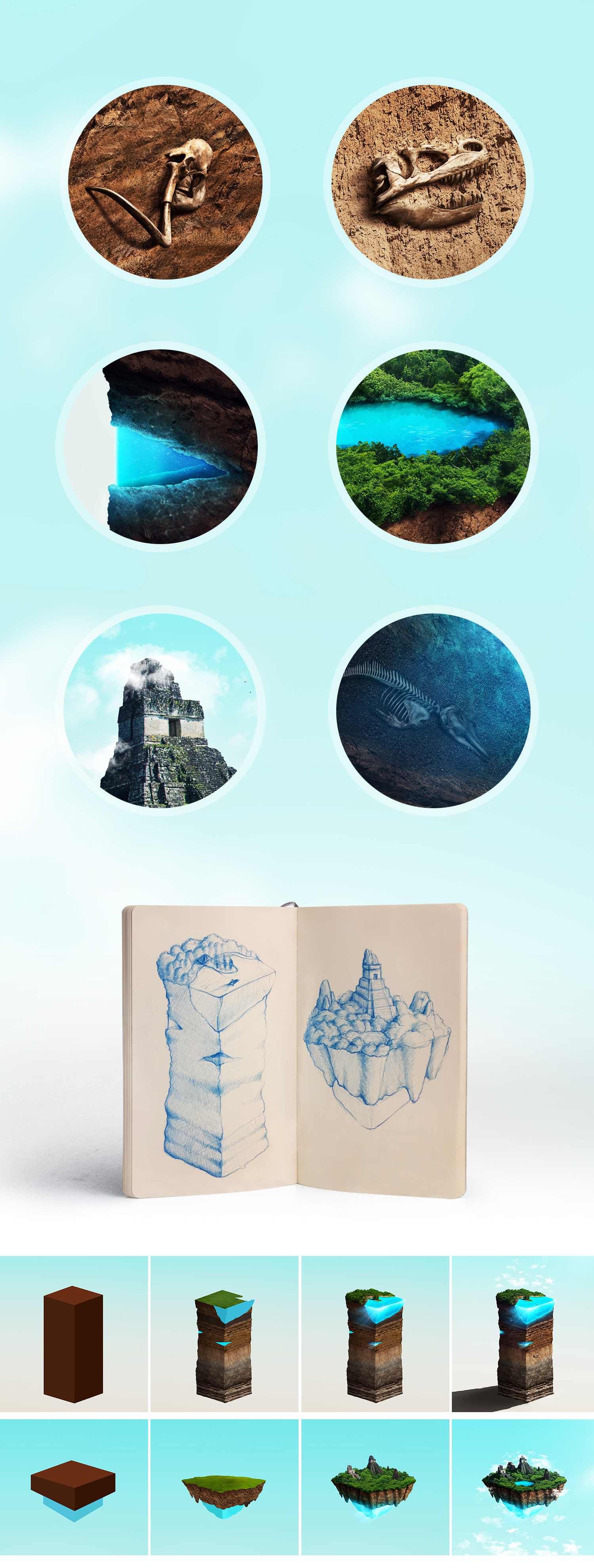
Quick Process
AoiroStudio
Jan 16, 2018
Source: Abduzeedo Illustration
January 14, 2018
Need to Get Some Overhead Shots? Here’s a DIY Rig That Is Simple and Adjustable

Overhead rigs can be kind of complicated to set up, but this one only requires a couple of things you probably have in your studio.
One of my favorite shots is the overhead. It’s stylish and fun and offers a unique point of view if you want to add a little flair to your cinematography. However, putting together a rig that lets you get these types of shots can be a bit of a pain, especially since most of the time you’re trying to find tools around your house or studio that can somehow fit together to accommodate your camera. But if you’ve got a C-stand, a spigot, and a tripod head lying around you can very quickly put one of these rigs together, and filmmaker Peter McKinnon shows you how to do it in the tutorial below.
Source: NoFilmSchool
January 13, 2018
Watch: Tips on Shooting in Tight Spaces to Get Creative Shots

Want to capture a unique angle or perspective? Then you’ll have to get creative with camera placement.
In filmmaking, coverage is pretty straightforward. You’ve got your standard shots, like wides, mids, and close-ups, your over-the-shoulders, two-shots, and dollies, but occasionally it necessary to throw in something creative to give your audience something new and interesting to look at. You can do this a number of ways, but one that is definitely worth mentioning is by shooting these kinds of shots from a unique perspective.
In this video, Jay P. Morgan from The Slanted Lens goes over some tips on how to approach camera placement more creatively, how to set up shots in weird, often small or tight spaces, as well as how to go about lighting these peculiar shots. Check it out below:
Source: NoFilmSchool
January 13, 2018
The big PC trends from CES: Intel befriends AMD, monitors get massive, and more
The trends we saw from the show floor at CES 2018 have us both curious and excited about the future of computing. Some will undoubtedly end up in dead ends — and others will probably become the new status quo in just a few years.
The post The big PC trends from CES: Intel befriends AMD, monitors get massive, and more appeared first on Digital Trends.
Source: Digital Trends VR
January 13, 2018
‘You gotta be patient.’ Why HTC keeps pushing VR forward, and what’s next
We sit down with an executive from HTC to talk all things Vive Pro — the controllers, the headphones, and taking VR to the next level. We even touched on the future of the stand-alone Vive Focus, which hasn’t been released in North America yet.
The post ‘You gotta be patient.’ Why HTC keeps pushing VR forward, and what’s next appeared first on Digital Trends.
Source: Digital Trends VR
January 13, 2018
Bad Weather Ruining Your Shot? Here’s How to Fix It in Post

You can’t control the weather, but you can control the way it looks in your image if you know a few tricks in post.
As filmmakers, we try to prepare for anything and everything that can go wrong during a shoot, including checking the weather conditions if we’re shooting outdoors. We read forecasts, watch the news, or use mobile apps that tell us days in advance what to expect from the skies, but no matter how diligently we plan, the weather has a way of sneaking up on us and threatening to ruin our most important shots.
Most of the time, you just call for a reshoot, reschedule, or just kind of do the best you can with what you’ve got, but sometimes you can actually fix bad weather conditions in post. In this Premiere Pro tutorial, Tom Antos shows you how to perform a sky replacement, effectively turning a dreary, overcast sky into one that looks vibrant, dynamic, and best of all, realistic.
Source: NoFilmSchool