Monthly Archives: May 2018

Point process modeling: how to detrend a raster (in R) and bring it back into ‘spatstat’ (by Dr. Anderson)

In my last blog post, I talked about how to identify and test for inhomogeneity of a point process, and I stated that the best way to characterize an inhomogeneous point process is to fit a good parametric model. When fitting an inhomogeneous point process model, the point pattern (really, the spatially varying intensity of the point pattern) is the response variable and the predictors are some type of spatial object, such as a raster surface, that can be evaluated anywhere within the test region. In ecology and geography, where the focus is often on hypothesis testing (rather than prediction, per se), it is often the predictors/covariates themselves that are of interest: the goal is to test whether the predictor has a significant effect on the spatially varying intensity of the point process.

For example, I have recently been working on a study with a group from south Florida and they want to determine whether elevation affects the intensity of burrowing by gopher tortoises in pine flatwoods (a type of pine savanna that is seasonally flooded). In this case, the response is the intensity of burrowing and the predictor is a raster derived from a digital elevation model (DEM); the goal is to test whether an increase (or decrease) in elevation affects the average intensity of burrowing. The elevation data were derived from LIDAR and were provided as a set of ERDAS IMAGINE (.img) files, where each pixel is 0.5 x 0.5 m and contains information about elevation.

When I agreed to conduct the analysis, I thought it would be a rather simple: figure out how to process the DEMs for use in ‘spatstat’ and then fit point process models with the elevation rasters as predictors. I started the process in ArcGIS, where I converted the .img files to .tif and then clipped the .tif to the extent of each point pattern. Next, I used the readGDAL() function from the ‘rgdal’ package in R to convert the .tif files to a “SpatialGridDataFrame” object, which I then converted to an object of class “im” representing a two-dimensional pixel image in ‘spatstat’. Here is a pixel image of the elevation surface for the first point pattern that I examined in ‘spatstat’.

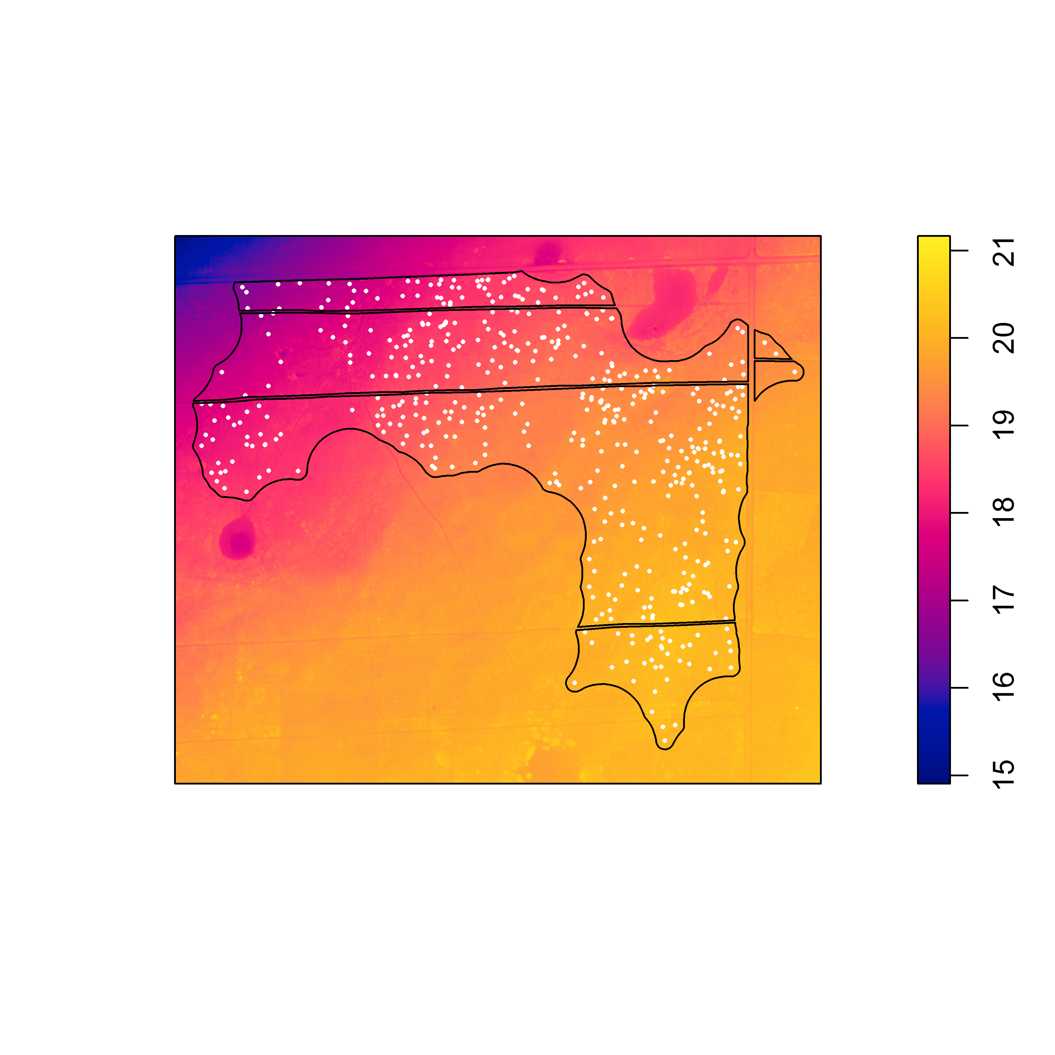
Pixel image (of class “im”) of elevation with locations of gopher tortoise burrows (white dots). The black lines represent the study area window boundaries. Note the trend in elevation from the northwest to the southeast.

If you fit a point process model with this elevation surface as a predictor, there is strong evidence against the null model (of a homogeneous Poisson point process) in favor of the model that includes the elevation surface. This results reflects the  increase in mean intensity from the northwest to the southeast along the elevation gradient, associated with the change from bottomland to upland habitat. If you look closely, you can also see local variation in burrowing intensity along the elevation gradient, that seems to be associated with local topographic relief [i.e., high (dry) and low (wet) spots within a particular area]. At ground level, these subtle differences in elevation can be difficult to discern, but may be important in explaining local variation in burrowing intensity. To examine the effect of the local topographic relief, you first have to detrend the raster. To do this, the elevation surface will need to be processed outside of ‘spatstat’ and then returned as a pixel image (of class “im”) that can be used as a covariate in a point process model to examine the effect of local variation in elevation on burrowing intensity.

When I searched for how to detrend a raster on the internet, I was surprised to find little to no existing guidance or functionality. I knew that I could potentially fit a regression model based on the coordinates (vis  a vis “trend surface analysis”) and then re-build the covariate surface based on the residuals, but I felt insecure about fitting a linear model in R to a raster surface with over 5 million pixels. Most of the links that I could find were focused on detrending a DEM to examine bathymetry in rivers, and other links led to tutorials on trend surface analysis, but almost entirely in context of interpolation from arbitrary sample locations. I saw some posts that discussed detrending a DEM in ArcGIS using the raster calculator or the arc.py library, but some extra tricks would be required to make it work if your input is a raster, and not points. Due to the lack of existing functionality, I decided to develop my own solution using some tools from the “raster” package in R (via intermediate object types from the “sp” package).

Before I describe my solution, I should say that I did eventually find an R package (called “EcoGenetics”) that has a function [called eco.detrend()] that does exactly what I was looking for, and is based on the same basic  approach that I imagined. The eco.detrend() function is, in turn, based on code (for a trend surface analysis) from the book “Numerical Ecology with R” by Legendre and Borcard. Hence, if you are looking to quickly detrend a surface, I would recommend that you use eco.detrend(). That said, since many of the steps in the eco.detrend() function are automated and not readily apparent, the code that I am providing should help you to understand how the process works, and should be especially helpful if you want to customize the procedure in some way (e.g., if you want to fit a different type of model).  Since my goal was to detrend the DEM for the purpose of a point pattern analysis in ‘spatstat’, my solution also provides the extra steps that will enable you to convert the detrended surface back into a pixel image object (of class “im”) in ‘spatstat’.

Below is the sample code for the solution I developed. For the sake of brevity, I have skipped the initial process of building the point pattern object in ‘spatstat’.  My solution involves: 1)  Converting the TIFF to a “SpatialGridDataFrame” and then to a “RasterLayer” object, 2) using the rasterToPoints() function to extract the pixel data and coordinates from the “RasterLayer”, 3) fitting a polynomial model (of a specified degree) and then rebuilding the data frame with the residuals (rather than the raw elevation data), 4) rebuilding the raster from the data frame using the rasterFromXYZ() function and restoring the projection information; 5) using the SpatialGridDataFrame() function to convert from “RasterLayer” object back to a “SpatialGridDataFrame” object; and 6) converting the “SpatialGridDataFrame” to an “im” object in ‘spatstat’.

There is only one step that I have modified after inspecting the eco.detrend() function: in my original code, I used the poly() function separately on the x and y coordinates and overlooked the fact that, when such an approach is used, the interaction term (between x and y) is not included. Passing the xy data as a matrix to poly() solves this problem (and I thank Leandro Roser for pointing out the missing interaction term). The eco.detrend() function also mean centers the coordinates before fitting the model, I have skipped this step.

#####################################################

library(spatstat)

library(rgdal)

library(raster)

#######################################

# ppp object was built in spatstat                      #

#######################################

### Example pipeline for detrending the raster.

# use ‘rgdal’ to convert the .tif to a SpatialGridDataFrame

alex_15 <- readGDAL(“Alexander2015.tif”)

# convert SpatialGridDataFrame to a RasterLayer

alex_15_ras <- raster(alex_15)

# extract coordinates and elevation band

x_y_z <- rasterToPoints(alex_15_ras)

#convert matrix to data frame

x_y_z <- as.data.frame(x_y_z)

# create a vector with the elevation data

band1 <- x_y_z[, 3]

# fit a linear model with the x and y coordinates as predictors

fit_test <- lm(band1 ~ x + y, data = x_y_z)

alex.residuals <- fit.test$residuals  #extract the residuals

# To fit polynomial of degree two or higher, you must pass a matrix with # the xy coordinates through poly()

# isolate the columns with the x and y coordinates and covert to matrix

X_Y <- as.matrix(x_y_z[, c(1, 2)])

fit_test <- lm(band1 ~ poly(X_Y, degree = 2))  # change degree as required

alex_residuals <- fit_test$residuals

# Recreate the data frame with the coordinates and the residuals

x_y <- x_y_z[, 1:2]  # isolate the coordinate columns

x_y$residuals <-  alex_residuals # create column of residuals

x_y_r <- x_y   # rename the data frame

head(x_y_r)  # check to make sure it worked

# convert back to RasterLayer and restore the projection and datum

alex_15_detrend <- rasterFromXYZ(x_y_r, res = c(0.5, 0.5), crs = “+proj=utm +zone=17 +datum=WGS84”)

# convert back to SpatialGridDataFrame

alex_15_detrended <- as(alex_15_detrend, ‘SpatialGridDataFrame’)

# convert to im object in spatstat

alex_15_d <- as.im(alex_15_detrended)

#####################################################

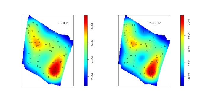
Here are the detrended rasters for the linear model and the second degree polynomial.

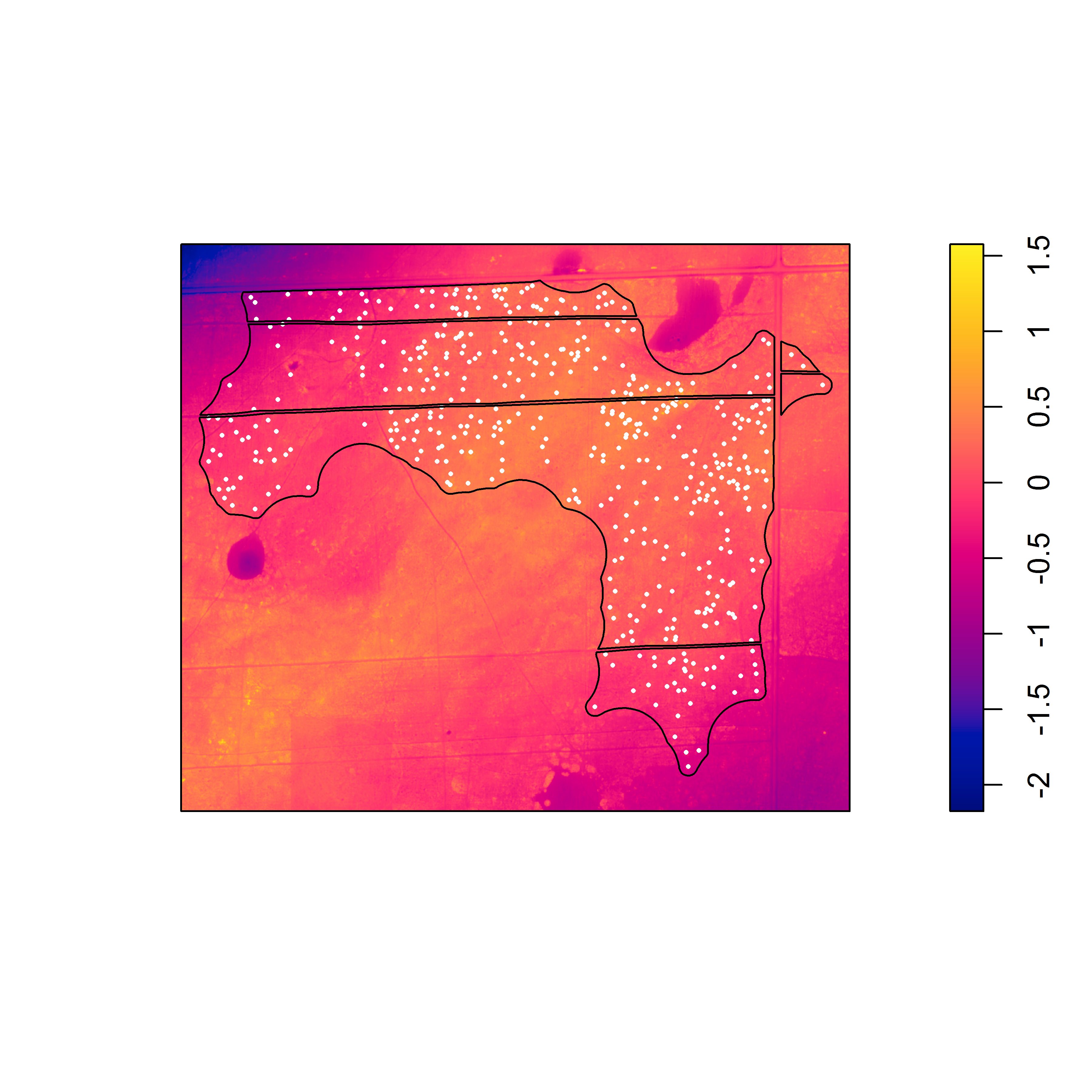
Pixel image of the elevation surface that was detrended via a linear model (with the x and y coordinates as predictors).

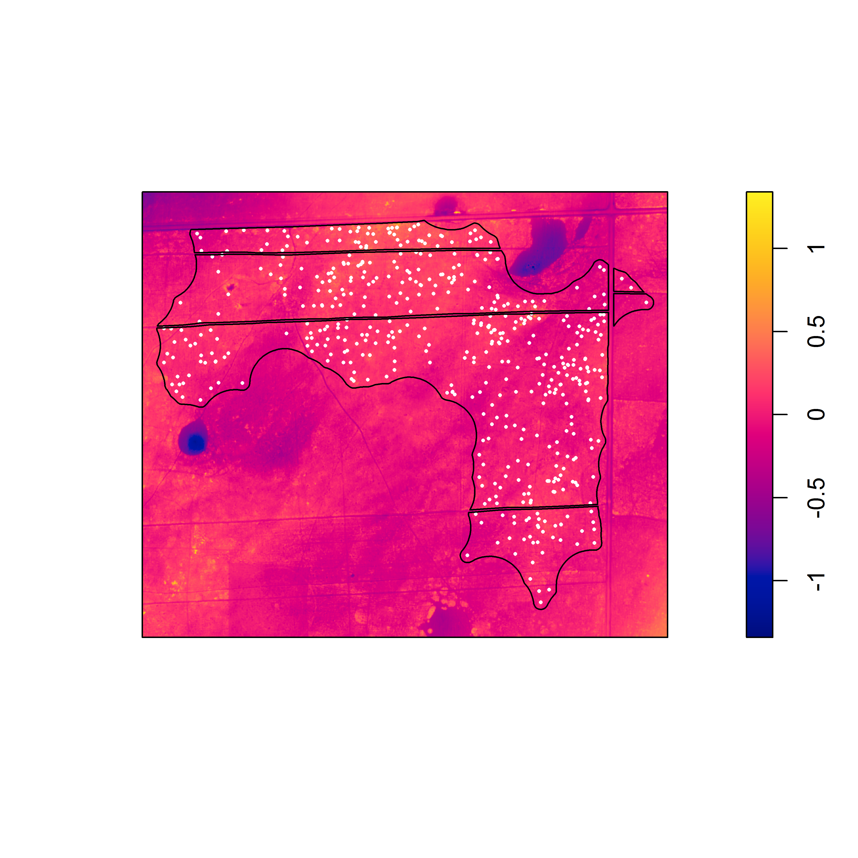
Pixel image of the elevation surface that was detrended based on a second degree polynomial of the x and y coordinates.

With the detrended surfaces, it is easier to see the association between the burrows and local topographic relief. For both detrended surfaces, there is strong evidence against the null model in favor of the model that includes the detrended surface as a covariate.  Although the appearance of the raw elevation surface suggests a trend, the linear model seems to underestimate elevation in the northwest and southeast corners, suggesting that a higher degree polynomial or nonlinear model would better fit the surface.

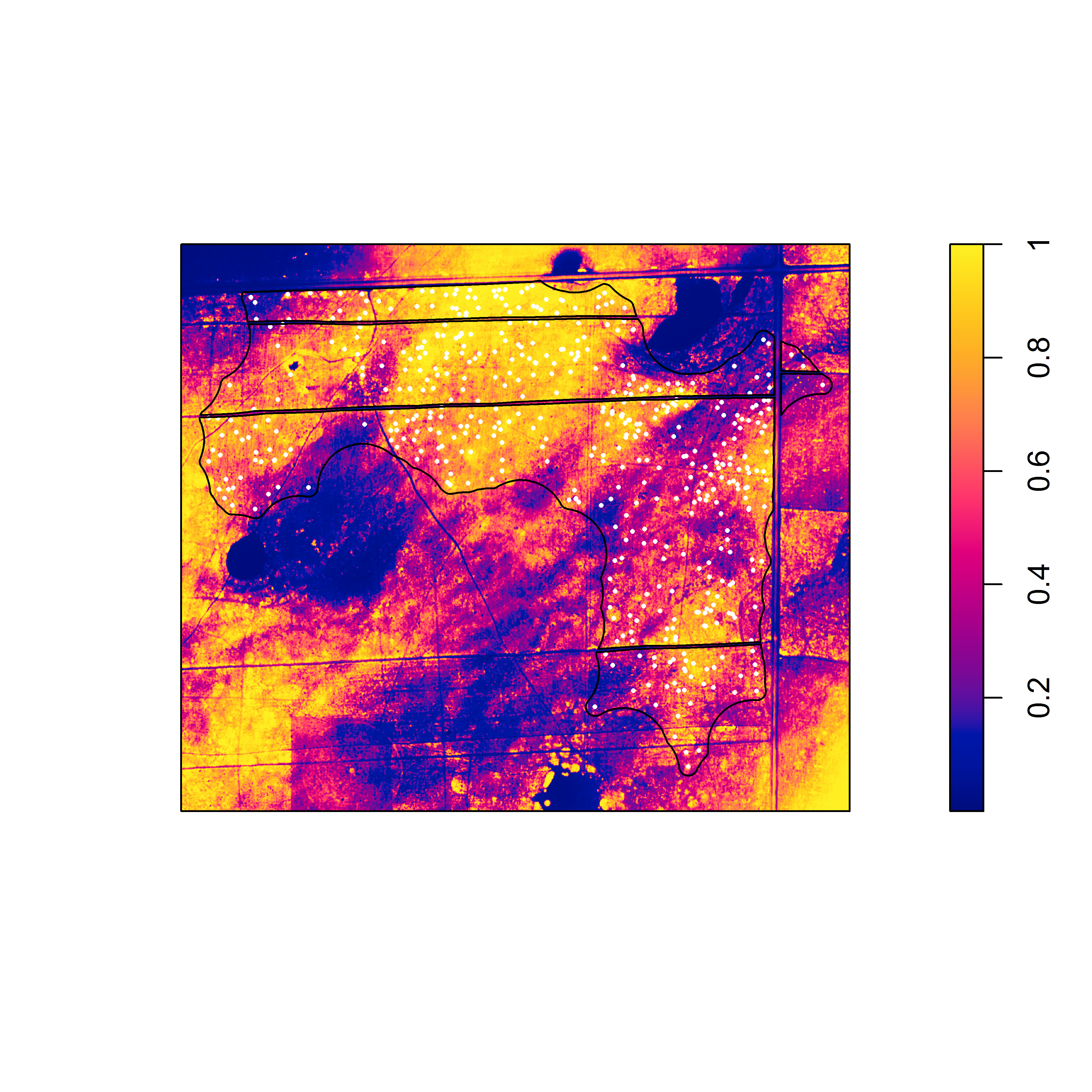
As far as I know, there is no simple trick for determining the optimal order of the polynomial to use when detrending. Given an appropriate thematic resolution (and color scheme), just the appearance of the raster (or the appearance of the detrended raster) might be the best clue, as in the example above. In terms of visualization, applying a probability integral transformation to the raster is a useful trick to the sharpen image:

pit <- ecdf(alex_15_d) # calculate ecdf for raster cell values

alex_15_d_pit <- eval.im(pit(alex_15_d)) # evaluate function for each cell

Any sort of model selection scheme could be incorporated into the pipeline, but a rough sample-based heuristic would be to write a function to evaluate model fit (based on something like adjusted R-squared value or rmse error) against the polynomial order to find the threshold where there are diminishing returns. Here I wrote a function (poly_r2) that evaluates the adjusted R-squared value for a polynomial function up to five degrees.

> poly_r2(x_y_z, 5)

[1] 0.8484003 0.9700987 0.9763606 0.9787306 0.9831541

Based on the result shown, one might conclude that there are diminishing returns beyond a polynomial degree of two. Over-fitting the distribution is also a bad idea if you are interested in the residual elevation. Rescaling the elevation surface to avoid negative values (e.g., by adding the residuals to the minimum elevation or minimum residual value) does not change the estimate of the regression coefficient in the point process model (or the test of significance of the regression coefficient), but it does affect the estimate of the intercept. In our case, we are mainly interested in whether local topographic relief affects burrowing intensity, and the results suggest that there are both global and local effects of elevation on burrowing intensity.

There are lots of potential situations, beyond detrending a raster for the purpose of fitting a point process model, where detrending a raster surface might be useful. In the “EcoGenetics” package, there is an interesting example where a global trend is removed so that a test of local spatial autocorrelation can be conducted. Moreover, this sort of approach (based on trend surface analysis) could be used for any sort of geostatistical data and does not have to be limited to the special case of raster data. While the solution I have provided is not necessarily novel, I hope it is useful to somebody looking to detrend a raster in R, especially in the context of point pattern analysis. Point process modeling is a powerful approach for examining inhomogeneity, but such an approach is only worthwhile if important covariates can be measured and mapped effectively.

[If you are interested in the application to gopher tortoise conservation, see Castellon et al. (2020) in Copeia]

Leave a Comment

Filed under Uncategorized

Point pattern analysis: visualizing and testing for inhomogeneity (by Dr. Anderson)

What is inhomogeneity?

A common “rookie” mistake in point pattern analysis is to reject CSR in favor of clustering, but without realizing that apparent clustering might actually be driven by inhomogeneity. Inhomogeneity is a form of first-order nonstationarity and refers to the violation of the assumption that the mean intensity of the point process is constant (or, more formally, “invariant under translation”). This does not imply that the count of points should be exactly the same in different test regions (such as quadrats), but that the counts are drawn from a distribution with the same mean intensity. A point process of constant mean intensity is said to be “homogeneous”; if the mean intensity varies, the point process is said to be “inhomogeneous”. Note that almost all basic tests of independence (including commonly used indices such as Clark-Evans and summary functions such as Ripley’s K) assume homogeneity, where the null model is a homogeneous Poisson point process [a.k.a. complete spatial randomness (CSR)]. Conducting this type of test is often a first step in a point pattern analysis (a “dividing hypothesis”); if CSR is rejected in the direction of clustering, the point pattern is either clustered or inhomogeneous; the task then becomes determining between clustering and inhomogeneity. The problem is that identifying and testing for inhomogeneity can be tricky. The purpose of the present article is to raise awareness about inhomogeneity and to demonstrate some common ways to visualize and test for inhomogeneity.


The classic approach

The classic way to test for inhomogeneity is the chi-square test of uniformity. For a homogeneous Poisson point process, the expected count of points in a test region is equal to the area of the test region (i.e., the area of each quadrat) times the estimated intensity in the study area; the observed counts are then compared to expected counts via the Pearson chi-square statistic.  The major disadvantage of this test is that the same procedure is also used to test for independence assuming homogeneity; the two can be easily confounded.


Modern approaches for visualizing and testing for inhomogeneity

For any sort of statistical analysis, the first step is always to look at the data. For point patterns, looking at the pattern itself can often provide the best clue as to whether the pattern is inhomogeneous. For example, below is a realization of a simulated inhomogeneous Poisson point process, where a one-unit change in the x-coordinate results in a fivefold increase in the intensity of the point pattern.

An inhomogeneous Poisson point pattern with a systematic trend in intensity. For a 1-unit change in the x-coordinate there is a fivefold increase in intensity.

It is easy to see that the intensity on the left side of the plot is substantially lower than the intensity on the right side of the plot, which is a clue that the point pattern is inhomogeneous. If a summary function (e.g., Besag’s L-function) were used to test the null hypothesis of CSR against the alternative that the point pattern is clustered, there is strong evidence against the null hypothesis in the direction of clustering, even though the result is being driven entirely by inhomogeneity and not clustering.

Besag’s L-function for the inhomogeneous point pattern with a trend in the intensity along the x-coordinate (shown above). A one-sided, simultaneous significance envelope was constructed based on 999 simulations of CSR with the same global intensity. Note that the summary function deviates above the envelope (in the direction of clustering) and provides strong evidence against the null hypothesis of CSR. The apparent clustering, however, is driven by inhomogeneity.


In other cases, inhomogeneity can be more difficult to identify visually, especially when the intensity of the point pattern is relatively low. For example, here are six realizations of a homogeneous Poisson point process with mean intensity equal to 0.5. Note that several of the point patterns (e.g., Simulation 1 and Simulation 3) may appear as if they were inhomogeneous, when (in fact) the underlying point process is homogeneous.

Six realizations of CSR with an itensity (lambda) of 0.5. Note that several of the point patterns (e.g., Simulation 1 and Simulation 3) appear as if they could be inhomogeneous when, in fact, the underlying process is homogeneous.


Another common way to visualize inhomogeneity is by kernel smoothing. This results in a raster surface where each cell represents the kernel smoothed local intensity of the point pattern. A Monte Carlo procedure can then be used to compare the maximum intensity of the observed point pattern to the maximum intensity for multiple realizations of CSR with the same global intensity. For example, below is the kernel smoothed intensity surface for a point pattern that represents the locations of gopher tortoise burrows in a pine stand. In this case the bandwidth (i.e., the standard deviation of the isotropic Gaussian kernel) was chosen via the default method in the ‘spatstat’, which is based on the dimensions of the study area window. Applying the Monte Carlo procedure described above resulted in a P-value of 0.11 and hence failure to reject the null hypothesis (at α = 0.05) of no difference between the observed maximum intensity and the expected maximum intensity under CSR. While kernel smoothing is a useful nonparametric method for visualizing the intensity surface, test results often vary depending on the method that is used to select the bandwidth. For example, when maximum likelihood cross-validation was used to select the bandwidth and the same Monte Carlo testing procedure was applied, the P-value was 0.012 and the null hypothesis was rejected.

Kernel smoothed intensity surfaces for a point pattern representing the locations of gopher tortoise burrows (black circles) in a pine-stand. For the figure on the left, the default method in ‘spatstat’ was used to select the bandwidth (which is based on the dimensions of the study area window); for the figure on the right, maximum-likelihood cross-validation was used to select the bandwidth. For the intensity surface based on the default bandwidth selection method, the null hypothesis (that the maximum observed intensity was more extreme than that expected under CSR with the same global intensity) could not be rejected (P = 0.11). For the intensity surface where the bandwidth was selected based on maximum-likelihood cross-validation, the null hypothesis was rejected (P = 0.012). This example illustrates that sensitivity of methods based on nonparametric kernel smoothing to the chosen bandwidth.

Kernel smoothed intensity surfaces can also be problematic when they are used to estimate intensity for the purpose of correcting for it (e.g., when using something like an inhomogeneous K or L-function), and the results can often vary depending on which bandwidth is chosen. For example, if the intensity of the process is substantially higher in certain areas, using a kernel smoothed intensity surface as a source to correct for inhomogeneity often results in a summary function that seems to be under-corrected at short distances and over-corrected at longer distances (for a demonstration, see my other post on: “Significance envelope for cross-type summary function based on kernel-smoothed intensity surfaces”).

I have found that a useful way to assess if the kernel smoothed intensity surface is accurate is to simulate an inhomogeneous point pattern based on the kernel smoothed intensity surface. For example, below is a kernel smoothed intensity surface for armadillo burrows (found in the same study area as the gopher tortoise burrows shown above); the open white circles are the armadillo burrows. Much of the inhomogeneity in the distribution of armadillo burrows in this study area is associated with raised dirt berms that were created when the pine stand was windrowed, and on which the armadillos burrow intensively (as they prefer to burrow on sloped surfaces). Note that simulations based on this surface result in point patterns that do not closely resemble the observed point pattern; when the kernel smoothed surface is used to estimate the intensity surface, the intensity of the point pattern is lower than expected on the berms, but higher than expected in the vicinity of the berms.

Six realizations of an inhomogeneous Poisson point process based on the kernel smoothed intensity surface for armadillos (shown above). Note that the intensity of burrows is over-estimated in the vicinity of the berms.


If you want to examine whether the intensity of the point process is dependent on a single covariate, there are a handful of methods that can be used to both visualize and test for dependency, such as relative distribution estimation and various tests based on cumulative distribution functions. However, a more flexible approach (especially when you want to examine more than one potential covariate)

When possible, a better way to estimate the intensity function is by fitting a parametric point-process model, such as an inhomogeneous Poisson point-process model. There are other methods that exist for testing the effect of a covariate on intensity (such as methods involving cumulative distribution functions), but model fitting is superior because there is the potential to include more than one covariate. For the armadillo example, a binary mask was created from the GPS outlines of the berms and was used as a logical covariate; I then fit a model that is “homogeneous in different regions”: the point patterns on and off the berm are CSR, but differ in intensity. Based on the eyeball test, one can see that simulated point patterns based on this model more closely resemble the observed point pattern. Moreover, one can use an analysis of deviance table (with something like a likelihood ratio test) to compare the fit model with the logical covariate to a model with constant intensity; in this manner, model fitting provides a sensible way to test whether one can reject CSR in favor of an inhomogeneous model; in this case, there is strong evidence against CSR in favor of the model that includes the logical covariate (P < 0.001). For comparison, I have also simulated point patterns based on CSR; it is easy to see that these simulated point patterns do not resemble the observed point pattern.


Eight realizations of an inhomogeneous Poisson point process based on model fitting. The outline of the berms was traced with a GPS and then coverted into a binary mask that was used as a logical covariate in the log-linear model. Note that the simulated point patterns based on the model better represent the observed pattern.


Eight realizations of CSR based on the global intensity of the armadillo burrows in the stand. There was strong evidence against the model based on CSR in favor of the model with the logical covariate representing the area of the berms. The simulated point patterns shown here do not look anything like the observed pattern.

In most cases, estimating intensity from a parametric model works better than nonparametric kernel smoothing, but model fitting is only practical when the covariates driving the inhomogeneity can be mapped and accounted for. In the case of armadillo and gopher tortoise burrows in the above example, the point processes for armadillo and gopher tortoise burrows  are independent, but the two species are choosing locations with subtle differences in microhabitat, the latter of which can be very difficult to map over a large area.


Summary and prospectus

In point pattern analysis, inhomogeneity can confound tests of independence, but is often unrecognized by novices because: 1) they are unaware of the problem and 2) many popular software packages do not have functionality to characterize and account for inhomogeneity. Even when such functionality exists, tests of inhomogeneity can be easily biased and it is not always clear how to characterize inhomogeneity so that it can be accounted for (e.g., using inhomogeneous summary functions). While there does not seem to be a simple solution to this problem, you should start by looking at your data and then calculating a simple summary function with an envelope test; rejection of null hypothesis of CSR in the direction of clustering would indicate that the potential for inhomogeneity should be explored further. Kernel smoothing can be a useful way to visualize inhomogeneity, but bandwidth selection can be tricky, and analysts should be careful when using such surfaces to correct for inhomogeneity because over-smoothing can distort intensity estimates when there are subregions with relatively high intensity. The best approach for estimating intensity (e.g., for the purpose of correction) is to fit a parametric model, but this may not be feasible if the underlying covariates are difficult to map.

Although inhomogeneity can make point pattern analysis more complicated, the emergence of methods that can account for inhomogeneity represents an exciting development in point pattern analysis because most point patterns are inhomogeneous.


Postface:

All of the analyses and figures above were created with the ‘spatstat’ package in R, along with ‘colorRamps’ (for the color scheme in the kernel surfaces) and ‘rgdal’ (for importing shapefiles).

The citation for ‘spatstat’ is:

Baddeley A, Turner R (2005). spatstat: An R Package for Analyzing Spatial Point Patterns. Journal of Statistical Software 12:1-42.

If you are interested in point pattern analysis, I highly recommend their companion book:

Baddeley A, Rubak E, Turner R(2015). Spatial Point Patterns: Methodology and Applications with R. London: Chapman and Hall/CRC Press.


Leave a Comment

Filed under Uncategorized